Dear user,
This section of our website forms the heart of the EVC project. Here you find a collection of images of objects from different ‘visual cultures’. Our contributors selected and interpreted them in their respective contexts believing that these objects are particularly important for intercultural understanding across boundaries. Each time a user opens this page, the order in which the objects appear changes. In this way we hope to avoid a hierarchical understanding of the collected objects as their entries continue to be accessed in the long run. The constant changing face of the page also reflects the continuous expansion of the collection. As there are already over more than a hundred entries, users may want to form an overview, or to navigate through the growing collection according to their interests. For this purpose, we offer the following search options:

Filter: This enables you to search for objects according to time, place, keywords, etc. / Free title search: If you know the title of an object, you can find it in the free search field. / Lab: In the lab section, objects from the database are grouped under overarching themes. This is an ongoing project and about to be expanded extensively.
Enjoy exploring our database!
-
The philosophy of borrowing materials and tools, as well as visual motifs, from the local environment goes back to his student days at Kwame Nkrumah University of Science and Technology in Kumasi in the late 1960s. It was the creative efforts of local artisans there that inspired him to become interested in the philosophy of "Natural Synthesis" from 1975 onwards at the University of Nigeria, Nsukka, where he is now Professor of Sculpture. This manifesto of the so-called "Zaria Rebels", whose members included Uche Okeke, at that time also a lecturer in Nsukka, postulated that local traditions should be interpreted using modern materials and techniques. This idea was to have a lasting influence on El Anatsui.
A striking example of its expression in his work is the metal "tapestries" he has made since the late 1990s, which are actually sculptures rather than wall hangings. They consist of thousands of aluminium bottle caps discarded by Nigerian distilleries. Sorted by colour and prepared by El Anatsui's many assistants, they are stitched together with copper wire into "tapestries" several square metres in size. The tiny pieces of aluminium are arranged in patterns that evoke the narrow-band kente textiles made by Asante and Ewe weavers. However, this classical form of West African cloth is subjected by El Anatsui to a radical transformation in these works, which undermine the idea of metal as a rigid material. He transforms into something pliable and almost sensuous. Closely linked to this is the concept of a "nomadic aesthetic" involving fluidity of ideas, impermanence of form and indeterminacy. For El Anatsui this especially includes encouraging and even forcing the curators of his exhibitions to hang his works in accordance with their own ideas. He himself sees his wall hangings as physically unfixed and insists that there is no final and mandatory way of hanging them.
In addition, El Anatsui creates connections with the aesthetic, political and economic roles of textiles – as an important component of global trade and consumer history, and as a significant vehicle for the transfer of ideas and creative ingenuity across cultures. Furthermore, he refers repeatedly to the function of kente cloths as a way of memorializing something, for they are often linked to events, people and historical or current issues: "You can memorialize a lot of things in cloth instead of having a statue in bronze," says El Anatsui and takes this up not only by naming some of his works after kente cloths, but also through the fact that the bottle tops he uses to create his "cloths" come from brands of liquor with names that refer to historical events.
El Anatsui's wall hangings directly continue his idea of creating "transformations" of regional West African phenomena, and experimenting with materials that are important in the local cultural context. His artistic career began with wooden food trays from local markets which he decorated with burned or carved versions of adinkra symbols. The next phase was characterized by a series of broken and partially mended clay pots which served as a reflection on the current political situation in many African countries, and at the same time as an optimistic reference to the fact that clay pots are repairable and new uses can always be found for them: "When a pot breaks it's not the end of its useful life," says El Anatsui. Even breakage can lead to something new.
In the 1980s he again turned to wood as a material, and discovered the chainsaw as a particularly suitable instrument for working African hardwoods. The chainsaw became for him a metaphor of the long history of violence to which the cultural traditions of Africa were, and still are, exposed. "Each process has its own peculiarities or language. [The chainsaw´s] language [is] of violence, of tearing, of clawing, of dividing," says El Anatsui.
In the abstract wood sculptures of this phase the seed is already sown for something that runs through his work to this day: aesthetic comments on globalization and consumer culture, on the wastage of goods – and human lives. It is this aspect that has led to the great popularity of some of his works, for instance "Visa Queue" (1992), and in particular "Akua´s Surviving Children" (1996), which was made in Denmark while he was grappling with the theme of the slave trade. The stylized human figures made of driftwood show the damaging effects of water, wind and weather, the chosen material in itself a symbol of unprotected exposure: "The wood having (like the slaves) been torn from its land source and exposed to the hostile elements of water and wind."
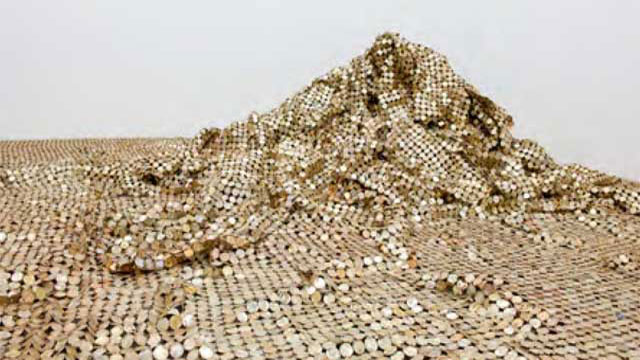
Linking aesthetic creations with political and economic issues is also a characteristic of those works in which he takes up the world's growing ecological challenges. This applies to his "Peak Project", created in 1999, which consists of numerous freestanding "peaks" made from thousands of glittering milk tin lids. Once again, the unfixed nature of the work is a prominent feature, the "peaks" taking on a different shape at each exhibition site. The open-endedness of his works can be seen in "Coal Pot", a work exhibited in the sculpture garden of the University of Kentucky Art Museum. It consists of a 15-feet iron cauldron filled with large pieces of Kentucky coal. In the course of time, the coal will disappear, gradually changing the appearance of the sculpture.
El Anatsui has always been concerned with West African traditions facing the Global North under conditions of modernity, and in his special way he strives to give them new life and meanings that are of relevance today.
-

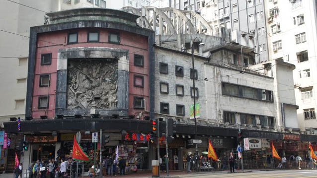
State Theatre, originally named Empire Theatre, was opened in 1952. According to interviews with veterans from cultural circles, the Theatre was the “very origin of Hong Kong’s entry to the world of high arts” (South China Morning Post, Jan 11, 2017). It was Hong Kong’s cultural hub and only to be eclipsed by the City Hall that opened four years later in 1962. Located in North Point on Hong Kong Island, it was founded by a Russian-Jewish impresario Harry Odell, a legendary giant in the history of Hong Kong entertainment. Odell had started a film distribution company ‘Harry Oscar Odell’s Commonwealth Enterprises Corporation Ltd.’ in the post-war years and arranged for internationally acclaimed artists to perform in Hong Kong and in the theatre, including the late Taiwanese famous pop singer Teresa Teng, the late British tenor Peter Pears and Katherine Dunham’s Broadway dance company (South China Morning Post, March 2, 2016).
The Theatre was also a popular venue for live shows such as Chinese drama, opera and musical performances. The roof of the auditorium is suspended from external parabolic concrete roof trusses, which are exposed to the public and serves as a prominent feature and trademark of the building. This ingenious design also freed the auditorium from pillars and allowed for flexible internal arrangements. Designed by a Chinese architect S.F. Liu, the Theatre is moreover fronted by a large decorative relief panel with the artwork by renowned Lingnan artist Mui Yu-tin featuring the ancient Chinese tale of ‘The imperial warlord Dong Zhuo and the legendary beauty Diao Chan’. Together with the framed squared architraves and banded windows harmoniously fronting the elevation of the Theatre, there is a distinct Modernist and Art Deco quality to the whole building.In 1959, it was renamed State Theatre, and due to practical reasons the building has since then been converted into a theatre-cum-shopping complex, and a multi-storey block with shops, residential flats and a night club was opened in the adjacent site. The Theatre finally ceased to operate in 1997, and has today changed its use to a billiard centre with removable partitions sealing off the upper deck of the auditorium. The rest of the complex currently consists of a rundown shopping mall, still in function, and small residential flats.
In July 2015, a local property developer started to purchase various property rights within the State Theatre complex, and rumours of demolition and redevelopment of the site started to spread. Eventually, after substantial consolidated public efforts towards the Theatre, it was finally given a Grade 1 historic building status in March 2017. The State Theatre, narrowly escaping demolition, is only the third building after the Bank of China (built 1952) and the City Hall (built 1962) listed as a Grade 1 historic building in Hong Kong that is built after 1950, indicating a flaw in local heritage policy to value modern built heritage.
published January 2020
-

CONNECTING THE DOTS
A Pilgrimage.
My studio is literally a skein; an element that forms part of a complex whole. Everything that forms part of its composition to me is like a thread being pulled through the eye of a needle to form a tapestry of narratives as body of works. I have absolutely no idea of what impact the connection of these dots/knots will fabricate or the entirety of its arrival and that to me is where I get immersed in roller coaster of jouissance. That is how the idea of process even in the most pleasurable way becomes an integral part of the context in which I work as an artist.
Unravelling.
Here, I connect the dots/knots within the current situation running through my artistic journey. The space in itself has multiple sub spaces I call ‘moods’’. I swing in-between these moods literally in pursuit of a certain expression towards my interests and concerns. These mood swings take off from my IDEA BOARD (https://www.explore-vc.org/en/galleries-content/idea-board.html) where my thoughts appear partially in flesh. That for me becomes my point of departure into streams of decision making. In totality, it’s a snapshot of all my thoughts as a cohesive whole where I can make choices guided by my ultimate motivation at a given time, on a particular body of work.
Then I swing into my RED BOOK (https://www.explore-vc.org/en/galleries-content/red-book.html) where I narrow down my thoughts into writings as part of a research. In transition from the previous mood of writing to this new mood is the optimum to my purpose, which refers to the making or the tangible expression. I deliberately swing back and forth between these two moods to create a certain dialectical relationship between them as a deliberate and crucial aspect to my practice. This opens up my explorations and discussions of the subject of the body, the politics of marginalization and subjugation from a feminine perspective with the use of materials and techniques connected to a certain body presence (craft).
Enchanted by the Familiar.
I see the body as a fluid material that morphs with time or momentarily based on certain conditions or instances. It is like that one thing that is connected to several things. I am interested in that materiality of the body that allows it to be transient. And in terms of that materiality, what it can become and what it can do.
So, to me, the idea of the female body aside its continuous flux is my interest in something about it that creates a permanent or ongoing relationship with itself. That is how the idea of the hand with regards to craft becomes crucial to my practice. This is in reference to its past and present subtle association with subjugation or oppression or basically how the idea of subjugation and oppression is tied to work categorized in the frame of the domestic. That sense of marginalization or the coupling of an idea to a body that makes it lay claim to a certain power absence is of interest to me.
With the hand, I rethink the value of craft.
Through that there is already an acknowledgement of a certain distance that is brought back to close proximity with the body through intimate artistic approaches like thread embroidery and tambour beading. This is where I swing to my TAMBOUR TRESTLE SPACE (https://www.explore-vc.org/en/galleries-content/tambour-trestle-space.html), here, I make laborious and intimate embroideries that feature beads. I perceive this process of beading as a metaphor in reclamation of the self, while highlighting the residue of power that still lingers within the very same system of subjugation. It is a subtle performance that happens in the studio yet inherent to the context.
A thousand Yards Away and Within.
I am tempted to refer to my whole studio as a bigger idea board where certain themes and artistic strategies come together to form narratives and contributions to subjects of interest. In constant exploration and experimentation, a mash up of all these themes and artistic strategies may birth a work of art that offers a blend of fabric cut-outs merged with beaded patterns or forms in the current state of my practice. Yet, I am open to exploring diverse forms of expressions in relation to the context as time goes on.
Absorbing the Far Fetched.
I connect with materials from a perspective where I perceive them as political instruments that exist in time and not only as objects of enjoyment. I believe in the idea of a common vocabulary in the use of familiar materials and objects because they inherently possess personal and cultural meanings from spaces they have been.
In Pursuit of…
If I’m to imagine my destination (the ideal work) from the swinging I’ve been doing for some time now, I assume I’m going to arrive at a magical tapestry composed of fabric cuts outs of feminine bodies fused with other forms of embroidery that may features threads and beads. These materials and artistic approaches may be composed to create fantastical characters, emerging out of a playful hybridization of the human body and sometimes other life forms.
My destination may not be a narrow one, I believe, but one of diverse interesting processes where I can achieve limitless possibilities in my creative projects. The narratives within the symbolic realm of imagery seek to emancipate the oppressed feminine body through a material and technique culture.

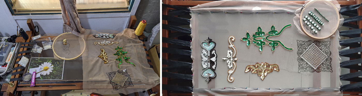
Fig.2 & 3: Table in front of the window with bead embroideries (Photos: Priscilla Kennedy)
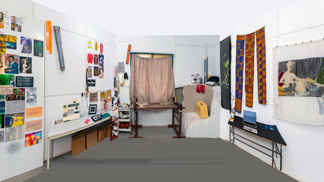
In the photo we see the artist's studio; in it, work tools (such as rubber gloves, a sewing machine, rulers), materials to stimulate the artistic process (e.g. image sources, sketchbooks, materials) and artistic work results. The room is painted white, even the crumbling block in the right-hand corner. This echoes the idea of the "white cube" with neutral walls as a currently still valid basic model for exhibition spaces of contemporary art. Everything is very clean and tidy. On the three tables in the room, materials and tools are arranged like in a still life. For example, on the table in front of the (curtained) window, an arrangement showing, among other things, a round embroidery frame with a bead embroidery that is not yet finished: work in progress. Everything is obviously deliberately placed in this museum-like working space, which thus develops a programmatic expressiveness.
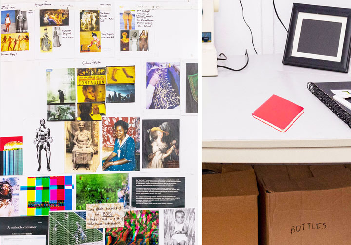
Fig. 4 & 5: Print outs on the wall, red book (Photos: Priscilla Kennedy)
Fabrics, textiles play a major role in this scenario. They are simply material (the kente fabrics on the right) or supports for the two larger works (also on the right). But they also play a major role in the many pictures (DIN A 4 printouts on the left wall), now as depicted clothing: women's dresses in older prints, on works of art (from ancient Egypt) to more recent photographs. Surprisingly, there are images of the vestments of Catholic priests and, beyond that, abstract fabric patterns, ornaments. Working with fabric (which also includes the embroidery frame) is repeatedly found as an important field of work for feminist-oriented artists or for a feminist-oriented visual language in contemporary art.
The DIN A 4 printouts are partly annotated in writing, which reinforces the impression that we are dealing with a "picture atlas" in the sense of Aby Warburg or an "atlas" in the sense of Gerhard Richter, i.e. an often surprising compilation of pictures which in this combination can or should provide very systematic suggestions for pictorial design and for reflecting on contexts.
This also includes the other collections of pictures in the room, in the photo album, on the computer or in transparent sleeves (on the right-hand table), which are obviously often biographically oriented, for example through the baby and children's photos, or through images of their own artistic works.
The overall picture is thus dominated by central aspects of current "global art", an art that could just as easily be shown in Berlin or New York. In this one, however, site-specific aspects, i.e. aspects related to Kumasi, Ghana or West Africa, emerge again and again: the kente fabrics, the photos in the album, even the materiality and construction of the walls speak of the place of origin.
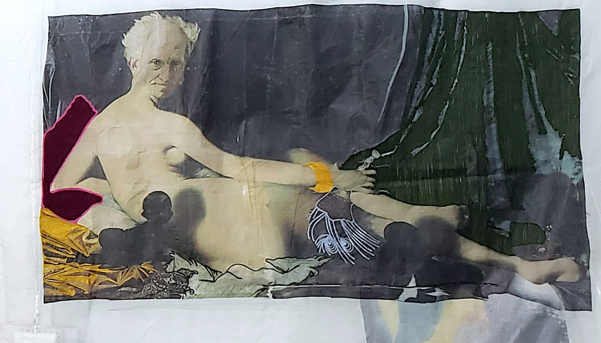
Fig.6: Priscilla Kennedy, o.T., experimental study (courtesy the artist)
This coming together of different thematic layers becomes clear once again in a detail, the painting that the artist presents in her studio on the right wall and which she herself sees as a technical experiment (see illustration below).[1] It shows an adaptation of Ingres' painting "Great Odalisque" from 1814, now in the Louvre. The superimposed head of an older white man (Arthur Schopenhauer) is reminiscent of the same pictorial strategy that the Guerilla Girls successfully tried out with the odalisque in 1989 by putting a gorilla head on it ("Do women have to get naked to get into the Met. Museum?"). While the other elements of the work vary the forms from Ingres' painting, mainly in colour and technique, there is one crucial addition in this work: a small baby in silhouette, black, looking up at Schopenhauer and casting a shadow on the pale odalisque body. The whole thing is printed or embroidered on a transparent, light fabric that throws folds.
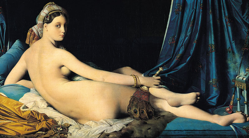
Fig. Ingres, The Great Odalisque, oil on canvas, 1814, Louvre (Copyright CC)
These references make the picture seem familiar to Europeans, but in its combinatorics and with the harsh contrasts it is enigmatic, just like Kennedy's studio itself. Here, an icon of Western art is cheekily alienated, here the canvas becomes a thin nettle, here the woman becomes a man, the soft cushion becomes a hard wedge, the white woman gets a black baby. On the one hand, objects and their meanings are thus unambiguously designated and named, but at the same time, through the artistic formulation and its combination, they are placed in an enigmatic resonance space, which immediately eludes the unambiguous settings that have just been made. An "in-between space" between black and white skin colour, man and woman, opaque and transparent, old man and young child, European (old) art and West African (young) art.
If one looks back through this image (which is taken here - against the artist's intention - as a key image) to the studio, one finds very similar constellations there: empty chasubles of Catholic, i.e. male priests against female bodies in erotically charged clothing, falling, soft fabrics against rigid measuring instruments from geometry lessons, physicality against abstract patterns and ornaments. With such contradictions Kennedy creates an experimental constellation, she spans a field that reports on possibilities in between without letting them culminate in a final work. The open, unfinished field of experimentation thus becomes the actual "work".
[1] "This work does not have a title. I considered it as an experiment to try printing with a blend of embroidery. What is actually piercing through from the back is also part of the experimental process where I made heat transfers again behind the fabric to see the interplay of images from various directions of the material. I do not consider it as a work but as an experiment. " (Information from Kennedy to the author via email on 5.10.2022)

-

Rainbow Nation
The rainbow in the Bible given in Genesis 9:16 is a reminder that we have a covenant with God not to destroy the earth again by floods. “I set My rainbow in the cloud, and it shall be for the sign of the Covenant between Me and the earth,” says the Lord. God had made a covenant with Noah and his seed for generations. Genesis 9:9. And I, “behold, I establish my covenant with you, and with your seed after you”. Since we are all Abraham’s seed, we are covered in this covenant, although Jesus makes a better covenant in the New Testament. Returning to the rainbow nation, this covenant is saying “ no more destructions”. It is as if God is saying we should no longer fight each other but live together in peace. He made us all people with different colours (rainbow).
The metaphor describes a people with multi-cultures living together. The image of the flag is a symbol of togetherness or unity. The different colours. Adopted in 1994, the red, white and blue were adopted form the colours of the Boer Republic while the yellow, black and green were taken from the ANC (African National Congress) flag. The black colour is a symbol of the people; the green represents fertility of the land while the gold represents the wealth from minerals beneath the soil. The ANC adopted these colours way back in 1925.Associated with the flag is the national anthem. This is unique in that it has many languages:
- Nkosi sikelel’ Afrika
- Maluphakanyisw’ uphondo lwayo,
- Yizwa imithandazo,
- yethu,
- Nkosi sikelela,
- thina,
- lusapho lwayo.
- Morena boloka setjhaba sa heso,
- O fedise dintwa la matshwenyeh
- O se boloke (Ntate)
- O se boloke
- setjhaba sa
- heso,
- Setjhaba sa
- South Afrika
- – South Afrika.
- Uit die blou van onse hemel,
- Uit die diepte van ons see,
- Oor ons ewige gebergtes,
- Waar die kranse antwoord gee,
- Sounds to call to come together,
- And united we shall stand,
- Let us live and strive for freedom,
- In South Africa our land…
Songwriter: Cornelius Jacob Langenhoven
Summary
The Rainbow metaphor is characteristic of a nation that aspires for peaceful living; building a peaceful nation. The symbol taken from the Bible donating the Noahic covenant reminds us that God will no longer send the floods to destroy us.
The flag is a symbol of unity between the Boers and the African National Congress colours, which represents the whole of South Africa. It is a sign of hope and nation building.
Associated with the Flag and the Rainbow nation is the National anthem. It is written in many languages signifying the rainbow nation of multi-cultures.
References
- https://en.wikipedia.org/wiki/Rainbow_nation
- https://www.worldatlas.com/webimage/flags/countrys/africa/soafrica.htm
published January 2020
-

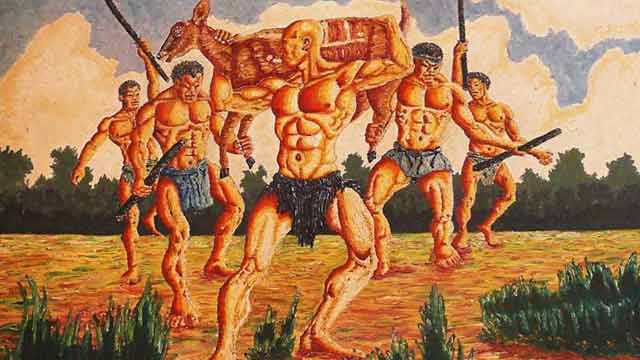
Owusu-Ankomah’s painting at first glance reveals a foreshortening company of energetic warriors, muscular framed with broad shoulders, muscled chest, and a narrow waist in a chiselled physique. The hunters were portrayed with huge hands, clenched fist, knuckles, strong legs visibly revealing biceps brachiis and dabs of varicose veins on the arms, thighs and legs evident of powerful and efficacious men. Before modern society, the average male spent most of their time hunting, protecting, and engaging in physical activities that increased their muscle mass and maximize their muscular proportions. Owusu-Ankomah’s production exhibits masculine competitiveness and a sense of adventure – the brave team were a-fire with passion, armed with sticks in a leopard-like graceful movement as the captain leads carrying a captured antelope shoulder high.
The warriors are noticeably naked with only a string of grass costume wrapped around the private parts which is the formal and ceremonial attire for the ancient culture. Owusu-Ankomah’s choice of colour in rendering the human figures lends credence to the fact that colours have a strong position in identifying humans while hunting. Wearing hunter orange is the best way to ensure other hunters see you and don’t accidentally mistake you for game in complex backgrounds that are often green or brown. The artwork reveals harmonizing brown colours which tend to create a central focal point in the entire picture frame to evoke earthiness, emotions, security and safety related to the natural world. The tints and shades of hues enhanced the main features in the painting to vividly communicate the intended message as well as create an illusion of depth.
A thick flora forms the background of the painting evident that the hunting expedition was carried out in a thick forest. As the fearless, able-bodied men advance through shrubs in high spirit of mission accomplished, an earthly scent swirled around them coupled with a sense of eagerness to meet a welcoming, expectant and jubilant community. Hunting is an extremely important mode of human-nature interaction closely linked to culture patterns and value systems. This engagement with wild animals is thought of as part of a deeper unity with nature, which means being part of nature in physical sense (Lowassa et al., 2012). Sustainable hunting prescribes taking as much as needed and as much as the habitat and the population can regenerate. Suffice to say, when hunting for a game form the basis of a year-long survival of a people, it calls for a deeper reflection. Owusu-Ankomah’s painting comes on the back of an ancient heritage of a distinct tribe in Sub-Saharan Africa.
‘Aboakyir’ translated ‘deer hunt’ is a festival uniquely celebrated by the Effutu (Simpa) people of Winneba in the Central Region, southern coast of Ghana, West Africa. The festival which is celebrated annually on the first Saturday in May has the historical antecedent of the replacement of a human sacrifice to a tribal god with a leopard – an alternative which resulted in the loss of many more lives than the sacrifice of a single slave. Consultations with the deity for a more humane alternative resulted in the “Wansan” (the deer) as a practicable and most acceptable substitute. The capture of a live deer, like the leopard, required many more hands than the members of the royal family could find. The additional hands required were solicited from the local militia as a service to ‘the stool – a symbol of chieftaincy, royalty, custom and tradition’. It was this change in form; that is, the involvement of the local militia, that the annual consecration and appeasement of the deity became a public, state-wide affair. This marked the birth and hence the origin of the “Aboakyer” festival.
The design of the Effutu State emblem tells this story; the ‘stool’ on which the King is installed sits on the “Wansan” (the deer).

Emblem of the Effutu state (Source: Palace of Oma Odefe)
The festival is therefore important for the ‘stool’, its occupant and the entire royal stool family. It is a religious duty and an obligation for the general citizenry to ensure its celebration annually is sustained to honour the ancestors and protect their historic culture for posterity on the back of removing evil and predicting a good harvest for a prosperous life in the coming year. The week-long activity begins with two traditional warrior groups known as the ‘Asafo’ companies consult their shrines for clearance, protection and early catch. The warrior groups clad in distinct costumes with distinct musical instruments — the ‘Tuafo' and ‘Dentsefo’, move to their respective hunting grounds at dawn on Saturday, wielding sticks and clubs amid chanting of war songs. No weapons, other than clubs and sticks are used to catch the deer, as it must be brought back alive.
By far, the relevance of Owusu-Ankomah’s painting is not in doubt as it fosters a deeper understanding of the historical and societal roles of hunting within Ghanaian communities. The painting holds both cultural and educational significance which sparks discussions on conservation, sustainable practices, and the preservation of cultural heritage. Consequently, bridging the gap between present generations and the rich tapestry of cultural and environmental history. The sight of the painting in Ghana’s National Museum serves as a poignant reflection of the nation’s cultural heritage and connection to nature. In this visual narrative, the core of historical period of a distinct society is unearthed.
References
- Lowassa, A., Tadie, D. & Fischer, A. (2012). On the role of women in bushmeat hunting – Insights from Tanzania and Ethiopia. Journal of Rural Studies 28(4):622–630.
Further Reading
- Anane-Frimpong, D. (2022). Aboakyir: Deer hunt festival. Link Retrieved on April 10, 2023
- Rubiano, W. (2017). Planting trees for the aboakyer festival 2017. Link
Published March 2024

An energetic scene. Five men in a flat landscape approach the viewer. Their bodies are naked - except for their loincloths - their faces grim. Muscles in the bright light stand out under the skin, their chests bulge voluminously - they are timeless heroes. The men do not look at the viewer of the picture. With their long, dark sticks firmly in their strong hands, they gather symmetrically around the bald man in the foreground. He presents himself with an antelope in his raised arms. His bald skull points to the left, as does the antelope's head.
On closer inspection, some things are irritating. Are the men dancing or walking? Where is the animal spatially located? Somehow it is on the shoulder of the man, but the legs are captured by the men behind, who would be much too far away for that. Is an event, an episode (as in a photograph) depicted? Or does the symmetry of the composition speak more of a constructed symbol, a sign, as in an emblem? The latter would support the strict division into horizontal planes: with the islands of grass in the foreground, the flat, ochre-coloured plane in the middle ground and the forest with sky in the background. But then again many design principles undermine this order: the tense, energetic movements of the figures, the strong brushstrokes, the irregular shapes of the white clouds and the tufts of grass, the dynamic accents of the sticks.
We know from our Ghanaian colleagues that what is depicted here, the catching of the animal, is part of a ritual celebration and a festival (the Aboakyer Festival). Here the moment is shown when the men have stepped out of the dark, hermetically sealed forest in the background with their prey and now present themselves in the bright light with their success. A comparison with the results of an image search on the internet for “Aboakyer festival” (Fig. 2) shows that this is the iconic moment. Here the idea of the festival seems to be condensed. And this also explains the emphasis on muscles: the hunters must be well trained to match the animal's speed and strength.
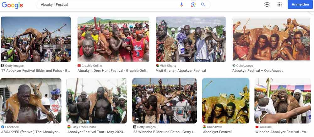
Fig. 2 (Google search for "Aboakyer Festival" on 9.9.2023 - the first page of results) Screenshot: Ernst Wagner
Owuso-Ankomah's painting focuses on the men with the animal. At first glance, the painting shows above all the strength of the men. The space thus becomes the backdrop for their performance. Their bodies are not only idealised but theatrically exaggerated, their muscles as if illuminated by a spotlight. The geometric centre of the picture, through which the horizon also passes, brings the loincloth of the leader into focus (see fig. 3) - perhaps an allusion to male potency?
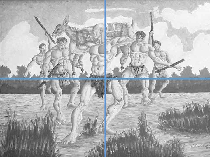
Fig. 3: Composition sketch (horizon and geometric centre) Photo: Ernst Wagner
A comparison with photos on the same theme from the Heritage Centre in Winneba (see Fig. 4-6) shows clear differences to the depiction in Owusu-Ankomah's painting. In the artwork, both animal and hunter have their mouths open, exhaustion is evident in both. In this way, too, man, animal and landscape are connected - despite hunting and death. The artist uses the warm ochre tones in such a way that the earth, the human body and the animal hardly differ in colour. Since the animal is still alive, its head does not have to be held. Thus, visually, it seems to elude a depiction of "being trapped", also due to the ambiguous spatiality described above. It could almost just as easily be understood as a triumphant appearance of the animal, to which the men are subordinate as bearers and assistant figures - comparable, for example, to Jan van Eyck's depiction of the lamb (see fig. 7), which also marks a mediating position between victim and victor, between human beings and God.
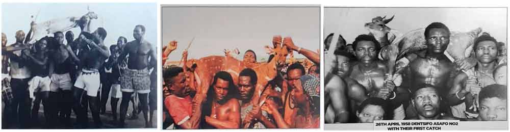
Fig. 4-6: Photos from the Heritage Centre Winneba Photos: Ernst Wagner
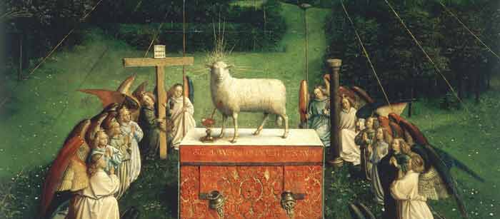
Fig. 7: Van Eyck, Lamb of God, Image Detail: Ghent Altar. Oil on wood, 350 x 461 cm
Cathedral of St Bavo, Ghenthttps://commons.wikimedia.org/w/index.php?curid=109213 [28.10.2024]
This image sets against each other contradictory concepts: static-symmetrical-ordered vs. dynamic; accidental situation vs. deliberate staging; documentation vs. sign; hyperrealism in body and space vs. symbolic charge. It sets these contradictions against each other in the unity of the painting.
Reference
Published March 2024

-
The discriminatory apartheid politics in twentieth-century South Africa were designed to advance the political, social and economic empowerment of the white citizenry; the entrenchment of Western culture and values; to transform the black populace into a labour force and limit their education and training. Within that white supremacist dogma, black material culture’s only footing was its anthropological and ethnographic interest. The output of the pottery, weaving and print workshops of Rorke’s Drift came to stand in symbolic defiance of all of that.
Rorke’s Drift grew from the missionary work of the Evangelical Lutheran Church in South Africa’s KwaZulu-Natal Province Under the initial management of Peder and Ulla Gowenius who were recruited from Sweden, the centre was conceptualised for the training of black members of the local community to produce art and crafts as a means of self-support. The pottery workshop at the centre was established in 1968 by the Danish potter Peter Tyberg.
Whilst the Zulu culture is predominant in the province, it also accommodates other cultural groups. The majority of the initial group of women recruited for the pottery workshop belonged to the Sotho group and had the skills to produce utilitarian pottery for brewing, cooking and storage in traditional forms, decorated with applied motifs and incised elements (Fig 2).h The women were also familiar with traditional Zulu pottery forms in monochromatic colors (hues of black and brown) and decorative motifs that included pinched surfaces, geometric designs and raised linear coils. These were and continue to be produced with hand-building techniques and pit-firing.
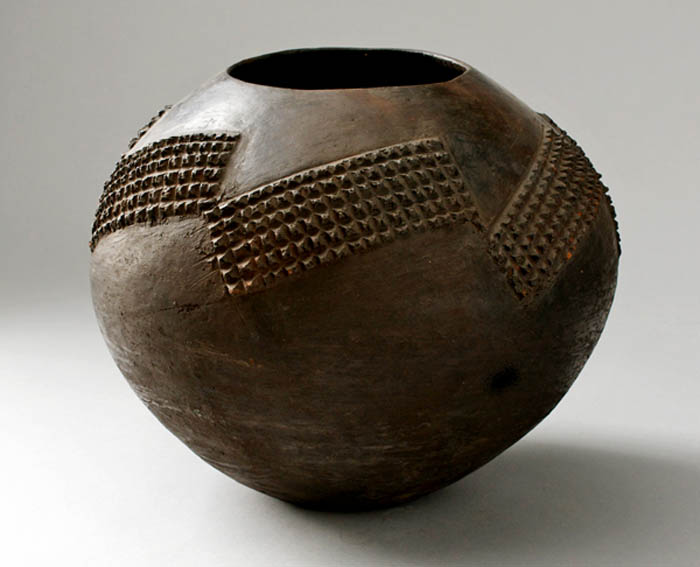
Figure 2
A traditional vessel (ukhamba) for the serving of beer in the Zulu culture, 1965, hand-built, burnished and decorated with applied raised designs (amasumpa), collected in Melmoth in KwaZulu-Natal Province, South Africa, 24 x 29 cm, Collection of Iziko Museums of South Africa, Cape Town, ©Michael Hall
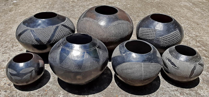
Figure 3
Traditional Zulu vessels collected in KwaZulu-Natal Province, South Africa, c.1990 to 1996, various potters, hand-built, burnished and decorated with incised and raised designs, Collection of Ian Garrett, ©Ian Garrett
The potters were introduced to Western production techniques, materials and kiln technology at the workshop. They were also shown books and magazines that exposed them to pottery forms outside of their culture and convention such as of Pueblo Indian and Nigerian pottery (Hosking, 2005, p. 33 and Gers, 2015, p. 268). It was the dictum of Rorke’s Drift to promote individual expression flowing from “an innate naivety and conceptualism” (Leeb-du Toit, 2012, p. 79) but the resulting works had to have appeal for Western consumers. In the pottery this culminated in a “composite globalised identity” (Hosking, 2005, p. 57) that married Scandinavian late-modernism and indigenous African knowledge systems. Freddie Motsamayi (2012, p. 24) described it bluntly as an example of an invented tradition in which new forms of African expression were produced for the benefit of Western patrons.
Whilst staying for the most part within the parameters of traditional Sotho and Zulu forms, the women potters created their versions of Western forms of bowls and vases and also vessels that approached sculptural forms or were distinctly sculptural forms. The decorations which referenced indigenous culture usually covered most of the surface and were applied as incised or built features and painting in layers of slips. The works became progressively more intricate and composite with richly painted and texturally decorated surfaces (Hosking, 2005, p. 96).
A new form that emerged in the workshop oeuvre was the “bird pot” introduced by Judith Mkhabela who worked in the studio during the 1970s. This was a pot with a pedestal base to which the head, wings and tail of a bird were added. Whether this form was Mkhabela’s own innovation is not a certain fact. It might have been modelled on the nineteenth century European hen-on-nest form (Maggs and Ward, 2011, pp. 155–156) that served as a container for fresh eggs. It is equally likely that the pot referenced two other indigenous cultural vessel forms, namely the bird-shaped earthenware vessels made by the South Sotho cultural group for possible use as water containers, water coolers or egg storage (Riep, 2011, p. 185) and the other being the totemic pig and elephant vessel forms made by the amaHlubi tribe associated with the Basotho cultural group (Garrett, 2020).Over the years this form was adapted by some of the other potters such as Elizabeth Mbatha (Fig 4).
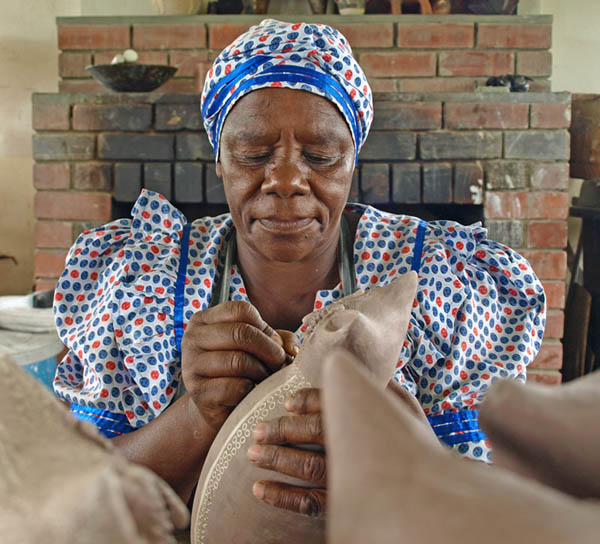
Figure 4
Elizabeth Mbatha at work in the Rorke’s Drift pottery workshop in 2014, ©Ronnie Watt
Rorke’s Drift pottery was first . Two years later, the gallery acquired hand-built and thrown works from the studio for its permanent collection. This was significant for being the first ceramic works by black South African artists to be acquired for inclusion in a public collection during the apartheid era. The best of the pottery was selected to be sold in overseas outlets with Sweden and Germany as prime destinations. The potters set a precedent amongst South African black potters by signing their works on the feet of the pottery and further adding the date and kiln data alongside the leaf logo of Rorke’s Drift (Fig 5). This practice copied Western potters who identified their works with potter’s marks, signatures or monograms.
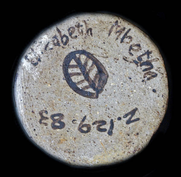
Figure 5
The foot of the double bird vase bears the name of the potter Elizabeth Mbatha [sic], the kiln data and the leaf-form logo of the Evangelical Lutheran Church Centre for Art and Craft at Rorke’s Drift, ©Ronnie Watt
As a collective and as individuals, the potters defied tradition and convention, Western perceptions and expectations of traditional pottery. The potters preserved elements of indigenous form and designs in their pots alongside the non-traditional features and sculptural appendages (Figs 6, 7). This illustrates the statement by the ceramics art historian Elizabeth Perrill (2008, [Sp]) that Indigenous Knowledge Systems (IKS) of materials, methods, forms and values are not monolithic and permit an expansion of innovative aesthetics within and as a continuation of a culture.
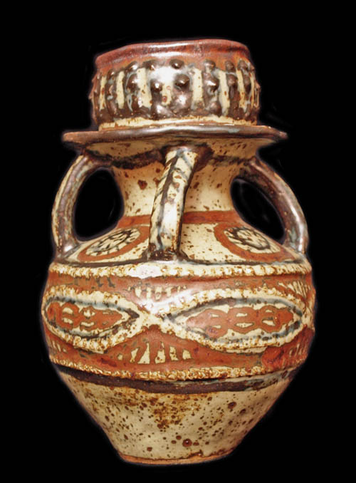
Figure 6
Lephina Molefe, Stacked vessel, 1980, hand-built and glaze-decorated reduction-fired stoneware, 26 x 17 cm, Evangelical Lutheran Church Centre for Art and Craft at Rorke’s Drift, South Africa, private collection, ©Ronnie Watt
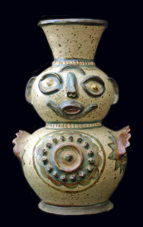
Figure 7
Euriel Mbatha, Figurative vase, 1984, hand-built and glaze-decorated reduction-fired stoneware, 21 x 13 cm, Evangelical Lutheran Church Centre for Art and Craft at Rorke’s Drift, South Africa, Collection Minette Zaaiman, ©Ronnie Watt
The demand for Rorke’s Drift pottery started to wane in the 1990s for several reasons. Dealers and collectors broadened their interest to include the other indigenous potters who had since come to the fore. Problems with the management of the centre and financial constraints detracted from the promotion of the pottery and the recruitment of new potter talent. The quality of the pottery deteriorated after the introduction of commercial clay bodies and glazes and there was little variance in the forms and their decorations. The potters were no longer producing for the local and international collector market but had to produce works that met the expectations and budgets of tourists.
As “tourist art”, the twenty-first century pottery of the ELC Art and Craft Centre at Rorke’s Drift reveals forms and decoration intended to meet buyers’ tastes and budgets. The purposeful re-orientation towards the tourist market to tap into that source of revenue, is not a slur on the history, aesthetics or ethos of the studio. As in the earlier works, the more recent works illustrate an entanglement of the maker and the made, relevant to a new context of time and circumstance.
References
- Garret, IW. (2020). Personal correspondence.
- Gers, W. (2015). Scorched earth: 100 Years of Southern African pottery. Johannesburg: Jacana.
- Hosking, S. (2005). “Tradition and innovation: Rorke's Drift ceramics in the collection of the Durban Art Gallery, KwaZulu-Natal.” Unpublished MA (Fine Arts) dissertation. University of KwaZulu-Natal, Pietermaritzburg.
- Leeb-du Toit, J. (2012). Rorke’s Drift ceramic traditions in context. In J. Stretton (Ed.), All Fired Up: Conversations between storerooms and classrooms (pp. 77-81). Durban: Durban Art Gallery.
- Maggs, T. & Ward, V. (2011). Judith Mkhabela: An inspirational potter from KwaZulu-Natal. Southern African Humanities (23), September, 151–71.
- Motsamayi, MF. (2012). “The Bernstein Collection of Rorke’s Drift ceramics at the University of KwaZulu-Natal: A catalogue raisonné.” Unpublished MA (Art History) dissertation. University of KwaZulu-Natal, Pietermaritzburg.
- Perrill, E. (2008). Indigenous Knowledge Systems (IKS) & Zulu Ceramic Arts: Azolina MaMncube Ngema, One Woman’s Story. Interpreting Ceramics 10, [Sp]. Retrieved from www.interpretingceramics.com/issue010/articles/01.htm.
- Riep, DMM. (2011). “House of the Crocodile: south Sotho art and history in southern Africa.” Unpublished PhD thesis. University of Iowa, Iowa City. Retrieved from https://doi.org/10.17077/etd.0dzbhfvg.
published November 2020
-
His artistic production is informed by the basic concepts of "love", "peace" and "liberty", and he expressly hopes that his works will help to create a better future.
Since 1996, after twenty-five years of working with clay, plaster, stone, cement and wood, Joe Big-Big has mainly used wire, iron nets and barbed wire to produce works with a very characteristic signature. Through the use of metal nets, he produces an effect of lightness and dynamism, even in sculptures several metres high. It was his fondness for big and high sculptures that earned him the nickname Big-Big.
Through his choice of materials he reveals the preoccupations that inform his work: he believes that people are free to decide whether they want to produce or destroy something, to encourage or suppress. In Joe Big-Big's work, wire and barbed wire, commonly symbols of oppression, captivity and division, represent the overcoming of bondage: they stand for prevention and protection. Joe Big-Big plays here with the notion of wire as an everyday material that normally goes unheeded, but which can become an instrument of human creativeness and global understanding through artistic activity. However, in Joe Big-Big's work this metal material seldom loses its ambivalence – for it is also a symbol of human labour and human toil. The artist makes use of these associations in works showing toiling people.
Joe Big-Big is intensely interested in the iconology of his metal materials and the objects he integrates into his works. Padlocks, for instance, symbolize the difficulties we get ourselves into, while keys stand for solving problems, freedom, peace and happiness. Coins represent the money we need to live, and clocks or watches are references to the time we need for solving our problems on the way to a carefree future. The metal materials thus symbolize wealth, strength and power. The artist also deliberately combines old with new metals, as a reminder that one needs to remember the old in order to be able to cope with the present and the future.
The themes taken up by Joe Big-Big come from nearly all areas of human life. His works are concerned with very personal issues as well as with political topics, such as war, poverty, flight, displacement, or the equality of women. He believes that his images speak louder than words, and he intends them to arouse emotions in the viewer, for "art without emotion, feeling or meaning is like a voice or a noise without meaning".
-

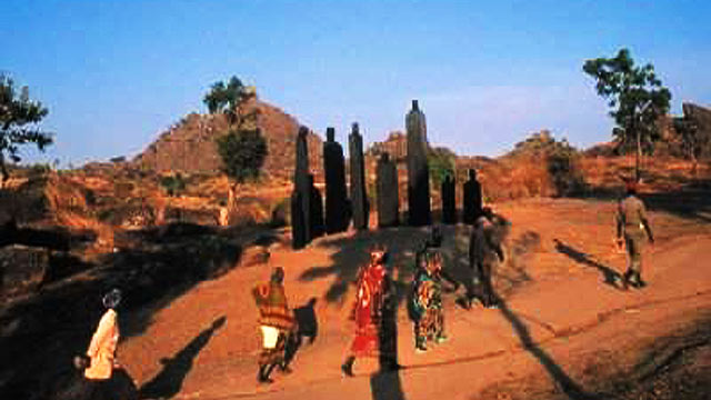
The image is a photograph showing details of the French artist Christian Lapie’s public installations in 2001 in the city of Ngaoundéré, capital of the Adamawa Region in Cameroon. The work consists of five modules composed of nine figures, ranging between 150 and 450cm each and laid in a semi-circular radius of 1000 cm. The pieces are made of wood and placed vertically in an upright position. The upper end is shaped like a head, giving each piece the appearance of a human silhouette. Arranged like a gathering of people dressed in local traditional attire, called boubou (a long, loose-fitting garment worn by both sexes in parts of Africa), the works are aligned in a semi-circular arc.
The work’s detailed structure is closely linked to its title Djaoulérou, which means "traditional space, place of meeting and reception". The artist echoes customs in a context where the relationship between traditional practices and Islam remains ambiguous. Islam provides an opportunity for certain members of local society to acquire privileged positions under the auspices of religion. Religion’s role in the political game has proven to be so important that post-colonial politicians have laboured to maintain control of the religious sphere in every region. Religion presents challenges for politicians in terms of governance and control. Maud Lasseur (2005, 95), echoing this sentiment, maintains that: “During the colonial period and under the regime of President Ahidjo (1960–1982), Christian missions were thus contained to the south of Cameroon so as not to hinder the Muslim aristocracy of the Far North or thwart the unifying political project of the first Cameroonian president”.
The monumental character of the work, the rhythm and movement suggested by forms treated with little attention to detail, the variations in volume and the different dimensions of each silhouette make the installation look both impressive and expressive. Each individual group of statues, displayed at the same time in different places in the city, shows how the "mysterious objects" made by a foreign artist present unfamiliar traits regarding the city’s socio-cultural imagination. The work breaks taboos: an unusual appearance that creates artistic experience, tradition and beliefs, which have become subject to manipulation and political propaganda within the society.
The work’s destruction reflects the fragility of a slavish society instrumentalized by politically motivated religious arguments in the 2002 legislative elections in Cameroon. The fact that a French artist has carried out an unusual and iconoclastic installation project in this city is seen as a provocation, particularly by the Muslim cultural authority. This religious and political authority occupies a very influential social position as "guardian of the temple" (custodian of traditions) and is in a position to incite people to commit acts of such magnitude. In addition to setting fire to the works and proceeding to uninstall them, public authorities definitively closed down the Franco-Cameroonian alliance of Ngaoundéré because of the social unrest the works provoked. This cultural centre for Franco-Cameroonian cooperation had supported the artist's installation project.
The act of vandalism perpetrated on Christian Lapie’s work exposes Cameroon’s national society in search of landmarks. Art, and particularly sculpture, has played an important role in expressing belief systems. The cosmogonic universe and the world view of the populations that have succeeded one another in this territory have been revealed through artistic representation. The bold production and reproduction of anthropomorphic, zoomorphic, geometric and imaginary forms is typical of these societies. As in many countries in sub-Saharan Africa, art has helped what people see, think, imagine and believe (J.P. Notué, 2005). Because of the lack of critical understanding of their history and the changes they experienced, societies are confronted with major shocks that have an impact on their development. Among these shocks are an ambiguous relationship to religion. Its consequences are the religious and political manipulation that societies are sometimes subjected to. One historical reason for this is the attitude of missionaries who made no discernment in the positive values of the tradition and the absence of doctrine and deep convictions of these values (E. Mveng, 1985).
Cameroon’s colonial religious legacy is one of the most important sources of the ethical foundation of its society in the 21st century. The generalization of the religious profession of faith/conversion seems to have fostered a latent form of "alienation" among the urban society. There is a superficial knowledge of both the principles of modern culture and the traditional environment, two references whose slavish play of opposites have political stakes. In Cameroon, the policy of conviviality between Islam, other religions and local cultural practices implemented by Sultan Njoya in the Kingdom of Bamum presents elements of inspiration for a compelling form of social emancipation. The policy of inculturation and multi-confessionalism has favoured the cultural openness of society and preserved, for example, the sustainability of the region’s remarkable creative industry. Art, belief systems and politics are all values of cultural expression fundamental to society.
The work breaks taboos: the artistic experience created by its unusual appearance calls upon traditions and beliefs that have become subject to manipulation and political propaganda within the society.
References
- Mveng Engelbert. 1985, Histoire du Cameroun, tom 2, Yaoundé, Ed. CEPER.
- NOTUE Jean-Paul, TRIACA Bianca, 2005, Bandjoun, Trésors royaux du Cameroun, Milan, Ed. 5 continents.
- Maud Lasseur. 2005, in « www.cairn.info/revue-afrique-contemporaine-2005 ».
- Assako Assako PH.S. 2011, l’art au cameroun du XXe au début du XXIe siècle : étude des expressions sculpturales en milieu urbain, thèse de Doctorat/Ph.D. en histoire de l’art, Université de Yaoundé 1.
- www.christianlapie.net/oeuvres/16/djaoulerou
- www.christianlapie.net/mobile/news/326/.%20http:#news
- www.christianlapie.net
published February 2020
-

Preparation in Nairobi
The Wakujuu collective (link) was invited to Documenta in 2022. The process that started from there has been long, not only to make the art work to be presented in Kassel, but also to become part of Lumbung, the concept the curators proposed. We went through a long process coming up with ideas, collecting materials, shaping it, discussing among ourselves as artists and also with the artistic team from the Lumbung Network. In addition, we decided, before we take our exhibition to Germany, we do it here in Nairobi to share it with our community, fellow artists and other people. Thus, we started local workshops with different people, artists, photographers, musicians and community members. These workshops led to a huge festival in the community in 2021 which was part of our offsite project for documenta, together with the exhibition we did in Nairobi. The idea was to share with our community what we bring to Kassel.
Workshop in Nairobi (Courtesy the artist)
It’s important to mention that in our collective, all individual artists have their own ideas. So, we started to look at the objective for the whole collective. We discussed and then we decided that every individual artist does his own artwork, but we discussed as a collective, supporting each other, giving ideas, criticizing.
Preparation in Kassel
When we came to Kassel, we brought some material with us and we found other material there. At the Documenta we were supported by a team. It was challenging, but still most enjoyable and it created a lot of learning.
For instance, we were excited to work together with Instar from Cuba, Britto-Arts Trust from Bangladesh and Wakali Wood from Uganda, as we were sharing the same spaces. The idea of Lumbung is sharing. And it doesn't matter what you're sharing: stories, food, materials or tools. We got to sit together and discuss also with Jatiwangi Art Factory. We lived like a family. And this is the most memorable thing that I will take with me forever, not only with the Lumbung members, but with the Kassel community. It's a thing you wish to repeat over and over.
When we were invited to come to Germany the first time in 2021, there were incidents of racism. And I started feeling I don't want to go to Europe. But this time it was different, apart from the antisemitism accusations that seemed to halt the whole event. Even with the German people with whom we worked at Documenta halle we just connected immediately; we just became family.
Our art works at documenta
The different artworks we made for Kassel had different themes, but all tackling what is happening in the world, not only in Mukuru slum (where we are based in Nairobi[1]). The world is one big village and we all have the same challenges that are affecting us as humans, like climate change, war, economic hardship, failed systems, pandemics and so on. When you look at the world, it's fragile, it's dangerous, and it’s not livable. Everything is tough. But there are also good stories.
Construction of the tunnel in Kassel (Courtesy the artist)
The tunnel
For the entrance to Documenta Halle, where we exhibited our works, we used the corrugated iron sheets that the houses are made from in Mukuru. Our installation started with a tunnel, built by Kimathi Kaaria and Lazarus Tumbuti from our collective. You enter the tunnel and hear a sound. You go inside and you don't see anything. There is just darkness, and you hear this sound, recorded randomly in the streets in Mukuru.
The title of the installation is “Wakija Kwetu… ”. It is a Swahili name that means: “When they come to our home they get to know us better.” The sound is bringing you to Mukuru. The idea is to move you from Kassel to Mukuru and give the impression how it feels like to be in the streets there. And when you go inside, you see the corrugated iron sheets, you see the walls of our houses. You have this feeling of being in Mukuru.
Inside you are welcomed by three installations, ‘misingi wa nyumani’ by Joseph ‘Weche’ Waweru, ‘wrapped reality’ by Shabu Mwangi and ‘kahio kugi gatemaga o mwene’ done by Ngugi Waweru.
Inside the tunnel (Courtesy the artist)
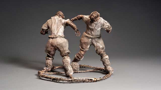
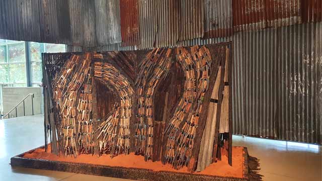
Ngugi Waweru. Kahio kugi gatemaga o mwene. Used knives, motorbike chains, corrugated iron sheets. 2022
The situation of the world is the theme of my work “kahio kugi gatemaga o mwene”, in which I used old knives. I heard from many people, that the world is beautiful and brutal at the same time, it's scary. And I said to them: “Exactly, it's scary now to be in the world.” There was COVID, there is war, there is hunger - it's scary. It's like you are surrounded with death or illness.
 Ngugi Waweru. kahio kugi gatemaga o mwene. Used knives, motorbike chains, corrugated iron sheets. 2022 (Courtesy the artist. Photo Avi Sooful)
My artistic process always starts in the brain and how I feel when observing the surrounding. For my Documenta work, I was studying those people who come to the community in Nairobi to sharpen knives for the butchers. I realized that they sharpen the knives over and over again until they are worn out. That led me to knives and I started collecting them long time ago. I didn't know what I will do with them. But, when we started talking in our collective about the exhibition, I came across a proverb: Kahio kuhiga muno gatemaga o mwene. It is a Kikuyu proverb that means “When a knife is too sharp, it cuts the owner.” I remembered that I had these sharp knives. This is how I came up with this idea of my art work for documenta fifteen.
In the older days before we were colonized proverbs were used to educate or warn people. In this case I used the proverb to warn people. This Kikuyu proverb warns against the possibility of being harmed by one’s own decisions. The human quest for advancement in various spheres (technology, education, religion, economies, or colonizing other planets, etc.) is also marked by a growing distance between people and the qualities that makes us human beings – our capacity for love, kindness, care, understanding, sharing, community. Just as a knife is eroded as it is sharpened repeatedly, so are we made less and less human by the actions we take to adapt and survive within our present society.
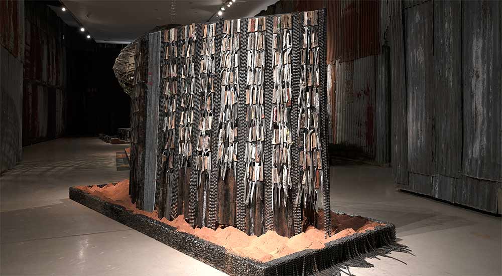
Ngugi Waweru. kahio kugi gatemaga o mwene. Used knives, motorbike chains, corrugated iron sheets. 2022 (Courtesy the artist. Photo G. Tenter)
Background
But we have also good stories, the Wajukuu story, our story, e.g.. This story is creating hope where there is no hope. Building community and togetherness. Sharing is what we are doing to solve our issues, as artists, as a community. The world can learn from us. It doesn't matter where you come from, it doesn't matter what you have or what you don't have: We all have challenges. We have to come together and find solutions.
Before the white man came to Africa, art was part of our life. When a child was born there was a ritual, a dance and a song to welcome the child into the family/community. In other traditions there was painting of the house. When the white man came, all of this was demonized. They forced us to start living their life. Even in school, we learn about Picasso or Leonardo da Vinci, but there were African artists whom we never heard from. They were masters, and the elders taught the young. Since we went through the white man’s education, art is defined according to the name. Now it's art, before it was our lifestyle.
When the colonizers came, they took away three most important things, our land, our freedom and our religion. When they left they gave back our land and some part of our freedom but they never gave back our altars. What the white man also left is capitalism. But, with capitalism there is no way to connect with our Gods and our planet. Capitalism creates appetite for profits. With this appetite we destroy our home, our earth in the quest for riches. The capitalism system all over the world is suppressing our spirituality, our creativity, and our being human. It's making people to be workers, not free people or free thinkers. It took millions of colonizers’ soldiers, hundreds of years to disconnect us from our true being and our true Gods. What we are doing as Wajukuu Artists is like a tear drop in the ocean, but we are able to ignite a spark that will connect us to our roots. Our role in the community is to ignite a spark of change and alternative way of thinking.
When we started to make art in Mukuru, the kids came where we were worked. At first we chased them away. But they would come again and again, because kids are attracted to the good things and art attracted them. After a few unsuccessful attempts to chase them away we decided to take them in. We realized if we don’t take and train them they will grow with the same vices we grew up with. For us, it's not about teaching them to be artists, but to create a platform for the kids to express themselves and give them an alternative education. We intend to find land to start practicing agriculture, teaching kids how to take care of the soil, to take care of the plants, the trees, and the environment, and also to reconnect with our spirituality, with our roots. This means, we teach kids our traditions. We also incorporate traditional dancers and traditional instruments in order for us to go back to our ways, not necessarily exactly, but to have a connection with our past.
published February 2025
Documenta
For over half a century, documenta in Kassel was considered the most important exhibition of contemporary art in Europe and beyond. It marked the respective current state of the art discourse in and for the Global North. The documenta in 2002, curated by the Nigerian-American Okwui Enwezor, corrected the existing narrow focus on art mainly from America and Europe for the first time.
Twenty years later, in 2022, documenta was curated (again for the first time) from the Global South and additionally by a collective: ruangrupa from Jakarta. ruangrupa organized this documenta under the theme “lumbung”, the Indonesian name for a shared rice barn. Applying the lumbung ideal to the art world means that artists and collectives should work together sharing knowledge, resources and ideas. Instead of the purely market-oriented art business, the exhibition should focus on social, ecological and economic sustainability. Thus, the curators did not only ask the artists to present artworks, but offered support for their collective work in the public space. This is one of the reasons why, in addition to the existing museum spaces, numerous other places such as old factories or churches in Kassel were included as shared spaces.
An outstanding example of the implementation of the Lumbung concept was the Wajukuu Art Project working in the slums of Nairobi. (Wajukuu is Kiswahili for grandchildren, or other relations of the second generation.) Wajukuu's installations at Documenta drew on used materials, furniture and everyday objects from the slums. In this way, they offered an aesthetic as well as socio-political examination of questions of identity:
Entrance to the Documenta Halle through Wajukuu's tunnel (Courtesy the artist)
Anyone who wanted to visit the documenta-Halle in Kassel, a modern hall with a glass façade built in 1992, first had to pass through an installation by Wajukuu: a tunnel-like, dark corridor made of corrugated iron, rusty Mabati, a building material commonly used in the Mukuru slum. “In reference to the vernacular architecture of Maasai housing, the meandering tunnel that contained the installations was covered by thin dark-brown reeds.” (https://www.textezurkunst.de/de/articles/eric-otieno-sumba-documenta-sell-the-vision/) The contrast between this noisy, dark scrapyard atmosphere and the light-flooded modernity and transparent rationality of the documenta hall could hardly be starker. In the tunnel, you could hear dogs barking, engines rattling and sirens wailing.
During the creation process two other worlds collided: “In a ‘Post Documenta Artist Talk’ (Link) on October 13, 2022, two members of the collective reported that it took some negotiation to obtain clearance to build the tunnel without professional architectural guidance. The artists convinced the two firms that had been commissioned for construction to allow the structure to be built outside of construction norms and standards.” https://www.textezurkunst.de/de/articles/eric-otieno-sumba-documenta-sell-the-vision/#id4
Inside the tunnel (Courtesy the artist)
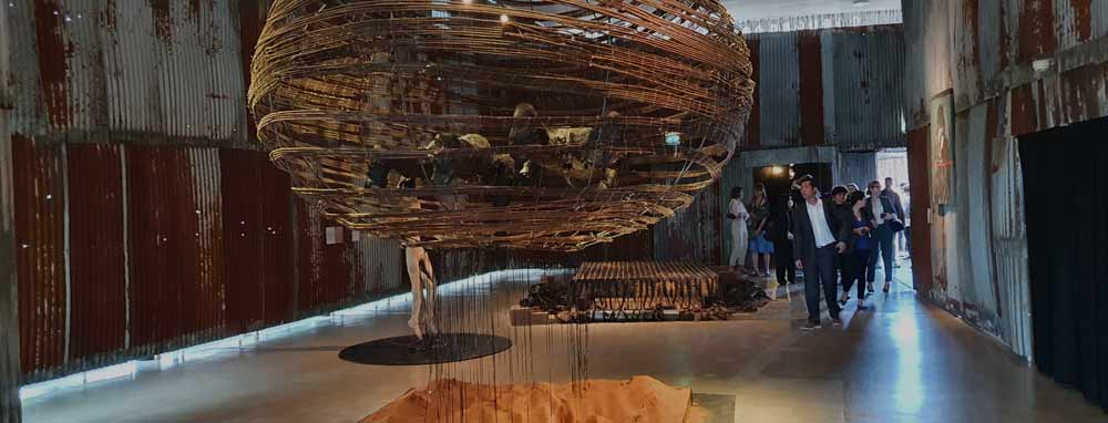
At the far end of this tunnel, visitors (with their predominantly Western-influenced view) stood in front of enigmatic sculptures. These were again made from used materials from the slum. Together with videos on screens, they encouraged visitors to reflect on life in the slum and prompted speculation about their possible use and meaning. Soft materials, for example, formed a resting place in the size of a typical one-room dwelling (Joseph Waweru Wangui). Next to it was another installation by Shabu Mwangi: a mirror set in a bed of sand, with a cloud floating above it, a wickerwork of bent woods, with two human figures. Behind them emerged two half-arches, formed from used sharp knives: the work of Ngugi Waweru “Kahiu kogi gatemaga mwene” (“If a knife is too sharp, it will hurt the owner”).
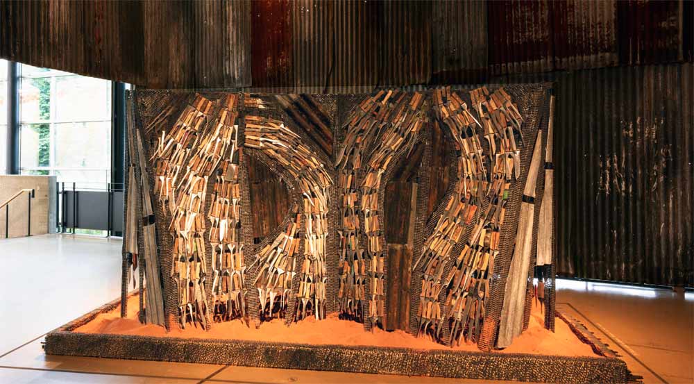
Ngugi Waweru. kahio kugi gatemaga o mwene. Used knives, motorbike chains, corrugated iron sheets. 2022 (Courtesy the artist. Photo Avi Sooful)
This work of art, which is not quite two meters high, stands in a basin filled with reddish, sandy earth - the edge of the basin is covered with motorcycle chains. On this "pedestal" is a construction made again of corrugated iron, which is covered with more motorcycle chains and, above all, sharp meat knives. In two large fields at the front, which are at a slight angle to each other, 'streams' of knives each frame a large opening in which the rusty corrugated metal construction is visible. For the viewer, it is above all the knives that make an impression. (They can also be found - less ornamentally arranged - on the back of the sculpture). This effect is certainly due to the fact that - as with El Anatsui e.g. - their ornamentation and the glitter of the flashing blades unfold their splendor from a reduced colorfulness. A splendor, however, which - with the narrow, long blades - is quickly associated with violence and destruction, torture and death, threat and power.
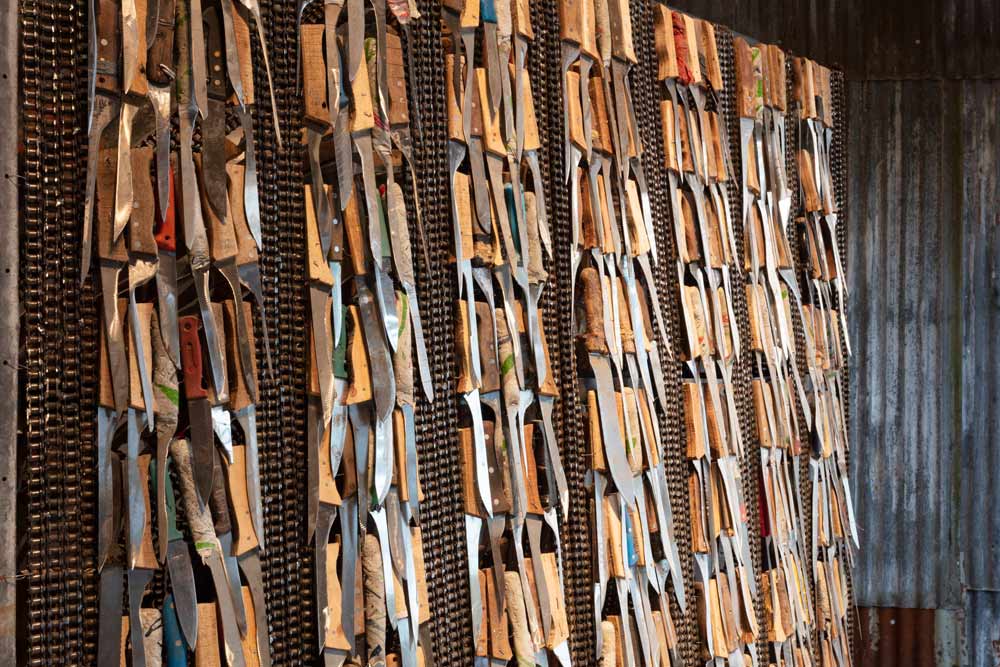
Ngugi Waweru. kahio kugi gatemaga o mwene. Backside (Courtesy the artist. Photo Ernst Wagner)
In respect to these associations, images from European cultural memory come to mind, from Caravaggio's Beheading of Holofernes by Judith to Arman's "accumulations" with knives or Marina Abramović's performances. Immediate impact and these associations play together to steer a perception between beauty and threat - in the given context obviously a symbolic expression of the slum experience. This specific form of aestheticization has also been questioned by art critics: is the work about the authenticity of the real experience or does it not rather serve a certain cliché of African slums? (https://www.textezurkunst.de/de/articles/eric-otieno-sumba-documenta-sell-the-vision/)
However one decides, the impression of the work that it leaves behind remains, for which its artistic quality (according to the standards of the Global North) is decisive: it is visually striking, formally consistent and coherent, it draws on familiar aesthetics while at the same time is innovating, and it remains open for interpretation, the viewer is invited to. This artistic quality was certainly also decisive in Wajukuu being awarded the Arnold Bode Prize in 2022, a prize that is awarded every two years by the city of Kassel to outstanding contemporary artists. The concept of creation, the relationship between the work and its anchoring in the social process in the slum was certainly a decisive factor as well. Thua, the jury of the Bode Prize has also honored an important social project and acknowledged the work to improve living conditions in the slum.
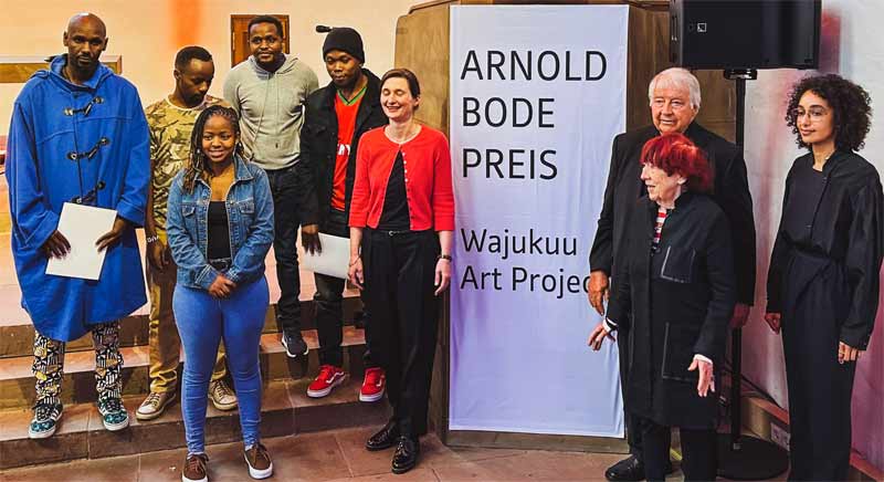
Award ceremony in Kassel 2022 (Courtesy the artist)
With the awarding of the prize, all the voices that did not see "l'art pour l'art" thinking in the Wajukuu Project, but rather the will to change something in the reality of life with the help of art, were heard once again. "The Art Project uses art to create a future that shapes and improves the path for the next generation. Art forms the core of Wajukuu, not just as a practice, but as a way of life with tangible implications in the lives of its community." (Ann Mbuti: From beginnings. Laudation for the award of the Arnold Bode Prize 2022; source of the text: Cultural Office of the City of Kassel)
Finally, the city of Kassel purchased this particular work by Ngugi Waweru, "Kahiu kogi gatemaga mwene", for its collection in the Neue Galerie (https://www.kassel.de/buerger/kunst_und_kultur/documenta/index.php). Now, it is isolated as a single work by a single artist, which was originally a contribution to a group presentation of a collective and which (together with the corrugated iron tunnel) was perceived as a unit. The transfer of the sculpture to the museum thus raises questions about the loss of context and the resulting transformation of meaning: Collective art practice and social commitment become (another) work of art in a museum, which at best still documents the Lumbung approach of 2022. Without context, without informative videos about the artists' work, without the other sculptures by the Wajukuu artists, we are confronted with an aesthetic object that continues to fascinate, but has lost an important dimension, its context.
Accordingly, the interpretations of Waweru's now solitary sculpture were strangely sparse. The title of his work was interpreted in all publications as a warning to people in a meritocratic and consumer society, according to Ann Mbuti in her tribute at the award ceremony. Not a word about the sculpture itself, its materials, its atmosphere and effect. Not the question of what we see and feel. Arnold Bode, the ingenious stager of modern art, would also have awarded the prize to Wajukuu, but he would have strongly objected to the isolated presentation of Waweru's sculpture after the documenta.Published February 2025
-
South Africa gained its independence in 1994 with Nelson Mandela becoming the first black President on the fall of apartheid. The problem was: Even after the demolition of the apartheid system, social cohesion was a challenge as people still lived and gathered in separate groups, according to their race. Freedom had come but the people still segregated themselves. One of the ways to promote social cohesion is through sport. The hosting of the 2010 World Football cup therefore was a welcome opportunity.
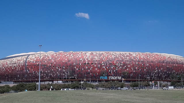
The photograph shows the First National Bank Stadium or simply FNB Stadium. It is also known as the Calabash, because of its resembling an African vase. It is located near Nasrec and bordering Soweto and Johannesburg.
The Department of Arts and Culture defines Social cohesion as “the degree of social integration and inclusion in communities and society at large, and the extent to which mutual solidarity finds expression among individuals and communities”. This means that South African communities or society is cohesive when “ the extent that the inequalities, exclusions and disparities based on ethnicity, gender, class, nationality, age, disability or any other distinctions which engender divisions, distrust and conflict are reduced and/or eliminated in a planned and sustained manner. Thus, with community members and citizens as active participants, working together for the attainment of shared goals, designed and agreed upon to improve the living conditions for all”.
Based on the above understanding, building a nation is a complex process that entails “a society with diverse origins, histories, languages, cultures and religions come together within the boundaries of a sovereign state with a unified constitutional and legal dispensation, a national public education system, an integrated national economy, shared symbols and values, as equals, to work towards eradicating the divisions and injustices of the past; to foster unity; and promote a countrywide conscious sense of being proudly South African, committed to the country and open to the continent and the world“.
The hosting of the World Football Cup therefore was an optune moment in the history of the nation. According to Barolsky, (2011) sport was used as a catalyst to build a non-racial, non-sexist, democratic, prosperous and free South Africa. The FIFA World cup in 2010 referred to it as „African and South African. The Bafana Bafana team received great support from home. The social cohesion was divided into three dimensions: Civic, Social and Economic."
The impact of the FIFA World cup was significant in building social cohesion. There was little doubt that the World cup was an “extraordinarily unifying moment for the country as whole, which broke down social, racial and even gendered barriers as women were increasingly drawn into the fervor around the a game usually predominantly watched by men.” (Barolsky, 2011)
References
- Barolsky, V (2011).Impact of 2010 soccer World Cup on social cohesion and nation-building, Technical Report · January 2011.
- DOI: 10.13140/2.1.2007.5841
- Retrieved from https://www.researchgate.net/publication/271700976
- Department of Arts and Culture statement on Social Cohesion
published April 2020
-
The selection of informants was randomly done as we were only interested in identifying the most relevant resource persons within the research areas like members of defunct and existing regulatory societies, traditional rulers, herbalists, and other village notables with measurable experience in material culture and their symbolisms which is the interest of the author in this paper. The paper consists of three parts: an introduction, the background issues or the historical antecedence, and the core, which deals with interpretation of the motifs on the objects, significance and ends with a summary.
African arts and cultures predates the colonial and missionary encounter in Africa. Some of the works provide useful information about indigenous craft industries such as pottery, carvings, iron metallurgy, weaving and much more. This article made use of works of earlier scholars who discussed aspects linked to the current paper. I also exploited some archival records, for example, file No. E.P.4929, entitled “Assessment Report [on] Bali, Bamenda Division- Cameroon Province (1925) by W.E.Hunt, District Officer, National Archives Buea, NAB. The works are framed into three broad thematic: objects made out of clay; objects made out of iron, and those produced out of wood and forest fiber materials.
Wooden Carvings and Clay Objects
Traditionally, the Bamenda grass fields and the Western Grassland regions of Cameroon are known for their mastery in the production and commercialization of various art works. In this region, craftsmanship is believed to be handed down from one generation to the next; from father to son. Grassland traditional architecture, objects, and symbols were unique from the point of view of their aesthetics, decorations and uses. In the 19th Century, a German Military Officer, Hans Glauning’s Official Report of 1906 on the Pre-colonial Nso (Banso) described grasslands houses in the following words:
The Banso houses, some 5-6 meters high to the roof, are [were] roomy and neatly built in Grassland style. The floors are paved with small pebbles. Each village has at least one meeting and drinking hall with carved door posts. Both frontages of the meeting house in Kumba were hung with about 900 skulls of Bamum and Nsungle warriors…[1]
The above extract clearly describes the pre-existing cultural and social institutions the European came across in the Bamenda grassland in early phase of the 19th century. The people were talented carvers, weavers and painters. The most remarkable designs were and are still royal stools, bangles, and door / window frames on houses that helped to show various layers or classes in society. On the door or window frames for example, were carefully carved motifs of animals and other selected creatures. The motifs were interpreted and symbolized cultural and political differenceswhich the society was aptly stratified.
According to Knopfli (1995a, 2000b) the carved posts were sometimes awards from the Fon, Kwifo as gifts to some notables, cult members, or other great men. These sculptures on wooden frames sometimes depicted great societal achievements of fons and great men and women in society. Also, in royal circles, such sculptures bore symbolic representations of warriors, heroes, and royal animals such as buffalo, lion, python, elephant and leopard appeared conspicuously carved on the chosen object. Other creatures like lizards, tortoise, and scorpions were widely engraved on Grass field arts. Besides, inanimate objects like iron gongs and cowries were represented on objects.
The zoomorphic and anthropomorphic Ethno-historical Dimensions of Cameroonian Carvings
To better appreciate the origins and meaning of some of the animal motifs on artistic objects, it would be important to understand the cultural and philosophical dynamics of some of the zoomorphic motifs on the objects and what they represent. There are different animals reproduced in aesthetic designs by the carvers like lion, scorpions, tigers, toads, various species of lizards and a host of other non-living things. However, for the purpose of this paper, we shall focus more on the lizards depicted on the wooden board (the ‘Blue Rider Post’). As far as lizards are concern, Hans Knopfli (1990), studied various kinds of lizards which were/are common in the Western Grasslands of Cameroon. The stylistic motif of lizard is one of the most common designs in wood sculpture in the region, but also in many forest areas of Cameroon such as in Kribi in the South Region, amongst the Ejagham group in Manyu and Meme Divisions in the South-West Region of Cameroon. Generally, lizard motifs, or appear on various works of arts such as royal stools, masks, doorframes, drums, clay pots, title cups, and on embroidered robes and caps.[2]
However, the actual meaning of the lizard symbol is not quite clear. Knopfli noted that lizards are treated with maximum respect in the grassland. The belief about lizards include the idea that twins, chiefs and ancestors can transform themselves into lizards and that lizards have the spiritual ability to drive away witches. These however, does not close the page on their relevance in the cultural settings of different communities. In Africa, different groups perceive lizards differently according to their customs and traditions which have of course redefined their outlook as a people. There are three main types of lizards common to the grassland groups: the rainbow lizard (known in Bafut as kwifongu).[3] Another type of lizard is called the majuku lizard in Bafut language. This lizard is used by witch doctors to send and direct lightning in cases of theft, adultery, land stealing etc. Apart from the majuku, there is also the kukub (Mungaka language) lizard. This is a smooth skinned lizard with a long tail and it is very swift running lizard.
In Mungaka language it is called kukub, in Bafut language it is called akongse and in the Babanki language it is called fekeke, while Bakossi called it ebote-ngule. Worthy to note is the fact that most of the grassland sculptures carried this and other kinds of lizard motifs on door and window frames as well as traditional stools. Such insignia symbolized authority and deity, and life (Knopfli, 1990:58) In recognition of the above notion, one is tempted to argue alongside Knopfli that lizards therefore symbolizes life. He further states that any design of two or three rows of lizards round a stool with interlocking fore and back legs expresses the fullness of life.
Interpretation of the Motifs on the ‘Blue Rider Post’: New Perspectives
The information that follows herein is a fair, reliable and verifiable opinions of our informants who after careful examination of the photographed images gave their interpretations of the motifs on the ‘Blue Rider Post’ in its entirety. It is important to point out that the motifs are zoomorphic (animal), anthropomorphic (human-made) and inanimate gestures in the form of dots and circular/square indications.
The object has two sides which are embellished with similar motifs. The motifs include: dark patches, white dots, red marks, two human-like heads at the top, lizards, squared shape, circular shape in the middle of the object, and at the bottom, two human figures or deities. It is important to look closely at the object in order to have a clear interpretation of its motifs. According to recently collected data, the various marks like red, white and black confer or indicate various meanings according to the customs of the resource persons and sampled communities in Anglophone Cameroon. In this connection, the white colours stands for purification, membership, fertility, peace, prosperity, life, and an ‘eye’ like in the liengu female society.
Similarly, informants in Buea hold that the red colour represents danger, defence, and blood of sacrificed animals, authority and bravery. While, the black colour on the other hand, also represent prestige, authority, danger, and power. All these colours are still used by members of some cult agencies and cultural dance associations in most parts of South-Western Cameroon and the Cameroon-Nigeria Cross River Region. The red colour was extracted from either clay or camwood, while the white dot came from certain milky plants in forest. Existing cultural associations in Meme, Manyu and Kupe Muanenguba make use of these colours. The use of these colours as painting or decorations by associations like the Monikem and Oroko dances depicts closer similarities of the embellished colours used by the originators of the so-called ‘Blaue Reiter Pfosten’.
The upper/top layer with heads represents ancestors who watched over or protected the chief or king on the throne. Lizards on the carved object too represents many aspects or dimensions of community life as messengers, bravery, fertility, protection, and courageousness. On the hand, the square ark and the circular parts depict various things. While the square ark symbolizes the village’s sacred house such as etana, njeb, mbwog, the circle on the contrary represents the village, environment or community. The environment or the village is governed by the king or chief, who derived his authority and spiritual wisdom from the environment which was guided by ancestors.
Lastly, at the bottom side of the object there is a human-like figure, which assumes the status of a village ‘god’ or deity. The two figures at the bottom of the other side are depicted to pay allegiance to their superior king or the hegemonic ruler and played the role of mediator between the spiritual (dead) and the living in society. This is what the two little human-like at the bottom represent. They also played the role of messengers, mediators, seers, defenders, source of fertility and councillors to the reigning kings.
In terms of name, the object was recognized by various informants in areas where the tradition of either its use or production was common like amongst the Bakundu, and Ejaghams of Anglophone – South-West Cameroon. As a spiritual object, some informants called it ndo’obe while others called it nsibiri. According to Ayuk Divine Ndifon and Ernest Effim Lahluh, the object was likely the cult object of the Epke society in Ejagham, and the carvings on its represent a cult writing called nsibiri which could only be read and interpreted by those initiated into the inner core of the secret agency. The nsibiri depiction is used by members of the Epke cult, who opined that the object was probably dismantled from its original structure in a violent context.
By situating the object within the forest regions of Cameroon especially amongst the Ngolo, Bakundu of Ndian and Meme Division, and also the fact that there is cultural legacies that identifies with certain features of the so-called Blaue Reiter Pfosten, convinces the researcher to claim this region and its constituent villages as the likely source communities of the object whose biodata lacks comprehensive information to reconstruct its origins and provenance in recent years in spite of its popularity in the global North than in the Global South where it came from.
Summary
The paper has attempted to deconstruct the so-called Blaue Reiter Pfosten by tracing its seemingly obscured origin, its possible source societies and the meanings attached to its assorted motifs and much more. Based on current data it seems probable that the object was a religious medium of one of the cult agencies or a ritual symbol of some cultural associations or cult that flourished in villages that straddle the Cameroon-Nigerian Cross-River Region, including Ejagham, and Ekoi ethnicities in Manyu and Ndian Divisions of Cameroon. Other possible source villages of origin include Ngolo, Ikiliwindi, Bombe-Bakundu and Ngolo-Bolo. One of the likely reasons for arguing in favour of this assertion is because the above named villages share the same traditional religious, political and cultural beliefs that made used of similar posts for their initiation, divination, protection and other important rituals. It is believed that such an imposing object with impressive characteristics and diverse colorations: red, white and black dots had other uses which only core members of the cult agencies could analyse. This is because the secrets of any cult are kept jealously by its members and non-members are not allowed to know its real meaning. This is another difficulty realized in deconstructing the object.
As earlier mentioned, the object depicts the life of a true traditional African society where there is an inseparable bond between the dead and the living on the one hand, the community leader and his courtiers and deities on the other. However, because of lack sufficient information about this object because failing memories our informants, it seems difficult to ascertain the exact period when the object was made. It is however, true in my humble view that the object was customarily used by the peoples of the originating villages prior to the arrival of European missionaries and German colonial authorities in Cameroon by 1884.
References
Chem-Langhee, Bongfen and Fanso, V.G., eds, “Nso and the Germans: The First Encounters in Contemporary Documents and in Oral Tradition”, 1996,
H, Knopfli. Sculpture and Symbolism. Limbe: Presbook Publication, 1998.
Ngitir,V.B. “Bamenda Grassfields royal collections and museums from ancient times to the beginning of the 21st century: The symbolisms and Conservation of Palace Art,” Yaoundé: thesis, Department of History, Yaoundé I, 2014.
Interviews
Name of Informants
Profession
Age
Date & Place
Language
Interviewer (s)
Ethnic Group
Prince Remigius L. Endeley*
Teaching/Museum manager
47 years old
27/07/2020, Buea.
English
Ngome Elvis N.
Bakweri (SW)
Dr.Venantius Ngwoh Kum
University Lecturer
55 years old
5/08/2020, Buea.
English
Ngome Elvis N.
Esu (Wum) – (SW)
Ekema M. Ahone
Teaching
65 years old
Tombel, 25/07/2020
English Language
Ngome Elvis N.
Bakossi (SW)
Michael Emeh
Retired state Agent
84 years old
17/07/2020, Ngob-Baseng, Tombel
English Language
Ngome Elvis N.
Bakossi (SW)
Prince Nzum’etoe
Researcher/Farming
45 years old
Bakweri-Town-Buea,17/07/2020
English Language
Ngome Elvis N.
Bakossi (SW)
Richard Tarkang
Retired State-Agent
64 years old
Kumba, 1/08/2020
English Lang.
J.B. Ebune
Banyang (Mamfe) –(SW)
Mosses Ebollo
Retired state-agent
84 years old
27/07/2020, at Kumba
English
Lang.
J.B. Ebune
Bakundu –Ibemi (SW)
Pa Esseme
Retired farmer
84 years old
Kumba, 13/07/2020
English Lang.
J.B.
Ebune
Kokobuma-Bafaw (SW)
Moka Williams M.
Farming
40 years old
06/07/2020, Wolikawo-Small Soppo, Buea
English Lang
Ngome Elvis N.
Bakweri (SW)
Prince Kombe David Monono*
Farming/security guard
46 years old
13 October, 2020, Great-Soppo-Buea
English Lang.
Ngome Elvis N.
Bakweri (SW)
Ikome Kingue
Traditional healer
70+ years old
Bonduma, Buea, October 28, 2020
English Lang.
Ngome Elvis N.
Bakweri (SW)
Mathias Nyoki
Retired soldier
55 years old
Great-Soppo, Buea, 2020
English Lang.
Ngome Elvis N.
Bakweri (SW)
Nteh Roland
Teaching
46 years old
28/09/2020, Limbe
English Lang.
Ngome Elvis N.
Bakossi (SW)
Joss Clinton
Security Guard
46 years old
Limbe, 13/09/2020
English Lang./Pidgin
Ngome Elvis N.
Menchum (NW)
Chief Ekumbe Thomson*
Traditional Ruler
74 years old
Bakweri-Town Buea, 16/10/2020
English Lang.
Ngome Elvis N.
Mbonge-Bakundu (SW)
Tita Oliver T.*
Teaching
54 years old
22/09/2020, Limbe
English Lang.
Ngome Elvis N.
Misaje-(Dongamantong) –NW.
Paul Mukete
Retired state-agent
80+
Great-Soppo-Buea, 23/10/2020
English Lang.
Ngome Elvis N.
Bakossi (SW)
Simon Buma*
Church Worker/PCC
61 years old
Great Soppo, 17/10/2020
English Lang.
Ngome Elvis N.
Bali-Nyonga
(NW)
Allen Maimbo B.
Building
58 years old
15/09/2020, Limbe
English Lang.
Ngome Elvis N.
Basum- (NW)
Footnotes
[1] “Nso and the Germans: The First Encounters in contemporary Documents and in Oral Tradition” in Chem-Langhee, Bongfen and V.G.Fanso (eds.), 1996, 123. Quoted in Ngitir (2013): 169. See the entrance to the second Courtyard of the Fon’s Palace, Bali-Nyonga in 1907.
[2] Knopfli (1990), 55.
[3] The word is a combination of the kwifon, the name of the much feared secret society and ngu fowl. Kwifongu then means ‘danger to fowls’.
-

The Eiffel Tower in Paris, the Sydney Opera House, the Empire State Building in New York – it is not uncommon for innovative and striking buildings to become symbols of the cities they were built in. Architectural landmarks turn into trademarks of their cities. They shape the city’s silhouette and make it recognizeable.
In Munich, a big city in the South of Germany and provincial capital of Bavaria, one of the most striking buildings is the Frauenkirche, which loosely translates to “Church of Our Lady”. It is dedicated to Virgin Mary, the Mother of Jesus Christ, who plays a big role in Munich as she is said to be the patroness of Bavaria. Its 99 meter (324 ft) high twin towers with the characteristic cupola roofs rise high over the inner city (as it is still prohibited to build any higher than them within the inner city). It is - by all means - not the biggest or even most beautiful church of its kind. Neither is its location in the city center, on plane ground and narrowly surrounded by pubs, shops and historic residential houses, spectacular.
 Up to this day, the Frauenkirche is the tallest building in Munich's inner city. View from the Academy of Fine Arts, Munich ©the author
Still: The citizens of Munich have great sympathy with the brick building and identify strongly with it. There are several reasons for that: First of all, about 30% of the people living in Munich identify as roman catholic Christians and therefore have a religious connection to the 500-year-old church that is still in use for almost daily services. But the number of Catholics decreased drastically since 1925, when more than 80% identified as Catholic. In conclusion, there must be other reasons why this church is so important for Munich.
A people’s church
What makes this church indeed quite unique is the way it came to be: Munich didn’t lack any churches at all. In 1468, when the construction of the Frauenkirche was started, only 13,000 people resided there and there already was (and still is) a cathedral in the city center: Saint Peter’s church, or simply: Alter Peter (Old Peter). The Frauenkirche was enormously large compared to the city’s size and can house 20,000 standing people. It was built within only 20 years, which is faster than any other church in Europe at that time. The construction was probably initiated by the citizens – and can therefore be seen as a sign of confidence and emancipation of the common people in regard to the ruling class. (Which makes it all the more tragic that the towers were abused early on as platforms for cannons during the Landshuter Erbfolgekrieg at the beginning of 16th century, a war between two aristocratic families contending for heritage.) As a side note, Germany’s supposedly very first photography, taken in 1839, shows the twin towers of the Munich church.
Muslim towers on a German church?
The two cupola roofs made of oxidized copper give the cathedral its unique and unmistakeable shape. Originally, it was meant to be topped by gothic pinnacles (comparable to those of the cathedral in Cologne, Germany). But at the beginning of 16th century, architectural (and overall artistic) style changed drastically with the advent of the Italian renaissance. Pointed church spires suddenly seemed old-fashioned. And so, for more than 30 years, the two towers of the Frauenkirche remained “headless”.

Bernhard von Breydenbach, Peregrinatio in terram sanctam, 1486, woodcut (Creative Commons); The Temple area, 1920, Library of Congress; Blick auf die Türme der Frauenkirche vom Odeonsplatz aus. 2017, D. Fuchsberger (Creative Commons)
Lukas Rottaler, who was assigned with the construction of the roofs, was long thought to be inspired by Venetian churches, precisely the cathedral Madonna dell’Orto. Indeed, the 14th century Italian church has a high brick tower with a cupola roof that might look a little like the Frauenkirche, if you turn a blind eye. But the origins of the onion-like shape are assumed to reach way back and way farther: Rottaler probably saw a woodcut of Jerusalem, which shows the Dome of the Rock. This dome, erected in the 7th century and therefore the oldest edifice of the Islamic world, marks a place that is equally important for Muslims, Christians and Jews – the dome itself though is Muslim. That didn’t keep Rottaler from taking inspiration from the Dome of the Rock for his building project at a Catholic church in Munich. Hence, the Frauenkirche is shaped by originally “oriental” roof tops.
Moreover, many churches in the rural outskirts of Munich, which were built in the following centuries, are oftentimes crowned by bulbous cupola roofs. This drop shape, which contrasts the villages’ common saddle roofs, now naturally is a part of the landscape as well as of the baroque style.
The devil, a Munich sense of humor, kitsch, tourism and modern lifestyle
One more reason why the Frauenkirche is so important for the Munich identity are the many legends surrounding it, which are an inherent part of many children's upbringings. The story of the bet between the devil and the constructor of the church, master bricklayer Jörg Ganghofer is widely known among Munich citizens. Ganghofer bet his soul that in this church there would be no windows. As soon as the church was complete, the devil entered the back of the church through the main portal and looked around. Indeed – there were no windows visible! Of course, the church has big windows which let an even stream of light enter the gigantic room. Ganghofer skillfully placed the massive pillars framing the middle section of the nave so that they cover all windows from a certain point of view – and thus won the bet! The devil was outraged and stomped his foot on the ground. This footprint is still visible in floor tiles (image below). In his temper, lucifer left in a rush, which caused a chilly gust of wind that up to this day blows around the church.
The "Devil's footprint" ©the author
There are many more legends like these surrounding the historical center of Munich. The fact that they are not forgotten but very much part of social life shows how much the people of Munich value their ancient traditions and customs. Also, these legends – and the legend about Jörg Ganghofer is a prime example for that – often showcase a certain sense of humor, mischievousness and boldness. Possibly typically Munich qualities.
The unique twin towers as logo: A design for a Munich tourism agency ©Georg Schatz, schatzdesign.de
Today corporate logos, kitschy souvenirs but also everyday products reference the Frauenkirche’s silhouette. The Munich tourism agency „München Tourismus“ markets the city with the slogan “simply Munich”: approachable, hospitable, relaxed. It’s all about “Genusskultur, Kulturgenuss”, which translates to „culture of enjoyment, enjoyment of culture”. According to the agency, tranquility, love for old things and the so called “Bavarian cosiness” are trademarks of the Munich way of life. Compared to the daringness of Lukas Rottaler and Jörg Ganghofer, the constructors of Munich’s biggest cathedral, these qualities seem rather tame.
References:
- Forschungsgruppe Weltanschauungen in Deutschland: „München: Religionszugehörigkeiten 1925-2018“, https://fowid.de/meldung/muenchen-religionszugehoerigkeiten-1925-2018
- E. Wagner, S. Wimmer, L. Sedghi: Isar-Arabesken – Spuren des Orients in München, München (Alitera), 2013
- https://stadtfuehrung.info/stadtfuehrungen/zeitreise_muenchen_anhand_alter_fotos_und_bilder
- https://www.muenchen.travel/artikel/ueber-uns/die-marke-muenchen
- https://www.historisches-lexikon-bayerns.de/Lexikon/Frauenkirche,_M%C3%BCnchen#Der_Neubau_im_15._Jahrhundert
- https://www.venediginformationen.eu/kirchen/kirchen-in-venedig-teil-3/madonna-dellorto/madonna-dellorto.htm
- https://de.wikipedia.org/wiki/Tempelberg#Islamische_Bebauung:_al-Masdschid_al-Aqsa
- https://de.wikipedia.org/wiki/Frauenkirche_(M%C3%BCnchen)#Bau_der_sp%C3%A4tgotischen_Kirche
published November 2020
-

A helplessly wretched female figure: The “Little Mermaid” in Copenhagen
Well known worldwide is the monument of the „Little Mermaid“ in Copenhagen. The figure is called a “national symbol” for Denmark and a “landmark” for Northern Europe. The bronze sculpture of 125 cm height was constructed by Edward Eriksen in 1913. It shows a naked young woman, her feet like the tail of a fish. The intention of the sculptor was to honour and remember Hans-Christian Andersen (1805-1875), the Danish author of the story „Den lille Havfrue“ (The little mermaid). The place which had been chosen for erecting the monument is a rock in the water near the open sea; the figure turns her face to the shore of the Danish capital Copenhagen.
"Little mermaid" by Edward Eriksen 1913, 125 cm, Copenhagen harbour,
https://dreamguides.edreams.de/daenemark/kopenhagen/die-kleine-meerjungfrauWith this installation the country accentuates its identity of being involved in the element water and its representation in literature and culture. The famous piece of art transports different messages and reactions, has its own life and a specific history.
The narrative behind this figure, a fairy-tale for children, is well-known in Europe: A young mermaid wants to get into contact with a prince she loves. But he never recognizes her and marries a noble woman. The mermaid dissolves to foam, which flows back in the ocean. But also she is transformed to stay as a ghost in the air, where she can be part of earthly life and earn an immortal soul.
As a being of the nature the mermaid is part of the “other” of civilization and as subordinated to human and especially masculine beings. The title marks her to be “little”, not having a name and individuality. She did not receive any respect and interest, not even for her female beauty. By this ignorance she is killed, with no traces of her life. The story shows the most helplessly wretched female figure in literature we can imagine.
Within a memory-culture the monument might help a region of seafarers to feel superior over the sea and the beings involved with this element. Denmark was a colonial power. From overseas came goods and wealth on trading-ships. People from West Africa were deported as slaves to the Danish colonies Carribean Islands, where they had to grow sugarcane. The Molasses, the essence of this plant, was brought to Northern Europe, where Rum was made from it, the central product which made towns very prosperous. In visualizing a sentimental mythical story from the period Biedermeier the monument helps to divert from this context or even to suppress it. But the symbolic meaning might also be an accusation against (male) neglection of the nature and a warning for girls to hope to win the dream prince. It also can be seen as a protest against monarchy, aristocratic lifestyle and the glorified royal history of the country.
Performance and public reactions
Many tourists visit the monument every day and there are activities and actions around it. It stimulates the wish of giving the mermaid the attention she did not get in the story, as a symbolic compensation. There are also anonymous acts of aggression and destruction against the statue (see examples). Feminist groups protest against the offer of a voyeuristic view on a naked woman in this exposed location, this is also done by conservative circles in a prudish mentality. The statue also provoked campaigns of environmentalists who added her slogans demanding protection of other creatures being under control of human power like the whales for example.
An independent queen in Premodern Times: Melusine
The fairytale of Andersen is a modern adaptation of older stories and there are lots of distinctions within the development of this symbolic figure. Very common throughout several European languages is a narration about a female figure with the name Melusine, which is derived from the french word “mere” (mother) of the Lusignans, an influencial family, living in France and in Cyprus, from where the legend might have reached Africa. In the shape of a woman she marries a nobleman and rules over the country, building it up in an innovative way. When her husband discovers her in the bathroom being half a dragon, she flies away. In the official belief she is said to be a dangerous demon with no soul, destroying Christian families. But in aristocratic traditions the mermaid is understood as the ancestress of their gender and put in their heraldry. In illustrations in books she is depicted as a courtly lady with half the body of a fish, standing in a basin; the destructive element of water being abolished. She is not a victim, but the active part in the plot; when she leaves, her big family suffers and the country loses its strong ruler with her outstanding creativity.
The twofold character of Melusine represents very well the beginnings of noble families: Polygamic life was common, and when the institution of the Christian marriage was imposed, one of the spouses of a ruler needed to be sent away. The element water might hint at the origin of the mistress from a village near the river outside the castle, which is on top of a hill. In popular narrations she was given an aura of mystery, having the body of a dangerous monster.
Melusine. The mermaid as a court lady and the ancestress of noble families (woodcut and illustration of a manuscript 15th century), Thüring von Ringoltingen: “Melusine”. In der Fassung des Buchs der Liebe (1587), hg. Hans-Gert Roloff, Reclam Verlag Stuttgart1991, S. 3.
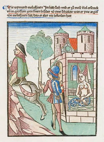
She is discovered having half a fish-body (book illustration 15th century), Thüring von Ringoltingen: „Melusine“ First printing Basel: Richel, around 1473/74. digit. ULB Darmstadt urn:nbn:de:tuda-tudigit-35087
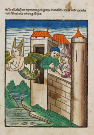
She flies away (book illustration), from "der Seelen Wurzgarten“. St. Peter pap. 23, Coburg bei Schwäbisch Hall 1467 (digitized by the ‘Badische Landesbibliothek Karlsruhe’, 65v.)
The modern tale of a beauty killing her lover: Undine
With the name “Undine” (lat. “unda”: wave) in Romanticism the mermaid-figure develops vampiric qualities, killing her lover by a kiss when he marries another woman.
This motif inspired many paintings. They channel phantasies and visions about the chances and problems of a partnership between persons from different origin and about death as the consequence of an unsuccessful encounter. How can strange-looking persons, which come from or over the sea, be integrated?
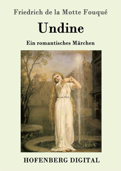
Friedrich de la Motte Fouqué (1777 – 1843), novel, 1814, published by Karl-Maria Guth. Berlin 2015, Painting by John William Waterhouse 1872.
Conclusion
Premodern times reflect the mermaid mainly as bringing fertility from nature to mankind, hoping to gain a soul through marriage with a human being. There are systematic changes to this story during modernity, which might result from the background of colonialism as absorption and subjugation of everything different and “strange”. Men are longing for its attractiviness, but also fearing that this inclusion of a natural being might cause protest and fury. The European tradition can be said to be a parable about migration and exchange between different worlds, the mermaid being a symbol-figure for the futile attempt of colonizing the other.
The task of a transcultural comparison: Mami Wata
In Ghana I learned about Mami Wata, a traditional African figure, the patron of fishermen. In Quidah (Benin) I saw her as a goddess of the python, the holy snake. She has her own shrine where specifically educated priests pay tribute to her to keep her merciful. The name is interpreted to be a pidgin-version of „Mother of the water“. Scholars from Europe assumed that Melusine was carried on ships' bows in the 15. century from Europe to the West-African coast, where her narrative interlaced with local narrations with their own long tradition of water-goddesses. But: It might also be the other way round, from West-Africa to Europe, probably on the trade-roads through the Sahara. There, the legend emerged much earlier and arrived in Europe as early as the 12th century, when the mermaid-stories began to gain popularity. How is a figure transformed when it is transferred to a region with such different history and traditions?
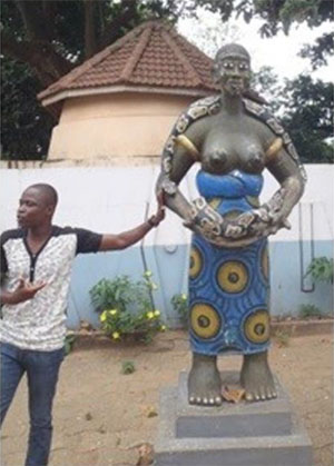
Temple of the Python, “Holy Forest”, Quidah (Benin) 2015 Foto: Nina Paarmann
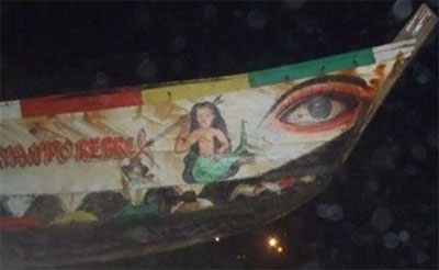
Fishing boat in Winneba (Ghana) 2012, Foto: Nina Paarmann
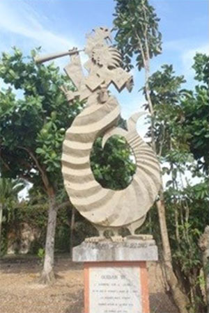
Quidah (Benin) 2015: “Slave Road”, Text: “memorial for the ‘tree of forgetting’ which had to be orbited, nine times by the male and seven times by the female slaves”, Foto: Nina Paarmann
References
- Hans-Christian Andersen: „Den lille havfrue“ (The little Mermaid) fairytale, in: Sämtliche Märchen 1-2, München 1974 (hg. Nielsen, E.).
- Bea Lundt: Melusine und Merlin im Mittelalter. Modelle und Entwürfe weiblicher Existenz im Beziehungsdiskurs der Geschlechter. Ein Beitrag zur Historischen Erzählforschung. (Diss. 1990), Fink-Verlag München 1991.
- Bea Lundt: Wassergeister als universales Motiv. Paracelsus’ Deutung der Nymphengestalt und die Figur Mami Wata in Afrika. In: Nova Acta Paracelsica. Beiträge zur Paracelsus-Forschung (NF 28). Hg. Pia Holenstein Weidmann. Bern u.a. 2018, S. 9-40
Edited by Kelly Thompson.
published February 2020
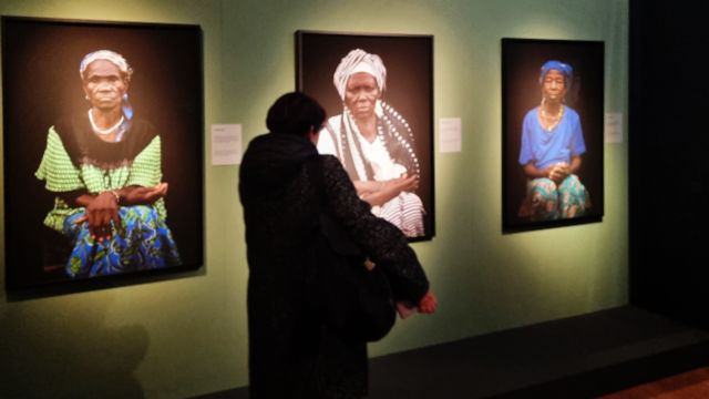
-
‘Witches in Exile’ Exhibition at Museum Fünf Kontinente: Advocacy or cultural exploitation?
In June 2024, Museum Fünf Kontinente, located at the heart of Munich, held an exhibition themed “Witches in Exile.” This exhibition dwelled on the photodocumentary of German-French artist Ann-Christine Woehrl and her African collaborator Senam Okudzeto. The duo visited Gushiegu and Gambaga townships in North East, and Northern regions, respectively, and other parts of Ghana between 2009 and 2013 for the said portraits of women alleged to be witches. The exhibition attracted approximately 12,000 visitors during its run and extended its original closing date due to public interest. This article analyses the cultural and ethical issues the exhibition raises and questions the motives behind it.
In some Ghanaian communities, the accusation of witchcraft is rooted in certain cultural beliefs and practices. The practice of witchcraft and sorcery is part of indigenous Ghanaian customary practices. Article 26(1) of the 1992 constitution provides that ‘Every person is entitled to enjoy, practice, profess, maintain, and promote any culture, language, tradition, or religion subject to the provisions of this Constitution.’ This clause implies that Ghana has cultural pluralism and does not suppress any indigenous culture. However, the constitution disapproves of any cultural practices that diminish people's dignity and dehumanise them. With regard to the practice of witchcraft, there are reports of people accused of witchcraft across Ghana who have experienced witchcraft-related violent attacks, stigmatisation, banishment, and in some cases threats to their lives (Actionaid International, 2012; Musah, 2013; Roxburgh, 2016; Badoe, n.d.). Some communities in northern Ghana have established safe havens for individuals accused of witchcraft. Scholars and actors have found that the witch camps are not ‘prisons’ but rather served as refuge for the alleged witches and wizards (Mutaru, 2018; Musah, 2013; Actionaid International, 2012).
Subsequently, there have been governmental efforts to legislate against the practice. Article 26(2) of the 1992 constitution of Ghana provides that ‘All customary practices which dehumanise or are injurious to the physical and mental well-being of a person are prohibited.’ In line with this constitutional provision, there is a bill in parliament under consideration. Apart from that, the Ghanaian society largely condemns instant justice and frequently calls on security agencies to bring culprits of violence against people on the basis of alleged witchcraft to book.
The Museum Fünf Kontinente disclosed on its website that showing the ‘Witches in Exile’ Exhibition was based on the political brisance of the topic in Ghana and the critical discourse in the country about witch hunts and the closure of the ‘witch camps’ (Museum Fünf Kontinente, 2024). On the contrary, the exhibition seems to have an ulterior motive of perpetuating the neocolonialist agenda of painting a grotesque image of Africa’s Ghana to prolong its imperialist and neocolonial domination. This has been the colonialists’ style of framing Africa to a global audience (Nkrumah, 1963). There are ethical contradictions that reveal the negative intent of the museum in showcasing this exhibition. Both the artists (Ann-Christine Woehrl and Senam Okudzeto) and the museum, in my view, flouted ethical standards and made the alleged women witches less dignified in the eyes of right-thinking people in the society. The way the exhibition was framed ran the risk of sustaining the very injustices it was claiming to eradicate. The photographs reduced complex socio-political crises, which have their roots in poverty, gender violence, and colonial legacies, to personal spectacles of suffering by isolating the women as symbols of "resilience." Instead of placing the structural factors that allowed their persecution in context, this strategy strengthened the stigma associated with being a "witch," enshrining their identities within a victim narrative. Under Ghanaian law, such an exhibition frowns upon the dignity of the women. It would not be tolerated, most especially for an educative institution such as a museum charged with the mandate of educating the people in a constructive way. Showing such an exhibition would be an affront to Ghanaian cultural standards.
Woehrl experienced trust with those women who participated, transitioning from "stranger to confidante"; nonetheless, there was a lack of proof of sustained consent for the worldwide museum exhibition. A question that begs for a response is: Were the women informed that their photographs taken under the guise of NGO work and support were going to be exhibited in a European museum? Since they are not illiterates, was it explained to them in the language they understand? Once the women's photographs were turned into art, they were curated by Europeans. This is similar to how colonial powers objectified marginalised bodies for Western viewers, depriving the women of control over their portrayal. Showing the women's photos in Munich, which is far from Ghana's legislative battlegrounds, turned their suffering into an exhibit that others could buy. The museum's focus on their "isolation" and "pride" ironically made them more likely to be accused of witchcraft.
The artists' claim to "give voice" conflicted with its power disparity, with a European photographer and a diaspora artist (Okudzeto) articulating African suffering for mostly White audiences. The museum's past as an ethnological institution that helped with colonial objectification made this situation even more awkward. Although the museum included West African perspectives, the primary location of the exhibition in Europe emphasised a Western viewpoint, transforming injustice into an artistic experience.
When you think about whether the photographers would put their families through the same thing, their humanitarian rhetoric does not hold up. It would be difficult to imagine showing a mother's anguish to people across the world without knowing that she would be able to go back to society or have influence over how she is seen. This contradiction highlights a more serious moral failure; the women have less freedom in the name of "awareness." The exhibition's legacy is yet unclear. Did it provide the women more authority, or did it make them feel like they were always exiles, stuck in Munich's galleries as symbols of "woe"?
Understanding the customary practices helps us understand the cultural and social contexts and the efforts of Ghana’s government to curb them through legislation. The practice of witchcraft and sorcery remains one of the cultural beliefs in Ghana. The phenomenon has attracted increased research interest in the quest to understand, reinterpret, and question the practice of keeping ‘witchcraft camps’ for alleged witches and wizards. Musah (2013) explored the experiences of the fifteen alleged witches, comprising thirteen women and two men resident in the Gnani witch’s camp in the northern sector of Ghana. The study revealed that the camp serves as a refuge for the alleged witches and wizards and not a ‘prison’ as perceived by the public. Their thoughts of the witch camp as a haven of refuge are owing to the fact that they face being stigmatised and attacked, which puts their lives in danger even after being exorcised and cleansed from alleged witchcraft as demanded by indigenous cleansing and ritual. For these reasons they remain in the camp instead of going back to their original communities.
Yaba Badoe (n.d., p. 95) shared the obstacles encountered in the documentary film The Witches of Gambaga. Badoe questioned the ulterior motive of some Western broadcasters and scholars in portraying issues of fighting alleged women’s witchcraft issues in Ghana, saying that though their Witches of Gambaga documentary was situated in the broader context of the women’s movement in Ghana and its ongoing campaigns to expose and stop all forms of violence against women, Western-based broadcasters had negative agendas and priorities. The obstacles included the complicated politics of representation in and beyond contemporary Ghana in the context of reproduced images that were given currency by ‘Western-based broadcasters, who operate according to their priorities and agendas, not those of African feminists experimenting with the media they have dominated for so long.’
"Witches in Exile" effectively illustrates the delicate balance between documentary art and ethical infringement. It by no means mobilised people to support Ghanaian women and for legislative purposes as it claims; rather, its techniques have made the dehumanisation it spoke out against worse. The photographers' insistence on "resilience" did not address the fundamental injustice of converting real individuals into artefacts for European consumption, so perpetuating their marginalisation under the pretence of solidarity. In addition, the bodies of the women with exploited in the name of exhibition for financial gains. As the pictures grace the museum, the women's consent, dignity, and healing remain in the shadows.
Published August 2025
References
- Actionaid International. (2012). Condemned without trial: Women and witchcraft in Ghana. Actionaid.
- Amuzuh, J. (2021). Report on alleged witches’ camp in Ghana – June 2021. The Sanneh Institute.
- Badoe, Y. (n.d). Representing Witches in contemporary Ghana: challenges and reflections on making the ‘Witches of Gambaga’. Feminist Africa, 16, 82-97.
- Mutaru, S. (2018). An anthropological study of ‘witch camps’ and human rights in Northern Ghana. In Green MC, Gunn TJ & Hill M (eds), Religion, Law and Security in Africa. Stellenbosch: Conf-RAP.
- Museum Fünf Kontinente (2024). Witches in Exile. Photographs Ann-Christine Woehrl.
- Installation Senam Okudzeto. https://www.museum-fuenf-kontinente.de/ausstellungen/r%C3%BCckblick-auf-unsere-sonderausstellungen/witches-in-exile-english/
- Musah, B. I. (2013). Life in a witch camp: Experience of residents in the Gnani witch camp in Ghana. (Mphil Dissertation). Universitas Bergensis.
- Pierre, S. (2018). Human rights violations and accusations of witchcraft in Ghana. 6(1). McGill Centre for Human Rights and Legal Pluralism.
- Roxburgh, S. (2016). Witchcraft and violence in Ghana: An assessment of contemporary mediation efforts. Cahiers d’Études africaines, LVI (4), 224, 891-914.
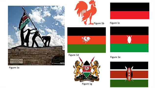
-

Kenya’s Independence monument resides at Uhuru Gardens in Nairobi (Figure 1a), most likely because this is where received Independence (Kiarie 2022). Though only a few people visit Uhuru Gardens and get to see the monument, it reminds us of 12 December 1963, the day of Independence and when Kenya Army soldiers first raised the national flag on Mt Kenya. Mau-Mau and other guerilla soldiers see hoisting the flag as a visual symbol of military victory over King’s African Rifles and their British collaborators though some felt it is the same collaborators who inherited power from the British (Branch 2007). In this context, Independence is remembered as a military defeat of the British sense of military invincibility. However, a political class comprised of ‘under-educated’ intelligentsia saw Independence as an intellectual contest and a defeat of so-called colonial arrogance. Rural dwellers, on the other hand, seemed spectators with the view that Independence was coming ready with ‘owners’ (politicians, businessmen and educated elite). That Independence has owners who enjoy it while rural remain on the sideline is evident the persistent poverty thriving in rural Kenya (Njeru 2018). So, even Uhuru Gardens and the Independence Monument have ‘owners’ who are not rural dwellers; it is clear that the monument is the collective memory and visual culture of its ‘owners’.
It seems the majority of rural dwellers understood Independence according to what politicians said- wealth as the accumulation of money, health as getting treatment in hospitals, education as attending school and passing examinations (Kenya African National Union 1969). We are not sure they are able to read and understand the Independence monument at Uhuru Gardens. Why KANU did not install the rooster at Uhuru Gardens draws considerable curiosity. That is beyond our scope here. One with a thick African cultural knowledge could easily choose the image of a rooster instead of that of hoisting the national flag because KANU was a nation-wide party and the rooster has cultural meanings nationwide. Among the Luos of Western, establishing new homesteads entailed carrying an axe and rooster to the site of the first house; this ideology is well-represented in the KANU flag (figure 1d). In other parts of Kenya, the rooster is a symbol of manhood required to make many children (Wikipedia. 2022). By crowing early in the morning, the rooster does not simply announce time but also sets the work-eat-rest rhythm of life in rural areas.
Before discussing WWII monument and of pre-Independence flags, we want to briefly address meanings in choices of colors and other elements in party flags and the national flag. The black, red and green stripes in KAU, KANU and the national flag have the same meanings. The black stood for the indigenous population, red for the common blood of all humanity or blood shed during the struggle for Independence. Green symbolized the nation’s fertile land or landscape of the country, while the weapons were a reminder that organized struggle was the basis for future self-government (Smith 2001). No doubt the shield and spear are common traditional Kenya tools of offence and defense. It is said that white represented unity and peace. It is rather clear that a section of Kenya’s coat of arms is modeled on KANU’s flag- colors and the rooster carrying an axe. Meanings herein are similar to those we mentioned in our discussion on KANU’s flag; the shield and spears also bear the same meanings as we mentioned when discussing the national flag.
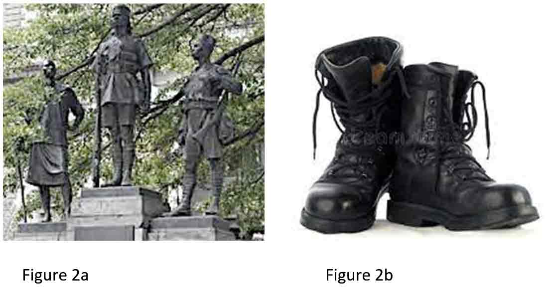
The combat boots (Figure 2b, Internet sources) tend to strike a note that is closer to the Acholi collective memory of WWII because they refer to it as too bin (Acholi for ‘come ye death’). Among the Acholis of Northern Uganda, the combat boots symbolize the massive death in the War and the sacrifice of people forced to be loyal to the King of England. There is quite a stark contrast between the intended collective memory and the actual one. At least among the Acholi, the boots are infinitely more meaningful that the bronze images so hapless servant/soldiers.
Many of us in Kenya may not be able to remember the pre-Independence flags presented here because they were in use a long time ago. Between Indonesians, Indians and Arabs, we are not sure on who first visited Kenya. However, Arabs came in greater numbers over a longer period, intermarried with the local population and eventually set a government with the Sultan of Oman as its emperor or king. We included the flag of the Sultan of Zanzibar (3a, Internet sources) as a part of the visual culture of Kenya. The flag does not fly anymore but Arab dhows and their sails are prominent visual feature at the coast of Kenya. History has it that the Portuguese followed and displaced the Arabs and built Fort Jesus- we included Portuguese flag (3b, Internet sources) of that time since we consider it a part of the visual culture of Kenya at that time. Apart from Fort Jesus in Mombasa and the Vasco da Gama monument in Malindi, there seems no outstanding visual feature that rigorously reminds us of the Portuguese.
We turn now to the World War II monument standing on Kenyatta Avenue, Nairobi (Figure 2a, Internet sources). Our action was driven by the thought that the monument is also a reminder of how Africans were roped into a war they did not start, meaning, they did not have any special interest in the war. While the British saw this monument as honoring the regional war dead, we remember our own who died in North Africa, Burma or elsewhere as WWII raged. In any case it would have served us Kenyans more meaningfully if the monument had represented Kings African Rifles in action instead of as the transport company that was its main function. The figures of this monument are just standing as if posing for a photograph.
The eagerness related to the partitioning of Africa and the establishing of colonies saw the Germans come to Kenya and German East Africa (Tanganyika) where the German flag flew (Figure 3c). Heller, the German coin is the most outstanding collective memory of German East Africa; old folk still refers to coins as heller (hela, eeera, Figure 4a and 4b, Internet sources). Though rupee was more popular as an Indian coin, it was also used in German East Africa and its name was integrated into many languages that still use it to mean ‘money' (Figure 4c, Internet sources).
Some people think that if Germany had won World War I (WWI), East Africa would have been a German colony. But that was not to be; various parts of East Africa were under Brisstish rule until Independence in the early 1960s. The Witu flag (Figure 3d) was hoisted soon after the British drove Germans out of East Africa, this was followed by the British East Africa flag (Figure 3g, Internet sources) and flags (Figures 3e and 3f, Internet sources) were used in Kenya colony, specifically. The Union Jack was prominent in flags for British East and Africa and Kenya Colony. British influence is massive in Kenya and related visual culture is so massive that it deserves more attention that is possible here. Meanwhile we note that the structure of Kenya’s coat of arms is similar to emblems and related devices that were in use when Kenya was a colony.
Summary of Discussions
We embarked on writing this article hoping to add to on-going efforts in exploring collective memory in Africa. Our short article touched on political collective memory including but not limited to past and existing monuments, flags, coat of arms and emblems. It is difficult but possible to argue that pre-Independence devices form a part of Kenya’s visual culture; we argue thus for believe that the past makes today as the present makes tomorrow. Heller, the German coin of colonial Kenya, provides one example of how past visual culture persists through time to be a part of the present and does so with little cultural transformation.
In this article, monuments, flags, emblems, coats of arms and coins provided fodder for discussions. It seems the Independence monument is a Government object that only officers of Government and the intelligentsia communicate with and use it to remember Independence and WWI. Kenyans who paid the price of WWI and Independence have yet to enjoy whatever benefits may accrue from the two. The once very powerful KANU that received Independence from Great Britain is now a pale shadow of the political party it was. However, its rooster remains a visually powerful emblem that speaks of time, space, majestic manhood and connection with the universe.
We do not know why KANU’s rooster is dwarfed in the coat of arms and is absent in the national flag. The absence or minimizing of such a powerful symbol can raise questions. For example, is it a part of continued colonization that thrives on suffocating local expressions? Or was it a matter dictated by non-Kenyan concepts of design? These questions need addressing soon and with more concerted efforts.
References cited
- Branch Daniel 2007: The Enemy Within: Loyalists and the War Against Mau-Mau in Kenya, in Journal of African History, Volume 48, Issue 2, July 2007, Cambridge University Press
- Kenya African National Union 1969: The K.A.N.U Manifesto, University of Virginia
- Kiarie Maina 2022: http://www.enzimuseum.org/museums-of-kenya/monuments/uhuru-gardens
- Njeru Timothy Njagi 2018: What is Driving Persistent Poverty in Rural Kenya, in: The Conversation https://theconversation.com/whats-driving-persistent-poverty-in-rural-kenya-99765
- Smith Whitney 2001: https://www.britannica.com/contributor/Whitney-Smith/4445
- Wikipedia 2022 Cultural References to Chickens: https://en.wikipedia.org/wiki/Cultural_references_to_chickens
- Woods Steven Paul, Weinborn Michael, Ryan Yangi Li, Hodgson Erica, Amanda R.J. Ng, Bucks Romola S. 2015 Does Prospective Memory Influence Quality of Life in Community-Dwelling Older Adults? in: Neuropsychol Dev Cogn B Aging Neuropsychol Cogn https://www.ncbi.nlm.nih.gov/pmc/articles/PMC4537668/
For further reading: Lydia Waithira Muthuma. How Public are Public Statues? (Public statues in Nairobi)
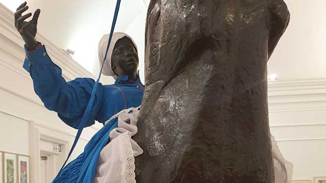
-

Mary Sibande’s sculpture The Reign (2010) affects the viewer due to its interplay of bipolarities such as European/African, male/female, past/present, working class/bourgeoisie, private/public, reality/fiction. It forces us to scrutinize our contemporary thinking about the past in relation to the present. The criticism of the colonial era and the rebellion against limitations, that history has placed on identity is inherent in the work, which focuses on African women, historically oppressed as Blacks, as workers, and as women. As a sign of resistance and tribute to all Black women fighting for equal rights it raises questions about race, class and gender.
Vaulting on a boisterous horse, a life-size female figure is displayed in the hyperrealistic sculpture. Rider and mount – both made of fiberglass – are identical in color, creating a consistent medium of presentation for the abundant dress supported by a scaffolding of white and purple undergarments rimmed in Broderie Anglaise, a technique of embroidery, which originated in 16th-century Europe. In addition, the mannequin wears a white apron tied into a voluminous bow at the back and a white headscarf covering her hair. On the one hand, the distinctive elements of the apparel such as puffed sleeves, petticoats and ruffles can be identified as characteristic features of 19th-century Victorian fashion. The style of clothing popular in Great Britain was brought to Africa by the settlers during the unprecedented expansion and consolidation of the British Empire, where it became a symbol of colonial rule. On the other hand, the specific blue color in combination with the white headscarf, collar and apron refers to the uniform of South African maids, that has hardly changed until today. Domestic service – established in the earliest days of European colonisation and later assured by Apartheid – has long been a major sector of the South African labour market. In 2010, the same year the sculpture was created, “the domestic worker industry employed 18% of all women, and 80% of domestic workers were women, with poorly educated Black South Africans making up the vast majority of these women.” (Bosch & McLeod, 2015, p. 135, quoted after Dinkleman & Ranchod, 2010) Readily available at local supermarkets the artist draws on the maid’s uniform and uses the mass product as starting point for her textile hybrids. Born into a line of domestic workers that stretches back three generations, Sibande makes her family history the subject of her art. (Dodd, 2010, p. 467) From silicone casts of her own body she created a fictional character named Sophie [the English name given to her grandmother by her white employer, as Corrigall (2010, p. 155) states]; as alter ego, homage, and representative of former and current domestic workers, she appears here as the protagonist of the work. Through the interplay of the Black body and the dress oscillating between workwear and sublime gown, Sibande performs a subtle manipulation of the semiotics of fashion and their social function as indicators of status, gender, and affiliation (Corrigall, 2015, p. 150). Power relations are explored and the dichotomy of maid and mistress, which implies further bipolarities such as colonist and slave, oppressor and oppressed, European and African, woman of substance and pauper, is deconstructed. “Sophie” occupies the role of the white landlady and thus claims a social position denied to her by repression and racism, whereby her outfit can be read as recovery of autonomy through dispossession of the 'Other'. Regarding the title of the work, the words reign and rein are played on here. In The Reign she is holding the reins both figuratively and metaphorically.
The composition is, also due to its surface property and shade, reminiscent of the European equestrian statue, a portrayal of a sovereign, politician, or commander on horseback, that has functioned since antiquity as a tried and tested means for the demonstration of male power. During colonial rule it was also introduced in South Africa; two well-known examples are the statues of Louis Botha (general in the Second Boer War and first prime minister of the South African Union) in Cape Town and Cecil Rhodes (British entrepreneur and one of the leading players during the high point of imperialism) in Kimberley. Thus, the equestrian statue as a form of representation of white supremacy is anchored in the collective memory of South African society and is here referred to, deconstructed, and reinterpreted by Sibande.
By replacing the idealized male character with a Black female figure, the artist adds an additional layer to the postcolonial debate about South Africans as oppressed Blacks and oppressed workers: women’s limited scope of action in the patriarchal system. Through the usurpation of potentiating positions of power – the mistress first, the sovereign second – Black femininity is calling for an uprising. Dodd (2010) points out that the maid, who is expected to disappear, unseen and unheard, into the background of private life and thus remained socially and culturally invisible for a long time, has assumed the center stage, boldly announcing herself to the world in the gallery room. Her visibility in public space was once again enhanced as the sculpture was featured during the 2010 World Cup within the city of Johannesburg on the side of a building as large, photographic mural. To ensure a dominant and imposing presence, Sibande shows the mount in the so-called pesade: Using the horse's body as a shield and its front hooves as a weapon, the rider is erect according to the movement of the rearing horse and is usually depicted in paintings and sculptures as a battling hero with a sword in his hand and a determined expression on his face. “Sophie” can thus certainly be understood as an insurgent and tribute to all Black women fighting for equal rights. But in my reading the absence of a weapon and the daydreaming character of the human figure, which has her eyes closed as if in trance, break with art historical tradition and expose the scene as an objectification of inner desires and empowering imaginations. The overcoming of class and gender boundaries as well as of limitations, that history has placed on identity, still more of a wishful thinking than an actual condition. This is also evident in the ambivalent figure of the horse, which on the one hand symbolizes the momentum of the protest movement, but on the other hand can also be interpreted as the oppressive system that must be made compliant. While circling the sculpture, it becomes visible, that the dynamics of the animal are not necessarily reflected in the rider’s posture. In a fragile intermediate state, half falling, half vaulting, she presents herself to the viewer from one side as if she were controlling the horse, and from the other as if she would be thrown off at any moment. The Black woman exploring options in the political and social field is thus in a constant balancing act between control and loss of control, combat and lethargy, fiction and reality.
In the large scale work The Reign, Mary Sibande calls on the elaborate attire of the Victorian era to, in some way, refashion our contemporary thinking about the past in relation to the present. She is intent on collapsing binaries around race and power, and alerting us by means of the textile, which is a linchpin of identitarian negotiations, to unexpected interplays between apparently oppositional and asymmetrically related cultures; the plastic body thereby serves in accordance with the functionality of the mannequin as an accessory that reinforces the statement. Clothing is used performatively and, in addition to the cultural reappraisal of national history on the macro level, functions on the micro level as a vehicle of expression and personal search for the artists own postcolonial identity.
References
- Bosch, Tanja / McLeod Caitlin: Dress, Address and Redress. The relationships between female domestic workers and their employers in Cape Town South Africa, in: Global Media Journal African Edition, Vol. 9 (2015), p. 134-155.
- Corrigall, Mary: Sartorial excess in Mary Sibande's “Sophie”, in: Critical Arts 29 (2015), p. 146–164.
- Dodd, Alexandra: Dressed to thrill. The Victorian postmodern and counter archival imaginings in the work of Mary Sibande, in: Critical Arts 24 (2010), p. 467–473.
- Long Live the Dead Queen (Exhibition Catalogue). Gallery MOMO Johannesburg 2010, Johannesburg 2010.
In my reading of this work, I am tempted to and almost seduced by the immediate crutch of a colonial critique that is rooted in positioning the rider and horse within a Eurocentric frame. Instead, I re-read the words spoken by the artist Mary Sibande in an interview held with Malibongwe Tyilo (2021) from the Daily Maverick that crystalises Sibande’s thinking. “My work is not about complaining about apartheid, or an invitation to feel sorry for me because I am black and my mothers were maids. It is about celebrating what we are as women in South Africa today, and for us to celebrate we need to go back, to see what we are celebrating. To celebrate, I needed to bring this maid” (Tyilo 2021).
In summary, Sibande speaks of celebrating black women today and this is vested in the courage that black women had during apartheid to protest against such experiences. It was my responsibility as a researcher to seek out these celebratory moments that Sibande speaks about in her work. In response to the sculpture The Reign (2010), the artist portrayed Sophie riding a black horse that stands on its hind legs referred to as rearing. The rearing of a horse is associated with aggression, disobedience, or pain that is experienced by the animal and in this case, the horse appears to be a mare rather than a stallion. The rearing can also be caused by an inexperienced rider however, it appears that Sophie is calm and in full control of the horse that she rides. Would this animal not be a metaphor for all black women during apartheid in celebration of their aggression, disobedience and pain endured while facing the inhumanity that was meted out to them? In retaining this thought, would Sophie then not be a symbol for all the black female leaders who led the women’s struggle during apartheid and who were also labourers on the farms and domestic workers in cities?
I think that Sibande deliberately played with the pronunciation of the words reign and rein when she titled the work. On the one hand, the work references the reign of black women who were revered as queens when they marched and protested their abuse. The fact that they were severely undermined by apartheid restrictions made them more militant than men. During the years of abuse under apartheid, anger festered within black women, giving rise to 60 000 women who marched to the Union Buildings in Pretoria in 1956, a protest against the pass laws and the 1957 Public Utility Transport Corporation (PUTCO) bus boycott which began in Alexandra. Women also formed the Natal Organisation of Women (NOW) in 1983, The Federation of Transvaal Women (FEDTRAW) in 1984 and the United Democratic Front Women’s Congress (UDFWC) in 1987. Women as members of these organisations protested and marched against high rents, increased food prices and demanded the release of incarcerated black leaders.
Sibande also references rein in this work that indicates the control that the rider has on the horse or the female leadership over the thousands of women who marched on apartheid via protest marches and the formation of women’s organisations. This idea of control via the use of a rein is indicated by the blue length of the rein attached to the horse that Sophie loosely holds in her hands. This shows that Sophie does not require or impose an aggressive response to the rearing horse but allows the horse to perform as Sophie does sitting on its back. In this paused moment, control is about leadership that is asserted without force.
The Reign (2010) appears to include the seeds of democracy with Sibande’s use of the purple undergarment that the rider wears. This introductory period would be 1989 into the 1990s when the African National Congress and many other anti-apartheid organisations were unbanned, and many political prisoners were released including Nelson Mandela which allows for the greater celebratory moments that Sibande refers to. The year 1989 is significant apart from it being the year when violent protests took place nationally, in schools, universities and on the streets. It was the year when the police used purple dye in water cannons to spray protestors, a dye that did not wash off easily and was referred to as the purple rain.
When one considers the idea of protest during apartheid, it was a performance by a mass of people, a performance that included song, dance, body gestures and movements that emulated, ridiculed, and promoted a different approach to the ‘norm’. The rearing horse is a performance indicative of the protests that fuelled the journey to democracy. A journey that demanded sacrifices from black people of their time, lives and brutality that can only be imagined. In my view, the meters of the blue dress that Sophie wears is a metaphor for the millions of workers who participated in this struggle. The sculpture is a metaphor for the black female struggle during apartheid, her struggle against patriarchy and a demand for equality that was situated within the broader apartheid struggle. These two struggles gave birth to the adoption of the Women's Charter (1954) and the Freedom Charter (1955) in Kliptown, Soweto.
There is no doubt that the work is a critique against colonial rule however, the manner in which Sibande has invented and presented the work, is saturated with the achievements of black women within metaphors of significance that describe the black female struggle without pity. It celebrates black female achievements in eroding the inhumanity imposed by apartheid specifically on women who endured the slurs and oppression of race, class and gender.
The fact that Sophie sits with her eyes closed, allows her to reminisce about the periods that announced the celebration of black women’s victories against the apartheid beast through women’s protests, boycotts, arrests, torture, fragmented family lives and mass marches. The domestic attire is Sibande’s prop for the historical enactments that define black women’s contribution to the struggle against apartheid.
In my view, Sibande’s work The Reign has encapsulated black women’s struggle not only against apartheid but their right to equality within a South African democracy.
References:
- Tyilo, M. 2021 Iconic South African Works: Mary Sibande’s ‘The Reign’. Daily Maverick. 22 June (online)
-
Photography as a technique and medium is questioning terminologies of truth and representation as part of the respective and genuinely inscribed authorship of technically enhanced images since the emergence of early photographic works. Through rapid and widespread distribution in print media, photographic images soon became part of the formulation and documentation of shared visual memory in the Global North.
Walker Evans, the father of documentary as one web article states1, heavily influenced the style of modern (not meaning contemporary) photography. His importance as a photographer is essentially based on the photographs he took during the Great Depression in the mid-1930s. The photographic portraits of the three US-american tenant families Fields, Borroughs and Tingle became icons of photographic history and formed the general visual representation of this era by telling a story (in the sense of a historical narrative) at the same time. They, thinking like Evans here, document the person(a), meaning identity or essence, of white, hardworking americans, who, even if they struggle, keep up their integrity. They represent a socio-cultural construct in insisting on their ability of showing, ordering and defining the truth. As Evans' images focus on an American underclass of the time, they show the author of those pictures as part of their own reality.
How does the search for some kind of visual truth in modern photographic images take place when they seem to not look for their own but for the other, which is imagined to be foreign to them and mostly without history? What kind of approach to questions about history and its narratives are they able to re-present as a consequence?
Concepts of history are always entities that reveal just as much about their architects as they do about the evidence integrated into them, which represents constructors and construct at the same time. History rarely appears in a singular form, is never neutral and always normative. It is part of its own discourses, demands order as well as testimony. In documentary terms, the latter (the testimony) should legitimize science and itself. Ordering structures and strategies, on the other hand, require places and institutions where they can appear. Gazes at the end of which historical narratives should stand are seldom equal. Often they are one-sided observations, classifying and hegemonic, alienated observations through mimetic imitation or intended othering. The basis of such categorical observations are specific techniques and strategies for appropriation; results are metaphors or emanations of one's own reality.
The exhibition African Negro Art, which was on view at the Museum of Modern Art New York in 1935, marks the beginning of the institutionalized exhibiting of so-called (or labeled) African Art at major western art museums. Finally coining a terminology often still used today, 603 African objects were exhibited at the MoMA from March 18 to May 19 1935. Walker Evans was commissioned to (literally) photographically document the objects on display.
The resulting images are characterized by long exposure times, which made it possible to guide a light source around the respective object while the cameras aperture was open. The illumination is therefore mostly impressively uniform and soft, strong shadows and the constitution of space are avoided. The images have a hyperfractual clarity.2 The surface of a Bamende facemask for example is uniformly illuminated, the exposure emphasizes the contrasting structures and lines, the formal essence, if one would say so. The actual plasticity of multidimensional objects becomes obvious in a second shot. The face of the same mask appears to be pointedly drawn forward, the slight inclination of a wide comb only becomes apparent here. It almost does not seem to be the same object, so much does the first shot focus on the ornamental surface. Evans used an 8 x 10 medium format camera, the resolution of the images is correspondingly high. The partly dramatic concentration on the object causes a visual monumentalization of things, image sections are often claustrophobic narrow - the objects are not relationally representative, but are re-presented according to their formal characteristics, analyzed by the photographer. This leads to major shifts in reception. One of Evan's most effective images is the photograph of a Pende pendant made of ivory. As if from nowhere, from a timeless, deep black and imponderable background, the masks face emerges from the pictorial ground. The focus lies on the middle plane of its face, which is photographed using a large aperture. Therefore initial blurring starts as early as behind the eyes of the carved face. It is shot from above, not from the front. Viewers are urged to imagine the figure's body (which is neither present nor laid out in the object). Deep shadows let the face appear threatening and alien, framed by sharp contrasts; it becomes clear that the intention of the mask cannot be a good one. Evans gives the alien object an equally alien character, an emotion. The mask stands pars per toto for the ‘other’, the uncanny.
Evans photographs were published quite widely. Starting with the exhibitions catalogue they were used in several publications by the exhibitions curator James Johnson Sweeney focusing on the ‘Art’ of Africa in a broader even more general and art historical perspective: the generalizing and educative intention of pictures and text is already foreshadowed in the somewhat holistic titles of such publications - African Folktales and Sculpture (1952) and African Sculpture (1964) for example . Entering the realm of the photobook as a medium Evans photographic images become part of semi-theatrical stagings, some kind of educational character is inscribed into them, especially looking at the close interlacing of text and pictorial object. Ultimately, the message and content of the images are only self-referential. Evans photographs where often published together with the ones of Elitot Elisofon, who amongst other jobs worked as a photojournalist for the LIFE magazine. In The Sculpture of Africa (1958) Elisofon makes use of the photobook as a medium very consciously. For example he uses different photographic views on the same sculptural object to kind of animate it in a cinematic way, using the photobook as an idea to look at three-dimensional properties of things in a two-dimensional way, making the accessible by flipping through the book. Both photographers work is often labeled as having a documentary style, both seem to have a special interest in photographically analyzing pictorial qualities of the surface and materiality of the things they look at. Exposure and contrasts (re)produce haptic qualities and material properties of the things being looked at through the camera quasi argumentatively, based only in the photographic objects themselves.
Methodically, Walker Evans' documentarism is ergo characterized by the omission of object-immanent information and the simultaneous genesis of image-immanent content. His pictures do not allow conclusions to be drawn about the size, material and context of the representations; a mostly unspecific monochrome background detaches the objects from the contexts inscribed into them. The photographer repeats aspects of the aesthetically and content-wise neutral display of a modern art exhibition and demands that the images focus on purely formal aspects. The representations do not permit any connection between the signifiers in terms of content. In narrow sections, each object is presented in a very specific view - the photographic images ergo become significant only in a Western canonical art context, shifted to its terminology and histories.
Stylistically, Evans' photographs can be described as clean and cerebral.3 The images of African objects are clean (and timeless) in the sense that they are cleansed of any context; they are cerebral in the sense that they are open to new inscriptions and attributions. The highly specific aesthetics of the images serve to conceal and reveal equally specific information at the same time, they are markers of tailored representations4 which are more the presentation of Evans as the author of those images and his techniques to strip pictorial objects from their original terminology and historical narratives, than the representation in the sense of a documentation of the object shown.
1) https://www.theguardian.com/artanddesign/gallery/2015/dec/03/walker-evans-documentary-photography-great-depression-gallery; 15. Juli 2020.
2) Cf. Campany, David: Walker Evans. The magazine work, Göttingen 2014, S. 52.
3) Cf. Strother, Z.S.: Looking for Africa in Carl Einstein’s Negerplastik, in: african arts Winter 2013 VOL. 46, No. 4, S. 8 – 21, S. 8.
4) Cf. Webb, Virginia-Lee: Perfect Documents. Walker Evans and African Art 1935, New York 2000, S. 15.
References
- Eliot Elisofon: The Sculpture of Africa (text: Ralph Linton, William B. Fagg), New York 1978
- James Johnson Sweeney, Paul Radin (eds.): African Folktales and Sculpture, New York 1964
- Kerstin Pinther, Niklas Wolf (eds.): Photobook Africa. Tracing Stories and Imagery, München 2020
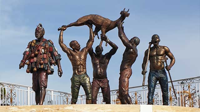
-

Theophilus Kwesi Mensah and the Placemaking Paradigm
Within the rebranding and the making of new identity for Winneba as enshrined in the Effutu Dream Project, the name Theophilus Kwesi Mensah cannot be overlooked in this intercourse. This is not only because he engineered the widely talked about installations: the Unity Monument, The Aboakyer Monument, The Fishermen of Akosua Village and the Monument of Ofarnyi Kwegya but the awe-striking aesthetical connotations he incorporated in the aforementioned works. Each of these statues were rendered to mimic the idea of Winneba as a community built on a collective space. Being native of Winneba, heightened his understanding of how the amalgamation of economic, political, and cultural activities in the past, would accord him the impetus to express himself publicly. In so doing, he empowered his sculptures to ventriloquy the unique narratives that define Winneba and redefine this relatively old settlement yet burgeoning municipality as a dwelling place or a place worth visiting.
Figure 1: Theophilus Kwesi Mensah, Ofarnyi Kwegya, 2021. Fibre Reinforced Polymer. Yeepimso Community Centre, Winneba. Courtesy of Edem Dedi Photography.
Through the lens of placemaking, Ofarnyi Kwegya (Figure 1) and the Fishermen of Akosua Village (Figure 2) are two typical statues that has beautified the vernacular space of two historical settlements in the older southern half of Winneba.
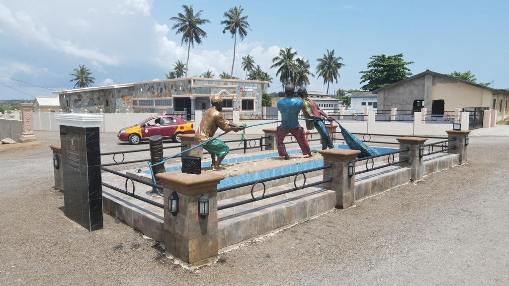
Figure 2: Theophilus Kwesi Mensah, Fishermen of Akosua Village, 2021. Fibre Reinforced Polymer. Akosua Village Community Centre, Winneba. Courtesy of Edem Dedi Photography.
The two statues stand in the middle of Yeepimso and Akosua Village communities respectively as embodiments of vital ingredients helping in creating a sense of community, civic identity, and culture in both spaces. They have both transformed their unique sites as lively and attractive communities with the monumental figures not just becoming legible maps to the sites but turning the spaces into places that support human interactions. The site of the statue has become the most important and attractive places in the two communities. They have become the center of attraction where the community gather for entertainment and trade, especially at night when economic activities in the two communities are at their peak.
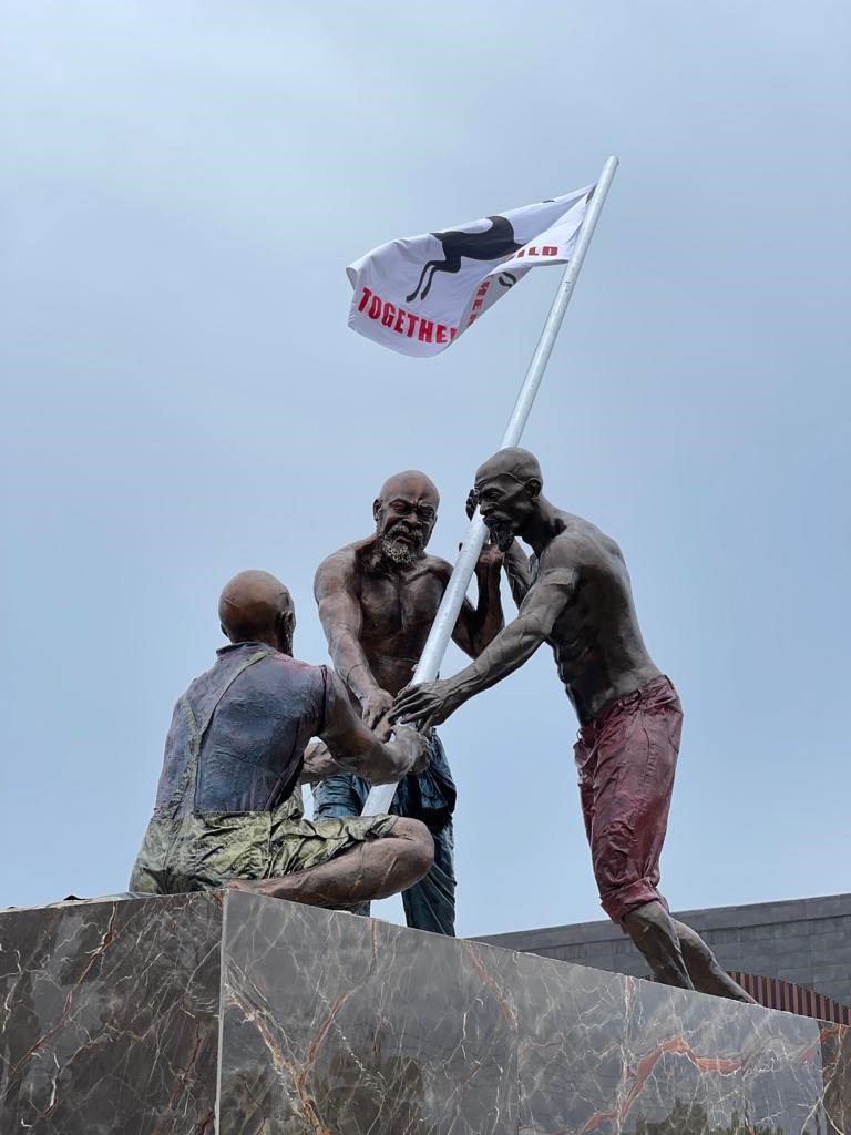
Figure 3: Theophilus Kwesi Mensah, Unity Monument, 2021. Fibre Reinforced Polymer. The Unity Square, Winneba. Courtesy of Edem Dedi Photography.
Another compelling monumental statue that has transformed the landscape of its site is the Unity Monument (Figure 3). Before the advent of the monument, the site of the statue (the Y-intersection – Winneba Traffic Light) was a deserted barricaded mere chaparral which displayed all forms of notices including obituaries and political posters (Mensah & Abraham, 2022). Yet, Theophilus Kwesi Mensah’s statue has transformed the space into an ideologically charged space for a deliberative unity and peace agenda in Winneba. The environment is so aesthetically pleasing that people like to visit the site for selfies and sightseeing thereby generating income for the Municipal Assembly.
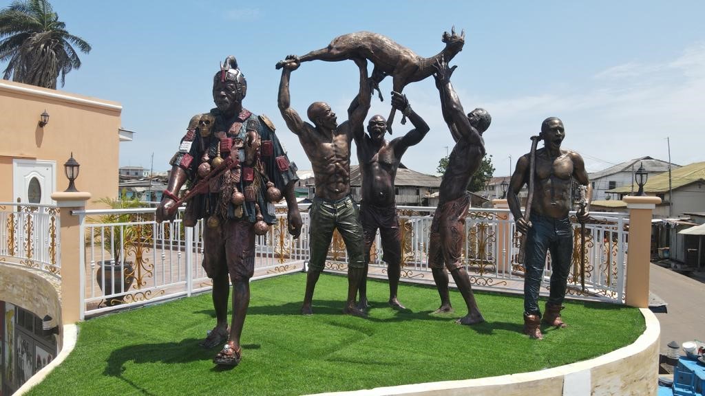
Figure 4: Theophilus Kwesi Mensah, The Aboakyer Monument, 2021. Fibre Reinforced Polymer. Osimpam Museum, Winneba. Courtesy of Edem Dedi Photography.
Theophilus Kwesi Mensah’s ontological orientation of Winneba is multifaceted. Hence, he found significance in the century’s old festival of the people of Winneba, Aboakyer to sculpt a monumental statue to this honour (Figure 4). The Aboakyer Monument mounted on the roof-top of the Osim Pam Museum is at the heart of Winneba as an embodiment of Winneba’s heritage. Owing to the enormous narratives surrounding the Aboakyer Festival, it is seen as one of the most popular and most significant festivals in Ghana (Akyeampong, 2019). The people of Winneba are invariably identified by the Aboakyir Festival. Theophilus Kwesi Mensah captured the very essence of the festival by vividly depicting the most significant characters: the Supi, the Asafo warriors, and their cheer leaders in procession with the catch.
During the 2022 Aboakyer Festival, it was observed that both celebrants and tourist were awe-struck by the aesthetic connotations of the monument. People gathered around the site for various reasons. Whilst some were seen taking tourist photos, others were seen venerating the ancestors who in the past led the festival.
In view of the Effutu Dream Project, Theophilus Kwesi Mensah’s artistic ingenuity to a large extent has contributed to rebranding the Winneba Township by beautifying the place and making it attractive for tourist. However, beyond the beautification agenda, part of the underlining philosophy of the statues was to consciously bring to the fore, some compelling memories of Winneba in relation to the current narratives within the land.
Theophilus Kwesi Mensah and the Collective Memories of Winneba
Theophilus Kwesi Mensah capitalized on his creativity to translate some notable historical events pertaining to his beloved native, Winneba into tangible remnants of the recent past to shape and, indeed, consolidate the Effutu Dream Project. Whilst usurping a storyteller, he equipped his statues to mimic the historiography of Winneba as collective memorials for the publics of Winneba. This is underpinned by his inclination to the truism that cities are built based on their histories and for that matter, Winneba cannot be gentrified without laying claims to the past publicly. Therefore, he ensured that whilst the Effutu Municipal Assembly initiated the Effutu Dream Project, the glorification of the public triumphs of Winneba was not taken for granted. This desire culminated into transforming some important public vernacular spaces into storehouse of memories embedded and inscribed on the landscape of Winneba.
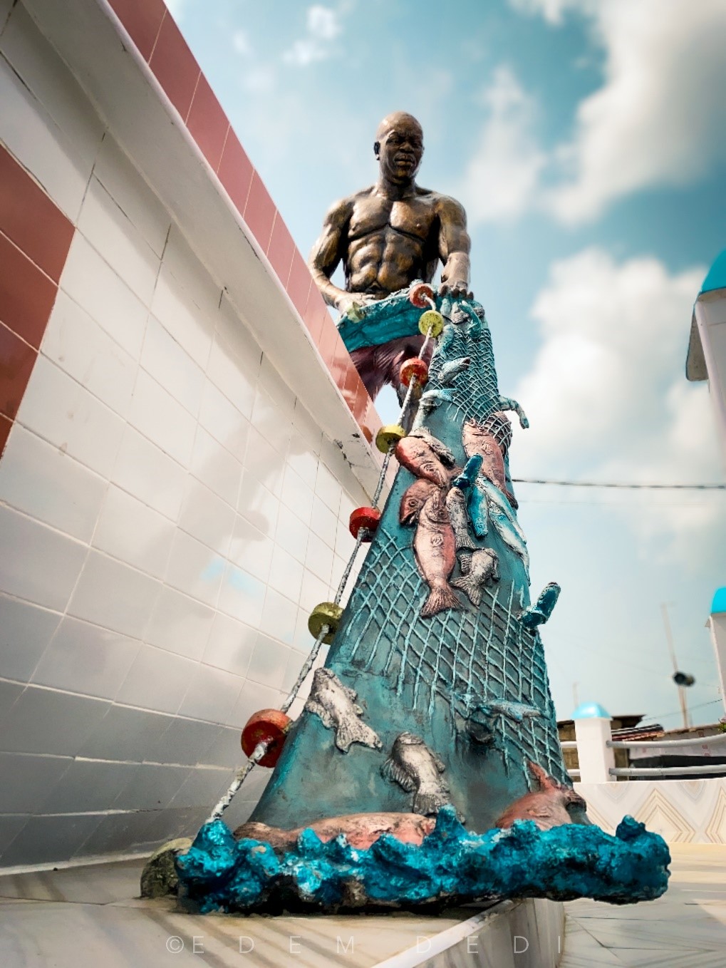
Figure 5: Theophilus Kwesi Mensah, Ofarnyi Kwegya, 2021. Fibre Reinforced Polymer. Yeepimso Community Centre, Winneba. Courtesy of Edem Dedi Photography.
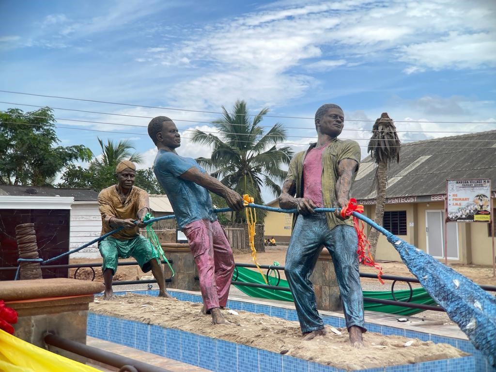
Figure 6: Theophilus Kwesi Mensah, Fishermen of Akosua Village, 2021. Fibre Reinforced Polymer. Akosua Village, Winneba. Courtesy of Edem Dedi Photography.
Knowing Winneba traditionally as a fishing community, Theophilus Kwesi Mensah produced two major monuments, Ofarnyi Kwegya (Figure 5) and the Fishermen of Akosua Village (Figure 6) as a concretized instantiation to the noble trade that has in the past defined what place Winneba is. Ofranyi Kwegya, is the statue of the unheralded giant master fisherman, an exponent of mid water trawling in Winneba who captured huge number of fish whereas the Fishermen of Akosua Village depict the famous trio: Zagada Afadzinu, Kwami Akpade and Sogbka Dagodzo who introduced artisanal fishing or subsistence fishing to Winneba.
Although the fishermen portrayed in these monumental statues have died long ago, they constitute such significant heroes in the historiography of Winneba. In view of their important roles in the socio-economic phenomenology of Winneba, Theophilus Kwesi Mensah aimed at stopping their decay and position them into the realm of the timeless with the erection of their statues as memorials that transmit their archetypal narratives.
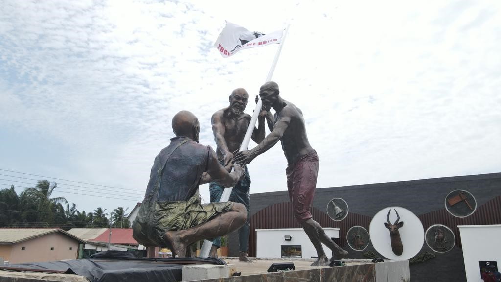
Figure 7: Theophilus Kwesi Mensah, Unity Monument, 2021. Fibre Reinforced Polymer. The Unity Square, Winneba. Courtesy of Edem Dedi Photography.
In view of Theophilus Kwesi Mensah’s understanding of the political and dynastic heritage of Winneba, he engineered the construction of the Unity Monument in commemoration of the end of the protracted chieftaincy feud that had ensued in Winneba in the past. Ephraim-Donkor (2019) recount that since the latter part of the nineteenth century, the people of Winneba have clashed in violent struggle for power until 22nd July, 2015 when the Supreme Court of Ghana, finally intervened. The feud was rooted in an uncanny clash of cultures within the same family three, resulting in a political quagmire as to which succession mode to follow, the male or female model. The people of Winneba traditionally follow the patrilineal line of succession, however the Acquahs who are for the female model, tasted power as caretakers but refused to cede power back to the original benefactors, the Otuano Royal Family (Gyatehs or Gharteys) who are for the male model.
The female model became popular in Winneba because of their hospitality which allowed their Akan neighbours to live with them and rendered Winneba as a cosmopolitan community. Theophilus Kwesi Mensah’ depicted the two families, Gharteys and the Acquahs and a third figure representing the non-natives as a united force in the gentrification of Winneba as they erect a flag as signifier to this commitment. The Unity Monument does not only exhibit an aesthetically astute display of Theophilus Kwesi Mensah’s artistic ingenuity but also, it encapsulates the political and dynastic history of Winneba whilst being a crucible of memory to the unity and peace in Winneba presently.
As part of Theophilus Kwesi Mensah’s memorialization agenda with regards to his statues in Effutu Dream, he produced the iconic Aboakyer Monument as a memorial to the Aboakyer Festival of the Effutus of Winneba. The Aboakyer, known throughout Ghana as the "Winneba Deer Hunting Festival," is held annually in early May. It commemorates the founding of Winneba some three centuries ago, when the Effutu, led by one Osim Pam and accompanied by the god Penkye Otu, settled on the coast at the end of their migratory journey from northern Ghana to the present location.
Pedagogical Connotations of Theophilus Kwesi Mensah’s Statues in Effutu Dream
As artist academic, having been under the tutelage of the Emancipatory Art Teaching Project (EATP) by Professor kąrî’kạchä seid’ou, he is an alley of the blaxTARLINES community in Kumasi. Theophilus Kwesi Mensah’s practice ties in with contemporaneity in the arts. In his teaching, he identifies with the philosophy that trainee art educators ought to think and act creatively. He does this by championing their epiphany in the studio as nexus of exploring emerging issues in art education. Through the studio, his statues in Effutu Dream creatively imparts on his students as agents of transformation in addressing the urgent call for equity, diversity, and inclusion in our educational structure and practices.
Whilst his students have the liberty to choose their own masters, he has been readily available, and the doors of his studio was opened to all students who loved art whilst working on his statues in Effutu Dream. After all, he too has absorbed lessons from legendary Ghanaian Artist Academics such as Benjamin Menya, Kwamevi Zewuze Adzraku and Buckner Komla Dogbe. So, students with varied backgrounds are mainstays in his studio beyond the statues in Effutu Dream. He reckons the studio space as a crucible of intellect and a window to add to knowledge as his students pick his brain as apprentices there.
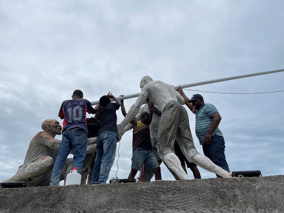
Figure 8: Theophilus Kwesi Mensah working with his students (Courtesy the artist)
Despite his inclination to EATP, he does not sway from being a traditionalist in the sense that he continues to enjoy working from the human figure. His preference to the human figure in his statues in Effutu Dream was informed by the truism that life changes and the language of sculpture evolves. So, it does not really matter if he is being repetitious with a subject that has preoccupied sculptors throughout history. Yet, as didactic symbols, he sought to make explicit what many sculptors make implicit in contemporary memorials in a classical sense with his figurative renditions.
Whilst the public may tend to be passive receptors of his statues in Effutu Dream, his students cannot afford to be indifferent. There are obvious educational imperatives they naturally cannot ignore. As far as they look and see the statues, there are predisposed to learn from them by asking questions. Reis (2010) citing Silva (1984) concerning public art claimed that even if we do not pay any attention to it, daily contact influences our attitude towards the conservation of artworks and our intellectual and sensory appropriation of them. What more do students need to get motivated in their studies aside having the opportunity to see the works of their lecturer installed all over the community? As artist academic, Theophilus Kwesi Mensah thrives to integrate his vast knowledge in the art into the practice of cultivating artistic design talent. His contribution to knowledge is application oriented. His statues in Effutu Dream make meaningful contributions to practical solutions that are at the core of art education. His students garner the nuances of what he says in the classroom when they see his statues in town.
Conclusion
Theophilus Kwesi Mensah’s ingenuity as a sculptor, draftsman and an academician are undeniable, so too is his energy and prolific creative output in the wider Effutu Dream Project. Within a trilogy of paradigms, he displays a profound representation of Winneba as a beautiful place to live and work. He does so by immortalizing four important collective memories of the town whilst using Fibre Reinforced Polymer, a material that stands the test of time and exudes a sense of eternalness. In the process, his students tapped into his creative sense both at his studio and on site.
Whilst Theophilus Kwesi Mensah’s artistic praxis is eclectic, what I have sketched is a heuristic effort to describe his monumental contribution in the Effutu Dream Project in his beloved Winneba where he lives and practice as artist academic. The few details I have carved may at times be minor, but they add up to have a larger impact to his contributions in the effort to redesign and develop Winneba.
References
- Akyeampong, O. A. (2019). Aboakyer: traditional festival in decline. Ghana Social Science Journal, 16(1), 97.
- Farman J (2015). Stories, spaces, and bodies: The production of embodied space through mobile media storytelling. Communication Research and Practice 1(2): 101–116.
- Mensah, T. K. & Abraham, E. K. (2022, June). The unity monument: A hope of the end to the political quagmire in simpa. Paper Presented at The Creative Arts Conference, University of Education, Winneba, Ghana
- Reis, R. (2010). Public art as an educational resource. International Journal of Education through Art, 6(1), 85-96.
-
Fortunately, contemporary Ghanaian artists like Vincent Akwete Kofi and Kofi Antobam, who by their training, developed both the skills and the mindset to create and fully appreciate African arts have played major interventional roles. They, through rigorous production of masterpieces over the years, led the move to redirect the wavelength of Ghanaian artistic expressiveness along the paths of decolonization. A typical example of these arts is the Crucifix, the selected object for this discussion.
The Artist – Vincent Akwete Kofi
The Crucifix is a sculpture in the round, measuring 45x10x19 inches, and was created by Vincent Akwete Kofi, a Ghanaian artist who lived between 1923 and 1974. Characteristically, Vincent creates outstanding sculptures in humanistic forms. His sculptures speak to traditional African philosophies, ideals and beliefs (Grobel, 1970), and he through his works, seeks to reinforce the beauty, dynamism and complexities of African art. Indeed, Vincent’s artistic posture was largely informed by his training in the then Achimota College in the Gold Coast (now Ghana), an educational institution which sought to bridge the gap between European and African forms of knowledge (Woets, 2014).
Description and interpretation
The Crucifix was carved in tropical hard wood, one of Vincent Kofi’s preferred media, with the style and subject matter reminiscing his belief in the creative and objective fusion of lessons from the history of modernism in the arts by an immersion in his Ghanaian heritage. Like his earlier sculptures therefore, the choice of this Euro-Christian theme throws lights on his Pan-Africanism and decolonization intents.
The sculpture is a depiction of a free-standing human figure with features that conform with his earlier wood carvings, such as depiction of enlarged head and heavy feet which are more representational than naturalistic. Again, the entire form is seen as being directed by the limitations of the tree trunk deliberately chosen for the work. This, of course is one of Kofi’s traditional wood carving styling.
The Crucifix is postured in a clasped forward-bent lower limb. Like the lower limbs, the upper limbs of the figure which are raised over the head and stretched backwards, are also clasped together, depicting the entire image in a rather discomforting posture. Further strengthening the feeling of distress and discomfort in the image is the dropped and lifeless face and facial features of the image. The long thick beard of the image with the tightly fitting cylindrical hat on the head, carved after one of those won by royals among some sections of Ghanaians, give the figure an elderly look.
Other significant features of the image are the exaggerated clasped, forward-bent and wobbly elephantine feet, dropped face with shuttered eyes, flaccid body/skin/muscles (which is visible even in wood), and the heavy beard.
In trying to understand the presentation of the Crucifix, it is important to note that Ghanaians have stories about characters who lived and suffered similar fates as that of the Christ. The Fante people (a section of the Akan ethnic group), for example have records on a man called Ahor, who offered himself as a sacrifice to the gods, when the life of a human being was demanded as an antidote to a calamity which befell the people. Up to today, Ahor is celebrated in a festival called Ahorbaa to commemorate his brave and sacrificial feat. Other ethnic groups in Ghana have similar stories which render the Passion of the Christ not just a familiar phenomenon, but a lived experience recorded in the history of the people.
Also worthy of notice is the familiarity of the various themes which characterize the story of the Christ, such as his kingship, miraculous personality, sacrificial journey and his eventual torture and death. The Crucifix therefore, was Vincent Kofi attempt at depicting the passion of the Christ in a way that would make it familiar and relevant to the people.
The image in Kofi’s Crucifix was therefore needed to be presented as a man with royal personality, as depicted in the cylindrically shaped cap, which is symbolic of some of the Ghanaian royal millinery that depict kingship and authority. This is reinforced by a heavy beard to portray wisdom. Wisdom which is reserved for kings and aged people.
Analysing from the experiences of a people whose history was not devoid of unpleasant experiences, such as enslavement, brutal torture and execution, the image presented in the Euro-Christian Crucifix could not have been a complete representation of the Man of Sorrow described in the Christian holy book (Isaiah 53:3). Kofi therefore saw the need to present a figure which paints a real picture of a man who had gone through an extreme physical pain. Those strong and heavy, yet wobbly feet were a symbol of a man overburdened with sorrows and sins of the world.
Indeed, the man on the Crucifix was dead, with no chance of maintaining a smooth and shiny skin as seen in the Euro-Christian crucifix. In Vincent Kofi’s Crucifix, therefore, he, even in wood, managed to present a flaccid body/skin and muscles which, with the closed eyelids, dropped and lifeless face gave an impression of an extremely tired dead body. Probably an artistic rendition that comes close is Mel Gibson’s crucified Christ in his movie, the Passion of the Christ.
Conclusion
Early missionaries introduced the Christian religion with its attendant icons, images, stories and language in 1400s. Semblance in religious icons, images, stories and their associated functions made the acceptance of Christianity easier among indigenous Africans/Ghanaians. Vincent Kofi’s Crucifix could therefore be considered as a great effort towards connecting foreign Christian belief systems to known religious experiences, thereby making Christianity much more relevant to the African than it has been.
References
- African Artists in America (1978). African Affairs, 11 (3), 84-85.
- Frank, B. (1999). The Visual Arts of Africa: Gender, Power, and Life Cycle Rituals by Judith Perani and Fred T. Smith (A review). African Affairs, 11 (3), 14-16.
- Kwami, A. (2016). Kofi, Vincent Akwete (1923–1974). In the Routledge Encyclopedia of Modernism.: Taylor and Francis. Retrieved 31 Dec. 2021, from https://www.rem.routledge.com/articles/kofi-vincent-akwete-1923-1974. doi:10.4324/9781135000356-REM845-1
- Moore, G. (1967). The Arts in the New Africa African Affairs, 66 (263), 140-148.
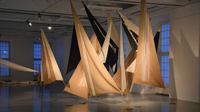
-
Based on the Ghanaian interpretation, it quickly became clear that certain ideological or political positions are immediately connotated with the respective image selection. These in turn are linked to historical and social experiences, which Winkler (2021) recently elaborated on the basis of the history of Germany. In our case, the West German, left-liberal intellectual milieu is of particular interest, since all the German project partners involved in the discussion can probably be assigned to such a milieu. "In the 1970s, the view prevailed among liberal and left-wing intellectuals in former West German, which objectively was not a nation state, did well to see itself as a >post-national democracy<. In the 1980s, this led to the conviction among many that the time of the nation state had passed and that Europe only had a future as a post-national union. [...] The self-destruction of one's own nation-state [in Nazi Germany - author's note] led to the conclusion that the nation-state as such had outlived its usefulness, and the term ‘national’ was equated with nationalist. [...] In Germany the idea that the nations had to merge into a European republic found a broader public echo." (Winkler 2020 p.186)
For art educators, the majority of whom probably feel committed to this idea of Germany as a post-national democracy, the question of a current symbolisation of national unity[1] is therefore obsolete. It cannot therefore be relevant to art education. A consensus in the German team on how at least the general topic could be addressed could be reached by the proposal to deal with the topic on another level, and to use Hans Haacke's installation "Der Bevölkerung" (2000, courtyard of the German parliament in Berlin) to deal with the topic of "national unity" in a contemporary art lesson.
Hans Haacke (*1936) is a German-American artist who has lived and worked in New York since 1965 and whose conceptually influenced works primarily address art-political processes.
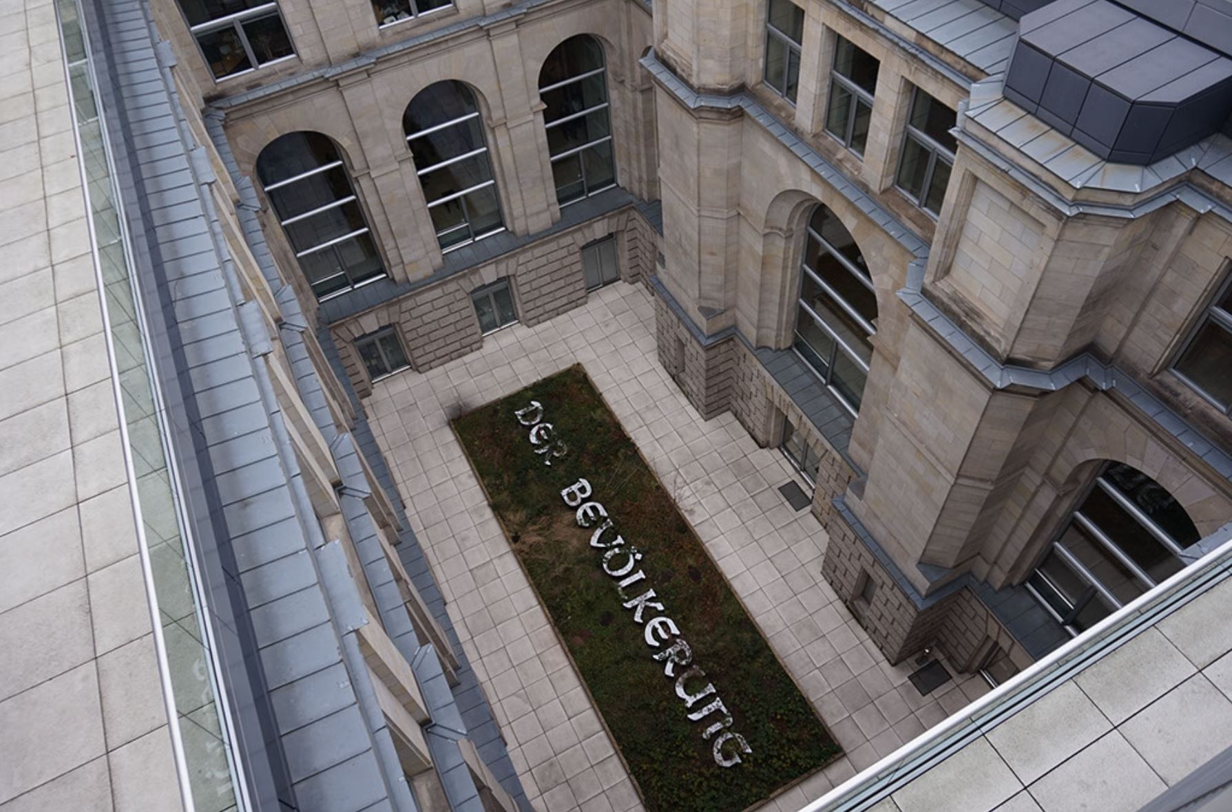
Figure 2: View into the courtyard of the Reichstag building. © Hans Haacke / VG Bild-Kunst.Haacke's installation "Der Bevölkerung" is located in a courtyard of the Reichstag building. This architectural context is part of the work. The building was constructed at the end of the 19th century, during the Second German Empire (1871-1918). In neo-baroque style, it paid homage to the national pomp under emperor Wilhelm II. Damaged by fire in 1933, it was further damaged during the Second World War. Located directly on the Wall to East Berlin, the dome was finally blown up in 1954. In reunified Germany, however, a new function was found for the building. Rebuilt according to plans by Norman Foster in the 1990s, it now serves the German parliament, the Bundestag.
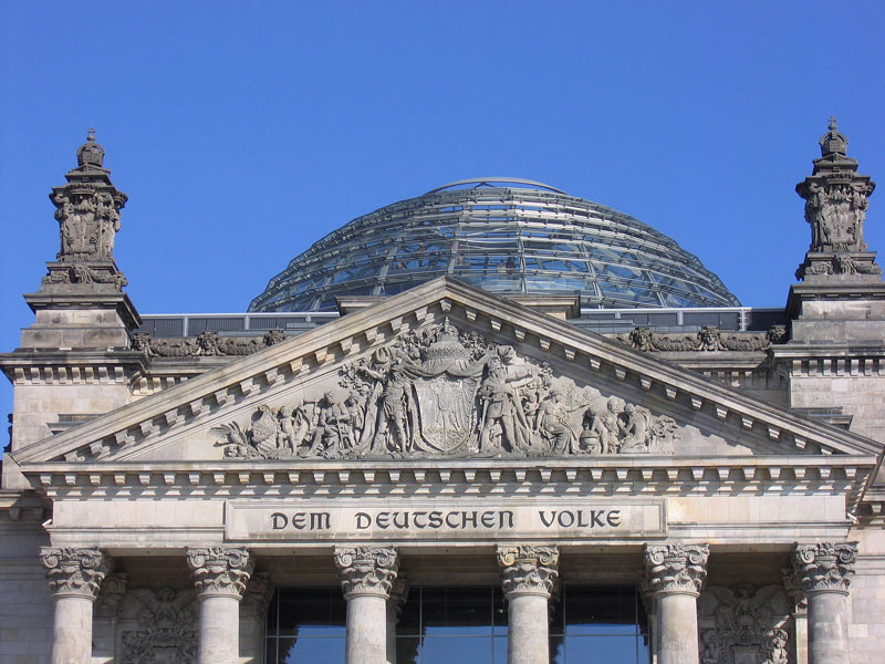
Figure 3: View of the façade of the Reichstag building with the inscription "Dem Deutschen Volke" © Hans Haacke / VG Bild-Kunst.
Hans Haacke built a 21 x 7 metre rectangular, flat wooden enclosure in this building. He then asked the MPs to gradually fill it with soil from their respective home regions. In the middle of the box, the inscription "Der Bevölkerung" (To the People / Population) can be read, in white letters illuminated from the inside. The typeface corresponds to the inscription "Dem Deutschen Volke" (To the German People / Nation), which has been on the outside of the building's west portal since 1916.[2] According to the initiator, the invitation to bring soil from the constituencies is valid as long as members are democratically elected to the German parliament. A webcam, belonging to the installation (www.bundestag.de), takes a picture every day at 2 p.m. and 8 p.m. and thus allows a take a look at the development of the project since 2000 and at the current situation.
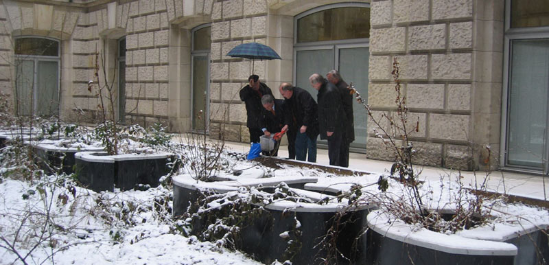
Figure 4: An MP distributes the home soil from his constituency in Haacke's installation. © Hans Haacke / VG Bild-Kunst
When Haacke proposed to install this large-scale installation in the new parliament in 1999, ten years after German reunification, it triggered a heated public discussion. Many MPs found the words "Der Bevölkerung" (To the People / Population), which appeared to be a dedication, inappropriate and provocative. Haacke was deliberately alluding to the older inscription "Dem deutschen Volke" (To the German People / Nation) on the outer façade. In contrast to this, he used the term " Bevölkerung - population" to refer to all the inhabitants of Germany, including people who do not have German citizenship and live here. According to his own statement, Haacke was inspired by Bertolt Brecht when deciding on the lettering. Brecht had written in 1935 in exile that whoever said population instead of people would avoid many lies (Brecht 1935). Haacke is obviously also concerned with the question of how words can and should be used in the context of a national parliament to designate the basis of this democratically elected representation of the people/population. Does the term "Volk" fit, a traditional, conventional but loaded and perhaps not at all accurate term? Or would be the term "population" better, a word that sounds unfamiliar and strange at first, but perhaps makes more sense. The discussion intended on such questions is part of Haacke's work.
Similar discussions were triggered by the idea of having MPs bring home soil. For many, this was reminiscent of the National Socialist blood-and-soil ideology. Or they criticised it as "kitsch" because of the well-intentioned but overused symbolism. Obviously, the work here plays with this iconographic tradition (“Heimaterde”), but reinterprets it just as it reinterprets the lettering. At the same time, the installation is constantly changing as a result - both through the ever-changing soil and through the growth of the plants over the course of the year.
Figure 5: Screenshot of the project's website https://derbevoelkerung.de
© Hans Haacke / VG Bild-Kunst.
The installation is thus in constant dialogue with the population designated in the inscription, tries to involve the MPs and responds as a living piece of nature to the stone surroundings of the parliament building. The work of art is thus never fully completed. Haacke's art project was particularly controversial in parliament; only by a narrow majority did the MPs finally vote in favour of the realisation of the artwork in 2000 after a specially scheduled debate in the Bundestag. The entire debate is documented on the project's website - as another part of the work (Bundestagsdeabtte 2021).
[1] I.e. a "small German" solution after 1990 and with shifted borders after 1945.
[2] It was designed by the Art Nouveau artist Peter Behrens.
References
- Brecht 1935: Bertolt Brecht. Five Difficulties in Writing the Truth. www.literaturwelt.com/werke/brecht/wahrheit.html (13.10.2021)
- Bundestagsdeabtte 2021: https://derbevoelkerung.de/bundestagsdebatte/
- Kaernbach 2011: Andreas Kaernbach. Projekt „DER BEVÖLKERUNG“ im Reichstagsgebäude. https://www.bundestag.de/besuche/kunst/kuenstler/haacke/haacke-198996 (13.10.2021)
- Winkler 2020: Heinrich August Winkler. Wie wir werden, was wir sind - Eine kurze Geschichte der Deutschen. Munich (Beck)
- Winkler 2021: Heinrich August Winkler. Das widerspruchsvolle Erbe des Otto von Bismarck. In: FAZ of 18.1.2021, p.6
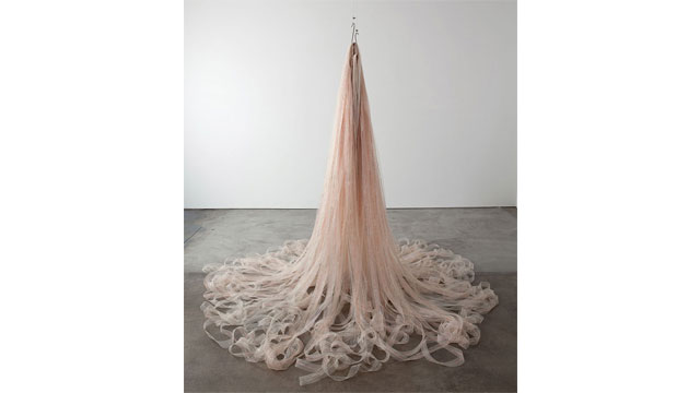

-

As a miniature, the sculpture Indépendence Tchao (2014) by the Franco-Algerian artist Kader Attia refers to the Hôtel de l'Indépendence in Dakar, Senegal. At the beginning of the1970s – a little over ten years after the independence of the west African country under Lépold Sédar Senghor and a few years after the first Festial Mondial des arts nègres (1966), the hotel was built by Henri Chomette and Roland Depret. Since the end of the 1940s and into the 1980s, the office of the French architects had built governemental and private buildings and others in numerous African countries. Indépendence Tchao was initially created as a site-specific installation on the occasion of the 11th Dakar Bienniale in Senegal. It refers back to the hotel high-rise with the sculpture; the ‘borrowing’ can immediately be recognized, above all by its characteristic brise-soleil façade. Kader Attia used discarded and somewhat rusty inex index boxes, stacked on top of each other. The inventory of the archive itself came from a dissolved administration in Algeria. Only a few kilometres away from the central exhibition venue of Dak'Art, the hotel still forms a striking, decidedly 'modern' architectural antithesis to the flat neo-classical colonial administrative buildings - an aesthetic incunabulum that symbolized the future in its outstanding verticality and modern furnishings. However, the former architectural icon is now empty and in a state of decay. Indépendence Tchao (the title is a reference to the famous song Independence Cha-cha from 1960/Kalle) thus refers both to a utopia that has grown fragile, the bursting of a dream; as well as to the persistence of colonial archiving and (also structural) standardization practices, to old and new (architect) networks in the postcolony.
Attia, Kadar. Pascale, Fernand Pouillon, Alger. 2012
https://inferno-magazine.com/2012/06/23/kader-attia-le-corps-utopique/ [Stand: 28.10.24]
Two further - this time photographic - works by the same artist also address the ambivalences and potentials of modern architectural promises: In the case of the photograph of a woman, seen from behind, surrounded by the mighty arcades of the 200-column courtyard, the connection between the body as the 'first architecture' and the 'built' architecture is central. Not least through the title Pascale, Fernand Pouillon, Alger (2012), it becomes apparent that the person is a transsexual. According to Attia in an interview, the strangeness in one's own body corresponds to the 'architectural' alienation that the inhabitants of the 'Climat de France' who had resettled from the Kasbah in Algier must have felt in the 1950s; the necessity of appropriation, re-territorialisation or even 'becoming at home' applies to both bodies (the human and the architectural).
Attia, Kadar. Déconstruir - Reinventer. 2012
https://slash-paris.com/en/evenements/construire-deconstruire-reconstruire-le-corps-utopique/sous/3669 [Stand: 28.10.24]
A reflection on transgression and imagination also lies at the centre of another photo: Déconstruir - Reinventer (2012) actually shows only the results of a minimal intervention in the standardized construction method, and yet these traces of spatial action are marked here as meaningful in the sense of aesthetic place-making.
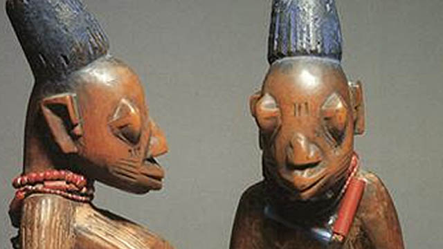
-
Historical link between the Ga and the Yoruba
It is believed that the Ga-Adangbe came from Ile Ife at Yorubaland in Nigeria through Seme, a settlement on the border between Nigeria and Republic of Benin of today. According to popular oral traditions, the groups migrated together crossing the Mono River but scattered after crossing the Volta River (Nortey, 2012). They settled on the Accra plains within the south eastern corner of Ghana (Kilson, 1974). Their initial administrative capital was Ayawaso but was later moved to Accra, as Ghana gained its independence in 1957 and Accra became the capital city of Ghana.
Indigenous belief system among the Ga and Yoruba
The Ga, like other ethnic groups in Ghana and Nigeria, believe in life after death. They demonstrate this belief through comprehensive funeral rites. The type of occupation the deceased engaged in on earth while alive is believed to continue in the next world and as such a coffin is carved to depict the work of the deceased for their burial. The Ga, just like the Yoruba people, belong to Islam, to Christian faith or to traditional religious beliefs (Leroy, Olaleye-Oruene, Koeppen-Schomerus, & Byrant, 2002). They believe in the immortality of the soul and on its re-birth, which are both essential to the Ibeji twin belief.
The Ibeji sculptural figures in perspective and their aesthetic considerations
The Ibeji figures among the Yoruba provide an insight into the recognition of twins within the Yoruba society. The visual sculptural form presents the viewer with a glimpse of what the Yoruba society cherishes through the lens of visual culture. The two figures are presented in semi-abstract forms showing a male and a female (based on genital characteristics). It also shows the relevance of beads in body adornment as found in their usage in the form of necklace, wrist-bands, and waist-bands. On the heads of the figures are scarifications (marks on the body) and both figures are holding a string of cowries.
Cowries were extensively used during pre-colonial times in Africa as symbol of wealth and used as currency and medium of exchange, for symbolic messages, as objects of divination, as jewelry and as a religious accessory, as well as a powerful force that represents the eye of the gods and the womb of the goddess (Yiridoe, 1995; Wayne, 2010; Odunbaku, 2012). Also, the projection of the breasts of one figure is an indication of a female with youthful exuberance.
The pronounced shapes in the figures are curves with minor angular forms in feet and ears. Both figures also show projecting and rounded forehead which are basic characteristics of many African figures. The head-gear is cylindrical and this is similar to that of the Dipo initiates among the Krobo of Ghana who are related to the Dangme.
Though the basics of African aesthetic differ across cultures, the common ones would include symbolism, togetherness, luminosity, craftsmanship, self-composure, and youthfulness (Molokwane, 2010; Vogel 1986). In the Ibeji figures, it is envisaged that a culture of teamwork was involved in the production process, from the felling of the tree through carving to the finishing of the statuettes, building a sense of communal unity. The craftsmen usually work with a master-craftsman. In terms of craftsmanship, the figures are sculpted intricately, with exquisite details, body adornment, and to excellent finish that has made them stand the test of time.
Symbolism is embedded into traditionally African made objects and the Ibeji figures are no exception. They have elegant glossy finishes that portray purity and well-being/good health. The author considers the statuettes (reference to the Ibeji figures) as being young: vibrant, healthy, and a source of strength.
Recognition of twins in Yoruba and Ga societies
In many traditional African societies, twins are considered of supernatural origin and raised emotional reactions ranging from fear and dislike to hope and joy (Leroy, 1995). It is believed that twins are able to grant happiness, health and prosperity upon their family. As such, their nurture is far more venerated than that of other children (Stoll & Stoll, 1980).
Another similarity in terms of belief and practice between the Ga and the Yoruba is that twins share the same combined soul, and it is envisaged that when a new-born twin dies, the life of the other is exposed because the balance of his soul has become disturbed. To forestall any danger, a special ritual is carried out. Though the Yoruba carve a small wooden figure as a symbolic substitute for the soul of the deceased twin, the Ga only perform the ritual. If both twins have died, two of these figures are made among the Yoruba. These statuettes are called Ere ibeji (from ‘ibi’, meaning born and ‘eji’, two; ere means sacred image).
The Ga believe that the twins are special messengers from the Supreme god and therefore highly revered. They also believe that they could bring either a good or bad omen to the society based on the way they are treated. The Yam Festival which falls on the Friday of the Ga Homowo festival celebrated in August, presents a special occasion for twins in the Ga community who are presented with special feast in a form of sumptuous meal and mashed yam with eggs. It is honouring the twins in the traditional families (Nortey, 2012).
During the Homowo festival celebration on Friday, twins carry herbal mixture (leafy concoction) called “baa woo” that is prepared in metal containers and they move through the township in a frenzied manner amid singing and chants. The special concussion is believed to induce fertility and as such people bath themselves with it with the hope of bearing twins.
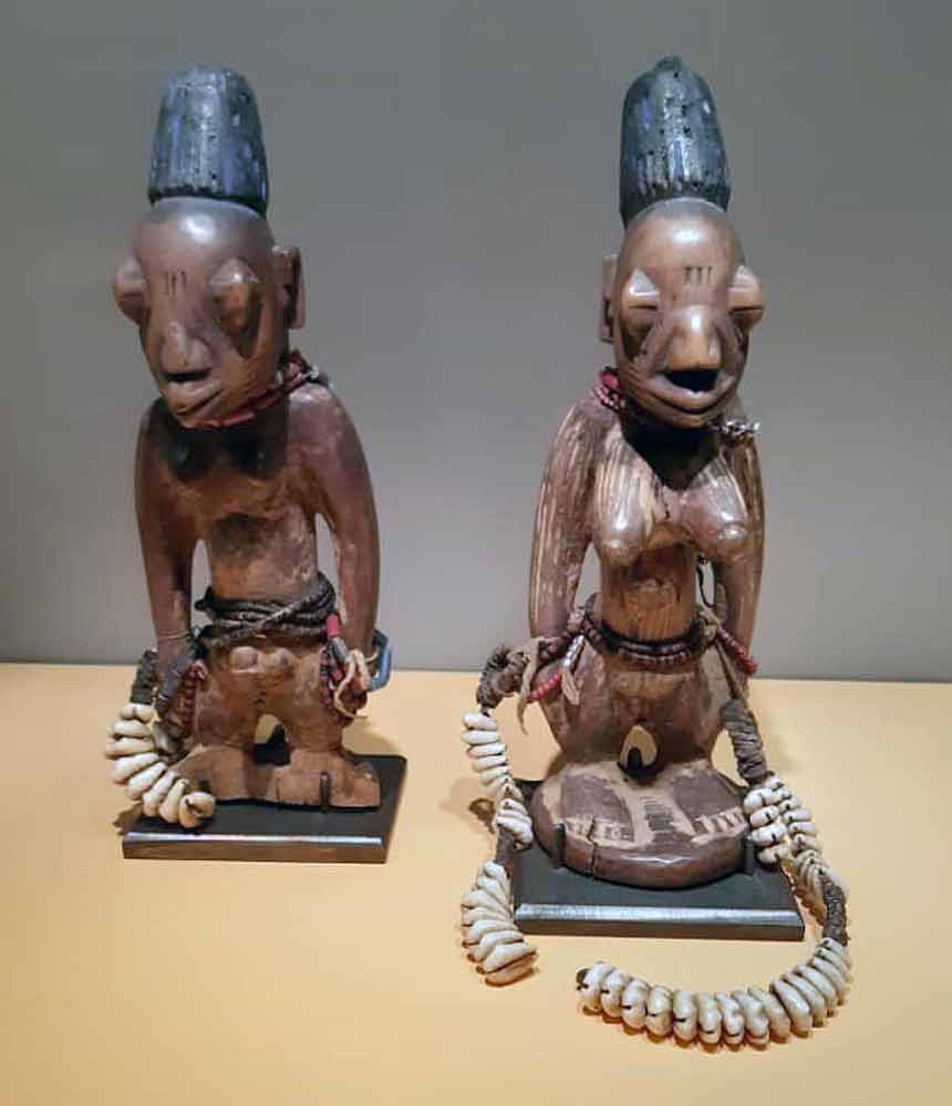
Unknown artist. Ibeji Twin Figures of the Yoruba. Presentation in the museum. First half of the 20th century. Wood, red chalk, cowries, glass. Height 27,5 cm. Museum Fünf Kontinente, Munich. © Museum Fünf Kontinente
Conclusion
The belief in reincarnation and life after death are linked to the Ga and Yoruba ancestor belief. As part of the veneration of twin in families, the Yoruba carve Ibeji figures that has symbolic and spiritual relevance among the people. Among the Ga and the Yoruba, twins are revered and honoured. Furthermore, the two societies believe that every human soul has a chance to return to earth as a new-born, mostly within the same family. The wellbeing of any family is dependent on that of its ancestors and twins. Therefore, periodic prayers/rites are said and sacrificial gifts are presented to ancestral deities, including the Ibeji figures.
References
- Kilson, M. (1974). African Urban Kinsmen, The Ga of Central Accra. London: C. Hurst and Co. Ltd.
- Leroy, F. (1995). Les jumeaux dans tous leurs états. Louvain –la - Neuve [Twins in every state], Belgium: DeboeckUniversité.
- Leroy, F., Olaleye-Oruene, T., Koeppen-Schomerus, G., & Bryan, E. (2002). Yoruba Customs and Beliefs Pertaining to Twins. Twin Research, 5(2),132-136
- Molokwane, S., & Shorn, B. (2002). The African aesthetic as it informs the product form. In:Computer-Based Design. Proceedings of the Engineering Design Conference, King’s College, London, 9 -11 July 2002.
- Nortey, S. (2012). Artistic Evolutions of the Ga Mashie Twins Yam Festival and Its Cultural Implications. Arts and Design Studies, Vol. 2, 2012.
- Odunbaku, B. J. (2012). Importance of Cowrie Shells in Pre-Colonial Yoruba land SouthWestern Nigeria : Orile- Keesi as a Case Study. International Journal of Humanities and Social Science, 2(18), 234-241.
- Vogel, S. M. (1986). African Aesthetics. New York: Center for African Art.
- Yiridoe, E. (1995). Economic and Sociocultural Aspects of Cowrie Currency of the Dagaaba of Northwestern Ghana Aspects. Nordic Journal of African Studies, 4(2), 17-32.
This article is part of a gallery: Perspectives from Ghana on Museum Objects in Germany
Published January 2021
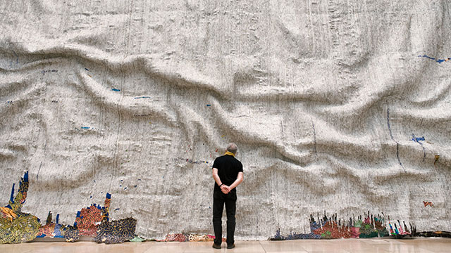
-
The Rising Sea by El Anatsui is a naturalistic presentation of an ocean in turbulence, which elicit attention through both grotesquery and finesse. The work, which covers an area of about 14,38 by 6,90 meters, is made up of several pieces of flattened aluminum bottle tops stitched together with copper wires into a massive sheet of grey wall overlay.
To achieve the intended illusion, the artist manipulated portions of the metal fabric into large series of ridges of different sizes that combine into an irregular rhythm randomly positioned across the surface of the sheet to simulate sea waves. Beyond supporting the movements of the sea waves, the rhythm created by the raised portions of the work also provides narrow range of values that effectively bring out the three-dimensionality of the work and transforms the otherwise flat sheet into an illusionistic volume.
Like the texture of oil paints in Van Gogh’s Starry Night, the texture of the stitched pieces of metals sheets introduce energy into the work, bringing out the fluidity of the sea and the potency of the mesmeric sea waves. Indeed, improper disposal of those materials used (and many others) is causing a lot of nuisance in his home country and other parts around the globe, with the sea being the most affected. Therefore, right from the materials used to its marvelous finishing, it is not difficult to discern a blend of severe censuring and admonition in the voice of the artist. The sea is, in the way presented, depicted as rising against improper treatment; and El, by the pains taken to stitch every piece of material together, seems to emphasize the need to make it our business to salvage the sea from improper handling.
The sea, which has served as an important source of livelihood for Ghanaians over the centuries invokes multidimensional viewpoints and draws out divergent responses and reactions depending on its relationship with the people. Among the coastal dwellers (and indeed a very great population of Ghanaians), the sea is considered an important resource for commercial activities, an arena for entertainment and recreation and grounds for spiritual exploits and worship.
He himself being born in the coastal town of Anyako in the Volta Region of Ghana, El seems to know so much about the sea. Growing up, he most likely experienced the sea being perceived, treated and utilized in many different ways. Besides its major use for commercial activities and other useful ventures, he might have listened to many stories about the sea as a god (with other inhabitants), as a provider and as a friend. He might have learnt about how the sea and her inhabitants contribute to the fortunes of the people. He might have witnessed how people got healed as they bathed in the sea, or had their fortunes turned around as they threw some coins in the ocean and made their requests known to the sea.
Beyond this, he might have also been warned about the consequences of flouting the taboos and other prohibitions that regulate the “use” of the sea, including forbiddance from desecrating the sea with unhealthy practices such as defecating in the sea, throwing filth into the sea or wearing sandals or shoes in the sea and the need to observe the tabooed fishing days, and so on. Besides, another important thing which Ghanaian coastal dwellers take very seriously is the need to adhere to physical signs and conditions of the sea, which have various local interpretations and implications. For instance, there are periods when the sea is considered as “full”, during which times the sea waves “rise” and become more intense and turbulent. Fisher folks are supposed to take a rest from “climbing the sea” (as they say in the local parlance) as the sea is likely to be unfriendly, and therefore unconducive for fishing.
Factors that cause the “rising” of the sea may not be ordinarily known. However, according to coastal dwellers, there is always something sinister about a rising sea – either somebody got drowned, or someone or a group of persons might have violated the rules of the sea god – and what motivated El in his presentation of the Rising sea might not be any different from what are traditionally believed. Probably the sea is fed up with deliberate dumping of wastes and toxic materials into her bowels. Therefore, she must rise!
But the “full” or “rising” sea is not as unfriendly as it sounds. Though it prevents fishing activities, which might be one way of punishing the people for disrespecting her, it also affords the people the opportunity to dry up their canoes, mend their nets and relax in the beautiful view of the sea along the coast. The occasions of the rising sea also witness other people who just move along the shores to observe the large waves that gather in the deep ocean, roll angrily towards the shoreline and dissolve tumultuously at the shore in a creamy white lather. The views at the seashore during these periods are nothing short of aesthetical experience that is shared by different kinds of observers with different perceptions, questioning, discussing, enjoying.
In so many ways therefore, the spectacle of observers in front of El Anatsui’s gigantic reconstruction of the Rising Sea gives so much semblance to the natural phenomenon, and this is a fundamental underpinning to the success of El’s work.
Culturally, the Rising Sea could be perceived as an allusion to the dynamisms in life, which sometimes rise against human tendencies and restrict mundane behavior, at the same time ensuring regularization of natural behaviors. What is important is to identify what is causing what, and how to seek for the right solutions.
For it to be presented as an aesthetic piece of work, El is probably saying that, the Rising is Sea is frightening; it is confusing; it is chaotic. But she is still beautiful, because in the right time, when given the right treatment, she will calm down so we have nothing to fear. She is still our god, our friend, our provider and our protector.
published February 2020
El Anatsui (* 1944) created 'Rising Sea' 2019 specifically for a particular wall in a comprehensive solo exhibition of his oeuvre entitled “Triumphant Scale” at the ‘Haus der Kunst’ in Munich. Like many of his other works, “Rising Sea” is a large-scale piece comprised of thousands of flattened liquor bottle caps (extrapolated approx. 190.000) that have been tied together with copper wire. It hangs like a large tapestry from ceiling to floor and though it looks solid, it is flexible and has a seemingly textile structure. The effect is monumental and magnificent; it impresses by the sheer size as well as by the sensual materiality of the almost infinite number of small, shimmering pieces of tinplate.
To see the composition we need to view the work from a distance. The sculpture is divided into three starkly contrasting horizontal zones. A vibrantly colored strip runs along the bottom. It appears fragile and becomes thinner and interrupted as it runs toward the lower right corner. The broad, massive, monochrome grey zone in the middle falls with heavy folds. The third zone at the top is a narrow, shiny, silver and smoother appearing plane that rises from its lower edge on the left in a sharp line upwards to the right, like a ‘Silberstreif’ (i.e. glimmer of hope).
Nearing the work, we discover bright flecks of color that emerge out of the shimmering mother-of-pearl gray middle zone. While some of the flecks appear to build concrete figurations others seem to be randomly dispersed. In the lower right corner small speckles of color gravitate toward and buzz around a concentrated cluster of speckles. We are enticed to move closer and to discover more details. Individual bottle tops become recognizable out of a speckled ‘field of pixels' or 'threads in the fabric’. One recognizes and reads the labels "Turn to open" and the names of African high-proof alcoholic beverages that are popular in Ghana or Nigeria where El Anatsui lives and works (KP Beverages, Bacco , etc.)
As with an impressionist painting, this work enables and requires two different viewing positions: close up and from a distance. Both perspectives tell different stories. In contrast to impressionism, El Anatsui’s stories address political and social issues of highest relevance. From a distance, the rising water level caused by global warming is addressed, to which the title of the work 'Rising Sea' refers. “Reading” from left to right, sculptural folds in the large gray middle area remind us of mighty waves that are in the process of destroying the narrow, speckled strip on the floor that we may associate with human dwellings and their fragile situation. The ‘Silberstreif’ is dwindling and so is hope. Obviously, this meaning is addressed directly and in all clarity.
The inscriptions on the bottle tops tell another story, the story of alcohol and slave trade during European colonialism in West Africa. Thousands of Africans were sold and taken across the Atlantic in ships to cut sugar cane in the Caribbean plantations to make rum. The rum was shipped to England and then later sold to Africa. Rum with its high alcohol content became another means of dominating an already exploited people. In the course of time, West Africans commonly used rum and other forms of alcohol for libations. However, El Anatsui only uses discarded bottle caps from liquor made in Africa today.
In turn, the process of 'sewing' the individual metal pieces together is an important, additional cultural-historical referral to El Anatsui’s roots in West Africa where there is a long tradition of weaving colorful textiles.
The close-up view of “Rising Sea” thus speaks of the past in West-Africa. Whereby the view from the distance, speaks of the future, a future that directly and indirectly affects the world globally. The narrative strands are connected by the idea of upcycling: discarded bottle caps become art, the cheapest material becomes sumptuous beauty, the past becomes present and future, regional colonialism becomes the narrative of a global threat.
It is important to remember that it is a black artist from Ghana exhibiting this threatening beauty in a space that was built in Munich to serve National Socialist racism. The title of the exhibition 'Triumphant Scale' alludes directly to this context, which Okwui Enwezor, the initiator of the exhibition, was certainly aware of. The Nazi regime, a regime without scale, built the Haus der Kunst, a building that broke all scales. El Anatsiu’s magnificent, grand scale triumphs over the excessive Nazi scale.
Challenging the Western concept of art
As an artist, El Anatsui is a representative of the Global South as well as of global art. He displays past and present catastrophes in decorative splendor. We can understand this message through classical analysis and interpretation on the base of the iconography of material and motifs. This system of decoding is familiar to us and confirms our Western expectations of a work of art. However, the simple explicitness of the content of El Anatsui’s work, poses a challenge to Western expectations of open, complex, self-contradicting art.
According to the latent notion of the community of art experts, if there is a clear content in art it should be as ironic, witty or distanced as possible. Hence, the intrinsic value of art (l'art pour l'art) eludes ideological appropriation and art gives no instructions for action. None of these tenets of Western art is is evident in Anatsui’s work. "Turn to open” with an arrow pointing up or down is the instruction repeated thousands of times in the middle section of “Rising Sea”. The sentence can be read as a directive for us to act on the challenges of our time.
El Anatsui thus negates the ‘prohibition' of unequivocal, direct symbolism and narration in the Western concept of art and its associated prohibition of politics and agitation. As a global artist, he challenges this concept. In addition, it is interesting to note that El Anatsui, unlike most Western artists, often leaves the responsibility of installing his work in exhibitions to the respective curators. In every exhibition, the same works look a little different, or quite different: folds will fall differently, pieces will be grouped differently and work that has been previously exhibited hanging on the wall may even be presented lying on the floor. With this artistic strategy, he formulates an unmistakable position from the Global South. Thus Western dominance loses its normative power in art and culture in general. The world becomes more diverse and polycentric.
Learn more about El Anatsui.
published February 2020
Two perspectives on one work of art
In 2019, a large solo exhibition of the Ghanaian artist El Anatsui, initiated by Okwui Enwezor, took place at Munich's Haus der Kunst. It was the occasion for Patrique deGraft-Yankson and Ernst Wagner to write together about one of the works there. deGraft-Yankson and Ernst Wagner agreed on a parallel writing process in order to minimise any mutual influence of their respective approaches. Thus, they knew nothing of each other's point of view. The resulting texts can be read above.
The result of this exercise is surprising and fascinating. In some aspects, of course, the interpretations of the work coincided, but in others they differed considerably. What they had in common, for example, was the appreciation of the production process and the impressive effect of material, size and surfaces. Also that the issue of environmental pollution plays a central role in the interpretation of Rising Sea. But it was precisely here that the first differences, even mutually exclusive approaches, emerged: for example, when deGraft-Yankson referred to the sea as a deity, a deity that can sometimes be friendly, but also unfriendly. Understood in this way, the sea in its immediate effect is simultaneously frightening and beautiful, it threatens and at the same time invites aesthetic enjoyment.
Ernst Wagner could easily relate this aspect to the Western aesthetic of the sublime, however, the difference becomes quite clear when we look at the underlying concept of what an art work is. deGraft-Yankson's text takes the work of art as its point of departure, but it always speaks of the sea itself, while Ernst Wagner always speaks of the work - and not of the sea. This different focus marks a fascinating difference: deGraft-Yankson is concerned with the sea, which he brings to us through his discussion, while Ernst Wagner is concerned with a work of art that simply has the sea as its subject. For deGraft-Yankson, the sea is "in" the work, it is really present. For Ernst Wagner, the sea is a represented motif, it lies "behind" the work, so to speak. It serves as a theme or a point of reference.
This has consequences for the methodology: while Ernst Wagner delivers an analysis of form, deGraft-Yankson focuses on contextualising the art work; he describes the significance of the sea for the people on the Ghanaian coast today. This difference is probably also due to the different perceptions of what the sea itself is: in his text, deGraft-Yankson speaks of the sea as an independent, souled entity, an acting being or a god that enters into a relationship with people. For Ernst Wagner, the sea - as part of the ecosystem - is also in relationship with humans, but he does not ascribe an independent will to it.
These different understandings of the relationship between human beings and the world are then echoed in an obviously equally different concept of what art or an art work is. In deGraft-Yankson's text, the work of art, like the sea itself, is charged with energy. The sea appears, as it were in the work, indeed it is present there. In the work, then, the sea materialises as something we perceive directly. In this sense, the work and the sea appeal to us to "preserve it from improper treatment [...] or it will be desecrated."
This approach of deGraft-Yankson, in which everything interpenetrates, is contrasted with Ernst Wagner's approach, which analytically separates everything: proximity and distance, splendour to be enjoyed and admonition to be taken seriously, discourse on colonialism and ecology, work and motif, art system and ecology, art system and colonialism, and so on. In the end, Ernst Wagner achieves a synthesis, but it only works on a meta-level by addressing the irritation of the Western concept of art through Anatsui's work. An irritation that dissolves or at least relativises the fundamental separation in Western understanding of viewer and object, of sign (the concrete work) and signified (the rising sea), of spirituality and reality, of art and ethics.
Annette Schemmel, then member of the ISB group, wrote to the the authors in 2020:
"Dear Patrique, dear Ernst,
Your texts are a great read and so complementary! For me, writing from Munich, the aspects raised by Patrique have opened up an entirely new reading of this marvellous piece of art, which I was lucky to contemplate at the exhibition of Haus der Kunst. What you're telling about Ghanaians' relation to the sea is unveiling and beautiful, thank you for unfolding these narratives here! Thank you all the more for sharing a piece of local wisdom (how the sea can react angrily) and linking these narratives to the global challenge of saving the sea, a challenge with impacts on localities all over. On another note, the evocation of "Starry Night" caught my eye at once and does make a lot of sense to me. I will be using it in my art classes, if you don't mind.
Ernst's reading of the piece is much more familiar to me, obviously. He is telling about the context of the exhibition on site in Munich, a context that is so highly charged! When exhibited at this specific museum, Anatsui's work can't but comment on our German history, laughing at its racism by means of its "immoderate" dimensions and calling for a long-due revision of our role in colonialism and in exploitative global circuits of goods like alcohol. It is for this potential of speaking to a place that artworks should always be seen in different locations!
I would also like to point out that Ernst is exemplifying a familiar method of accessing artworks here, a method that I am happily teaching to my pupils. This method from academic art history wants you to start from close observation and description of formal aspects of the work before risking an interpretation. By means of this strategy arguments about a work of art are meant to become more solid, even if this visible gesture of searching for the right interpretation makes a text less smooth. Thus, Patrique's and Ernst's approaches are totally complementary.
This said, I am not agreeing with Ernst in the way that "Rising Sea" is explicit in a way that certain Western art lovers might want to criticize. They might, but they would be very wrong. Let me explain: to me, the reproach of explicity rhymes with simplicity and a lack of layerdness. As you both have shown, "Rising Sea" does have multiple layers of possible interpretation and certainly some more, which have not been addressed here. These layers are visible, not only but most clearly, if the work is read against the backdrop of different locales. Artworks from our global age command us to look at them with changing perspectives. If certain Western art lovers can't be bothered to do this, they will forever be missing the point. Their fault. Let me add that you might even spot a good deal of irony in the way that El Anatsui has made this piece outstandingly beautiful, caressing the eye to the degree that every exhibition visitor wanted to take a selfie in front of it, while at the same time pointing to some very painful and threatening truths about today's humankind. Therefore, I would like to uphold that this artwork's relation to the viewers and to its places of exhibition is complex and challenging rather than simple or explicit.Annette"
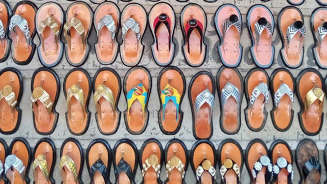
-
Fashion accessories help in decorating the human body and act as an essential influencer of accessories production and commodification. By decorating the human bodies, fashion accessories heighten the aesthetic aura around its wearers based on the precepts of the standard of beauty held by the society that created such objects. The production and commodification of fashion accessories are universal to different cultures across the globe. It happens in different parts of the world, including Africa. On the continent of Africa, different societies have demonstrated their creative prowess in fashioning accessories for the decoration of human bodies. For example, the Asantes of Ghana are known for their decorative gold weights, pendants, and other jewellery products that served as regalia (Rattary, 1927; Busia, 1951; McLord, 1981; Ross, 1982, Antubam, 1963; Kyeremanten, 1965; Fosu, 1994) for utilitarian and communicative purposes.
The use of artistic fashion accessories such as dresses, fabrics, footwear, headwear, brooches, earrings, belts, bangles, anklets, amongst others, have always had a strong political, social and cultural role in safeguarding the histories, values, and identities of different cultures. It implies that these fashion objects give hints that help to unravel particular histories surrounding their origin, material, tools, semiotics, and creators in society. Of the accessories that served as regalia, one of the commonest, yet essential and inevitable fashion objects for Asante kings/chiefs, and by extension Akan and even non-Akan chiefdoms is ahenema (native sandals). The usage of ahenema goes beyond Ghana. Some kings/chiefs in neighbouring countries such as Togo and Cote D'ivoire also use it as essential regalia for traditional functions. There have been instances where ahenema has seemingly been used as panoplied regalia and an authoritative object of the power of a king/chief. Ghanaweb (2007, August 18) reports of the Asantehene, Otumfuo Osei Tutu II’s destoolment of the Asomfohene, Nana Osei Kwabena, for flouting the chieftaincy orders of the Asante Kingdom. The destoolment process included the removal of his ahenema sandals to signify that the said chief has been destooled under Asante chieftaincy tradition. There were also reports that the Asantehene, Otumfuo Osei Tutu II, in December 2010 destooled the Queen of Atwima, Obaapanin Asamoah Duah II, and two sub-chiefs for taking a bribe (VibeGhana.com, 2010). As part of the destoolment rituals, the ahenema sandals of all the three culprits, which symbolised their office as traditional rulers, were removed from their feet. These instances of destoolment with the ahenema seemingly playing a symbolic role need further investigation. This is because the instances raise questions of the sociocultural relevance of ahenema regalia in Asante chieftaincy culture. Besides, the historical twist to the origin of this fashion object and regalia needs academic attention. This study, therefore, traces the historical origin of ahenema, and investigates its sociocultural relevance in Asante chieftaincy cultural milieu.
The theoretical perspectives that support this study is the object-based theory propounded by Lou Taylor. The study is situated in the object-based theory propounded by Lou Taylor (2002) and Riello’s (2011) methodological model of material culture of fashion. The object-based theory is concerned with materiality which has to do with description and documentation to bring out and classify garments or objects for historical purposes. It also focuses on the contextual attributes of the exhibits, oral history, company history, and design philosophy of fashion production (Taylor, 2002; Skou & Melchior, 2008). Riello’s (2011) methodological model of material culture of fashion which he borrowed from art history, anthropology, and archeology also makes fashion art objects central to historical studies and narratives be it socio-cultural, economic, and other practices of a particular period (Essel, 2017). Informed by object-based theory and material culture of fashion, the study considered the contextual attributes of ahenema, its oral history, design philosophy, description and documentation to bring out its history and sociocultural relevance amongst the Asantes and by extension, the Akan chieftaincy. This theoretical stance took ahenema fashion art object as central to historical studies and narratives in a sociocultural context.
Historical case studies constituted the research designs for the study. The historical case study helps in analyzing cases from the distant past to the present, using eclectic data sources, in generating both idiographic and nomothetic knowledge (Widdersheim, 2018). The use of the historical case study was informed by the fact that although case studies and histories can overlap, the case study’s unique strength lies in its ability to deal with a variety of evidence including documents, artifacts, interviews, and direct observations, as well as participant-observation beyond what might be available in a conventional historical study (Yin, 2018). A total of nine (9) respondents were purposively sampled for the study. They consisted of four (4) ahenema designers and producers with active experience ranging from 20 to 35 years on the job, two (2) chiefs and three (3) elders from chief palaces in Asanteland. Unstructured interview and focus group discussion constituted the method of data collection. Permission was sought from the respondents for face-to-face interview with the agreement to audio-tape for transcription purposes. Historical and narrative analysis tools were the data analysis tools used. With the historical research tool, the study used the heuristic of considering the source and the context of the data and corroborate it to ensure the trustworthiness and authenticity of the data gathered. Historical research concerns itself with identification, analysis, and interpretation of old texts (Špiláčková, 2012), eyewitness accounts, and other oral history and interviews. Using the narrative structure, data analysis was done to accentuate consistency, suppress contradiction, and produce rationally sound interpretation (Holloway & Jefferson, 2000) without truncating the content of the told stories about the lived experiences of the respondents. The historical narration was supported with photographs of ahenema taken with the permission of the creators. The transcribed and analysed data was shared with the respondents for verification purposes. The respondents also provided some pictures and permitted the researcher to use them for academic purposes. To ensure the anonymity and confidentiality of the respondents, pseudonyms were used in place of the original names.
The Akan word ahenema literally means ‘children of kings/chiefs.’ Legend has it that, when it was developed, only kings/chiefs and their families could wear it to show their status as royals. Later, it became permissible for the subjects and all to use. The king/chief belonged to the high class of society because they were the leaders of their flourishing kingdoms and ethnic states respectively. They had creative artists in their courts who produced functional and decorative artworks and fashion accessories used as body adornments. Per the high status of kings/chiefs in the society, the trickle-down theory, where new fashion art usage begins with the top echelon of society and gradually gets to the masses, exemplifies the spread and use of ahenema in Ghanaian society. Ahenema is also called Kyawkyaw. The word Kyawkyaw was derived from the sounds it makes when worn for the usual characteristic majestic walk. Respondent Opanin Kwame explained that:
Ahenema used to be worn by only the chiefs/kings and their families. If you are not a chief … you are not permitted to wear it. When the one who is not a chief is sighted wearing some at a durbar, the elders sent people to remove it from the person’s feet.
Legend has it that, the first ahenema was fashioned out of wood which served as the sole (called aseɛ) while the top (referred to as nsisoɔ or ahenemapɔnkɔ) was made of leather. It developed to a stage where the flat wooden soul was replaced with layers of animal skins, cut out to form the shape of the sandals. The animal skins (for example, okohoma) used as the sole produced the kyawkyaw sound when in use. The sound became the name of the sandals.
Respondent Opanin Antwi and Opanin Kwaku have been in the business of Ahenema production for more than thirty-five years. They make a living from the job, and have trained more than ten 10 and 16 apprentices respectively, some of which have set up their production shops. In a focus group discussion, they revealed that:
There are two basic soles (aseɛ) of ahenema, namely Asansatoɔ and Atenee (Figure 1). Beyond these, producers create new ones which are sometimes suggested by clients. It could be in the shape of animals like crocodiles, lizards, tortoises (Figure 1c) or fish. The soles have symbolic meanings that are usually associated with the animal or objects which influenced its creation. However, it is the top (nsisoɔ) that determines the name of the ahenema.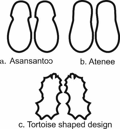
Some of sole pattern designs of ahenema. © Osuanyi Quaicoo Essel
There are different schools of thought on the etymology of ahenema footwear. One legend account traces it to the reign of the fourth Asante king, Otumfuo Osei Kwadwo Okoawia who ruled from 1764 to 1777(‘A Guide to Manhyia Palace Museum’, 2003). This account posits that Asantehema (Queen mothers) had specially made sandals, for they do not walk barefooted in the courtyard of the palace. One of the Asantehema once got injured in the foot while walking without sandals. The wound, according to legend, took long to heal and became a great oath of the Asantehema. Since this account is believed to have occurred during the reign of Otumfuo Osei Kwadwo Okoawia, then, the fourth Asantehema, Nana Konadu Yiadom I (whose tenure began in 1768 – 1809), was the possible beneficiary of the earliest ahenema footwear.
Bodwich’s (1818) narrative accounts of the culture of the Asante people offer some hints on the history of the ahenema footwear. In his description of the regalia of the kings, he pointed out that (p.35) ‘their sandals were of green, red, and delicate white leather …’ In thick description of what the king wore Bodwich said, their royal sandals ‘of a soft white leather, were embossed across the instep band with small gold and silver cases of saphies’ (p.38). Gold pendants and designs of varied symbolism that show the power and wealth of the Asante kings were used to embellish their unique ahenema footwears. Vansina (1982, p.222) offered hints of the period of production and usage of some ahenema. She revealed some of the artefacts including sandals and cast of gold rings had production dates estimated in the range of 1700 to 1900. This confirms the eighteenth century as a possible period ahenema sandals production in Ghana began.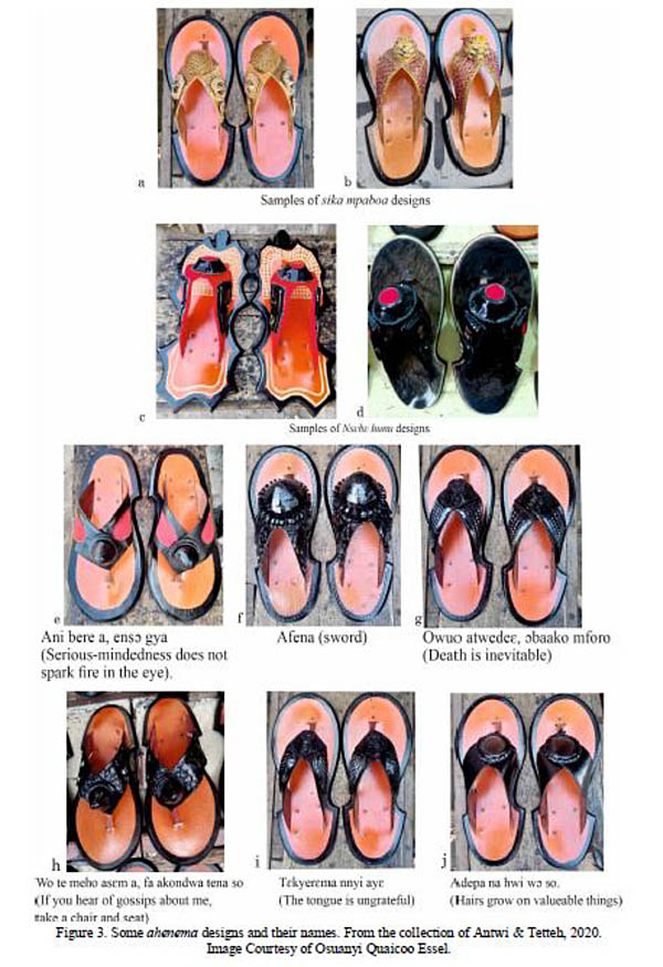
Categories of Ahenema. © Osuanyi Quaicoo Essel
There are categories of ahenema (image above). The categories of ahenema are traditionally informed by the kind of occasion and the purpose for which they are made. There are those used for funerals, durbars and festive occasions (festivals and other merrymaking events), especially, in the customs and traditions of chieftaincy institutions. The red, black and brown coloured ones are usually used for funerals to depict bereavement, sadness and death. In the Akan notion of colours, red, black and brown are associated with decay, death, bereavement and pain (Antubam, 1963; Amenuke et al., 1991), hence, its association with funerals. Those meant for durbar (adwabɔ) are the gold stud sandals (Sika mpaboa), silver and related colours. One of the Akan chiefs commented that:
To complement the wearing of toga style by the chiefdom, they desired to develop footwear to match with it. As a result, they developed ahenema for different occasions. They created ahenema for funerals and durbars. But there are some people who are unaware of the types and, therefore, use them anyhow. This suggests that there are categories of ahenema worn for different occasions but certain factors have caused its improper usage in the traditional cultural milieu. These factors include ignorance of the colour symbolisms as well as the meanings ascribed to the entire design. In one breadth, the users who default the conventional usage in terms of colour schemes and meaning may be doing so for purely aesthetical reasons rather than meaning associated with them.
Amongst the Akans (which form over 70% of Ghana’s population), ahenema is the traditionally sanctioned footwear accessory suitable for traditional gatherings or occasions. Wearing the toga fashion (usually 6- 12 yards of fabric gracefully wrapped on the body) without ahenema is culturally inappropriate in the traditional chieftaincy milieu. Likewise, it is traditionally unethical and unacceptable in Asante customs and traditions for kings or chiefs to wear the toga fashion classic without wearing befitting ahenema. Even for those who are not part of the chiefdom, wearing ahenema that is unsuitable for a particular durbar, funeral and other traditional events of the chiefdom are likely to invite troubles for themselves.
Per the categorisation of ahenema sandals, sika mpaboa (literary translated as ‘golden footwear/sandals) for example, is the highest status-defining type of ahenema footwear amongst the chiefdom. For the chiefdom in the Asanteland, sika mpaboa (Figure 3) is a preserve of the Asante King. No other paramount chief could wear it without his approval. Based on the achievement of chiefs under the rulership of Asantehene, he may honour a chief with sika mpaboa. Such honours remain a great chieftaincy laurel, privilege and meritorious achievement in the Asanteland. Once a chief has bestowed this honour, it implies that that chief has the power to wear sika mpaboa at traditional chieftaincy functions, durbars, or occasions. The sika mpaboa of the Asante king remains distinctive. It may be decorative with cast-gold (Ross, 1982) symbolic animal and geometric figurines that ornament the (top) nsisoɔ of the sandals. Bodwich (1818, p.256) confirms this centuries-old and long-standing tradition of who has the prerogative to wear sika mpaboa (ahenema stud with gold or golden colours). He writes:
The caboceers of Soota [Nsuta], Marmpon [Mampong], Becqua [Bekwai], and Kokofoo [Kokofu], the four large towns built by the Ashantees at the same time with Coomassie [Kumasi], have several palatine privileges; … These four caboceers, only, are allowed, with the King, to stud their sandals with gold.’
A chief who wears Sika mpaboa that is not sanctioned by the Asantehene to durbars and other traditional occasions is slapped with contempt. The act becomes contemptuous because it breaches Asante chieftaincy etiquette, customs and traditions, which is punishable. In support, one of the chiefs commented that: ‘Look, I’m a chief in the Asanteland, but I do not have the right to wear sika mpaboa. Should I wear it, I would be cited for contempt, for it does not show respect to the Asante King.’ There are ranks of chiefs. A subchief could not wear ahenema of a higher status and prestige such as sika mpaboa to a durbar of paramount chiefs. He will be cited for contempt. One elder recounts that:
We attended a durbar in the Asanteland. I wore a particular ahenema as part of my toga fashion. As custom demanded, I was part of the entourage that went to greet the chiefs at the durbar. While greeting, I overheard one of the subjects whispering to one of the chiefs, if I’m traditionally permitted to wear that particular ahenema. The chief sighed in the affirmative in response to his subject due to my status in the traditional area (N. K. Duah, personal communication, October 19, 2020).Ahenema names and Semiotics
As in the case of wax print fabrics, ahenema are given unique symbolic and proverbial names. The names are usually given by the producers. In some cases, the client suggests the preferred name for the producers to fashion the sandals based on that. Respondent Opanin Kwame added that:
We came to meet some of the design names given by some of the earlier ahenema producers. We also create some designs and name them based on Akan symbolism associated with animals, plants, human body parts, adinkra symbols, among others. I have personally created some designs based on periwinkles which are small marine snails. Per its tiny nature, many people usually eat it when they don’t have money to buy fish or meat. People, therefore, consume it in difficult times. Based on this I used the shells of the periwinkles in my ahenema design and named it Me nso meho behia da bi which literally means ‘I will be useful to people one day’.
The names given by the producers or suggested by the clients may cast insinuations, promote peace, warns against the ills of society and show one’s status. Some of the names are presented in Table 1 and Figure 3 respectively. For example, Ani bre a, ensɔ gya design (Figure 3 e), shows red-dyed leather used as in-lay against the black colour scheme to suggest the symbolism of it name. The red parts of the design look seed-like, an abstract representation of reddening eye, which symbolically suggests seriousness. Philosophically, this treatment connotes that no matter the degree of seriousness in pursuing something, it will not cause the eyes to redden. In other words, seriousness, as an attribute does not mean one has to be boisterous or overly expressive. One could be serious and yet show a calm disposition.
In the production of ahenema, some producers specialise in making the sole (called aseɛ) while others specialise in making the top (referred to as nsisoɔ). Both the sole and the top have their unique names. However, when the top is fixed onto the sole, the name of the top becomes the name of the ahenema.
Meaning of some ahenema designsName of ahenema Meaning Ani bre a, ensɔ gya. Serious-mindedness does not spark fire in the eye. Ebididi bi ekyi. There are classes/grades in things Enku me fie, na enkosu me abontene. Do not kill me home and turn to sympathize with me in public. Da bɛn na me nsoroma bepue? When will my star arise? Abuburo nkosua, adea ebɛyɛ yie no, ɛnnsɛe da. Something that is destined to succeed will never fail. Asaase tokru, oibara bewura mu bi. All are susceptible to death. Wo te meho asɛm a, fa akondwa tena so. If you hear of gossips about me, take a chair and seat. Tɛkyerɛma nnyi ayɛ. The tongue is ungrateful. Nsɛbɛ hunu. Powerless talisman Kɔtɔ didi mee a, na ɛyɛaponkyerɛni ya. When the crab is well fed, the frog becomes jealous. Ebusua dɔ funu. The extended family cares overly for the dead body. Ebusua te sɛɛ kwayieɛ. A family is like a forest. Akokɔ nae tia ba, na ennkum ba. The legs of the hen step on its chicks, but it does not kill them.
Ahenema symbolisms in enstoolment and destoolment
Ahenema is considered as irresistible chieftaincy regalia in the scheme of Akan customs and tradition. Without it, the adornment of any Akan king or chief becomes incomplete. This implies that it holds a central position in the chieftaincy diplomacy and culture. As a result of its inevitable role in that regard, it has become symbolic regalia in both enstoolment and destoolment of kings and chiefs. When a chief goes contrary to the etiquettes, rules and regulations, taboos, customs and traditions in his/her role which tantamount to destoolment, the removal of his/her ahenema from his/her feet is a symbolic sign of destoolment. One of the chiefs explained that:
When a chief faulter, the queen mother and the council of elders that throne, removes the ahenema from the feet of the culprit chief to show that s/he has been destooled. The affected chief could seek redress from the paramount chief under which s/he serve.
Likewise, in the enstoolment process, wearing ahenema signifies his/her authority. In both the enstoolment and destoolment process, the sandals connote power, authority and might. Beyond enstoolment and destoolment, the Akan observe some etiquette in the usage of ahenema because of its symbolism to show respect to the elderly or powers that be. One has to negotiate a partial withdrawal of the feet from the ahenema as a sign of respect and demonstration of custom adherence during the greeting of the elderly or chief at durbar or public gathering.
Ahenema occupies a central place in the chieftaincy institution, customs and traditions of the chiefdom and the life of Asante people, and by extension the Akan of Ghana. It has remained essential regalia that is inseparable from the customs and traditions of the Akan. Though the regalia is associated with the Akan, it was developed by the Asante people. As a culturally essential fashion object, its historical origin and socio-cultural relevance in Asante chieftaincy cultural tradition which remains largely uncharted was the focus of this study.
By delving into oral history, supported with available historical documents, the study positioned the root of ahenema (also called Kyawkyaw) regalia designing and production as an eighteenth-century Asante phenomenon during the reign of the fourth Asante king, Otumfuo Osei Kwadwo Okoawia who ruled from 1764 to 1777; and the queenship of Nana Konadu Yiadom I. The Asantehema Nana Konadu Yiadom I, whose tenure began in 1768 – 1809, was the beneficiary of the earliest ahenema regalia. Subsequently, ahenema became regalia for the chiefdom, a tradition which has remained unchanged; and spread to both Akan and non-Akan states and kingdoms till now. Some chiefdom in parts of Togo and Cote d'Ivoire use the regalia. From the chiefdom, the regalia did trickle-down to the masses. To be ablest with the evolving designs of ahenema in the twenty-first century require extensive documentation of existing ones for posterity. Also, the creators of ahenema designs need to be saved from the clouds of anonymity to reveal their creative contributions in fashion accessories production.
Ahenema design and production are informed by the purpose and functions (occasion) for which they are made. There are designs meant for funerals, durbars and festive occasions (festivals and other merrymaking events), by traditional authorities in the observance of the customs and traditions, while there those made for purely utilitarian and aesthetical reasons. The Akan notion of colours applies in the designs for the chiefdom. Of all the ahenema, sika mpaboa (ahenema stud with gold), is regarded as the most prestigious, for it is the preserve of Asantehene. A chief under his reign could be honoured with sika mpaboa. With ahenema assuming a fashion object of huge socio-political and cultural connections and signification, it would be of interest to delve into the power politics of ahenema and how it is used to negotiate self-actualisation among the chiefdom.
The regalia, Ahenema, has unwavering socio-cultural power in the (un)making of kings/chiefs in Akan culture in the realms of enstoolment and destoolment rituals of Asante chiefs as well as Akan chiefs as a whole. Ahenema are given unique symbolic and proverbial names by its original producers and, in some cases clients. The names have philosophical meanings that need decoding to fully understand the language of ahenema. In the traditional sense, failure to understand the language of ahenema, may land one into contempt.
References- A Guide to Manhyia Palace Museum. (2003). Ashanti Region Kumasi. Otumfuo Opoku Ware Jubilee Foundation.
- Bodwich, T. E. (1819). Mission from Cape Coast castle to Ashantee, with a statistical account of that kingdom, and geographical notices of other parts of the interior of Africa. W. Bulmer and Co.
- Busia, K. A. (1951). The position of the chief in the modern political system of Ashanti. Frank Cass.
- Ghanaweb (2007, August 18). Otumfuo sacks chief. http://www.ghanaweb.com/GhanaHomePage/economy/artikel.php?ID=129165
- Essel, O. Q. (2017). Searchlight on Ghanaian iconic creative hands in the world of dress fashion design culture (Unpublished PhD thesis). University of Education, Winneba.
- Fosu, K. (1994). Traditional art of Ghana. Dela Publications and Designs.
- Holloway, W. & Jefferson, T. (2000). Doing qualitative research differently. Sage Publication Ltd.
- Kyerematen, A.A.Y. (1965). Panoply of Ghana. Longmans, Green and co Ltd.
- McLeod, M. D. (1981). The Asante (87 – 111). The Trustees of British Museum.
- McCaskie, T. C. 2000. Asante Identities. History and Modernity in an African Village 1850-1950. Edinburgh University Press.
- Rattray, R. S. (1927). Religion and Art in Ashanti. Oxford University Press.
- Ross, D. H. (1982). The heraldic lion in Akan art: A study of motif assimilation in Southern Ghana. Metropolitan Museum Journal, 16, 165 – 180.
- Špiláčková, M. (2012). Historical research in social work – theory and practice. ERIS Web Journal, 3(2), pp. 22 – 33.
- Vansina, J. (1984). Art history in Africa. Longman Group Limited.
- VibeGhana.com. (2010). Otumfuo destools chiefs for taking bribe. http://vibeghana.com/2010/12/15/otumfuo-destools-chiefs-for-taking-bribe/
- Widdersheim, W. M. (2018). Historical case study: A research strategy for diachronic analysis. Library & Information Science Research, 40(2), 144 – 152.
- Yin, R. K. (2018). Case study research and applications: Designs and methods. Sage.
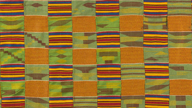
-
Noted for its attractive and bright colour schemes, a beautiful kente design is stuck on the walls of the entryway to the Permanent Exhibition of the African Collection at the Museum Fünf Kontinente. Its wide array of colours and strategic placement invites spontaneous spectatorship and captures into consciousness of visitors, the Afrocentric sense of colour use which is a precursor to the continental origin of the fabric. Indeed, kente originate from Ghana located on the African continent. Kente fabric designs have also gained international reputation and attracted considerable amount of research that centre on its historicity, weave structure, symbolic patterns, semiotic power, design structure, and its loom and the corresponding accessories, amongst others. Featuring the kente design in the collection by the curatorial team complements to drawing renewed attention to the indigenous fabric design technology of Africa.
Historically, kente has been known as a cloth which was a preserve for royals (kings and the chiefdom) in the Asante kingdom. It was later produced for use by all in the society. Being a fabric for royals, it signifies pride, wealth, power, authority and status of wearers. Though its usage extends to all, the kente designs worn by the Asante Kings are unique, distintive and of couture standard. The culture of adorning the Asante Kings with the top notch kente designs as in the ancient times has, therefore, not been eroded. In the court of the Kings were seasoned kente designers and weavers carefully selected to produce stunning kente design that are not found on the market. The fabric was woven with variously dyed handspun cotton yarns, in plain and double weave format in the form of stripes usually determined by their design structure. The stripes are joined together with the aid of a needle to form a wide sheet of fabric. The zigzag machine has become a replacement in joining the stripes together.
On the political sence of Ghana, the first president of the country, Osagyefo Dr. Kwame Nkrumah’s introduction of national dress agenda evoked the kingly use of the fabric in presidential inauguration ceremonies which has become a non-statutory policy emulated by six out of eight democratically elected presidents of Ghana from 1960 to present (Essel 2019). Nkrumah was the pacesetter in the use of kente in toga style for presidential inauguration in the history of Ghana. Prior to that he had worn kente fashion to political events and meetings in and outside Ghana before he became the president of the nation. His exemplary use of the Ghanaian fashion classic has been maintained and practised for more than half a century, though it is non-statutory.
Apart from its aesthetic clout, kente comes with symbolic patterns, whose decoding reveal the philosophical message encoded in the woven patterns of the fabric. Structurally, the kente fabric design featured in this exhibition encompasses variations of babadua, kaw, nkyemfre and fa hia kɔtwere Agyeman patterns, amongst others.
Figure 2: Top row: Variations of Babadua patterns. Bottom row: Names of some identifiable Kente patterns (Photo: the author)
Babadua is a name of a plant based on which the pattern was developed. The plant is noted for its strong look and resilience, perhaps a reason for its choice. Babadua, therefore, signifies strength, resiliency, formidability, firmness, superiority and power. These symbolic attributes of babadua is communicated by its wearer to observers. There are variations of babadua patterns used by kente designers (Figure 2). Some of the variations of babadua patterns are captured in the kente design (Figure 1). Nkyemfre (‘a pot shed’) pattern, depicted with alternating right-angled triangular shapes, symbolises history, recyclability and healing power, knowledge and service while Kaw mframa pattern derived from the physical characteristics of centipede, symbolises uniqueness. Fa hia kↄtwere Agyeman (literally translated as ‘lean your poverty on Agyeman’), arranged in the form of staircase in diagonals stands for hope, faith, sharing and benevolence (Essel, 2019). Combination of these observable kente patterns deftly arranged to communicate the idea of history, power, hope, pride, healing power, knowledge and service. The philosophical interpretation of kente designs could be informed by decoding its symbolical patterns. It could be observed that the variations of Babadua patterns dominate in the design (Figure 1). The dominance of this pattern informs the overall message embedded in the design. In this context, the fabric sings praises to the power and superior status of a king or chief in keeping intact the history and indigenous knowledge systems of the society.
Kente has become a prominent visual image and identity marker used in reference to the African continent. For instance congressional democracts led by Nancy Pelosi on June 2020 wore kente stoles to make political statement in pursuit of legislative goals of equality for Black people. This occured in solidarity of the gruesome death of the African-American George Floyed in the hand of white police and police brutality in the US. The kente fabric adorned by the lawmakers was used to signify African heritage and pride. During the 400th anniversary celebration of the arrival of enslaved Africans to America in 2018, the Congressional Black Caucus wore kente in paying allegiance to their African heritage. Kente fabric, therefore, has strong historical connections with Blacks across the globe.
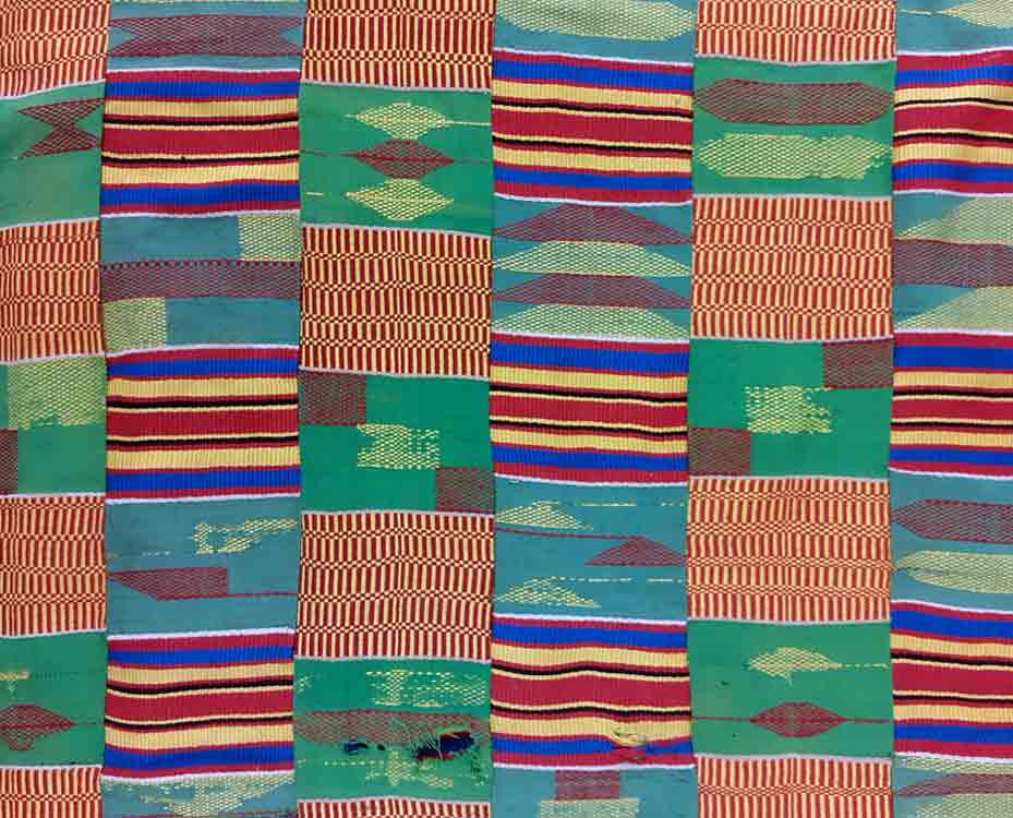
The Kente fabric in the depot of the Museum Fünf Kontinente © Museum Fünf Kontinente (Photos: Sophia Lubin)
Teaching and learning of kente fabric with the focus on history, sociocultural, political significance and educational relevance; improving the production technique for mass production purposes; improving of loom and its accessories; and alternate way of creating handmade kente print, among others, informed my teaching. Learners under my tutelage also explore appropriation of the symbolic kente patterns and engage in experimenting with kente designs.
published January 2021
Reference
- Essel, O. Q. (2019). Dress fashion politics of Ghanaian presidential inauguration ceremonies from 1960 to 2017. Fashion & Textiles Review, 1(3), 35 – 55.
This article is part of a gallery: Perspectives from Ghana on Museum Objects in Germany
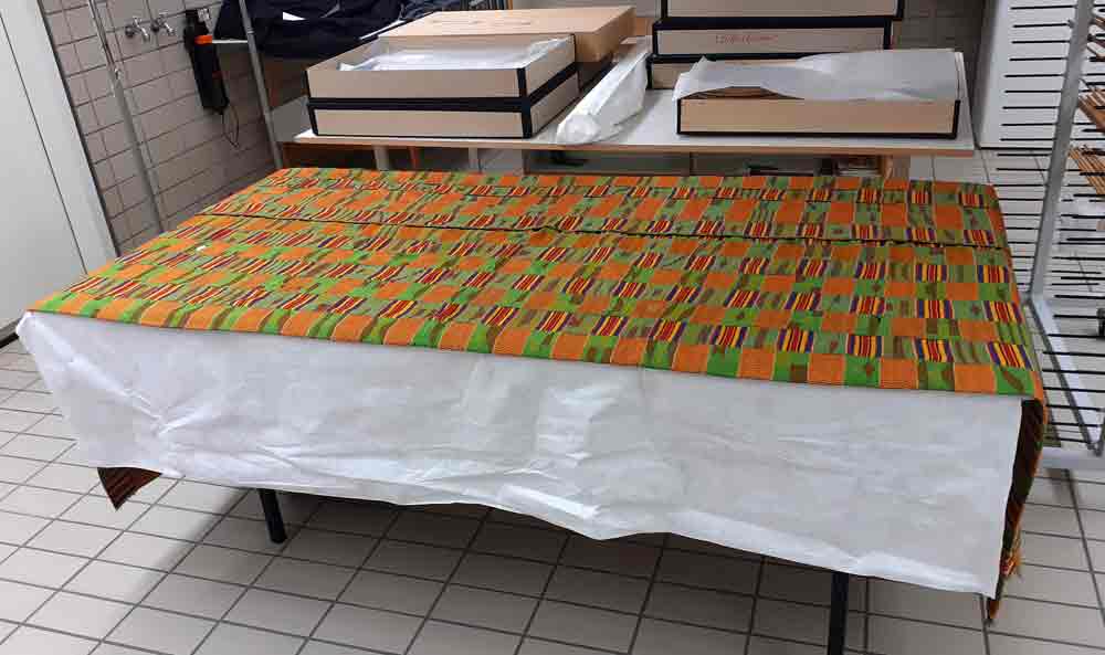
The Kente fabric in the depot of the Museum Fünf Kontinente © Museum Fünf Kontinente (Photos: Sophia Lubin)
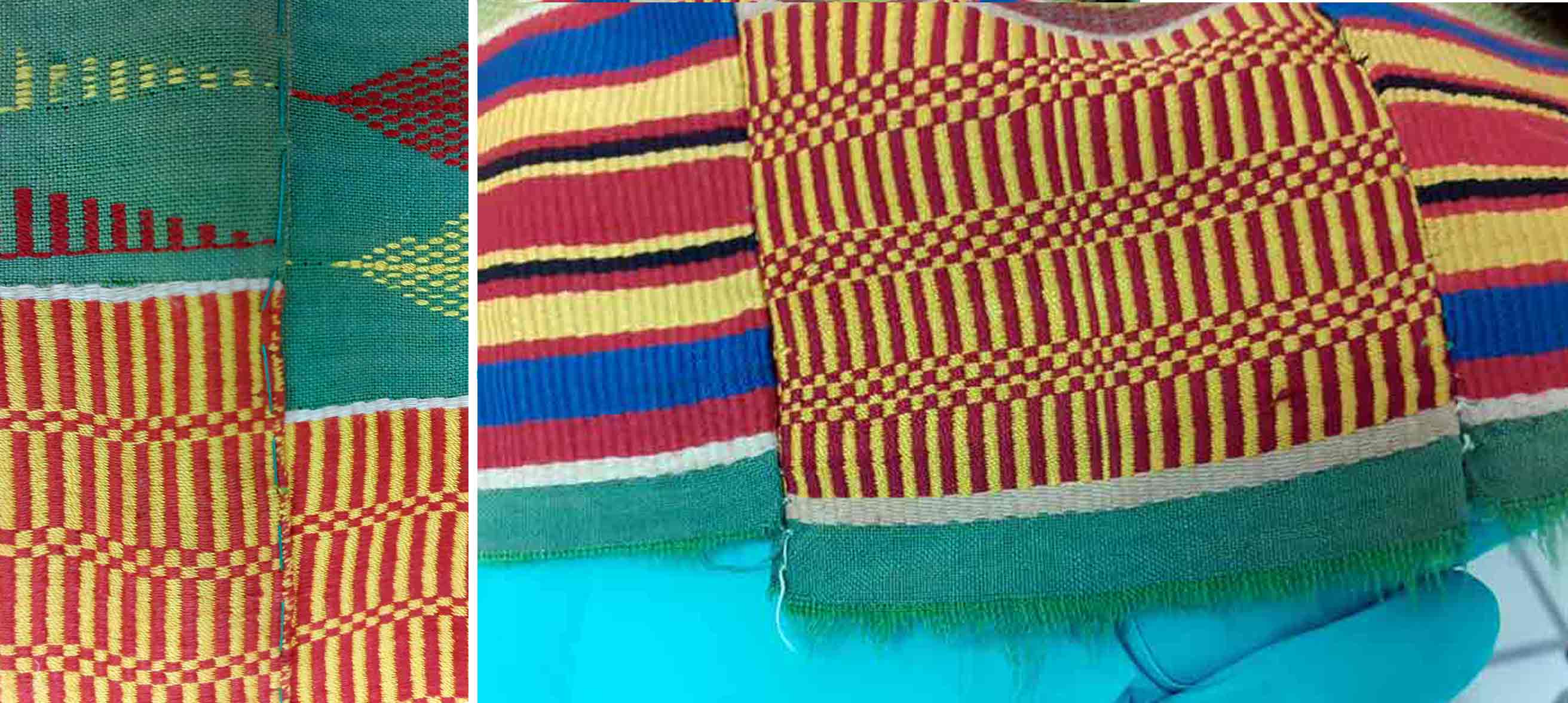
The Kente fabric in the depot of the Museum Fünf Kontinente © Museum Fünf Kontinente (Photos: Sophia Lubin)

-

The Koma figurines did not only enrich the stock of African artwork but evoke the minds of a great culture represented or embedded greatly in these art pieces. These figurines have been classified into anthropomorphic (the use of human features), and zoomorphic (the use of animal features), based on the stylistic representation while some are both anthropomorphic and zoomorphic (they possess both human and animal features). They are some of the anthropomorphic figurines that have one head and two faces or one body with multiple heads while some have a head with a conical shape. Those anthropomorphic coned figurines are the most common types and are consisting of a head with a long conical neck or body.
The Koma figurines could be equated to those of Nok and Ife (in Nigeria), Sao (around Lake Chad), the Akan funerary clay figures (in southern Ghana), and the Jenne and Bankoni clay figurines of the Inland Niger Delta (in Mali). Beyond their artistic significance and historical products, the Koma figurines have generated some interest among intellectuals in and outside Ghana including antique dealers.
Before the scientific investigations commenced in the 1980s and 2006 onwards, the communities within this geographical area known as "Komaland" were encountering or recovering these terracotta figurines when they were digging for soil to build their homes. The people then referred to them as kronkronballi which literary means "children from an old-time". These figurines are either found in house or burial mounds within the area. The culture of the current inhabitants of the area where these figurines are found do revere their ancestors, and any disturbance of the ancestral graves or the removal of any burial goods either intentionally or accidentally must be expiated by sacrifices, and all the grave goods are reburied at the same place. Since the people are far remote from the creators or ancestors of these figurines, many of the damaged ones were either thrown away while a significant number of them were taken home and given to children as toys.
Moreover, art dealers in Ghana and West Africa recognized the commercial value of these Koma figurines long before the scientific investigations by the first anthropologists, archaeologists, and historians. These Koma figurines were, therefore, sold at the various art markets in northern Ghana (in Bolgatanga at the craft village) and southern Ghana (in Kumasi and Accra art centers) to foreign tourists. It is through this medium that Koma figurines have found their way into many European and Western museums.
Furthermore, scientific excavations in the 1980s and the subsequent excavations in 2006 onward by a team of archaeologists in Ghana and abroad, have attracted the attention of the world through conferences and publications. The Koma figurines were initially appreciated based on their aesthetic values but the subsequent archaeological excavations subjected them to more rigorous scientific analysis and historical classification such as social, cultural, political, and environmental. The scientific excavations have also to some extent put a stop to the numerous lootings of the sites that were hitherto very rampant.
The archaeological investigations in recent times and based on radiocarbon analysis from pieces of charcoal dated the site between the 6th and 14th centuries AD. But further investigations are still ongoing to identify the authors or creators of this supposed complex civilization in northern Ghana though, parallel has been made to the Lobi in Ghana and Burkina Faso.
-
Louis XIV (1638-1715), King of France, was painted by Hyacinthe Rigaud (1659-1743) in his palace in Versailles near Paris in 1701. The oil painting was larger than life: 277 cm in height and 194 cm in width. The official title reads: Portrait de Louis XIV en costume de sacre. The painting is exhibited at the Louvre in Paris (INV 7492, open access), and a copy is in the Bavarian State Painting Collection in Munich.
In this portrait, the king is shown dressed in the official royal robes of the monarch, posing magnificently in front of his throne, which is placed in the background. In the painting are gathered together all of the traditional symbols of a ruler: the crown, the sword, and the ermine cloak, which uses the fur of this most precious animal.
Hyacinthe Rigaud was a famous and experienced court painter and had many assistants in his big atelier, so we do not know which parts of the picture are actually done by him. Since photography was not yet established at the beginning of the 18th century, every court employed artists specialising in portraiture to show people what their ruler looked like, or rather how he was expected to look or wanted to be seen in order to legitimise a political programme of monarchy. Specific iconographic symbols and accoutrements were used to demonstrate the tradition of rulership, which was thought to be bestowed by divine right. Rigaud fulfilled the wishes and orders of his patrons, but he also showed subtle characteristics of the people he painted.
‘Absolutism’: Paradigm of a ruling structure that today is considered a myth
Nowadays, the portrait is often used for educational purposes to visually substantialise Louis XIV as the most important representative of ‘Absolutism’ in Europe, the regime of direct rule with no control by a parliament or council: ‘L’etat c’est moi’ (‘I am the state’), he is said to have described his understanding of his place in the world. Research has discovered that he never really defined his role in this way (first in Bernier, 1988, p. 110). However, it is true that he was attributed with the image of being the central part of nature and the cosmos: as the ‘Sun King’, he was staged as the genesis and focus of all energy whence all life originates.
Scholars of the early modern era (Henshall, Wrede, Reinhard) consider ‘Absolutism’ to be a myth constructed in the 19th century. Since Gerhard Oestreich observed the ‘non-absolutistic elements in absolutism’ in 1969, many studies have pointed out that the king depended on an influential elite as well as a number of committees. A complex and effective network of groups existed as the executive authority controlling the political system, as Althoff and Stollberg-Rilinger have shown in their groundbreaking books on the political organisation of the late medieval and early modern states in Europe. In their publications, they describe the ritualised methods used in communication between the influential groups in order to find a consensus. As result of that scholarly discussion of the topos of ‘Absolutism’, Wolfgang Reinhard, like other scholars, recommends, ‘that one should abandon the term’ (p. 40). But, as it is rooted quite deeply in the historical consciousness, this does not seem so simple. Martin Wrede complains in his article ‘Absolutismus’ in the handbook Enzyklopädie der Neuzeit of the continuation of the topos, namely ‘the cliché, still firmly anchored in popular views of history as well as in textbooks, of the all-dominant, all-regulating, arbitrary state built on princely power and with a splendid façade’ [‘das in populärem Geschichtsbild wie Schulbuch nach wie vor fest verankerte Klischee des alles beherrschenden, alles reglementierenden, auf fürstliche Macht gebauten Willkürstaates mit prachtvoller Fassade’] (p. 33).
The portraits of Louis XIV and other kings are used to prove the existence of this colourful glory, whilst in reality, the monarchs were representative figures and personal symbols. During Louis’s lifetime, France expanded its territory in Europe and overseas, which brought extreme losses and financial burdens to the people. Because of that disaster, it was necessary to produce a reputation of honour for the king.
Interpreting the portrait
The portrait shows Louis XIV at the age of 63, at the height of his success. But he does not appear as a strong and resolute ruler who travels around in his country, nor an active fighter who leads battles to defend his people. Pupils today always miss a specific physical ‘masculinity’ that they expect from a king They fault this person for not being able to move, run, or ride in his heavy clothes, high heels and white tights. He is forced to stay indoors, surrounded with sumptuousness. They perceive him as ‘feminine’, as the only part of his body he is presenting is his legs, much like a young woman in a miniskirt, and the grandiose wig with its long hair hinders many activities. The entire image seems ridiculous to today’s pupils. What we see here is an old, ill, vain man who is dressing up to fulfil representative duties. What pupils remark is not just some disrespectful observation but is in line with what we know about reality. Rigaud is a superb artist to show the man in his demonstration of the ritualised courtly pageant of luxury.
There are more paintings showing Louis at different phases of his life. As all royal children, he was kept in the same pretty clothes as girls during the first six years of his life. Portraits show him even at the age of ten with facial features and accessories we perceive as feminine and fanciful, not suited to preparing for the life of a strong ruler. The official regent for Louis until he turned 22 was his mother, Anna of Austria. Louis strengthened the Catholic church but did not follow her order of monogamy: besides his six legal children, he had eleven illegitimate ones, all of whom he cared for (Bernier, Tischer, Wrede).
The ideal of masculinity during this time was the mixed one of early modern times, when gender was more hybrid than in the 19th/20th centuries, and life concepts were not sharply polarised between men and women in different spaces, placing men in the public sphere (Dinges, Lundt). Also, the central symbolic figure for the state was not necessarily masculine; there were very influential wives, concubines, and even female rulers.
Conclusion
In the educational process, it is important to dismantle prejudices about past ideals for masculinity as being strong, powerful and heroic. The historic examples of individual men’s glorious performances on European thrones need to be questioned. Pictures like the one of Louis XIV can help to construct a different understanding of courtly life. If it is understood against the background of a plurality of life concepts for ruling men and women, it can help us to see the limitations of their power.
References
- Gerd Althoff: Rules and Rituals in Medieval Power Games, Brill Academic Publ. 2019.
- Olivier Bernier: Ludwig XIV Die Biographie, Albatros Verlag 1988. English edition: Louis XIV, New Word City 2018.
- Ida Blom, Catherine Hall, Karen Hagemann: Gendered Nations. Nationalisms and Gender Order in the Long Nineteenth Century, Bloomsbury 2000.
- Martin Dinges (ed.): Männer-Macht-Körper. Hegemoniale Männlichkeiten vom Mittelalter bis heute, Frankfurt am Main 2005.
- Karen Hagemann: Gender, War, and Politics: Transatlantic Perspectives 1775-1830, Palgrave Macmillan 2020.
- Nicholas Henshall: The Myth of Absolutism. Change and Continuity in Early Modern European Monarchy, London 1993 (first published in 1992).
- Bea Lundt: Die Grenzen des Heros. Vielfältige Männlichkeiten in Mittelalter und Früher Neuzeit. In: Martin Lücke (ed.): Helden in der Krise. Didaktische Blicke auf die Geschichte der Männlichkeiten, Berlin 2013, pp. 67-102.
- Gerhard Oestreich: Geist und Gestalt des Frühmodernen Staates, Duncker & Humblot-Verlag 1969.
- Wolfgang Reinhard: Geschichte des Modernen Staates, München 2007 (and elsewhere).
- Barbara Stollberg-Rilinger: Des Kaisers alte Kleider. Verfassungsgeschichte und Symbolsprache des Alten Reiches, C.H. Beck Verlag 2nd edition 2013.
- Anuschka Tischer: Ludwig XIV, Stuttgart 2016.
- Martin Wrede: Absolutismus. In: Enzyklopädie der Neuzeit vol. 1, Stuttgart 2005, cols. 24 -34.
- Martin Wrede: Ludwig XIV. Der Kriegsherr aus Versailles, Darmstadt 2015.
Translated from German by Kelly Thompson.
published September 2020
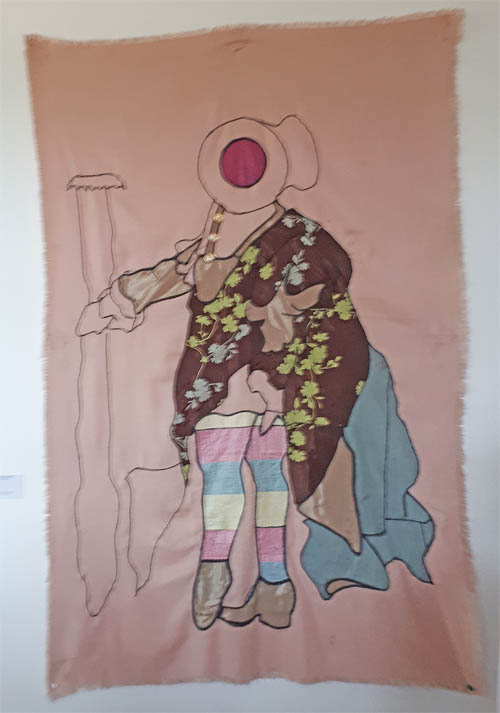 Prince Osei Owusu Bempah, from the exhibition "Orderly Disorderly" - End of Year Exhibition, KNUST (Kwame Nkrumah University of Science and Technology) in Kumasi, Ghana, Museum of Science and Technology in Accra, 2017, © Prince Osei Owusu Bempah
The artist Prince Osei Owusu Bempah from Ghana artistically examines in two art works the portraits of Louis XIV (and below a typical European equestrian portrait of a ruler, like e.g. Charles V, painted by Titian 1548, today at the Prado Museum in Madrid). "Bempah appropriates historical images in the form of painting, sculpture and photography. Considering images as a multiplicity, he is now drawn to news from social media, television, radio and newspaper. Information is crucial to the making of his works which extends beyond the visual representations. He reinterprets them in tapestry, embroidery, banners and uses plastic sacks, curtain accessories, second hand table cloths and silk in different configurations. He substitutes certain elements of the original images with mortars and pestles" (leaflet of the exhibition).
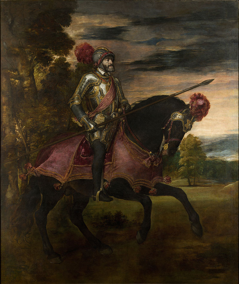
Image 1:Prince Osei Owusu Bempah, from the exhibition "Orderly Disorderly" - End of Year Exhibition, KNUST (Kwame Nkrumah University of Science and Technology) in Kumasi, Ghana, Museum of Science and Technology in Accra, 2017, © Prince Osei Owusu Bempah. (left)
Image 2: Tizian, Carlos V en Mühlberg, 1548, H: 335 cm, W: 283 cm, Oil on Canvas, Museo del Prade. (right)
published November 2020
-
Catching a glimpse of the feminine hairstyles (re)presentation in rows on a single support, brings to memory the barber salon promotional campaign artworks that served as visual displays to invite potential customers in parts of Africa in the past. Artists in the community were commissioned to create picturesque signages that display plethora of Afrocentric hairstyles on wooden boards and placed in front of hair salons or vantage points to attract potential clients. The artworks served as form of advertisements to the salon operators. Some itinerant hairstylists moved around with these signages in search of customers. The painted images have been replaced with printed catalogue of pictured hairstyles printed on large sheet of papers and flexy materials which are displayed in and outside salons in the communities. The picturesque hairstyles signage presented in this exhibition reminisces the artistic practice of creating these portraits as form of hair salon advertisement in Togo, Ghana, Nigeria and other West African countries.
Cutout from anonymous artist, second half of the 20th century, plywood, oilpaint, Image: Osuanyi Quaicoo Essel.
Uniformly arranged on a support, the artist presents fifteen Afrocentric feminine flashy plaited coiffures in portrait orientation. Of the fifteen hairstyles, one occupies the epicentral position of the entire composition in frontality of pose, depicting her full facial details in simple flat tone of brownish colour with the hair stylization rendered in black. Her rigged neck, pronounced eyebrow and bejeweled ears depicts her feminine characteristics. In Togolese culture, wearing of earring is a preserve of females as in the case of Ghana and some West African countries. The artist’s treatment of this centrally placed figure gives hint of Togolese feminine beauty standards. Four of the hairstyles are shown in side view, facing the left. Similar to these four figures in profile are the type-form head, rigged neck details and varying earrings. The rigged neck features found on these four figures also appear on the centrally placed figure in the composition. With this treatment, the artist makes visual notation of feminine beauty culture standards that characterised some West African countries. Rigged neck feature is considered as a marker of beauty ideal, and commonly depicted in West African feminine sculptures. For example, Akuaba (wooden doll, predominantly used as fertility figure), of Ghana is often armoured with rigged neck characteristics. Understanding the beauty culture ideals of Africa depicted in this simple but interesting hairstyles composition offers viewers of African art a better understanding of the art.
To reveal a great deal of the level of sophistication of the hair stylizations, the artist showed ten of the figures in back view posture, three each atop and down in horizontal placement, while four are arranged in a kite-shaped arrangement in the middle portions of the painting. The artist generates visual interest with the arrangement of the figures to create a sense of movement, variety and rhythm. For example, in the depiction of the clothing of the figures, shades of reds were used in a serpentine orderliness that forces the eyes to traverse gracefully upon a gaze from the topmost middle part to the down and vice versa. Similar colour treatment is achieved with shades of blue from the top left, moving in diagonal direction to far right of the middle portion of the painting, and orchestrating another diagonal turn towards the down left part. One striking feature that bedews the ten hairstyles in back view posture, is the skillful use of the negative and positive spatial relations that creates visual curiosity for deeper gaze of the hairstyles. With the exception of the blue-shirted figure on the last row of the composition, the remaining blue-shirted figures wear trumpet-shaped hairstyles with multi-sectional visual interests.
All the hairstyles represented by the artist are a reflection of the Afrocentric standardized beauty ideologies and practices inherent in the social environment of practice. These hairstyles make use of no hair extensions and or wigs; and are also practised in Ghana and other neighbouring countries. Females usually cared for their hair to grow long and plait it with black twine to form long narrow stripes which are then arranged in a particular manner by way of styling. Based on the society that wear them, the hairstyles may be given names and have symbolic meanings. The hairstyles portrayed are usually worn by the youthful and middle-aged females.
Colonialists’ invasion, slavery, Western religion, racial discrimination, amongst others, contributed to Black hair stereotyping which has caused some Black women to resort to hair beauty ideals of the colonialists. Historically, the discrimination resulted in some Black women who found themselves in foreign lands, hiding their hair by using coverings, especially, in public places. Some Black women use artificial chemicals to straighten their hairs to imitate the beauty ideals of the colonialists. Despite the counter-resistance to the stereotyping of Afrocentric hairstyling through civil right movements and visual (re)presentation by its practitioners and artists, many African women now wear extensions and wigs, a trend that raises the question of identity crisis and politics. The work of the artist in this context sheds light on the purely Afrocentric hairstyling culture of Togo and its neighbouring countries, and makes unapologetic statement of turning away from the colonial past.
The work brings into focus the need for fashion art educator and artists to join hands in contributing to institutional restructuring of teaching and learning of African fashion history including standardised beauty ideologies and ideals for reclamation of the past, and impenitent practice of Afrocentric beauty culture. Towards this end, teaching and learning should be focalised on the African cultural reorientation, concept of sankofaism (return to fetch the goodies of the past) and respect for one another irrespective of geography, skin colour, hair type or physique. Learners must be taught to build positive self-esteem and love for their culture, and demonstrate love for individual differences.
This article is part of a gallery: Perspectives from Ghana on Museum Objects in Germany
published January 2021
-
Objects from the Global South in early collections of the Global North often lack any information about their specific local context. This is also true for this wooden sculpture made from a single block of hard wood, carved with different figures and forms on two sides and painted with natural colours in red, white and black. It was acquired in 1893 by the “Royal Ethnographic Collection” (Königlich Ethnographische Sammlung) in Munich, today the Museum Fünf Kontinente. No specific information about its geographic origin, its producers, users or use was documented in the inventory book. “Huge four-edged block, 1.80 high made of heavy wood, double-sided carved with human figures and lizards, heavily damaged by termites” is the only information recorded. The wooden block was sent from “Cameroon” (Kamerun) which is therefore documented as its region of origin. It was given to the museum as a present by Max von Stetten, a colonial officer in the German colony.
The post gained a new layer of significance through its inclusion in the almanac “The Blue Rider” (Der Blaue Reiter), one of the most famous and important publications on art in the early 20th century in the Global North. The almanac was edited in 1912 by two artists based in the environs of Munich, Franz Marc and the Russian Wassily Kandinsky. They designed the publication as a starting point for a new epoch of art, rejecting academic art and encouraging new forms of artistic expression. Thus, Kandinsky and Marc included reproductions of different non-canonical art forms, such as artworks from the Middle Ages, folk art, art made by children – and non-Western artworks, in those days called “art of the primitives” (Kunst der Primitiven), among them this sculpted block from Cameroon. In this way, the editors of the almanac aimed to break down the hierarchies between art forms from different times, regions and levels of professional skill, and to expand the canon of art in the Global North.
The editors’ fascination with non-European art had different roots: Wassily Kandinsky was a trained ethnographer and often visited ethnographic museums. Franz Marc, since his visit to the ethnographic museum in Berlin in 1911, especially admired sculptures from Cameroon. Thus Marc included a photograph of this wooden block to illustrate August Macke’s article “The Masks” (Die Masken). Marc captioned the picture simply “Cameroon” (Kamerun), its known geographic origin, and the country whose sculptures he admired.
Fig 1: Almanac "Der Blauer Reiter" (page 58-59)
In his article, the artist Macke stressed that for Africans their “idols” (Idole), as he called their sculptures, were a “visible expression of an invisible idea”, “a personification of an abstract term”. He also stressed the equality of the art forms from different times and regions. For example, Macke valued bronze works from the kingdom of Benin, in what is today Nigeria, and other ethnographic works, because they are just as expressive as a grave marker in the cathedral at Frankfurt. To demonstrate this non-hierarchical attitude to art from different regions and times, Marc and Kandinsky placed two photographs side by side on a double page in the almanac – on one side the Gothic figure of a knight, and on the other a bronze plaque showing a soldier from the kingdom of Benin, which also was in the collection of the Munich ethnological museum by then (Fig 1).
The later fame of the almanac, and of its publishers Kandinsky and Marc as artists, led to the wooden sculpture being named “The Blue Rider Post” in the narrative of the museum.
It is significant for global art history dominated by the Global North that, in contrast to our broad knowledge in respect of the European admirers of this object, very little is known about its original local context in the Global South. The state of our knowledge concerning its producer(s), its patron(s), its use, its specific place of origin, the meaning of special forms, colours, figures or gestures sculptured is poor. There are two reasons for this. First, in the Global North, there has been little interest in investigating its local context. Second, it is actually very difficult to carry out such investigations in respect of such badly documented early works in ethnological museums. To unfold these difficulties: the common method used to trace the local context of poorly recorded works is to look for stylistic similarities and ethnological background information concerning comparable objects in other collections or publications. Spending long periods doing fieldwork in the place of origin is too time- and money-consuming, as there are numerous badly recorded objects, especially in the early ethnological collections. Moreover, in the Forest region of East Cameroon, the assumed place of origin, there are numerous small ethnic communities which have been inadequately studied. Thus the poor results of previous research in the Global North are the following: The sculpted post is valued as unique in ethnological and art publications. Only single figures and their gestures show similarities with a few other objects in collections of the Global North. The current suggested origin of this carved work in view of these stylistic similarities is among the Lundu or Mbo people in the Forest region in East Cameroon. There it was probably used in a cult.
A new approach has been made possible by a provenance research project of the Museum Fünf Kontinente, funded by the German Lost Art Foundation and the Bavarian State Ministry for Science and Art. In collaboration with scholars from Cameroun and the presumed source communities, members of the project are exploring the provenance and the local context of this special Cameroonian wooden block, as well as the whole collection from the German colony of Cameroon donated by Max von Stetten to the museum between 1893 and 1896. Hopefully the blank sheet regarding the original context of this wooden block will be filled.
For comparison, also read Patrique deGraft-Yankson's analysis of this object here.
The post in the context of the the repatriation discourse: Link
References
- Eisenhofer, Stefan (2009): Kulthauspfosten (?). In: Bujok, Elke (ed.): Der Blaue Reiter und das Münchner Völkerkundemuseums. Staatliches Museum für Völkerkunde München, Hirmer, München. S. 16-18
- Erling, Katharina (2000): Der Almanach Der Blaue Reiter. In: Hopfengart, Christine (ed.): Der Blaue Reiter. Bremen, Köln. S. 188-240.
- Kecskési, Maria (1999): Skulptierter Holzblock. In: Kecskési, Maria (Hg.): Kunst aus Afrika. Museum für Völkerkunde München. Prestel, Munich, London, New York. S. 116.
- Kecskési, Maria (1982): Zwei beschnitzte Holzblöcke. In: Kecskési, Maria (ed.): Kunst aus dem Alten Afrika. Pinguin, Innsbruck. S. 238-239, 72.
- Macke, August (1912): Die Masken. In: Kandinsky, Wassily/ Marc, Franz: Der Blaue Reiter. Piper, Munich. S. S. 53-59.
- Marc, Franz and Kandinsky, Wassily (eds) (1912): Der Blaue Reiter. Piper. Munich.
published March 2020
-
A carpet is neither produced nor read like other pictures. As such, how does it communicate and what is the proper way of reading a carpet? Does it enjoy an esoteric meaning? A meaning beyond that of its patterns? In other words: is the carpet a decorative object with a symbolic or iconic meaning added on top, or does it contain—at least for viewer who belongs to Persian visual culture—a meaning completely different from any other quotidian object? The mesmerizing power of the carpet lies in the fact that it convinces the viewer of the latter. Many studies on the subject aim at understanding how different Persian carpets are made, trying to elucidate the nature of their mode of production. Yet, “how the appearance is consumed”[1] has rarely been the subject of study, as well as inquiring about the causes behind the formation of such a bizarre appearance. It can easily be shown that the answer cannot be reduced to how a carpet is produced: it is clear that Persian carpets are more than, as it were, a pixelated version of Persian images found in other Persian decorative arts, or the product of a “design process” (as one understands the term today) and sheer creativity; it is rather an object unlike any other quotidian objects and not just another branch of fine or decorative arts.
It is very difficult to penetrate the different layers of meaning in a Persian carpet, at least much more so than Persian miniature paintings for example there is a winding path from form to meaning in carpets. A Persian carpet has something to say that is not a statement: it is not a text with a definitive meaning, not even one that we could call “abstract” in the sense of avoiding any reference to the real world. Similar to mystic verses of Sufis, known as shat-hiyyāt, whose general meaning is unclear to the reader, yet written down, with meaningful words, for a purpose clear to the author, the appearance of carpets insists on signifying something: they are not just pleasant melodies without words. As such, the carpet cannot be studied as an abstract painting. (Probably that is why it has rarely inspired modern Persian paintings and protects itself against easy visual plagiarism.) The image of a carpet is not the same as the carpet itself: the carpet is not produced to be “seen”, rather be “watched” in the long term. It is meant to be lived on, not to be distanced from the viewer to produce a moment of reflection, which is the essence of European painting. It is not an exaggeration to say that every Iranian grows up on a carpet and learns visual literacy from it. It is the very first window through which every Iranian look. The opposite of a Renaissance painting, i.e. a window opening to the outside world, is the carpet, not even the Persian miniature painting.
Despite its decorative function, the effect of Persian carpets, and in particular pictorial Persian carpets, on viewers do not depend on the text that accompanies it (as is the case with urban, fictional, pictorial carpets[2] and Persian painting alike). The origins of pictorial carpet have been, as it follows, purely aesthetical, nothing more.
Historically, pictorial carpets appeared as new art, not only because of a change in their function but also because of their new appearance[3]. They were woven according to the personal taste of weavers or specific clients, and for that reason, they were less mass-produced. There is no doubt that such carpets as Persian miniatures are ultimately born of the poverty of illustration[4] in Iran. Such carpets, also known as figural carpets, “emerged in the late twelfth century AH (18th century AD) following developments in various other fields of art in Iran and coincided with the emergence of new possibilities in the visual realm, such as printed pictures or photographs. All these led to a new expression in Persian carpet weaving.” (Tanavoli, 1989:9) The story narrations in the pictorial carpets of Iran have different origins. Themes of pictorial carpets include kings, epic and romance stories from classical Persian literature, religious themes and stories of Quran, dervish and Sufism, Armenians pictorial carpets, nomads’ pictorial carpets, pretty women, and animals.
In order to enter the realm of the Persian carpet, let us begin from a simpler point of departure. We ask: what is the relationship of the carpet to the space in which it is unrolled? What is the horizon of the carpet and what is space and time in the carpet? The objective form of such a relationship is reflected in the relation between the carpet and the architectural space. Of course, we have samples of carpets woven for a particular space, as well as spaces built to house a particular carpet. We know, for example, that Nasser al-Din Shah (who reigned from 1848 to 1896) ordered a complete building to be fitted with a carpet he received as a present from the Ottoman sultan. Mo’ayer al-Mamālek writes: “Abyaz Palace: Although the building is still in place, not everybody knows why it was built, therefore, some facts are mentioned here. Sultan Abdul Hamid sent dozens of pieces of furniture and some precious Turkish carpets to Nasser al-Din Shah. Several large portraits of European kings and queens painted by the most influential painters of the era were also given to Nasser al-Din Shah. As other palaces were all decorated with various ornaments and were not suitable for the aforementioned gifts, so the king ordered the Abyaz palace to be built and tailored to the size of the largest Ottoman carpet. When it was finished, they unrolled the carpet in the hall and decorated the space with precious upholstery. They hung the portraits together with another painting depicting Napoleon I, given to Fat’h Ali Shah, thus creating a magnificent hall for receiving kings and dignified guests. One day I was there when the king went to the treasury, and there he chose some artifacts to complete the arrangement of the Abyaz palace.”
The visual significance of the Persian carpet must be considered as Iranians’ historical understanding of art and painting as an independent language, and pictorial carpets can perhaps be formulated as a new form of testimony to such a language. The language begins with the synchronicity of Persian painting with literature and fiction texts and its culmination in the pictorial carpet. Persian painting is considered narrative art. “Because some example of Persian painting is an illustrated book that depicts a literary text, most of which are fiction.” (Shokrpour, Azhari, 2019:104) In Persian painting, the drawings depend on the text “and this feature is one of the main features of the illustrations of Shahnameh, which includes short and concise themes in which the narrative aspect lies. These texts were chosen for illustration because their readers were fully acquainted with the leading text, allowing the painter to show the last minutes of the events and the most notable or most tragic moments in his work.” (Shokrpour, Azhari, 2019:104) The logic of the carpet, however, is much more complex than painting. The charm and wonder of the pictorial carpet stem from the middle point between the carpet and painting, where the story originates, and which, of course, has become “inexpressible.” Neither the image nor the story is a reality of this world; just like the miniature, pictorial carpet is also an imaginary window to stories; no event or thing in that frame has a real presence. They are pure images (without any text) that create a suspended and immaterial world of colors, shapes, and textures. Pictorial carpet is a unity resulting from the contradictions between the common presence of figural pictures and details of carpet designs. That is why the carpet frame and its details have added to its grace and appeal rather than reducing the magical attractiveness. The “childish” aspect of such images, which are not solely due to the weaver's inability to render everything realistic, is a result of a vast game of imagination combined with pictures.
What is unique in the pictorial carpet is the magical aspect, and the subject of the painting is completely insignificant. Of course, in harmony with the scene, each picture has its own special figural drawing and necessities in terms of color combination. (The color combination is insignificant in nomadic and rural pictorial carpets. For example, the skin color of the body could be very strange, e.g., red, etc.). But whatever the image is, whether romantic like countless scenes of Shirin bathing with Khosrow secretly watching her or battle scenes, such as the battle of Rostam and Sohrāb, the shocking effect of the pictorial carpet is the same in each case.
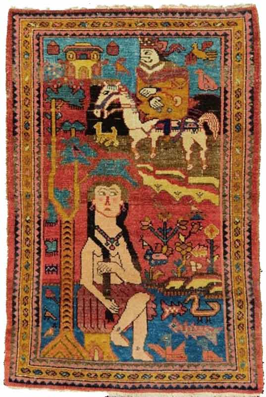

Figure 4: Lilihan Poshti. The story of Khosrow and Shirin. Natural color, size 100*67 cm, Yousef Samadi Bahrami’s Collection.
Figure 5: Rostam and Sohrab, Karabakh (South Caucasus), inscription reads: “Sohrab” (inverted text), late 13th century AH, 120*85 cm, asymmetric knot, displaying 672 knots per square decimeter (Tanavoli 1989, 43) When the carpet depicts a story, it does not narrate it.
A pictorial carpet is not really depicting the place of an event or the feeling or interpretation of what happened in the scene. Apart from the feeling of wonder at the visual beauty reflected in the carpet, there is nothing but a thoughtful or emotional expression: there is no drama, no sadness or sense of impression. The event as a whole is an absent element in the pictorial carpet. All details are equally important; thus, the important function of a pictorial carpet is that it guides the viewer's gaze on numerous details of the carpet, while an inner harmony skillfully creates a strong, decorative unity. Such carpets attract viewers’ attention, not because the scene is a special story that is unsuccessful in its narration, but in the harmony with the story figures within the form of a carpet.
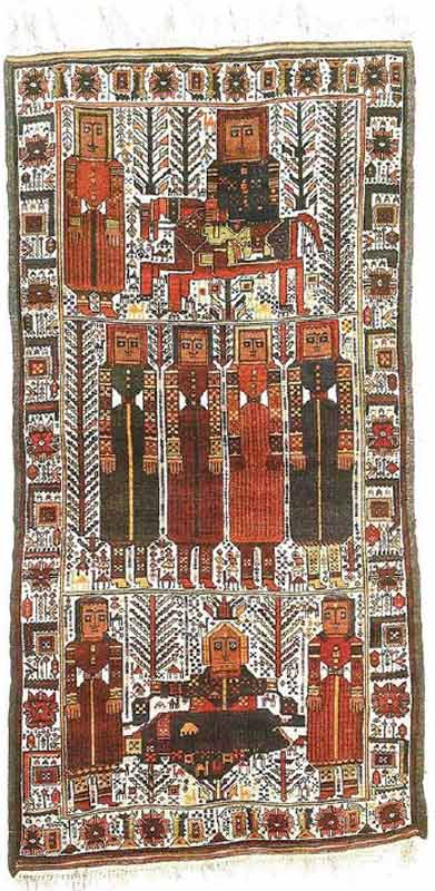
Figure 6: Baluch, Zabol, mid-14th AH century, asymmetric knot, 1280 knots per square decimetre; this carpet displays a scene from the story of Khosrow and Shirin. However, the images in the carpet do not narrative anything and if the viewer is unfamiliar with the story there is little to be understood from the images. (Tanavoli 1989, 48)
Of course, the carpet, in its physical aspect, has a distinctive relation to space in Persian architecture, as it covers a rectangular space that shall not deflect both horizontally and vertically. It is true that the carpet was not always considered a floor covering and not necessarily been rectangular in shape: as in the case of saddlebags and cushions, or carpets hanging from walls or covering a horse or a mule, and so on. Yet it is the Persian architectural space that provides a flat, rectangular space for the carpet: it is part of the formal relationship of carpets with the architectural space. This is why in European paintings that feature a Persian carpet, the first thing that strikes an Iranian viewer is the unusual use of these carpets: Hung from a window crawled up the stairs and deflected in height. This, in itself, has a definite relation to the way the carpet is seen: on the one hand, the formal carpet looks like a horizontal tableau that is clearly framed and as such forms a totality. It does not resemble, for example, the scattered Islamic designs on glazed tiles that crawl up walls whose entirety forms the totality of the building; on the contrary, the carpet has a strong, coherent framing that protects it against any deflection.
In the past, Persian carpets were not masked by pieces of furniture and thus better seen in their entirety. The carpet was the most important part of interior design. It was a furniture in itself. Thus, the carpet is fundamentally different from a painting: viewers of a carpet never actually see it in its entirety because they are already standing “on” the carpet. They never lose contact with it or distance themselves from it, far enough to see it in its entirety. They can kneel and touch it, or sit or lie down on it and get closer to it as much as they want, but their distance to the carpet never exceeds their height. The prohibition of walking on carpets with footwear allows a close and intimate relationship with the carpet, emphasizing its dignity and sanctity. Even paintings on ceilings (which sometimes reflect the patterns of a carpet, as in the case of Sheikh Safi’s tomb) do not enjoy such quality and can be seen and appreciated in one glance while remaining out of viewers’ reach. In the case of carpets, viewers can see the design from different angles and need to move in space and change their standpoint to fully appreciate the work (exactly the same way they need to circulate within the introverted spaces of Persian architecture in order to grasp a proper sense of space).
It might seem that the distance between the carpet and the observer is a secondary quality of the carpet and does not have a direct impact on the aesthetic aspect of the Persian carpet. However, we know of aesthetic systems (including that of Kant) that define the aesthetic experience fundamentally on the basis of an idea of distance. The most prominent is that of Edward Bullough (1880-1934), the English aestheticist, i.e. Psychical Distance. In a paper published in 1912, Bullough writes that the aesthetic experience takes place at a certain distance from the work, not too far nor too close, and this applies to the locative, temporal, and subjective distance of the observer from the object, and is an aesthetic principle (Neil 1995, 304), and is an element present in all art forms (ibid., 299). The transition from the agreeable to the beautiful takes place through distance (Neil 1995, 305). And it is advisable to reduce this distance both in creating and in understanding art, without having it completely removed. (Neil 1995, 302) In his view, this depends both on the audience and the object (Neil 1995, 302). For instance, the Persian miniature takes advantage of its small dimensions to reduce such distance. In carpets, however, the distance is completely different, both objectively and subjectively. The maximum distance is a person’s height and the minimum is zero. It is this distance that has resulted in the unique form of viewing carpets. The Persian carpet is not seen, but “watched” (tamāshā), as was the case with Persian gardens. That is to say, carpets were observed in motion, with a constant shift of the viewer’s point of view. The term tamāshā means “to watch” and “to walk in the garden with a friend” at the same time. Such a relationship between how carpets and gardens are viewed is by no means a coincidence. Persian carpets have long been associated with Persian gardens, sometimes even reflecting and imitating their patterns. In terms of function, the Persian carpet brings nature into the interior and plays the role of green in times of the year when grass does not grow. We know that the famous Sassanid “Baharestan” carpet had a similar function. Tabari History writes about this carpet:
“They wove a carpet with colored silk, sixty cubits in sixty cubits … they unrolled it in wintertime when no flowers blossomed and no green was seen on the globe. On the margins were sown emeralds and peridots… Omar ripped the carpet and the gems and gave each person a fair share… Ali ibn Abi Talib received his, which he sold for twenty thousand Dirhams.” (Tabari History, 1985, 41).
Thus, we encounter one of the most important subjective aspects of the relationship between carpets and architecture: the viewer is a part of the image; the observer of a carpet is “inside” the carpet. This also properly explains the horizon line in Persian carpets, which is very different from that of miniature painting: the carpet does not necessarily have a horizon line, and the horizon line is not necessarily within the carpet or in its “upper” part. The figures in pictorial carpets are not depicted “on” the carpet but are rather “inside” the carpet, like a letter in an envelope.
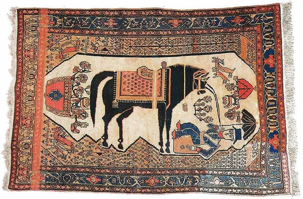
Figure 7: Horse and stableman, Hamedan, Darjazin, early 14th Century AH, 189*129 cm, symmetrical knot, 1296 knots per square decimeter (Tanavoli 1989, 95). The logic of the carpet design is much more bizarre than miniature. Where is the horizon line in this carpet?
This statement is also true on another level: the observer is “within” the carpet subjectively too. The carpet is not a home decoration, it is part of the home: it is home itself. This is why the unit for counting carpets, was called “home” (khāneh), or why the carpet sometimes imitates the plan of the Persian houses or gardens. Children are well enough familiar with this concept and elders respect it too. Children carefully trying to walk on the lines of a carpet pattern imagine themselves walking on a bridge above avoid. The patterns of a Persian carpet always show depth, as opposed to Persian miniature painting which appears flat and even.
So, when confronted with carpets, even pictorial ones, “touching” is more important than “seeing”. In fact, this is the only way to see it. Touching renders, us more dominant. Seeing does not allow one to understand the physical quality of a phenomenon, but the tactile sensation does. In pictorial carpets, this touching proximity is more realistic than an unattainable distance, as it empowers the viewer to touch the universe once again. The carpet is a representation of the universe, as the root of the Persian term indicates: in Haji/Engineer Travelogue, Ali Hassouri traces the root of the word Qāli (carpet), back to Qalin in the early Islamic centuries, to the words Kalinin the Sassanid era and Kar’einé in Avestan, back to the word Kāshtan (“planting”), as making every carpet knot is like planting a seed, that would later represent grass at the time of its absence in winter: the carpet is a perpetuated Persian garden. (Hassouri 2017, 42) In Mithraism, human beings are descendent of the plants: Mashya and Mashyana, the first human beings to grow out of the earth. Each knot of a carpet is a seed that is planted with hope and carries a wish, the same way lovers knot grasses in Nowruz with the hope of their wishes being fulfilled. Every Persian couple begins their married life with a home/carpet on which their children will later grow up and flourish.
Resources
- Emami Pari, Azar, and Bavand Behpoor. “The Iranian Carpet Is not a Picture”, Herfeh Honarmand (Iranian quarterly journal on visual arts), no. 73 (2019): 151-160.
- Parviz Tanavoli (1989) Iranian Pictorial Rugs (Tehran: Soroush Publication)
- Hafiz-e Abru, Nur-Allah ibn Lotf-Allah ibn 'Abd-al-Rashid Behdadini, edited by Seyyed Kamal Haj Seyyed Javadi (Tehran: Ministry of Culture and Islamic Guidance Publications)
- Ali Hasouri (2017) Haji muhandes Travelogue (Carpet Travelogue) (Tehran: Cheshme Publication)
- Doost Ali Khan Muir al-Mamalek (2011) Notes on the private life of Nasser al-Din Shah (Tehran: Iranian History Publication)
- Alex and Aaron Ridley Neil (ed.) (1995) The Philosophy of Art: Ancient and Modern Readings (Boston, Mass.: McGraw-Hill)
- shokrpour, and f.azhari , Azhari. “The role of the Figure in the Narratology of Persian Paintings” (Case Study: Six Drawings from Shahnameh Tahmasebi), Journal of Visual and Applied Arts (Quarterly Journal of Tehran Art University). no. 25 (2019): 101-121.
- Tabari History, illustrated version, 1208 ed., Astan Quds Razavi, Iran Culture Foundation, 1966, 17-18, quoted from Parham 1985, 41.
Acknowledgments
I would like to express my special thanks to my colleague and friend, Mr. Bavand Behpoor, for his intellectual support and insightful comments on this paper.
[1] The function of a carpet does not justify its appearance: Persian carpet has played throughout history a much more significant role for Iranians than merely providing a warm and soft flooring and has gained its appearance through complex and lengthy historical procedures.
[2] Persian pictorial carpets have been divided into two classes: one is urban carpets, and the other rural and nomadic ones. Urban carpets were woven according to a plan, painted by a carpet-designer, while nomadic carpets had a different origin. In Iranian villages and among Persian tribes, carpets were woven without a plan, and rather based on another carpet. When a weaver intends to weave a carpet, s/he borrows a carpet from their neighbors or relatives and uses it as a model (in local parlance: “Dastūr”). (Tanavoli, 1989:16)
[3] The installation of pictorial carpets on walls brought about changes in the way carpets were used. The new application moved the carpet from the floor and underfoot to the walls, turning it into a painting. Previously, ordinary carpets were occasionally hung on at door gates and walls, but that was a temporary function, in occasions such as wedding, religious celebrations, especially commemorating the birthday of the last Imam (the Messiah or “Mahdi”). Walls of houses, shops and markets could be decorated with carpets, a custom that still exists today. (Tanavoli, 1989:14)
[4] The 19th and 20th centuries should be considered the time of popularization of illustration in Iran. In those two centuries, a significant tendency towards simulation and naturalism became apparent in nearly all branches of art. Simulation, as a pervasive movement, attracted the attention of artists. The leaders of that movement, of course, were painters. Although painters constitute different classes and branches in this, the main goal of all groups was to depict their subjects through likeness and similarity to nature. Two groups of painters had the largest share in spreading visual arts among the masses: Coffee-House painters and religious painters. The works of these artists were widely seen and influenced the taste of artists in other disciplines, including engravers, illustrators of printed books, and carpet weavers. (Tanavoli, 1989:11)
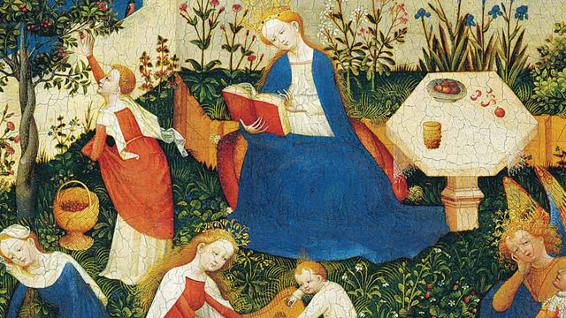
-

The motif Paradiesgärtlein originates from Christian imagery. It was painted many times in the 15th century, especially in Italy and along the Rhine. The enchanting devotional picture shows Our Lady enthroned on a bright red cushion in the middle of the garden, tall, in a radiant blue robe, as the figure dominating the picture. Her head is bowed and she is reading a book. A crown with leaves distinguishes her as the Queen of Heaven.
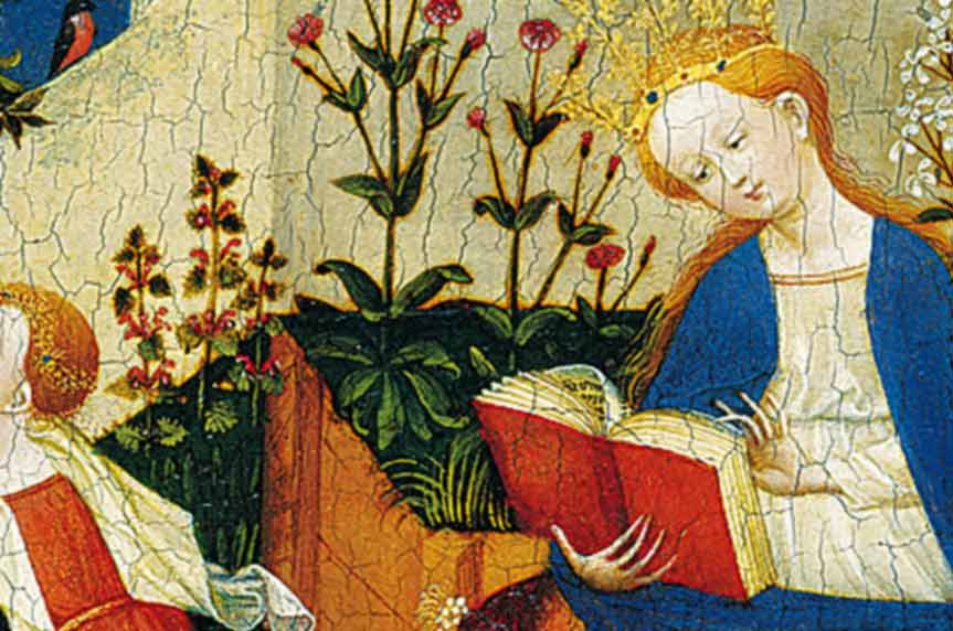
The Christ Child is playing at her feet. The other female figures in the left half of the picture are also to be understood as Holy Virgins because of their splendid clothing. A clear assignment of these saints is uncertain (Keazor 2001, p. 231 ff.). St. Barbara is probably drawing water with a golden spoon from the (life) well in the foreground on the left, because legend attributes to her miraculous powers in overcoming a period of drought. And it could be St. Dorothea who picks cherries from the (life) tree and puts them into the basket, although – according to the legend – the cherries are handed to her (ibid.). The figure holding the plucked instrument (psaltery) to the infant Jesus is interpreted as St Catherine of Alexandria or St Agnes. She is distinguished by a golden diadem with floral decoration and by her flowing hair (ibid.).
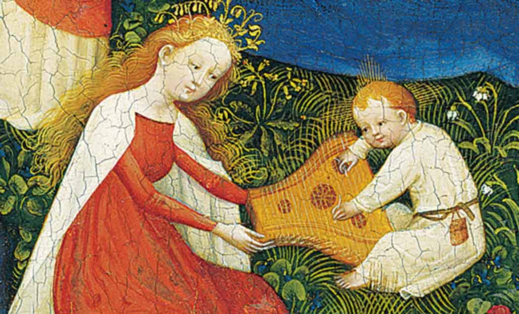
The group of figures on the right consists of the pensive Archangel Michael, also crowned with a golden plant, and – facing him – St. George in chain mail, next to whom lies a small dead dragon. A third figure, probably St. Oswald, bends down to both of them, as a raven peeps out from behind his knee (ibid., p. 233). He is holding on to the tree of knowledge. Saint George has of course already conquered the dragon, which stands for evil, and looks expectantly at Mary. Under another tree sits a frightened monkey with the distinct features of the devil.
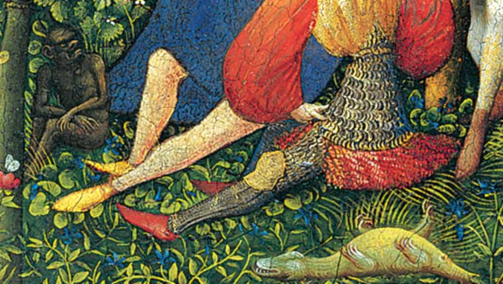
According to biblical legend, he is held in check by the Archangel Michael, the fighter against evil and guardian of paradise. The apples mentioned in the creation story, which tempted to sin, lie ready on the hexagonal, bright white stone table. Wine and bread refer to the Last Supper. The table is compositionally remarkable, dividing the male group of figures from Mary.
Both paradise and the garden stand for a protected, enclosed and bounded place that provides food and water as well as peace and quiet. In the garden, flowers, herbs, fruits and grasses blossom and grow, spanning a supra-temporal, idealising arc from spring (lily of the valley) to midsummer (roses). Especially the white-flowered plants, such as the lilies, stand for the purity of Mary. Just like the plants, twelve birds of different species are depicted in detail and realistically - and thus identifiable (Brinkmann/ Kemperdick 2002, p. 93).
Compositionally, the colour scheme dominates the picture: the secular blue sky frames the graceful Mary leaning towards the book, whose blue robe corresponds with the blue clothing of St Barbara and that of the archangel. The white garments of the saintly figures, the wall in white tones and the light-coloured table enclose the baby Jesus, also dressed in white, in their midst. At the same time, the bright red of the virgins' robes, the red of Mary's book, her seat cushion, St. George's sleeves, the blossoms and fruits reinforce the clear composition, which is additionally underlined by the complementary green of the plants and once again places Mary at the centre of the picture's action. The spatial effect is essentially determined by groupings and overlaps of the figures and pictorial objects; there are no shadows in the heavenly world.
The figures appear relaxed, peaceful and serene, the colourfulness and the abundance of vegetation with springing water embody serenity and earthly happiness. The Holy Virgins are engaged in an occupation that does not cause any trouble. The clothing and hair ornaments are reminiscent of courtly life in a well-tended castle garden. This is also indicated by the killed animals, which are not usually part of the heavenly world, as well as a tree of knowledge that does not bear fruit. This combination of the divine world as a heavenly paradise with the impression of earthly reality characterises the picture to a great extent and thus lends it a peculiar mood, explosiveness and tension in its contemplativeness.
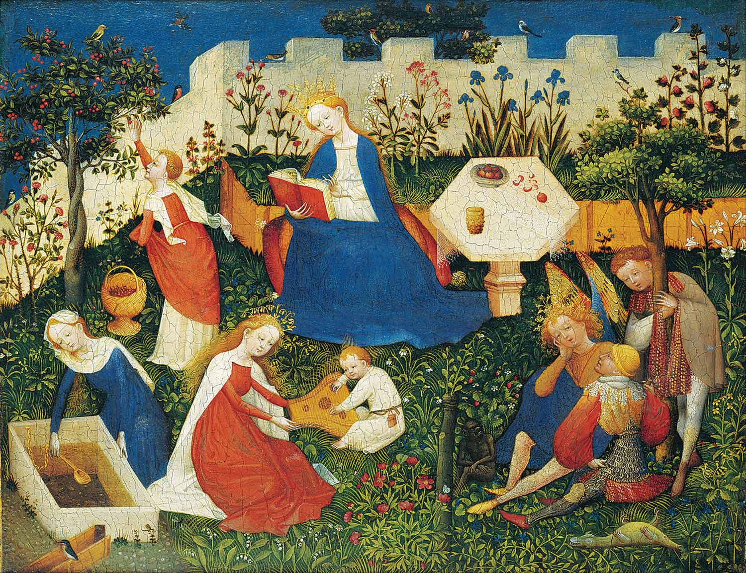
There are numerous studies on the painting technique, the use of colour, the symbolism, the identification, function and activities of the saints, the plants and animals. Also research has been done on provenance in the monastic context or on the attribution of the picture type as ‘hortus conclusus’ (closed garden as a symbol of Mary's virginity). ‘Hortus conclusus’ is often alluded to in paintings of Mary - a garden with an enclosure and with certain plants that refer to Mary (lily, rose, but also lily of the valley or strawberries) - as can also be seen in the Paradiesgärtlein. At the same time, however, the Paradiesgärtlein evokes associations with the gardens of pleasure and love, as found, for example, in engravings by the Master of the Gardens of Love in the mid-15th century (http://bildersammlung-prehn.de/de/node/946, 06.03.2019) - and in this ambivalence once again clearly emphasises the link between divine and earthly worlds of life.
What does the Paradiesgärtlein mean?
The Paradiesgärtlein defies a clear interpretation. The duality of good and bad is hinted at, but the victory of good in paradise over evil or sin – represented by the dead dragon and the vanquished devil – is clearly emphasised. However, the ideal state in paradise is not unbroken: With their tilted heads, the figures in the painting appear pensive, as if they know that there is a life of tormenting reality outside their shelter. The garden as a retreat from the dangerous outside world protects, where in everyday life there is oppression, fear of hunger or sudden death. With the devotional image, religion offers comfort in the promise of salvation to a paradisiacal existence in which the threatening is banished. The imponderable reality is countered by the protective enclosure of the massive wall – outside, the world is full of danger.
The devotional image builds a bridge from this world to the hereafter and vice versa. It opens up a view into eternity and thus into a transcendental space of experience that lies outside finite everyday experience. Visual means are used to create access to the divine, an access that at the same time recalls one's own experience of the world and yet enables the imaginative experience of transcendence.
As an anthropological constant, the idea of a transcendent reality, which usually characterises life after death, runs through many cultures. Experiences of transcendence are described in many ways and often refer to extrasensory perceptions and supernatural forces to which the respective belief is tied.
Why is the painting interesting for art education?
Transcendence and spirituality are often at the core of cultural traditions - in this case Christian heritage. It could be exciting to enter into a conversation about this and to draw on examples of non-European cultural testimonies of faith from the 15th century. In this way, world history can be opened up and a Eurocentric perspective on the history of Western art can be expanded. (As the epitome of European beliefs about the Garden of Eden, the work also stands at the end of the medieval conception of nature and art.)
The image announces divine truth: In paradise, the world is in order. Outside the garden, man lives in untamed nature and is exposed to all incalculable events. With its religious context of origin, the painting's function is primarily to depict an otherworldly, divine order that illustrates the promise of salvation after death in contrast to the earthly hardships of the late Middle Ages. But the pictorial interweaving of earthly and heavenly life already points beyond the late medieval conception of the image. The shielded divine world view experiences ruptures, opening and change.
Not only can the work paradigmatically explain the end of the Middle Ages and the development of art history. Furthermore, the it invites discovery: plants can be identified, animals and groups of figures with their actions tell stories that can be researched, re-enacted, developed further and transformed into the present day. And last but not least, the linking of divine and earthly reality allows analogies to virtual and real, individual and global worlds of life.
References
- Brinkmann, Bodo/ Kemperdick, Stephan (eds.): Das Paradiesgärtlein. In: German Paintings in the Städel: 1300 - 1500, Catalogues of the Paintings in the Städel Art Institute. Frankfurt am Main/ Mainz 2002, pp. 93 -120
- Leaflet of the Städelsches Kunstinstitut on the work: "Das Paradiesgärtlein", c. 1410-1420. Upper Rhenish Master, mixed media on oak, 26.2 x 33.4 cm. Städelsches Kunstinstitut, Frankfurt am Main o.J., o.S.
- Historisches Museum Frankfurt am Main, Prehn'sches Kabinett. http://bildersammlung-prehn.de/de/node/946 (06.03.2019)
- Keazor, Henry: "Manu et voce". Iconographic Notes on the Frankfurt Paradise Garden. Original publication in: Bergdolt, Klaus/ Bonsanti, Giorgio (eds.): Opere e giorni: studisu mille anni d'arte europea dedicati a Max Seidel, Venezia 2001, pp. 231-240. http://archiv.ub.uni-heidelberg.de/artdok/2344/1/Keazor_Manu_et_voce_Ikonographische_Notizen_zum_Frankfurter_Paradiesgärtlein_2001.pdf (07.03.2019).
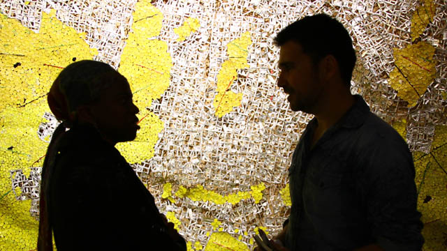
-

Sir David Adjaye puts his hands on the ochre-coloured earth walls of the pavilion while speaking into the microphone: “We have brought that earth here. This is West Africa, this is Ghanaian soil that was applied by Venetian plasterers." 1
Sir David Adjaye, the renowned British architect with Ghanaian roots, based the design of the Ghana Pavilion on the traditional earth buildings of the Gurunsi from Eastern Ghana. The organically merging ochre room sequences evoke a rural Ghana in which the works of the six artists are presented. All of them have Ghanaian roots, but some live and work in England. In an interview, he describes his understanding of architecture as follows: “Art and Architecture create powerful narratives about our lives. Architecture is a story, it’s a way of marking and talking about our aspirations and hopes. So, in what I do, the methodology to every project I make, is to find a narrative [...].”2
This raises the question of the possible interpretations of the pavilion. Out of a multitude of possible architectural quotations and structures that could represent Ghana, it is rural Ghana that was chosen as the structure and backdrop for the artworks. But it is precisely the Gurunsi and their country that were worn down by the European colonial powers in the course of the conquest of West Africa and were finally divided in two at the end of the 19th century by their geographical affiliation to the French and British administrative districts. In this respect, a connection can be drawn to the all-encompassing motto of the exhibition – dealing with the colonial period that ends with the final cry of triumph “Ghana Freedom”.
In addition to this critical, post-colonial discourse, the pavilion also invites an interpretation in which “Africa” is staged as an earthy, dark and rural-tribal space: as much as you feel comfortable inside, the bright light makes you blink when you step out. The odour design by Ibrahim Mahama from the first honeycomb of the pavilion offers a further sensory component to this impression.
While the conscious use of white cube gallery spaces was a struggle for contemporaneity and belonging to the global art discourse,3 Adjaye has decided on a placemaking, in which “Ghanaian identity” is presented as an imaginary picture of origin and authenticity or a rural cut-out reality. In addition, the multiple experiences of London-based artists, such as Akomfrah and Yiadom Boakye, are, thus, transferred back to their native Ghanaian earthworks.
This raises the question of how much of Ghana’s aesthetic construction is to be seen as a concession to the expectations that the global art world places on the artists of African countries. Just as Edward Said has described this for the Orient4, it remains to be examined whether an imagined “Africa” has not just been created in the global art world, whose multiple requirements put artists from the African continent under pressure to master the balancing act between postmodern, conceptual approaches and African side-specificity or even ethnicity in the form of an aesthetic Africa-specific local flavour. Here in the national pavilion of Ghana, the artists are released from this pressure insofar as the pavilion already provides the aesthetic headline or frame which harmonises all the works exhibited there under the imaginary of Ghana/Africa.
While experiencing the pavilion, it becomes clear how difficult it might be for artists from an African country and its diaspora to position themselves within the global art discourse without falling into one of the numerous traps that lurk there, starting with the simplest chain of associations of clichéd fantasies. Close your eyes for a moment and tell me how you imagine the national pavilion of a West African country: earth, elephants, desert, migrants, sunsets, recycling art and a strong smell of spoiled fish?
That the expectancy of local flavour can also be handled quite differently becomes evident if we consider a young generation of Cuban artists, such as Alejandro Campins, who ask provocatively: “Cuban art, what’s that?”5
Expectations can also be met with confrontation in other respects. As a response to the demand for the adjustment to concepts of art influenced by Europe and North America, the artist collective Atis Rezistans from Haiti launched their own biennial with the programmatic title: "What happens when first world art rubs up against third world art? Does it bleed?"6 With this idea of a clash of art cultures, they are more radical in asserting their own (bloody) concept of art. However, this kind of confrontation is not for everyone. (Link)
Enwezor sums up these expectations clearly when he says that artists of African origin, whose contemporaneity he appreciates, must, in any case, comply “to be deeply located within conceptual and postmodernist matrices”.7 As understandable as this may seem from the perspective of Euro-American contemporary art concepts, it is, nevertheless, clear that it is precisely these “matrices” mentioned by Enwezor that exclude other ways of making and understanding art. That they are able to do so is due to their position of power.
The social anthropologist Thomas Fillitz speaks of the contemporary global art world as a world culture, ultimately a global transnational culture, only to conclude that “this global art world continues to be determined by the discourses of Occidental art history and its affiliated ordering systems of classification”.8 We should ask to what extent the concept of art is one of the last (so far only weakly attacked) bastions of an Eurocentric view of the definition of contemporary art and, thus, a kind of colonial survival. The increasing networking of individual art worlds does not necessarily bring about an equal reciprocal exchange.
In this respect, the Venice Biennale could be understood as the palace of this concept of art – a place where its “Urmeter” (standard) of the art is measured and conveyed in a constantly redefined way by mostly European-North American curators and art theorists.
Now the question is how exactly at this place, the Venice Biennale, as a classical place of westernness and whiteness in Ghana’s National Pavilion (even if it comes along in the manner of the buildings of the Gurunsi corrupted by the colonial system), can a confrontation with Ghana’s colonial past succeed, which in the end would have to be continued as a confrontation with existing power structures. But this does not seem to be the intention. It is too much of a joy to finally get the desired recognition from exactly this system and yet, there remains the stale taste of a paternalistic hierarchy in which Ghana is proud to finally present itself to the art world represented in Venice.
Nevertheless, the debut of the Ghana Pavilion is still a real success story, especially when one considers the representation of other African countries at the Biennale di Venezia. Only four countries of the African continent were represented with a national pavilion in the main exhibitions at the 58th Biennial, the others had to be sought out in sometimes often arduous exploratory walks in the urban area. This shows that participation and the positioning at the Biennial is linked to the political structures in the country, with contacts to European decision makers with financial resources but also with clear goals.
From the outset, Ghana’s national pavilion had a clearly defined mission, which, in turn, is inextricably linked to the nation state and its representation. Taiye Selasi9 in his article “Who is afraid of a National Pavilion?”, after critically reviewing the structure of the Venice Biennial, asks: “Is there any good reason […] to exhibit theses six wildly different artists as Ghanaian?” “Yes there is”, we hear the tourism manager Barbara Oteng Gyasi, the curator Nana Oforiatta Ayim, the Ghanaian Ministry of Tourism Art and Culture and the architect David Adjaye calling. They are all working together on the script of a “bigger book” – the positioning of Ghana on the global stage as one of the African countries that can promote itself with its art and culture,10 in short, as a country to be proud of. And so we are not claiming too much when we state that one of the greatest successes of the Ghana Pavilion at this year's Venice Biennale was that it became a place of pride and identification for its many visitors with African decent.
Sergio Linhares, student at the Department of Social and Cultural Anthropology, LMU Munich while conducting research on the perception of the Ghana Pavillon at the Venice Biennale, June 2019. Foto: Natalie GöltenbothFootnotes
1 Sir David Adjaye in an Interview with Al Jazeera Journalist Charlie Angela (www.youtube.com/watch?v=6PM5e8NhGFk)
2 Sir David Adjaye – Building Transformative Narratives www.thehourglass.com/video/david-adjaye/
3 “For Kafou: Haiti, Art and Vodou, the gallery walls remain white and the art works are evenly spaced and lit – as is customary in exhibitions of modern and contemporary art. By sticking to type we sought to minimize the distance between Kafou and more mainstream contemporary art, hoping to create the conditions for fresh encounters between the two” (Farquharson 2013: 10).
4 See Edward Said, Deconstruction of Orientalism.
5 Alejandro Campins in an interview with Natalie Göltenboth in Havana 2018, stressed that he doesn’t want to be seen as a Cuban artist, but as a contemporary artist.
6 Leah Gordon. 2017. Ghetto Biennale – Geto Byenal 2009-2015. Port au Prince. See also: www.ghettobiennale.org
7 Enwezor 1998: 34
8 Flillitz 2007: 116
9 Selasi 2019:40
10 See Nana Oforiatta Ayim’s statement during the opening of the Ghana Pavilion www.youtube.com/watch?v=6PM5e8NhGFk
References
- D. Building Transformative Narratives.
- Retreived 15.10.2020 https://www.thehourglass.com/video/david-adjaye/
- C. (2019). Ghana makes Pavilion debut at 2019 Venice Biennale Art Show. Al Jazeera. Retreived 22.7.2020 from: https://www.youtube.com/watch?v=6PM5e8NhGFk
- Enwezor, O. (1998). Between Localism and Wordliness. Art Journal. Vol 57, No 4. Liminalities: Discussions on the Global and the Local. Pp 32-36.
- Farquharson, A. (Ed.). (2013). Kafou – At the Crossroads. IN: Kafou. Hait, Art and Vodou, pp 8-19. Nottingham Contemporary (catalogue).
- Flillitz, T. (2007). Contemporary Art in Africa. Coevalness in the Global World. IN: Hans Belting and Andrea Buddensieg (Eds.) The Gobal Art World. Audiences, Markets and Museums. Ostfildern. Hatje Cantz. Pp 116-134
- Gordon,L. (2017). Ghetto Biennale – Geto Byenal 2009-2015. (catalogue). No Eraser Publishing
- Said, E. (1978/2003). Orientalism. New York: Penguin Books
- Selasi, T. (2019). Who is afraid of a National Pavilion? IN: Ayim. N.O. (Ed.) Ghana Freedom: Ghana Pavilion at the 58th Biennale di Venezia 2019 (catalogue). Koenig Books. Pp:38-43.
published November 2020
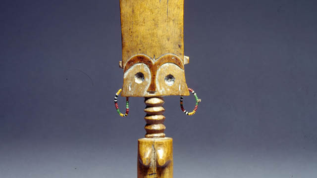
-

Inversion of Hegemony with Ideas of Femininity
Scholarly works abound on factors and causes of gender inequality in the Ghanaian society and many of these writings address gender inequality solely in terms of women as the victims and thus reinforcing the gender stereotype of female passivity. Although this is true in most cases, such studies do not necessarily address the question of how women have responded to and addressed issues of gender expectations and gender-related roles in African societies. By using the ‘Akuaba’ doll (fertility figurine), this research seeks to explore how the concept of womanhood has been portrayed and represented through time in the Ghanaian society among the Akan ethnic group. It seeks to extend an argument for the interpretation of these images beyond the depiction of women as sexual objects to that of creating an inversion of female hegemony in the society. I argue that instead of considering gender stereotypes as an all-pervasive oppressive tool, we must begin to think of the finer nuances and conceptualize how women have shaped, redefined, and negotiated socio-cultural construction of gender.
The object is widely referred to as the fertility figure, also known as the Akuaba doll among the Akans of Ghana. My reasons for selecting this object are two-fold. Firstly, it speaks to my childhood experiences as a girl growing up in an Akan society and secondly, as someone who is very passionate about gender-related issues either from an intellectual and personal perspectives, I was motivated to choose for this project an object that I can easily relate to, both from a personal and intellectual perspectives.
The object in question is the depiction of a female body, an exhibition of the Akan concept of an ideal woman. The features include a flat forehead with an elongated “ring-like neck shape”1 which reflects Akan standard of beauty. The understanding is that a woman with this type of neck is well-fed, healthy, and strong, a paragon of beauty and affluence. The flat broad forehead also is an embodiment of wisdom, while the accentuated breasts and hips with beads worn arounds the waist is the Akan ideal of womanhood, a depiction of woman as the giver of life. The beads worn around the waist has both aesthetic and symbolical meanings. In terms of beauty, beads were worn as an ornament for beautification, just as portrayed by the wearing of the jewels around her ears. It was also believed that wearing of beads around the waist is sexually appealing, while beads were also worn to broaden the hips and shape the waist for reproductive purposes. It is important to note that in the Akan society, and indeed in most Ghanaian culture, an ideal woman is one that carries and bears children. Clearly, ideas of beauty, sexuality and reproduction were the very essence of womanhood or femininity in the Akan society.
According to a very popular Akan oral tradition, the Akuaba doll is deeply rooted in one’s woman’s quest to overcome her inability in meeting societal ideas and expectation of womanhood.2 Akua, a childless woman, consulted a ritual specialist for a child. She was instructed to go to a woodcarver and make a doll of her choice for a child. Some rituals were then performed on the doll and given back to her to take home and treat and care for as her child. Later she became pregnant and gave birth to a daughter, just as she desired. The Akuaba doll then became symbolic for female reproduction. Amenumey explains that the Akuaba dolls were “…supposed to induce fertility and pregnancy….”.3 Among the Akan, like most precolonial Ghanaian societies, the concept of womanhood was largely defined and shaped by a woman’s ability to give birth to as many children as possible. Childbearing was a blessing from the gods and was usually celebrated with pomp and merrymaking. For instance, the custom was to reward a man whose wife has given birth to ten children with a sheep. The Akan refer to this as “badudwan”4 literally, a sheep for the tenth child. This was usually provided by the wife’s family to the husband to show their appreciation for the replenishing and sustainability of their family.5 In the quest to attain such feat, women worked hard to give birth to at least this number of children as prove of her worth to her husband and the society. This undoubtedly made women who were childless in the society feel undervalued and highly marginalized.
Such ideas and concepts of womanhood and inadvertent marginalisation of women still resonate in contemporary Ghanaian society and indeed in most contemporary societies. A woman’s value and worth continue to be tied with her sexual and reproductive abilities. Although women at present now have access to spaces and engage in works that go beyond the traditionally assigned roles of wife and motherhood (sexual and reproductive values), a woman is still expected to neatly fit in with socio-cultural construct of gender. This underscores the value place on women’s sexuality and reproduction to the detriment of other roles beyond these norms, thus leading to the marginalization of women. It is for these reasons that scholars such as Lerner and Allman have often called for the need to question entrenched patriarchal norms that undermine women’s oppression while it reinforces male- superiority.6
The understanding that women have continually been passive and largely detached from the making of their own history and are mere tools in the hands of a patriarchal society is neatly contested by the history behind the Akuaba doll. While it is true that it was Akua’s desperation to fit into societal expectation of ideals of motherhood that forced her to consult a diviner to help her conceive a child, the knowledge that Akua chose to actively engaged with the process of making the doll; how the doll is carved out, the shape, the physical features, and the aesthetic nature is significant. Additionally, the fact that she chose to carve out a girl child clearly indicates the active role she played in redefining and negotiating power with the matrilineal, yet patriarchal society, thus creating and inverting power in an all-pervasive patriarchal institution. It is also an indication that she did not consider the female as of little value in her society.
Paradoxically then, the history and philosophical ideologies that underpin the concept of the Akuaba doll is a clear exhibition of the nuances and complexities of societal construction of gender roles and status. In a society with a deeply entrenched gender expectations and assigned gender roles, it is remarkable that Akua sought to circumvent, manipulate, and yet conversely acquiesce with existing status quo to her advantage, an inversion of hegemony amidst patriarchal privilege. Therein lies the ambiguities and contradictions of performing gender.
References
- Addo-Fening, R (1973). Asante refugees in Akyem Abuakwa 1875-1912. Transactions of the Historical Society of Ghana. 14, 1. 39-64.
- Akyeampong, E & Obeng, P. (1995). Spirituality, Gender, and Power in Asante History. The International Journal of African Historical Studies. 28, 3. 481-508.
- Allman, Jean. (1996). “Rounding up Spinsters: Gender Chaos and Unmarried Women in Colonial Asante.” Journal of African History, 37, 2, 195-214.
- Amenumey, D. E. K. (2008). Ghana: A concise history from pre-colonial times to the 20th Century. Accra: Woeli Publishing.
- Appiah Anthony K. (1991) “Is the Post- in Postmodernism the Post- in Postcolonial? Critical Inquiry. Vol. 17, No. 2. 336-357.
- Lerner, G. (1994). The creation of feminist consciousness: From the Middle Ages to 1870. Oxford: Oxford University Press.
- Lerner, G. (1986). The creation of patriarchy. New York: Oxford University Press.
Footnotes
1) It is quite common today to hear songs in the Ghanaian society eulogising a woman’s beauty by referring to her ring-shaped neck, together with other physical features. This is an indication that the Akan standard of beauty in the past as enshrined in the Akuaba doll continue to resonate with contemporary Ghanaian societies.
2) This is a popular story among the Akans and was often recounted to young girls especially by an older woman in the family or society. I grew up listening to these stories from my mother and grandmother, among others.
3) D. E K. Amenumey. (2008). Ghana: A concise history from pre-colonial times to the 20th Century. Accra: Woeli Publishing. P. 90. From a spiritual and philosophical perspectives, the use of the Akuaba went beyond just fulfilling the desires of childless women. In most of these Akan societies, when a woman gives birth to twins but in an unlikely situation where one of them dies, she is expected to make a replica of an Akuaba doll in replacing the dead child. Some would also bury the dead child with the Akuaba doll as a way of warding off evil spirit from killing the living child.
4) “Badu” is an Akan name for the tenth born child. ‘Ba’ or ‘ɛba’ is the Twi word for child, while ‘ɛdu’ or ‘du ‘means the number ten in the Akan language. Therefore, the name Badu in Akan usually refers to a tenth born child.
5) It is significant to point out that Akan society, unlike most ethnic groups such as the Mole-Dagbani, Ewe, Ga-Adangbe and Guan, is mostly a matrilineal society. Lineage, inheritance, and chieftaincy succession have always been through the female line. Although precolonial Akan society was not completely immune from patriarchal ideals, women played important roles and and had significant status in society especially in areas of religion, politics and economy. For further details on this, see for example the articles Addo-Fening, R (1973). Asante refugees in Akyem Abuakwa 1875-1912. Transactions of the Historical Society of Ghana. 14, 1. 39-64 & Akyeampong, E & Obeng, P. (1995). Spirituality, Gender, and Power in Asante History. The International Journal of African Historical Studies. 28, 3. 481-508.
6) See for example, Allman, J. (1996). “Rounding up Spinsters: Gender Chaos and Unmarried Women in Colonial Asante.” Journal of African History, 37, 2, 195-214, Lerner, G. (1994). The creation of feminist consciousness: From the Middle Ages to 1870. Oxford: Oxford University Press., & Lerner, G. (1986). The creation of patriarchy. New York: Oxford University Press.
This article is part of a gallery: Perspectives from Ghana on Museum Objects in Germany
published January 2021
A German Perspective on the Akuaba Doll in the Museum Fünf Kontinente Munich
Akuaba Dolls are wooden figures that were and apparently still are in use mainly in rural areas in southern Ghana. Young women hoping for pregnancy or - if they are already pregnant - for the health and beauty of their child, wear these figures on their bodies like real babies and take care of them. That is why they are called 'dolls'.
Akuaba or better Akua-Bà literally means 'child of Akua'. The story tells of "a woman named >Akua< who could not get pregnant and went to a local diviner or priest and commissioned the carving of a small wooden doll. She carried and cared for the doll as if it were her own child, feeding it, bathing it and so on. Soon the people in the village started calling it >Akua< >ba< - meaning >Akuaba's child<, since >ba< means child. She soon became pregnant and her daughter grew up with the doll." (Annor et al., p. 308)
This story also forms the basis for the function of the widespread dolls as aids in a desire for pregnancy. An Akuaba Doll expresses this desire for a child, so the figure is 'cared for' by a girl from puberty onwards. This happens within the family. Outside the family, Akuaba Dolls can be found in shrines under the care of a ritual specialist, where they can be borrowed for their purpose.
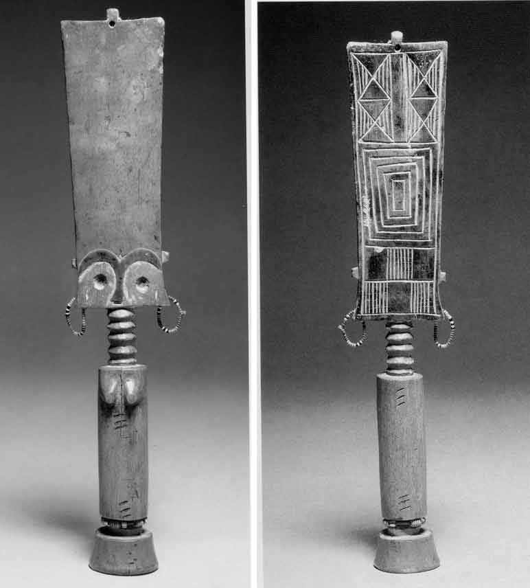
Fig. 1 & Fig. 2 Views of the Akuaba Doll in the Munich Museum Fünf Kontinente
Anonymous artist. Fante Fertility Figure. Early 20th century, Wood. 27,5 cm. Museum Fünf Kontinente. Presentation at Museum Fünf Kontinente.
© Museum Fünf Kontinente
Description
The doll in Munich's Museum Fünf Kontinente (Fig.1) comes from the Fante area. It shows a female figure. The very strongly abstracted forms and proportions symbolise various aspects:
The rectangular shape of the very flat head becomes - seen from the front - somewhat broader in an elegant curve towards the top. A strikingly high forehead, with eyes, eyebrows and nose only indicated, while mouth and ears are missing. The accentuated arch segments of the eyebrows flow together and then form the nose. On the back, the head has geometric patterns (Fig. 2). Added earrings of glass beads give the figure a colourful accent. For Kecskési (p. 38), their daintiness is a sign that the doll has been lovingly treated. At the very top there is another small moulding with a hole where hair was originally attached (compare Fig. 3a).
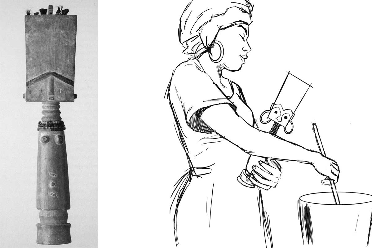
Fig. 3a: Akuaba Doll from the Linden Museum Stuttgart (Forkl p. 94). Fig. 3b: Use of the doll (drawing by Vanessa Rast - courtesy the artist)
The neck has five rings. It sits on a very slender, round trunk, which in turn stands on a delicate base. Striking are two groups of three diagonal embrasures each, which are repeated on the back. The figure has no arms, the legs are short stumps. The protruding forms in the chest area mark the figure as female. Its strict symmetry is softened by small deviations. One can well imagine taking the cylindrical figure in one's hand.
Material and technique
A ritual specialist to whom a woman who wishes to have a child goes makes the decision about the choice of doll at the respective shrine. If no suitable figures are available there, he instructs the woman to order a new Akuaba Doll from the woodcarver. The craftsmen then visit the tree to obtain the wood and ask the tree's spirits for permission to do so (oral information from the Ghanaian colleagues 2022 in Bayreuth [Link]). The Akuaba Doll in the Munich Museum was carved from softwood. (There are also darker examples made of hardwood, for example among the Ashanti, also an Akan group, as the presentation in the Ghana National Museum in Accra shows - see Fig. 4.) In the example in Munich, eyebrows and nose are darker.
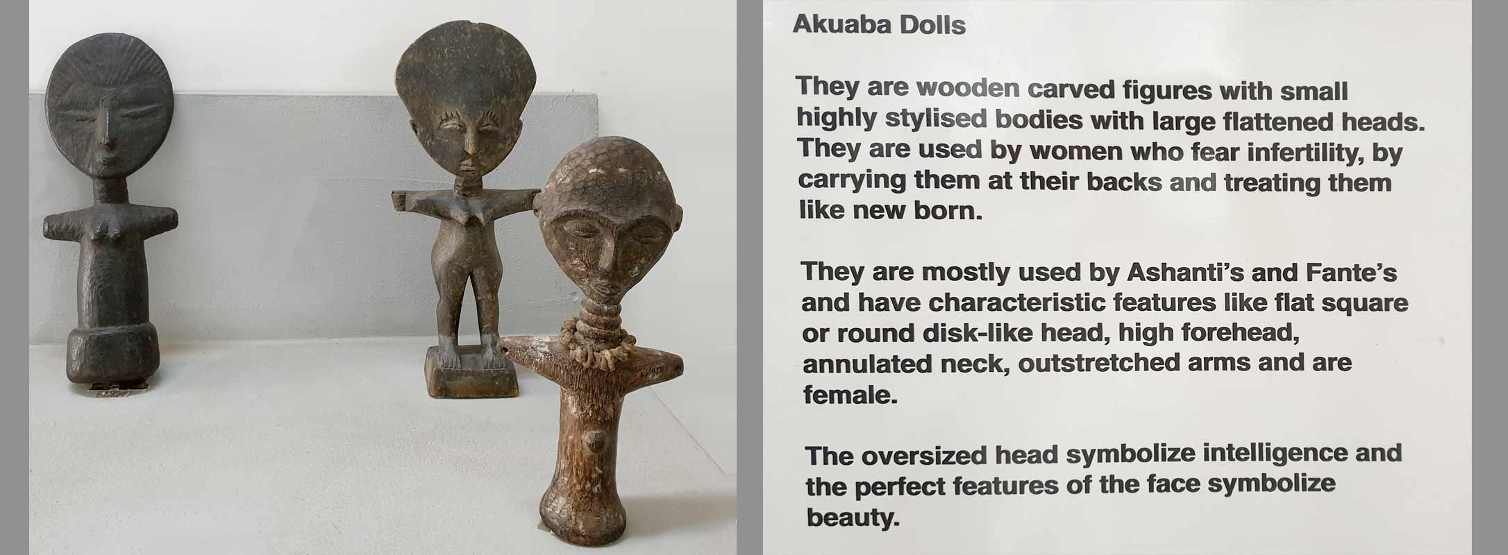
Fig. 4: Presentation of Akuaba Dolls at the Ghana National Museum in Accra (March 2023. Photo: the author)
Interpretation of the Munich figure within the original Ghanaian context
(1) Utility function: The figure is made for the family context. It is meant to lead to fertility, sometimes also to the beauty of a child. The size (height 28 cm), the pleasant material and the weight allow the figure to be carried and cared for like a baby. When an Akuaba Doll has fulfilled its task, it is often returned to the ritual specialist who accompanies the process.
The breasts indicate a female figure, which does not necessarily have to do with a corresponding desire for the sex of the child desired. Forkl (p. 94) assumes, however, that "women desire daughters, on the one hand as progenitors in a matrilineality oriented society, and on the other hand as support in household work." (There are also Akuaba figures with the characteristics of both sexes and probably male specimens; furthermore, breastfeeding examples and those who in turn carry other Akuaba Dolls.)
(2) Body shape: T The conspicuous and disproportionately large rectangular head symbolises the head as the seat of intellect and wisdom in local imagery. Akuaba figures among the Ashanti show round heads (see fig. 4), but they are also proportionally very large. High foreheads and flat faces correspond to the ideal of beauty. Luxuriant bulges on the necks tell that the figure is well-fed and thus refer to happiness and prosperity. There are Akuaba Dolls that show more feminine body shapes, wider hips, possibly emphasised by strings of pearls.
(3) The spiritual context: As Nkrumah writes in her contribution, an Akuaba figure serves as a dwelling place for a soul being, a being that is in a transitional area between the earthly and the spiritual world. Carrying and caring for it is a prerequisite for the entrance of such a soul being, which then sets out to appear on earth as a living being, i.e. to enter the family of the young woman through birth. A ritual specialist is involved in the selection, consecration and regulations for use. After a birth, the figure is returned to the ritual specialist.[1]
(4) The social and cultural context: The figure can also be seen as a sign of the traditional expectation for a woman to bring children into the world. In recent times, where traditional societal expectations of women collide with other worldviews, the ritual use of Akuaba Dolls obviously decreases .
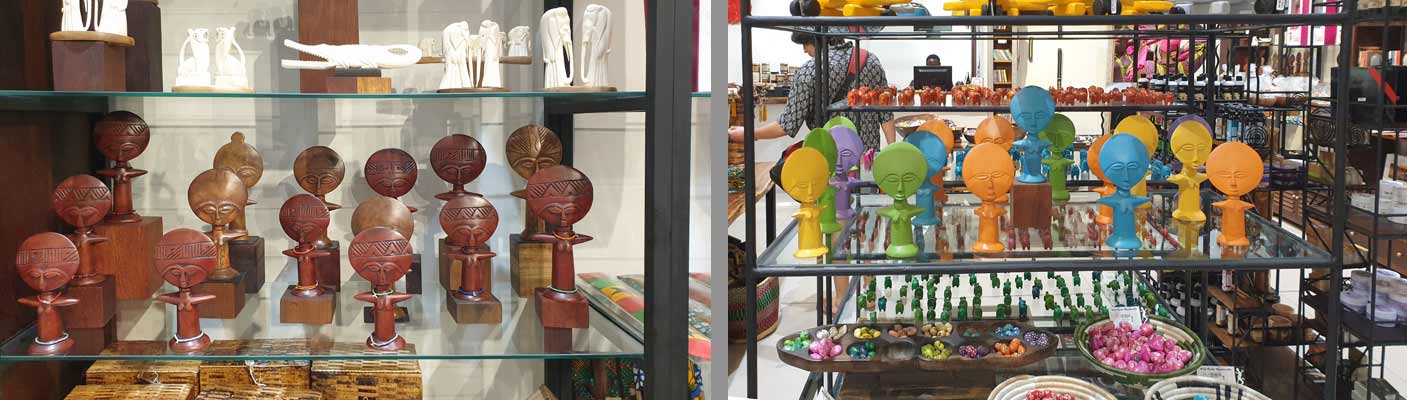
Fig. 5: Souvenir shop at Accra Airport (March 2023. Photo: the author)
In the last decades, an interesting production for tourism has been established - apparently the dolls are seen as 'typical for Ghana'. However, these are not Akuaba Dolls in the traditional sense, but rather 'quotes'.
How can one relate Akuaba Dolls to European visual traditions and experiences?
As familiar as the image of an Akuaba figure may seem in Europe - as a 'typical' example of traditional African art - its traditional meaning is unknown in Europe. Nevertheless, it obviously seems to be attractive to tourists, e.g. as 'airport art' (see Fig. 5), perhaps because its shape somehow corresponds to the cliché idea of 'typically African', the size fits well into the suitcase, or the large head (by means of the Bambi effect) makes it appear 'cute'.
Fig. 6: Paul Klee. Senecio. 1922. Oil on chalk base on gauze on cardboard. 40.3 × 37.4 cm. Kunstmuseum Basel (Wiki Commons)
In the context of art history, the influence of Akuaba Dolls (and many other carved representations from West Africa) on European art of the early 20th century (see Fig. 6) is of interest. [2] The formal similarity to Klee's painting (fig. 6) is striking at first glance, but whether this is a direct reference must first be verified. In the context of art history, it would then be of interest in a next step which aesthetics were of interest to the artists at the time and which they blanked out, i.e. which "image of Africa" they wanted to have and also communicate.
Fig. 7: Hieroglyph Anch
(Photo: https://anthrowiki.at/Anch)
The authors also considered whether the formal similarity of the Akuaba Dolls with the ancient Egyptian hieroglyph ‘Anch’ (the "loop of life" or the "key of life" - see Fig. 7) could have come about through a historical relationship between Egypt and Ghana. This would also correspond to the accentuation of content in Nkrumah's text with regard to the "representation of the woman as the giver of life" (see her chapter). Nevertheless, this association would also have to be examined more closely. To assume a universal archetype in the sense of C. G. Jung appears to be pedagogically misleading in its levelling effect.
In the German educational context, on the other hand, it seems important to link the figure - beyond clarifying its function - to Akua's story and thus include the role of narratives. This prevents another comparison that is also too quick and reductive when it comes to social practices (and not the isolated object), as dolls are also cared for and nurtured in traditional European contexts, but mostly by young children before puberty. So, in Europe, it does not belong to a fertility ritual, even if the child puts itself in the role of a ‘little mother’ or ‘little father’. (Another interesting question, whether Ghanaian women also go to a doctor when they are not pregnant, and whether there are comparable ritualised practices in Central Europe - for example among alternative practitioners or in esoteric circles - would have to be addressed in interdisciplinary approaches.)
Such comparisons appear to be useful, as they can show both similarities and differences, with the aim of better recognising one's own perceptual conventions or stereotypes and thus putting them into perspective. All this still leaves the question of the status of this doll in Munich when it is displayed in a showcase in a European museum (see Lab entry: What is an object? Link). Such a presentation contradicts its ritual and spiritual use. An Akuaba is then no longer an Akuaba. But what is it then?
Sources
This text is based on:
- Contribution by Gertrude Nkrumah: https://explore-vc.org/en/objects/the-akuaba-doll.html
- Talks with the Ghanaian EVC partners in Bayreuth in 2022: https://explore-vc.org/en/activities/archive/april-22-25-2022-joint-workshop-uew-team-and-isb-team.html
- The presentation at the National Museum in Accra, seen in March 2023: Fig. 4.
- Reading: see list of references
References
- Akyeampong, E & Obeng, P. (1995). Spirituality, Gender, and Power in Asante History. The International Journal of African Historical Studies. 28, 3. pp 481-508
- Anderson, Elizabeth L. (1989): The Levels of Meaning of an Ashanti Akua'ba. In: Michigan Academican. 21 205-219
- Annor, I., Dickson, A & Dzidzornu, A. G. (2011): General Knowledge in Art. Accra (Aki-Ola Publications)
- Forkl H. (1997): Healing and body art in Africa. Stuttgart (Lindenmuseum)
- Kecskési, M. (1999): Kunst aus Afrika - Museum für Völkerkunde München. Munich (Prestel)
Footnotes
[1] The number of five neck bulges here (there are also specimens with 3, 8 or 9 bulges) may also be a reference to the sacred number of "Odumankoma", the Akan creator deity, in this context.
[2] On the relationship of the European avant-garde to the aesthetics of West African carvings, see also the discussion of the Blue Rider post on this website (link 1 and 2).

My Encounter with Black Feminism and Womanhood Inspired by the Akuaba Doll
I first came in contact with the Akuaba Doll while reading Bernardine Evaristo’s award winning book Girl, Woman, Other. In the book, the character Nazinga was described as “at least six foot tall with ornamented dreadlocks, large wooden Akuaba fertility doll earrings, red trousers, a cream embroidered caftan and strappy Roman sandals“ (Evarsito 2020, p. 81). I searched for Akuaba fertility doll earrings on the internet, but did not delve further into the topic at this time. A few weeks later, attending a seminar with Dr. Wagner at Friedrich-Alexander University in Erlangen, I stumbled upon the Akuaba Doll again. I knew, I had to take this opportunity to get to know her better. The comment from Gertrude Nkrumah is to be considered my first source of information about the history of origin and the tradition into which the Akuaba Doll is woven.
Through Nkrumah's feminist perspective on the Akuaba Doll, I wanted to dive deeper into the topic of Black Feminism to extend my knowledge in feminist theory. With the Akuaba Doll as my point of departure, I decided to focus on the ability to bear children and the social significance of abortions for Black women.[1]
At this point I move past the Akuaba Doll and her cultural context. Other works of art could have led me to a similar path. I have chosen to look at the Akuaba Doll with categories, which are not directly related to the Akuaba Doll and her cultural context as I questioned whether I have the right to write about the Akuaba Doll considering the colonial past of my own country, Germany. I am a white, European woman, a feminist, who is aware of intersectionality and racist structures within the society I have been socialised in and its way of thinking, but with no cultural connection to the Akuaba Doll other than the colonial impact on African art and culture (cf. Kushinator, Rahman and Dompreh, 2020[2]). Therefore, I chose a topic to which I have access via my role as a student of pedagogy and focus on Black Feminism and Womanhood of Black women living in white-dominated countries.
In white-dominated societies, Black women were excluded from a feminist movement for decades (cf. hooks, p. 216f.). White women systematically utilised the racist hierarchy within women to gain power and thereby forced a specific Black feminist movement to form and uncover the oppression Black women had and still have to face. The prefix “Black” emphases the specific oppression Black women face in white-dominated countries, although, of course, there has been feminist movements in Black-dominated countries before (cf. Roig quoted from Berlin Biennale 2022, 48:00 – 49:50).
In American history, Black women have always had to fight to be seen as women. As bell hooks gets to the heart of it: “the black female was a creature unworthy of the title woman; she was mere chattel, a thing, an animal” (hooks 2015, p. 214). Sojourner Truth[3] had to bare her breasts to prove that she was a woman indeed. Being yelled at “I don’t believe you really are a woman” by a white man represents the contempt and disrespect for Black womanhood (cf. hooks 2015, p. 214). In her famous speech “Ain’ I a Woman” (1851), she argues, that she – as her white women audience too – is indeed a woman. Here she argues with characteristics, that can also be found in the Akuaba Doll. The most important argument is the carrying and bearing of children and the “mother’s grief” (Truth 1851 quoted from hooks 2015, p. 215) she cried out, when her children were sold into slavery.
The ability to bear children has always played an important role in the history of womanhood and was – and still is – utilised to oppress and exploit Black women. In times of slavery, Black women were forced to procreate and bear children, who were worth a lot of money in a perfidious system of human trafficking (cf. Federici 2020, p. 23f.). In the late 20th century, Black men in the U.S. reasserted what they called their “rightful positions as patriarchs” (Taylor 2022) and denounced birth control and abortions as genocide that compromised the future and freedom of Black families by limiting the Black population (cf. Federici, p. 25f.). With the overturn of Roe v. Wade[4] – Black women are specifically affected, as Kwajelyn Jackson, Executive Director of the Feminist Women’s Health Center in Atlanta, Georgia puts it into a nutshell: "Abortion bans are inherently racist because they do not consider the lived experiences of Black people and other communities of colour. Many state policymakers would rather criminalize and endanger Black birthing people than supply them with all of the resources they actually need" (Jackson quoted from Long 2022). Even before the abortion laws were restricted, Black (and other BIPoc) women in the U.S were two to three times more likely to die from pregnancy-related causes than white women (cf. CDC 2019). Being allowed to decide whether you want children or not and furthermore, having access to certain facilities to end a pregnancy or not is still a bound to privileges. It is not only tied to the health care system, but also to cultural beliefs and practices, to the financial and educational background, as well as to class, race and many other factors.
In a world imprinted by patriarchy and privilege, it is important to unravel power structures that dominate our world, uncover where they come from and how different groups are affected differently. As patriarchal patterns of thought are inscribed in nearly all societies of our world, it is a tough task to uncover them in every aspect of our lives and hence require lifelong learning and feminist thought. Nevertheless, it is indispensable in order to build an anti-racist gender-equal society in which every woman can decide herself, if she wants to get children without fearing financial or social consequences.
In this context the Akuaba Doll can be interpreted as an early moment of feminism, where women disrupt the patriarchal system that marginalizes them. As Nkrumah states, by deciding about the gender of her child in a binary system, she chose to bear a girl rather than a boy, which – in the matrilineal line – effects the lineage, inheritance, and chieftaincy succession (cf. Nkrumah 2020). In my eyes, Akua used the power she had to influence her life to her advantage. Yet the worth of women was still tied to her sexual and reproductive abilities, but nevertheless she made a first step by empowering women to stand up for themselves and for their own lives.
References
Berlin Biennale (2022). Panel: Afrofeminism. Bridging the Gap. <https://12.berlinbiennale.de/media/panel-afrofeminisms-bridging-the-gap/> (09/30/2022).
Center for Reproductive Rights (2022). The World’s Abortion Laws. <https://reproductiverights.org/maps/worlds-abortion-laws/> (09/30/2022)
Evaristo, B. (2020). Girl, Woman, Other. UK: Penguin Books.
Federici, S. (2020). Jenseits unserer Haut. Körper als umkämpfter Ort im Kapitalismus. Münster: Unrast.
hooks, b. (2015). Ain’t I a Woman. Black Women and Feminism. New York: Routledge.
Kushiator, G., Rahman, A. and Dompreh, H.-O. (2020). The Influence of Western Culture on Traditional Art Forms and Cultural Practices: ‘Akuaba’ doll among Akan Women in Africa. ADRRI Journal of Arts and Social Sciences, Ghana: Vol. 17, No.6 (5), S.59 – 71.<https://www.researchgate.net/publication/344438737_The_Influence_of_Western_Culture_on_Traditional_Art_Forms_and_Cultural_Practices_%27Akuaba%27_Doll_Among_Akan_Women_in_Africa> (09/30/2022).
Long, S. (2022). Abortion Bans pose a Danger to all Mothers. For Black Women, they’re especially damaging. <https://www.refinery29.com/en-us/2020/10/10015405/abortion-ban-racism-black-women-effects> (09/30/2022).
Nkrumah, G. (2021). Inversion of Hegemony with Ideas of Feminity. <https://www.explore-vc.org/en/objects/the-akuaba-doll.html> (09/30/2022).
Taylor, K.-Y. (2022). How Black Feminists defined Abortion Rights. <https://www.newyorker.com/news/essay/how-black-feminists-defined-abortion-rights> (09/30/2022).
Footnotes
[1] In this context, I will delve into the topic of reproductive abilities and use the term "woman" throughout my text. However, I want to clarify that the ability to bear children is not a defining characteristic of womanhood. Not all women have a uterus, and not all women are able to bear children. Furthermore, one's physical appearance is not a determining factor of one's gender identity. Despite this, the reproductive ability is instrumentalised in our society and can lead to harmful stereotypes, which many women are confronted with at some point in their lives.
[2] In addition to exploring the different forms and cultural backgrounds of Akuaba Dolls, this article delves into the ways in which culture, religion, and artistic expression are intertwined in African cultures. The article points out how the colonization by white, western, and Christian men and women caused a change in function and values of the Akuaba Doll.
[3] Sojourner Truth lived from 1797 to 1883. She was an American abolitionist of New York Dutch heritage and a women’s rights activist. She was born into slavery, but escaped to freedom in 1826. In 1851 she joined George Thompson, an abolitionist and speaker, on a lecture tour through central and western New York State. At the Ohio Women’s Rights Convention in Akron, Ohio, she gave her speech with later became famous as “Ain’t I a Woman?”
[4] Roe v. Wade is a legal case in which the U.S Supreme Court ruled that unduly restrictive state regulation of abortion is unconstitutional and that the Constitution of the United States generally protects a pregnant woman's liberty to choose to have an abortion. This decision from 1973 was overturned by the U.S. Supreme Court in 2022.
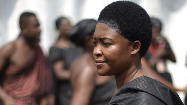
-
Different cultures may practise different hair beauty culture. Some of the hair beauty cultural practise could be unisex or may distinguish between sexes. In this instance, hair becomes a tool for sexual differentiation and serves as a precursor to one’s gender. It may tell which part of the world a person hails from. That notwithstanding, one may borrow hairstyles from different cultures other than his or her own for fashionable reasons since fashion inspiration is multicultural. Based on the cultural orientation and the role of a particular hairstyle to a group, society or institution, hair aesthetic ideals may be preserved as a tool for identity construction. A typical example of a hairstyle that has remained resilient even in the face of (neo)colonial and imperial hair aesthetic regimentation of the West on Africa is kentenkye hairstyle (Akan Women’s Hairstyle, 2008), popularly renamed as dansikran. Legendary has it that, queen mother Nana Kwaadu Yiadom II, (1917 - 1945), the sister of Nana Prempeh I, of the Asante Kingdom, performed the majestic Adowa dance during the restoration of the Asante Confederacy around 1935 in her kentenkye hairstyle, which inspired the then Governor’s description of her kentenkye hairstyle as a 'dancing crown' (Akrase, 2008) due to its visual effect during the dance. The phrase ‘dancing crown’ was linguistically corrupted as dansinkran which has become the popular name of the hairstyle.
The dansinkran hairstyle is noted for its simple, yet iconic stature in purely indigenous Ghanaian cultural milieu. Its selection was informed by its historical epoch, purely indigenous natural hair beauty care and treatment and socio-political significance in Ghanaian chieftaincy. It has proven to be an unadulterated Ghanaian hair fashion practice necessary in the decolonisation of hair fashion discourse. It is important in the decolonisation of hair discourse in the sense that it is purely Afrocentric which has evolved from its symbolic status to contemporary appropriation. The use of purely natural and sustainable hair treatment cosmetics with little or no harmful effect on the body makes it worthy of handing down to youth. This is because, there has been influx of artificial hair cosmetics with detrimental dermal effects which many youth subscribe to in the name of modernity without recourse to its side effects. The historical significance and interest of this hairstyle for posterity, especially as something of Africa practise, contributes in this regard to the decolonisation process. Dansinkran polity and politics among Akan kings, queens, chiefdom and the society in general reinforced its choice.
This hairstyle is achieved by trimming down the peripheries of the crown of the head almost to the skin while the remaining portions are trimmed to define the oval shape of a wearer’s head. The haircut gives the head a calabash-like shape. A natural black pomade-like colourant mixture composed of powered charcoal, soot and sheabutter, is then applied to the hair to give it intense blackened appearance. Charcoal has been in use for hair treatment in precolonial Ghana for many centuries. Considering the intense heat coupled with dust particle in Ghana and other African countries, the use of charcoal as hair treatment helped to protect their hairs from dust build up, dirt, oil and sebum that settled on scalp and negatively affects hair quality and growth. It implies that charcoal promotes hair growth. The natural hair colourant used in this process armours the hair with lustre and protection against bacteria and fungi. It nourishes the scalp and protects it from dandruff infections and maintains the hair’s natural moisture level. The eye lashes are also darkened to complement the facial look of a wearer.
The haircut helps to focus on the facials of a wearer since the hair receives little or no elaborate ornamentation. Usually, queen mothers who wear this hairstyle are not supposed to wear earrings during possessions or durbars. Judging from the benefits of charcoal in natural hair treatment it is not surprising that it features as essential ingredient in modern cosmetics manufacturing.
The dansinkran hairstyle serves as a socio-cultural barometer, political signifier and as a religious marker. This hairstyle help to identify queen mothers and female kings from other females. It is a symbolic hairstyle that was a preserve of the Akan feminine chiefdom and royals. Some priestesses also wear this hairstyle. Politically, the hairstyle symbolises authority, royalty and power of a female king or queen mother. In this sense, the hairstyle is status-defining in terms of the social rank. It is considered as inevitable lifestyle heritage that needs to be preserved among the chiefdom. When a king or chief passes on, a queen mother who is not wearing that hairstyle is not allowed to pay homage to him/her.
In the case of queen mothers, they complement this hairstyle with a feminine Ghanaian fashion classic named queen mothers’ style. This classic consists of a wraparound fashion of a six-yard fabric that stretches from the chest regions to beyond the knee, which is accentuated by another six-yard fabric draped in toga style. The wearing of this classic in addition to the hairstyle has bestowed onto it, the name dansinkran, hence, both the hairstyle and the classic are named as such. Despite the symbolism of the hairstyle, it now worn by the youth in contemporary times. It has acquired the name sweat. The only difference is that the youth who wear the hairstyle do not apply the charcoal mixture on their hairs. It has become unisex hairstyle among the youth.
The Western hair superiority politics could not erode the many centuries old hair identity visual code and marker that characterised the majority of the chieftaincy institutions in Ghana. As a traditional lifestyle culture that has proved unyielding despite black hair discrimination and politics, it is an important tool in the decolonisation of Afrocentric hair beauty culture practice and education.
References
- Akan Women’s Hairstyle. (2008). Retrieved from https://www.abibitumi.com/community/culture/akan-womens-hairstyles/
- Akrase, N. (2008). Pomp, power and majesty. Retrieved from http://akrase.blogspot.com/2008_01_01_archive.html
published March 2020
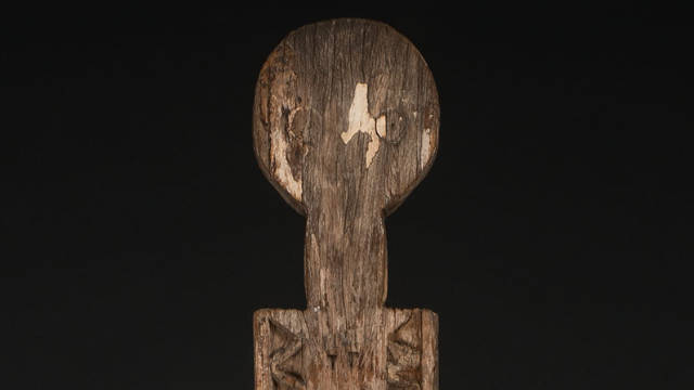
-

Given the ownership structures of museums in countries such as Germany, the local politicians will never support repatriation requests if they still solely understand objects as pieces of art/craft. It is high time we appreciate spirit, soul and body of these objects. To illustrate this point, I will use the three funerary posts, the vigango (singular kigango) from the Giriama Community in Kenya which are part of the museum collection in Munich. Museum audiences and art enthusiasts in the Global North admire the artistic side of these objects. The truth is, they are not objects according to the producing community. Vigango are souls of the departed elders and thus an integral part of the Mijikenda community. Vigango are also significant to the Giriama as a way of communicating with Mulungu (God). The vigango serve as media of communication with Mulungu since they are no longer trees (wood) but humans (spirits). The vigango are very tall and are made largely for those who have attained the highest status in the society. Vigango are anthropomorphic carvings. They are made using valued indigenous species of hard wood through a lengthy ritual process. There are also strict rules to handle a fallen kigango. Thus their presence in museums collections are highly contestable!
Perhaps Western museums ought to exhibit the processes involved in making of these objects more. To have a better understanding of these objects it is important to learn how they are used in their original community. To make a kigango, an appropriate hardwood tree is selected and prayers made to sanctify it and transform it from being a tree to a human spirit. Vigango are normally handled with great care usually wrapped with white cloth and erected when it is still dark (around 5am).
The vigango provide protection to the community and ensure the education and progress of the family and members of the community in general. The living Mijikenda believe that the dead members of their community not only have influence on them but also that their special needs must be met for which they would receive blessings of good health, abundant rainfall and bountiful harvest. Otherwise they would cause trouble to them when neglected as indicated by the presence of termites or snakes in the house. When a kigango falls down it is left to rot away, under no circumstance it can be picked up and given to a museum or treated as part of a museum collection. A new kigango would be made to replace it. They can be erected somewhere in the kaya or in homestead and as much of the kigango is under ground as above the ground.
Understanding vigango therefore should move beyond the motifs and patterns shown in them and look at the cultural significance and what they represent in Giriama community. As human spirits, Vigango are revered in Kenya and thus treated as human remains. Therefore no one dares to tamper with the fallen ones for fear of the repercusions. Besides, it is locally known in Giriama society that those community members who were complicit in removal of vigango for sale as works of art met early death. While such assertions may be hard to ascertain, it shows how valuable they are to the local Giriama community. It is worth noting that this community reveres the remains of their elders in exactly the same manner they treat vigango. Which brings the question, if they are considered as human spirits by the makers, should museums keep them in their storages? Should they not be treated as part of human remains because the process of working the trees into vigango transforms the trees into anthropomorphic characters with special influence over the living?
If that was to happen, first, the only vigango that should remain in Western museums could be those purposely commissioned by holding museums for purposes of advancing their artistic values. If such a kigango is to be exhibited, it should be accompanied with a community documentary which gives the community an avenue to explain to the world the role of the object in their community including changes through time and space.
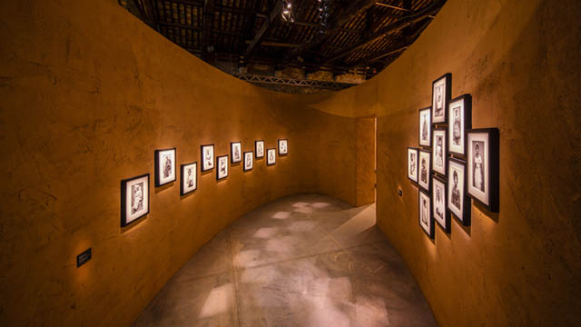
-

The Ghana National Pavilion at last year’s 58th International Art Exhibition of La Biennale di Venezia served to augment the fervent energy of contemporary art already simmering in its locality. The Pavilion staged a stellar intergenerational selection of six “multi-local”1 artists from Ghana— Felicia Ansah Abban, El Anatsui, John Akomfrah, Lynette Yiadom-Boakye, Selasi Awusi Sosu and Ibrahim Mahama— whose works range between photography, painting, film, video, and installation. Stationed in the Artiglierie within the Arsenale, the Pavilion displayed the artists' works in continuous cylindrical enclosures designed by architect David Adjaye, and executed with laterite soil couriered from Ghana. The nation’s debut outing at the Biennale, titled Ghana Freedom, summoned the “boundlessness” and euphoria in the spirit of self-determination promised in its mid-century Independence moment and epitomised in such cultural events as the World Festival of Black Arts— the first being Festival Mondial des Arts Nègres (FESMAN) which took place in 1966 in Dakar, Senegal, and then the Festival of Arts and Culture (FESTAC) which happened in Lagos, Nigeria, in 1977. “There is no longer any need to look back in the same way as an act of reclamation or reaction”, writes the curator Nana Oforiatta Ayim, since “these pathways remain with us and evolve”(Ayim, 2019, pp. 31).
The emancipatory ideal summarised in the titular of the exhibition is a poignant basis for this evolution given the colonial mediation of Ghana’s formal education in general, and art education in particular (seid’ou, 2014; seid’ou, 2016). In this regard, Ghana Freedom could be said to have countenanced an approach to the practice of art that is unconstrained by the de-contextualised imposition of the beaux-arts tradition which became ingrained through colonial instruction in the Gold Coast (pre-independence Ghana) from the late-19th century to the late-1950s, and which prevailed in the postcolonial mediation from then till the first decade of the 21st century. Exhibitions of this dispensation predominantly lacked curatorial direction. Indeed, the Ghana Pavilion, however obliquely, can also be said to have announced the inventiveness of emergent exhibition practices in the country. For example, Ibrahim Mahama’s early site-oriented and itinerant exhibitions in public places is a pragmatic and critical response to the derelict infrastructural conditions an art practitioner in the country has to contend with. Mahama’s attitude to this systemic neglect is traceable to the interventionist ethic and affirmative politics of blaxTARLINES KUMASI.2
It goes without saying that the spectacular occasion of the Pavilion accumulates cultural capital for the nation in asserting a compelling place and reputation as far as the global mainstream of art is concerned— more especially for a nation which has been treated as a footnote in literature on the history of art in Africa. It is therefore our task to, so to speak, “brush history against the grain” (Benjamin, 1969, pp. 257) by practically intervening in it through such exhibition making ventures. In this vein, the success of the Pavilion highlights two major points for discussion.
The first is a dialectical situation. At a time when cultural institutions and producers are enduring famishing conditions as far as state support or infrastructural systems are concerned, the state has demonstrated that it is possible to alter this fate— seeing as the Ministries of Finance and that of Tourism, Arts, and Culture, respectively supported and commissioned the Pavilion. But now that the impossible has happened, one would have thought that prioritising a National Pavilion would pave the way to launch serious longterm cultural policies ensuring continued presence in Venice itself, and also to invest in and build the necessary economic and cultural support structures for those local practitioners who are in dire need of it. As this is yet to happen, it will be crucial for Ghana to sustain the legacy of the Pavilion beyond the rhetoric of representation, even if it turns out to be a one-time affair.
Secondly, turning our attention to local relevance, the intention of the organisers to, later that year, bring the exhibition to the National Museum of Ghana to be able to show it to local audiences and to generate new knowledge has yet to materialise, for whatever reasons.3 This is unfortunate given the curator’s unequivocal concern for institution building and the “possibilities of artistic development in Ghana itself” (Ayim, 2019, pp. 140). If we keep in mind, apropos Borges, that every exhibition, at any given moment, based on its arguments or claims, “creates its own precursors” and therefore holds the potential to alter our conceptions of both past and future within that genealogy,4 then it presently counts as a missed opportunity not to have optimised Ghana Freedom in terms of creating history rather than solely staging one. What I mean is that the exhibition could have served as an epistemic site through which to actively produce and update the history of contemporary art in Ghana. For example, by citing5 or acknowledging the timeliness in the return of the exhibition to the National Museum falling on the 20th anniversary of South Meets West6 — the seldom talked-about contemporary art exhibition of African artists based on the continent and in the diaspora which also took place at the National Museum in 1999 with an artist lineup including Atta Kwami, Tracey Rose, and Yinka Shonibare— in addition to such “precursors” as FESMAN, FESPAC and “Authentic/Ex-centric".7
Such an instance would have contributed to the intellectual legacy of Ghana Freedom in fulfilling the task of theorising the newly emergent curatorial and artistic paradigms in Ghana, all the while establishing the critical connections, differences, and evolutions between postcolonial and transnational antedatings of such political attitudes to exhibition making. This is especially important when we take the emancipatory promise of contemporary art seriously by considering the exhibition as a system that is not only meant for [re]producing spectacular displays, while taking the commodification of art for granted, but as one which deploys the convergence of symbolic and material consequences enveloped in the immanent tensions of history and power. Particularly when we acknowledge that the National Pavilion structure of the Venice Biennale impedes the institution from turning towards the non-imperialist substance of contemporary art.8
It remains to be seen how far representation of culture as the sole basis of participating in such blue-chip events as the Venice Biennale can get us9 (or any nation with egalitarian aspirations for that matter). Let us also not forget that biennales have not always existed, nor should they necessarily always exist in the future.10 Accepting this, at least, cautions us not to take its existence as well as what it promises for granted. If we succeed in the latter it breeds conformism which can be opposite to true freedom. To boot, the present COVID-19 pandemic has gone a long way to expose the fragility of existing exhibition conventions as it threatens to revolutionize our economic, socio-cultural, health and political sectors on a planetary scale. The institutions by which we traditionally associate the production, circulation and experience of art— i.e. galleries, museums, the art market, etc.— have all suddenly ground to a halt and are facing the challenge to structurally rethink their modus operandi. Therefore the future of exhibition making, as we know it, is what is currently at stake. We are confronted with the task, now, as in previous times in history, to be more inventive with the exhibition form. Bonaventure Soh Bejeng Ndikung, artistic director of Sonsbeek (2020-2024), articulates this grammar of contingency well enough in the epigraph.
Where Ghana goes from here in verifying art as an egalitarian universality and creating particular models to suit its locality is entirely up to us, its protagonists. And so the question becomes, when such real threats and crises have paled the superficiality of representation (in other words, when all the pomp and pageantry of Ghana Freedom has disappeared), what will its historical substance be posthumously based on?
About Selasi Awusi Sosu's presentation at the pavilion see: Link
About Ibrahim Mahama's "Savannah Center for Contemporary Art" in Tamale see: Link
Footnotes
1Taiye Selasi uses this term in her essay Who is Afraid of a National Pavilion? in Ayim (2019 pp.38-44).
2Both Mahama and Selasi Sosu are alumni of KNUST and active protagonists of blaxTARLINES who espouse these transformations. This internationally networked collective has been functioning as the contemporary art incubator in the Department of Painting & Sculpture in Ghana’s foremost Art College at the Kwame Nkrumah University of Science & Technology (KNUST) since 2015, and has radically upended the hegemony of salon style display formats erstwhile ubiquitous in commercial galleries, hotel lobbies, and other spaces which had contrived the realisation of artistic potential primarily for the patronage of tourists.
3Nana Oforiatta Ayim confirmed in her lecture in ibid. (in June) after its opening on May 11th that the show would be at the National Museum of Ghana later that year.
4I appropriate this thought from Jorge Luis Borges in his essay Kafka and his Precursors (1951).
5By citing, I do not mean merely mentioning (since the curator succeeded in mentioning FESMAN, FESPAC and “Authentic/Ex-centric” as precursors), but through curatorial research, and coming to terms with their historical, theoretical, and aesthetic substance and formulating an argument that deals critically with the claims and implications of these events through an analysis of their significance to our own epoch.
6South Meets West is an exhibition organized by Kunsthalle Bern and Historical Museum of Bern in collaboration with the National Museum of Ghana which happened in Accra in 1999 and travelled to Bern in 2000. The exhibition curators are Dr. Bernhard Fibicher (Kunsthalle Bern, assisted by Eszter Gyarmathy), Dr Yacouba Konaté (Université d’Abidjan-Cocody, Côte d’Ivoire), Dr. Yvonne Vera (National Gallery Bulawayo, Zimbabwe). Participating artists are Jane Alexander, Fernando Alvim, Meshac Gaba, Kendell Geers, Tapfuma Gutsa, Atta Kwami, Goddy Leye, Zwelethu Mthethwa, Tracey Rose, Yinka Shonibare, Pascale Marthine Tayou, Yacouba Touré, Minnette Vári, and Dominique Zinkpe. The catalogue included texts by Oladélé A. Bamgboyé, Dr. Bernard Fibicher, Kendell Geers, Clive Kellner, Dr. Yacouba Konaté, Atta Kwami, Simon Njami, Prof. Joe Nkrumah, Tonie Okpe and Sarah Zürcher. See South Meets West (2000).
7Oforiatta Ayim acknowledged her debt to Salah Hassan’s and Olu Oguibe’s curated exhibition at the 49th Venice Biennale in 2001, Authentic/Ex-centric: Africa In and Out of Africa. See Ayim (2019. pp. 140).
8Oforiatta Ayim commented on the problematics of this in our public conversation in op. cit. @thestudioaccra. (2019). Taiye Selasi also points at this issue in her catalog essay.
9The curator of the Pavilion, Nana Oforiatta Ayim, states her motivations for realising the Pavilion as such: “One of my driving forces [for being in Venice] is this idea of representation— of voice, of narrative— of who gets to speak the narrative.” She made this statement in a public conversation I had with her at @thestudioaccra. (2019, June 27). Ghana Pavilion Venice Biennale: Conversation with Nana Oforiatta Ayim. [Facebook post]. https://web.facebook.com/accrastudio/photos/a.1118364178194088/2491384694225356/?type=3&theater. Audio of lecture is in author’s archives, courtesy @thestudioaccra.
10I appropriate this thought from Walter Benjamin who, in a similar spirit of contingency, was speaking particularly of the novel form in literature. See Benjamin (1998. pp. 89).
References
- Ayim, N. O. (Ed.). (2019). Ghana Freedom: Ghana Pavilion at the 58th International Art Exhibition La Biennale di Venezia [catalogue]. Koenig Books.
- Benjamin, W. (1969). Theses on the Philosophy of History. In Hannah Arendt (Ed.) Illuminations: Essays and Reflections. Schocken Books.
- Benjamin, W. (1998). The Author as Producer. In Understanding Brecht: Walter Benjamin. Verso.
- Mitter, S. (2020). Art Biennials Were Testing Grounds. Now They Are Being Tested. 2020. https://www.nytimes.com/2020/05/01/arts/design/art-fairs-biennials-virus.html. Accessed 6th May, 2020.
- seid’ou k. (2006). Theoretical Foundations of the KNUST Painting Programme: A Philosophical inquiry and its contextual relevance in Ghanaian Culture [Unpublished PhD Thesis]. Kumasi: KNUST.
- seid’ou, k. (2014). Gold Coast Hand and Eye Work: A Genealogical History. Global Advanced Research Journal of History. Political Science and International Relations ISSN: 2315-506X Vol. 3(1). pp. 008-016.
- South Meets West exhibition catalogue. 2000. Kunsthalle Bern, NÀWÁO. ISBN 3-85780-124-7.
published May 2020
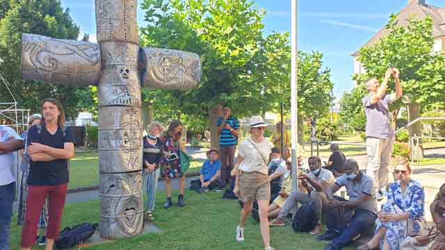
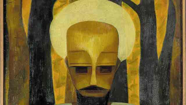
-
The seated human-like figure is centrally placed with the head occupying almost the centre of the entire composition while the hands rest gently on the laps. The head and the face of the human figure is rendered in planes and cubistic orientation, a style reminiscent in precolonial African wooden sculptures. Hands of the figure received similar cubistic treatment with less details as in realistic depiction. Interestingly, there is a deliberate subtle emphasis on the head size of the figure. In African sculptural renditions, the human head is considered as seat of wisdom and, therefore, presented bigger to defile the realistic canonic proportions and connote its Afrocentric symbolic essence. This concept of head re(presentation) is termed as African proportions (Amenuke et al, 1991).
To create a harmonious contrast of colour and shape, tints of yellow forms an arc-shaped design around the head. This treatment possibly suggests a halo effect characteristic of saintly figural paintings in Western art traditions. It also mimics a turbaned human figure. As an artist who hailed from a predominately Muslim community, this stylistic treatment, perhaps, pays tribute to his religious cultural background. The eyes are presented with dark brown rectangular dabs, with the forehead gently highlighted with bright yellows, a treatment that puts the human figure in a meditative mood and sanctimonious character. Though Uche Okeke presented the work in a portrait orientation, the skilful placement of the human figure, and the peculiar colouration of the head regions creates a triangular effect when imaginary diagonal lines are projected from the bottom corners of the composition to the halo-shaped found on the head. Similarly, the haloed effect on the head and the elongated pharaonic beard creates an imaginary inverted triangle resonating a visual excitement.
Symbolically, yellow depicts riches and royalty in African colour scheme. With this schematic colouration, Okeke gave a clue to the kingly characteristics of the human figure. The white looking garment of the figure also adds to the sanctimonious conjecture of the figure as in African colour symbolism. The artist’s use of luminous chromatic reflection of the tint of yellow and dark shades helped in achieving the sense of depth in the garment. Complementing the overall kingly posture of the human figure is its elongated pharaonic beard and bodily language as found in sculptures of ancient Egyptian kings.
Okeke skilfully deceived viewers of this composition into believing that it is symmetrical per its stylistic tendency, yet an intense observation reveals a psychedelic mutation of the placement of the fingers, padding of the background with tree-shaped figures in rich application of tints and shades of black, yellow and brown to create contrast of colours and shapes. Placement of the trees in colour variations and the sprouting of the branches forms a psychedelic cross and contribute to breaking monotony. The patchy effects of the intense yellow forming the negative spaces adds to creating a perceptual believability that the human figure wears a contemplative mood per the facial looks. There seem to be gentle highlights of the yellow from the shoulders to the halo-shaped object.
Per the compositional portrayal, Okeke showed a kingly and majestic posture of, perhaps, the Christian religious icon in Africanised bodily posture and cultural praxis. This compositional contextualisation feeds into his personal manifesto that he did not subscribe to borrowing Western artistic accent hook, line and sinker. Neither was he comfortable with resorting his Nigerian indigenous artistic traditions without modification. He emphasised in his manifesto that it is ‘… futile copying our old art heritages, for they stand for our old order. Culture lives by change. Today's social problems are different from yesterday's, and we shall be doing grave disservice to Africa and mankind by living in our fathers' achievements’ (Okeke, n.d). For that reason, he appropriated western artistic accents and fused them with Afrocentric artistic concepts and perspectives to achieve a hybrid artistic language which is not purely African nor Western, but yet circumvent the boundaries of artistic cultural traditions in general. The fusion lends itself to exploring the familiar and the unfamiliar to create a renewed breed of art. He called this effect ‘natural synthesis’. Emanating from Nigerian non-conformist artist group named Zaria Rebels, Okeke sought to reinterpret the Western artistic style of realistic depiction, perspectival detailing, accurate proportions and tonal gradation he was exposed to by the Eurocentric-inspired faculty in the so-called formal education setup in art in Ahmadu Bello University, Zaria. As part of the pioneering post-independence artists in Nigeria, Uche Okeke was experimenting for a renewed artistic accent for his creations through the assessment of his Nigerian cultural values and the new artistic training he had been exposed to in order to arrive at the boundary of these two traditions.
Using this painting in teaching and learning in the context of collective memory could inspire relevant competencies in the learners. Gathering inspiration from the artistic pursuit of Okeke, learners could fuse multiple artistic traditions of the artworld to arrive at their individualised artistic accents. Teachers could engage learners in this manner by asking them to borrow and appropriate a foreign artistic style and fuse it with their nationalistic art making techniques to develop a new breed of art or concept. Teachers could also discuss with learners about the fact that gathering artistic inspiration is multicultural with no boundaries. Furnishing learners with links to the biographical account of the artist for them to understand his cultural nuances remains key in the process. It would also be beneficial to guide learners to explore with their own interpretation of the artwork (figure 1). Teachers could also provide learners with printed copy of the painting and ask them to redraw this religious-centred figure to suit their own religious understanding and cultures. This approach addresses the competencies of critical thinking and problem solving; creativity and innovation; cultural identity and global citizenship; and personal development.
References- Amenuke, S. K., Dogbe, B. K., Asare, S. K., Ayiku, F. D. & Bafoe, A. General knowledge in Art for
- senior secondary schools. Evans Brothers Limited.
- Okeke, U. (n.d.). Natural synthesis. final okeke natural synthesis manifesto 1960.doc (live.com)
The image is presented in a form of a male figure in a seated position with long beard, white turban, white robe, long sleeves and a probably waist band. The painting represents fairly the complexion of a male, black bearded and wearing a face mask, with hands resting on the laps possibly in a meditation mood. The Background is probably a wooded environment or garden with tall trees of two colours (black and yellow). The figure seated probably on a staircase or an amphitheater. The sun ray penetrating through the tree created shaded patches reflected on the image.
An Islamic perspective: I base my interpretation of the painting on Islamic perspective as one of the foreign region that had an early contact in northern Nigeria as early as 15th century long before Christianity and eventual colonization of Nigeria by European power (the British) and its possible independence in the 1960. The emir is mostly male usually dressed with a white robe, long sleeves and a white turban tied around his head to signify his authority. The painting perhaps represents an Emir of the Zaria state at that time sitting in a garden relaxing.
Using an African mask: The use of an African mask to represent the figure was done deliberately or perhaps to avoid revolution from the Muslim community of disrespecting their leader which the author was much familiar in this volatile society especially, the intolerance nature between Muslims and Christians at this era in the Zaria state. The mask as a tradition signature that ubiquitous across many cultures that can be used to represent the religious discourses by appropriating and manipulating them to produce art forms of the past to produce a mythology for the present.
Lessons
- The image portrays the power of the emir in the Zaria state with a possibly palace and vineyard or gardens where he retires to relax. The seat or staircase/amphitheatre is constructed within the park for relaxation.
- It also shows the importance of trees because the natural air and shade provided. It reflects the symbiotic relationship between man and the natural environment or biosphere.
- The long beard is a reflection of the age of the figure, combined with the white turban tied around the head which is a symbol of power and authority of the emir within the context of an Islamic state. Again, the white long robe coupled with black beard and the white turban is a reflection of the dress code of the emir within the states dominated by Muslims. The waist band (blue sea colour) is used to tie the robe for easy movement.
- The facial representation of the figure doesn’t conform with normal human head based on the eyes, nose and mouth. It is probably a mask of an Egyptian pharaoh to imbibe the spirit of the Pharaoh as a kingly figure that wielded much power. A story that is synonymous in both Islam and Christian doctrines except the West Africa Indigenous Religions that do ascribe this myth. The use of the mask also simmer the tension of using identifiable imagery that would have rise tension in this probably consecutive Muslim state. The use of masks within the Africa context show the spiritual powers embedded in them that the wearer or user is mostly possessed and transfigured a situation that can only be explained by adherences to that particular belief system.
- The black and yellow tall trees depict the diverse nature of the ecosystem and the symbiotic relationship mostly exhibited in the environment. This shows the complex nature of the human society with diverse cultural and different colours complexion that need a person with wisdom and patience to rule, like the emir who assumes the position of an Egyptian Pharaoh.
- Uche Okeke, was a revolutionary artist who tried to break away from normal art presentation handed to Africa by the white colonial powers. This diversion was to Africanize the art industry in West Africa and Africa at large. This where Okeke decided to use the Pharaoh mask from Egypt that was considered even among Europeans of the cradle of human civilization in the world.
I argue in the following text from a special position. Firstly, I was present in Bayreuth on 26.4.2022 when the two co-authors, Osuanyi Quaicoo Essel and Mahmoud Malik Saako, discussed the painting in a larger circle. The representatives of the Iwalewa House clearly expressed their doubts about the (traditional) title of the painting "Christ".[1] Perhaps this brought the question of who was depicted in the painting, Christ or another person, to the fore. This question also shapes my discussion of the painting presented here. It became the guiding theme behind which other topics disappeared, such as the question of the painting's function (what was it created for?), its biography (how did it come to Bayreuth?) the role of oil painting (is it a European import), the context of the debates on modern art during the independence movements in Africa (does the painting belong to a global modernism after the Second World War or does it mark a Nigerian path? [2]) - to name just a few.
My own interpretation is therefore less an independent approach to the work than a response to the positions presented with the intention of building bridges between the approaches by introducing a meta-level. Whether this is convincing, whether the bridge is sustainable, is for the reader to decide. But more on that below.
Traps through aesthetic stereotypes that lead to false classifications / interpretations
And a second preliminary remark: I didn't like this picture at the beginning. It reminded me too much of the religious pictures of the 1950/60s of my childhood. They were popular for death pictures back then: A mixture of a bit of Pre-Raphaelite and icon-inspired imagery, soaked in the formal world of a moderate and esoterically inclined modernism (Franz Marc). The intention was easy to see through: To somehow keep alive that which, in my view, was no longer contemporary at all, and to do so through a bland, unconvincing and even less convincing adaptation (a kind of "modern facing"). This is also why, when I saw the picture hanging at the entrance to the Iwalewa House from the corner of my eye, I immediately saw a Christ.
Iconography - inclusion of other perspectives
Detail
In the discussion mentioned at the beginning, the intervention of Mahmoud Malik Saako was really surprising for me - against the background of this perception, which was shaped by my own stereotypes. The halo (which I saw - see detail) was a turban (which Malik saw). But I could not counter his view. There was no argument for the interpretation as a halo. This is also true now when I read Malik's text (like Osuanyi's). So I first had to recognise my stereotype in perception, which had lured me onto a perhaps (?) wrong track, I had to get rid of this, unlearn something, in order to be able to open up to the other perspective.
Why I - retrospectively - still speak of "perhaps wrong", a research on Okeke's work has confirmed as meaningful. After all, there are obviously works in his oeuvre that iconographically quite certainly represent Christ or St Mary, as an internet search reveals (see fig. below). The auction house Bonhams (Abb.1) states - even if for 1963, two years after our work: "in 1963 ... the Passion of Christ was a recurring theme for the artist. He had produced the stained-glass designs of the Fourteen Stations of the Cross in Munich earlier in the year." (www.bonhams.com/auctions/25800/lot/28 accessed 14 Sept 2024)
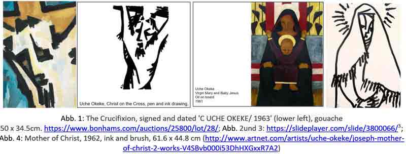
Christian motifs in Uche Okeke's Ouevre between 1962 and 1963 found by the author on the internet (May 22, 2022)
Perhaps this is why the discussion about whether Christ or a Muslim is depicted makes me feel uneasy. In my mind, the question is connected with the attributions or depreciations: To whom / which faith does the work of art belong? Does it belong to the Christians, the Muslims, or the traditional believers in northern Nigeria, if, as Philipp Schramm or Mahmoud Malik Saako suggest, one also discovers a traditional wooden mask?
New approach and reflection on its anchoring
Hence my attempt to think of the painting in a different way, i.e. not from the artist's point of view and what he or she wanted to represent. In doing so, it is clear to me that I am taking a specifically Western approach to a modernist work (where I now place Okeke's painting) with my new approach. This approach is based on the loss of a binding iconography and a fundamental openness / never-quite-unambiguity of 'autonomous' works of art for a Western-oriented, middle-class audience. In addition, my proposal for interpretation is based on a specific position in the interpretation of images, from production theory to reception theory (in the context of constructivist epistemology). The loss of a binding iconography is accompanied by a greater significance of form (which is now itself charged with content to compensate for the loss). In a next step, I therefore try to examine the image - beyond a positioning in the question of whether it is an "Islamic" or a "Christian image" or a "traditional image" - form-analytically.
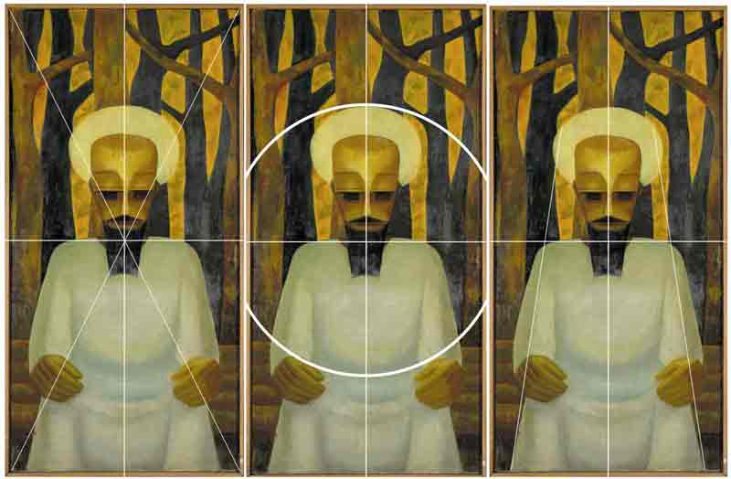
Analytical composition with auxiliary lines. (c) the author
Form analysis
The dominant, almost penetrating axial symmetry in a very high longitudinal format speaks of high order; the pyramidal structure of the figure also speaks of calm and stability, indeed of sublimity and dignity, of quiet, immovable power. And this dignity is not fed by external insignia or theatrical staging, but by a calm that radiates from within. It is a picture in front of which one can become calm if one trusts the order as a viewer.
The striking human figure contributes to this effect. Although clearly figurative, it does not represent - to the degree of abstraction - a concrete portrait or a human being that can be grasped by the senses. This is most obvious in the geometricised eye area, which is shaded in various dark zones. This makes the gaze ambiguous: is the figure looking at the viewer, is it looking forward, is it looking inwards (contemplatively, with closed eyes)? Together with the geometric rhythm of the picture's surface (the symmetry, but of course above all the parallels that can denote eyelid, tear sac, eyebrow - or not) support the depiction of a human being in an abstracted ideal form that remains open to itself, as in a mask. The latter is also characterised by the fact that the viewer immediately sees what has been made, what has been assembled, as in the case of the moustache, for example.
The figure sits quite classically in front of a middle and a background: at the bottom the zone (again - between two-dimensional and spatial effect - strongly abstracted) is divided into horizontal stripes, which become slightly narrower towards the top. They again suggest something familiar (a wooden bench), but this remains ambiguous. In the upper zones, the tree trunks (without leaves) form the liveliest, least symmetrical, most restless element in the painting, even if the alternation of light and dark again shows the abstracting hand of the artist.
With this spatial layering in clear zones (background, trees, seat, figure), but also the geometric reduction of the forms, the picture looks like a carved relief. The colouring also fits in with this, for example when the "sky" behind the trees as well as the lighter trees have the same colouring as the face, while the beard, eyes and the dark trees form a second colour zone. The lightest zones are formed by the robe and the shape around the head. Despite the large spectrum in the area of light-dark contrast, the picture does not appear colourful, rather like a natural wood relief. An effect that is again particularly evident in one detail: the way the hands are shaped is reminiscent of hands carved out of a piece of wood.
This character is supported by the way Okeke uses oil painting. He clearly outlines the contours of the surfaces. The objects are each assigned a main colour, applied impasto with broad brushstrokes. The modelling creates plasticity, lightly set with internal structures enliven the colour surfaces.
Conclusion
The degree of abstraction, the modelling construction of the figurative out of a colourfulness, the strict symmetry of the composition, the tectonics of the pictorial space unfold a tableau that nevertheless - and this is now decisive - creates zones of ambiguity in the figurative. The viewer must fill these with his or her own ideas. The viewer's gaze is directed towards the picture, but the eyes do not look back. In this respect, the painting is suitable for contemplation, meditation, spiritual experience. In seeing the painting, one's own can come to rest. And so the distinction between the Christian halo, the Muslim turban and the ritual mask can also come to rest in the contemplation of the painting.
This consideration is based on an 'ideal viewer' of the work, i.e. it is reception-aesthetically oriented. If one finally turns it once again to production aesthetics, one could interpret the work as an attempt by the artist in which it experimentally unfolds what a spirituality beyond the distinction traditional - Christian - Muslim could look like.
Footnotes
[1] Philipp Schramm's position becomes clear in his text (https://www.bayfink.uni-bayreuth.de/de/Sommerausstellung-2021_-Not-yet/audio-not-yet---welcome/index.html).
[2] Perrin Lathrop, "Uche Okeke," in Smarthistory, August 9, 2015, accessed May 21, 2022, https://smarthistory.org/uche-okeke/.
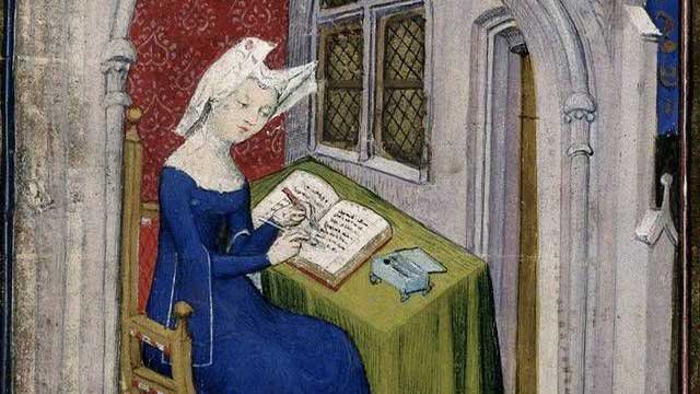
-
The picture of Christine de Pizan and our knowledge about her life show that this is not true. Christine de Pizan (1364 – c. 1429), born as Cristina da Pizzano in Venice, was a poet and author at the court of King Charles VI of France. Christine produced a large number of vernacular works, in both prose and verse. Her works include political treatises, mirrors for princes, epistles, and poetry.
This very famous miniature is an illustration from a book, handwritten in the years between 1410 and 1414 and preserved at the British Library in London (Harley MS 4431, Vol. 1, fol. 4 r). This manuscript contains texts by Christine de Pizan and is called The Book of the Queen, as it had been produced on behalf of and dedicated to Isabeau of Bavaria, wife of King Charles VI of France. There is another miniature showing Christine on her knees dedicating the book to the French queen. Christine can be identified by her facial features and style of dress.
Detail of: Master of the Cité des Dames and workshop, 1413 - 1414, parchment, 36,5 cm x 28,5 cm, British Library, London. © British Library, London. Photo: the author
In the centre of the aforementioned picture, a woman is shown sitting at a table and writing into a voluminous book. With her left hand, she is erasing coloured letters with a knife and with her right hand correcting them. This dynamic gesture of self-correcting fills her working situation with life. On her head is a headdress typical for a widow, the guimpe/wimple. Around the desk, we see some fictive architecture with a broad symbolic meaning: it shows a room which is specifically tailored to an intellectual working woman but also opens to the outside, as there are windows, an arch, and entryways. The roof of another storey marks the building as a town house. Though the scene is an interior one, the colours on the woman are bright, and there are warm red colours around her. This is different from older pictures showing clerical female authors in the narrow, closed rooms of a cloister.
‘Je, Christine’: An independent author defining her role in society
The picture shows a professional female author in an urban context in the process of writing a book and working for the public, where she is honoured as being part of the highest level of society. There are similar pictures with Christine sitting behind her desk with an open book and people coming and arguing with her in a lively manner. In one, a young man, who has been identified as her son, stands in front of her and speaks to her. Another one shows four men visiting her in her room and discussing her writings with her. Sitting Christine, standing men: the arrangement shows that the guests will leave soon. Such encounters are also atypical for a cloister, which is said to be the usual space for educated women.
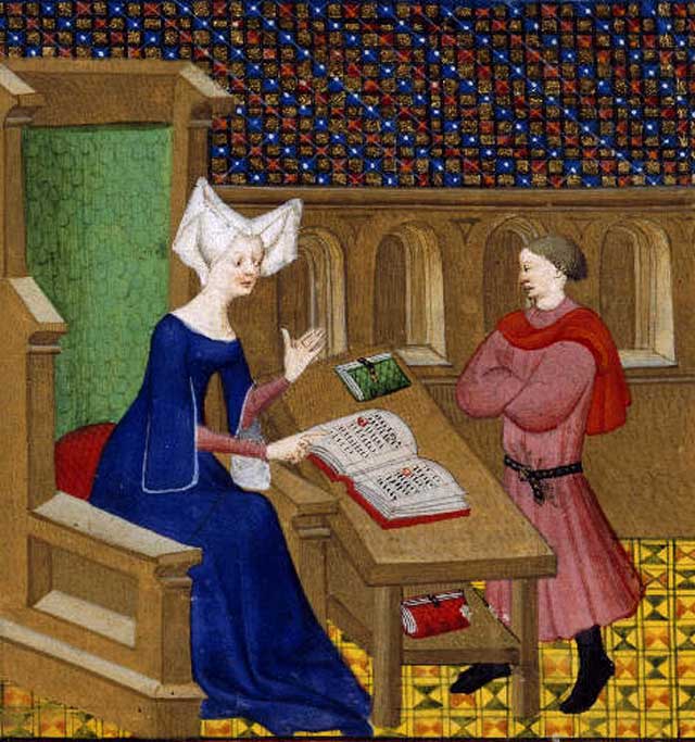
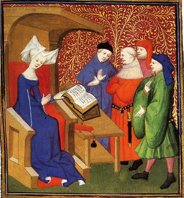
Detail of: Master of the Cité des Dames and workshop, 1413 - 1414, parchment, 36,5 cm x 28,5 cm, British Library, London. © British Library, London. Photo: the author
As experts see it, it was Christine herself who ordered the illustrator to characterise her in this manner. Several autobiographical comments of hers document that she liked to show herself living this individualist intellectual lifestyle. Traditional scholars call this typical for the Renaissance, which began a bit after Christine’s lifetime. Very often in her books we find ‘Je, Christine’ (‘I, Christine’), at the beginning of a chapter.
Christine’s life story
Christine was born in Venice in 1364 as the daughter of a doctor of medicine and astrology. He was called to the French court in Paris. Christine married a royal secretary and had three children. But then her father, her husband, and the king who had supported the family died. Christine was 25 years old and had to care not only for her children but also for her old mother and younger relatives living with her. She decided not to marry again but to support her living by writing. Her oeuvre contains poems alongside utopian, philosophical, historian, didactical, allegorical, and autobiographical texts. Noble families ordered her books and paid her well. In her old age, she escaped from the civil war in Paris to a cloister nearby where she died around 1429.
The first secular female author in Europe
With her Italian-French background, Christine is an example for the migration of intellectuals in southern Europe in the late Middle Ages and early Renaissance. She was not herself noble but came from an academic family and remained near the court. She was privately educated, mostly by her father, and also educated herself using the offer of the erudition centre in France. Living within a totally Christian cosmos with a spiritual way of thinking, she was not a clerical but rather a secular woman. In her books, she fought for gender equality, especially in education, as well as for recognizing the extraordinary performances of women in the past and in her own time. She wanted this knowledge to be part of a new understanding of history. She sharply protested against texts which reduce women to sex objects. With her pugnacious notes, she provoked the first literary quarrel about femininity and masculinity in Europe, the ‘Querelle des Femmes’.
The masculinisation of literacy and education in the modern era
In premodern Europe, competencies in literacy were considered more or less ‘feminine’. Girls learned to read at least the Bible to their families; noblewomen were taught languages and literature to be able to marry into different countries. The ideal for masculinity was fighting strength; sitting with books seemed to be viewed as non-masculine. Many kings and noblemen were illiterate. This changed in modern times. Literacy became part of the public world and school education developed as a privilege of men.
In the colonial period, Europeans attempted to impose this central European order on the African colonies: women were relegated to the private sphere, while men had the privilege of acting in public, which was more valued. The colonisers argued these gender roles were anthropologically fixed constancies, and they had the civilising mission of transferring this pattern to their colonies. But African scholars insist that in precolonial times, polar structures of different worlds for men and women did not exist, exactly as they had not in premodern Europe.
Conclusion: Confirming non-dualistic, fluid gender concepts
As we still need to fight against the discrimination of women and girls in educational systems worldwide, the message of the picture might be encouraging. This visual icon helps to deconstruct a common myth about Europe and to reject static ideas about continuities of bipolar gender structures. Even in the European Middle Ages, independent female authors were shown, combining inside and outside worlds. To see that it was different in history motivates us to see the hybridity of gender structures on both continents, which do not merely follow the dualistic scheme of men working in public professions and women working as housewives.
References:
- Christine de Pizan: Le Livre de la Cité des Dames. Stock 1986 (French).
- Christine de Pizan: The Book of the City of Ladies (Penguin Classics) rev. 2000 (English).
- Christine de Pizan: Das Buch von der Stadt der Frauen. Originally in Middle French. Translated and with commentary and an introduction by Margarete Zimmermann, Orlanda Buchverlag Berlin 1986, dtv 1999 (German).
- Roberta L. Krueger: Towards Feminism: Christine de Pizan, Female Advocacy, and Women’s Textual Communities in the Late Middle Ages and Beyond. In: Judith M. Bennett, Ruth Mazo Karras (eds.): The Oxford Handbook of Women and Gender in Medieval Europe. Oxford University Press 2016, pp. 590-606.
- Henry Kam Kah: The Sacred Forest. Gender and Matriliny in the Laimbwe History (Cameroon), c. 1750-2001. Berlin 2015.
- Oyewumi, Oyeronké: Colonizing Bodies and Minds. Gender and Colonialism. In: ibid (ed.): Invention of Women. Making an African Sense of Western Gender Discourses. Minneapolis, MN 1997, pp. 121-156.
Edited by Kelly Thompson.
published August 2020
-

Originally, South Africa was discovered by the Portuguese in 1488, but this was not permanent, just like the Dutch settlement in 1652 that is generally viewed as the birth date of the country. In 1795 the Cape Colony fell under British rule again; it reverted back to Dutch rule in 1803; and again to the British in 1806. From the onset of colonisation, the transatlantic slave trade was immense and especially South-East Africa was a main source of slaves. The colonisation of Southern Africa had as main purposes the setting up of refreshment posts where food and other essential stock could be collected, as well as the trading of slaves. The indigenous nations were subject to the whims and fancies of the colonisers, and they were sexually and labour-wise exploited; families were broken up and those who resisted were punished and often killed by whipping, shackling, hanging, beating, burning, mutilation, branding and rape. In many cases the slave ships themselves were killer machines since the slaves were packed into the haul like sardines with little attention to hygiene.
In addition, South Africa is extraordinarily rich in mineral resources and gold, which has brought about massive wealth, but also instability. Johannesburg was established in 1886, due to the so-called gold rush, with fortune seekers and diggers flooding to it from all over the world to the country. Since then the gold mines have attracted an influx of locals as workers, which contributed to much nomadism, but especially since 1948 during apartheid, such mine workers were ironically allowed to work underground but once aboveground they had to return to townships outside the large city.
Since 1948 when the country became locally governed by the Afrikaner-dominated right-wing National Party, whilst still regarding Queen Elizabeth II as head of state as a relic of British imperialism, attempts were made to throw off the colonial yoke permanently, and on 5 October 1960 the country became an independent Republic. At all times there have been resistance to the ruling governments by groups of all cultural origin, but especially during the 1980s and early 1990s there was severe resistance to the ruling policy of segregation: a period that saw much abuse, violence and many incarcerations. In 1990 Nelson Mandela as leader of the oppositionist African National Party was released from prison and in 1994, as part of a peaceful handover, he was inaugurated as the new president of the country with the ANC as government.
It is clear that, as a country, South Africa has been torn apart by politics, and especially by the impact of colonisation. The postcolonial impulse is therefore inordinately robust in this part of the world. The notion of the postcolonial is closely linked to that of the postmodern, and according to Gen Doy (2000:204), author of Black Visual Culture: Modernity and Postmodernity, much of current art practice is “often relating to issues discussed in postcolonial theory such as identity, displacement, mixing of cultures and peoples (hybridity) and indeterminancy.” Post-colonialism could be viewed as a response as well as a resistance to colonialism, whereby issues such as historical events, beliefs, traditions, conventions and languages are evaluated and critiqued in an attempt to uncover the superiority and centrality of certain systems of thinking. Ideas of superiority and power relations play a core role in postcolonial investigations, but a main problem in much postcolonial theory is to nurture the idea of static black culture, which in reality is constantly changing and adapting to new developments and ideas. Decoloniality or decolonialism originated as a Latin American movement which focuses on understanding modernity in the context of a form of critical theory applied to ethnic studies. Similarly it is a response to colonialism. It seems to be more radically critical than postcolonialism which indicates more of a general resistance. Coloniality is generally understood as the sentiment and logic essential to the evolvement of Western civilisation from the Renaissance to today. Foundational to decoloniality is the deconstruction or decoding of the coloniality of power. This logic is commonly referred to as the colonial matrix of power and has its own set of theories and methodologies.
Since the 1980s, the work of internationally renowned South African artist William Kentridge (b. 1955, Johannesburg) has mainly served the purpose of commenting on socio-political issues in the country. He is best known for his prints, drawings, operas and animated films. A work of special interest is his The refusal of time of 2012 (hereafter referred to as ‘TRT’), since it presents a clear image of postcolonial legacies and decolonial sentiments that have resulted in an eclectic mélange of narratives, experiences and events. Particularly interesting is also how the artist mixes various kinds of technologies in sophisticated way.
TRT premiered at Documenta 13 (2012) in Kassel, Germany, specially commissioned by the curator of Documenta 13, Carolyn Christov-Bakargiev, and since then it has been exhibited at various other venues in Japan, Italy, Australia, the United States, Brazil, Holland and Finland. The work was produced in the artist’s studio in the Maboneng district in downtown Johannesburg and as a prelude to Documenta 13, a series of notebooks entitled 100 notes – 100 thoughts was published by Hanje Katz in 2011. In South Africa, the artistic production was shown first from November to December 2014 at the Johannesburg Art Gallery and then at the National Gallery in Cape Town in 2015. A collaborative piece, the artwork entails teamwork with Peter L. Galison, Philip Miller and Catherine Meyburgh. The chamber opera, Refuse the Hour (made in collaboration with Miller, Meyburgh, Dada Masilo and Galison) - with an international cast of eleven, including dancers, musicians, performers and vocalists - is the theatrical accompaniment that laid the groundwork for the artwork and is also an independent production. Prominent in the production is the artist presenting a lecture-performance on productive procrastination, myth, entropy, empire, black holes, the ancient Greek myth of Perseus and Einstein, surrounded by animations, swirling dancers, singers with megaphones, instrumentalists and a solitary physicist (BAM | Refuse the hour 2015).
As an installation, TRT comprises five digital film projections on thirty-minute loops and a large automaton, occupying the entire space of a single, large hall. In the dark enclosed space of TRT, a hive of moving figures and intersecting stop-frame imagery ensues in the five film projections, creating an impression of vibrating energy. The complex imagery includes the artist as one of the performers, walking, reading and performing acts such as changing hats; a female figure, dancing and producing ‘wagon wheels’ and other acts; figures in comical scenes in colonial rooms à la George Méliès; figures in a laboratory-like space, maybe busy with experiments; dispersing and flying anamorphic fragments becoming human figures, representing a kind of chaos rendering; a rhinoceros; silhouettes; ticking metronomes and clocks; and imagery of inter alia megaphones, starry skies, stop-frame animations and drawings. On the other hand, chaotic time is presented as humanly, existentially and imaginatively inferred. Mortal conceptions of the physical body appear in the form of chaos imagery of disintegrating matter; and swirling moving figures, transgressed boundaries, and fleeting script and words render an awareness of temporality and transience in order to defy conceptions of certainty and fixed systems. The moving human agents in TRT ‘transgress’ the confines of the delineated boundaries of each projection by walking across the edges, and by so doing become displaced and emplaced in in-between, liminal zones.
Kentridge positions the human body centrally in TRT. Technically, his scientific and conceptual method levies each projection that transforms intermittently from the graphic, more abstract imagery into the stop-frame animations to human figures (including the artist himself performing), clothed idiosyncratically in contemporary as well as traditional outfits. Other transmutations include a turn to colonial comical scenes with actors performing in rooms with historical architecture; walking and dancing figures; and figures in shadow procession, recalling some of Kentridge’s well-known earlier works. The sculptural automaton and ticking metronomes are given equal presence in the five film projections, which generates the comment that technological development has shown progress from elementary, handmade technologies to advanced digital technologies, but that the embedded techniques and processes are equally relevant.
In TRT, preference is given to a conceptual engagement with the human technological condition instead of a lofty statement about science itself. Kentridge ‘relegates' science to technology and succeeds in generating comment and meaning through the very processes of the techniques used. In the five ancillary virtual ‘rooms’, an artificial environment has been created, entrenched in the technologies of the digital age, which has borne witness to emerging engineerings such as electronic communications, artificial intelligence and biotechnology. Symbolically comment is generated in terms of politics as ‘experimentation’ and human beings as the victims thereof. Set in virtual reality, the rooms in the Méliès-type comical scenes in TRT resemble colonial architecture, but notably these are graphically hand-drawn. Through very technique of the linear and expressive sketching of doors, windows and other paraphernalia, heterotopic ‘frames’ are created that resonate with the racial and gender regimes of the histories of colonial culture in South Africa. Several spaces are represented in the work, but in a dualistic sense they are both material and immaterial, and ambivalently premised.
The flying particles in TRT subtly reveal thin red lines, crossing and indicating geographical points of intersection, but without explanation of what they represent. Metaphorically they could function as boundaries, relational reference points, historical markers, psychographical moments or points of reference wherefrom the ‘walk’ into time takes place or even the liminal ‘place’ where life and death meet. The particles become chaotic and finally disintegrate, almost in reflection of the processes of memory and how everything fades in time.
References
Doy, G. 2000. Black Visual Culture: Modernity and Postmodernity. Gen Doy London: I.B. Tauris.
About the artist
William Kentridge (born 28 April 1955) is a South African artist best known for his prints, drawings, and animated films. His political perspective is expressed in his opera directions, which involves different layers: stage direction, animation movies, influences of the puppet world. He has staged Il retorno d’Ulisse in patria (Monteverdi), Die Zauberflöte (Mozart) and The nose (Shostakovich). Berg's Lulu premièred at the Metropolitan Opera in New York, and in 2017 Wozzeck (Alban Berg) premiered at the Salzburg Festival.
published February 2020
-
The "reunification" is the result of a synergy of different societies willing to modify their way of life and the principles of their socio-cultural organization in order to cope with the vicissitudes of the colonial yoke. These societies are based in the Great West, the Coastline, the Southern Forest, the East and Lake Tchad, the regions that mark Cameroon’s geography. Each of these regions is home to a large number of ethnic groups such as the Bamileké, the Bamun, the Akunakuna, the Babungu, the Duala,the Beti, the Fang, the Peul, the Kirdi, the Fula, the Dourou, the Fali, etc. The date of May 20th, 1972 marks Cameroon’s passage from Federal Republic to United Republic by referendum. This date can be said to be the culmination of the political commitment initiated on the 1st of October 1961 with the reunification. Based on this commitment of 1961, Cameroon continued the construction of a unitary state and the consolidation of national unity encompassing the country's entire population. It can be argued that this unitary state was the only way to protect Cameroon’s sovereignty after Independence and to implement projects of prosperity. In President Ahidjo’s words of 1961: "It is together that we will make our Cameroon finally returned to the borders of our ancestors1, a modern country where it will be good to live in a climate of freedom, fraternity and prosperity." (Mveng 1985, 262).
The Reunification Monument is situated on "Plateau Atemengue", Yaoundé’s political and administrative centre. In this area, the colonial administration had placed institutions for education and administration that were crucial constituents of the new country: the National Assembly, the school of administration and the judiciary, the military headquarters, the Leclerc High School and the University of Yaoundé, to only name a few examples. The large boulevard initially used for the parades commemorating the celebration of the feast of national unity is located on this plateau as well. Placed on top of the city, amongst the republic’s essential institutions the Reunification Monument was obviously meant to become a reminder of the sense of unity amongst the initiatives engaging the Cameroonian republic.
The ensemble of the Reunification Monument consists of an architectural structure and a sculpture. According to Noé Tonye2, its shape emerged from sketches selected by the public authorities following a national and international competition on the theme of reunification launched by the Cameroonian Head of State. However, the identity of the authors of this monument suggests that they might also have been directly commissioned because they appeared qualified for the job due to their previous projects. These artists are Gédéon Mpando and Engelbert Mveng with his “Art Nègre Workshop”, who both used to receive public commissioned in Yaoundé at that time. Annette Schemmel (2015, 66) points out with regard to Engelbert Mveng: “As the author of Cameroon’s first national history, a contributor to ABBIA {Revue}, and a politician in Ahidjo’s service, Mveng enjoyed an excellent reputation among Cameroon’s élites. His social standing also led to secular commissions ». A third partner was the French architect Armand Salomon. His involvement in the realisation of this monument is due to his proximity to the French government, who probably recommended him to the Cameroonian government, according to Noé Tonye.
Although the conditions of the commission are somewhat obscure, Engelbert Mveng is known to be the designer of the spiral tower as well as of the representation of the cultural areas of the new state, while Gédéon Mpando created the monumental statue and Armand Salomon was in charge of the realization of the spiral-shaped building. Arguably, the teaming up of three professionals had a symbolic dimension because building a "merged" nation called for the commitment of society as a whole. Such a vast project required an explosion of research and creative initiatives towards a culture of common values driven by teaching and education. The involvement of several Cameroonian artists and a French architect in the design and the construction of this monument reflects the political will to involve different parts of society and to create mechanisms that are operational and serving the interests of national unity.
The architectural component of the monument to the reunification of Yaoundé has the appearance of a giant cone built of concrete. This cone consists of two spirals which describe a sinusoidal movement, and which unite on the top. The basis of this architecture is a circular structure and each spiral is a form of concrete slide made up of stairs to the top. A high column in the centre and four parallel pillars support the structure as a whole. For these four main pillars, the Art Nègre Workshop has designed reliefs showcasing characteristics of lifestyles, landscapes, cultural and artistic elements from the North, South, East and West of Cameroon. In a similar style, the team has pictured school scenes, construction scenes of modern architecture, scenes of farming, etc. for the decoration of the underground part of the building, thus celebrating the process of transformation and development of both society and land.
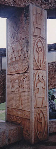
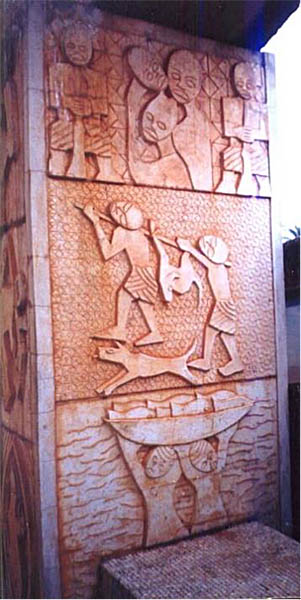
Images: ASSAKO ASSAKO Paul-Henri. 2014. L’art au Cameroun du XXe au début du XXIe siècle : étude des expressions sculpturales en milieu urbain, thèse présentée et soutenue en vue de l’obtention d’un doctorat/Ph.D en Histoire de l’Art, UY1-Cameroun, p. 571.
Details of a pillar cladding representing the diversity in the Cameroonian regions: the cone-shaped architecture and an initiation mask of the Kounga from Cameroon’s West; the abbia motifs and the hunting scene characteristic of the forests on the South Cameroonian plateau and finally the fishing scene which recall the Littoral region.3
Engelbert Mveng and Atelier Arts Nègre (design, decoration in relief on the architectural structure), Armand Salomon (architecture), Mpando Gédéon (sculpture), 1973 -1976, concrete, H: 7m, Atemengue Plateau Yaoundé, Cameroon. Photo: Paul-Henri Souvenir ASSAKO ASSAKO
The sculpture by Gédéon Mpando that is situated in front of the spiral architecture reinforces the idea of a united nation as a foundation for development, fulfilment and prosperity in its own way. The artist has personified the nation in a figurative sculpture. The composition represents a stocky colossus (53 tons, height of 7m) in a seated posture of great stability. He holds a torch in his right arm while his left hand serves to support the four children who are clutched to him. The children’s visible efforts to climb up the colossus make for a strong vertical tension, echoing the cone-shaped architecture in the background. Mpando’s sculpture reveals a kind of serenity. Its strong expressiveness is due to a harmonious play of masses and volumes in the treatment of forms. Both artists’ contributions translate a vision of the nation that is both poetic and critical and as such essential to the development of a national society. Both components of the monument incorporate the idea of belonging to a nation that is united and hence display the most universal property that an image can acquire in such a context: its true ontological significance (H. Belting, 2004).
Let us come back to the relevance of this monument’s imagery. The inhabitants of the territory of Cameroon have inherited a common history of colonization. This history has forged socio-cultural, symbolic, emotional and political ties between ethnic groups. E. Renam speaks of these ties as the “fusion of populations” (1882). These links constitute the raw material of the national collective memory. It can be argued that it is worthwhile to overcome the obstacles to the consolidation of this nation due to the socio-cultural sedimentation of these ties. Disappointment with the promises of prosperity have resulted in calls to return to regional autonomy, be it in the form of a federal state or in the form of secession. Precaution needs to be preserved, however, because deconstructing the Cameroonian Republic constituted in the 1960s and 70s would imply calling into question the historical heritage, that Cameroon was born from the colonial system developed at the African conference in Berlin in 1884. The consequence would be the restoration of a precolonial environment. Instead, it seems more productive to critically analyse the historical stakes in favour of the development of today’s society.
Overview report on the current political situation in Cameroon (April 2021) - in German: Link https://www.bpb.de/internationales/weltweit/innerstaatliche-konflikte/327306/kamerun?pk_campaign=nl2021-04-07&pk_kwd=327306
References
- RENAN Ernest. “Qu’est-ce qu’une nation?” Bulletin de l’Association Scientifique de France. 26 March 1882.
- BELTING Hans. 2004. Pour une anthropologie des images, Ed. Gallimard
- BAHOKEN J.C. et ATANGANA Engelbert. 1975. La politique culturelle en République unie du Cameroun. Éditions Les Presses de l’Unesco.
- MVENG Engelbert. 1985., Histoire du Cameroun. tom 2. Yaoundé. Ed. CEPER.
- CHEICKH ANTA DIOP. 1079. nations nègres et culture, Ed. Présence Africaine
- SCHEMMEL ANNETTE. 2015. Visual arts in Cameroon - A Genealogy of Non-formal Training 1976-2014, Langaa Research & Publishing CIG, Mankon.
- ASSAKO ASSAKO Paul-Henri.2014. L’art au Cameroun du XXe au début du XXIe siècle: étude des expressions sculpturales en milieu urbain, thèse présentée et soutenue en vue de l’obtention d’un doctorat/Ph.D en Histoire de l’Art. UY1-Cameroun. p. 571.
- https://www.osidimbea.cm/collectivites/centre/monument-reunification/
- www.mbogliaa.com
Footnotes
1) The expression ‘boundaries of ancestors’ refers primarily to the idea of traditional cultural heritage and its appropriation for planning the prosperity of the nation.
2) https://www.osidimbea.cm/collectivites/centre/monument-reunification/
3) Source of images: ASSAKO ASSAKO Paul-Henri. 2014. L’art au Cameroun du XXe au début du XXIe siècle : étude des expressions sculpturales en milieu urbain, thèse présentée et soutenue en vue de l’obtention d’un doctorat/Ph.D en Histoire de l’Art, UY1-Cameroun, p. 571
published February 2021

-
Administrative, esoteric and patriotic purposes until the first half of the 19th century
After an initial sighting the clothing can still prove to be expectable in the context of its time and regionality. While the medieval weapon seems useful for the guard's task, the hat's purpose can be seriously doubted. But peculiar as the outfit might be, it must have identified its possible former wearer as a civil servant, who was authorized, e.g. to punish violations of the rules. To protect the vineyard, a Saltner had to be reliable, vigilant, fearless, persuasive and loud. In addition to this executive function, there was also an esoteric one: Myths have developed claiming that a Saltner is able to defend himself successfully not only against thieves and ravenous animals, but also against attacks from the otherworld. Thus, the formerly more modest hat might have taken on a fetish-like function as well, alongside an expectedly Christian context — similar to the magic „Hexenkreuz“ (a shoe-length iron forged in the shape of a cross, von Hörmann 1872, p. 41-47) which should be part of the equipment of a Saltner too.
Fig. 1, 2: Meraner Saltner, Germanisches Nationalmuseum, 1875/1899 © Germanisches Nationalmuseum
In addition, there are other striking features of the costume. Apart from the hat, many handed down costumes of vineyard keepers look very similar to that of an outstanding Tyrolean folk hero. As to the beard, most vineyard keepers on contemporary pictures also come very close to Andreas Hofer, the leader of the Tyrolean popular uprising of 1809 (fig. 3). Thus, two hero constructions could be woven into the image of these objects: the brave guardian with supernatural powers and the defiant folk hero who successfully defended his country against the Bavarian occupiers (at least for a short time).
Fig. 3: Franz Defregger: Andreas Hofer, 1894, oil on canvas, Tiroler Kaiserjägermuseum, Innsbruck (© CC-BY-4.0 CC)
Tourist purposes in the course of 19th century
A steady evolution of this appearance towards hypertrophic splendor (cf. Ramming 1997, p. 119) could be observed. Whom did the vineyard keepers want to impress? Did the scary outfit or its models also have the function of a lure, even a courtship dress? One could speculate a lot about this, as well as the question of the addressees and the success of this posing in the rural environment. Indeed, there were harsh rules that state how vineyard keepers had to behave towards women (cf. von Hörmann 1872). Like the myths of nocturnal seduction attempts by witches in the vineyard, they also point to the possibility of their transgression (Matscher 1933, p. 217). The clearest indications of courtship even in the sexual are found indirectly where the vineyard keepers discovered their tourist attractiveness in the later 19th century. Here it was not only a matter of inspiring the exoticism expected from the outside. The Saltner in the role of „Papageno“ (Halbritter 2005, p. 88) offered a masculine performance to a changing — even female — audience, too. And the public, frightened by the wild man in the vineyard, gladly paid for this thrill with the usual, officially regulated tax for trespassing — and then sent a postcard with a picture of such a strange imposing guy out into the world (op. cit. p. 88-104, fig. 4).
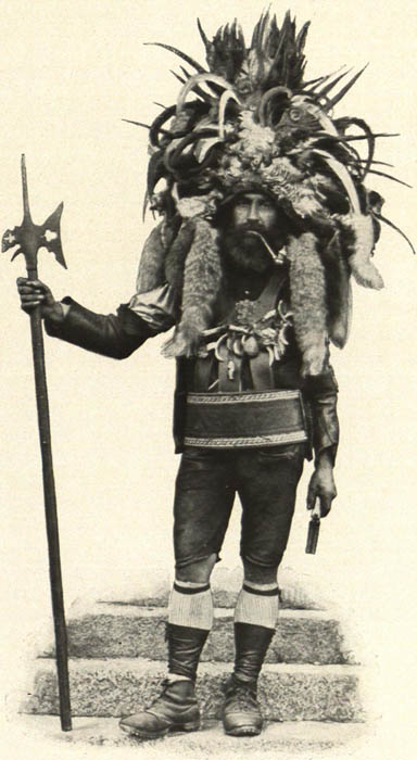
Fig. 4: Meraner Saltner. Postcard sent 1907. © CC-BY-4.0 austria-forum.org
Use in the attempt of nation building until after 1900
The emergence of traditional costumes in the 19th century was due to an increased interest in regional distinctiveness. The dependence on supra-regional trade, a corresponding desire for a special appearance and the burgeoning tourism in picturesque South Tyrol drove this development further. The purchase of the object by the GNM in 1899 was completely in line with the museum's historistic concept. Unique characteristics were to be collected to support the idea of nation-building in the German-speaking area which includes parts of South Tyrol (Austria till 1918, then Italy) too. The interest in the costume can thus be attributed to an implicit concept of „Großdeutschland“, the desire for identification even far beyond the national borders of that time (and also today). In 1905 the Saltner-figurine became a part of a multi-figure panorama of German traditional costumes in the museum. But 100 years later Jutta Zander-Seidel, curator of the exhibition „Kleiderwechsel“ (that means "change of clothes") at the GNM judged harshly about the former exhibition practice: Neither does the object represent the peasant costume of the past in its historical authenticity, nor does it reach beyond documents of historicized festive culture at that time (cf. Zander-Seidel 2002, p. 76).
From carnival use to cultural appropriation and appreciation
On top of that, the object wasn't even bought in South Tyrol at all, but from a Munich costume fund. The painter Franz Defregger is said to have worn it at a Munich artists' masked ball in 1883 (Ramming 1997, p. 16-18). Was it merely a product of his imagination, made to poke fun at the strangers across the near borders, at those archaic mountain people with their culture, which at the time was perceived as weird, backward, even exotic? There is evidence that Defregger designed costumes too (Irgens 2010, p. 14).
Then it would also be possible that parts of the costume were actually copied, e.g. by using early photographs of Native Americans, perhaps to make the appearance seem even more exotic. The foxtails hanging down on both sides of the face, the necklace of wild animal teeth or the splendor of the feathers come quite close to such cliché images. And Franz Defregger showed great interest in Chief Rocky Bear, for example, whom he met and portrayed in 1890. Rocky Bear had come to Munich (Bavaria) with Buffalo Bills' Wild West Show as a living exhibit (Assmann e.a. 2020, p. 123). But this was seven years after the masked ball. In addition, the object at the GNM is said to have been touched up in the early 20th century, so that it could fit the cliché of the pictorial and written sources of the 19th century even better (Selheim 2005, p. 274).
In the same supposedly colonialist view, Defregger made a painting for an Austrian encyclopedia called „Kronprinzenwerk“ (1885-1902, fig. 5). In this illustration, the figure of the Saltner is used just as clichéd and exoticizing for his country, Tyrol, as we know it, e.g. from images of snake charmers and the Indian subcontinent. But the picture shows a man who looks much like both the Nuremberg specimen – and the artist himself. Could this still be a form of self-exaltation, an act of othering (Said 1985)? If we take into account that Defregger himself was a native Tyrolean, this perspective escapes its chauvinistic dress and shows us a completely opposite form of individual expression and a corresponding search for identification: When abroad, the successful painter dressed like a person of status in his native country.
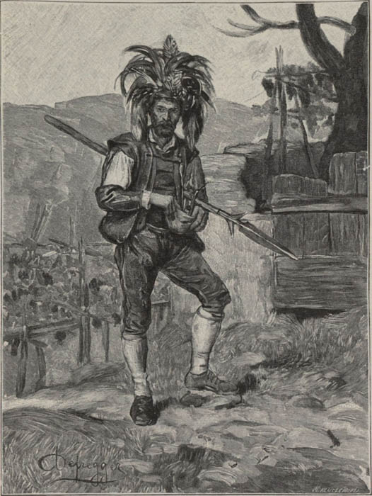
Fig. 5: Franz Defregger: Ein Saltner bei Meran. 1890, Xylography by M. Kluszewski. © CC-BY-4.0 austria-forum.org
Conclusion
It has taken one century for this change in function to be clearly named in the GNM (cf. Zander-Seidel 2002, p. 148): from an uncertain practical object of use to a product of tourist expectations, from a carnival costume to a decided construction of national identification and back again. The outfit of the vineyard keeper is neither particularly artistic nor valuable. But the questions it is able to generate lead far into a dense field of visual communication across times, national borders and continents, to ideas of foreignness and (self-) exoticization and ultimately to the question of how we deal with them today. The costume of the Saltner and its related outfits seem to come from the supposedly “good old time“. But they illuminate a rather fleeting moment in which historical upheavals in Europe (e.g. early globalization, increased emigration, advanced secularization, consequences of colonialism, desperate search for identity and nation building) are reflected in a peculiar object. They can lead to the question of how to deal with other traditions on the one hand or with the individualization of (male) appearance (e.g. in the later star cult) on the other. The fact that a whimsical hat can still serve an extremely dubious yet visually powerful purpose today was demonstrated by the million-fold shared footage of the self-proclaimed "shaman" storming the Washington Capitol in early 2021.
Special thanks to my students at Gymnasium Wendelstein who enriched this analysis with plenty of valuable questions and discoveries.
References
- Assmann, Peter/Irgens-Defregger, Angelika/Hess, Helmut. 2020. Defregger. Mythos — Missbrauch — Moderne. Innsbruck, München: Hirmer.
- Ramming, Jochen. 1997. Weinberghüter und Heimatwächter. Der ‚Meraner Saltner‘ zwischen Amt und Emblem. In: Jahrbuch für Volkskunde 20. Paderborn. München. Wien. Zürich: Schöningh. p. 116-141.
- Halbritter, Roland. 2005. Saltner – Weinberghüter – Touristenschreck – Vogelscheuche – Papageno – Alpenindianer. „Ihm gebe Kreizer a comprar tabacco; dann still sein gut Freund“. In: Der Schlern, Bozen. August edition 2005, p. 88-104.
- Irgens, Angelika. 2010. Was Tiroler und Indianer im Herzen verbindet, Bayerische Staatszeitung (BSZ). 23.04.2010 (ePaper) and: Unser Bayern 4/2010, München (Verlag Bayerische Staatszeitung)
- von Hörmann, Ludwig. 1872. Die Saltner. In: Der Alpenfreund, Monatshefte für Verbreitung von Alpenkunde unter Jung und Alt in populären Schilderungen aus dem Gesammtgebiet der Alpenwelt und mit praktischen Winken zur genußvollen Bereisung derselben. Dr. Eduard Amthor (ed.), Volume 5, Gera, p. 41-47, proofread for SAGEN.at by Mag. Renate Erhart, august 2005. Spelling carefully reworked and brought up to date: http://www.sagen.at/doku/hoermann_beitraege/saltner.html. Called on 7.02.2021
- Matscher, Hans. 1933. Der Burggräfler in Glaube und Sage. Bozen 1933. Found at sagen.at and carefully reworked by Leoni Wallner. December 2005. http://www.sagen.at/texte/sagen/italien/meran/burggraefler_matscher/wimmetzeit.htm. Called on 7.02.2021.
- Said, Edward. 1985. Orientalism: Western Conceptions of the Orient. London: Penguin Books.
- Selheim, Claudia. 2005. Die Entdeckung der Tracht um 1900. Die Sammlung Oskar Kling zur ländlichen Kleidung im Germanischen Nationalmuseum. Published by Germanisches Nationalmuseum Nürnberg.
- Zander-Seidel, Jutta (ed.). 2002. Kleiderwechsel. Frauen-, Männer- und Kinderkleidung des 18. bis 20. Jahrhunderts (Die Schausammlungen des Germanischen Nationalmuseums). Published by Germanisches Nationalmuseum Nürnberg.
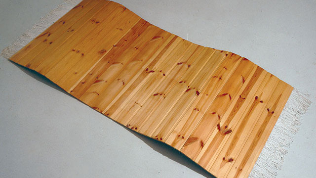
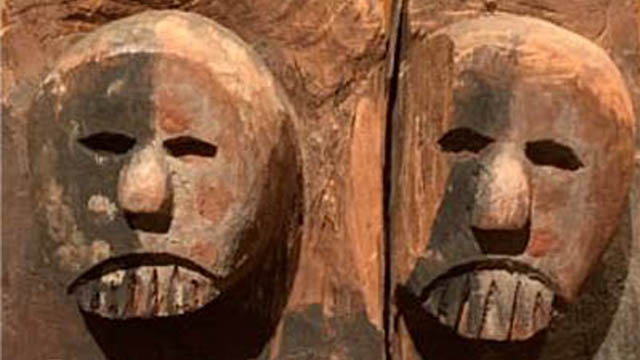
-
Exploring an Enigmatic Piece of Traditional Cameroonian Sculptur
The Veranda Post found in Museum Fünf Kontinente is an exemplification of the extent to which indigenous Africans mutually reinforced socio-religio-cultural existence and expressiveness of form through sculpture. Various examples of these artefacts abound in the collections of African plastic artforms found in many museums across the globe. The beauty in experiencing, analysing and speaking about this artwork (as well as many of its kind), lies within the absence of authenticated historical and analytical literature on them. This makes it possible for the observer to exert complete authority of personal perception and interpretation devoid of any fixed attitude that dictates, interfere or curtails aesthetic enjoyments, interpretations and judgements, as attempted in this presentation.
With the dimensions of 199 x 60 x 50 cm, the Veranda Post found in Museum Fünf Kontinente is one of the numerous examples of the African artistic expressiveness, confirming the artistic prowess of the traditional African. Examples of these artefacts abound in the collections of African plastic artforms which record indigenous religious beliefs, practices and performances that date back from the beginning of African history.
As typical of most indigenous African sculptures, this work is not only uncaptioned, but the artist/creator is not known. What is known, however is that, its peculiar characteristics and style makes it easily identifiable and representative within the milieu of popular African sculptures. According to the Museum Fünf Kontinente records, this work was collected from 'Kamerun'. 'Kamerun' was an African colony of the German Empire between 1884 and 1916, which was located in the region of today's Republic of Cameroon (Wikipedia, 2020). Comparing the characteristic features of this sculpture with similar sculptures described by some art historians as Veranda Posts created as part of ancient African monumental architectures found in the Cameroons Grassland (Willett 1981) therefore, it is not difficult place it within that category. Hence its caption.
As can been seen from similar ‘posts’ and judging from the elaborateness of the images created on them, the major reason for the production of these posts was more to afford the sculptor or sculptors the opportunity to decorate the buildings with stories, rather than serving as supports (see figure 1).
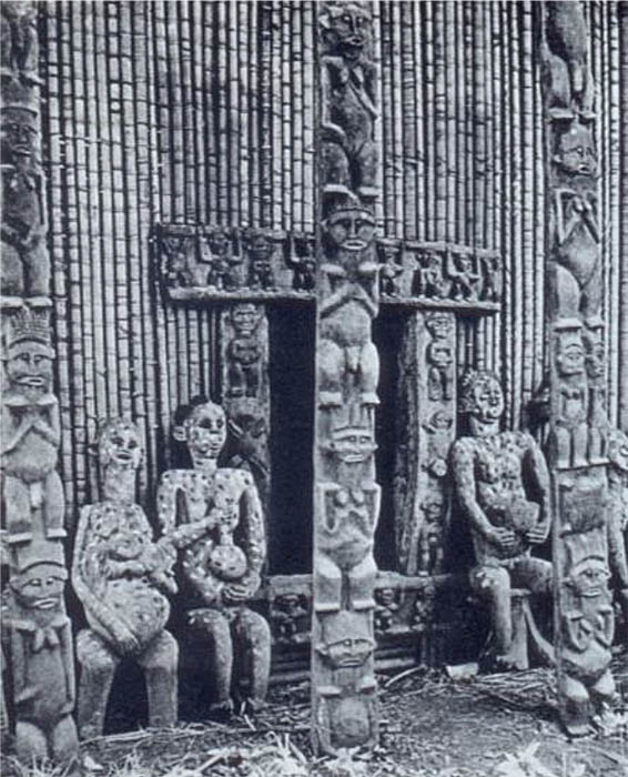
Figure 1: Ancestor statues, carved door-frame and verandah posts (Source: Willett 1981)
As said above, the beauty in analysing and speaking about this artwork (and many of its kind), lies within the absence of historical and analytical literature. The fact that this makes it possible for me (and for that matter any other observer) to exercise personal powers of perception and interpretation without any fixed attitude to direct or curtail their aesthetic interpretations and judgements made it my object of choice for this project at the Museum Fünf Kontinente.
Going by Margaret Trowell’s generalisations about African art, this Veranda Post can be classified under the ‘spirit-regarding’ art. Like many others of its kind, this work, which has front and back views, is flanked with human and other figures, ostensibly those of ancestors and is symmetrically disposed about a vertical axis, rendering it frontal at both sides.
Analyses of the images created on this pole reveal striking similarities between the age old traditional religious practices of the African and the Western religious beliefs and practices brought in by the earlier missionaries.
At the direct look of the object from the front (as it has been positioned at the museum, but actually one of its two sides), a prominent kneeling figure with hands clasped together unto the chest (much like the praying hand) can be seen in a pose that looks very much like the kneeling praying postures at Christian worships. To the African, this posture is not only assumed at prayer sessions as a visual image of submission to God’s authority, but is also exhibited as a sign of respect, humility and total surrender to a superior authority. For the sculptor to present the kneeling man as a central figure and subsequently rendering all other human figures in similar submissive postures therefore makes the theme of prayer, submissiveness and spirituality very strong in the composition.
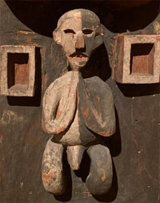
Figure 2: The kneeling or praying figure
The kneeling man is placed right below two human faces whose prominence and positioning easily pass them for elders, superiors, or better still, ancestors. Before the ancestors, all supplications are made, and through them, request are carried through to the supreme God.
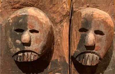
Figure 3: Ancestor figures
The importance of the two faces and emphasis on their superiority is further strengthened by a strong demarcation between them and the kneeling man through a thick rigid contoured line that forms a partition between the elements. This could be interpreted as a spiritual borderline that separate the spiritual world from the physical world. Generally, the African believes in the existence of the physical and the spiritual worlds as separate entities and this demarcation clearly depicts this belief. Also worthy of notice is the orientation of the demarcating border which rhymes with the praying hands of the kneeling figure, thereby visually connecting the figures. This carefully chosen placement of the two faces in the composition alludes to the supremacy of the ancestors and their exclusive existence in the after world as well as their connection with humans.
Figure 4: The spiritual borderline
Another striking imagery is created with the placement of a very visible image rendered in concentric circles. Among many African ethnic groups, the circle represents completeness, holiness, perfection and other such attributes ascribed to the supreme being (God). Among the Akan people of Ghana, for instance, the Adinkra symbol called Adinkrahene (king of Adinkra symbols) is presented as concentric circles. This symbol represents authority, leadership and charisma. The sculptor most likely created a bull’s eye of this symbol as an indication of exactly where this particular post belongs. The post could possibly be one of the furnishes for a palace or the abode of a traditional priest. This could also suggest the likelihood of the prominent kneeling figure being the King or the chief priest. Considering the atmosphere created by these symbols, the circle, with the kind of prominence it exudes could also represent the omnipresence of the supreme being, thereby heralding the people’s belief in the iniquitousness of God and His closeness to mankind.
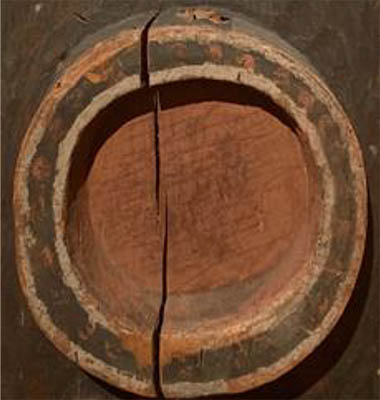
Figure 5: The concentric circles
Other recognizable images of animate and inanimate objects in the work include crocodiles, lizards and geometric shapes. Whilst it is likely that the geometric figures may have been deliberately presented to create balance, simulate a built living environment and arouse aesthetic sensibilities, the images of animals like those of the crocodiles have significant meanings as far as African culture and belief systems are concerned. Among some ethnic groups in Africa, crocodiles are believed to be the souls of ancestors who come back to live with men. Examples are the crocodiles in the Crocodile Pond at Paga in the northern part of Ghana who virtually live peacefully among the people. There are numerous African stories about crocodiles coming to the aid of men to either protect them or lead them to safety. Their inclusion in this particular work therefore is to establish the existence of spirits among men, especially as humans pray to seek their guidance and protection.
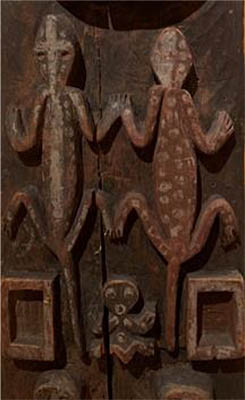
Figure 6: The crocodiles
Considering where it was created and where it is located now, as well as the current effort towards extracting a meaning out of its symbolism, this veranda post and many other such African artefacts in several museums around the globe have demonstrated how images and symbols resonate relationship between cultural practices around the world. The confluence of symbolic interpretations of the icons in the traditional African religions and the Euro-Christian religion, as depicted in this veranda post, gives justification to Africa’s unquestionable acceptance of Euro-Christianity and all the associated visual cultural practices.
For comparison, also read Karin Guggeis' analysis of this object here.
References
- Roy, C. (2019). Signs and Symbols in African Art: Graphic Patterns in Burkina Faso. Signs and Symbols in African Art: Graphic Patterns in Burkina Faso. https://africa.uima.uiowa.edu/topic-essays/show/38?start=13
- Wikipedia. (2020). Kamerun. Kamerun. https://en.wikipedia.org/wiki/Cameroon
- Willett, F. (1981). African Art. London: Thames and Hudson.
This 'Veranda Post' is variously referred to (mostly in relation to its architectural-functional context) lintel or "te ken dy dye" (in the local Bandjoun language - PHSAA), porch post, house front pillar, post, cult house post (M5K, p. 17), Cameroon post / family crest (Macke at M5K, 13, 24). Post, however, in the sense of sign (post-it) is suggested by PdGY to address the communicative function. Other designations do not address the function, but limit themselves to the given, perhaps to avoid any pre-interpretation: 'sculpted wooden block' (Kecskési 1999 n. 108) or 'large carved square wooden block' (Kecskési 1976, p. 22).
Object biography: The object was taken before 1893 by Max von Stetten during expeditions on the Bamileke Plateau (south-western Cameroon), where it was presumably part of a meeting house of a confederation. Stetten (1860-1925) was German commander of the Kaiserliche Schutztruppe for Cameroon until 1896. Cameroon was a German colony at that time. The exact circumstances of how the object came into Stetten's possession are unknown, as is its original location and context.[2] In 1893, the Royal Ethnographic Collection acquired the pillar as a gift from Stetten.[3] In 1912, a photograph of the pillar was published in the Almanac of the Blaue Reiter. It is currently on display in the permanent exhibition in the Museum Fünf Kontinente Munich in a niche - a mirror allows a view of the second side (see Fig. 2). Along with other objects from the collection, it is currently the subject of a transnational project on their provenance (GI).
Fig. 2
Status: In comparison with carved mullions on façades of royal residences in the Cameroon grasslands (Fig. 3),[4] other mullions or door frames in the Museum Five Continents (M5K, p. 17, Kecskési 1999 No. 11, 70, 75) or in the Humboldt Forum Berlin, there is a partial similarity of motifs, but a strikingly 'archaic' formal language. Other examples are clearly more 'elaborate'. The multitude suggests that this type of pillar is quite typical of works from this period in this region of West Africa.
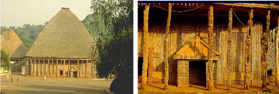
Fig. 3
Interpretation
The current view of the work
For the interpretation, the following questions lend themselves to art lessons: Form, iconography (meaning of the motifs), function, theme (or core idea) of the object, i.e. an interpretation.
With regard to the guiding idea of multi-perspectivity, two positions will be addressed: On the one hand, the view of today on the basis of ascertainable contexts, which seeks to understand the object from its time of origin and its context of origin. On the other hand, the view of the object by the artists of the Blaue Reiter. The comparison of these perspectives seems particularly relevant from an art didactic point of view, even though other perspectives would be conceivable, e.g. from the point of view of museology, provenance research, from the context of current restitution debates, etc. However, these are addressed in the teaching suggestions.
Shape
At first, the pillar develops an immediate physical presence for the visitor: through its sheer size (larger than life, almost square in plan), the materiality of the massive, cracked block of wood (the outline is irregular and probably corresponds to the tree) and the clear, concise, reduced language of form, whose meaning seems inaccessible. The surface treatment is archaic, the wood is more hewn than carved.[5] Thus it appears powerful and at the same time mysterious, which is supported by its presentation in the exhibition on a plinth and without glazing (see Fig. 4).
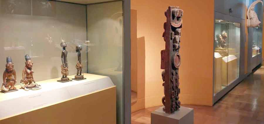
Fig. 4
A closer look reveals how the sculptor interweaves various modes of representation between complete abstraction (circle, rectangle) and representationalism (human figures, animals) in a compositional way[6] , monumentalising the individual motifs through internal symmetry, geometrisation, frontality and statics. This is supported by the painting (see Fig. 5). In this reduction, everything narrative is missing. The representation becomes emblematic, it becomes a symbol.
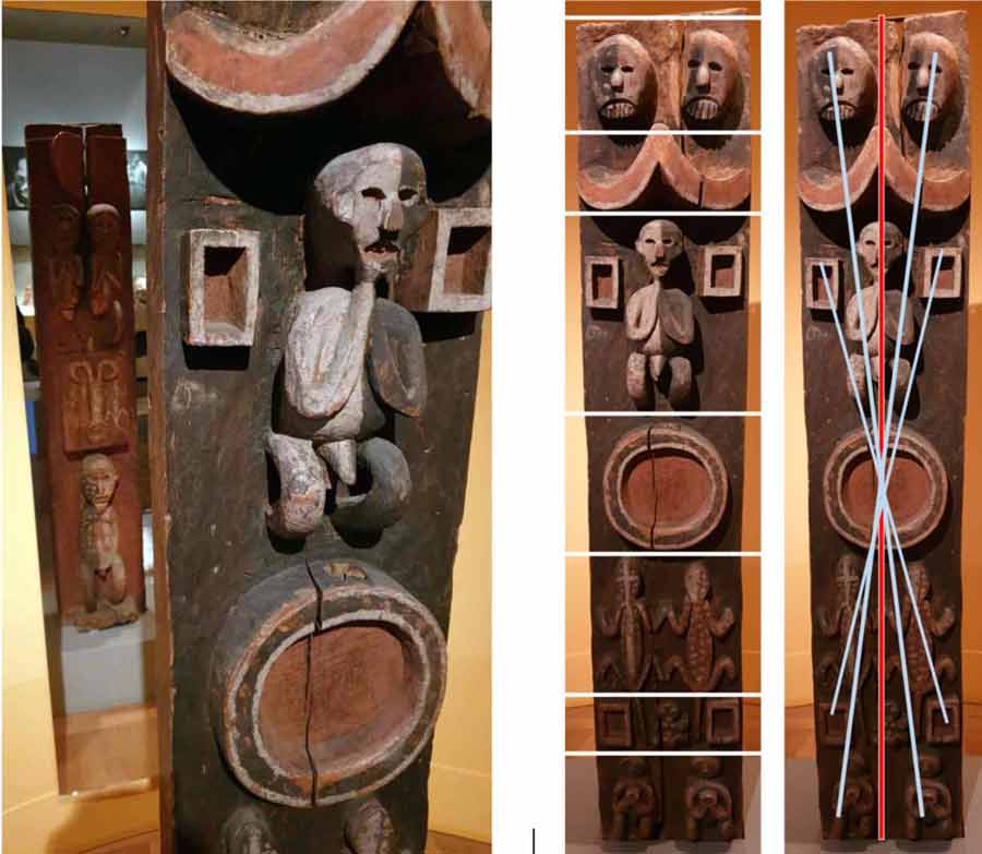
Fig. 5, 6 and 7
This is also supported by the overall composition, which obviously follows a calculated geometric order. It is strictly horizontally divided into individual zones, only once do lizard tails protrude into another zone. However, the separation into individual layers is ingeniously overcome compositionally by the strict axial symmetry in the vertical, but also by the point-symmetrical arrangement around the respective centres. The result is a tension between the contradictory compositional principles (see Figs. 6 and 7) that is decisive for the effect of the pillar.
The lack of any narrative on the one hand and the high creative effort on the other underline once again that it is about a symbolic level. This can perhaps be deciphered, even if its immediate complex order makes it seem above all direct, sensual.
The secure decoding of the iconography (what the individual motifs as well as the arrangement meant in the context of origin) is not possible with today's state of knowledge. Oral culture has left no written sources that could be consulted. Moreover, the oral tradition has been torn down - not least due to colonial destruction. However, since the work obviously has a symbolic language with clear iconography, this level cannot be left out in art lessons. German-language literature and oral experts from West Africa were consulted here. The results contradict each other, but nevertheless yield a court of meaning (see Fig. 8, in which the individual attributions of meaning are named)[7] , which provides a certain direction.
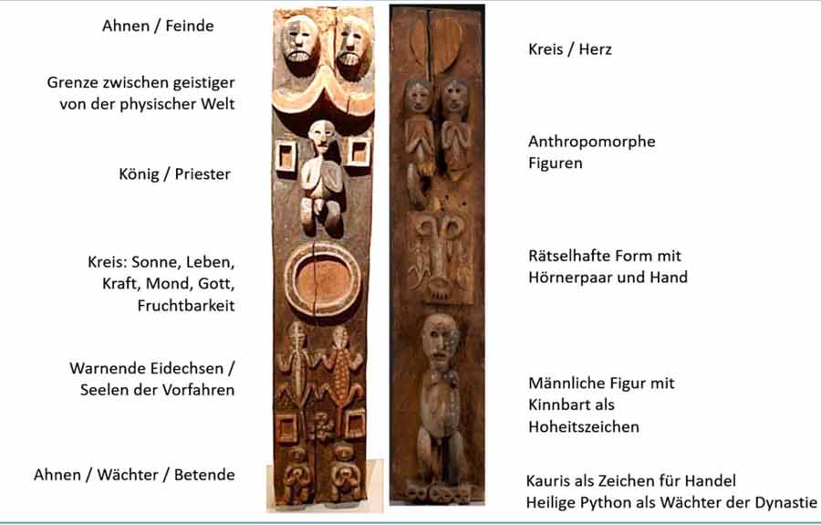
Fig. 8
In addition, the block is painted in three colours. These also carry meanings: Black could symbolise suffering, white could be the colour of the dead and symbolise mystery, red, the colour of blood, symbolises life (PHSAA). The light-dark contrasts themselves symbolise life and death (Kecskési 1999).
Function
PdGY suspects that the pillar - as part of the architecture of the house - stood at the spatial interface with the public (on a path) in order to communicate the significance of the house, presumably a cult house, to the outside. The object could therefore have been part of the façade of a particularly distinguished house[8] , also with a supporting function for the roof. It communicates what happens in the house or who lives or resides there.
Kecskési, on the other hand, considers a free positioning in space (Kecskési 1976, p. 22) and suspects an ancestral tablet. This in turn would fit the following determination by Gouaffo: "The 'Blue Rider Post' is a spiritual object. According to oral traditions, the object was placed in the sacred house like a statue. Caps, chains, bags or skeletons could hang from the object. Secret societies like the 'Losango' used the statue to perform certain rites, for example to cleanse the village of evil spirits." (Albert Gouaffo in GI) KG also suspects the context of a meeting house of such a secret society. Common to all assumptions is that the pillar stood in the context of a house with a sacred or cultic function.
'Theme' of the object: Basically, three different levels can be delimited, some complementary, some contradictory. First, the communication function on the façade or at the entrance to the outside. Then the pictorial formulation of a certain understanding of human being-in-the-world is asserted; man is ultimately embedded cosmologically.[9] At the Humboldtforum Berlin, in turn, such pillars from West Cameroon are also seen as the "architecture of power", power exercised by the rulers or the secret societies through impressing and deterring.[10]
Second perspective
The interpretation provided above can be countered by a second perception of the pillar, as it appears in the almanac "Der Blaue Reiter". This almanac, an artist's book, was published in 1912 by Franz Marc and Wassily Kandinsky. The reception of this book is over a hundred years old, but it is significant for the development of European art, as it is a good example of how artists of this time created a new frame of reference by referring to non-European art. In this respect, the Blaue Reiter clearly differs from Cubism, Expressionism or Dadaism, which were all being developed at the same time.
Fig. 9
In the Almanac, on pages 21 to 27, there is an essay by the painter August Macke entitled "Die Masken" (The Masks), in which a relatively small illustration of the pillar in question is embedded (see Fig. 9). Macke's contribution, like all the other texts in the Almanac, was probably written at a joint meeting of Macke, Marc, Münter and Kandinsky in Murnau.[11]
Visits to ethnographic museums are documented above all for Wassily Kandinsky, who was a trained ethnologist, and Franz Marc. Marc had also admired sculptures from Cameroon in particular during his visit to the Berlin Ethnographic Museum in 1911. And it was he who was ultimately responsible for the insertion of the photograph of the post in Macke's article.[12] In his letters to Macke, Marc writes about this. On 14.1.1911 about the objects from Cameroon in the Berlin Ethnological Museum: "I remained amazed and shaken by the carvings of the Cameroonians"; and later that he would furnish Macke's article in the Almanac with "ethnographic wonders" (MW).[13] In the text itself there is a single, very brief reference to "carved and painted pillars in a Negro hut", by which presumably the post was meant.
The text itself represents Macke's conception of art. In it, "intangible ideas", "mysterious forces", an "invisible God" express themselves in the world of appearances and "cultic expressions". The invisible materialises in the visible. This realm of the visible includes not only art, such as that of Giotto or van Gogh, who are classified as 'primitive', but also nature. Children's drawings, the folk art of the 'primitives' and 'savages' or non-European cultural forms are also expressions of the mysteriously invisible. These themselves are - and this is decisive - equal to each other. There is no hierarchy, no distinction between high and low, between high art and popular culture. All forms speak - as Macke characterises it - in "strong language". For Macke, the pillar in the museum is then an example of "the tangible form for an intangible idea, the personification of an abstract concept" (Macke 24). He also calls this the figure of an "idol".
The approach underlying this thinking sounds familiar; we have known it since the Platonic theory of ideas. However, this approach does not justify the selection of this particular post, as other posts from the museum's collection would also have been available.[14] Here one can only assume. I suspect that there are various factors that led to the selection: the archaic power of the forms; the initially wild and carefree-looking, additive combination (or montage) of the various principles of representation in the individual motifs (concrete - abstracted, geometric - organic, symbolising - depicting), which on closer inspection, however, then reveals itself to be consciously composed; or the coarse, physically perceptible materiality of the cracked, thick block of wood in impressive dimensions. PdGY also speaks of "wonderfully composed".
In the work, everything is represented with great sensual power that is the opposite of an "empty" image in European "cultures that have already passed through a thousand-year course, like [...] Italian Renaissance" (Macke 24) and from which Macke renounces: "We must bravely renounce almost everything that has hitherto been dear and indispensable to us as good Central Europeans [...] in order to get out of the fatigue of our European lack of taste". (Macke ibid.)
In art lessons, the question arises to what extent the image that Marc or Macke create of the pillar (as representative of the idea of an idol) goes together with what the object presumably was and is in its original context. Or to put it another way: are they designing a certain, exotic image that does not correspond to the object itself? [15]
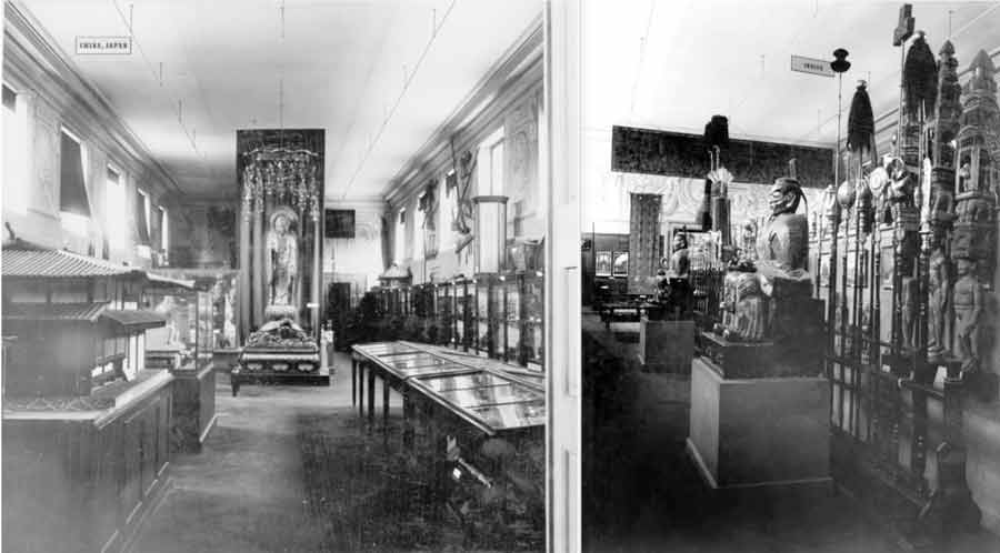
Fig. 10 Historical photos of the exhibition of the India Department in the Munich Museum around 1910 (source M5K)
References
- GI: Juliane Glahn and Marta Krus: CAMERUNS RIGHT TO CULTURAL OBJECTS. https://www.de/prj/zei/de/pos/22656808.html
- Kecskési 1999: Maria Kecskési. Art from Africa - Museum of Ethnology Munich. Munich (Prestel) 1999
- Kecskési 1976: Catalogue for the exhibition African Art. Andreas Lommel (ed.). Munich (Bruckmann) 1976
- M5K: Staatliches Museum für Völkerkunde München (ed.). The Blaue Reiter and the Munich Museum of Ethnology. Munich (Hirmer) 2009
- KG: Karin Guggeis. The Blue Rider Post. (2021): https://www.explore-vc.org/en/objects/expanding-the-canon-of-art-at-the-global-north.html
- PdGY: Patrique deGraft-Yankson. The Veranda Post. (2019) https://www.explore-vc.org/en/objects/the-veranda-post.html and oral interview on 23.4.2022 in Bayreuth, Iwalewahaus.
- PHSAA: Paul-Henri Souvenir Assako Assako. Information by email 20.5.2022
- Wikipedia: Cameroon & Max von Stetten
- MW: Macke Wolfgang (ed.). August Macke - Franz Marc: Briefwechsel, Texte und Perspektiven. 1964. Cologne (DuMont).
- Macke: Macke August. The Masks. In: Almanac "Der Blaue Reiter", 1912, edited by Franz Marc and Wassily Kandinsky, pp. 21-27
Appendix on iconography
- Anthropomorphic figures: ancestral couples / guardians and protectors of the royal residence. These anthropomorphic figures are treated with respect as extraordinary personalities. They are considered ensouled beings, spirits with supernatural powers. (PHSAA) Depiction of all human figures in similar postures: theme of prayer and submission to spirituality. (PdGY)
'Front' side from bottom to top:
- Two people: Ancestral couples / guardians and protectors of the royal residence (PHSAA). People pray for the guidance and protection of the ancestors (PdGY).
- Lizards: The symbol of the lizard warns everyone; it symbolises death. (PHSAA) PdGY sees here two crocodiles (ancestral souls returning to live with humans) instead of lizards.
- Circle: motif of the sun, symbol of life and power; the moon, image of woman and symbol of fertility. (PHSAA) The circle represents completeness, holiness, perfection and other attributes attributed to the supreme being (God). (PdGY)
- Kneeling figure: King or priest (PdGY)
- Line of demarcation between the spiritual and the physical world
- Two heads above: Ancestors (PdGY)
'Back' side from bottom to top:
- Python (geometric frieze at the bottom of the 'back' side): royal totem/sacred python, guardian of the dynasty (PHSAA).
- Male figure with chin beard as emblem of sovereignty (Kecskési 1999)
- Enigmatic form with a pair of horns ending in a hand (?) at the bottom (Kecskési) on a rectangle with two flanking lizards.
- Anthropomorphic figures
- Circular area
Footnotes
[1] The object is variously referred to, mostly in relation to its architectural-functional context: lintel or "te ken dy dye" (in the local Bandjoun language - PHSAA), porch post, house front pillar, post, cult house post (M5K, p. 17), Cameroon post / family crest (Macke at M5K, 13, 24). Post, however, in the sense of sign (post-it) is suggested by PdGY to address the communicative function. Other designations do not address the function, but limit themselves to the given, perhaps to avoid any pre-interpretation: 'sculpted wooden block' (Kecskési 1999 n. 108) or 'large carved square wooden block' (Kecskési 1976, p. 22).
[2] The first German trading posts were established in Cameroon as early as 1868, and in 1891 German military "expeditions" were launched in Cameroon. In 1884, the German Consul General concluded protection treaties with regional rulers and thus proclaimed the protectorate of Cameroon as a German colony. The seizure of the hinterland, which included the grasslands, took place over the course of the following 30 years. (Wikipedia) Even if the provenance is still not clear today, one can certainly share the Humboldt Forum's assessment of such objects that - even if they were not looted through acts of war - they are nevertheless "an expression of unequal power relations and structural, colonial violence". (https://www.smb.museum/nachrichten/detail/ethnologisches-museum-weg-frei-fuer-die-rueckkehr-der-ngonnso-nach-kamerun/)
[3] In the entry book it is noted: "Gr. square block, 1.80 cm high made of heavy wood, carved on both sides with humans and lizards, heavily damaged by termites". (https://onlinedatenbank-museum-fuenf-kontinente.de/) In 1895 Stetten published detailed "Travelogues" in the Deutsches Kolonialblatt.
[4] http://www1.biologie.uni-hamburg.de/b-online/afrika/kamerun/palast.htm; http://www1.biologie.uni-hamburg.de/b-online/afrika/
[5] The block is almost certainly worked with a chisel.
[6] "decorated with geometric, anthropomorphic and zoomorphic forms" (PHSAA)
[7] All performers avoid a complete decoding. They only make suggestions for individual motifs.
[8] It could have been the house of a 'priest' whom one could consult there and through whom or ancestors one could pray to God (PdGY).
[9] "Expression of the cosmogony of the universe of the peoples of the Bamileke plateau; expression of the belief system" (PHSAA).
[10] The assertion of power is also included by PHSAA.
[11] Catalogue: August Macke, Lenbachhaus Munich, 1987, Bruckmann. Munich. S.164
[12] He simply titled the painting "Cameroon", the name of the country of origin (the country whose sculptures he admired).
[13] There are other illustrations in the text: a bird's head from Brazil, a figure from Easter Island (see Fig. 9), one from Mexico, a bird mask from New Caledonia, a cloak from Alaska[13] and a child's drawing entitled "Arabs". Except for the child's drawing, all objects are from the then Royal Ethnographic Collection in Munich (M5K, p.11). They are only titled with the respective country of origin, e.g. Cameroon. Macke was obviously involved in the selection as well as the layout, as his layout sketch shows (M5K 24).
[14] It is not certain what was shown in the presentation at the Royal Ethnographic Collection in Munich at the time, which covered 400 square metres in six rooms in the north wing of the Hofgarten arcades in Munich. The only thing that is certain is that photos of the ten objects depicted, which came from various parts of the world, were lent to the artists for the publication of the Almanac. Photos of the presentation do not exist. "Whether Marc and Macke [actually also] saw the work in the exhibition at that time can be assumed with a high degree of probability, since it is after all very large and thus impressive." (Information Karin Guggeis 26.7.2022)
[15] In this context, it seems of interest that neither Marc nor Macke take up in their own pictorial language the aesthetics of the non-European works they "celebrate" here.
-

A German bowl inscribed in Africa
In the process of finding out more about this baptismal bowl – where it comes from, who used it, and when it was discarded, it becomes a portal into South Africa’s contested past. Methodologically, a cultural-historical approach is taken to investigate the object as multiple signifier, not only as part of a transcontinental network, but also within a local, transcultural, context – what John and Jean Comaroff (1991, p. 200) referred to as the “long conversation” between European missionaries and African Christians.
The bowl was meant to be used with an accompanying, although, in this case, not quite matching, pitcher for the baptism ceremony, in which Christians use water to symbolise the blood of Christ washing away their sins. The Wallmansthal station where the bowl was found, was established by the Berlin Mission Society in 1869. The farm was about thirty kilometres north of Pretoria, today a capital city of South Africa. It became home to African converts gathered from the Kekana-Ndebele and several other pre-colonial northern Sotho polities (Van Rooyen, 1953, pp. 15-20). By the mid-twentieth century, the congregation was approximately 550 people strong (Schulze 2006, p. 456). Together with several other German protestant mission societies, the Berlin Mission contributed to the making of a Christian denomination referred to as “Lutheran” in South Africa today. After a century under white missionary tutelage, the African Church became independent as the Evangelical Lutheran Church of South Africa in the 1970s (Pakendorf, 2011, p. 115).
Knowing that a protestant congregation in Bochum, Germany, donated a church bell to the Wallmansthal Church in 1870 (Van Rooyen, 1954, p. 26), we can deduce that the baptismal bowl may also date from this era. The pitcher bears the mark of Gerhardi & Co. Judged from its Art Nouveau design elements and knowing that this Ludenscheid-based (Gerhardi) company was quite prolific in the production of cast pewter in the Jugendstil (Online Encyclopedia), a post 1890 manufacturing date seems equally probable.
Called Taufgeschirr (Baptismal dishes), bowl-and-pitcher sets of this kind are still being manufactured and used in churches in Germany today. Some congregations include images of old as well as new baptismal bowls on their websites as part of the material markers of their heritage. The exact same design displayed by the Evangelical Church of Illertissen in Germany on their website, is still in use today in the Evangelical Lutheran Church of Masealama (formerly the Kratzeinstein Congregation of the Berlin Mission Church) in South Africa’s Limpopo Province (Joubert, 2015).
Many baptismal bowls were inscribed with verses from the Bible. The quote on the Wallmansthal bowl is a contracted version of Matthew 19:14. What makes this bowl an exceptional object of transculturation, is the fact that its inscription appears in the early orthography of the local African language, Sepedi: “Lesang bana batle gonna, ka gobane mmuso oa Modimo ki oa bona” (NIV: “Let the little children come to me, … for the kingdom of heaven belongs to such as these”).
The bowl was used in church services on mission stations in the same way it would be used in protestant churches in Germany: the pastor would sprinkle the children of African Christians on the forehead with water which had been poured into the bowl from the pitcher. The initial African converts, however, were baptised as adults, only after proving that they had internalised enough knowledge of the Bible and convinced the white missionaries of their commitment to the beliefs and practices of Christianity (which, well into the twentieth century, remained entwined with Western ideas about civilisation).
To these converts, the baptismal bowl was symbolic of their ritual immersion into a foreign way of thinking, living and believing. And yet it was inscribed in their own language, invoking possibilities for cultural translation; for selective appropriation as well as for imbuing the alien culture with own interpretations, relating it to the indigenous and the familiar, and composing new meanings in anticipation of changing circumstances. The baptismal bowl is thus taken as reflective of broader processes of societal, economic and political reconfiguration brought about by the colonial encounter, but with an emphasis on African resilience.
On the site where the Wallmansthal baptismal bowl was used, these processes played themselves out in a series of extraordinary episodes that indirectly also related to broader world-political epochs: Up until the First World War, the Wallmannsthal land sustained an African Christian farming community. In 1936, as an attempt to address their post-war financial crisis, the Berlin Mission sold off a large section of the farm, giving the (exclusively black) African buyers full title deeds for their plots. Until after the Second World War, Wallmannsthal was a bustling African town giving its inhabitants the economic advantage of being close to job opportunities in Pretoria (Van der Merwe, 1987, pp. 69, 135).
In 1967 the Apartheid government forcibly removed all the inhabitants, including the Berlin Mission Christians who had still lived on the retainer of the farm where the Church and other mission station buildings were (Schulze, 2005, p. 458). Wallmannsthal then became a military base and arms depot for the South African Defence Force. During the late 1980s, with the Cold War still dictating international relations and South African whites slowly awakening to the need for political reform, the Defence Force contemplated the restoration of the site. These plans never materialised.
In the early twenty-first century, in a successful land claim, the Wallmannsthal farm was returned to the descendants of its early twentieth century owners. The restitution did not herald a final episode of utopian prosperity. Increasing demands on limited resources seem to be one of the reasons for the reinstated landowners’ current challenges, ranging from obtaining municipal infrastructure, to addressing the status of illegal squatters on their land, and designing the best possible ways of yielding a sustainable livelihood for an increasing population (eNCAnews, 2018).
Today the Evangelical Lutheran Church of South Africa is but only one of several Christian denominations in South Africa with missionary roots. Many more South Africans belong to African independent or African initiated churches – and, increasingly, international churches with their roots elsewhere in the Global South. The process of inscribing Christianity with own meaning and local significance, continues.
References:
- 925-1000.com (2018). Online encyclopedia of silver marks, hallmarks and maker’s marks. Retrieved from https://www.925-1000.com/silverplate_G.html.
- Comaroff, J & Comaroff, J. (1991). Of revelation and revolution. Christianity, colonialism and consciousness in South Africa I. Chicago: Chicago University Press.
- eNCAnews (2018, 27 October). Pretoria land claims. Retrieved from https://www.facebook.com/eNCAnews/videos/pretoria-land-claims/302862580316147/
- Evangelische Kirchengemeinde Illertissen (2019). Die Taufe. Retrieved from https://evang-kirche-illertissen.de/informationen/taufe/
- Gerhardi (2019). Gerhardi – Ein innovatives Traditionsunternehmen. Retrieved from http://www.gerhardi.com/index.php?id=9&L=0
- Joubert, A. (2015). A journey into the life of a mission-ethnographer. doi: 10.6084/m9.figshare.1375528
- Pakendorf, G. (2011). A brief history of the Berlin Mission Society in South Africa, History Compass, 9/2, 106-118.
- Schulze, A. (2005). “In Gottes Namen Hütten Bauen“. Kirchlicher Landbesitz in Südafrika: Die Berliner Mission und die Evangelisch-Lutherische Kirche Südafrikas zwischen 1834 und 2005. Stuttgart: Franz Steiner.
- Van der Merwe, W. (1987). Die Berlynse Sendinggenootskap en Kerkstigting in Transvaal, 1904-1062. Pretoria: Government Printers.
- Van Rooyen, T.S. (1953). Kronieke van Wallmansthal I, Pretoriana: Journal of the Old Pretoria Society 4, 15-20.
- Van Rooyen, T.S. (1954). Kronieke van Wallmansthal III, Pretoriana: Journal of the Old Pretoria Society 2, 24-28.
published February 2020
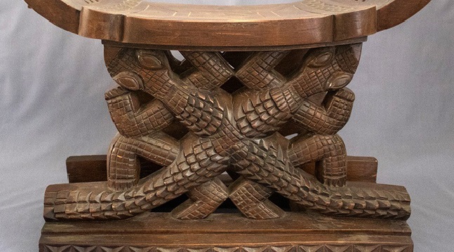
-
The Funtumfunefu-Dԑnkyԑmfunefu stool is a carved traditional wooden stool designed with an Akan symbol known as Funtumfunefu-Dԑnkyԑmfunefu (pronounced ‘fuun-tum-fu-ne-fu den-cheem-fu-ne-fu). This type of stool called asԑsԑgua in Fante (a dialect of Akan people from Ghana) is an art-cum-utilitarian object. It is basically composed of three main parts namely the animu (top) which is the seat; the mfinfinin (middle) which bears the design that gives identity to the stool; and the wiabour (base) which is the part that touches the ground and gives stability to the stool (Antubam, 1963; Amenuke, Dogbe, Asare & Ayiku, 1991). In this particular image, the middle portion, which is the focal consideration for this presentation, is created with the Funtumfunefu-Dԑnkyԑmfunefu symbol. The size of the stool is composed of a base that measures 53cm x 28cm, the top arc-shaped seat that gives the stool a length of 55cm and an overall height of 42.5cm.
The stool was presented as a special gift to the Chairman of the Provisional National Defence Council (PNDC), who doubled as the then Head of State, Flight Lieutenant Jerry John Rawlings by the Chiefs and people of Dormaa in the Bono Region of Ghana. It was brought to the Ghana National Museum through the State protocol in 1992. Flight Lieutenant Jerry John Rawlings led Armed Forces Revolutionary Council (A.F.R.C) to power through coup d’état on June 4, 1979 and prepared the grounds for the coming of the third republican constitution. In the same year, Dr. Hilla Limann was inaugurated as the president of the third republic after winning the election. Rawlings returned to power on December 31, 1981 through another military takeover with his Provisional National Defence Council (P.N. D.C) of which he was the chair. Rawlings’ PNDC party stayed in power for almost eleven years before working out for the adoption of the Fourth Republican constitution through a referendum on April 28, 1992 (Essel, 2019). Subsequently, presidential election was held, which he led the National Democratic Congress (NDC) to win. Though the exact date he received the stool as a gift is unknown, it might have been received within 1981 to 1992, judging from the period of his military regimes and constitutional terms of office before the Ghana National Museum received the stool as part of its collections.
The artist who carved this stool is anonymous. Within the context of the Ghanaian traditional creative work productions, this is not strange, since artworks produced in precolonial and traditional Ghanaian societies were hardly signed by the artists who produced them. This was because the artworks were communal, that is, they were produced for use by the community. The chiefs and kings had varied proficient artists in their courts or communities who produced artworks for the community. With the Funtumfunefu-Dԑnkyԑmfunefu stool being a special gift to the then president of the state, it might have been created by a revered and creative carving-artist in the Dormaa community.
The Funtumfunefu-Dԑnkyԑmfunefu symbol falls within tangible artistic creations which takes its name from the Akan expression for Siamese crocodile. Akan is a major Ghanaian language, which is spoken by about 48 percent of Ghana’s total population as first language, and by an additional 35 percent as additional first language or second language (2010 Population and Housing Census). The symbol derives its name from an Akan proverb which suggests that the Siamese crocodiles share a common stomach and yet struggle for food. Semantically, fun means stomach while funtum means ‘put together’ or ‘mixed together’. Funtum also represents the rubber tree that produces a milky sticky substance used to glue items together. Fu-ne-fu (literally, ‘stomach and stomach’) represents two stomachs joined together. Dԑnkyԑm is crocodile. Dԑnkyԑmfunefu, therefore, means ‘two crocodiles with stomachs joined together’. On the other hand, funtum, as verb, also means ‘to stir something up with tension’, generally producing dust. This also draws attention to the struggle or the confusion that comes with the two crocodiles struggling to feed.
Funtumfunefu-Dԑnkyԑmfunefu symbol (Photo: the author)
The Funtumfunefu-Dԑnkyԑmfunefu symbol (see Figure above), is a graphical representation of two crocodiles rendered in silhouette in a perpendicular orientation with a conjoined and centred stomach, which is a common food receptacle. There are four juxtaposed arc-like lines interspersed and connected by four diagonal lines, creating a rhombic shape at the centre of the symbol. The four arc-shaped lines suggest the limbs, with the prominent sharp-tapered edges attached to the forelimbs placing emphasis on the cephalic regions. At a casual glance, the idealised limbs appear to be same in size, yet a close observation reveals that the forelimbs slightly outsize the hindlimbs. Two tadpole-shaped linearity with sharp-tapered edges placed perpendicularly to fuse with the limbs give a heightened impression of two reptile figures put together.
The Akan expression fun, which is the stomach in the case of the Siamese crocodiles, has two levels of meaning in Akan worldview, the superficial and the hidden. The Siamese crocodiles have a common stomach yet the two heads scramble for food. Each tongue yearns to have a taste of the food, though the gulps of food consumed by each enter a common receptacle. The complexity of this allegorical image could also be found in its multifaceted cultural interpretations.
Criteria for Selection (Educational Relevance & Quality)
The Funtumfunefu-Dԑnkyԑmfunefu symbol belongs to the family of Adinkra symbols. The symbols encapsulate the general Ghanaian philosophical thoughts and ideologies, cultural values, beliefs and practices. Its origin and first usage is traced to the Asante nation state, which is part of present day Ghana (Rattary, 1927). Its usage predates the 19th century as recorded by Bowdich (1819).
The multi-layered meaning of the Funtumfunefu-Dԑnkyԑmfunefu symbol tells its usefulness and educational relevance in the Ghanaian society. Due to its historical, socio-cultural and national importance in Ghana, Adinkra features in the design of decorative and functional artworks. The Funtumfunefu-Dԑnkyԑmfunefu symbol designed into carved wooden stool symbolises unity in diversity, democracy, shared destiny and female-male duality. Giving visual annotation to the idea of unity in diversity, the compositional structure of the Funtumfunefu-Dԑnkyԑmfunefu symbol shows formidable stability, an attribute of unity. There is deliberate inflation of emphasis depicted by the prominent sharp tapered edges attached to the forelimbs, which connotes power, energy and aggressiveness in the process of scrambling for ‘food’ by the Siamese crocodile. Viewers who do not understand the true symbolism of the image sometimes greet the aggressive depiction and the centred common stomach with negative interpretation. However, in the same stable composition, the graceful movement that bedews the tadpole-shaped figures placed at right-angled position creates an impression of diversity.
Methods/Interpretation/Research Questions
The asԑsԑgua (stool) in Ghana symbolises the soul of the society and serves as inoffensive symbolic link between the people or the subjects and their head of state or king (Antubam, 1963). It implies that the stool has both political and nationalistic useful to the citizenry and their ruler. In this instance, the stool reminds its users and observers of the need to engage in activities that will lead to unity rather than divisive tendencies. It teaches the Ghanaian society of shared destiny and the need to strive for oneness irrespective of one’s political affiliation, social standing, physique or race. The integration of the Funtufunefu Denkyemfunefu symbol into the political significations of stool symbolism therefore combines the essence of communal leaving and nationalistic feeling with power and governance. Just as the Funtufunefu Denkyemfunefu stool symbolises unity in diversity, and nationalism, the coat of arms of Germany also symbolises national unity. In this sense, both are thematised on unity and national consciousness. Both designs are abstracted animal figures and play allegorical role in the semiotic interpretations of the symbols.
The coat of arms of Germany
https://de.wikipedia.org/wiki/Bundeswappen_Deutschlands [28.010.24]
In terms of artistic presentation, both were rendered in silhouette. The Funtufunefu Denkyemfunefu stool gives expressive meaning to unity by underscoring that individual difference, diverse shades of opinions and social standing that usually operate in the search for unity but must end in oneness of purpose for the national good. The broad vertical lines that conjoin the flanked arc-shaped lines to give impression of the wings of the eagle figure suggest strength, power and authority of the Germany coat of arms (Figure 3).
The common symbolic ideology in both the Germany coat of arms and the Funtufunefu Denkyemfunefu stool is to strive for oneness. Exploring the design concepts, socio-cultural and identity connections between these two images create opportunities for new levels of greater bilateral understanding and integration.
Obviously, interrogating images of this nature and identifying their essence within their traditional setting vis-à-vis other cultures is likely to help to eliminate prejudices about visual cultures among nations and reduce the barriers in visual communication.
References
- Amenuke, S. K., Dogbe, B. K., Asare, F. D. K., Ayiku, R. K., & Baffoe, A. (1991). General
- knowledge in art for senior secondary schools. London: Evans Brothers Ltd.
- Antubam, K. (1963). Ghana’s heritage of culture. Leipzag: Koehler & Amelang.
- Bowdich, T. E. (1819). Mission from Cape Coast Castle to Ashantee. London: Cass.doi: 10.1017/CBO9781107444621.
- Essel, O. Q. (2019). Dress fashion politics in Ghanaian presidential inauguration ceremonies from 1960 to 2017. Fashion and Textiles Review, 1(3), 35-55.
- Rattary, R. S. (1927). Religion and art in Ashanti. . London: Oxford University Press.
published March 2020
I am fascinated by the Ashanti-stool, being a symbol of soul of society, “to house the spirit of the Asante nation - living, dead and yet to be born” (Wikipedia), as it is described in this article. Travelling in Ghana very often, I had been told the background-story of this object again and again, so I know its importance to the people. Additionally, you can find several publications describing its meaning.
The beginnings are rooted in the 17th century when the Asante-confederacy was founded. As the legend tells, the Golden Stool fell from the sky as a religious legitimation of the King Osei Tutu, representing wealth and power of the region. During colonial times the Asante defended the stool against the British. They had been very successful to repulse the European invaders until they were finally beaten. So, for me the Golden Stool is also a symbol of anticolonial defence. People identified with this object as the representative symbol of their culture and protested any robbery of it. The stool as the main symbol of authority of the confederation gives the feeling of security and duration. Every 5th year it is presented to the public during the Akwasidae-Festival in Kumasi. As I read, there is also a Golden Stool of other ethnic groups, Denkyira and Ga. It is very interesting that this object can be constructed in different shapes and can also be decorated in quite different ways with additional meanings.
Golden Stool of Asante on its throne, the hwedom dwa, with its immediate caretaker (1935), United Kingdom Government, © public domain
One of the most exciting buildings I have ever seen, is the Golden Jubilee House (Flagstaff House) in Accra, which is the Presidential Palace and office of the President of Ghana (completed in 2009). Its architecture is following the model of the Golden Stool of the Ashanti people.
Golden Jubilee House - Flagstaff House (open access, https://commons.wikimedia.org/wiki/File:Golden_Jubilee_House.jpg)
The example of decoration which is chosen in this article is the Adinkra-symbol for „unity in diversity“. It always remembers me of the European story of Menenius Agrippa and the plebs, a narration which is bequeathed since Greek antiquity. It uses the body as metaphor for the society. The stomach is the symbol for the ruling elite. All the other parts of the body are in a revolt against the stomach, whom they define to be lazy. As the story moves on, they learn that they have to accept the different organs with its different functions because all of them need each other and work together. Also the two crocodiles have to accept that they live with a common belly whilst they both gain different food, which might be the symbol of diversity of the individualistic interests and spiritual goods from outside. They are equal beings which is an important difference to the European story which is used to play down rightful claims of disadvantaged groups.
The comparison of this symbol with the German coat of arms, the eagle: Germany has a quite different history and structure as e.g. Great Britain, France or Spain, countries who have a long tradition being structured centralized. The federal organized structure in Germany makes „diversity“ of the different regions much stronger in our consciousness than the longing for oneness. The state “Germany” just exists since the end of the 19th century; it comprises a hybrid population with many migrants from all over the world. It has to be blamed for two world wars and was divided in 1945; so the centres changed.
The eagle is a very old symbol found in the old Orient, e.g. in Egypt. Today it is also used by other countries like Austria or the USA. So it is not a specific part of the German culture or political tradition. Also, the traditional setting of this figure is joined to problematic contexts and even has a negative meaning as it often represented imperial endeavours, dictatorship, holocaust, state control and militarism. Very often the eagle is designed in a satirical critical way. A collection of this caricatures can be found in the “Haus der Geschichte der Bundesrepublik Deutschland” (House of History of the Federal Republic of Germany) in Bonn. It might be pedagogically interesting to follow these different performances and messages of the original pattern of this bird.
Reference
- Catherine Meredith Hale: Ananse Stools and the Matrilineage. Doctoral Dissertation Harvard University 2013; openly available via https://www.google.com/url?q=https://dash.harvard.edu/bitstream/handle/1/11004913/Hale_gsas.harvard_0084L_11004.pdf?sequence%3D3%26isAllowed%3Dy&source=gmail&ust=1594720839716000&usg=AFQjCNHu7lCXklUnOk2v6aQFdM2GjPKefw"> https://dash.harvard.edu/bitstream/handle/1/11004913/Hale_gsas.harvard_0084L_11004.pdf?sequence=3&isAllowed=y
Published July 2020
The EVC team from Ghana has chosen this traditional stool that plays a ritual role in the Akan culture. This stool uses a specific symbolic language. The two ravenous and competing crocodiles have a common stomach, i.e. their bodies are fused together. Thus this symbol "represents the idea of unity in diversity, democracy, shared destiny and female-male duality.” But then the text above goes further. It compares the symbol from the Akan culture with the German national coat of arms, which also shows a stylised animal, an eagle. There are many similarities between both symbols, the animal, the shape, the symmetry. Therefore – so the assumption in Ghana – the German coat of arms also has the same meaning as the Akan symbol: national unity. The assumption from Ghana, the equation, triggered an intense discussion in the German team of teachers in 2019. A German historian would say this interpretation is wrong. But, on the other hand, the eagle is definitely used in this sense, e.g. by politically right-wing groups in Germany.
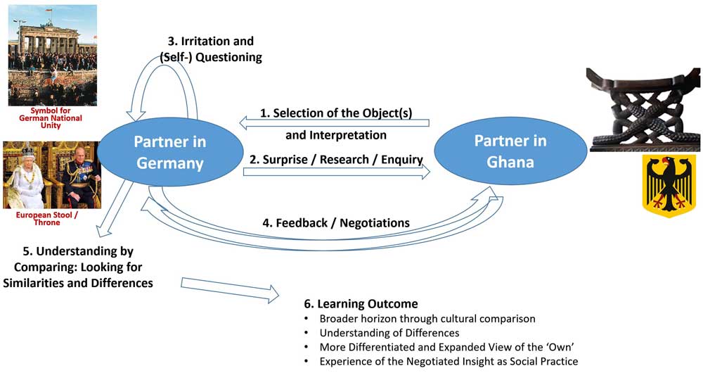
This figure presents a simplified visualisation of an extremely complex dispute that took place over several months - from a German perspective.
- The partners in Ghana selected the stool, interpreted it and made a connection to the German coat of arms.
- The addressees in Germany were very surprised by this, which led to intensive research into the symbols of the Akan culture. Through this, an acquaintance with the unfamiliar form of artistic expression took place.
- But, there was also an examination of the equation of meaning in the German coat of arms. The German team took up various aspects: the idea of the stool as a seat of power with symbolic adornment (as here with the English throne). But, the question of what image could be associated with the theme of "national unity" in Germany led to something quite different: the photo of cheering people on the Berlin Wall in 1989, when the division between the communist-totalitarian part of Germany and the capitalist-democratic part collapsed. This photo is much more anchored in the collective cultural memory than the coat of arms in respect to unity.
- In this way, the interpretations were discussed and negotiated together.
- Similarities and differences between the various cultural symbolisations could be identified,
- In a final reflection, the German team formulated their own learning experiences in this process.
Of course, everything was much more complicated and complex, but for the moment, perhaps the following conclusions can be drawn:
- The team in Ghana presents artefacts that are considered as important for the own context, the team in Germany tries to understand it, but starts a critical discussion when it comes to a German object, the coat of arms.
- The interpretations are negotiated with each other on eye level.
- The objects from Ghana and Germany (the stool and the coat of arms), although obviously completely different at first, are related to each other, come into contact with each other. Complex-entangled interactions of the objects themselves occur.
- What is initially seen as separate from each other becomes entangled in this way. The boundary between ‘one's own’ and ‘the other’ becomes fluid.
- This creates a hybrid intellectual space in which ambiguity becomes a paradigm.
Published August 2022
-
The logo takes on the formal look of the chips used in the “Abbia” game. It is a traditional game that was played only by men in the South Cameroon Plateau until the beginning of the colonial period. In its general form, the logo is comprised of two main parts: an upper part which bears the phrase “The University of Yaoundé 1” (in French and in English) and a lower part that is defined by the slogan in Latin words “sapientia collativa cognitio” (wisdom is collected cognition).
The central part of the upper component of the logo features four human figures organized around a table. The rigid geometrization of the composition of the logo and the regularity of the lines give great expressiveness to these graphics. The treatment of the shape of the logo exhibits remarkable influence by traits of the “Abbia” token. The geometric schematization of the pattern and the ogival shape of the logo scrupulously drawn by regular lines determine the elements that mark this influence.
The name of the game “Abbia” refers to “hazard”, “a game of chance where bets are placed, which may be a simple gourd of palm wine, a human being (woman or child), livestock, or the player's farm or plantation etc.” (Cyrille Bela, 2006). These are not just simple tokens but a characteristic artistic expression that is pertinent to the sculptural heritage of South Cameroon’s population. These tokens obtained from the pits of the sapotaceous fruit (Mimusops le-testui), present on their smooth faces a wide variety of anthropomorphic, zoomorphic, geometric subjects, etc. minutely engraved in bas-relief by the artists. In addition to their use for the game, Abbia tokens are also ideograms and pictograms that have sometimes been associated with divinatory practices (Maurice Pervès, 1949: 27). Designing a logo that is inspired by them is significant from a dual aesthetic and symbolic perspective capable of inspiring elements of content to national identity.
On the independence trajectory of the 1950 – 1960 period, the year 1957 is significant. It is marked by the creation of Cameroonian citizenship and the adoption of the first symbolic acts of the nation. After the investiture of André Marie Mbida, the first Prime Minister of the State of Cameroon on May 15th, 1957, the Legislative Assembly of Cameroon (ALCAM), on November 10 of the same year, chose the first national emblems: national anthem, flag, and a motto. From that moment, the visual and artistic elements revealed themselves and displayed their importance very early in the narrative of the history of the Cameroonian nation and the constitution of its heritage. The adoption of these national identification symbols is not unequivocal. We note with regret the anonymity of the authors/creators of these national emblems: “but we must nevertheless state the fact that no specific and nominal mention was made of the Cameroonian authors of the national anthem thus chosen. Later in 1960, the same silence will be reserved for the author – also Cameroonian, of the seals of the Republic of Cameroon, without us fully understanding the meaning to be given to these oversights” (J. E. Pondi, 2012: 65).
The trauma created by the sanctions imposed by the colonial powers on the various forms of reference to local iconographic and symbolic culture could justify the timidity of an exaltation of visual culture and its authors. The elements of visual and symbolic language such as the logo will come from an experience of distant memory and sporadic circumstances for several years. We observe, for example, that for several years the University of Yaoundé remained without a logo. The covers of the University’s annals of 1969 and 1970 illustrate this and bear only the words “Federal University of Yaoundé”. During the same period within the intellectual elite of the aftermath of independence, a nostalgia for traditional artistic culture is expressed in a literary modality. For example, one of the most important cultural journals created by this elite in 1962 is called Abbia in reference to the art of “Abbia”.
The absence of details on the date of creation and the conditions for the adoption of the logo of the University of Yaoundé does not exclude the probability that it was designed and produced by Engelbert Mveng between 1983 and 1987. Everything suggests that Mveng's legitimacy to take credit for the creation of this logo has not been subject to any reservations. As a Jesuit priest and artist/researcher, Engelbert Mveng’s cultural sensitivity, his academic reputation and his important artistic promotion action must have facilitated the adoption of the logo by the University’s administration. (Engelbert Mveng was Director of Cultural Affairs at the Ministry of Education and Culture from 1966 to 1974. Then, from 1983 to 1987, he was Head of the History Department at the University of Yaoundé.)The 1993 University Reform with the establishment of new state universities in Cameroon was also a significant factor in the creation of this logo. In Yaoundé, for example, the presence of two universities undoubtedly required the elements of visual identity capable of distinguishing the University institution from the others.
Universities are considered by politicians as the contexts for the conception of modern culture with identity characteristics for the young nation. Mveng (1930-1995) does not lose sight of this perspective. This is how he undertakes the re-appropriation and integration of traditional knowledge and skills in the creative process of the logo. The author applies his theory of the “loi de creation esthétique” (aesthetic process of creation) to the graphic design of the University of Yaounde’s logo.
The simplified form of this process is “OLMC” where O represents “natural object”, L represents “essential line of the object”, M is for “motif”, and C represents “composition”. This process was inspired by a methodological scheme of synthesis that Mveng (1980) notes by studying traditional artistic practice in several African societies. Mveng observes a recurrence of certain principles of creation: the observation of the natural object, the graphic representation of the object limited to the essential line and finally the use of the essential line as motif / sign in the composition of the works of art. The practical applications of this process favoured the development of an iconographic style and a production of works with a characteristic and very singular visual identity. This style is characterized by a schematic reinterpretation of the elements that surround us in patterns that we arrange in the compositions, which we transpose on different supports. In 1966, Mveng, inspired by the idea of modernizing “traditional African art”, created the “Art Nègre” workshop in Yaoundé. This workshop became a veritable laboratory for graphic design of iconography called to mark a cultural renewal.
Thanks to the privileged social and political position held by Mveng (priest, academic and artist), the Negro Arts Workshop succeeded in producing several works (paintings, drawings, sculptures, collages, etc.) both in Cameroon and in the diaspora. The workshop brings together artisans from various regions of Cameroon. It created a form of co-incorporation and also developed an important part of the production of religious art there. On the same methodological principles of “aesthetic creation”, the workshop produced the first liturgical imagery which presents the characteristics of the phenomenon of inculturation in the Cameroonian Catholic Church.
The University which the logo identifies is an educational context that predicts the future of society. The development of this society depends on the quality of training/education, skills and values that the school gives to young people. Education extends to everything from economic expansion to civic spirit. It engages the individual and collective prosperity of the country recalled in 1965 by Ahmadou Ahidjo (first president of the Cameroonian republic). The motto of the University in Latin: “sapientia collativa cognitio” displays the ideas that are dear to this institution whose mission is to train each Cameroonian well, to make him an artisan of prosperity and to make him a participant in the management of the state (J. C. Bahoken and E. Atangana, 1975).
The mention in French and English of “Université de Yaoundé 1/University of Yaoundé 1”, which follows the contours of the upper component of the logo, mainly reflects the bilingual nature of the Cameroonian University. Of course, this bilingualism is one of the symbolic markers of the political and cultural history of the unity of Cameroon. It expresses national political unity and guarantees openness to the participation of the Cameroonian University in transnational and intercultural dialogue that is essential for the development of the country. To use President Ahmadou Ahidjo's words during the inauguration of the said University on November 17, 1967, the University is an instrument of “dialogue with all nations of good will”.
Nowadays, the vices which characterize Cameroonian society such as corruption, the weakening of the patriotic and nationalist spirit in favour of ethnic and regional withdrawals, the weakening of the civic spirit, the inadequacy between training and employment and unemployment, to cite only these examples, expose the weaknesses of the education system in the country. The factors responsible for such an assessment are inter alia linked to the problems of immaturity of educational references very often adopted in a circumstantial manner (at random). Learning suffers from a lack of ingenious practices linked to the social transformation project. In other words, the educational project has a hard time building learning methods that take into account the socio-cultural, political and economic flows and bridges now established between here and elsewhere, today and tomorrow. As George E. Hein (2011) wrote, understanding learning as a social activity is a principle for considering successful education. An educational project which does not take this into account would venture to commit the fate of society at random as in the scenario of the game of “Abbia” where the most important goods of the players were randomly bet.
Download Paul-Henri Assako Assako's presentation on the origin of the logo by following this link.
References
- BAHOKEN J.C. et ATANGANA Engelbert. 1975. La politique culturelle en République unie du Cameroun, Éditions Les Presses de l’Unesco.
- BELA Cyrille. 2006. l’art des abbia : une forme d’expression sculpturale des pays pahouin, in « Afrique : archéologie et arts », 4 | 2006, p. 83-90.
- George E. HEIN. 2011. Constructivist learning theory//1991, in education, documents of contemporary art, London, Edited by Felicity Allen.
- MVENG Engelbert.1980. L’Art et l’Artisanat Africains, Éditions CLE, Yaoundé.
- PERVÈS Maurice. 1949. Parmi les Fangs de la Forêt Equatoriale : le jeu de l’Abbia, Revue de géographie humaine et d’ethnologie n° 3, p. 26-41.
- PONDI Jean-Emmanuel, 2012, (Re)découvrir Yaoundé ! Une fresque historique et diplomatique de la capitale camerounaise, Yaound Ed. Afric’Eveil.
- https://journals.openedition.org/aaa/1373.
- https://www.osidimbea.cm/cameroun-okoba/cameroun-1967/
published February 2020
-
Africans, including Ghanaians, had their peculiar way of life long before they encountered the colonialists. They had a robust governance structure (kinship system), laws and standards of beauty inherent in their beauty culture practices. The African society was orderly organised to the extent that there were minimal deviants. They had built no prisons for offenders, rather, their sense of communalistic living and religious practices shaped their modest way of life. Based on their customary laws and taboos, offenders atoned for their wrongdoings through rites and rituals which were enough corrective measures. In some cases, the corrective stigma associated with particular wrongdoing was enough deterrent to possible offenders. For example, someone who stole a bunch of plantains was made to carry the plantain on the head, and matched by multitudes through the streets of the community, announcing the offenses s/he has committed. Sometimes, offenders were sent to the chief palace for settlement of the case. The society was so organised and cultured to the extent that when the community became aware of the wrongdoing of an offender, s/he may not find a spouse or suitor in that community. Before arranging for marriage, the families of both parties engaged in serious investigation about the socio-moral backgrounds of both suitors regarding their behaviours in and outside the community. When a suitor had criminal records, the family of the suitors disallowed such a marriage. In personal communication with M. Opoku-Mensah (12th June 2020), he referred to a purported address of Lord Macaulay to the British Parliament on 2nd February 1835 which confirmed what pertained in precolonial Africa. Lord Macaulay reportedly said:
“I have travelled across the length and breadth of Africa and I have not seen one person who is a beggar, who is a thief such wealth I have seen in this country, such high moral values, people of such calibre, that I do not think we would ever conquer this country, unless we break the very backbone of this nation, which is her spiritual and cultural heritage…”
Just as any society, this statement suggests that Africans also had the way of life, including the standard of beauty and makeover practices.
Precolonial Ghana, as in the case of other Africans, held in high esteem their indigenous beauty culture standards. They held a complex standard of beauty embodied in their ‘Afrocultural aesthetics’ (Essel, 2017, p.25). Afrocultural aesthetics has to do with the conceptual and contextual hybridity of aesthetics that celebrate ideas expressed in artworks (Essel & Acquah, 2016) and the intended purpose of art, be it functional, symbolic or decorative. A work of art is considered good or beautiful once it served the purpose for which it was done. This implies that beauty is judged in context as well as the concept. The Afrocultural aesthetics also apply to the beauty culture practices of the people. One of the beautyculture practices precolonial Ghana held high was hair grooming aesthetic ideals. Hair occupied a central position in the scheme of social standing to the extent that it sent a message about the status of its wearer to the audience who understand such a language. One could differentiate a married woman from the others based on her hairdo in Ghanaian society. Hair was treated with natural hair softeners, conditioners, colourants, and accessories such as comb. Special combs that helped the people to keep the hair in good shape were fashioned by sculptors from wood, bones and metal. The combs were artistically shaped with symbolical essence just as the hair itself. What the precolonial African society did not do was to stigmatise the hair type and texture of their fellow Blacks.
The advent of the slave trade, colonialism and Western education began to sew the inferior seed of black hair stigmatisation and discrimination. Gradually, this ‘inferior seed’ (Morrow, 2014) sewn has entered the educational institutions which should be the agent of change, centre of Black consciousness, character reformation centre and panacea of pan-Africanism has rather turned into Afrosaxons colonialist surrogates perpetuating Afrocentric hair stigmatisation against their educands (Essel, in press). In the effort to decolonise the bastadised and proscribed Afrocentric hairstyle practices in Ghanaian schools, this article explores the conflicting tensions in the process on the part of the school authorities, students and the parents.
Decolonisation theories is central to this study. There exists different perspective on the subject matter of decolonisation. Some have looked at it from Euro-American perspective while others argued that the process remains incomplete when it is one-sided instead of two-sided, that is, looking at it from the perspective of the colonised and the coloniser. On this path, Wenzel (2017) examined the multiple objects and aspects of decolonisation namely, political economy, epistemology, culture, language and nature, and theorised that there exists unevenness and incompletion of the decolonisation process. By studying the various roles played by the colonisers, anti‐colonial nationalists, and Cold War superpowers in decolonisation, Wenzel (2017) observed that postcolonial independence did not necessarily bring national liberation. This liberation in my view includes mental emancipation, and redefinition of Africanness, believing in
ourselves.
In the encounter of the colonialists with the colonised, the former has painted monstrous and negative perceptual image about the latter which has affected the way of life of the latter.The colonialist projected their standards of beauty and art to the colonised and spoke ill of that the colonised to retard social progress and prolong colonial domination of the latter (Nkrumah, 1963).By so doing the colonialists’ beauty culture standards have been ingrained and practised in academic institutions and everyday life and has seeming override indigenous beauty culture standard of the colonised. In line with this, the decolonisation concepts that guides this study is that, the African needs to be measured by his/her cultural beauty standards that does not breach the fundamental laws of his nation or state. The African must gain national cultural consciousness and must not be necessarily be measured with the standards of the colonialist (Nkrumah,1963; 1964). Before the Black Hair Stigma in Precolonial Ghana There are different types of hair ranging from type 1(a, b, c), 2(a,b,c), 3 (a, b, c) and 4 (a, b, c). The types were classified according to the straightness, waviness, curl patterns and kinky look. Hair may also be described in terms of its texture, density, porosity and colour. These characteristics of hair
differences may manifest in individuals, groups, society or race. Despite the differences in hair type, all people of the world belong to one race, that is the human race (Elliot, 2016). Even among Blacks, there are differences in hair type. Precolonial Ghana was made of different ethnic groups of which the Akan were the majority. Though they were of different ethnicities, they did not discriminate against each other on the basis of their hair type or hairstyle. The people wore different hairstyles based on their ethnic affiliations, beliefs and practices, social status, and to celebrate events such as festivities and or funerals. Sometimes the hairstyles were worn for art sake. The hairdos had performative importance, semiotic power, and engendered identity. For
example, queen mothers wore a kind of hairdo named dansinkran (Figure 1) known for its iconic stature amongst the chiefdom.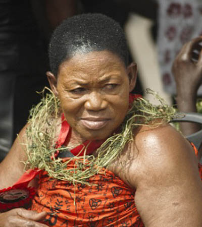
Figure 1: A woman wearing the dansinkran hairstyle. (Image courtesy: Godhit, 2017).
The hairstyles of the people ranged from natural dreadlocks popularly called rasta (known in Akan language as mpɛsɛmpɛsɛ), Afro, braiding, plaiting, shaving and African wigs. Though the word rasta is regarded more as a Jamaican phenomenon, mpɛsɛmpɛsɛ (which was named rasta) existed in some parts of Africa including Ghana in precolonial times. Some were born with the rasta. People born with rasta were considered by society as special beings, for that matter sacred. Apart from that, some priests and priestesses wore dreadlocks or afro. Cowries were placed in the rasta or afro hair of some priests and priestesses for symbolic, decorative, religious and ritual purposes. In this article, the term rasta is used in the context of both natural and artificial dreadlocks in precolonial, colonial, postcolonial and contemporary times. Again, the term Afro was introduced in the 1960s in reference to African American grown hair. From this word came Afrocentric. It is worthy of note that the enslaved Africans who were taken ashore had relatively long and grown hair. This was one of the hairstyles associated with males in precolonial Africa. The colonialists negatively described that hairstyle as bushy. Meanwhile,the long hair of the colonialists did not merit such a negative description. Till now, the term bushy hair connotes an offensive description of overgrown African hair. Many young Ghanaian people would prefer the term Afro to mean fully-grown hair than to describe their hair as bushy. Though the term Afro emanated from the US, the hairstyle was long in practice in many parts of Africa.One could differentiate between a maiden and a married woman just by looking at the hairstyles they wore. The people also used natural hair treatments that conditioned and softened it to keep it in good shape. The Akan often said ɔbaa n’enyimyam nye ne tsirhwin which literally means ‘The glory of a woman is her hair.’ This expression underscored why women in precolonial Ghana cared so much about their hair. They spent a great deal of their time in pursuance of their hair beauty culture practices. During puberty rites, female adolescents are given special education on hygiene, good grooming and hair beauty culture practices and treatments because of the premium society placed on the hair. Consequently, hair became a significant communicative symbol used to express moods such as bereavement, joy; and in some cases, power and authority. For example, a male child who lost his father, mother or close relation cut the hair down to the skin (Figure 2). He appeared hairless on the head as a sign of bereavement. Some Akan female adults wore a hairstyle called takua, done by holding the hairs together atop the head and with thread to stand upright. To them, such a hairstyle is design-less and simple in paying homage to the dead.
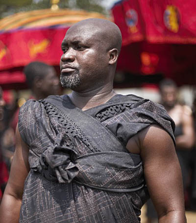 Figure 2: Man with hair cut to the skin as a signal of bereavement. (Image courtesy: Godhit, 2017).
Slave Trade, Colonialism and Western Education in Black Hair Stigmatisation
Precolonial Ghana had its own well-established form of education, evolved by the people themselves (Sampson, 1932; Essel, 2019) before their encounter with the colonialists. They trained the young ones through a rigorous enculturation process and apprenticeship system. They passed on the artistic culture and way of life from generation to generation through the robust apprenticeship system which is formal education and training (Essel, 2019). Training of the young ones was the duty of the immediate and extended families as well as other people in the community. It was for this reason that the precolonial society was described as living a communalistic life. In personal communication with M. Opoku-Mensah (12th June 2020), he referred to a purported address by Lord Macaulay’s to the British Parliament on 2nd February 1835. Macaulay had found that the people had strong cultural institutions that rule their socio-moral lives. In the said statement as pointed out by M. Opoku-Mensah (12th June 2020, personal communication), Lord Macaulay said to the British parliament:
"I propose that we replace her [Africa’s] old and ancient education system, her culture, for if the Africans think that all that is foreign and English is good and greater than their own, they will lose self-esteem, their native culture and they will become what we want them, a truly dominated nation."
Macaulay’s statement was recognition of the plausibility and relevance of the precolonial form of education that catered for the good socio-moral upbringing of the people which seemed impervious. As he suggested, the way forward was to introduce their culture including the language and beauty standards which they did, and used the slave trade, colonialism and Western education as a weapon to achieve their malevolent ideological and social-imperialism agenda. With the advent of Western education in the 1500s, learners with afro and rasta were asked to cut their hair before they were permitted to enrol. Afro and rasta hairstyles were considered unkempt and cutting them signalled cleanliness. The Euro-Christian churches planted in precolonial Ghana also asked new Black converts with rasta or afro to cut them as a sign of born again. The mission schools also proscribed
these hairstyles. In the name of religion, this practice continuously ate into the social-moral fabric of the society, especially, amongst the so-called Christian elite. In effect, this gradually contributed to afro and rasta hairstyles’ stigmatisation (Alhassan, 2020; Whiteman, 2010, Whiteman, 2007)). Those who wore these hairstyles, especially, the middle-class males and adolescents, were perceived as rascals, vagabonds, smokers, and unclean.
Based on rereading of scholarly information and archival sources on Black hair, interviews and focus group discussion as a method of data collection, the study provided insight into the hair decolonisation process in Ghanaian Senior High Schools and the conflicting tensions associated with the process. The focus group consisted of Senior High School teachers with more than five years of teaching experience at that Senior High School level. Descriptive and explanatory case study designs constituted the research design for the study. The descriptive aspect was for the purpose of describingthe phenomenon (the ‘case’) in its real-world context while the explanatory case study aimed at explaining how or why some condition came to be (Yin, 2018).A sample of twenty-eight (28) participants consisting of heads (2), teachers (20), and students (6) were purposively sampled from the accessible population of fifty (50). Simple descriptive analysis formed the method of analysis. To ensure the confidentiality of participants, pseudonyms were used to conceal their identity.
Conflicting Tensions in Black Hairstyles Decolonisation There have been reports of discrimination against the hairstyle of Black students in and outside Africa. During the 2015 West African Senior Secondary School Certificate Examination (WASSCE), three students of the St John’s Wesley Grammar School, Accra, Ghana were disallowed to write because they were wearing afro hair (Citifmonline.com 2015). In 2016, there were students protest in South Africa that questioned discrimination against African natural hair in class (Mwaura, 2016). Perry (2019) also reported Black hair stigmatisation which she sees as a vestige of segregated past that deemed blackness inferior and the emulation of whites as the route towards assimilation. This discriminative happening tells that black hair stigma persists in Africa even after colonialism. With the school as an agent of enforcing colonialists’ legacy of anti-Afrocentric hairstyle practices in primary, junior and senior high schools, specifically, rasta and afro, the practice
has become deep-rooted to the extent that attempt by parents and learners to question it proves futile. Students are not happy with the enforcement, and at some point in time prove adamant to school authorities. Mirekua narrated her story:‘I attended primary and Junior High School at Opah Municipal Assembly School from 2009 to 2012. There was a time I had to hide under my desk to avoid being sacked by the headmistress. I was given a warning at the assembly grounds to go and barb my entire hair. In my second year in Junior High School, I was told to go home and barb my hair because it would hinder me from taking part in the Basic Education Certificate Examination. I stayed home for a week because [after I cut my hair for] the fear of being mocked by friends seeing, as it was my first time of having a down cut.’
Mirekua’s accounts reveal the feeling of uneasiness and low self-esteem she developed as a result of being reprimanded to cut her long hair. Her hair was cut because she must be in school or face sacking sanctions. Students who go contrary were labelled as bad or stubborn. Maame Esi, was a student in a Senior High School in the Western Region of Ghana. She completed in 2014. She confessed that she complied with the rules and regulations governing hair beauty practices in her school because she feared being suspended, sacked or disgraced at the assembly grounds of the school. Not complying with the dictates of school authorities on hair in itself is a stigma. The enforcement of these anti-Afrocentric hairstyles has been internalised to the extent that some members of the society may cast aspersion on those who wear such hairstyles. A male participant said his best friend was
advised by the parent to Part Company with him because he left his hair to grow long. ‘My grandmum told me to keep my hair… One of my friends developed a cold attitude towards me afterward. When I asked, he told me that the parents have asked him to keep his distance from me because… I have become a bad boy. Only bad boys leave their hair without cutting it’, he said.
These vignettes of the students revealed that students kowtow to the hairstyle enforcement to avoid negative labelling by the school authorities and their own colleagues. There were others who also left the public school to attend a private school who were lenient with Afrocentric hairstyle restrictions. In a focus group discussion among 20 Senior High School teachers drawn across eight regions of Ghana, the issues that emerged were that students who wore afro and rasta are perceived as deviants and ill-mannered people who do not abide by the rules and regulations of the school. This is because the school proscribes wearing of these hairstyles. To
the teachers, students appear as adults when they wear afro and rasta hairstyles which do not distinguish them from the teachers. Succinctly put, ‘They appear like mothers and fathers’ than students in those hairstyles. In addition, they argued that wearing such hairstyles in school generates competition amongst the students as they may strive to put up flashy hairstyles and put little or no concentration on their academic work. As a result, they only permit students to wear rasta or afro on health and religious grounds. As explained earlier, hairstyles have religious implications in Ghanaian society. For example, afro and rasta have a strong affinity with African Traditional Religion, which is the authentic religion in precolonial Africa. A teacher explained that: Well, from my little knowledge, I know that … priest and priestesses do not barber. Secondly, some students have soft scalps making it easy for them to catch cold anytime their hair is down. These categories of students could be allowed to wear dreadlocks or afro to school. A teacher who aligned to the Christian faith perceived these hairstyles as unacceptable. He said, ‘My religious background wants us to have a close [hair] cut as a Christian man.’ The teachers said the culture of the school does not allow afro and rasta. So, they normally use scissors on students’ hair. They also admitted asking students to go and shave their hair but when the students refuse, they sacked them from the examination hall or class, since they were not ready to shave their hair without any tangible reason. Students who wear afro are perceived as ‘weed smokers’. On the contrary, four of the teachers argued that wearing afro or rasta is normal since it
borders on individual differences, and generally accepted in Ghanaian society. The issue is that these hairstyles become unacceptable when worn by students at the primary, junior and high school levels.
In response to the question of rules and regulations regarding hair beauty culture standards of students in public schools, a teacher said:What happens is that the housemasters, housemistresses, and some teachers on duty often send scissors to the various classes or examination halls to give students awkward hair cut against the will of the students to force them to shave their grown hair. This is
a kind of punishment given to the students for leaving their hair to grow. Some students, out of pain and dislike for such treatment, leave their hair in its awkward form as done by the teachers. Such students are often refused access to classes or examination
halls; canned, suspended or asked to weed as punishment. Students comply in order to take classes or
examinations.One of the participants has taught in five schools covering primary, Junior High School and Senior High Schools, with twenty-four years of teaching experience. She has taught in Ashanti and Central regions of Ghana, and currently a headmistress of a Senior High School. She opined that:
With twenty-four years of teaching, what the schools consider a neat haircut is down cut. Rasta isn’t allowed. Any child who came to school with grown hair is either driven home or the parents are invited to the school and advised to shave the hair of the ward. Some
parents come to explain to the school authorities that cutting the hair of their children has spiritual implications that may cause sickness to the child, so, the hair should not be cut. If the authorities disagree with them, it occasionally brings quarrels. Parents who
disagree are told that their children could not fit in the school... Personally, I think those who smoke marijuana wear rasta [dreadlock]. Once they come into the school with this hairstyle, their mannerism, their characters are influenced. They might not be smoking, but other students, sometimes, see them as marijuana smokers… Actually, for my long years in teaching, most of our recalcitrant students, most of our problematic students, when you look at them from head to toe, you realise that the sort of dressing speaks to their characters too.
The views of the headmistress-participant confirmed the thoughts of the teachers. The school expects learners to wear down-cut hairstyles as institutionalised by the colonialists. The school has done little or nothing to question the etymology of this self discriminating and self-stigmatising act they enforce hook, line and sinker. This negative enforcement has been instituted through a complex network of colonial apparatus namely Euro-Christianity, Slavery, colonialism and Eurocentric education making it difficult in decolonising the process. Any attempts to decolonise are faced with vehement opposition from Blacks to their fellow Blacks. Educated Blacks (Negroes) as pointed out by Woodson (1933, p. 7) ‘hope to make the fellow negroes ‘conform quickly to the standards of the whites and thus remove the pretext for the barriers between the races.’ Caucasians who attend Ghanaian public schools are exempted from this rule. Myjoyonline.com (2019, para 2, line 2 &3) reports of a leading member of a teacher union in Ghana who said: “what I gathered was that when Caucascians [Caucasians] students cut their hair to the level of black ladies, it makes them look very ugly and it can even affect their looks so Caucasian students are not allowed to cut their hair. There is no rule in the Ghana Education Service concerning Caucasians in Ghana because we are not Caucasians, we are negroes.”
Some teachers also argue that when students are allowed to leave the hair to grow long, it attracts lice, eczema and dandruff. These comments demonstrate the anchored conflicting tensions in the decolonising process. Diseases associated with hair are curtailed when students are properly groomed by the school to follow body and hair hygiene protocols. Their hair does not attract hair and skin-related diseases because it is black or not good. Hair and skin diseases are no respecter of colour or race. Good hair has nothing to do with its texture, density, porosity or colour. It is a hair of any type that is well maintained and kept healthy. The position of the school teachers and authorities brings to mind Carter Woodson’s (1933, p. xiii) assertion that:
When you control a man’s thinking you do not have to worry about his actions. You do not have to tell him not to stand here or go yonder. He will find his ‘proper place’ and will stay in it. You do not need to send him to the back door. He will go without being told. In fact, if there is no back door, he will cut one for his special benefit. His education makes it necessary.With this, Woodson looked at how the Negro has been miseducated to the extent that s/he exhibited ‘attitude of contempt to their own people’ (p.1). He also focused on the minds of Black people giving the right kind of education that would contribute to high self-esteem to their people. There are tensions and conflicts that ensue between school authorities and students on one hand, and school authorities and parents on the other hand. Students feel that such negative enforcement deprives them of their self-esteem, selfconfidence and uniqueness as individuals. Yet, they must abide by the colonialist monolithic mentality of wearing down-cut hair as a signal for obedience, neatness and smartness as required by the school to have access to education since noncompliance attracts harsh sanctions. Some parents who disagreed with the school authorities on the position of hairstyles, pick quarrels with the school authorities. Parents have the option of kowtowing or taking their wards from the school. One particular instance of a parent taking the school on is what happened in Achimota School on March 19, 2021, which became a national debate for more two weeks, and took a centre stage on social media, Ghanaian print (newspapers) and electronic media (radio, television, internet). One parent named Raswad Menkrabea took to his Facebook page to pour out his frustration about his son being denied admission on the basis of his rasta hairstyle. Raswad Menkrabea wrote:
This morning, the school authorities of Achimota School claimed that their rules do not allow students with dreadlocks to be admitted. The school authorities denied two brilliant dreadlock students from being admitted after having been posted there by the Computer School Placement System [Computerised School Selection & Placement System]. My son was one of the affected children and the other student was also refused on the same grounds. We have no option but to battle against this gross human right violation. As a child he has every right to his culture in so far as such culture do not breach the 1992 Constitution. He equally deserves the right to access education within his culture just like other cultural believers. As a Rastafarian, I think that dreadlock do no way cause any
harm which should even be a basis to be asserted by the school authorities. The fundamental questions to ask is what does our law
say about right to one’s culture? Do you deny a child access to education based on his/her culture? Do public school rules override the supreme law of the land?
This issue, which became a national debate in public transports and markets, attracted the attention of Ghana’s parliament in March 25 2021, based on which the Education Minister, Dr Yaw Osei Adutwum assured the house that the Ghana Education Service (GES) will soon issue policy guidelines on students’ admission to all Heads of Senior High Schools in Ghana to bring finality to the issue.
Wearing long or short hair plays no role in distracting students to focus on their academics. There are many renowned private schools in Ghana that do not proscribe students from wearing rasta or Afrocentric hairstyles. The school whether public or private has the primary role of grooming students to be creative thinkers with good time management skills. The hair students keep has nothing to do with their academic performance and socio-moral conduct.
From the discussion, it has emerged that the public schools proscribe Afrocentric hairstyles with no substantial scientific evidence that wearing afro and rasta inhibits the acquisition of creative and innovative thinking, and academic performance or progress of the students. Neither have the schools established from their arguments that wearing Afrocentric hairstyles negatively impacts the socio-moral and cultural wellbeing of the Ghanaian society or indigenous culture. They point to no sound research that establishes the relationship between academic performance and hairstyle worn, and the relationship between hairstyle and social conducts of students. The conflicting tensions around the hairstyles cut across precolonial, colonial and part of global fashion, and create multiple conflicting meanings within the many-sided existence of Ghanaian hairstyles. This helps to show how unstable, changing, and multiple the meanings of the hairstyles can be. Yet the Ghanaian public schools enforce the colonialists’ discriminative legacy of stigmatising Afrocentric hairstyles in Ghanaian schools with monolithic mentality without questioning the roots of such segregative practices. Teachers have challenges with students because when they wear rasta, afro and other Afrocentric hairstyles, they do so to show seniority. In other words, do so to signal that they have come of age. Therefore, wearing afro or rasta by the public school
students becomes a sign of rebellion and badness, while for the teachers they are signs of authority and respectability while this is not the case in the private school students. The difference between the public and private school policies creates a class division in the meaning of the hairstyles, where the Rasta and Afro styles become a sign of privilege.
Again, the teachers also deprived students of their Afrocentric hairstyles because they think it makes students susceptible to skin and hair diseases. These reasons deduced from the argument of the teachers and school authorities are not convincing to parents and students which leads to student-teacher and parent-teacher conflicts. Students gained continued access to education only when they shave their hair. Their education is threatened when they refuse to conform to the rules and regulations on hair. Students wear rasta, afro or long hair for several different reasons. Some wear it for spiritual/religious obligations, aesthetics and for fashionability purposes. This interesting practice challenges the so-called tradition and modernity opposition since a pre-colonial religious meaning and a fashion meaning can coexist in the same style and space. It is discouraging that six decades after independence from the colonialists, there are pitfalls in an attempt to decolonise the Afrocentric hair stigma created by the colonialists through the churches and schools they established. Surprisingly, the public-school authorities in Ghana have tended to be colonialists’ agents enforcing the discriminative Afrocentric hairstyles in schools. It is recommended that the Ghana Education Service and the Conference of Heads of Assisted Senior High Schools (CHASS) must work together to review the hair policies for students, so that it will not be a bottleneck for students to have access to education, which is their fundamental right enshrined in the 1992 constitution of Ghana.References
- Alhassan, S. W. (2020). “We Stand for Black Livity!”: Trodding the Path of Rastafari in Ghana. Religions, 11, 374, 1-10. doi:10.3390/rel11070374
- Citifmonline.com. (2015). School bans students with ‘unkempt’ hair from writing WASSCE. http://citifmonline.com/2015/04/22/school-bans-students-withunkempt-hair-from-writing-wassce/
- Essel, O. Q. & Acquah, E. K. (2016). Conceptual art: The untold story of African art. Journal of Literature and Art Studies, 6(10),
1203 – 1220. - Essel, O. Q. (2017). Searchlight on Ghanaian iconic hands in the world of dress fashion design culture (Unpublished Thesis).
University of Education, Winneba. - Essel, O. Q. (2019). Decolonising Ghana fashion education and training history. International Journal of Humanities & Social
Studies. 7(7), 381 – 392. - Essel, O. Q. (In press). Hair and body fashion identity narratives in ‘the Return of the Slaves’ exhibition.
- Elliot, J. (2016, May 26). Elliot Jane on the Rock Newman show. https://www.youtube.com/watch?v=fF9s0as_d_4
- Morrow, W. (2014). 400 years without the comb: Sewing the inferior seed. https://www.youtube.com/watch?v=SH7nNdz3ImY
- Mwaura, W. (2016). South African schools under attack over Afro hairstyles ban. https://www.dw.com/en/south-african-schoolsunder-attack-over-afro-hairstyles-ban/a-19513159
- Myjoyonline.com. (2019). Let it grow: Why the policy against long hair in schools must beabolished. https://www.myjoyonline.com/opinion/let-it-grow-why-the-policyagainst-long-hair-in-schools-must-be-abolished/
- Nkrumah, K. (1963). The African genius. Speech delivered by Osagyefo
Dr. Kwame Nkrumah, President of the Republic of Ghana, at the Opening of the Institute of African Studies on 25th October, 1963 - .Nkrumah, K. (1964). Consciencism. Panaf Books Ltd.
- Perry, A. (2019). “Stay out of my hair”: Black students need the federal government to tell schools to leave their hair alone.
https://hechingerreport.org/stay-out-of-my-hair/ - Sampson, M. (1932). Gold Coast men of affairs.
- Wenzel, J. (2017). Decolonization. In I. Szeman, S. Blacker, & J. Sully(Eds.), A Comparison to Critical and CulturalTheory.
https://doi.org/10.1002/9781118472262.ch28 - White, C. M. (2010). Rastafarian repatriates and the negotiation of
place in Ghana. Ethnology, 49(4), 303 – 320 - White, C. M. (2007). Living in Zion: Rastafarian Repatriates in Ghana,West Africa. Journal of Black Studies, 37(5),677-709.
- Woodson, C. (1933). The mis-education of the negro. Khalifah’s Booksellers & Associates.
Yin, R. K. (2018). Case
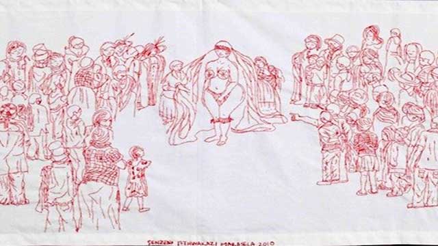
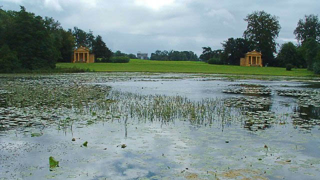
-
The English Garden perceived as harmonious, lovely, picturesque or graceful to visitors in our present day, is charged with political resistance, struggle for power, projection of social utopias or flight into resignation. Like many interesting creations, these gardens are microcosms full of contradictions – particularly during the time they were created in the early 18th century: utopia and idyll, a mirror of society and its antithesis, dream and melancholy, imitation of nature and going beyond nature.
Stowe House Park, less than 70 miles northwest of London, is considered to be the first and most definitive site of an ‘English Garden’ – Lancelot Brown (1716 – 1783) who was employed there was the first person whose life-long occupation was that of a landscape gardener. The Stowe gardens embodied the ‘English Garden’ paradigm like no other and Benton Seeley’s guidebook (1742), the first garden guidebook to be published in the world, helped to spread Stowe’s influence throughout the 18th century as the model for the ideal English garden.As a country estate of the Temple family, it was – many decades before the redesign – first committed to Baroque, i.e. French models: symmetrically laid out, geometrized nature, combined with the pompous splendor of the manor building. The early model was abandoned and the new complex design of 26 hectares followed more innovative principles, for good reason; however, it still remained a status symbol of the wealthy family.
Thus the many buildings that were built in the park are demonstratively not Baroque. After all, Baroque embodied absolutism, which was despised. Instead, they were inspired by Renaissance, Gothic, antiquity, or Chinese architecture, pre-baroque styles or styles found geographically outside the borders of England. Each style tries to evoke its own mood: Gothic stood (and stands) for the morbid, the unearthly, China for the exotic, antiquity for the free citizenry.
In this sense, the names of the garden parts can be understood as allegories: Temple of Concord and Victory, Grecian Valley, Stauen von Saxon Deities (Germanic Deities) or Homer and Socrates, Gothic Temple, Elysian Fields and many others refer to cultural regions that represent a different, supposedly better social order. It is about an alternative concept to the absolutist principles, about freedom. The dedication inscription on the Gothic Temple makes this very clear: “To the liberties of our Ancestors”.
This directly decipherable political iconography is complemented by a differentiated iconology of forms. For example, the grass around the Temple of Ancient Virtue is subtly maintained as a lawn, while the grass around the ruins of ‘contemporary virtue’ grew wild until the ruins disappeared completely. The outdoors devours the contemporary, decadent, (neo-) absolutist tendencies. Thus nature was liberated from geometrizing corsets just as society was liberated from absolutism. As in free nature outside the garden with its unbridled forms, the garden becomes a free landscape in which free people move freely.
This conception of how such a landscape garden should look was influenced by three main sources: from the personal memories of nature that English nobility brought back with them from their Grand Tours through Europe; various descriptions of exotic Asian gardens; and, finally, from the classical landscape paintings by Ruisdael, Lorrain or Poussin.
Areas in the garden were designed for such three-dimensional pictorial stagings, which in Stowe featured over 90 selected scenes (or one might call them intriguing or harmonious compositions) that could be experienced from certain spots or areas in the garden. The visitor had to and has to set out to walk in order to experience all the spaces and perspectives along the way. Winding paths, which repeatedly open up to surprising glimpses of the unexpected, lift the visitor from everyday life and put him in a special mood. Hence, the course of the path is the central means of the landscape designer to develop his own dramaturgy. He steers the visitor and controls what he sees and when. What the visitor doesn’t see are typical walls. Instead the use of ha-has, a recess in the landscape similar to a sunken ditch, creates a vertical barrier while preserving an uninterrupted view of the landscape. The fine line between art and nature disappears.
The ever-changing weather, light and appearance of the plants, and the multifold of views along the way, allow the visitor to immerse himself again and again in an entirely new visual experience. This sensual experience should have a purpose. In the five-volume Theory of Garden Art by Hirschfeld, published 1779-85 in Leipzig, the aims are clearly outlined: On the one hand, the education of the observer through the enjoyment of art (“inner true cheering up of the soul, enrichment of the imagination, refinement of feelings”) and on the other hand, the “beautification of an earth which is our home for a time”. The aim is thus the refinement of nature by man as well as the refinement of man by nature.
The Temple family had initially acquired its immense wealth through sheep farming, and on the basis of its economic success it provided members of the English parliament for generations, including four prime ministers. English politics in the 18th and 19th centuries would be inconceivable without its influence. Richard Temple, 1st Viscount Cobham (1675 – 1749), who was a key figure in the founding of the park at Stowe, was initially a successful army commander in the War of Spanish Succession against France. In the early 18th century, however, as a supporter of the ‘Glorious Revolution’ (1688/89), which had led to the abolition of absolutism in England, he was marginalized by internal adversaries, which made the development of his garden so important for him.
In search of an aesthetic alternative to the ideologically rejected French garden (as the embodiment of absolutism), Chinese or Japanese gardens offered a central source of inspiration. William Temple had already published a book on Asian gardens in 1690. These gardens were above all a counter-model to the symmetrical arrangement of geometrically limited flowerbeds, the prototype of which was the park of Versailles. The irregular, free composition of trees, plants, stones, and water in Asian gardens was the model for a natural appearance that was as natural as possible and, in turn, created with the highest degree of craftsmanship, that is, artificially. In 1738, this enthusiasm for Asian gardens led to the construction of a Chinese house in Stowe – the first in garden history – an innovation that found its successors in many gardens throughout Europe.
Reference
Sibylle Hoimann, Garten; in: Fleckner U., Warnke M., Ziegler H. (eds.), Handbuch der politischen Ikonographie, Vol. I, München 2011 (Beck), pp. 388.
published January 2020
At the moment, I find it fascinating that such English and Chinese or Asian cultural exchange upon the built environment started so early on in the 18th century. It reminds me of the Chinese garden that focuses also on landscape, and an emphasis for reflection and escape from the outside world.
published January 2020
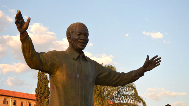
-

Katsushika Hokusai, Nami-ura
Many Japanese feel astounded when they know that Hokusai is considered as the most famous Japanese artist in the Western countries. The art-historical assessment in Japan also turns out differently than one would probably expect from a Western perspective. For example, it was only in 1997 that one of his works was admitted as Japan’s cultural heritage for the first time by the Japanese Ministry of Culture.
In order to understand this understatement, one needs to understand the socio-historical context of the time of the period when Hokusai produced this work: In the Hokusai's lifetime, an ukiyo-e master was considered as a mere craftsman. This, for example, represents a strong contrast to the Kano school artists, whose focus was primarily on Chinese painting. Many of the Kano school artists worked as the shogunate’s official painters, which enabled them to be part of the warrior class. In feudal society there was an unbridgeable clear class difference between those artists and ukiyo-e masters. Moreover, ukiyo-e was considered vulgar, as it was a medium for common people and some were even pornographic. Today “ukiyo-e” specially represents Japanese woodblock prints of the later Edo period. But actually the term ukiyo originally has a Buddhism-originated, rather pessimistic meaning, namely: “transitory world”, which contrasts to the word jōdo as “pure land” or “paradise”. “Ukiyo-e” in this context would mean “images from this world”. However, it was precisely in the Edo period mentioned about the attempt of reinterpretation, especially among townspeople, to perceive, affirm and even enjoy this temporary, worldly world as something positive. Accordingly, despite its originally negative meaning of the word, motifs that came to mean everyday, life-affirming, bourgeois life were often chosen for “ukiyo-e”.
In the Hokusai's lifetime his artistry1 in this sense certainly met with positive response and interest from the townspeople in Edo (today Tokyo). But it was French art critics and modern artists at the end of the 19th century who gave Hokusai “world-class” status. With the style of the so-called Japonisme they hoped to get impulses or artistic suggestions from the color woodcuts or lacquer works to overcome the hopelessly frozen academic European art from their viewpoint; bold, asymmetrical compositions, spontaneous drawing, strong colors, overcoming the central perspective. It seems clear that the view of these Europeans on Japanese works of art was from the beginning selective. And obviously Hokusai was an ideal projection here.
In Hokusai's extensive oeuvre the “Thirty-six Views of Mount Fuji” is regarded as his main work. Among all of Hokusai’s works, “The Great Wave off Kanagawa” particularly has attached special attention in the West until the present day. Already in 1897 Camille Claudel (1864-1943) created her work “La Vague”, which was inspired by “The Great Wave” and in 1888 Vincent van Gogh (1853-1890) pointed out the special nature of this work in a letter to his brother. Eventually “The Great Wave” established itself as an “global icon” as one acknowledged today.2 According to the English art historian Christine M. E. Guth, it was decisive for the enormous spread of the picture that in the West, “The Great Wave” was chosen as the title to differ from the original “The Backside of the Wave”. In this way, the image has been separated from the original context.3
The fascination, which this work still holds globally today, certainly lies all in the geometrical or typically Japanese asymmetrical composition and the dynamic representation of the big waves. Thereby the horizon is set unusually low, which additionally serves to increase the effects. The position is actually very unnatural and almost impossible. Here it is important to point out that this perspective representation was a result of Hokusai's attempt to appropriate or interpret the European central perspective. It was in the early 18th century that the Japanese began to deal intensively with this Western style of painting. By directly connecting the foreground and the distant view without a middle ground, they found a particularly effective means of dramatic representation, which in reality deviated from the actual Western painting principles. The Japanese art historian Shigemi Inaga calls this typical Japanese expression “chūkei-datsuraku (falling out of the middle ground)”.4 Many ukiyo-e masters liked to make use of this manner. Also in Hokusai's “The Great Wave” it seems to have succeeded impressively. As already expressed in the original title “Nami-ura” (the backside of the wave), the picture draws the viewer's gaze deep into the inner side of the devouring movement of the waves. Thereby a literally sublime feeling is awakened in the observer. In front of this mighty natural phenomenon, the people in the picture look powerless, as if they were merely driven by the waves. The holy Mount Fuji silently watches all this sight from far away.
Mount Fuji, a 3776 meter high volcano, is not only the highest mountain in the country, but has been worshipped as a religious object in ancient Japan. On the one hand, Fuji with its rich water reservoir provided fertility, but on the other hand its eruptions caused great damages to the population. Accordingly, it was always regarded with a certain reverence and in the 9th century the first shrine for the fire god “Asama” was built on it. The mountain then also became a holy place for Buddhists. The Mount Fuji worship became especially popular during the Edo period. The most eloquent example is Hokusai’s “Thirty-six Views of Mount Fuji”. Otherwise Mount Fuji was chosen as subject of the painting again and again since the 11th century at the earliest. Later, at the peak of nationalism in Japan, especially during the second Sino-Japanese War and the Pacific War (1937-1945), the mountain was identified with the nation “Japan” per se and eventually became an authentic “national symbol”. After World War II it was then seen as a symbol of the new, revived Japan. Based on these historical backgrounds it seems obvious that many Japanese perceive something particularly familiar in the depiction of Fuji in the work “Nami-Ura”. In this sense, it is quite significant that Mount Fuji was recognized by UNESCO as a World Cultural Heritage in 2013, as a “sacred place and source of artistic inspiration”.
Today, the image “The Great Wave” is often used for merchandising products of museums, such as coffee mugs, plates, notebooks, ties, T-shirts, wristwatches or umbrellas, and is extremely successful. The Japanese government finally jumped on this trend at the beginning of the 21st century when it developed a state-sponsored marketing strategy based on “Cool Japan”, a neologism created by the American journalist Douglas McGray, in which the Japanese subculture such as manga or anime would play a major role. The motif was also used for the “Cool Japan” project. Guth sees this as the final recognition of Hokusai on the Japanese side.5
Inaga writes that Hokusai was an artist who had gained his unique historical significance in the international context of Japonisme "as a sociological phenomenon“.6 The shift in Hokusai's evaluation for over a century makes his creative approach a complex construct of the artistic, cultural and social development of the Edo period. Inaga notes that “many things that today are considered the essence of Japanese aesthetics were actually refined in dealing with imported culture. […] Cultural characteristics are not revealed in isolation, which shields itself from foreign influences, but rather through curiosity about the outside world“7. Especially Hokusai's art is a prime example of this statement.
Download a more detailed version of this essay by Nobumasa Kiyonaga (in German).
Footnotes
1 The concept of art with the European sense did not exist in Japan at that time yet. For this reason the author avoids the term “art“ at this point. It was only after the opening of Japan to the Western countries in the 1850s that the term was newly introduced from Europe as a translation word.
2 Christine M. E. Guth (2017): 21 Seiki no Yōroppa · Amerika bunka no naka no “Ōnami” (eng: The Great Wave in Twenty-first Century Euro-American Culture), in: exh.cat. Hokusai and Japonisme, Tōkyō: Kokuritsu seiyō bijutsukan (The National Museum of Western Art) und Yomiuri shinbun Tōkyō honsha, p. 296.
3 Guth (2017): Ibid.
4 Shigemi Inaga (1999): Kaiga no tōhō – Orientarizumu kara Japonisumu e (eng: The Orient of the Painting: Orientalism to Japonisme, Nagoya: The University of Nagoya Press, p. 90ff.
5 Guth (2017): pp. 298-299.
6 Inaga (1999): p. 174.
7 Shigemi Inaga (2018): Nihon-bijutsu-shi no kindai to sono gaibu (eng: The modernity of Japanese art and its outside) Tōkyō: Hōsōdaigaku kyōiku shikōkai, p. 33.
published June 2020
Hokusai, The Great Wave off Kangawa
A raging sea, mighty waves, spray falling like snow from their crests. The waves form huge claws that hover precariously over the fishermen in their fragile boats. Adapting to the shape of the mighty waves, the boats’ bows thrust their way ahead towards the left. The energy of the boats speeding forward is compositionally absorbed by the propulsive force of the water pushing to the right. Hypothetically, the viewer is positioned in the water and is in just as much in danger as the oarsmen.
In the centre of the wave trough’s mighty movement, we see the static Mount Fuji diminutive in the distance. Although one could almost overlook it due to its size and similar colour to the water it is the central subject of this woodcut, one in a series of “36 views of Fuji”, completed by Hokusai. Fuji’s peak lies in the golden section and serves as a stabilising element. The mountain, holy in Shintoism[1], appears like a vision, promising (unattainable) security. A pale white cloud above it takes on the shape of the wave adding to the threatening atmosphere. It is somewhat irritating how Mount Fuji and the waves approach each other through colour, form and lines. Even the drops of water coming out of the spray look like snow falling on Fuji’s peak. The small rowers crouching in their boats do not even see the mountain. In comparison with the other pictures in the series, this sheet displays the most dramatic representation in juxtaposition to the calm steadfastness of Fuji. The other 35 sheets mostly depict Fuji in idyllic everyday scenes or in quiet, monumental sublimity. (The great differences in style show that the series was published over a span of several years.)
The composition is like a snapshot of a scene at its dramatic climax. We, the observers perceive it from the distance and, at the same time, we are right in the middle of it. The giant wave is about to crash over the boat on the left, while the other two boats, swift as arrows, are heading right into it as well. According to historical accounts, they are fishing boats that are on their way back with their catch to the mainland, to Kanagawa, a place in the bay of Edo, today's Tokyo. But none of this is visible in the print. Instead, Hokusai illustrates a powerful and dangerous nature in which men must integrate themselves in order to survive. The picture displays the fishermen nestled within the frame of the wave. In this way, Hokusai creates a timeless and emotionally moving metaphor for man at the mercy of nature. He thus takes a specific artistic position that makes him interesting in comparison with European paintings by e.g. Caspar David Friedrich or William Turner who address a similar experience.
The title and Hokusai’s name appear in the upper left corner of the print in Japanese script. The concept of combining image and script is typical for Far Eastern traditions. We can find more features that can be considered as typical for Japanese woodcuts: flatness, reduction of colours, graphic patterns (e.g. the light and dark stripes in the water) and black lines outlining or defining the objects. Hokusai uses these means with expressive exaggerations, which often take on caricature-like features, for example in the representation of the spray or the frightened fishermen in their boats.
However, since Hokusai also uses Western pictorial principles, especially the conception of space and the idea of a dramatic climax, he created his own visual language, based on his reception of Western painting. This is significantly demonstrated by his treatment of spatial depth. Looking through the waves at the central motif – in this case Mount Fuji – from an observer's point of view is committed to the Western concept of perspective formulated in the Renaissance: the picture as a window to the world, which appears in perspective. In Hokusai's work, this European concept of space merges with the traditional Japanese art of colour woodblock prints, which was characterized by emphasized two-dimensionality, contrasting empty spaces, ‘abstract’ pictorial structures, and dynamic linearity. Hokusai's mediation between two culturally different pictorial conceptions ultimately led to his being more popular in the West today than in Japan itself.
The opening of Japan after 1853, forced by US gunboat politics – and supported by European governments – triggered trade between Japan and the world. At first, some Japanese woodblock prints were used as packaging material, which may seem surprising to lovers of this art form today. Fortunately, they were discovered and enthusiastically received by artists in France. Among those were Hokusai’s prints and his popularity grew rapidly throughout Europe and elsewhere. The collecting frenzy of Japanese art (Japonism), which was also triggered by this, influenced Post-Impressionism, Art Deco and Art Nouveau and, in particular, architecture and design such as was taught at Bauhaus. Just as Western visual language came to Japan, Asian visual concepts now influenced art in Europe.
Ukiyo-e
Hokusai, trained in painting and woodblock printmaking, is considered a master of the multi-coloured ukiyo-e woodblock prints. From the early black and white prints, an extremely refined multi-colour printing process with up to fifteen woodblocks was developed during his lifetime. For the production of the plates and complicated printing process there were highly specialized workshops, for which – in our case – Hokusai provided the templates. Compared to other prints, however, relatively few plates were needed for the 'Great Wave': three for the different shades of blue, one each for the colour of the boats and the sky, and black and grey. As some of the prints found today show considerable traces of wear on the plates, we can assume that hundreds or thousands of prints were printed from the same plates. The peaceful Edo period (1603 - 1867) had led to new forms of expression as well as to the mass production of woodblock prints, such as those by Hokusai.
[1] At 3776 m, this volcano is Japan's highest mountain. Its shape is elegant and at the same time monumental, memorable and easy to recognize. In Shintoism it is a holy place. Moreover, as it has repeatedly been a "source of artistic inspiration", not only for Hokusai. It was recognized by UNESCO as a World Heritage Site in 2013.
published September 2020

Grueto Uebo: Globalisation, Commercialisation and Politicisation
Hokusai’s color woodcut, “The Great Wave”, is now one of the most famous images of Japan in the world. However, its meaning has changed considerably since it was created in the mid-19th century. This article examines the historical impact of “The Great Wave” against the backdrop of globalization, commercialization, and political instrumentalization. Selected examples demonstrate how the motif has become increasingly detached from its original historical and cultural context in the 20th and 21st centuries. Rather than viewing the diverse reinterpretations as a loss of meaning, the essay considers them to be an expression of the image’s enduring transcultural impact.
Introduction
Katsushika Hokusai’s “Great Wave” is now one of the most widely reproduced works in Japanese art history. From the nineteenth century onwards, the color woodcut attracted considerable attention in Europe and North America with the rise of Japonism. Fascination with Hokusai’s “ukiyo-e” prints, as well as those of other Japanese artists, continued into the 20th and 21st centuries, as demonstrated by numerous exhibitions in European and American museums.[1] At the same time, the image increasingly moved away from its original context and took on new meanings.
While Hokusai’s work was originally part of the popular visual culture of the Edo period, “The Great Wave” has developed numerous new symbolic meanings and interpretations in the 20th and 21st centuries. Christine Guth describes this process as the “biography” of an image, with its meanings constantly expanding through transcultural exchange.[2] Based on this idea, this article looks at how and in what contexts “The Great Wave” has been reinterpreted since the second half of the 20th century. Three aspects are examined in particular: the increasing commercialization of the motif; its use as a symbol for (environmental) disasters; and its role within Japanese and international visual politics.
Commercialization, Products, Lifestyle
The widespread commercialization of “The Great Wave” is a key factor in its enduring popularity. Since the second half of the 20th century, the motif has appeared on a wide range of products, particularly in museums. Posters, books, postcards and textiles featuring the print are often purchased as souvenirs. Despite being greatly simplified and placed in new contexts through its reproduction on a wide variety of surfaces, this type of commercialization usually retains some connection to the original work.[3]
Figure 1: Mug from the British Museum, © Private photo.
Additionally, there are forms of commercialization in which any connection to Hokusai or to Japan is increasingly lost. In these cases, “The Great Wave” is selected as a product motif primarily for its perceived timelessness and visual appeal, rather than for its historical or cultural associations. Since the 1970s, numerous contemporary brands have used the image on T-shirts and other items of clothing. In these contexts, the image almost always appears in a modified form, as the emphasis lies on creating a visually striking design associated with a particular lifestyle rather than on producing a souvenir or a direct reproduction of Hokusai’s work. The sacred Mount Fuji, which plays a central role in the original composition, is often removed, allowing “The Great Wave” to function as a simplified graphic motif. This adaptation is especially popular among sports brands, particularly in the skateboarding and surfing scenes.[4] In such products, the wave no longer refers to a specific work of art but instead conveys a sense of movement, freedom, and power. Consequently, the motif operates less as a reproduction of the artwork and more as a lifestyle-oriented design.[5]
Figure 2: Mural of the “Great Wave” and the Mattehrhorn with a surfer, Switzerland, © Private photo.
This development demonstrates the extent to which “The Great Wave” has become detached from its original context, while the motif’s visual simplicity and high recognizability are precisely what enable and promote its recontextualization.
“The Great Wave” as a symbol of (environmental) disasters
In addition to consumer culture, the use of “The Great Wave” as a symbol of disaster has played a central role in its modern history. As early as the end of the 19th century, the image was associated with tsunami events in Europe.[6] From the 1960s onwards, this association became increasingly prevalent, as seen in the use of a simplified version of the wave as the logo of the International Tsunami Information Centre.[7]
However, this comparison is problematic. Scientists have pointed out that Hokusai's depiction is not of a tsunami, but of a so-called “monster wave”. [8] Using “The Great Wave” as a warning symbol could therefore give a false impression of the natural phenomenon and lead to dangerous misconceptions. Nevertheless, the motif remains popular to this day thanks to its powerful symbolism and international recognition.[9]
Beyond its specific reference to the tsunami, “The Great Wave” is increasingly used as a general symbol of disaster. In political caricatures, monuments and media representations, it represents sudden, overwhelming events.[10] The motif also appeared repeatedly in connection with the 2011 Fukushima nuclear disaster, for example in satirical depictions criticizing government decisions.[11] In those examples, the wave can be seen as a representation of sudden danger, overwhelming force and violence – in short, of disasters in general.
“The Great Wave” as a symbolic image of an international Japan
While many contemporary adaptations of “The Great Wave” originate in the West, it is worth exploring its relevance in Japan. Although the color woodblock prints and drawings from the Edo period triggered a trend known as Japonism in the European art world at the end of the 19th century, they lost much of their significance in Japan during the same period and were even described as “vulgar”.[12]
However, although “ukiyo-e” art had lost its significance in Japan, its popularity in Europe and North America was well recognized. After the Second World War, the Japanese government deliberately used these traditional, popular images for international self-promotion. For instance, stamps featuring “The Great Wave” were designed to align with Western perceptions of Japan as a culturally rich nation, despite hardly reflecting post-war Japan.[13]
As part of the increased international marketing of Japanese culture since the 1990s, “The Great Wave” has also gained new visibility within Japan. It has appeared in tourism campaigns, public spaces, and international advertising strategies. Since 2024, “The Great Wave” has also featured on the thousand yen note. However, these marketing and product placements still primarily appeal to a foreign audience.[14] So, what connection does Japanese society today have to Hokusai’s “Great Wave”?
Figure 3: 1,000 yen note, reverse side. © Creative Commons.
In his 2019 analysis of Japanese school education, Nobumasa Kiyonaga observes that “The Great Wave” plays a significant role in contemporary art education and is commonly addressed in the curriculum. His study shows that “ukiyo-e” color woodblock prints have become well established in Japanese schools and have shed their former “vulgar” stigma.[15] Although Japanese society now recognizes “The Great Wave” as part of its artistic heritage, and the image is frequently cited in international contexts as a visual symbol of Japan, the significance attributed to it in Japan remains less than in the West.
Conclusion
The history of the “The Great Wave” illustrates how a work of art’s meaning can be transformed through global circulation, commercialization and political appropriation. As the motif has become increasingly separated from its original historical context, it has gained the flexibility to function in a wide range of settings.
Following Christine Guth’s concept of an image’s biography, these diverse meanings should be understood as part of the image’s ongoing history.[16] Today, “The Great Wave” serves as a visual template for depictions of waves worldwide, influencing shared perceptions of nature, danger, and motion across cultures. However, the image’s biography is far from complete. Through new media, political developments, and cultural exchanges, “The Great Wave” will continue to gain new meanings.
[1] This is evident from the numerous exhibition catalogues that have been published for these exhibitions. See: Boller (1945), Katsushika Hokusai 1760 – 1849, Zürich; Basil Gary (1948), The work of Hokusai 1760-1849: woodcuts, illustrated books, drawings and paintings, a catalogue of an exhibition held on the occasion of the centenary of his death, Ausstellungskatalog des British Musuem; Anon (1951), Rembrandt, Hokusai, Van Gogh, Ausstellungskatalog des Stedelijk Museums in Amsterdam; De Gruyter, W.J. (1952), Rembrandt, Hokusai, Van Gogh, Ausstellungskatalog des Kunstmuseum Basel; Anon (1955), Hokusai. Handzeichnungen und Aquarelle, Ausstellungskatalog des Museums für Kunst und Gewerbe in Hamburg; Anon (1958), Hokusai (1760-1849) - dessins, aquarelles, estampes, livres, Ausstellungskatalog der Galerie Berès in Paris; Harold P. Stern (1960), Hokusai. Paintings and drawings in the Freer Gallery of Art Smithsonian Institution, Ausstellungskatalog der Freer Gallary in Washington D.C.
[2] Christine Guth (2015), Hokusai’s Great Wave. Biography of a Global Icon, Honolulu, 11f.
[3] See: Shop des British Museum, Version from 30.01.2026. https://www.britishmuseumshoponline.org/inspired-by/inspired-by-hokusai.html?p=1
[4] Well-known sports and lifestyle brands such as Roxy, Patagonia and HUF use the motif on a variety of clothing items.
[5] Christine Guth (2011), Hokusai’s Great Waves in Nineteenth-Century Japanese Visual Culture, in: The Art Bulletin 93(4), 468–485, 24.
[6] Guth (2015), Hokusai’s Great Wave, 55f.
[7] See: International Tsunami Information Center, Version of 30.01.2026. http://itic.ioc-unesco.org/index.php ; Doak C. Cox (2001), The Inappropriate Tsunami Icon, in: The International Journal of The Tsunami Society 19(2), 87–92, 90.
[8] Ibid., 91f.; Wendy S. Shaw, James Goff (2016), Misrepresentation in tsunami warning signage: iconic denial, in: GeoJournal 81(3), 333–336, 333.
[9] For more on the dangers of misguided symbolism, see: Ibid., 335f.
[10] Examples include the monument “Die Woge” (The Wave) by Tobias Stengel, created after the 2002 flood disaster in Dresden, and a monument in Smith Point County Park, New York, commemorating a 1996 plane crash. The wave motif becomes particularly abstract when it is used merely as a symbolic image, as with the “wave of refugees” on a float at the Cologne Carnival in 2016. See: Anon (2005), Woge auf der Augustusbrücke. Jury entschied über Gestaltung zum Thema Flut 2002, in: Dresden.de. Version of 30.01.2026. https://www.dresden.de/de/rathaus/aktuelles/pressemitteilungen/archiv/2005/06/c_100.php ; Guth (2015), Hokusai’s Great Wave, 193f; Anon (2016), Zehntausende feierten Kölner Karneval, Bild 28, in: Kleine Zeitung. Version from 30.01.2026. https://www.kleinezeitung.at/international/4920991/Trotz-Sturmwarnung_Zehntausende-feierten-Koelner-Karneval-Anzeigen
[11] Liu Caiyu, et all (2021), Japan’s public image crumbling after nuclear wastewater dumping decision, in: Globaltimes, Version from 10.09.2021. https://www.globaltimes.cn/page/202104/1221726.shtml
[12] Shigemi Inaga (2003), The Making of Hokusai’s Reputation in the Context of Japonisme, in: Japan Review (15), 77–100, 81.
[13] Guth (2015), Hokusai’s Great Wave, 112f.
[14] Michiko Mae (2013), Nipponspiration als transkulturelle Grenzüberschreitung in der Kunst. Japonismus und japanische Populärkultur, in: Michiko Mae, Elisabeth Scherrer (Eds.), Nipponspiration. Japonismus und japanische Populärkultur im deutschsprachigen Raum, Köln, 21–49, 23f; Nobumasa Kiyonaga (2020), Die Monsterwelle von Hokusai - Zur Wahrnehmung von Hokusais „Die grosse Welle vor Kanagawa“ an japanischen Schulen, in: Exploring Visual Culture, Version from 30.01.2026, 8. https://www.explore-vc.org/en/objects/katsushika-hokusai-nami-ura-the-backside-of-the-wave.html ; Reinhard Zöllner (2006), Geschichte Japans. Von 1800 bis zur Gegenwart, Paderborn, 425.
[15] Kiyonaga (2020), Die Monsterwelle von Hokusai, 9f.; Shigemi Inaga (2007), Is Art History Globalizable? A Critical Commentary from a Far Eastern Point of View, in: James Elkins (Eds.), Is Art History Global?, New York. Revused version from June 2007, 1–18, 1ff.
[16] Guth (2015), Hokusai’s Great Wave, 11f.