Dear user,
This section of our website forms the heart of the EVC project. Here you find a collection of images of objects from different ‘visual cultures’. Our contributors selected and interpreted them in their respective contexts believing that these objects are particularly important for intercultural understanding across boundaries. Each time a user opens this page, the order in which the objects appear changes. In this way we hope to avoid a hierarchical understanding of the collected objects as their entries continue to be accessed in the long run. The constant changing face of the page also reflects the continuous expansion of the collection. As there are already over more than a hundred entries, users may want to form an overview, or to navigate through the growing collection according to their interests. For this purpose, we offer the following search options:

Filter: This enables you to search for objects according to time, place, keywords, etc. / Free title search: If you know the title of an object, you can find it in the free search field. / Lab: In the lab section, objects from the database are grouped under overarching themes. This is an ongoing project and about to be expanded extensively.
Enjoy exploring our database!
-
School crests, school logos or school emblems as they are variously referred to are a popular feature in the functions of all academic institutions in Ghana. They are normally designed to visually reflect the key ideologies and philosophies upon which educational institutions thrive. In determining a logo for academic institutions therefore, efforts are put in place to ensure that they serve an appreciable level of visual representativeness. By this, school logos in so many ways establish emotional connections with parents, students and other stakeholders, whose interpretations and perceptions determine their level of confidence and trust in the institutions.
This logo, by its very visual appeal, informed by the familiarity of the key compositional element and simplicity, generates a point for discussion. Moreover, the popularity and the history of Achimota College always makes it an important destination for various studies pertaining to senior high school education in Ghana. In my current interest in the study of icons and symbols therefore, the Achimota School crest comes handy, worthy and accessible.
The designer of the Achimota School crest is not really known as most of the literature on the school's history is silent on the subject. However, judging from the fact that the key concept behind the logo emanated from a popular quote from Dr Emmanuel Kwegyir Aggrey, the Old Achimota Association attributes both its origin and design to him (OAA, 1973). The creation of the Achimota School crest follows strictly the conventional crest design procedures which inform the design of several school crests in Ghana. It is composed of a classic narrow base shield, with the all-important motto of the school, ut omnes unum sint (Latin phrase meaning ‘that all may be one’), rendered in an arc form below the shield to provide a mantling and support of a sort to the design. In a rather minimalistic fashion, the key element of the design which also represents the main ideal of the school (the piano keyboard) has been rendered in amazing level of simplicity which makes it easy to perceive and reproduce by all graphic reproduction methods.
By this design process, the Achimota school logo offers a depth of meaning without being too literal in its composing elements. It has a pleasing contrast between dark and light, and connection to the existing school structures. Most importantly, the logo has sustained the semiotics and narratology which students, parent and stakeholders have always responded to since the establishment of the school.
It can be said that the logo of the Achimota college is more than a visual representation of the ideals of an educational institution. By mere consideration of the diversity in the caliber of people who masterminded its foundation, the school’s logo could indeed be described as the very foundation upon which the school was built. The logo seems to echo silently a belief that underscores the essence of peaceful coexistence of all manner of people, as exemplified in the collaboration of people of different colours from different parts of the world coming together to establish an institution of that caliber. It must be noted that the use of black and white keys of the piano to signify the harmony that comes along with peaceful co-existence of people of all races mean a lot more than anti-racial advocacy. It is obvious that Aggrey, drawing from his own experiences as a black young man who has been able to successfully attain the feats that could be equaled to what any white young man of his age could attain, was drawing the attention of the African youth to their own strength and capabilities. This is because Aggrey lived in a time when the “black man” looked up to the “white man” as an embodiment of all wisdom and custodian of all the goodies that mankind needed for their existence. The idea that he, as a black young man could attain a higher education just as the white man had not been very much considered. Aggrey making himself a case for the possibility of the black race mixing up perfectly with the white race to produce something good therefore seemed to be the underlining principle for the creation of the logo of the Achimota school.
The question of Aggrey creating this logo not for some cooperate body or a church is also an interesting factor to consider. As far back as 1924, Aggrey sought to established the efficacy of ‘education’ in the promulgation of ideals, principles and philosophies. This is deducible from the efforts he put in co-founding the Achimota College with Sir Frederick Gordon Guggisberg and Rev Alec Garden Fraser; opening up the college for both male and female; and ensuring that teachers were made up of blacks, whites, males, females. This indicates Dr Aggrey’s confidence in education as an important avenue for the promotion of peaceful co-existence and harmonious living. He believed strongly that quality education would contribute to balance and a peaceful society, and promote his conviction that ‘black keys of the piano give good sounds and the white keys give good sounds, but the combination of the two gives the best melody’. What a beautiful reason for all mankind to live as one!
Considering ongoing efforts towards the achievement of a coherent global community, as well as the premium laid on education as a single unit that can be used to achieve the sustainable development goals, it could be concluded that the relevance of the Achimota school logo is important today more than it has ever been. It therefore makes a whole world of sense to argue that the logo of the Achimota school could be considered as a strong icon for well-balanced education and a perfect advocate for education for sustainable development (ESD).
References
- Old Achimota Associstion (1973). Dr Aggrey. Retrieved August 3, 2020, from Retrieved 03 https://sites.google.com/site/oaa1973akoras/home/founders/dr-aggrey
- Wada, K. (2010). Achimota School. Retrieved August 3, 2020, from https://www.blackpast.org/global-african-history/achimota-college-achimota-school-1924/
published August 2020
-

Inversion of Hegemony with Ideas of Femininity
Scholarly works abound on factors and causes of gender inequality in the Ghanaian society and many of these writings address gender inequality solely in terms of women as the victims and thus reinforcing the gender stereotype of female passivity. Although this is true in most cases, such studies do not necessarily address the question of how women have responded to and addressed issues of gender expectations and gender-related roles in African societies. By using the ‘Akuaba’ doll (fertility figurine), this research seeks to explore how the concept of womanhood has been portrayed and represented through time in the Ghanaian society among the Akan ethnic group. It seeks to extend an argument for the interpretation of these images beyond the depiction of women as sexual objects to that of creating an inversion of female hegemony in the society. I argue that instead of considering gender stereotypes as an all-pervasive oppressive tool, we must begin to think of the finer nuances and conceptualize how women have shaped, redefined, and negotiated socio-cultural construction of gender.
The object is widely referred to as the fertility figure, also known as the Akuaba doll among the Akans of Ghana. My reasons for selecting this object are two-fold. Firstly, it speaks to my childhood experiences as a girl growing up in an Akan society and secondly, as someone who is very passionate about gender-related issues either from an intellectual and personal perspectives, I was motivated to choose for this project an object that I can easily relate to, both from a personal and intellectual perspectives.
The object in question is the depiction of a female body, an exhibition of the Akan concept of an ideal woman. The features include a flat forehead with an elongated “ring-like neck shape”1 which reflects Akan standard of beauty. The understanding is that a woman with this type of neck is well-fed, healthy, and strong, a paragon of beauty and affluence. The flat broad forehead also is an embodiment of wisdom, while the accentuated breasts and hips with beads worn arounds the waist is the Akan ideal of womanhood, a depiction of woman as the giver of life. The beads worn around the waist has both aesthetic and symbolical meanings. In terms of beauty, beads were worn as an ornament for beautification, just as portrayed by the wearing of the jewels around her ears. It was also believed that wearing of beads around the waist is sexually appealing, while beads were also worn to broaden the hips and shape the waist for reproductive purposes. It is important to note that in the Akan society, and indeed in most Ghanaian culture, an ideal woman is one that carries and bears children. Clearly, ideas of beauty, sexuality and reproduction were the very essence of womanhood or femininity in the Akan society.
According to a very popular Akan oral tradition, the Akuaba doll is deeply rooted in one’s woman’s quest to overcome her inability in meeting societal ideas and expectation of womanhood.2 Akua, a childless woman, consulted a ritual specialist for a child. She was instructed to go to a woodcarver and make a doll of her choice for a child. Some rituals were then performed on the doll and given back to her to take home and treat and care for as her child. Later she became pregnant and gave birth to a daughter, just as she desired. The Akuaba doll then became symbolic for female reproduction. Amenumey explains that the Akuaba dolls were “…supposed to induce fertility and pregnancy….”.3 Among the Akan, like most precolonial Ghanaian societies, the concept of womanhood was largely defined and shaped by a woman’s ability to give birth to as many children as possible. Childbearing was a blessing from the gods and was usually celebrated with pomp and merrymaking. For instance, the custom was to reward a man whose wife has given birth to ten children with a sheep. The Akan refer to this as “badudwan”4 literally, a sheep for the tenth child. This was usually provided by the wife’s family to the husband to show their appreciation for the replenishing and sustainability of their family.5 In the quest to attain such feat, women worked hard to give birth to at least this number of children as prove of her worth to her husband and the society. This undoubtedly made women who were childless in the society feel undervalued and highly marginalized.
Such ideas and concepts of womanhood and inadvertent marginalisation of women still resonate in contemporary Ghanaian society and indeed in most contemporary societies. A woman’s value and worth continue to be tied with her sexual and reproductive abilities. Although women at present now have access to spaces and engage in works that go beyond the traditionally assigned roles of wife and motherhood (sexual and reproductive values), a woman is still expected to neatly fit in with socio-cultural construct of gender. This underscores the value place on women’s sexuality and reproduction to the detriment of other roles beyond these norms, thus leading to the marginalization of women. It is for these reasons that scholars such as Lerner and Allman have often called for the need to question entrenched patriarchal norms that undermine women’s oppression while it reinforces male- superiority.6
The understanding that women have continually been passive and largely detached from the making of their own history and are mere tools in the hands of a patriarchal society is neatly contested by the history behind the Akuaba doll. While it is true that it was Akua’s desperation to fit into societal expectation of ideals of motherhood that forced her to consult a diviner to help her conceive a child, the knowledge that Akua chose to actively engaged with the process of making the doll; how the doll is carved out, the shape, the physical features, and the aesthetic nature is significant. Additionally, the fact that she chose to carve out a girl child clearly indicates the active role she played in redefining and negotiating power with the matrilineal, yet patriarchal society, thus creating and inverting power in an all-pervasive patriarchal institution. It is also an indication that she did not consider the female as of little value in her society.
Paradoxically then, the history and philosophical ideologies that underpin the concept of the Akuaba doll is a clear exhibition of the nuances and complexities of societal construction of gender roles and status. In a society with a deeply entrenched gender expectations and assigned gender roles, it is remarkable that Akua sought to circumvent, manipulate, and yet conversely acquiesce with existing status quo to her advantage, an inversion of hegemony amidst patriarchal privilege. Therein lies the ambiguities and contradictions of performing gender.
References
- Addo-Fening, R (1973). Asante refugees in Akyem Abuakwa 1875-1912. Transactions of the Historical Society of Ghana. 14, 1. 39-64.
- Akyeampong, E & Obeng, P. (1995). Spirituality, Gender, and Power in Asante History. The International Journal of African Historical Studies. 28, 3. 481-508.
- Allman, Jean. (1996). “Rounding up Spinsters: Gender Chaos and Unmarried Women in Colonial Asante.” Journal of African History, 37, 2, 195-214.
- Amenumey, D. E. K. (2008). Ghana: A concise history from pre-colonial times to the 20th Century. Accra: Woeli Publishing.
- Appiah Anthony K. (1991) “Is the Post- in Postmodernism the Post- in Postcolonial? Critical Inquiry. Vol. 17, No. 2. 336-357.
- Lerner, G. (1994). The creation of feminist consciousness: From the Middle Ages to 1870. Oxford: Oxford University Press.
- Lerner, G. (1986). The creation of patriarchy. New York: Oxford University Press.
Footnotes
1) It is quite common today to hear songs in the Ghanaian society eulogising a woman’s beauty by referring to her ring-shaped neck, together with other physical features. This is an indication that the Akan standard of beauty in the past as enshrined in the Akuaba doll continue to resonate with contemporary Ghanaian societies.
2) This is a popular story among the Akans and was often recounted to young girls especially by an older woman in the family or society. I grew up listening to these stories from my mother and grandmother, among others.
3) D. E K. Amenumey. (2008). Ghana: A concise history from pre-colonial times to the 20th Century. Accra: Woeli Publishing. P. 90. From a spiritual and philosophical perspectives, the use of the Akuaba went beyond just fulfilling the desires of childless women. In most of these Akan societies, when a woman gives birth to twins but in an unlikely situation where one of them dies, she is expected to make a replica of an Akuaba doll in replacing the dead child. Some would also bury the dead child with the Akuaba doll as a way of warding off evil spirit from killing the living child.
4) “Badu” is an Akan name for the tenth born child. ‘Ba’ or ‘ɛba’ is the Twi word for child, while ‘ɛdu’ or ‘du ‘means the number ten in the Akan language. Therefore, the name Badu in Akan usually refers to a tenth born child.
5) It is significant to point out that Akan society, unlike most ethnic groups such as the Mole-Dagbani, Ewe, Ga-Adangbe and Guan, is mostly a matrilineal society. Lineage, inheritance, and chieftaincy succession have always been through the female line. Although precolonial Akan society was not completely immune from patriarchal ideals, women played important roles and and had significant status in society especially in areas of religion, politics and economy. For further details on this, see for example the articles Addo-Fening, R (1973). Asante refugees in Akyem Abuakwa 1875-1912. Transactions of the Historical Society of Ghana. 14, 1. 39-64 & Akyeampong, E & Obeng, P. (1995). Spirituality, Gender, and Power in Asante History. The International Journal of African Historical Studies. 28, 3. 481-508.
6) See for example, Allman, J. (1996). “Rounding up Spinsters: Gender Chaos and Unmarried Women in Colonial Asante.” Journal of African History, 37, 2, 195-214, Lerner, G. (1994). The creation of feminist consciousness: From the Middle Ages to 1870. Oxford: Oxford University Press., & Lerner, G. (1986). The creation of patriarchy. New York: Oxford University Press.
This article is part of a gallery: Perspectives from Ghana on Museum Objects in Germany
published January 2021
A German Perspective on the Akuaba Doll in the Museum Fünf Kontinente Munich
Akuaba Dolls are wooden figures that were and apparently still are in use mainly in rural areas in southern Ghana. Young women hoping for pregnancy or - if they are already pregnant - for the health and beauty of their child, wear these figures on their bodies like real babies and take care of them. That is why they are called 'dolls'.
Akuaba or better Akua-Bà literally means 'child of Akua'. The story tells of "a woman named >Akua< who could not get pregnant and went to a local diviner or priest and commissioned the carving of a small wooden doll. She carried and cared for the doll as if it were her own child, feeding it, bathing it and so on. Soon the people in the village started calling it >Akua< >ba< - meaning >Akuaba's child<, since >ba< means child. She soon became pregnant and her daughter grew up with the doll." (Annor et al., p. 308)
This story also forms the basis for the function of the widespread dolls as aids in a desire for pregnancy. An Akuaba Doll expresses this desire for a child, so the figure is 'cared for' by a girl from puberty onwards. This happens within the family. Outside the family, Akuaba Dolls can be found in shrines under the care of a ritual specialist, where they can be borrowed for their purpose.
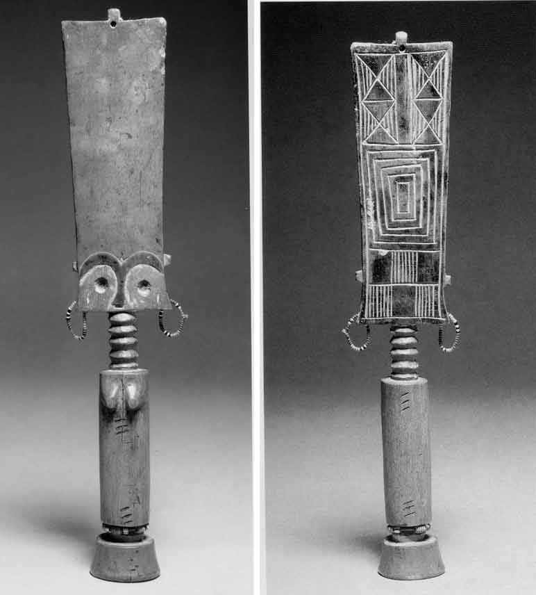
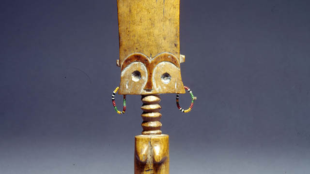
Fig. 1 & Fig. 2 Views of the Akuaba Doll in the Munich Museum Fünf Kontinente
Anonymous artist. Fante Fertility Figure. Early 20th century, Wood. 27,5 cm. Museum Fünf Kontinente. Presentation at Museum Fünf Kontinente.
© Museum Fünf Kontinente
Description
The doll in Munich's Museum Fünf Kontinente (Fig.1) comes from the Fante area. It shows a female figure. The very strongly abstracted forms and proportions symbolise various aspects:
The rectangular shape of the very flat head becomes - seen from the front - somewhat broader in an elegant curve towards the top. A strikingly high forehead, with eyes, eyebrows and nose only indicated, while mouth and ears are missing. The accentuated arch segments of the eyebrows flow together and then form the nose. On the back, the head has geometric patterns (Fig. 2). Added earrings of glass beads give the figure a colourful accent. For Kecskési (p. 38), their daintiness is a sign that the doll has been lovingly treated. At the very top there is another small moulding with a hole where hair was originally attached (compare Fig. 3a).
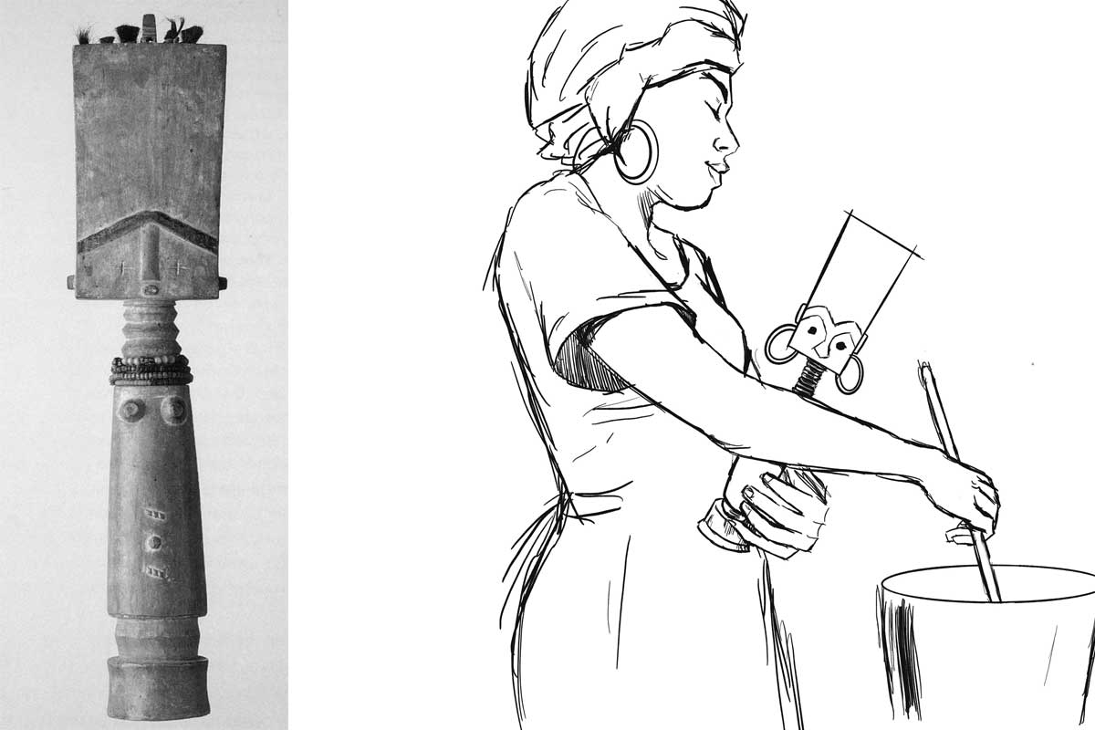
Fig. 3a: Akuaba Doll from the Linden Museum Stuttgart (Forkl p. 94). Fig. 3b: Use of the doll (drawing by Vanessa Rast - courtesy the artist)
The neck has five rings. It sits on a very slender, round trunk, which in turn stands on a delicate base. Striking are two groups of three diagonal embrasures each, which are repeated on the back. The figure has no arms, the legs are short stumps. The protruding forms in the chest area mark the figure as female. Its strict symmetry is softened by small deviations. One can well imagine taking the cylindrical figure in one's hand.
Material and technique
A ritual specialist to whom a woman who wishes to have a child goes makes the decision about the choice of doll at the respective shrine. If no suitable figures are available there, he instructs the woman to order a new Akuaba Doll from the woodcarver. The craftsmen then visit the tree to obtain the wood and ask the tree's spirits for permission to do so (oral information from the Ghanaian colleagues 2022 in Bayreuth [Link]). The Akuaba Doll in the Munich Museum was carved from softwood. (There are also darker examples made of hardwood, for example among the Ashanti, also an Akan group, as the presentation in the Ghana National Museum in Accra shows - see Fig. 4.) In the example in Munich, eyebrows and nose are darker.
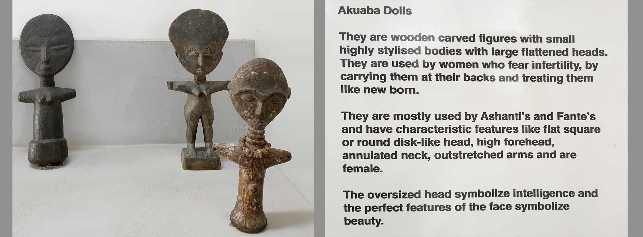
Fig. 4: Presentation of Akuaba Dolls at the Ghana National Museum in Accra (March 2023. Photo: the author)
Interpretation of the Munich figure within the original Ghanaian context
(1) Utility function: The figure is made for the family context. It is meant to lead to fertility, sometimes also to the beauty of a child. The size (height 28 cm), the pleasant material and the weight allow the figure to be carried and cared for like a baby. When an Akuaba Doll has fulfilled its task, it is often returned to the ritual specialist who accompanies the process.
The breasts indicate a female figure, which does not necessarily have to do with a corresponding desire for the sex of the child desired. Forkl (p. 94) assumes, however, that "women desire daughters, on the one hand as progenitors in a matrilineality oriented society, and on the other hand as support in household work." (There are also Akuaba figures with the characteristics of both sexes and probably male specimens; furthermore, breastfeeding examples and those who in turn carry other Akuaba Dolls.)
(2) Body shape: T The conspicuous and disproportionately large rectangular head symbolises the head as the seat of intellect and wisdom in local imagery. Akuaba figures among the Ashanti show round heads (see fig. 4), but they are also proportionally very large. High foreheads and flat faces correspond to the ideal of beauty. Luxuriant bulges on the necks tell that the figure is well-fed and thus refer to happiness and prosperity. There are Akuaba Dolls that show more feminine body shapes, wider hips, possibly emphasised by strings of pearls.
(3) The spiritual context: As Nkrumah writes in her contribution, an Akuaba figure serves as a dwelling place for a soul being, a being that is in a transitional area between the earthly and the spiritual world. Carrying and caring for it is a prerequisite for the entrance of such a soul being, which then sets out to appear on earth as a living being, i.e. to enter the family of the young woman through birth. A ritual specialist is involved in the selection, consecration and regulations for use. After a birth, the figure is returned to the ritual specialist.[1]
(4) The social and cultural context: The figure can also be seen as a sign of the traditional expectation for a woman to bring children into the world. In recent times, where traditional societal expectations of women collide with other worldviews, the ritual use of Akuaba Dolls obviously decreases .
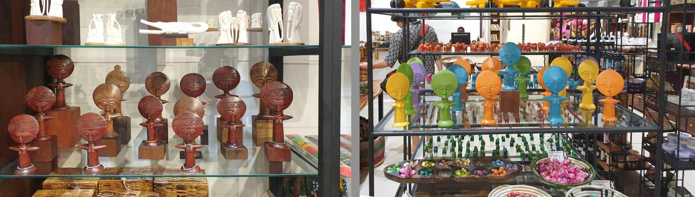
Fig. 5: Souvenir shop at Accra Airport (March 2023. Photo: the author)
In the last decades, an interesting production for tourism has been established - apparently the dolls are seen as 'typical for Ghana'. However, these are not Akuaba Dolls in the traditional sense, but rather 'quotes'.
How can one relate Akuaba Dolls to European visual traditions and experiences?
As familiar as the image of an Akuaba figure may seem in Europe - as a 'typical' example of traditional African art - its traditional meaning is unknown in Europe. Nevertheless, it obviously seems to be attractive to tourists, e.g. as 'airport art' (see Fig. 5), perhaps because its shape somehow corresponds to the cliché idea of 'typically African', the size fits well into the suitcase, or the large head (by means of the Bambi effect) makes it appear 'cute'.
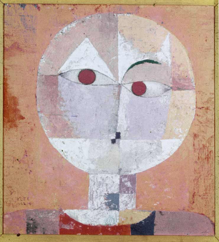
Fig. 6: Paul Klee. Senecio. 1922. Oil on chalk base on gauze on cardboard. 40.3 × 37.4 cm. Kunstmuseum Basel (Wiki Commons)
In the context of art history, the influence of Akuaba Dolls (and many other carved representations from West Africa) on European art of the early 20th century (see Fig. 6) is of interest. [2] The formal similarity to Klee's painting (fig. 6) is striking at first glance, but whether this is a direct reference must first be verified. In the context of art history, it would then be of interest in a next step which aesthetics were of interest to the artists at the time and which they blanked out, i.e. which "image of Africa" they wanted to have and also communicate.

Fig. 7: Hieroglyph Anch
(Photo: https://anthrowiki.at/Anch)
The authors also considered whether the formal similarity of the Akuaba Dolls with the ancient Egyptian hieroglyph ‘Anch’ (the "loop of life" or the "key of life" - see Fig. 7) could have come about through a historical relationship between Egypt and Ghana. This would also correspond to the accentuation of content in Nkrumah's text with regard to the "representation of the woman as the giver of life" (see her chapter). Nevertheless, this association would also have to be examined more closely. To assume a universal archetype in the sense of C. G. Jung appears to be pedagogically misleading in its levelling effect.
In the German educational context, on the other hand, it seems important to link the figure - beyond clarifying its function - to Akua's story and thus include the role of narratives. This prevents another comparison that is also too quick and reductive when it comes to social practices (and not the isolated object), as dolls are also cared for and nurtured in traditional European contexts, but mostly by young children before puberty. So, in Europe, it does not belong to a fertility ritual, even if the child puts itself in the role of a ‘little mother’ or ‘little father’. (Another interesting question, whether Ghanaian women also go to a doctor when they are not pregnant, and whether there are comparable ritualised practices in Central Europe - for example among alternative practitioners or in esoteric circles - would have to be addressed in interdisciplinary approaches.)
Such comparisons appear to be useful, as they can show both similarities and differences, with the aim of better recognising one's own perceptual conventions or stereotypes and thus putting them into perspective. All this still leaves the question of the status of this doll in Munich when it is displayed in a showcase in a European museum (see Lab entry: What is an object? Link). Such a presentation contradicts its ritual and spiritual use. An Akuaba is then no longer an Akuaba. But what is it then?
Sources
This text is based on:
- Contribution by Gertrude Nkrumah: https://explore-vc.org/en/objects/the-akuaba-doll.html
- Talks with the Ghanaian EVC partners in Bayreuth in 2022: https://explore-vc.org/en/activities/archive/april-22-25-2022-joint-workshop-uew-team-and-isb-team.html
- The presentation at the National Museum in Accra, seen in March 2023: Fig. 4.
- Reading: see list of references
References
- Akyeampong, E & Obeng, P. (1995). Spirituality, Gender, and Power in Asante History. The International Journal of African Historical Studies. 28, 3. pp 481-508
- Anderson, Elizabeth L. (1989): The Levels of Meaning of an Ashanti Akua'ba. In: Michigan Academican. 21 205-219
- Annor, I., Dickson, A & Dzidzornu, A. G. (2011): General Knowledge in Art. Accra (Aki-Ola Publications)
- Forkl H. (1997): Healing and body art in Africa. Stuttgart (Lindenmuseum)
- Kecskési, M. (1999): Kunst aus Afrika - Museum für Völkerkunde München. Munich (Prestel)
Footnotes
[1] The number of five neck bulges here (there are also specimens with 3, 8 or 9 bulges) may also be a reference to the sacred number of "Odumankoma", the Akan creator deity, in this context.
[2] On the relationship of the European avant-garde to the aesthetics of West African carvings, see also the discussion of the Blue Rider post on this website (link 1 and 2).

My Encounter with Black Feminism and Womanhood Inspired by the Akuaba Doll
I first came in contact with the Akuaba Doll while reading Bernardine Evaristo’s award winning book Girl, Woman, Other. In the book, the character Nazinga was described as “at least six foot tall with ornamented dreadlocks, large wooden Akuaba fertility doll earrings, red trousers, a cream embroidered caftan and strappy Roman sandals“ (Evarsito 2020, p. 81). I searched for Akuaba fertility doll earrings on the internet, but did not delve further into the topic at this time. A few weeks later, attending a seminar with Dr. Wagner at Friedrich-Alexander University in Erlangen, I stumbled upon the Akuaba Doll again. I knew, I had to take this opportunity to get to know her better. The comment from Gertrude Nkrumah is to be considered my first source of information about the history of origin and the tradition into which the Akuaba Doll is woven.
Through Nkrumah's feminist perspective on the Akuaba Doll, I wanted to dive deeper into the topic of Black Feminism to extend my knowledge in feminist theory. With the Akuaba Doll as my point of departure, I decided to focus on the ability to bear children and the social significance of abortions for Black women.[1]
At this point I move past the Akuaba Doll and her cultural context. Other works of art could have led me to a similar path. I have chosen to look at the Akuaba Doll with categories, which are not directly related to the Akuaba Doll and her cultural context as I questioned whether I have the right to write about the Akuaba Doll considering the colonial past of my own country, Germany. I am a white, European woman, a feminist, who is aware of intersectionality and racist structures within the society I have been socialised in and its way of thinking, but with no cultural connection to the Akuaba Doll other than the colonial impact on African art and culture (cf. Kushinator, Rahman and Dompreh, 2020[2]). Therefore, I chose a topic to which I have access via my role as a student of pedagogy and focus on Black Feminism and Womanhood of Black women living in white-dominated countries.
In white-dominated societies, Black women were excluded from a feminist movement for decades (cf. hooks, p. 216f.). White women systematically utilised the racist hierarchy within women to gain power and thereby forced a specific Black feminist movement to form and uncover the oppression Black women had and still have to face. The prefix “Black” emphases the specific oppression Black women face in white-dominated countries, although, of course, there has been feminist movements in Black-dominated countries before (cf. Roig quoted from Berlin Biennale 2022, 48:00 – 49:50).
In American history, Black women have always had to fight to be seen as women. As bell hooks gets to the heart of it: “the black female was a creature unworthy of the title woman; she was mere chattel, a thing, an animal” (hooks 2015, p. 214). Sojourner Truth[3] had to bare her breasts to prove that she was a woman indeed. Being yelled at “I don’t believe you really are a woman” by a white man represents the contempt and disrespect for Black womanhood (cf. hooks 2015, p. 214). In her famous speech “Ain’ I a Woman” (1851), she argues, that she – as her white women audience too – is indeed a woman. Here she argues with characteristics, that can also be found in the Akuaba Doll. The most important argument is the carrying and bearing of children and the “mother’s grief” (Truth 1851 quoted from hooks 2015, p. 215) she cried out, when her children were sold into slavery.
The ability to bear children has always played an important role in the history of womanhood and was – and still is – utilised to oppress and exploit Black women. In times of slavery, Black women were forced to procreate and bear children, who were worth a lot of money in a perfidious system of human trafficking (cf. Federici 2020, p. 23f.). In the late 20th century, Black men in the U.S. reasserted what they called their “rightful positions as patriarchs” (Taylor 2022) and denounced birth control and abortions as genocide that compromised the future and freedom of Black families by limiting the Black population (cf. Federici, p. 25f.). With the overturn of Roe v. Wade[4] – Black women are specifically affected, as Kwajelyn Jackson, Executive Director of the Feminist Women’s Health Center in Atlanta, Georgia puts it into a nutshell: "Abortion bans are inherently racist because they do not consider the lived experiences of Black people and other communities of colour. Many state policymakers would rather criminalize and endanger Black birthing people than supply them with all of the resources they actually need" (Jackson quoted from Long 2022). Even before the abortion laws were restricted, Black (and other BIPoc) women in the U.S were two to three times more likely to die from pregnancy-related causes than white women (cf. CDC 2019). Being allowed to decide whether you want children or not and furthermore, having access to certain facilities to end a pregnancy or not is still a bound to privileges. It is not only tied to the health care system, but also to cultural beliefs and practices, to the financial and educational background, as well as to class, race and many other factors.
In a world imprinted by patriarchy and privilege, it is important to unravel power structures that dominate our world, uncover where they come from and how different groups are affected differently. As patriarchal patterns of thought are inscribed in nearly all societies of our world, it is a tough task to uncover them in every aspect of our lives and hence require lifelong learning and feminist thought. Nevertheless, it is indispensable in order to build an anti-racist gender-equal society in which every woman can decide herself, if she wants to get children without fearing financial or social consequences.
In this context the Akuaba Doll can be interpreted as an early moment of feminism, where women disrupt the patriarchal system that marginalizes them. As Nkrumah states, by deciding about the gender of her child in a binary system, she chose to bear a girl rather than a boy, which – in the matrilineal line – effects the lineage, inheritance, and chieftaincy succession (cf. Nkrumah 2020). In my eyes, Akua used the power she had to influence her life to her advantage. Yet the worth of women was still tied to her sexual and reproductive abilities, but nevertheless she made a first step by empowering women to stand up for themselves and for their own lives.
References
Berlin Biennale (2022). Panel: Afrofeminism. Bridging the Gap. <https://12.berlinbiennale.de/media/panel-afrofeminisms-bridging-the-gap/> (09/30/2022).
Center for Reproductive Rights (2022). The World’s Abortion Laws. <https://reproductiverights.org/maps/worlds-abortion-laws/> (09/30/2022)
Evaristo, B. (2020). Girl, Woman, Other. UK: Penguin Books.
Federici, S. (2020). Jenseits unserer Haut. Körper als umkämpfter Ort im Kapitalismus. Münster: Unrast.
hooks, b. (2015). Ain’t I a Woman. Black Women and Feminism. New York: Routledge.
Kushiator, G., Rahman, A. and Dompreh, H.-O. (2020). The Influence of Western Culture on Traditional Art Forms and Cultural Practices: ‘Akuaba’ doll among Akan Women in Africa. ADRRI Journal of Arts and Social Sciences, Ghana: Vol. 17, No.6 (5), S.59 – 71.<https://www.researchgate.net/publication/344438737_The_Influence_of_Western_Culture_on_Traditional_Art_Forms_and_Cultural_Practices_%27Akuaba%27_Doll_Among_Akan_Women_in_Africa> (09/30/2022).
Long, S. (2022). Abortion Bans pose a Danger to all Mothers. For Black Women, they’re especially damaging. <https://www.refinery29.com/en-us/2020/10/10015405/abortion-ban-racism-black-women-effects> (09/30/2022).
Nkrumah, G. (2021). Inversion of Hegemony with Ideas of Feminity. <https://www.explore-vc.org/en/objects/the-akuaba-doll.html> (09/30/2022).
Taylor, K.-Y. (2022). How Black Feminists defined Abortion Rights. <https://www.newyorker.com/news/essay/how-black-feminists-defined-abortion-rights> (09/30/2022).
Footnotes
[1] In this context, I will delve into the topic of reproductive abilities and use the term "woman" throughout my text. However, I want to clarify that the ability to bear children is not a defining characteristic of womanhood. Not all women have a uterus, and not all women are able to bear children. Furthermore, one's physical appearance is not a determining factor of one's gender identity. Despite this, the reproductive ability is instrumentalised in our society and can lead to harmful stereotypes, which many women are confronted with at some point in their lives.
[2] In addition to exploring the different forms and cultural backgrounds of Akuaba Dolls, this article delves into the ways in which culture, religion, and artistic expression are intertwined in African cultures. The article points out how the colonization by white, western, and Christian men and women caused a change in function and values of the Akuaba Doll.
[3] Sojourner Truth lived from 1797 to 1883. She was an American abolitionist of New York Dutch heritage and a women’s rights activist. She was born into slavery, but escaped to freedom in 1826. In 1851 she joined George Thompson, an abolitionist and speaker, on a lecture tour through central and western New York State. At the Ohio Women’s Rights Convention in Akron, Ohio, she gave her speech with later became famous as “Ain’t I a Woman?”
[4] Roe v. Wade is a legal case in which the U.S Supreme Court ruled that unduly restrictive state regulation of abortion is unconstitutional and that the Constitution of the United States generally protects a pregnant woman's liberty to choose to have an abortion. This decision from 1973 was overturned by the U.S. Supreme Court in 2022.
-

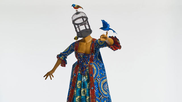
Mrs Pinckney and the Emancipated Birds of South Carolina (2017) is a sculpture in the round composed of a headless, female, ‘white’ mannequin swathed in historical dress and balancing on a globe. In place of her head is an empty birdcage from which three birds have escaped. The work was created by the internationally renowned artist Yinka Shonibare (born 1962) who is a black man of Nigerian descent living in the United Kingdom. He can thus be identified as a member of the African diaspora. In his artworks he usually engages with concepts that are related to the politics of colonialism and the slave trade and explores cultural identity in the context of globalisation. [1] While his creations are deeply critical of western imperialism, he always makes sure to render them visually alluring and engaging to elicit a visceral response. [2]
This particular artwork was co-commissioned by the Yale Center for British Art and Historic Royal Palaces, Kensington Palace, and created especially for the exhibition "Enlightened Princesses: Caroline, Augusta, Charlotte, and the Shaping of the Modern World".[3] This adds an aura of seriousness of intellectual and aesthetic intent to the sculpture. In the title of the work, the artist has identified the woman as Mrs Pinckney, or Elizabeth (Eliza) Lucas Pinckney, who at the age of 16 was put in charge of her father’s plantations in South Carolina. [4] She had a major influence on the colonial economy by developing indigo as an important cash crop to be processed as dye. [5] The sculpture is said to be the artist’s response to Eliza’s encounter with the German Princess Augusta in 1753 which further identifies her as a member of the social elite. [6] All of the above components help to retrieve the identity of the subject, the ideology being addressed as well as the message in the image.
The artist has encoded his artwork with visual tropes that clarify and enforce his message. While the style of Eliza’s dress is based on 18th-century fashion, the fabric used is Dutch wax cloth which Amah Edo describes as a “marker of Africanness”. [7] Manufactured in Europe but using the Javanese batik printing technique, the cloth “came to be produced specifically for West African markets in the 1890s … [and] its aesthetic was adapted by manufacturers to suit these new consumers’ tastes”. [8] Now widely perceived as symbolic of tradition, the Dutch wax cloth is regarded “as a high-end commodity desirable to elite customers”.[9] The material of the woman’s dress thus not only identifies her as a member of the elite but also refers to Africa as the source of her wealth: it is through the labour of the African slaves that Eliza was able to run her family’s plantations in America. Likewise, the blue of the material – and the bird on her finger – is a direct reference to her successful cultivation and processing of indigo. It can thus be seen that the artist explores concepts of race and class through a careful choice of materials and colours in his imagery. By dressing the white woman in African cloth, he complicates history and racial identity in an effort to startle the viewer’s conscience.
As the plantation’s manager, Eliza occupied a position of power which is visually manifested by her being placed literally on top of the world. The latter is represented by an eighteenth-century globe that shows the colonial territories of the British empire. [10] Eliza is thus turned into a symbol of white superiority and privilege granted by the politics of imperialism. Her balancing act, however, proves to be precarious and elicits tension as the ball can roll at any moment and topple her from her position of power. It is also interesting to note that the globe is an attribute of Fortune, the fickle goddess of antiquity. Fortune is blind and even eyeless, and the globe “on which she stands or sits, originally indicated instability, but to the Renaissance it was rather the world over which her sway extended”. [11] The headless Mrs Pinckney thus shows a cunning resemblance with the antique goddess Fortune “who bestows her favours at random”. [12]
The favours bestowed by Eliza relate to her release of the birds from the birdcage. However, instead of flying away to freedom, they come back to her. She playfully lifts her left arm for an indigo-blue bird to perch on her little finger, while another bright-coloured bird sits on her left shoulder and a third one on top of the cage. According to Shonibare, the birds are a metaphor for slaves and her gesture of setting them free symbolises her wish to emancipate the slaves – hence the title Mrs Pinckney and the Emancipated Birds of South Carolina. [13] The narrative thus presents a paradox between the white woman’s privileged yet unstable position as powerful, wealthy mistress and her fickle wish to liberate the black slaves whose destiny is entirely in her hands.
In this work, Shonibare has given his own interpretation of the story of Mrs Pinckney, choosing to focus on the effects of the slave trade and colonisation in the eighteenth century in the United States, then still British territory. While the playfulness of his rendition and its aesthetic appeal conceal the harsh realities of enslavement, the dehumanisation of black people as a result of colonial politics still filters through in the form of brightly coloured birds which, although set free, are so tamed – read oppressed and subjugated - that they are not able to fly.
[1] https://en.wikipedia.org/wiki/Yinka_Shonibare (26 July 2021).
[2] Yale News, 2017. Yinka Shonibare MBE (RA): ‘Mrs. Pinckney and the Emancipated Birds of South Carolina’. Video. Yale News, Yale British Art, 25 July 2017. https://news.yale.edu/videos/yinka-shonibare-mbe-ra-mrs-pinckney-and-emancipated-birds-south-carolina (26 July 2021)
[3] Yale News 2017.
[4] Yale News 2017.
[5] https://en.wikipedia.org/wiki/Eliza_Lucas (26 July 2021).
[6] Yale News 2017.
[7] Edo, Amah M. (2019). From African print to global luxury: Dutch wax cloth rebranding and the politics of high-value. In Mehita Iqani and Simidele Dosekun (Hrsg.). African luxury: Aesthetics and politics (pp. 77-92). Bristol, UK / Chicago, USA: Intellect, p. 82.
[8] Edo 2019, p. 80.
[9] Edo 2019, p. 85.
[10] Yale News 2017.
[11] Hall, James. 1974. Dictionary of subjects and symbols in art. London: John Murray, p. 127.
[12] Hall, James. 1974. Dictionary of subjects and symbols in art. London: John Murray, p. 127.
[13] Yale News 2017.

The oeuvre of Yinka Shonibare CBE is often characterised by a colourful and at the same time amusing appearance. This facilitates the viewer's immediate access. This is also the case with his 2017 work Mrs Pinckney and the Emancipated Birds of South Carolina. What one perceives here at first glance is the figure of a lady wearing historical European clothing, a "Robe à la Française" from the 18th century. However, the clothing is unusually colourful. Moreover, the woman is standing on a sphere, albeit shakily and leaning forward somewhat. This image quickly connects with the traditional European iconography of "Fortuna", i.e. the admonishing, allegorical symbol of "fate". It turns out that the sphere is the globe.
The graceful lady also has a strange head in the form of a birdcage. But its door is open and the three birds have long since escaped. This could be an allusion to Maurice Maeterlinck's The Blue Bird, the central message of which is the obvious true happiness. In any case, the caged head shows us that it is actually our thoughts that tie us down and hinder our actions, as is often the case. Seen in this light, at least this lady has succeeded in unmasking the internalised gender ideology and liberating herself mentally. But is it really a lasting liberation?
Who actually is this lady, this "Mrs Pinckney"? What fate is at stake? She is not known here in Japan, for example. A look at Wikipedia, for example, will help: she is considered one of the first emancipated women in the USA, who achieved prosperity with her pioneering attempt to grow indigo on slave plantations in South Carolina. This dye was in particular demand for military uniforms in Great Britain at the time.[1] That is why the lady is wearing this indigo dress. But where does the artist's reference to Mrs. Pinckney come from? A direct connection is hard to find at first. However, knowing that Shonibare describes himself as a "post-colonial hybrid"[2] - he was born in London as the child of Nigerian parents, grew up in Nigeria and studied in London - and that he very often uses "African wax prints" for his works,[3] one gains more clues about the work.
At present, those wax prints seem to represent "authentic" African life, but they have an Indonesian origin and were made by Europeans, especially Dutch, and sold and distributed in West Africa.[4] In this sense, they are in fact a transcultural product. Through their use, the artist points to the "cultural imagination as a power structure and means of domination"[5] in the spirit of the critique of representation. In this specific work, too, the wax prints, which have something in common with the fate of indigo, find their use in clothing.
Thus, it turns out that the lady functions as the encouraging and, at the same time, admonishing symbol of the emancipation of women, which never proceeds in a linear fashion and is still threatened and endangered everywhere today. Moreover, this emancipation movement must always be seen in an even more complex context, which was and still is connected with the fate of countless people - in Mrs. Pinckney's case, for example, that of the slaves, according to the message of the work.
[1] https://de.wikipedia.org/wiki/Eliza_Lucas_Pinckney (27 July 2021)
[2] Shoji, Sachiko. 2019. “History is Happening Now: What Connects Us All to the Art of Yinka Shonibare CBE.” In Exhibition catalogue Yinka Shonibare CBE: Flower Power. Fukuoka: Fukuoka Art Museum, p. 105. Incidentally, this is the artist's first solo exhibition in Japan.
[3] Shonibare CBE, Yinka. 2019. “Artist Statement. Woman Shooting Cherry Blossoms.” In Exhibition catalogue Yinka Shonibare CBE: Flower Power, Fukuoka: Fukuoka Art Museum, p. 13.
[4] Ibid. According to Shoji, Japan also became involved in the production of those wax prints and their export to Africa from the late 1920s to the mid-1990s. See Shoji 2019, 106-107.
[5] Shonibare 2019.

A life-size, headless, female mannequin balances on a globe showing the African continent from the front. Her Biedermeier-style clothing in bright colours shows a deep décolleté. The fabric pattern is Dutch Wax, which can be inferred from the given information on the work. In combination with the birdcage and the three colourful birds outside the cage, the sculpture is reminiscent of surrealist montages like in René Magritte's artworks.
 René Magritte, Le Thérapeute (1976), Tehran (Copyright: WikiCommons)
The title refers to a concrete iconography that makes research necessary which - as a reward - helps to decipher the birds and the blue dress: Mrs Pinckney refers to a prominent historical woman (Eliza Pinckney, 1722 - 93) whose biography - as one can read on Wikipedia - was deeply entangled with English colonialism and the American War of Independence. Shuttling between North America and England, she was remarkably innovative and entrepreneurial. The birds in the sculpture allude to a specific anecdote when Eliza Pinckney gave such birds as a gift to the mother of the British King George III. The blue of the dress can be seen as an allusion to Pinckney's production of indigo in South Carolina.
The globe and the pattern of the dress - like the title - also allude to the theme of colonialism. Even the material specification of "Dutch Wax" tells a tangled story in colonialism. But the female role model embodied by Eliza Pinckney in her time, obviously denies the usual connotations associated with colonialism, slavery and looting. The birds outside the cage perhaps also make references to the immanent contradiction between freedom and captivity.
Alluding seems to be the most adequate term to grasp the specificity of the visual language of this work. Nothing is clearly asserted, no thesis is put fprward. Rather, a dazzling, assembled, ambiguous figurine stands in the context of 18th-century colonialism, hinting at many themes that are significant also today: women's roles, capitalism, domination and exploitation of nature, colonialism, freedom and oppression. This fits in well with the immediate perception of the object. Looking at the artwork, one gets the impression of a strange balance of lability and stability, of theatricality and ridiculousness, of immediate sensuality and learned knowledge.
Now, the question remains as to how this work is located in the transcultural contact zones. Today, it is exhibited in a US collection of British art, the "Yale Center for British Art". The artist himself is called a British-Nigerian artist. He himself uses his English title of nobility CBE (Commander of the British Empire) in his name. Since documenta 13, he is well known in the context of Global Art. In terms of iconography, the work is also located at these interfaces. Through montage, it merges different associations into an inherently contradictory complexity that cannot be resolved. This creates a fundamental openness that is reflectes when we ask about its meaning: can we read the work as ironic alienation? Or as a commentary on history? Or as homage or, on the contrary, as criticism of the historical Mrs Pinckney? As a reflection of current and very serious issues or as a harmlessly playful object?
A video produced by the museum where the work is now located shows an analogous reception history (Link 1 / Link 2). How does the work constitute the “ideal” viewer? He or she is a decoding, deciphering viewer who allows the iconographic fixation to fail with relish because of the sensuality of the playful object, just as the narrative of Mrs Pinckney fails because of the mannequin's instability. The ideal, contemporary viewer simultaneously enjoys the openness and yet sees him-/herself confirmed in his/her anti-colonial habitus.

Discussion
EW: When I compared all three contributions, I was initially surprised by the large number of common intersections. This certainly points to the global power of interpretation of media representations in English (website of the collection at Yale, Wikipedia), which we could not escape either. We all researched Mrs. Pinckney on Wikipedia, we all trusted the video on the website as a source. But what is interesting now is how differently we deal with it and what different conclusions we come to. I have the impression that in your approach, Bernadette, the story of Mrs. Pinckney plays the biggest role, while in my text this story is rather only a possible reference point. I don't know if you can agree with me.
NK: Yes, I also see these differences. With Ernst, I see more of a fundamental, principled attitude in the analysis of the work. In Bernadette's interpretation, I found the interpretation of the birds as "slaves" interesting. I myself saw in it the - temporarily - liberated soul of an emancipated woman. Moreover, in this context, I also find your reference to the paradox of the actually already liberated "slaves" particularly illuminating, as it seems to have been derived from your discussion of colonial history in Africa.
BVH: When comparing our contributions, I was also reminded of the fact that art is always about other art, hence we looked for precedents that may have inspired the artist. But what I find most exciting about our interpretations are the differences in emphasis on the various meanings that are embedded in the work. For Ernst, the transcultural nature of the work stands out, as well as its openness in meaning. For Nobu, it is the reference to gender ideology and women’s emancipation that forms the core of the work, especially in light of ongoing gender discrimination. For me, it is the historical narrative that led me to interrogate the issue of racial discrimination which also continues today in movements such as #BlackLivesMatter.
EW: I share this, and I would like to follow up with a question. Is it possible that our respective contexts in which we work have influenced this? Not in terms of content – we agree on that – but in terms of patterns of argumentation. If you, Bernadette, place so much emphasis on the story of Mrs. Pinckney, does this perhaps reflect the great oral, meaningful storytelling traditions in Africa? And when you, Nobumasa, on the other hand, elaborate Mrs. Pinckney as an encouraging and at the same time cautionary symbol, does this perhaps reflect the great ethical traditions in Asia? My refusal of direct meaning-making and ethical service, on the other hand, would then be a European-style reflexive evasive manoeuvre to a (preferably unassailable) meta-level?
BVH: Good question indeed. In my opinion, this exercise shows how we are all conditioned by the sociocultural environment in which we live and work. Hence my response, from a South African point of view, focused on the story/history in order to highlight the importance of the work in decolonising the subject. While playfully complicating racial issues in a historical context, the artist mainly celebrates Africanness by means of materials, patterns and colours. This allowed me to infuse my interpretation with African epistemologies. Your response, Ernst, could be regarded as a refusal, perhaps, to acknowledge and engage with the deeper implications of the work and indeed rather shift the focus onto more theoretical concerns as inspired by German art historians? I am keen to hear Nobumasa’s view on this matter.
NK: Ernst's question about whether a Japanese ethical tradition might secretly be reflected in my interpretation is very difficult for me to answer. But as Bernadette has just pointed out, the social context in which we work definitely plays a certain role. While globalisation has erased spatial distances, perhaps not necessarily mental ones. For Japanese today, Africa is still very distant, in the double sense mentioned above. Although Africa is the second largest continent with 55 countries and countless information is available, detailed and nuanced ideas about it are often missing from our consciousness. My leap into the general, or ethical, implication of the work could possibly be explained in this way. Seen in this way, I have probably unconsciously "traced" my own situation. But this also underlines the fact that the critique of representation – in the sense of a critical questioning of pictorial representations – is still as relevant today as it ever was.
EW: I was very grateful to you, Nobumasa, for the emphasis on the ethical, because we always have to include the ethical dimension in the context of education. My argument from a German point of view would be that the interpretation of a work like Mrs. Pinckney must not be arbitrary. That would be the ethical responsibility of the interpreters. We will have to come back to this in a moment when we discuss conclusions for a toolbox for decoding images.
But first I would like to learn more about the differences between our approaches – even though there is a large area of consensus. In the theoretical discussions we had some time ago, we clearly distinguished the Japanese concept of 'kansho kyoiku', the South African concept of 'art criticism' and the European concept of 'work immanence'. Could you elaborate on the question of how these positions are reflected in your texts?
NK: The introduction of dialogue-based art viewing from the USA in the late 1990s revived the field of art education in schools or museums in Japan. Since then, this didactic method, which seems to seek to maximise the viewer's part in interpretation through its strict rejection of knowledge transfer and ultimately prioritises the discussion of interpretation, is still in vogue today. But a crucial question still arises as to how the meaning of interpretation, or meaningful interpretation, is secured without degenerating into mere arbitrariness. In this respect, too, our experiment seems to be very inspiring.
BVH: At the University of South Africa we believe that the basic skills required to interpret objects of visual culture are best taught by beginning to practise art criticism. The proper domain of a critic is the description, interpretation and evaluation of concrete works of art. As a first step in this process, students must learn how to describe and interpret artworks. Essentially art criticism is a practice embedded in western epistemology that has been appropriated to study the art of contemporary Africa in a global context. When investigating the historical arts of Africa, the method remains the same although the local context of traditional culture and customs must be taken in consideration. My interpretation of Shonibare’s work was guided by these very same principles.
EW: Finally, I would like to ask you something with regard to the 'methodological kit' proposed by the editors of this volume: Which methodological approaches for the interpretation of images do you consider absolutely necessary – independent of our respective Japanese, South African or European context? And I'll add a second question in a moment: Does that leave one area that plays a role exclusively in your respective local context?
BVH: From an art historical point of view, the methods best suited for the interpretation of political images stem from a contextual approach which demands critical consideration of the cultural context of the work, its artist and of the social practices and power relations in which it is embedded. As the interpreter, you can apply the iconological method: first describe what you see – formal elements and details – and then identify the iconography, the specific subject and symbolism of the work. Do some research on facts and historical context, as well as the reasons why the work was made or commissioned. Then you can explain how all this information was put together to express the meaning or content of the work and decide what message or ideas the artist was trying to communicate. Because every interpreter comes to the artwork with his/her own worldview, the interpretation will differ depending on that worldview and not on the local context. For example, because I attach more importance to the idea of decolonisation, my contextual approach is combined with and influenced by decolonial theory.
NK: Basically, Bernadette, I gladly agree with you, especially with regard to your gradual approach. I also think it is reasonable and sensible from a pedagogical point of view. But this raises the question of what actually constitutes a "political image" or "when" an image becomes political. Of course, there are pictures or works of art that are obviously and unmistakably recognisable as such, but there are also those that are much more subtle, that are not so noticeable to foreign eyes, or that were not originally created with political intentions, but that in retrospect seem to be quite political. What one considers to be political depends, after all, very much on the view of the observer, possibly even completely apart from the original intention of the creator. In this respect, it seems to me that a fundamental attitude is indispensable for the viewer to be able to keep a mental distance from a picture and its context as well as from himself and his own horizon in order to perceive a picture (also) politically.
EW: Thank you both, because from my point of view I cannot and do not need to add anything more. I completely agree that an iconological basis, as Bernadette has formulated it, is needed. And I am deeply convinced that the reception-historical and reception-theoretical extension that Nobumasa has added is absolutely necessary, indeed indispensable, for the toolbox. I can add nothing to this bundle of methods.
What perhaps came up short in our conversation were the different cultural conditions and the resulting consequences for interpretation. But we'll make up for that on another occasion.
NK: Finally, let me add something to my previous statement. For responsible interpretation, we need above all a willingness to engage in dialogue. I experienced this again in our conversation and our experiment also shows this in an exemplary way.
-

Mary Sibande’s sculpture The Reign (2010) affects the viewer due to its interplay of bipolarities such as European/African, male/female, past/present, working class/bourgeoisie, private/public, reality/fiction. It forces us to scrutinize our contemporary thinking about the past in relation to the present. The criticism of the colonial era and the rebellion against limitations, that history has placed on identity is inherent in the work, which focuses on African women, historically oppressed as Blacks, as workers, and as women. As a sign of resistance and tribute to all Black women fighting for equal rights it raises questions about race, class and gender.
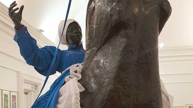
Vaulting on a boisterous horse, a life-size female figure is displayed in the hyperrealistic sculpture. Rider and mount – both made of fiberglass – are identical in color, creating a consistent medium of presentation for the abundant dress supported by a scaffolding of white and purple undergarments rimmed in Broderie Anglaise, a technique of embroidery, which originated in 16th-century Europe. In addition, the mannequin wears a white apron tied into a voluminous bow at the back and a white headscarf covering her hair. On the one hand, the distinctive elements of the apparel such as puffed sleeves, petticoats and ruffles can be identified as characteristic features of 19th-century Victorian fashion. The style of clothing popular in Great Britain was brought to Africa by the settlers during the unprecedented expansion and consolidation of the British Empire, where it became a symbol of colonial rule. On the other hand, the specific blue color in combination with the white headscarf, collar and apron refers to the uniform of South African maids, that has hardly changed until today. Domestic service – established in the earliest days of European colonisation and later assured by Apartheid – has long been a major sector of the South African labour market. In 2010, the same year the sculpture was created, “the domestic worker industry employed 18% of all women, and 80% of domestic workers were women, with poorly educated Black South Africans making up the vast majority of these women.” (Bosch & McLeod, 2015, p. 135, quoted after Dinkleman & Ranchod, 2010) Readily available at local supermarkets the artist draws on the maid’s uniform and uses the mass product as starting point for her textile hybrids. Born into a line of domestic workers that stretches back three generations, Sibande makes her family history the subject of her art. (Dodd, 2010, p. 467) From silicone casts of her own body she created a fictional character named Sophie [the English name given to her grandmother by her white employer, as Corrigall (2010, p. 155) states]; as alter ego, homage, and representative of former and current domestic workers, she appears here as the protagonist of the work. Through the interplay of the Black body and the dress oscillating between workwear and sublime gown, Sibande performs a subtle manipulation of the semiotics of fashion and their social function as indicators of status, gender, and affiliation (Corrigall, 2015, p. 150). Power relations are explored and the dichotomy of maid and mistress, which implies further bipolarities such as colonist and slave, oppressor and oppressed, European and African, woman of substance and pauper, is deconstructed. “Sophie” occupies the role of the white landlady and thus claims a social position denied to her by repression and racism, whereby her outfit can be read as recovery of autonomy through dispossession of the 'Other'. Regarding the title of the work, the words reign and rein are played on here. In The Reign she is holding the reins both figuratively and metaphorically.
The composition is, also due to its surface property and shade, reminiscent of the European equestrian statue, a portrayal of a sovereign, politician, or commander on horseback, that has functioned since antiquity as a tried and tested means for the demonstration of male power. During colonial rule it was also introduced in South Africa; two well-known examples are the statues of Louis Botha (general in the Second Boer War and first prime minister of the South African Union) in Cape Town and Cecil Rhodes (British entrepreneur and one of the leading players during the high point of imperialism) in Kimberley. Thus, the equestrian statue as a form of representation of white supremacy is anchored in the collective memory of South African society and is here referred to, deconstructed, and reinterpreted by Sibande.
By replacing the idealized male character with a Black female figure, the artist adds an additional layer to the postcolonial debate about South Africans as oppressed Blacks and oppressed workers: women’s limited scope of action in the patriarchal system. Through the usurpation of potentiating positions of power – the mistress first, the sovereign second – Black femininity is calling for an uprising. Dodd (2010) points out that the maid, who is expected to disappear, unseen and unheard, into the background of private life and thus remained socially and culturally invisible for a long time, has assumed the center stage, boldly announcing herself to the world in the gallery room. Her visibility in public space was once again enhanced as the sculpture was featured during the 2010 World Cup within the city of Johannesburg on the side of a building as large, photographic mural. To ensure a dominant and imposing presence, Sibande shows the mount in the so-called pesade: Using the horse's body as a shield and its front hooves as a weapon, the rider is erect according to the movement of the rearing horse and is usually depicted in paintings and sculptures as a battling hero with a sword in his hand and a determined expression on his face. “Sophie” can thus certainly be understood as an insurgent and tribute to all Black women fighting for equal rights. But in my reading the absence of a weapon and the daydreaming character of the human figure, which has her eyes closed as if in trance, break with art historical tradition and expose the scene as an objectification of inner desires and empowering imaginations. The overcoming of class and gender boundaries as well as of limitations, that history has placed on identity, still more of a wishful thinking than an actual condition. This is also evident in the ambivalent figure of the horse, which on the one hand symbolizes the momentum of the protest movement, but on the other hand can also be interpreted as the oppressive system that must be made compliant. While circling the sculpture, it becomes visible, that the dynamics of the animal are not necessarily reflected in the rider’s posture. In a fragile intermediate state, half falling, half vaulting, she presents herself to the viewer from one side as if she were controlling the horse, and from the other as if she would be thrown off at any moment. The Black woman exploring options in the political and social field is thus in a constant balancing act between control and loss of control, combat and lethargy, fiction and reality.
In the large scale work The Reign, Mary Sibande calls on the elaborate attire of the Victorian era to, in some way, refashion our contemporary thinking about the past in relation to the present. She is intent on collapsing binaries around race and power, and alerting us by means of the textile, which is a linchpin of identitarian negotiations, to unexpected interplays between apparently oppositional and asymmetrically related cultures; the plastic body thereby serves in accordance with the functionality of the mannequin as an accessory that reinforces the statement. Clothing is used performatively and, in addition to the cultural reappraisal of national history on the macro level, functions on the micro level as a vehicle of expression and personal search for the artists own postcolonial identity.
References
- Bosch, Tanja / McLeod Caitlin: Dress, Address and Redress. The relationships between female domestic workers and their employers in Cape Town South Africa, in: Global Media Journal African Edition, Vol. 9 (2015), p. 134-155.
- Corrigall, Mary: Sartorial excess in Mary Sibande's “Sophie”, in: Critical Arts 29 (2015), p. 146–164.
- Dodd, Alexandra: Dressed to thrill. The Victorian postmodern and counter archival imaginings in the work of Mary Sibande, in: Critical Arts 24 (2010), p. 467–473.
- Long Live the Dead Queen (Exhibition Catalogue). Gallery MOMO Johannesburg 2010, Johannesburg 2010.
In my reading of this work, I am tempted to and almost seduced by the immediate crutch of a colonial critique that is rooted in positioning the rider and horse within a Eurocentric frame. Instead, I re-read the words spoken by the artist Mary Sibande in an interview held with Malibongwe Tyilo (2021) from the Daily Maverick that crystalises Sibande’s thinking. “My work is not about complaining about apartheid, or an invitation to feel sorry for me because I am black and my mothers were maids. It is about celebrating what we are as women in South Africa today, and for us to celebrate we need to go back, to see what we are celebrating. To celebrate, I needed to bring this maid” (Tyilo 2021).
In summary, Sibande speaks of celebrating black women today and this is vested in the courage that black women had during apartheid to protest against such experiences. It was my responsibility as a researcher to seek out these celebratory moments that Sibande speaks about in her work. In response to the sculpture The Reign (2010), the artist portrayed Sophie riding a black horse that stands on its hind legs referred to as rearing. The rearing of a horse is associated with aggression, disobedience, or pain that is experienced by the animal and in this case, the horse appears to be a mare rather than a stallion. The rearing can also be caused by an inexperienced rider however, it appears that Sophie is calm and in full control of the horse that she rides. Would this animal not be a metaphor for all black women during apartheid in celebration of their aggression, disobedience and pain endured while facing the inhumanity that was meted out to them? In retaining this thought, would Sophie then not be a symbol for all the black female leaders who led the women’s struggle during apartheid and who were also labourers on the farms and domestic workers in cities?
I think that Sibande deliberately played with the pronunciation of the words reign and rein when she titled the work. On the one hand, the work references the reign of black women who were revered as queens when they marched and protested their abuse. The fact that they were severely undermined by apartheid restrictions made them more militant than men. During the years of abuse under apartheid, anger festered within black women, giving rise to 60 000 women who marched to the Union Buildings in Pretoria in 1956, a protest against the pass laws and the 1957 Public Utility Transport Corporation (PUTCO) bus boycott which began in Alexandra. Women also formed the Natal Organisation of Women (NOW) in 1983, The Federation of Transvaal Women (FEDTRAW) in 1984 and the United Democratic Front Women’s Congress (UDFWC) in 1987. Women as members of these organisations protested and marched against high rents, increased food prices and demanded the release of incarcerated black leaders.
Sibande also references rein in this work that indicates the control that the rider has on the horse or the female leadership over the thousands of women who marched on apartheid via protest marches and the formation of women’s organisations. This idea of control via the use of a rein is indicated by the blue length of the rein attached to the horse that Sophie loosely holds in her hands. This shows that Sophie does not require or impose an aggressive response to the rearing horse but allows the horse to perform as Sophie does sitting on its back. In this paused moment, control is about leadership that is asserted without force.
The Reign (2010) appears to include the seeds of democracy with Sibande’s use of the purple undergarment that the rider wears. This introductory period would be 1989 into the 1990s when the African National Congress and many other anti-apartheid organisations were unbanned, and many political prisoners were released including Nelson Mandela which allows for the greater celebratory moments that Sibande refers to. The year 1989 is significant apart from it being the year when violent protests took place nationally, in schools, universities and on the streets. It was the year when the police used purple dye in water cannons to spray protestors, a dye that did not wash off easily and was referred to as the purple rain.
When one considers the idea of protest during apartheid, it was a performance by a mass of people, a performance that included song, dance, body gestures and movements that emulated, ridiculed, and promoted a different approach to the ‘norm’. The rearing horse is a performance indicative of the protests that fuelled the journey to democracy. A journey that demanded sacrifices from black people of their time, lives and brutality that can only be imagined. In my view, the meters of the blue dress that Sophie wears is a metaphor for the millions of workers who participated in this struggle. The sculpture is a metaphor for the black female struggle during apartheid, her struggle against patriarchy and a demand for equality that was situated within the broader apartheid struggle. These two struggles gave birth to the adoption of the Women's Charter (1954) and the Freedom Charter (1955) in Kliptown, Soweto.
There is no doubt that the work is a critique against colonial rule however, the manner in which Sibande has invented and presented the work, is saturated with the achievements of black women within metaphors of significance that describe the black female struggle without pity. It celebrates black female achievements in eroding the inhumanity imposed by apartheid specifically on women who endured the slurs and oppression of race, class and gender.
The fact that Sophie sits with her eyes closed, allows her to reminisce about the periods that announced the celebration of black women’s victories against the apartheid beast through women’s protests, boycotts, arrests, torture, fragmented family lives and mass marches. The domestic attire is Sibande’s prop for the historical enactments that define black women’s contribution to the struggle against apartheid.
In my view, Sibande’s work The Reign has encapsulated black women’s struggle not only against apartheid but their right to equality within a South African democracy.
References:
- Tyilo, M. 2021 Iconic South African Works: Mary Sibande’s ‘The Reign’. Daily Maverick. 22 June (online)
-

The "reunification" is the result of a synergy of different societies willing to modify their way of life and the principles of their socio-cultural organization in order to cope with the vicissitudes of the colonial yoke. These societies are based in the Great West, the Coastline, the Southern Forest, the East and Lake Tchad, the regions that mark Cameroon’s geography. Each of these regions is home to a large number of ethnic groups such as the Bamileké, the Bamun, the Akunakuna, the Babungu, the Duala,the Beti, the Fang, the Peul, the Kirdi, the Fula, the Dourou, the Fali, etc. The date of May 20th, 1972 marks Cameroon’s passage from Federal Republic to United Republic by referendum. This date can be said to be the culmination of the political commitment initiated on the 1st of October 1961 with the reunification. Based on this commitment of 1961, Cameroon continued the construction of a unitary state and the consolidation of national unity encompassing the country's entire population. It can be argued that this unitary state was the only way to protect Cameroon’s sovereignty after Independence and to implement projects of prosperity. In President Ahidjo’s words of 1961: "It is together that we will make our Cameroon finally returned to the borders of our ancestors1, a modern country where it will be good to live in a climate of freedom, fraternity and prosperity." (Mveng 1985, 262).
The Reunification Monument is situated on "Plateau Atemengue", Yaoundé’s political and administrative centre. In this area, the colonial administration had placed institutions for education and administration that were crucial constituents of the new country: the National Assembly, the school of administration and the judiciary, the military headquarters, the Leclerc High School and the University of Yaoundé, to only name a few examples. The large boulevard initially used for the parades commemorating the celebration of the feast of national unity is located on this plateau as well. Placed on top of the city, amongst the republic’s essential institutions the Reunification Monument was obviously meant to become a reminder of the sense of unity amongst the initiatives engaging the Cameroonian republic.
The ensemble of the Reunification Monument consists of an architectural structure and a sculpture. According to Noé Tonye2, its shape emerged from sketches selected by the public authorities following a national and international competition on the theme of reunification launched by the Cameroonian Head of State. However, the identity of the authors of this monument suggests that they might also have been directly commissioned because they appeared qualified for the job due to their previous projects. These artists are Gédéon Mpando and Engelbert Mveng with his “Art Nègre Workshop”, who both used to receive public commissioned in Yaoundé at that time. Annette Schemmel (2015, 66) points out with regard to Engelbert Mveng: “As the author of Cameroon’s first national history, a contributor to ABBIA {Revue}, and a politician in Ahidjo’s service, Mveng enjoyed an excellent reputation among Cameroon’s élites. His social standing also led to secular commissions ». A third partner was the French architect Armand Salomon. His involvement in the realisation of this monument is due to his proximity to the French government, who probably recommended him to the Cameroonian government, according to Noé Tonye.
Although the conditions of the commission are somewhat obscure, Engelbert Mveng is known to be the designer of the spiral tower as well as of the representation of the cultural areas of the new state, while Gédéon Mpando created the monumental statue and Armand Salomon was in charge of the realization of the spiral-shaped building. Arguably, the teaming up of three professionals had a symbolic dimension because building a "merged" nation called for the commitment of society as a whole. Such a vast project required an explosion of research and creative initiatives towards a culture of common values driven by teaching and education. The involvement of several Cameroonian artists and a French architect in the design and the construction of this monument reflects the political will to involve different parts of society and to create mechanisms that are operational and serving the interests of national unity.
The architectural component of the monument to the reunification of Yaoundé has the appearance of a giant cone built of concrete. This cone consists of two spirals which describe a sinusoidal movement, and which unite on the top. The basis of this architecture is a circular structure and each spiral is a form of concrete slide made up of stairs to the top. A high column in the centre and four parallel pillars support the structure as a whole. For these four main pillars, the Art Nègre Workshop has designed reliefs showcasing characteristics of lifestyles, landscapes, cultural and artistic elements from the North, South, East and West of Cameroon. In a similar style, the team has pictured school scenes, construction scenes of modern architecture, scenes of farming, etc. for the decoration of the underground part of the building, thus celebrating the process of transformation and development of both society and land.
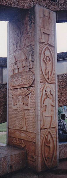
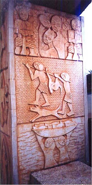
Images: ASSAKO ASSAKO Paul-Henri. 2014. L’art au Cameroun du XXe au début du XXIe siècle : étude des expressions sculpturales en milieu urbain, thèse présentée et soutenue en vue de l’obtention d’un doctorat/Ph.D en Histoire de l’Art, UY1-Cameroun, p. 571.
Details of a pillar cladding representing the diversity in the Cameroonian regions: the cone-shaped architecture and an initiation mask of the Kounga from Cameroon’s West; the abbia motifs and the hunting scene characteristic of the forests on the South Cameroonian plateau and finally the fishing scene which recall the Littoral region.3
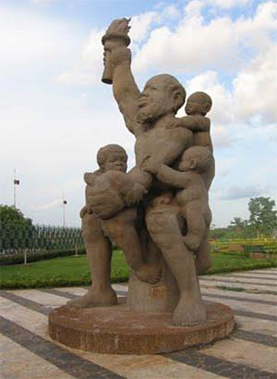
Engelbert Mveng and Atelier Arts Nègre (design, decoration in relief on the architectural structure), Armand Salomon (architecture), Mpando Gédéon (sculpture), 1973 -1976, concrete, H: 7m, Atemengue Plateau Yaoundé, Cameroon. Photo: Paul-Henri Souvenir ASSAKO ASSAKO
The sculpture by Gédéon Mpando that is situated in front of the spiral architecture reinforces the idea of a united nation as a foundation for development, fulfilment and prosperity in its own way. The artist has personified the nation in a figurative sculpture. The composition represents a stocky colossus (53 tons, height of 7m) in a seated posture of great stability. He holds a torch in his right arm while his left hand serves to support the four children who are clutched to him. The children’s visible efforts to climb up the colossus make for a strong vertical tension, echoing the cone-shaped architecture in the background. Mpando’s sculpture reveals a kind of serenity. Its strong expressiveness is due to a harmonious play of masses and volumes in the treatment of forms. Both artists’ contributions translate a vision of the nation that is both poetic and critical and as such essential to the development of a national society. Both components of the monument incorporate the idea of belonging to a nation that is united and hence display the most universal property that an image can acquire in such a context: its true ontological significance (H. Belting, 2004).
Let us come back to the relevance of this monument’s imagery. The inhabitants of the territory of Cameroon have inherited a common history of colonization. This history has forged socio-cultural, symbolic, emotional and political ties between ethnic groups. E. Renam speaks of these ties as the “fusion of populations” (1882). These links constitute the raw material of the national collective memory. It can be argued that it is worthwhile to overcome the obstacles to the consolidation of this nation due to the socio-cultural sedimentation of these ties. Disappointment with the promises of prosperity have resulted in calls to return to regional autonomy, be it in the form of a federal state or in the form of secession. Precaution needs to be preserved, however, because deconstructing the Cameroonian Republic constituted in the 1960s and 70s would imply calling into question the historical heritage, that Cameroon was born from the colonial system developed at the African conference in Berlin in 1884. The consequence would be the restoration of a precolonial environment. Instead, it seems more productive to critically analyse the historical stakes in favour of the development of today’s society.
Overview report on the current political situation in Cameroon (April 2021) - in German: Link https://www.bpb.de/internationales/weltweit/innerstaatliche-konflikte/327306/kamerun?pk_campaign=nl2021-04-07&pk_kwd=327306
References
- RENAN Ernest. “Qu’est-ce qu’une nation?” Bulletin de l’Association Scientifique de France. 26 March 1882.
- BELTING Hans. 2004. Pour une anthropologie des images, Ed. Gallimard
- BAHOKEN J.C. et ATANGANA Engelbert. 1975. La politique culturelle en République unie du Cameroun. Éditions Les Presses de l’Unesco.
- MVENG Engelbert. 1985., Histoire du Cameroun. tom 2. Yaoundé. Ed. CEPER.
- CHEICKH ANTA DIOP. 1079. nations nègres et culture, Ed. Présence Africaine
- SCHEMMEL ANNETTE. 2015. Visual arts in Cameroon - A Genealogy of Non-formal Training 1976-2014, Langaa Research & Publishing CIG, Mankon.
- ASSAKO ASSAKO Paul-Henri.2014. L’art au Cameroun du XXe au début du XXIe siècle: étude des expressions sculpturales en milieu urbain, thèse présentée et soutenue en vue de l’obtention d’un doctorat/Ph.D en Histoire de l’Art. UY1-Cameroun. p. 571.
- https://www.osidimbea.cm/collectivites/centre/monument-reunification/
- www.mbogliaa.com
Footnotes
1) The expression ‘boundaries of ancestors’ refers primarily to the idea of traditional cultural heritage and its appropriation for planning the prosperity of the nation.
2) https://www.osidimbea.cm/collectivites/centre/monument-reunification/
3) Source of images: ASSAKO ASSAKO Paul-Henri. 2014. L’art au Cameroun du XXe au début du XXIe siècle : étude des expressions sculpturales en milieu urbain, thèse présentée et soutenue en vue de l’obtention d’un doctorat/Ph.D en Histoire de l’Art, UY1-Cameroun, p. 571
published February 2021
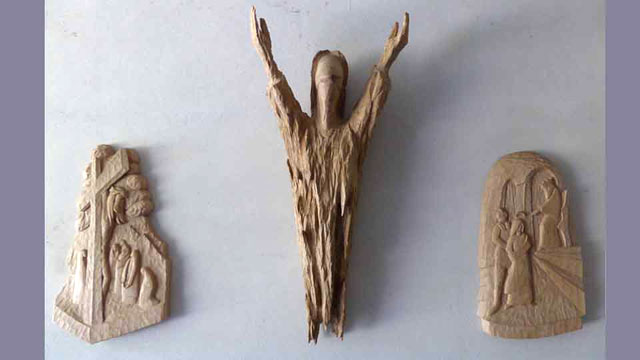
-
It is a small but powerful image. This power is based on its pictorial conciseness, its artistic quality. My reflection on the woodcut is based on a suspicion. Obviously, its message is problematic. At the beginning of the modern era in Europe, it formulates a worldview that has had great influence and fatal consequences to this day: the destruction of diverse nature and culture in the course of the anthropocene and colonialism.
On the left construction of the horizon and vanishing point, on the right with the viewer inserted (visualisations by the author)
With the help of this grid, he succeeds in creating a way of convincing representation, an interpretation that photography (invented almost 400 years later) would also deliver. I.e. a representation that is ‘correct’ in terms of perspective.
The woodcut itself also follows this principle of ‘correct’ linear perspective. The horizon is marked as the sea horizon in the right-hand window; the vanishing point of the grid lying on this horizon. This vanishing point also assigns a specific, clearly determined space to the viewer's eye. It is at the same height as the depicted artist, and on the right, the ‘male side’ of the image. In this way, the viewer is not only a witness to the event, but also a confidant and accomplice of the drawer / the artist.
In terms of composition, the symmetrical layout is particularly striking. As in a coat of arms, we see two equal-sized fields on the left and right, divided by the grid frame. In both parts, two windows, also of the same size - each with a view to the outside.
Subdivision according to centre lines, additionally thirds. The vanishing point is on the right perpendicular.
In the left part of this emblematic image, the woman. The flowing cloth emphasises her nakedness rather than covering it. She is bedded on soft cushions, 'lying according to the artist's will' (to speak with Dürer in his accompanying text). Her raised lap turned towards the man, her eyes look closed, her left hand rests on her thigh. The table on which she lies works as a presentation plate.
Dichotomies
With this composition, the image formulates an almost striking dichotomy. To name just a few aspects that are particularly significant in our context:
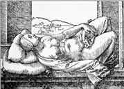
- Woman: naked and thus ahistoric, i.e. "timeless", with closed eyes and diffuse spatial orientation.
- Man: clothed and armed, watching closely, focused on the woman in front of him.
- Woman: In her passivity she has a powerful presence in the picture; she is - lying - the theme (the
- Man: He is actively engaged, sitting, taking action. He is an individual
- In the window: 'free', lively nature.
- In the window: reduced nature, mostly just the horizon line.
- Tall, naturally growing trees outside in the open air.
- One small, domesticated and cultivated 'tree' in a pot, indoor.
This dichotomy is not only emphasised by the narrow format and the symmetrical layout, but above all by the clear separation of the two ‘worlds’, which is achieved by means of the grid frame, i.e. an important tool in (Dürer’s) art. This again cements the structure of distance established by the artist: On the right, the male attention to the woman is conceived as (and through this reduced to) distanced looking and the spellbinding drawing of what he sees. The woman, on the other hand, presents herself - against a lively backdrop - as the ‘target object’ behind the frame. In this way, however, it is not only the clichéd gender roles being fixed, gender roles as they will be significant throughout the next centuries. But there is more at stake.
Panofsky had characterised this kind of linear perspective "as a symbol of a beginning, when modern anthropocracy was setting itself up" (1980: 126). That perspective initially puts the world at a distance. Above all, it opposes ‘subject’ and ‘object’ to each other in a clearly separated way. The aim of this procedure and the underlying model of thinking is to make the world 'calculable' in a 'modern' way: At last, even in a picture, one can say whether a line, a shape is right or wrong. The world is thus degraded to a supplier of 'appearance data' (Rebel 1996: 198). The data selected are now recorded - through a technical procedure - by the isolated and disembodied eye. In this process, the eye is the representative of a specific 'pictorial intellectuality'. Dürer emphasises: "the eye is the noblest sense of all" (Rebel 1996: 200). This gives the rational mind the decisive role, which becomes the ‘signature’ of the Renaissance. And, perspective is its symbolic form, its paradigm. Linear perspective represents "the world as it can be in the idea alone. It constructs the world" (Belting 2008: 27) according to cognitive principles.
In the woodcut, this rational, intellectual way of seeing belongs to the man. The woman, on the other hand, has her eyes closed, she does not look. (She is looked at.) With regard to the anthropocratic claim of the (male) rational mind, woman (as a sensually tangible allegory) thus becomes the indeterminate, unmarked “Other” (Latour 2017: 38). Ultimately she becomes the representative of the natural: she is naked, ‘as nature created her’ and thus timeless, i.e. untouched by a specific contemporaneity. She must - in order to become visible - be 'captured' by the man on the right, who has an individual face and is dressed in a contemporary manner.
Above all, the specific form of relationship of the two sides to each other are decisive for our question. As already shown, we find here a clear subject-object relation. The man (who represents civilisation, culture, the domestication of nature) is the active, acting, looking, mentally grasping subject who now ‘subjects’ the woman as a passive object to his artistic appropriation (and through this the 'naked', non-civilised nature that is embodied by her).
Latour points out that this conception is specifically European: "What occidental painting invented [...] and of which no trace can be found in any other civilisation" (Latour 2017: 38). From there, there is an striking parallel to the conquest of the "New World" by European powers in colonialism, as the image below shows.
 Theodor Galle/Jan van der Straet. Vespucci discovers America.1589. (https://www.deutsche-digitale-bibliothek.de/item/C6QXUXQLVIKAIVADBOAJ7ZM3WXLWTVT5)
References
- Belting 2008: Hans Belting. Florenz und Bagdad – Eine westöstliche Geschichte des Blicks. München (Beck)
- Latour 2017: Bruno Latour. Kampf um Gaia. Berlin (Suhrkamp)
- Panofsky 1980: Erwin Panofsky. Die Perspektive als „symbolische“ Form. In: Erwin Panofsky. Aufsätze zu Grundfragen der Kunstwissenschaft. Berlin (Volker Spiess)
- Rebel 1996: Ernst Rebel. Albrecht Dürer, Maler und Humanist. München (Bertelsmann)
- Zur Lippe 1981: Rudolf zur Lippe. Naturbeherrschung am Menschen. Bd. 1. Frankfurt (Syndikat)
This small-format woodcut by Albrecht Dürer from his book on perspective shows a sleeping woman, which is modelled on the motif of a Venus in Italian Renaissance painting. While two windows, typical of the Renaissance, provide a view of the vast landscape outside, a third ‘window’, the grid, leads the artist's gaze to the woman's intimate zone. The woodcut thus shows far more than a perspective construction: the male artist, as creator, seeks to capture his divine ideal in a construction. He keeps distance and pretends to give an objective view. Opposite him lies the partly naked, partly clothed ‘Venus’, who can be both a sign of purity and a sign of sin. In the innocent state of sleep, she has nothing to hide and stands for the much-cited ‘naked truth’.
This constellation gives rise to a speculative interpretation of the relationship between artist and woman, between draughtsman and model, between gaze and desire: "The wooden frame is positioned between the draughtsman and the woman. Not an opaque wall, but a grid and transparent. But precisely because of this, it creates a dichotomy, or at least supports it, the division of the one space in which both are. This creates two separate and oppositely charged areas. It seems as if the libidinal current between woman and man and man and woman is cut off by the apparatus of the visual grid. It obviously only lets through the visual rays, those of the draughtsman, with which he 'studies' his counterpart, his object. The woman keeps to herself with her body and the man keeps to himself with his activity.
In effect, the possible object of the male desire has become the object of an artistic investigation of nature. An activity that is borne by a sublimating activity and transformed into a form in which the sensual desire of the man is transformed, partly abolished, eliminated. [...] Desire only becomes visible to the person looking at the image, to the (male) viewer. He finds himself in a voyeuristic predicament. Is she not lolling around for him? The forces of seduction rejected by the grid are now directed at him. The man at the end of the table can be forgotten. He has other things to do. His occupation does not affect the erotic desire that could build up between the voyeur and his object. A completely different form of relationship that the male gaze there, the male gaze here, takes up."[1]
[1] Dürer, Zeichner. ungleichzeitig gleichzeitig. http://wegvonwegen.de
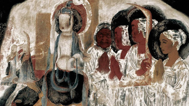
-

The importance of the series entitled by "Dream of Dunhuang"
The Dunhuang Dreams series from the 1990s marked the emergence of a new opportunity for meticulous figure painting. After his in-depth study of the Dunhuang murals and his many field trips, Yongli Tang drew inspiration, adhered to the core of traditional painting and incorporated the expressive strengths of Western painting to achieve a bold innovation in artistic expression.
In the creating of meticulous figure paintings, there are three crucial ingredients, including the use of line, modeling and coloring.
Modeling and Line
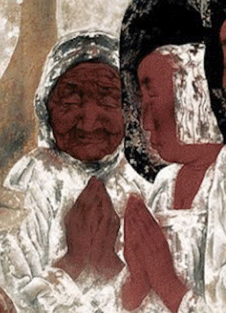
Fig. 2: Part of painting of hairpin ladies in the Tang Dynasty ,Zhou Fang, active late 8th–early 9th century, Ladies Wearing Flowers in Their Hair, handscroll, ink and color on silk, 46 x 180 cm, Liaoning Provincial Museum, Shenyang province, China - copyright: public domain / Wiki Commons.
Fig.3: Part of Memories Of Childhood, Yongli Tang, 1998, Copyright: the artist.Line is the most basic language of Chinese painting, and Chinese painting is concerned with the use of frames and calligraphy and focused on the expression of the structure and rhythm of the object's form, instead of the shading and the in-depth of the object. The series of works is mainly presented by the use of line in the traditional painting while the shading and the linear perspective of the sketch is enlighteningly integrated in the form of relief. The series Dream of Dunhuang innovatively uses linear sketches to portray and shape exaggerated figures, with extreme variations between lines. The spirit of the lines fits the mood created by the picture, while the light and dark faces are integrated to provide a detailed portrayal of the main figure. The juxtaposition of realistic and extracted Dunhuang symbols, modern and ancient figures, temporal and spatial wholeness, and a conceptual form of expression are harmoniously presented in the picture, and the modeling has both traditional cultural roots and modernity.
Coloration
Dunhuang murals have undergone thousands of years of natural and man-made changes in color, with some peeling and mutilating. It looks like a rich, deep, ancient palette that allows the viewer to achieve a secondary aesthetic pleasure. Being in the sacred, quiet rock cave, the soul is purified, and the individual remains in the flow of the years, achieving spiritual transcendence.
In order to pursue the sense of history in Dunhuang murals, Yongli Tang used Black and White as the main colors and interspersed with azurite, stone green, earth red and other traditional colors for embellishment. The color of cooked brown was used to present the figures’ skin. The author could not be confined with the realistic object so that he exaggerated color changes to highlight the subjective emotional orientation of the picture.
In the series of works, virtual dyeing method was innovatively applied to highlight the freehand of the picture. Dyeing high places or low places could be switched freely according to needs, and dyeing is not limited by the line, which presents a vague sense of void. In addition to the traditional color setting techniques, for example, flat painting, rendering and over-dyeing, the author developed the method of shedding. The thick painting and shedding methods set off each other. To be more precise, the author piled up degummed white powder on the base color, then chafed and patted, with some of the white powder falling off naturally. The rest was blended with the base color. The use of large areas of white color does not cause the picture to be chalky. During the painting process the shedding of white color is like the painting of the freehand work. With the controlled brushwork, there are uncontrollable and accidental factors, which gives the mottled and dappled left on the murals by the years. The thickness, light and dark, cold and warm of the white color is presented in an exceptionally subtle way, creating a harmonious and quiet relationship between religious culture and modern beliefs.
Material Texture
Stable social and cultural environment made the painting language of meticulous painting was solely and smoothly developed for quite a long time. In the late 1980s, political, economic and cultural changes leaded to the activation of the painting community and the reflection on tradition. New painting materials were triggered a change in creative thinking.
In his artistic practice, Tang Yongli discovered the texture beauty of the materials and used it in the painting process: mineral colors have a sense of luster, strong covering power, and can be repeatedly modified; the watercolor is rich and delicate; the shedding effect of degummed white powder reproduces the oxidation and wind erosion of mural; the layering of these colors gives the picture a sufficient sense of history and ethereal inspiration. Tang Yongli uses this as an opportunity for a new language, to expand and to strengthen it, as well as to form a new language paradigm. The beauty of the material texture becomes part of the creation and an aspect of the work to be tasted. The author chooses colored silk as the bearer, which is tough and can be used in a variety of techniques such as thick painting, shedding and reverse painting, and pigments such as ink, mineral color, lithopone powder and watercolor are used.
Classical meticulous painting can only do addition, not subtraction. The use of these material techniques breaks the border of the painting on silk. It also allows us to add and subtract freely and to change a single direction to a multi-directional expression (i.e., highly realizing self-consciousness). The expression of the free state of mind, workmanship, painting, color, texture and other factors become a new organism.
Summary
The series of Dunhuang Dream presents the interaction of multiple factors, scholarly artistic interrogation and the creation of diffuse imagery, as well as the attribution and transmission of spirit. It opens artistic horizons for the modern development of meticulous painting. The development of Chinese contemporary art has always been to move forward with the review and inheriting of history. They find visual art resources to reinterpret, redevelop and re-create them with a contemporary view, thinking and aesthetics, which will form a dynamic and growing tradition.
-
The Rising Sea by El Anatsui is a naturalistic presentation of an ocean in turbulence, which elicit attention through both grotesquery and finesse. The work, which covers an area of about 14,38 by 6,90 meters, is made up of several pieces of flattened aluminum bottle tops stitched together with copper wires into a massive sheet of grey wall overlay.
To achieve the intended illusion, the artist manipulated portions of the metal fabric into large series of ridges of different sizes that combine into an irregular rhythm randomly positioned across the surface of the sheet to simulate sea waves. Beyond supporting the movements of the sea waves, the rhythm created by the raised portions of the work also provides narrow range of values that effectively bring out the three-dimensionality of the work and transforms the otherwise flat sheet into an illusionistic volume.
Like the texture of oil paints in Van Gogh’s Starry Night, the texture of the stitched pieces of metals sheets introduce energy into the work, bringing out the fluidity of the sea and the potency of the mesmeric sea waves. Indeed, improper disposal of those materials used (and many others) is causing a lot of nuisance in his home country and other parts around the globe, with the sea being the most affected. Therefore, right from the materials used to its marvelous finishing, it is not difficult to discern a blend of severe censuring and admonition in the voice of the artist. The sea is, in the way presented, depicted as rising against improper treatment; and El, by the pains taken to stitch every piece of material together, seems to emphasize the need to make it our business to salvage the sea from improper handling.
The sea, which has served as an important source of livelihood for Ghanaians over the centuries invokes multidimensional viewpoints and draws out divergent responses and reactions depending on its relationship with the people. Among the coastal dwellers (and indeed a very great population of Ghanaians), the sea is considered an important resource for commercial activities, an arena for entertainment and recreation and grounds for spiritual exploits and worship.
He himself being born in the coastal town of Anyako in the Volta Region of Ghana, El seems to know so much about the sea. Growing up, he most likely experienced the sea being perceived, treated and utilized in many different ways. Besides its major use for commercial activities and other useful ventures, he might have listened to many stories about the sea as a god (with other inhabitants), as a provider and as a friend. He might have learnt about how the sea and her inhabitants contribute to the fortunes of the people. He might have witnessed how people got healed as they bathed in the sea, or had their fortunes turned around as they threw some coins in the ocean and made their requests known to the sea.
Beyond this, he might have also been warned about the consequences of flouting the taboos and other prohibitions that regulate the “use” of the sea, including forbiddance from desecrating the sea with unhealthy practices such as defecating in the sea, throwing filth into the sea or wearing sandals or shoes in the sea and the need to observe the tabooed fishing days, and so on. Besides, another important thing which Ghanaian coastal dwellers take very seriously is the need to adhere to physical signs and conditions of the sea, which have various local interpretations and implications. For instance, there are periods when the sea is considered as “full”, during which times the sea waves “rise” and become more intense and turbulent. Fisher folks are supposed to take a rest from “climbing the sea” (as they say in the local parlance) as the sea is likely to be unfriendly, and therefore unconducive for fishing.
Factors that cause the “rising” of the sea may not be ordinarily known. However, according to coastal dwellers, there is always something sinister about a rising sea – either somebody got drowned, or someone or a group of persons might have violated the rules of the sea god – and what motivated El in his presentation of the Rising sea might not be any different from what are traditionally believed. Probably the sea is fed up with deliberate dumping of wastes and toxic materials into her bowels. Therefore, she must rise!
But the “full” or “rising” sea is not as unfriendly as it sounds. Though it prevents fishing activities, which might be one way of punishing the people for disrespecting her, it also affords the people the opportunity to dry up their canoes, mend their nets and relax in the beautiful view of the sea along the coast. The occasions of the rising sea also witness other people who just move along the shores to observe the large waves that gather in the deep ocean, roll angrily towards the shoreline and dissolve tumultuously at the shore in a creamy white lather. The views at the seashore during these periods are nothing short of aesthetical experience that is shared by different kinds of observers with different perceptions, questioning, discussing, enjoying.
In so many ways therefore, the spectacle of observers in front of El Anatsui’s gigantic reconstruction of the Rising Sea gives so much semblance to the natural phenomenon, and this is a fundamental underpinning to the success of El’s work.
Culturally, the Rising Sea could be perceived as an allusion to the dynamisms in life, which sometimes rise against human tendencies and restrict mundane behavior, at the same time ensuring regularization of natural behaviors. What is important is to identify what is causing what, and how to seek for the right solutions.
For it to be presented as an aesthetic piece of work, El is probably saying that, the Rising is Sea is frightening; it is confusing; it is chaotic. But she is still beautiful, because in the right time, when given the right treatment, she will calm down so we have nothing to fear. She is still our god, our friend, our provider and our protector.
published February 2020
El Anatsui (* 1944) created 'Rising Sea' 2019 specifically for a particular wall in a comprehensive solo exhibition of his oeuvre entitled “Triumphant Scale” at the ‘Haus der Kunst’ in Munich. Like many of his other works, “Rising Sea” is a large-scale piece comprised of thousands of flattened liquor bottle caps (extrapolated approx. 190.000) that have been tied together with copper wire. It hangs like a large tapestry from ceiling to floor and though it looks solid, it is flexible and has a seemingly textile structure. The effect is monumental and magnificent; it impresses by the sheer size as well as by the sensual materiality of the almost infinite number of small, shimmering pieces of tinplate.
To see the composition we need to view the work from a distance. The sculpture is divided into three starkly contrasting horizontal zones. A vibrantly colored strip runs along the bottom. It appears fragile and becomes thinner and interrupted as it runs toward the lower right corner. The broad, massive, monochrome grey zone in the middle falls with heavy folds. The third zone at the top is a narrow, shiny, silver and smoother appearing plane that rises from its lower edge on the left in a sharp line upwards to the right, like a ‘Silberstreif’ (i.e. glimmer of hope).
Nearing the work, we discover bright flecks of color that emerge out of the shimmering mother-of-pearl gray middle zone. While some of the flecks appear to build concrete figurations others seem to be randomly dispersed. In the lower right corner small speckles of color gravitate toward and buzz around a concentrated cluster of speckles. We are enticed to move closer and to discover more details. Individual bottle tops become recognizable out of a speckled ‘field of pixels' or 'threads in the fabric’. One recognizes and reads the labels "Turn to open" and the names of African high-proof alcoholic beverages that are popular in Ghana or Nigeria where El Anatsui lives and works (KP Beverages, Bacco , etc.)
As with an impressionist painting, this work enables and requires two different viewing positions: close up and from a distance. Both perspectives tell different stories. In contrast to impressionism, El Anatsui’s stories address political and social issues of highest relevance. From a distance, the rising water level caused by global warming is addressed, to which the title of the work 'Rising Sea' refers. “Reading” from left to right, sculptural folds in the large gray middle area remind us of mighty waves that are in the process of destroying the narrow, speckled strip on the floor that we may associate with human dwellings and their fragile situation. The ‘Silberstreif’ is dwindling and so is hope. Obviously, this meaning is addressed directly and in all clarity.
The inscriptions on the bottle tops tell another story, the story of alcohol and slave trade during European colonialism in West Africa. Thousands of Africans were sold and taken across the Atlantic in ships to cut sugar cane in the Caribbean plantations to make rum. The rum was shipped to England and then later sold to Africa. Rum with its high alcohol content became another means of dominating an already exploited people. In the course of time, West Africans commonly used rum and other forms of alcohol for libations. However, El Anatsui only uses discarded bottle caps from liquor made in Africa today.
In turn, the process of 'sewing' the individual metal pieces together is an important, additional cultural-historical referral to El Anatsui’s roots in West Africa where there is a long tradition of weaving colorful textiles.
The close-up view of “Rising Sea” thus speaks of the past in West-Africa. Whereby the view from the distance, speaks of the future, a future that directly and indirectly affects the world globally. The narrative strands are connected by the idea of upcycling: discarded bottle caps become art, the cheapest material becomes sumptuous beauty, the past becomes present and future, regional colonialism becomes the narrative of a global threat.
It is important to remember that it is a black artist from Ghana exhibiting this threatening beauty in a space that was built in Munich to serve National Socialist racism. The title of the exhibition 'Triumphant Scale' alludes directly to this context, which Okwui Enwezor, the initiator of the exhibition, was certainly aware of. The Nazi regime, a regime without scale, built the Haus der Kunst, a building that broke all scales. El Anatsiu’s magnificent, grand scale triumphs over the excessive Nazi scale.
Challenging the Western concept of art
As an artist, El Anatsui is a representative of the Global South as well as of global art. He displays past and present catastrophes in decorative splendor. We can understand this message through classical analysis and interpretation on the base of the iconography of material and motifs. This system of decoding is familiar to us and confirms our Western expectations of a work of art. However, the simple explicitness of the content of El Anatsui’s work, poses a challenge to Western expectations of open, complex, self-contradicting art.
According to the latent notion of the community of art experts, if there is a clear content in art it should be as ironic, witty or distanced as possible. Hence, the intrinsic value of art (l'art pour l'art) eludes ideological appropriation and art gives no instructions for action. None of these tenets of Western art is is evident in Anatsui’s work. "Turn to open” with an arrow pointing up or down is the instruction repeated thousands of times in the middle section of “Rising Sea”. The sentence can be read as a directive for us to act on the challenges of our time.
El Anatsui thus negates the ‘prohibition' of unequivocal, direct symbolism and narration in the Western concept of art and its associated prohibition of politics and agitation. As a global artist, he challenges this concept. In addition, it is interesting to note that El Anatsui, unlike most Western artists, often leaves the responsibility of installing his work in exhibitions to the respective curators. In every exhibition, the same works look a little different, or quite different: folds will fall differently, pieces will be grouped differently and work that has been previously exhibited hanging on the wall may even be presented lying on the floor. With this artistic strategy, he formulates an unmistakable position from the Global South. Thus Western dominance loses its normative power in art and culture in general. The world becomes more diverse and polycentric.
Learn more about El Anatsui.
published February 2020
Two perspectives on one work of art
In 2019, a large solo exhibition of the Ghanaian artist El Anatsui, initiated by Okwui Enwezor, took place at Munich's Haus der Kunst. It was the occasion for Patrique deGraft-Yankson and Ernst Wagner to write together about one of the works there. deGraft-Yankson and Ernst Wagner agreed on a parallel writing process in order to minimise any mutual influence of their respective approaches. Thus, they knew nothing of each other's point of view. The resulting texts can be read above.
The result of this exercise is surprising and fascinating. In some aspects, of course, the interpretations of the work coincided, but in others they differed considerably. What they had in common, for example, was the appreciation of the production process and the impressive effect of material, size and surfaces. Also that the issue of environmental pollution plays a central role in the interpretation of Rising Sea. But it was precisely here that the first differences, even mutually exclusive approaches, emerged: for example, when deGraft-Yankson referred to the sea as a deity, a deity that can sometimes be friendly, but also unfriendly. Understood in this way, the sea in its immediate effect is simultaneously frightening and beautiful, it threatens and at the same time invites aesthetic enjoyment.
Ernst Wagner could easily relate this aspect to the Western aesthetic of the sublime, however, the difference becomes quite clear when we look at the underlying concept of what an art work is. deGraft-Yankson's text takes the work of art as its point of departure, but it always speaks of the sea itself, while Ernst Wagner always speaks of the work - and not of the sea. This different focus marks a fascinating difference: deGraft-Yankson is concerned with the sea, which he brings to us through his discussion, while Ernst Wagner is concerned with a work of art that simply has the sea as its subject. For deGraft-Yankson, the sea is "in" the work, it is really present. For Ernst Wagner, the sea is a represented motif, it lies "behind" the work, so to speak. It serves as a theme or a point of reference.
This has consequences for the methodology: while Ernst Wagner delivers an analysis of form, deGraft-Yankson focuses on contextualising the art work; he describes the significance of the sea for the people on the Ghanaian coast today. This difference is probably also due to the different perceptions of what the sea itself is: in his text, deGraft-Yankson speaks of the sea as an independent, souled entity, an acting being or a god that enters into a relationship with people. For Ernst Wagner, the sea - as part of the ecosystem - is also in relationship with humans, but he does not ascribe an independent will to it.
These different understandings of the relationship between human beings and the world are then echoed in an obviously equally different concept of what art or an art work is. In deGraft-Yankson's text, the work of art, like the sea itself, is charged with energy. The sea appears, as it were in the work, indeed it is present there. In the work, then, the sea materialises as something we perceive directly. In this sense, the work and the sea appeal to us to "preserve it from improper treatment [...] or it will be desecrated."
This approach of deGraft-Yankson, in which everything interpenetrates, is contrasted with Ernst Wagner's approach, which analytically separates everything: proximity and distance, splendour to be enjoyed and admonition to be taken seriously, discourse on colonialism and ecology, work and motif, art system and ecology, art system and colonialism, and so on. In the end, Ernst Wagner achieves a synthesis, but it only works on a meta-level by addressing the irritation of the Western concept of art through Anatsui's work. An irritation that dissolves or at least relativises the fundamental separation in Western understanding of viewer and object, of sign (the concrete work) and signified (the rising sea), of spirituality and reality, of art and ethics.
Annette Schemmel, then member of the ISB group, wrote to the the authors in 2020:
"Dear Patrique, dear Ernst,
Your texts are a great read and so complementary! For me, writing from Munich, the aspects raised by Patrique have opened up an entirely new reading of this marvellous piece of art, which I was lucky to contemplate at the exhibition of Haus der Kunst. What you're telling about Ghanaians' relation to the sea is unveiling and beautiful, thank you for unfolding these narratives here! Thank you all the more for sharing a piece of local wisdom (how the sea can react angrily) and linking these narratives to the global challenge of saving the sea, a challenge with impacts on localities all over. On another note, the evocation of "Starry Night" caught my eye at once and does make a lot of sense to me. I will be using it in my art classes, if you don't mind.
Ernst's reading of the piece is much more familiar to me, obviously. He is telling about the context of the exhibition on site in Munich, a context that is so highly charged! When exhibited at this specific museum, Anatsui's work can't but comment on our German history, laughing at its racism by means of its "immoderate" dimensions and calling for a long-due revision of our role in colonialism and in exploitative global circuits of goods like alcohol. It is for this potential of speaking to a place that artworks should always be seen in different locations!
I would also like to point out that Ernst is exemplifying a familiar method of accessing artworks here, a method that I am happily teaching to my pupils. This method from academic art history wants you to start from close observation and description of formal aspects of the work before risking an interpretation. By means of this strategy arguments about a work of art are meant to become more solid, even if this visible gesture of searching for the right interpretation makes a text less smooth. Thus, Patrique's and Ernst's approaches are totally complementary.
This said, I am not agreeing with Ernst in the way that "Rising Sea" is explicit in a way that certain Western art lovers might want to criticize. They might, but they would be very wrong. Let me explain: to me, the reproach of explicity rhymes with simplicity and a lack of layerdness. As you both have shown, "Rising Sea" does have multiple layers of possible interpretation and certainly some more, which have not been addressed here. These layers are visible, not only but most clearly, if the work is read against the backdrop of different locales. Artworks from our global age command us to look at them with changing perspectives. If certain Western art lovers can't be bothered to do this, they will forever be missing the point. Their fault. Let me add that you might even spot a good deal of irony in the way that El Anatsui has made this piece outstandingly beautiful, caressing the eye to the degree that every exhibition visitor wanted to take a selfie in front of it, while at the same time pointing to some very painful and threatening truths about today's humankind. Therefore, I would like to uphold that this artwork's relation to the viewers and to its places of exhibition is complex and challenging rather than simple or explicit.Annette"
-

Louis XIV (1638-1715), King of France, was painted by Hyacinthe Rigaud (1659-1743) in his palace in Versailles near Paris in 1701. The oil painting was larger than life: 277 cm in height and 194 cm in width. The official title reads: Portrait de Louis XIV en costume de sacre. The painting is exhibited at the Louvre in Paris (INV 7492, open access), and a copy is in the Bavarian State Painting Collection in Munich.
In this portrait, the king is shown dressed in the official royal robes of the monarch, posing magnificently in front of his throne, which is placed in the background. In the painting are gathered together all of the traditional symbols of a ruler: the crown, the sword, and the ermine cloak, which uses the fur of this most precious animal.
Hyacinthe Rigaud was a famous and experienced court painter and had many assistants in his big atelier, so we do not know which parts of the picture are actually done by him. Since photography was not yet established at the beginning of the 18th century, every court employed artists specialising in portraiture to show people what their ruler looked like, or rather how he was expected to look or wanted to be seen in order to legitimise a political programme of monarchy. Specific iconographic symbols and accoutrements were used to demonstrate the tradition of rulership, which was thought to be bestowed by divine right. Rigaud fulfilled the wishes and orders of his patrons, but he also showed subtle characteristics of the people he painted.
‘Absolutism’: Paradigm of a ruling structure that today is considered a myth
Nowadays, the portrait is often used for educational purposes to visually substantialise Louis XIV as the most important representative of ‘Absolutism’ in Europe, the regime of direct rule with no control by a parliament or council: ‘L’etat c’est moi’ (‘I am the state’), he is said to have described his understanding of his place in the world. Research has discovered that he never really defined his role in this way (first in Bernier, 1988, p. 110). However, it is true that he was attributed with the image of being the central part of nature and the cosmos: as the ‘Sun King’, he was staged as the genesis and focus of all energy whence all life originates.
Scholars of the early modern era (Henshall, Wrede, Reinhard) consider ‘Absolutism’ to be a myth constructed in the 19th century. Since Gerhard Oestreich observed the ‘non-absolutistic elements in absolutism’ in 1969, many studies have pointed out that the king depended on an influential elite as well as a number of committees. A complex and effective network of groups existed as the executive authority controlling the political system, as Althoff and Stollberg-Rilinger have shown in their groundbreaking books on the political organisation of the late medieval and early modern states in Europe. In their publications, they describe the ritualised methods used in communication between the influential groups in order to find a consensus. As result of that scholarly discussion of the topos of ‘Absolutism’, Wolfgang Reinhard, like other scholars, recommends, ‘that one should abandon the term’ (p. 40). But, as it is rooted quite deeply in the historical consciousness, this does not seem so simple. Martin Wrede complains in his article ‘Absolutismus’ in the handbook Enzyklopädie der Neuzeit of the continuation of the topos, namely ‘the cliché, still firmly anchored in popular views of history as well as in textbooks, of the all-dominant, all-regulating, arbitrary state built on princely power and with a splendid façade’ [‘das in populärem Geschichtsbild wie Schulbuch nach wie vor fest verankerte Klischee des alles beherrschenden, alles reglementierenden, auf fürstliche Macht gebauten Willkürstaates mit prachtvoller Fassade’] (p. 33).
The portraits of Louis XIV and other kings are used to prove the existence of this colourful glory, whilst in reality, the monarchs were representative figures and personal symbols. During Louis’s lifetime, France expanded its territory in Europe and overseas, which brought extreme losses and financial burdens to the people. Because of that disaster, it was necessary to produce a reputation of honour for the king.
Interpreting the portrait
The portrait shows Louis XIV at the age of 63, at the height of his success. But he does not appear as a strong and resolute ruler who travels around in his country, nor an active fighter who leads battles to defend his people. Pupils today always miss a specific physical ‘masculinity’ that they expect from a king They fault this person for not being able to move, run, or ride in his heavy clothes, high heels and white tights. He is forced to stay indoors, surrounded with sumptuousness. They perceive him as ‘feminine’, as the only part of his body he is presenting is his legs, much like a young woman in a miniskirt, and the grandiose wig with its long hair hinders many activities. The entire image seems ridiculous to today’s pupils. What we see here is an old, ill, vain man who is dressing up to fulfil representative duties. What pupils remark is not just some disrespectful observation but is in line with what we know about reality. Rigaud is a superb artist to show the man in his demonstration of the ritualised courtly pageant of luxury.
There are more paintings showing Louis at different phases of his life. As all royal children, he was kept in the same pretty clothes as girls during the first six years of his life. Portraits show him even at the age of ten with facial features and accessories we perceive as feminine and fanciful, not suited to preparing for the life of a strong ruler. The official regent for Louis until he turned 22 was his mother, Anna of Austria. Louis strengthened the Catholic church but did not follow her order of monogamy: besides his six legal children, he had eleven illegitimate ones, all of whom he cared for (Bernier, Tischer, Wrede).
The ideal of masculinity during this time was the mixed one of early modern times, when gender was more hybrid than in the 19th/20th centuries, and life concepts were not sharply polarised between men and women in different spaces, placing men in the public sphere (Dinges, Lundt). Also, the central symbolic figure for the state was not necessarily masculine; there were very influential wives, concubines, and even female rulers.
Conclusion
In the educational process, it is important to dismantle prejudices about past ideals for masculinity as being strong, powerful and heroic. The historic examples of individual men’s glorious performances on European thrones need to be questioned. Pictures like the one of Louis XIV can help to construct a different understanding of courtly life. If it is understood against the background of a plurality of life concepts for ruling men and women, it can help us to see the limitations of their power.
References
- Gerd Althoff: Rules and Rituals in Medieval Power Games, Brill Academic Publ. 2019.
- Olivier Bernier: Ludwig XIV Die Biographie, Albatros Verlag 1988. English edition: Louis XIV, New Word City 2018.
- Ida Blom, Catherine Hall, Karen Hagemann: Gendered Nations. Nationalisms and Gender Order in the Long Nineteenth Century, Bloomsbury 2000.
- Martin Dinges (ed.): Männer-Macht-Körper. Hegemoniale Männlichkeiten vom Mittelalter bis heute, Frankfurt am Main 2005.
- Karen Hagemann: Gender, War, and Politics: Transatlantic Perspectives 1775-1830, Palgrave Macmillan 2020.
- Nicholas Henshall: The Myth of Absolutism. Change and Continuity in Early Modern European Monarchy, London 1993 (first published in 1992).
- Bea Lundt: Die Grenzen des Heros. Vielfältige Männlichkeiten in Mittelalter und Früher Neuzeit. In: Martin Lücke (ed.): Helden in der Krise. Didaktische Blicke auf die Geschichte der Männlichkeiten, Berlin 2013, pp. 67-102.
- Gerhard Oestreich: Geist und Gestalt des Frühmodernen Staates, Duncker & Humblot-Verlag 1969.
- Wolfgang Reinhard: Geschichte des Modernen Staates, München 2007 (and elsewhere).
- Barbara Stollberg-Rilinger: Des Kaisers alte Kleider. Verfassungsgeschichte und Symbolsprache des Alten Reiches, C.H. Beck Verlag 2nd edition 2013.
- Anuschka Tischer: Ludwig XIV, Stuttgart 2016.
- Martin Wrede: Absolutismus. In: Enzyklopädie der Neuzeit vol. 1, Stuttgart 2005, cols. 24 -34.
- Martin Wrede: Ludwig XIV. Der Kriegsherr aus Versailles, Darmstadt 2015.
Translated from German by Kelly Thompson.
published September 2020
 Prince Osei Owusu Bempah, from the exhibition "Orderly Disorderly" - End of Year Exhibition, KNUST (Kwame Nkrumah University of Science and Technology) in Kumasi, Ghana, Museum of Science and Technology in Accra, 2017, © Prince Osei Owusu Bempah
The artist Prince Osei Owusu Bempah from Ghana artistically examines in two art works the portraits of Louis XIV (and below a typical European equestrian portrait of a ruler, like e.g. Charles V, painted by Titian 1548, today at the Prado Museum in Madrid). "Bempah appropriates historical images in the form of painting, sculpture and photography. Considering images as a multiplicity, he is now drawn to news from social media, television, radio and newspaper. Information is crucial to the making of his works which extends beyond the visual representations. He reinterprets them in tapestry, embroidery, banners and uses plastic sacks, curtain accessories, second hand table cloths and silk in different configurations. He substitutes certain elements of the original images with mortars and pestles" (leaflet of the exhibition).
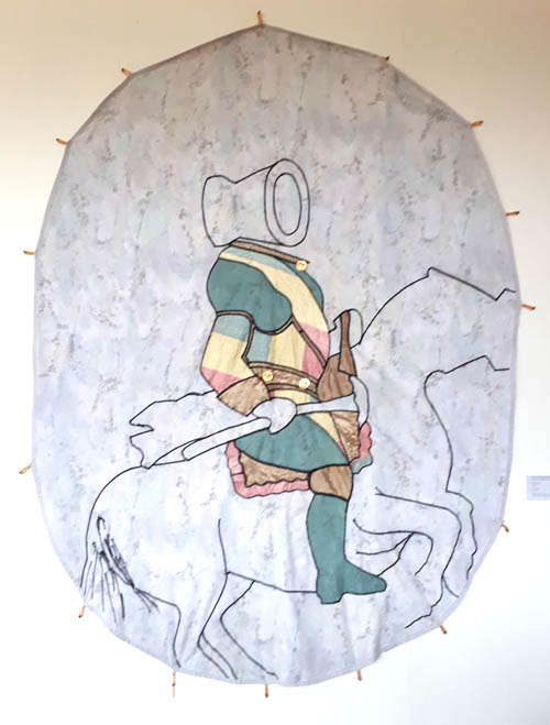
Image 1:Prince Osei Owusu Bempah, from the exhibition "Orderly Disorderly" - End of Year Exhibition, KNUST (Kwame Nkrumah University of Science and Technology) in Kumasi, Ghana, Museum of Science and Technology in Accra, 2017, © Prince Osei Owusu Bempah. (left)
Image 2: Tizian, Carlos V en Mühlberg, 1548, H: 335 cm, W: 283 cm, Oil on Canvas, Museo del Prade. (right)
published November 2020

-
The discriminatory apartheid politics in twentieth-century South Africa were designed to advance the political, social and economic empowerment of the white citizenry; the entrenchment of Western culture and values; to transform the black populace into a labour force and limit their education and training. Within that white supremacist dogma, black material culture’s only footing was its anthropological and ethnographic interest. The output of the pottery, weaving and print workshops of Rorke’s Drift came to stand in symbolic defiance of all of that.
Rorke’s Drift grew from the missionary work of the Evangelical Lutheran Church in South Africa’s KwaZulu-Natal Province Under the initial management of Peder and Ulla Gowenius who were recruited from Sweden, the centre was conceptualised for the training of black members of the local community to produce art and crafts as a means of self-support. The pottery workshop at the centre was established in 1968 by the Danish potter Peter Tyberg.
Whilst the Zulu culture is predominant in the province, it also accommodates other cultural groups. The majority of the initial group of women recruited for the pottery workshop belonged to the Sotho group and had the skills to produce utilitarian pottery for brewing, cooking and storage in traditional forms, decorated with applied motifs and incised elements (Fig 2).h The women were also familiar with traditional Zulu pottery forms in monochromatic colors (hues of black and brown) and decorative motifs that included pinched surfaces, geometric designs and raised linear coils. These were and continue to be produced with hand-building techniques and pit-firing.
Figure 2
A traditional vessel (ukhamba) for the serving of beer in the Zulu culture, 1965, hand-built, burnished and decorated with applied raised designs (amasumpa), collected in Melmoth in KwaZulu-Natal Province, South Africa, 24 x 29 cm, Collection of Iziko Museums of South Africa, Cape Town, ©Michael Hall
Figure 3
Traditional Zulu vessels collected in KwaZulu-Natal Province, South Africa, c.1990 to 1996, various potters, hand-built, burnished and decorated with incised and raised designs, Collection of Ian Garrett, ©Ian Garrett
The potters were introduced to Western production techniques, materials and kiln technology at the workshop. They were also shown books and magazines that exposed them to pottery forms outside of their culture and convention such as of Pueblo Indian and Nigerian pottery (Hosking, 2005, p. 33 and Gers, 2015, p. 268). It was the dictum of Rorke’s Drift to promote individual expression flowing from “an innate naivety and conceptualism” (Leeb-du Toit, 2012, p. 79) but the resulting works had to have appeal for Western consumers. In the pottery this culminated in a “composite globalised identity” (Hosking, 2005, p. 57) that married Scandinavian late-modernism and indigenous African knowledge systems. Freddie Motsamayi (2012, p. 24) described it bluntly as an example of an invented tradition in which new forms of African expression were produced for the benefit of Western patrons.
Whilst staying for the most part within the parameters of traditional Sotho and Zulu forms, the women potters created their versions of Western forms of bowls and vases and also vessels that approached sculptural forms or were distinctly sculptural forms. The decorations which referenced indigenous culture usually covered most of the surface and were applied as incised or built features and painting in layers of slips. The works became progressively more intricate and composite with richly painted and texturally decorated surfaces (Hosking, 2005, p. 96).
A new form that emerged in the workshop oeuvre was the “bird pot” introduced by Judith Mkhabela who worked in the studio during the 1970s. This was a pot with a pedestal base to which the head, wings and tail of a bird were added. Whether this form was Mkhabela’s own innovation is not a certain fact. It might have been modelled on the nineteenth century European hen-on-nest form (Maggs and Ward, 2011, pp. 155–156) that served as a container for fresh eggs. It is equally likely that the pot referenced two other indigenous cultural vessel forms, namely the bird-shaped earthenware vessels made by the South Sotho cultural group for possible use as water containers, water coolers or egg storage (Riep, 2011, p. 185) and the other being the totemic pig and elephant vessel forms made by the amaHlubi tribe associated with the Basotho cultural group (Garrett, 2020).Over the years this form was adapted by some of the other potters such as Elizabeth Mbatha (Fig 4).
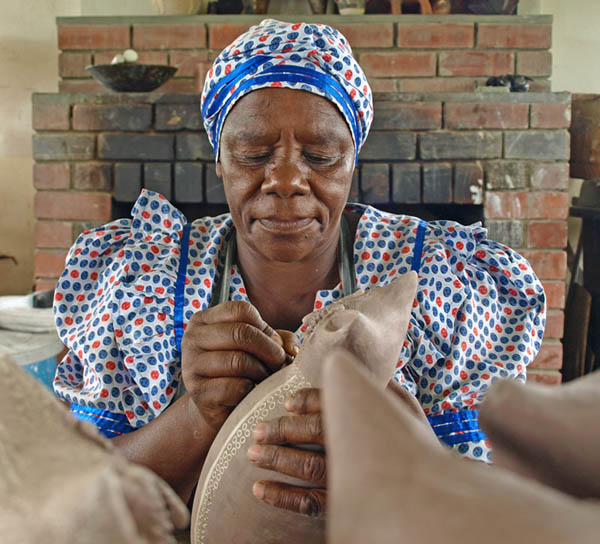
Figure 4
Elizabeth Mbatha at work in the Rorke’s Drift pottery workshop in 2014, ©Ronnie Watt
Rorke’s Drift pottery was first . Two years later, the gallery acquired hand-built and thrown works from the studio for its permanent collection. This was significant for being the first ceramic works by black South African artists to be acquired for inclusion in a public collection during the apartheid era. The best of the pottery was selected to be sold in overseas outlets with Sweden and Germany as prime destinations. The potters set a precedent amongst South African black potters by signing their works on the feet of the pottery and further adding the date and kiln data alongside the leaf logo of Rorke’s Drift (Fig 5). This practice copied Western potters who identified their works with potter’s marks, signatures or monograms.
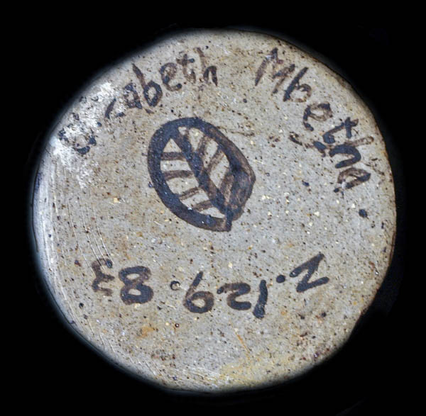
Figure 5
The foot of the double bird vase bears the name of the potter Elizabeth Mbatha [sic], the kiln data and the leaf-form logo of the Evangelical Lutheran Church Centre for Art and Craft at Rorke’s Drift, ©Ronnie Watt
As a collective and as individuals, the potters defied tradition and convention, Western perceptions and expectations of traditional pottery. The potters preserved elements of indigenous form and designs in their pots alongside the non-traditional features and sculptural appendages (Figs 6, 7). This illustrates the statement by the ceramics art historian Elizabeth Perrill (2008, [Sp]) that Indigenous Knowledge Systems (IKS) of materials, methods, forms and values are not monolithic and permit an expansion of innovative aesthetics within and as a continuation of a culture.
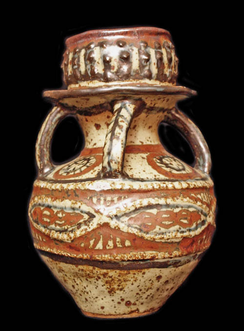
Figure 6
Lephina Molefe, Stacked vessel, 1980, hand-built and glaze-decorated reduction-fired stoneware, 26 x 17 cm, Evangelical Lutheran Church Centre for Art and Craft at Rorke’s Drift, South Africa, private collection, ©Ronnie Watt
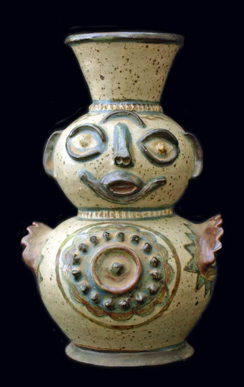
Figure 7
Euriel Mbatha, Figurative vase, 1984, hand-built and glaze-decorated reduction-fired stoneware, 21 x 13 cm, Evangelical Lutheran Church Centre for Art and Craft at Rorke’s Drift, South Africa, Collection Minette Zaaiman, ©Ronnie Watt
The demand for Rorke’s Drift pottery started to wane in the 1990s for several reasons. Dealers and collectors broadened their interest to include the other indigenous potters who had since come to the fore. Problems with the management of the centre and financial constraints detracted from the promotion of the pottery and the recruitment of new potter talent. The quality of the pottery deteriorated after the introduction of commercial clay bodies and glazes and there was little variance in the forms and their decorations. The potters were no longer producing for the local and international collector market but had to produce works that met the expectations and budgets of tourists.
As “tourist art”, the twenty-first century pottery of the ELC Art and Craft Centre at Rorke’s Drift reveals forms and decoration intended to meet buyers’ tastes and budgets. The purposeful re-orientation towards the tourist market to tap into that source of revenue, is not a slur on the history, aesthetics or ethos of the studio. As in the earlier works, the more recent works illustrate an entanglement of the maker and the made, relevant to a new context of time and circumstance.
References
- Garret, IW. (2020). Personal correspondence.
- Gers, W. (2015). Scorched earth: 100 Years of Southern African pottery. Johannesburg: Jacana.
- Hosking, S. (2005). “Tradition and innovation: Rorke's Drift ceramics in the collection of the Durban Art Gallery, KwaZulu-Natal.” Unpublished MA (Fine Arts) dissertation. University of KwaZulu-Natal, Pietermaritzburg.
- Leeb-du Toit, J. (2012). Rorke’s Drift ceramic traditions in context. In J. Stretton (Ed.), All Fired Up: Conversations between storerooms and classrooms (pp. 77-81). Durban: Durban Art Gallery.
- Maggs, T. & Ward, V. (2011). Judith Mkhabela: An inspirational potter from KwaZulu-Natal. Southern African Humanities (23), September, 151–71.
- Motsamayi, MF. (2012). “The Bernstein Collection of Rorke’s Drift ceramics at the University of KwaZulu-Natal: A catalogue raisonné.” Unpublished MA (Art History) dissertation. University of KwaZulu-Natal, Pietermaritzburg.
- Perrill, E. (2008). Indigenous Knowledge Systems (IKS) & Zulu Ceramic Arts: Azolina MaMncube Ngema, One Woman’s Story. Interpreting Ceramics 10, [Sp]. Retrieved from www.interpretingceramics.com/issue010/articles/01.htm.
- Riep, DMM. (2011). “House of the Crocodile: south Sotho art and history in southern Africa.” Unpublished PhD thesis. University of Iowa, Iowa City. Retrieved from https://doi.org/10.17077/etd.0dzbhfvg.
published November 2020
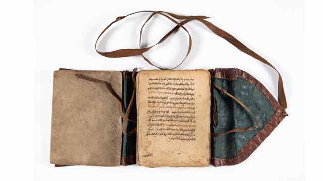
-

The Qur'an is typical for the time and the West African region in general. The idea originated in North Africa such as Morocco and Algeria. But the writing was later, influenced by the Hausa and Mande scholars in West Africa. The texts in this Qur'an are the same as the original from Arabia. But there are differences in the kind of calligraphy found in these Qur'ans and those found in Arabia. One important aspect of these Qur'ans is the calligraphy that comes after the beginning of a new chapter or Surah. Again, the use of red, gold and black colour in writing the Qur'an makes them unique.
Artistic features of the Qur'an
- The leather cover used to protect the Qur'an was designed with some relief using black ink. It shows that leather workers were very important in society. Similar covers are made but in a form of a bag for the Qur'an while others are wooden covers with a leather thong used to hold the wooden covers together with the Quran.
- The Holy Qur’an has Ayahs (words or verses) and Surahs (chapters). There is Bismillah before each Surah. The Qur'an has 114 Surahs or chapters.
- Calligraphy works in some portions of the Qur'an. Calligraphy as the art of beautiful, decorative writing has existed in Islam since the word of God, the Qur'an, began to be written. In West Africa which was known to the Muslim world as Bilad-al-Sudan (land of the blacks), Islamic calligraphy naturally came with Islam. They are just symbolic to honour the holy text.
- The use of three colours in writing such as gold, red and black: This shows how versatile the person was in giving an artistic impression of the Qur'an based on the Kanemi
- A large decorated sign known as shurafah (ennoblement) is written at the end of every fifteen hizb (that is the division of the Qur’an into parts and portions). This is done as a means of honouring the holy text. (See images below.)
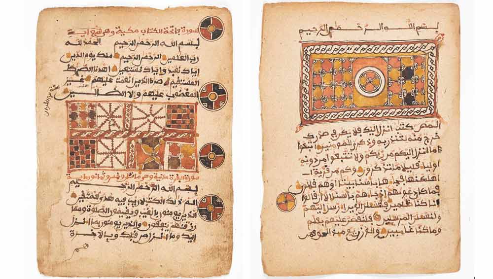
The shurafah or ennoblement at the beginning or end of a chapter (surah) is indicated in the two images. The gold, red and black colours are used to give it a splendid look. (Qur’an. 16th-17th century. Mossi in Togo. Museum Fünf Kontinente Munich. Courtesy Museum Fünf Kontinente. Nr. 20-3-1. https://onlinedatenbank-museum-fuenf-kontinente.de/detail/collection/b77d064f-c603-493c-af03-fc167f739586. [Stand: 08.08.24]. Photo: Nicolai Kaestner)
Material used for the Qur'an
The paper used is brown and a bit hard as compared to today’s paper used for printing. The ink is mixed in a variety of colours. There is jet-black ink that shines. Then there is a colour of black mixed with red and another colour which is neither black nor red. The ink is obtained through the following method. The roots of the desert date tree are collected and burnt into charcoal. This charcoal is then scraped into fine powder. The powder is filtered through a light piece of cloth. Water and gum Arabic are then added and the whole mixture is left to warm up in the sun. The mixture once prepared in this way gives out a very nice smell and its taste is very sweet.
Another method employed to produce the calligrapher's ink is to obtain the chaff of bulrush-millet (Pennisetum Spicotum), chips of the gum-yielding acacia (sieberiono), pods of the plant Egyptian mimosa (Acacia Arobico), slag from smithy and some bits of iron. All these items are then mixed with water. The mixture is filtered and boiled and once it is cooled it becomes ink. If the calligrapher wants a reddish colour or magenta colour imported dye of green or magenta colour is added. This type of ink is meant for the writing of the alphabet only and is always done in pure black. The ink is usually stored in small clay ink pots or small round gourds. The recent time, the ink is kept in small bottles.
What are the general specifics of these early Qur’ans?
The Qur'an is the holy text of the Islamic religion. In Islam, the Qur'an is believed to be the book of God’s words. The holy text remains sacred and unchanged since the beginning of time. The Qur'an is known as the most powerful text in Islam. Islam is a monotheistic faith and people of the religion take great pride in believing in pure monotheism. As followers of the Qur'an, Muslims must believe there is no one else besides Allah because Allah is the only one we worship sincerely, thus he is seen as the most powerful figure in the religion of Islam.
The Arabic text of the holy Qur'an in a book is known as the mus-haf (literally "the pages"). There are special rules that Muslims follow when handling, touching, or reading from the mus-haf. The Quran itself states that only those who are clean and pure should touch the sacred text. It is indeed a Holy Quran, a book well-guarded, which none shall touch but those who are clean... (56:77-79). The Arabic word translated here as "clean" is mutahiroon, a word that is also sometimes translated as "purified."
It was only Muslim believers who are physically cleaned through formal ablutions should touch or handle the pages of the Quran. Again, the Qur'an should be closed and stored in a clean or respectable place. Nothing should be placed on top of it, nor should it ever be placed on the floor or in a bathroom. Furthermore, when copying the Qur'an by hand, it should be legible with good handwriting. If you are reciting it you need to use a clear and beautiful voice. A worn-out copy of the Quran, with broken binding or missing pages, should not be disposed of as ordinary household trash.
Acceptable ways of disposing of a damaged copy of the Quran include wrapping it in cloth and burying it in a deep hole, placing it in flowing water so the ink dissolves, or, as a last resort, burning it so that it is completely consumed. But the translated Qur'an according to some scholars can be handled either by Muslims or non-Muslims.
Uses of the Qur'an
The Qur'an is meant for reading or recitation known in Arabic as taliwa. The recitation of the Qur'an is a highly honoured performance in Islam in which Allah blesses both the reciter and the listener. A person who memorizes the whole Qur'an is given the honorary title of a Hafiz (memorizer of the Qur'an). Again, the reproduction of the written Qur'an is as important as oral recitation. Two early calligraphic styles evolved in the writing of the Qur'an, Kufic (the more boxy, angular, heavy, and formal script) and Naskhi (the more elongated, rounded, cursive script).
The words in the Qur'an are regarded as the words of Allah and, therefore, handled with respect. Muslims also hold the view that some of the words contain mystical properties and as a result, Muslim religious scholars are sometimes consulted by people who have spiritual or psychological problems. They write verses from the Qur'an to ward off such evil spirits or for protection. The Qur'anic verses are often accompanied by diagrams drawn on a board and then washed off and given to the client to drink. As a result, these boards have high values based on the extent they have been used. It is believed that the older the board the more efficient it would be and vice versa.
At the Museum, there is one of the Qur'anic writing wooden boards that have verses from the Quaran on one side and diagrams on the other side. This board is brown and round at the base with a handle in a form of an animal beak. The surface is smooth while some old writing has remained and can be seen (see image below).
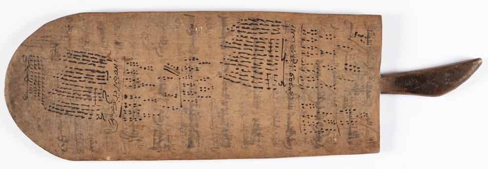
Board (Courtesy Museum Fünf Kontinente. Nr. 9-48. Photo: Nicolai Kaestner)
Where is the Qur’an kept?
Old Qur'ans were usually placed in two wooden covers before the use of leather cases or bags. It was easy to carry it once it was placed either in the wooden covers or in the leather bag. This is very important not to mess up the loose papers of the Qur'an. The two wooden covers after the Qur'an is placed and bound with a thong. There are two holes in the middle edge of the covers where the thong is passed through to bind the two wooden covers with the Qur'an. This method of bounding the Qur'an with wooden covers was practised during the early Abbasid period. Many of the early Abbasid manuscripts were copied into several volumes based on the Kufic script which was fairly heavy and not very dense. The Qur'ans of this early period were bound in wooden covers, structured like a box enclosed on all sides with a movable upper cover that was fastened to the rest of the structure with thongs. In this period, the Quran was arranged into 20 Juz or parts instead of the original 30 Juz during the Umayyad period. These wooden covers can be found at the Museum Fünf Kontinente (Inventar Nr 15-17-148).
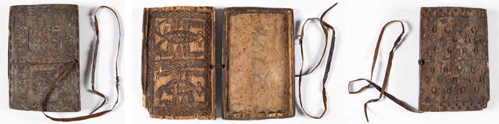
Wooden cover of a Qur'an. Museum Fünf Kontinente. (Courtesy Museum Fünf Kontinente. Nr. 15-17-148. Photo: Nicolai Kaestner)
Appendix
When is it read and how?
It is read during the five daily worship by Muslims, at leisure times, during periods of hardship, during important occasions etc. However, in West Africa, it is read even at funeral celebrations. In many instances, the whole Qur'an is shared among those who can read, or the 30 Juz are shared among 30 people who recite or read it.
Islam in West Africa
Islam as a religion was revealed to the Prophet Mohammed in the 6th century in the Arabian Peninsula. Africa was the first continent into which Islam spread, from the Arabian Peninsula in the early 7th century. By the 10th century, the Berbers of West Africa were converted to Islam by their North African counterparts. It was the Berber Muslims who began to spread Islam into Western Sudan by the end of the 10th century through their trading activities. The Berbers of West Africa also converted some of the Manding-speaking traders to Islam, and they also began spreading it alongside their commercial activities. It was the Mande traders who began to spread Islam into many parts of West Africa through trading activities. The nature of Islam made it easy for the indigenous people to accept it as adherents were able to tolerate, to some extent, some of the local beliefs.
Later, the Hausa from northern Nigeria were also involved in the Kola-nut trade in the mid-15th century. The rulers of many of the Western Sudanese States encouraged the trans-Saharan trade and extended hospitality to both traders and visiting Muslim clerics. The most crucial factor in the diffusion of Islam into many parts of West Africa was the conversion of some of the rulers to Islam. Between the 14th and 16th centuries, many rulers of the Mali and Songhai empires were Muslims and performed the annual Islamic pilgrimages to Mecca to establish trade relationships with the Muslim world. It was during the era of European colonization of West Africa that led to the spread of Christianity among the locals.
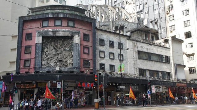
-

State Theatre, originally named Empire Theatre, was opened in 1952. According to interviews with veterans from cultural circles, the Theatre was the “very origin of Hong Kong’s entry to the world of high arts” (South China Morning Post, Jan 11, 2017). It was Hong Kong’s cultural hub and only to be eclipsed by the City Hall that opened four years later in 1962. Located in North Point on Hong Kong Island, it was founded by a Russian-Jewish impresario Harry Odell, a legendary giant in the history of Hong Kong entertainment. Odell had started a film distribution company ‘Harry Oscar Odell’s Commonwealth Enterprises Corporation Ltd.’ in the post-war years and arranged for internationally acclaimed artists to perform in Hong Kong and in the theatre, including the late Taiwanese famous pop singer Teresa Teng, the late British tenor Peter Pears and Katherine Dunham’s Broadway dance company (South China Morning Post, March 2, 2016).
The Theatre was also a popular venue for live shows such as Chinese drama, opera and musical performances. The roof of the auditorium is suspended from external parabolic concrete roof trusses, which are exposed to the public and serves as a prominent feature and trademark of the building. This ingenious design also freed the auditorium from pillars and allowed for flexible internal arrangements. Designed by a Chinese architect S.F. Liu, the Theatre is moreover fronted by a large decorative relief panel with the artwork by renowned Lingnan artist Mui Yu-tin featuring the ancient Chinese tale of ‘The imperial warlord Dong Zhuo and the legendary beauty Diao Chan’. Together with the framed squared architraves and banded windows harmoniously fronting the elevation of the Theatre, there is a distinct Modernist and Art Deco quality to the whole building.In 1959, it was renamed State Theatre, and due to practical reasons the building has since then been converted into a theatre-cum-shopping complex, and a multi-storey block with shops, residential flats and a night club was opened in the adjacent site. The Theatre finally ceased to operate in 1997, and has today changed its use to a billiard centre with removable partitions sealing off the upper deck of the auditorium. The rest of the complex currently consists of a rundown shopping mall, still in function, and small residential flats.
In July 2015, a local property developer started to purchase various property rights within the State Theatre complex, and rumours of demolition and redevelopment of the site started to spread. Eventually, after substantial consolidated public efforts towards the Theatre, it was finally given a Grade 1 historic building status in March 2017. The State Theatre, narrowly escaping demolition, is only the third building after the Bank of China (built 1952) and the City Hall (built 1962) listed as a Grade 1 historic building in Hong Kong that is built after 1950, indicating a flaw in local heritage policy to value modern built heritage.
published January 2020
-
Detail (Photo: Avi Sooful)
The woman who seems to be in a reflective mood, shows a reserved demeanor and sadness. The face is not shaded, maybe to allow the viewer to project themselves more into the work and to give a clearer interpretation of the mood. The work done in ink probably with a filt-tip or a ball pen by use of line technique is effectively rendered in flowing, horizontal, curved and vertical manner to project her character and what she stands for.The good grasp of the leading lines sets the work in time and emotion. It creates a feeling of harmony between the individual and her surroundings and successfully portrays an element of resiliency in the midst of uncertainties. The subject’s predominance intimates to the viewer her feeling of absolute command of her surroundings with her well-coordinated and symmetrically placed figure. The woman communicates beyond the physical likeness and tells the viewer something about her character. There is no reason not to believe that she is protective of her space, bears compassion, at the same time, not afraid to share her feelings, pain, emotions and empathy that connects with others in openness.
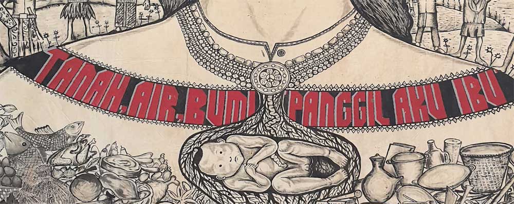
Detail (Photo: Avi Sooful)
The writings written in red color, that reads ”Tanah, air, bumi, panggil, aku ibu” (Indonesian, to be translated as ”land, water, earth, call me mother”) around the neck is glaring and tends to hold the entire work in place. It is a strong message intended to communicate to the viewer on environmental awareness and conservation of natural resources. Perhaps a deliberate attempt by the artists to draw attention to the area, helping to convey thematic ideas that distinguish the woman from the rest of the picture. The necklace has a pendant with a distinct shape of a baby, probably in the womb, is a symbolic reflection of continuity and a cry for protection for all, including the unborn. They too matter! The fine textured background has other people, holding hands in solidarity, a sign of peaceful co-existence and social commentary on issues faced.
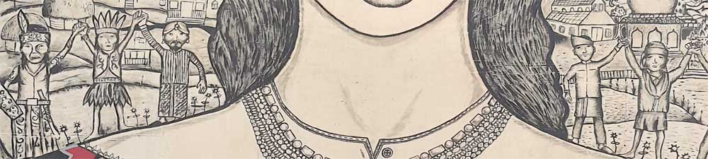
Detail (Photo: Avi Sooful)
The woman is against the destruction of what she holds dearly, and can foresee everyday activities such as fishing destroyed. The trees create balance in the work, while Rhythm and movement run across the canvas with reflection of real life situations, with a natural background that enhances the theme. The work’s portrayal of versatility and fluidity cannot be ignored. The relationships and interactions between the activities in the background and the main figure creates a complex meaning on nature’s importance for the human survival. The creatively rendered items held on both hands form part of the attire, thus creating a visual interest that has symbolic value. The firm, full, protective hands, held close to her heart, are symbolic of the strength of a woman, giving an impression of a mother, caregiver and a nurturer. The woman, in her use of direct gaze says “This is who I am” with her direct expression. She attempts to explain herself, to unravel her character, to invite the viewer to her space even if only for a moment.
The drawing which is both engaging and intriguing, depicts the experience of understanding the environment and its connection to everyday life, “the goodness of mother earth”. It shows unity of purpose whereby different cultures from different continents come together in solidarity to support a common cause as the bottom inscription says: “Masyarakat adat merayakan keberagaman” translated “Indigenous people celebrate diversity”. The work substantially cultivates through an emotional approach the development of a connection of various cultures with nature for a common good. It underscores the importance of art as best suited to examine human existence, and that of earthly surrounding that reflects in everyday experiences and confronts the terror of the universe.
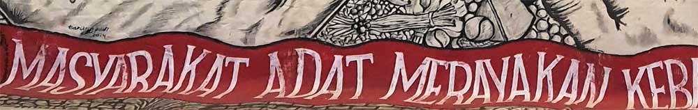
Detail (Photo: Avi Sooful)
Portrayal of how women play important roles in the construction of social and cultural meaning of different societies is evident. The realization of the goodness of Mother Earth is also shown to be a collective responsibility of all. The subject, executed from frontal view, is a woman in deep thought and a suggestion of underlying hidden pain and struggle for social justice that is explicit in various cultures. Her pain in addressing the social evils is captured more in her facial expression. Art as an expression of what it means to be human, is seen in the work that has religious expression, cultural undertones and creative energy. The artwork depicts a mysticism that is fabricated and intertwined in the socio-cultural realm, religious beliefs within different cultures. A view shared by Kumail (2017) who notes that art is a product of society’s members and so also reflects the culture and traditions of that society. Community members help to shape and evolve their culture through their efforts in the production of art. At the point when a society establishes its own particular character, the next generation is born, absorbs this identity, helps to spread it, and educates the world about it.
The black and white drawing portrays collective and creative abilities among different artists, with a show of a sense of togetherness that gives an idea of communal activity. The huge drawing distinctively points to the art of collaboration and understanding between different artists coming together for a common goal, which in turn, bonds them towards a shared future. The artists show their understanding of not only an aesthetic sensibility, but also an astute understanding of the local context, relationships and a co-creation process that engenders collective participation and ownership. The group work is a clear indication that artists do not function in isolation, and can use the visual language to transform a society. The work gives an impression of artists having good time as they work on one project thus creating a unique value of an artistic approach to community life and development. Lee, Lim, Liang, Zainuddin and Alhadad (2020) concur by stating that social issues are often unpacked when artworks are presented for sharing, eliciting further response, offering new opportunities for clarification, and imagination. The process thereby facilitates co-creation and joint decision-making because the finished product is not actually ‘finished’ as it continues to elicit reflection and dialogue. The arts are able to engage community in imaginative ways, creating a space for dialogue on community issues faced and also expanding the horizons of possible solutions.
CONCLUSION
Art is depicted in this work as a means of dealing with uncertainties and envisage of better future. The work expresses emotions that are not necessarily spoken but are powerfully rendered. The subject, overwhelmingly is suggestive of what the innate emotion is. The work brings in the significance of women’s voices and contributions as very critical in advancement of our societies. The artwork shows the diversity of artistic expression and how artists collectively use the visual language to transform a society. Different artists working together in one canvas, bring in different perspectives to properly convey the woman’s story that cuts across different cultures. The collaboration among the artists is a sure way of harnessing strengths and sharing resources through processes that foster mutual respect, shared decision-making and open communication. The artists show their understanding of not only an aesthetic sensibility, but also an astute understanding of the local context and a co-creation process, that gives rise to collective participation and ownership in development of society. Can interdisciplinary approaches to art appreciation widen perspectives of and sensibility to the meaning of art? Can collaborative creation of artworks across many media offer many avenues of self-expression and, is it an effective way in the teaching and learning of art in our institutions? How can art educators work collaboratively and explore the use of multicultural and cross-disciplinary teaching strategies in art education?
REFERENCES
- Kumail M. Almusaly (2017). Painting our conflicts: A thematic analysis study on the role of artists in peacemaking and conflict resolution. Nova Southeastern University. Department of Conflict Resolution Studies. College of Arts, Humanities and Social Sciences.
- Lee, Lim, Liang, Zainuddin and Alhadad (2020). The unique value of the arts in community development: A case study of ArtsWork Collaborative. Institute of Policy Studies, Lee Kuan. Yew School of Public Policy, National University of Singapore & Singapore University of Social Science.
Photo credits
Belinga, R.C. Institute of Fine Art Foumban, University of Dischang, Cameroon & Sooful, A., University of Pretoria, South Africa.
-

Sir David Adjaye puts his hands on the ochre-coloured earth walls of the pavilion while speaking into the microphone: “We have brought that earth here. This is West Africa, this is Ghanaian soil that was applied by Venetian plasterers." 1
Sir David Adjaye, the renowned British architect with Ghanaian roots, based the design of the Ghana Pavilion on the traditional earth buildings of the Gurunsi from Eastern Ghana. The organically merging ochre room sequences evoke a rural Ghana in which the works of the six artists are presented. All of them have Ghanaian roots, but some live and work in England. In an interview, he describes his understanding of architecture as follows: “Art and Architecture create powerful narratives about our lives. Architecture is a story, it’s a way of marking and talking about our aspirations and hopes. So, in what I do, the methodology to every project I make, is to find a narrative [...].”2
This raises the question of the possible interpretations of the pavilion. Out of a multitude of possible architectural quotations and structures that could represent Ghana, it is rural Ghana that was chosen as the structure and backdrop for the artworks. But it is precisely the Gurunsi and their country that were worn down by the European colonial powers in the course of the conquest of West Africa and were finally divided in two at the end of the 19th century by their geographical affiliation to the French and British administrative districts. In this respect, a connection can be drawn to the all-encompassing motto of the exhibition – dealing with the colonial period that ends with the final cry of triumph “Ghana Freedom”.
In addition to this critical, post-colonial discourse, the pavilion also invites an interpretation in which “Africa” is staged as an earthy, dark and rural-tribal space: as much as you feel comfortable inside, the bright light makes you blink when you step out. The odour design by Ibrahim Mahama from the first honeycomb of the pavilion offers a further sensory component to this impression.
While the conscious use of white cube gallery spaces was a struggle for contemporaneity and belonging to the global art discourse,3 Adjaye has decided on a placemaking, in which “Ghanaian identity” is presented as an imaginary picture of origin and authenticity or a rural cut-out reality. In addition, the multiple experiences of London-based artists, such as Akomfrah and Yiadom Boakye, are, thus, transferred back to their native Ghanaian earthworks.
This raises the question of how much of Ghana’s aesthetic construction is to be seen as a concession to the expectations that the global art world places on the artists of African countries. Just as Edward Said has described this for the Orient4, it remains to be examined whether an imagined “Africa” has not just been created in the global art world, whose multiple requirements put artists from the African continent under pressure to master the balancing act between postmodern, conceptual approaches and African side-specificity or even ethnicity in the form of an aesthetic Africa-specific local flavour. Here in the national pavilion of Ghana, the artists are released from this pressure insofar as the pavilion already provides the aesthetic headline or frame which harmonises all the works exhibited there under the imaginary of Ghana/Africa.
While experiencing the pavilion, it becomes clear how difficult it might be for artists from an African country and its diaspora to position themselves within the global art discourse without falling into one of the numerous traps that lurk there, starting with the simplest chain of associations of clichéd fantasies. Close your eyes for a moment and tell me how you imagine the national pavilion of a West African country: earth, elephants, desert, migrants, sunsets, recycling art and a strong smell of spoiled fish?
That the expectancy of local flavour can also be handled quite differently becomes evident if we consider a young generation of Cuban artists, such as Alejandro Campins, who ask provocatively: “Cuban art, what’s that?”5
Expectations can also be met with confrontation in other respects. As a response to the demand for the adjustment to concepts of art influenced by Europe and North America, the artist collective Atis Rezistans from Haiti launched their own biennial with the programmatic title: "What happens when first world art rubs up against third world art? Does it bleed?"6 With this idea of a clash of art cultures, they are more radical in asserting their own (bloody) concept of art. However, this kind of confrontation is not for everyone. (Link)
Enwezor sums up these expectations clearly when he says that artists of African origin, whose contemporaneity he appreciates, must, in any case, comply “to be deeply located within conceptual and postmodernist matrices”.7 As understandable as this may seem from the perspective of Euro-American contemporary art concepts, it is, nevertheless, clear that it is precisely these “matrices” mentioned by Enwezor that exclude other ways of making and understanding art. That they are able to do so is due to their position of power.
The social anthropologist Thomas Fillitz speaks of the contemporary global art world as a world culture, ultimately a global transnational culture, only to conclude that “this global art world continues to be determined by the discourses of Occidental art history and its affiliated ordering systems of classification”.8 We should ask to what extent the concept of art is one of the last (so far only weakly attacked) bastions of an Eurocentric view of the definition of contemporary art and, thus, a kind of colonial survival. The increasing networking of individual art worlds does not necessarily bring about an equal reciprocal exchange.
In this respect, the Venice Biennale could be understood as the palace of this concept of art – a place where its “Urmeter” (standard) of the art is measured and conveyed in a constantly redefined way by mostly European-North American curators and art theorists.
Now the question is how exactly at this place, the Venice Biennale, as a classical place of westernness and whiteness in Ghana’s National Pavilion (even if it comes along in the manner of the buildings of the Gurunsi corrupted by the colonial system), can a confrontation with Ghana’s colonial past succeed, which in the end would have to be continued as a confrontation with existing power structures. But this does not seem to be the intention. It is too much of a joy to finally get the desired recognition from exactly this system and yet, there remains the stale taste of a paternalistic hierarchy in which Ghana is proud to finally present itself to the art world represented in Venice.
Nevertheless, the debut of the Ghana Pavilion is still a real success story, especially when one considers the representation of other African countries at the Biennale di Venezia. Only four countries of the African continent were represented with a national pavilion in the main exhibitions at the 58th Biennial, the others had to be sought out in sometimes often arduous exploratory walks in the urban area. This shows that participation and the positioning at the Biennial is linked to the political structures in the country, with contacts to European decision makers with financial resources but also with clear goals.
From the outset, Ghana’s national pavilion had a clearly defined mission, which, in turn, is inextricably linked to the nation state and its representation. Taiye Selasi9 in his article “Who is afraid of a National Pavilion?”, after critically reviewing the structure of the Venice Biennial, asks: “Is there any good reason […] to exhibit theses six wildly different artists as Ghanaian?” “Yes there is”, we hear the tourism manager Barbara Oteng Gyasi, the curator Nana Oforiatta Ayim, the Ghanaian Ministry of Tourism Art and Culture and the architect David Adjaye calling. They are all working together on the script of a “bigger book” – the positioning of Ghana on the global stage as one of the African countries that can promote itself with its art and culture,10 in short, as a country to be proud of. And so we are not claiming too much when we state that one of the greatest successes of the Ghana Pavilion at this year's Venice Biennale was that it became a place of pride and identification for its many visitors with African decent.
Sergio Linhares, student at the Department of Social and Cultural Anthropology, LMU Munich while conducting research on the perception of the Ghana Pavillon at the Venice Biennale, June 2019. Foto: Natalie GöltenbothFootnotes
1 Sir David Adjaye in an Interview with Al Jazeera Journalist Charlie Angela (www.youtube.com/watch?v=6PM5e8NhGFk)
2 Sir David Adjaye – Building Transformative Narratives www.thehourglass.com/video/david-adjaye/
3 “For Kafou: Haiti, Art and Vodou, the gallery walls remain white and the art works are evenly spaced and lit – as is customary in exhibitions of modern and contemporary art. By sticking to type we sought to minimize the distance between Kafou and more mainstream contemporary art, hoping to create the conditions for fresh encounters between the two” (Farquharson 2013: 10).
4 See Edward Said, Deconstruction of Orientalism.
5 Alejandro Campins in an interview with Natalie Göltenboth in Havana 2018, stressed that he doesn’t want to be seen as a Cuban artist, but as a contemporary artist.
6 Leah Gordon. 2017. Ghetto Biennale – Geto Byenal 2009-2015. Port au Prince. See also: www.ghettobiennale.org
7 Enwezor 1998: 34
8 Flillitz 2007: 116
9 Selasi 2019:40
10 See Nana Oforiatta Ayim’s statement during the opening of the Ghana Pavilion www.youtube.com/watch?v=6PM5e8NhGFk
References
- D. Building Transformative Narratives.
- Retreived 15.10.2020 https://www.thehourglass.com/video/david-adjaye/
- C. (2019). Ghana makes Pavilion debut at 2019 Venice Biennale Art Show. Al Jazeera. Retreived 22.7.2020 from: https://www.youtube.com/watch?v=6PM5e8NhGFk
- Enwezor, O. (1998). Between Localism and Wordliness. Art Journal. Vol 57, No 4. Liminalities: Discussions on the Global and the Local. Pp 32-36.
- Farquharson, A. (Ed.). (2013). Kafou – At the Crossroads. IN: Kafou. Hait, Art and Vodou, pp 8-19. Nottingham Contemporary (catalogue).
- Flillitz, T. (2007). Contemporary Art in Africa. Coevalness in the Global World. IN: Hans Belting and Andrea Buddensieg (Eds.) The Gobal Art World. Audiences, Markets and Museums. Ostfildern. Hatje Cantz. Pp 116-134
- Gordon,L. (2017). Ghetto Biennale – Geto Byenal 2009-2015. (catalogue). No Eraser Publishing
- Said, E. (1978/2003). Orientalism. New York: Penguin Books
- Selasi, T. (2019). Who is afraid of a National Pavilion? IN: Ayim. N.O. (Ed.) Ghana Freedom: Ghana Pavilion at the 58th Biennale di Venezia 2019 (catalogue). Koenig Books. Pp:38-43.
published November 2020