Dear user,
This section of our website forms the heart of the EVC project. Here you find a collection of images of objects from different ‘visual cultures’. Our contributors selected and interpreted them in their respective contexts believing that these objects are particularly important for intercultural understanding across boundaries. Each time a user opens this page, the order in which the objects appear changes. In this way we hope to avoid a hierarchical understanding of the collected objects as their entries continue to be accessed in the long run. The constant changing face of the page also reflects the continuous expansion of the collection. As there are already over more than a hundred entries, users may want to form an overview, or to navigate through the growing collection according to their interests. For this purpose, we offer the following search options:

Filter: This enables you to search for objects according to time, place, keywords, etc. / Free title search: If you know the title of an object, you can find it in the free search field. / Lab: In the lab section, objects from the database are grouped under overarching themes. This is an ongoing project and about to be expanded extensively.
Enjoy exploring our database!
-
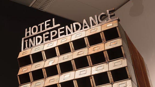
As a miniature, the sculpture Indépendence Tchao (2014) by the Franco-Algerian artist Kader Attia refers to the Hôtel de l'Indépendence in Dakar, Senegal. At the beginning of the1970s – a little over ten years after the independence of the west African country under Lépold Sédar Senghor and a few years after the first Festial Mondial des arts nègres (1966), the hotel was built by Henri Chomette and Roland Depret. Since the end of the 1940s and into the 1980s, the office of the French architects had built governemental and private buildings and others in numerous African countries. Indépendence Tchao was initially created as a site-specific installation on the occasion of the 11th Dakar Bienniale in Senegal. It refers back to the hotel high-rise with the sculpture; the ‘borrowing’ can immediately be recognized, above all by its characteristic brise-soleil façade. Kader Attia used discarded and somewhat rusty inex index boxes, stacked on top of each other. The inventory of the archive itself came from a dissolved administration in Algeria. Only a few kilometres away from the central exhibition venue of Dak'Art, the hotel still forms a striking, decidedly 'modern' architectural antithesis to the flat neo-classical colonial administrative buildings - an aesthetic incunabulum that symbolized the future in its outstanding verticality and modern furnishings. However, the former architectural icon is now empty and in a state of decay. Indépendence Tchao (the title is a reference to the famous song Independence Cha-cha from 1960/Kalle) thus refers both to a utopia that has grown fragile, the bursting of a dream; as well as to the persistence of colonial archiving and (also structural) standardization practices, to old and new (architect) networks in the postcolony.
Attia, Kadar. Pascale, Fernand Pouillon, Alger. 2012
https://inferno-magazine.com/2012/06/23/kader-attia-le-corps-utopique/ [Stand: 28.10.24]
Two further - this time photographic - works by the same artist also address the ambivalences and potentials of modern architectural promises: In the case of the photograph of a woman, seen from behind, surrounded by the mighty arcades of the 200-column courtyard, the connection between the body as the 'first architecture' and the 'built' architecture is central. Not least through the title Pascale, Fernand Pouillon, Alger (2012), it becomes apparent that the person is a transsexual. According to Attia in an interview, the strangeness in one's own body corresponds to the 'architectural' alienation that the inhabitants of the 'Climat de France' who had resettled from the Kasbah in Algier must have felt in the 1950s; the necessity of appropriation, re-territorialisation or even 'becoming at home' applies to both bodies (the human and the architectural).
Attia, Kadar. Déconstruir - Reinventer. 2012
https://slash-paris.com/en/evenements/construire-deconstruire-reconstruire-le-corps-utopique/sous/3669 [Stand: 28.10.24]
A reflection on transgression and imagination also lies at the centre of another photo: Déconstruir - Reinventer (2012) actually shows only the results of a minimal intervention in the standardized construction method, and yet these traces of spatial action are marked here as meaningful in the sense of aesthetic place-making.
-
The Eiffel Tower in Paris, the Sydney Opera House, the Empire State Building in New York – it is not uncommon for innovative and striking buildings to become symbols of the cities they were built in. Architectural landmarks turn into trademarks of their cities. They shape the city’s silhouette and make it recognizeable.
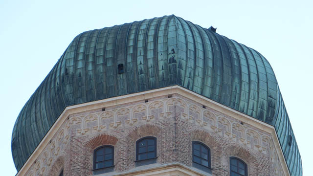
In Munich, a big city in the South of Germany and provincial capital of Bavaria, one of the most striking buildings is the Frauenkirche, which loosely translates to “Church of Our Lady”. It is dedicated to Virgin Mary, the Mother of Jesus Christ, who plays a big role in Munich as she is said to be the patroness of Bavaria. Its 99 meter (324 ft) high twin towers with the characteristic cupola roofs rise high over the inner city (as it is still prohibited to build any higher than them within the inner city). It is - by all means - not the biggest or even most beautiful church of its kind. Neither is its location in the city center, on plane ground and narrowly surrounded by pubs, shops and historic residential houses, spectacular.
 Up to this day, the Frauenkirche is the tallest building in Munich's inner city. View from the Academy of Fine Arts, Munich ©the author
Still: The citizens of Munich have great sympathy with the brick building and identify strongly with it. There are several reasons for that: First of all, about 30% of the people living in Munich identify as roman catholic Christians and therefore have a religious connection to the 500-year-old church that is still in use for almost daily services. But the number of Catholics decreased drastically since 1925, when more than 80% identified as Catholic. In conclusion, there must be other reasons why this church is so important for Munich.
A people’s church
What makes this church indeed quite unique is the way it came to be: Munich didn’t lack any churches at all. In 1468, when the construction of the Frauenkirche was started, only 13,000 people resided there and there already was (and still is) a cathedral in the city center: Saint Peter’s church, or simply: Alter Peter (Old Peter). The Frauenkirche was enormously large compared to the city’s size and can house 20,000 standing people. It was built within only 20 years, which is faster than any other church in Europe at that time. The construction was probably initiated by the citizens – and can therefore be seen as a sign of confidence and emancipation of the common people in regard to the ruling class. (Which makes it all the more tragic that the towers were abused early on as platforms for cannons during the Landshuter Erbfolgekrieg at the beginning of 16th century, a war between two aristocratic families contending for heritage.) As a side note, Germany’s supposedly very first photography, taken in 1839, shows the twin towers of the Munich church.
Muslim towers on a German church?
The two cupola roofs made of oxidized copper give the cathedral its unique and unmistakeable shape. Originally, it was meant to be topped by gothic pinnacles (comparable to those of the cathedral in Cologne, Germany). But at the beginning of 16th century, architectural (and overall artistic) style changed drastically with the advent of the Italian renaissance. Pointed church spires suddenly seemed old-fashioned. And so, for more than 30 years, the two towers of the Frauenkirche remained “headless”.

Bernhard von Breydenbach, Peregrinatio in terram sanctam, 1486, woodcut (Creative Commons); The Temple area, 1920, Library of Congress; Blick auf die Türme der Frauenkirche vom Odeonsplatz aus. 2017, D. Fuchsberger (Creative Commons)
Lukas Rottaler, who was assigned with the construction of the roofs, was long thought to be inspired by Venetian churches, precisely the cathedral Madonna dell’Orto. Indeed, the 14th century Italian church has a high brick tower with a cupola roof that might look a little like the Frauenkirche, if you turn a blind eye. But the origins of the onion-like shape are assumed to reach way back and way farther: Rottaler probably saw a woodcut of Jerusalem, which shows the Dome of the Rock. This dome, erected in the 7th century and therefore the oldest edifice of the Islamic world, marks a place that is equally important for Muslims, Christians and Jews – the dome itself though is Muslim. That didn’t keep Rottaler from taking inspiration from the Dome of the Rock for his building project at a Catholic church in Munich. Hence, the Frauenkirche is shaped by originally “oriental” roof tops.
Moreover, many churches in the rural outskirts of Munich, which were built in the following centuries, are oftentimes crowned by bulbous cupola roofs. This drop shape, which contrasts the villages’ common saddle roofs, now naturally is a part of the landscape as well as of the baroque style.
The devil, a Munich sense of humor, kitsch, tourism and modern lifestyle
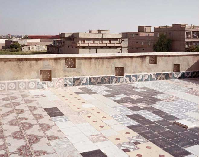
One more reason why the Frauenkirche is so important for the Munich identity are the many legends surrounding it, which are an inherent part of many children's upbringings. The story of the bet between the devil and the constructor of the church, master bricklayer Jörg Ganghofer is widely known among Munich citizens. Ganghofer bet his soul that in this church there would be no windows. As soon as the church was complete, the devil entered the back of the church through the main portal and looked around. Indeed – there were no windows visible! Of course, the church has big windows which let an even stream of light enter the gigantic room. Ganghofer skillfully placed the massive pillars framing the middle section of the nave so that they cover all windows from a certain point of view – and thus won the bet! The devil was outraged and stomped his foot on the ground. This footprint is still visible in floor tiles (image below). In his temper, lucifer left in a rush, which caused a chilly gust of wind that up to this day blows around the church.
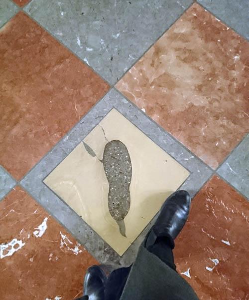
The "Devil's footprint" ©the author
There are many more legends like these surrounding the historical center of Munich. The fact that they are not forgotten but very much part of social life shows how much the people of Munich value their ancient traditions and customs. Also, these legends – and the legend about Jörg Ganghofer is a prime example for that – often showcase a certain sense of humor, mischievousness and boldness. Possibly typically Munich qualities.
The unique twin towers as logo: A design for a Munich tourism agency ©Georg Schatz, schatzdesign.de
Today corporate logos, kitschy souvenirs but also everyday products reference the Frauenkirche’s silhouette. The Munich tourism agency „München Tourismus“ markets the city with the slogan “simply Munich”: approachable, hospitable, relaxed. It’s all about “Genusskultur, Kulturgenuss”, which translates to „culture of enjoyment, enjoyment of culture”. According to the agency, tranquility, love for old things and the so called “Bavarian cosiness” are trademarks of the Munich way of life. Compared to the daringness of Lukas Rottaler and Jörg Ganghofer, the constructors of Munich’s biggest cathedral, these qualities seem rather tame.
References:
- Forschungsgruppe Weltanschauungen in Deutschland: „München: Religionszugehörigkeiten 1925-2018“, https://fowid.de/meldung/muenchen-religionszugehoerigkeiten-1925-2018
- E. Wagner, S. Wimmer, L. Sedghi: Isar-Arabesken – Spuren des Orients in München, München (Alitera), 2013
- https://stadtfuehrung.info/stadtfuehrungen/zeitreise_muenchen_anhand_alter_fotos_und_bilder
- https://www.muenchen.travel/artikel/ueber-uns/die-marke-muenchen
- https://www.historisches-lexikon-bayerns.de/Lexikon/Frauenkirche,_M%C3%BCnchen#Der_Neubau_im_15._Jahrhundert
- https://www.venediginformationen.eu/kirchen/kirchen-in-venedig-teil-3/madonna-dellorto/madonna-dellorto.htm
- https://de.wikipedia.org/wiki/Tempelberg#Islamische_Bebauung:_al-Masdschid_al-Aqsa
- https://de.wikipedia.org/wiki/Frauenkirche_(M%C3%BCnchen)#Bau_der_sp%C3%A4tgotischen_Kirche
published November 2020
-

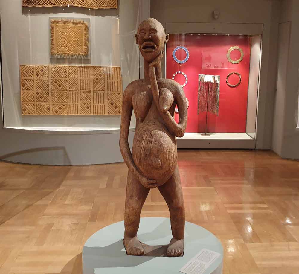
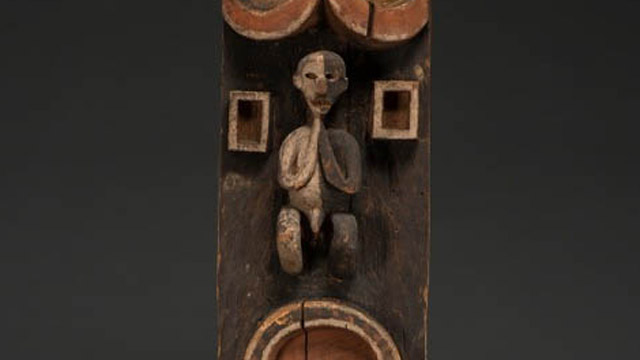
Choosing this object stemmed from my experience I had when my mother passed away in my arms. It was a painful reminder of mum's death when I saw the facial expression of the object. The question was; ‘So after all the painful moments she went through, she could not stay a little longer for me to pamper her before she died’? I therefore want this to be part of the project so that the world would appreciate responsible mothers and motherhood no matter the circumstance.
To be a mother marks female social completion in Africa especially among Ghanaians where motherhood is a pride. Without it, one is not quite an adult, or certainly not an adult who receives full respect. Images of this nature, especially in most communities of Ghana are very significant because of the belief systems of the indigenous people before conversion to Christianity or Islam. Though not so common today as a result of modernization and or Christian and Muslim religion as compared to a decade or two ago, it is still believed that, regardless of the changes in time and technology, these beliefs are still as revered as it used to be.
This work is a wood carving in the round portraying a standing, heavily-pregnant woman with her left hand on the chin; but laid on the left breast with the right-hand providing support beneath her belly. The legs are bent at the knees and she has a painful facial expression.
It is a semi-abstract form of work that is 161cm high which stands firmly on a pedestal. The pose of the figure gives an idea of life and death. The opened wide mouth indicates the pain she must be going through and the hand beneath the belly indicates a support for the weighing pregnancy and support for the unborn child.
The concept behind this piece of work depicts strain and stress most women go through before giving birth and it symbolizes fertility and good health. The elongated breasts suggest the vulnerable state of the woman though it has lots of breast milk to feed the unborn child.
This carved image is a representation of a pregnant woman which signifies life. This figure could be interpreted to represent several ideas in different cultures. However, Costa (2019) opined that, a wooden figure of a nude pregnant woman, which has been present at events, is not the Virgin Mary, but a female figure representing life.
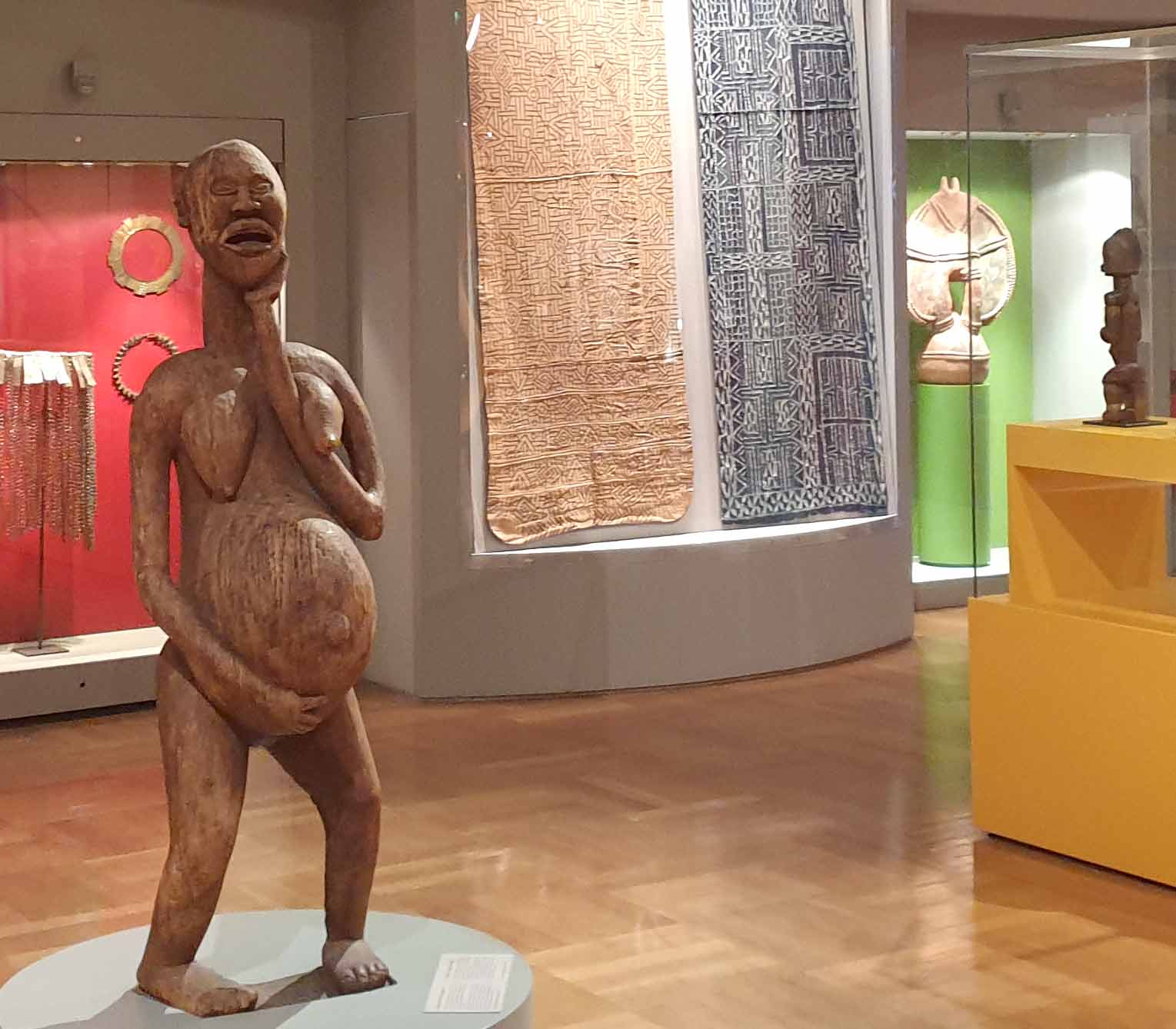
Anonymous artist, first half of the 20th century, wood, 161 cm, Bamileke, Cameroon (Photo Ernst Wagner)
In a similar narration, Costa (2019) said that, a wooden figure of a pregnant woman has been described as both a Marian image and as a traditional indigenous religious symbol of the goddess Pachamama, or Mother Earth. Costa maintained that it is an indigenous woman who represents life; it is a feminine figure and is neither pagan nor sacred but represents life through a woman.
Fundamentally, many indigenous Ghanaians believe that women are like trees that produce and reproduce to sustain life continuity. The woman is also believed to be a fertility goddess. It is with high esteem therefore that Ghanaian women who are capable of giving birth are exalted. As a result, these images or similar ones have been used to ‘serve’, particularly in the Akan and Ewe dominated communities in Ghana. They are seen as religious figures, an expression of health, fertility and grandmother goddesses, and they have over the years served as ritual or symbolic function.
Without children one cannot have a traditional funeral nor become an ancestor. While these issues relate to men as well as women, infertile men can acquire children through cooperative wives who ensure they become pregnant. Unfortunately, per the traditions of Ghana, women do not have that option. In practical terms, wives who are childless may be divorced or have to accept a co-wife. They have no support in their old age, if their husbands die, because that is the duty of children. In extreme cases, they are sometimes ejected from the husband’s house no matter their economic or social status and endure the pity or mockery of family members, friends, and acquaintances.
In most communities in Ghana, it is believed that babies born after a longed-for conception often bear names that reflect their mothers’ anxiety. For example, ‘Brenya’, which literally means “suffer and get” is such a name from the Akan people of Ghana. Also, ‘Nukomeko’, which literally means “I just laugh” is one of the names from the Anlo-Ewe of southern Ghana. These names are among many examples that reflect joy, triumph and satisfaction in a successful delivery after the pain of barrenness. Other names pointedly refer to previous distress and are meant as retorts to those who might have tried to block their pregnancy or had made fun of them. Examples are; ‘Dzitorwoko’, literally means “Only those who have the heart”, Azunukpenawo “It will be shame unto them”, or Nyavedzi “Matter that grieve the heart”. There are other unpleasant names that parents give their children as a mockery in return for what they suffered from either family, and/ or for child mortality. This has been buttressed by Agyekum, when he says that,
“the Akans, like other cultures in West Africa, believe that if a mother suffers constant child mortality, then the reason is that it is the child’s mother in the underworld that does not want the child to stay in the living world. To combat such an unfortunate situation, the parents give the child a weird name (2020: 221).”
For instance, a name such as ‘Asaaseasa’ which literally means ‘the land is finished’ is one of the many names that is used to combat such a situation. This suggests how important pregnancy and childbirth are revered in most communities in Ghana.
So, in the olden days in Ghana, just like in many parts of Africa, girls have received doll-like figures to care for – not as playthings when they are children, but as teenagers preparing for marriage. This sometimes occurs during initiation practices, when their attentiveness may be assessed. In the meantime, the girl would be detached from her family and allowed to stay alone in a small structure. The doll serves as her sole companion, and she “feeds” it, washes and oils it, decorates it with seed beads at neck or hips, and otherwise tends it like the infant she hopes to bear. Most of these dolls are made of females, as their breasts and genitals indicate. The reason being that, female children are especially desirable in order to increase the size of the matrilineage despite the desire that fathers always want their names to remain as a memorial for generations yet to come.
In direct reference to the subject under review, it is suggested that the woman is undergoing some form of pain. But as to whether it is a labour pain, abdominal pain, or crumps, could be a subject of debate depending on individual’s discretion.
It is good that technology has improved greatly over the years and there is a complete education on pregnancy as I try to analyze this piece of artwork. It is therefore necessary to note that these forms of education are very essential and there is no doubt that it will remain useful and also see tremendous improvement with time. Most of these challenges are normal occurrences during adulthood as stated earlier. It is in sharp contrast to what is used to be the case among other people across the globe where such issues are most often associated to evil spirit attacks hence creating fear in prospective mothers and a potential threat to motherhood.
It is relevant to note that womanhood is an undisputable way to ensure life’s continuous existence. In that regard, one can conclude that this artwork is tangible, contextually realistic (though physically semi-abstract) and precise to address the question of whether it communicates, represents or symbolizes the argument in the text. The world today and future will find its educational and cultural relevance as outlined in the context above. It is also appropriate to conclude that the interpretation of the meaning of the object was based not only in the belief systems of Ghanaian communities but transcultural significance and sensitivity to cultural aspects with regards to tolerance and respect as subjects of consideration.
Anonymous artist, first half of the 20th century, wood, 161 cm, Bamileke, Cameroon (Photo Ernst Wagner)
References
- Costa, G. (2019). A communications official for the Amazon synod: https://www.catholicnewsagency.com/news/amazon-synod-final-report-an-instrument-communications-official-says-36081. Retrieved On the 19th March, 2020.
- Agyekum, K. (2006) The Sociolinguistic of Akan Personal Name: http://www.njas.helsinki.fi/pdf-files/vol15num2/agyekum.pdf. Retrieved On the 19th March, 2020.
This article is part of a gallery: Perspectives from Ghana on Museum Objects in Germany, published January 2021
-

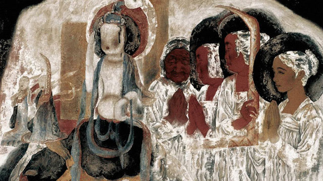
The importance of the series entitled by "Dream of Dunhuang"
The Dunhuang Dreams series from the 1990s marked the emergence of a new opportunity for meticulous figure painting. After his in-depth study of the Dunhuang murals and his many field trips, Yongli Tang drew inspiration, adhered to the core of traditional painting and incorporated the expressive strengths of Western painting to achieve a bold innovation in artistic expression.
In the creating of meticulous figure paintings, there are three crucial ingredients, including the use of line, modeling and coloring.
Modeling and Line
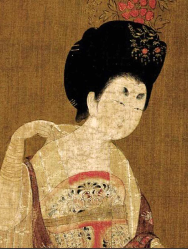
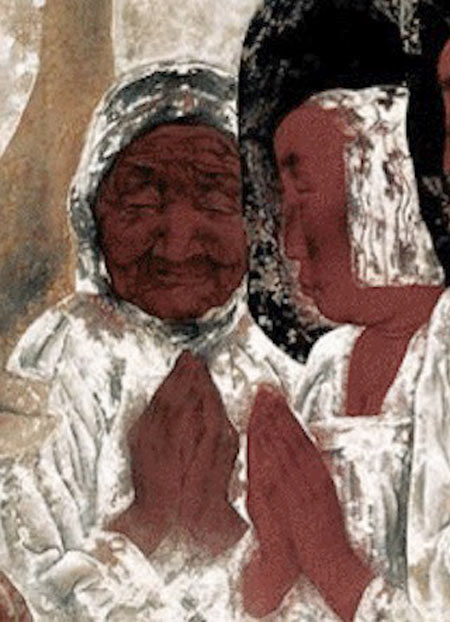
Fig. 2: Part of painting of hairpin ladies in the Tang Dynasty ,Zhou Fang, active late 8th–early 9th century, Ladies Wearing Flowers in Their Hair, handscroll, ink and color on silk, 46 x 180 cm, Liaoning Provincial Museum, Shenyang province, China - copyright: public domain / Wiki Commons.
Fig.3: Part of Memories Of Childhood, Yongli Tang, 1998, Copyright: the artist.Line is the most basic language of Chinese painting, and Chinese painting is concerned with the use of frames and calligraphy and focused on the expression of the structure and rhythm of the object's form, instead of the shading and the in-depth of the object. The series of works is mainly presented by the use of line in the traditional painting while the shading and the linear perspective of the sketch is enlighteningly integrated in the form of relief. The series Dream of Dunhuang innovatively uses linear sketches to portray and shape exaggerated figures, with extreme variations between lines. The spirit of the lines fits the mood created by the picture, while the light and dark faces are integrated to provide a detailed portrayal of the main figure. The juxtaposition of realistic and extracted Dunhuang symbols, modern and ancient figures, temporal and spatial wholeness, and a conceptual form of expression are harmoniously presented in the picture, and the modeling has both traditional cultural roots and modernity.
Coloration
Dunhuang murals have undergone thousands of years of natural and man-made changes in color, with some peeling and mutilating. It looks like a rich, deep, ancient palette that allows the viewer to achieve a secondary aesthetic pleasure. Being in the sacred, quiet rock cave, the soul is purified, and the individual remains in the flow of the years, achieving spiritual transcendence.
In order to pursue the sense of history in Dunhuang murals, Yongli Tang used Black and White as the main colors and interspersed with azurite, stone green, earth red and other traditional colors for embellishment. The color of cooked brown was used to present the figures’ skin. The author could not be confined with the realistic object so that he exaggerated color changes to highlight the subjective emotional orientation of the picture.
In the series of works, virtual dyeing method was innovatively applied to highlight the freehand of the picture. Dyeing high places or low places could be switched freely according to needs, and dyeing is not limited by the line, which presents a vague sense of void. In addition to the traditional color setting techniques, for example, flat painting, rendering and over-dyeing, the author developed the method of shedding. The thick painting and shedding methods set off each other. To be more precise, the author piled up degummed white powder on the base color, then chafed and patted, with some of the white powder falling off naturally. The rest was blended with the base color. The use of large areas of white color does not cause the picture to be chalky. During the painting process the shedding of white color is like the painting of the freehand work. With the controlled brushwork, there are uncontrollable and accidental factors, which gives the mottled and dappled left on the murals by the years. The thickness, light and dark, cold and warm of the white color is presented in an exceptionally subtle way, creating a harmonious and quiet relationship between religious culture and modern beliefs.
Material Texture
Stable social and cultural environment made the painting language of meticulous painting was solely and smoothly developed for quite a long time. In the late 1980s, political, economic and cultural changes leaded to the activation of the painting community and the reflection on tradition. New painting materials were triggered a change in creative thinking.
In his artistic practice, Tang Yongli discovered the texture beauty of the materials and used it in the painting process: mineral colors have a sense of luster, strong covering power, and can be repeatedly modified; the watercolor is rich and delicate; the shedding effect of degummed white powder reproduces the oxidation and wind erosion of mural; the layering of these colors gives the picture a sufficient sense of history and ethereal inspiration. Tang Yongli uses this as an opportunity for a new language, to expand and to strengthen it, as well as to form a new language paradigm. The beauty of the material texture becomes part of the creation and an aspect of the work to be tasted. The author chooses colored silk as the bearer, which is tough and can be used in a variety of techniques such as thick painting, shedding and reverse painting, and pigments such as ink, mineral color, lithopone powder and watercolor are used.
Classical meticulous painting can only do addition, not subtraction. The use of these material techniques breaks the border of the painting on silk. It also allows us to add and subtract freely and to change a single direction to a multi-directional expression (i.e., highly realizing self-consciousness). The expression of the free state of mind, workmanship, painting, color, texture and other factors become a new organism.
Summary
The series of Dunhuang Dream presents the interaction of multiple factors, scholarly artistic interrogation and the creation of diffuse imagery, as well as the attribution and transmission of spirit. It opens artistic horizons for the modern development of meticulous painting. The development of Chinese contemporary art has always been to move forward with the review and inheriting of history. They find visual art resources to reinterpret, redevelop and re-create them with a contemporary view, thinking and aesthetics, which will form a dynamic and growing tradition.
-
Objects from the Global South in early collections of the Global North often lack any information about their specific local context. This is also true for this wooden sculpture made from a single block of hard wood, carved with different figures and forms on two sides and painted with natural colours in red, white and black. It was acquired in 1893 by the “Royal Ethnographic Collection” (Königlich Ethnographische Sammlung) in Munich, today the Museum Fünf Kontinente. No specific information about its geographic origin, its producers, users or use was documented in the inventory book. “Huge four-edged block, 1.80 high made of heavy wood, double-sided carved with human figures and lizards, heavily damaged by termites” is the only information recorded. The wooden block was sent from “Cameroon” (Kamerun) which is therefore documented as its region of origin. It was given to the museum as a present by Max von Stetten, a colonial officer in the German colony.
The post gained a new layer of significance through its inclusion in the almanac “The Blue Rider” (Der Blaue Reiter), one of the most famous and important publications on art in the early 20th century in the Global North. The almanac was edited in 1912 by two artists based in the environs of Munich, Franz Marc and the Russian Wassily Kandinsky. They designed the publication as a starting point for a new epoch of art, rejecting academic art and encouraging new forms of artistic expression. Thus, Kandinsky and Marc included reproductions of different non-canonical art forms, such as artworks from the Middle Ages, folk art, art made by children – and non-Western artworks, in those days called “art of the primitives” (Kunst der Primitiven), among them this sculpted block from Cameroon. In this way, the editors of the almanac aimed to break down the hierarchies between art forms from different times, regions and levels of professional skill, and to expand the canon of art in the Global North.
The editors’ fascination with non-European art had different roots: Wassily Kandinsky was a trained ethnographer and often visited ethnographic museums. Franz Marc, since his visit to the ethnographic museum in Berlin in 1911, especially admired sculptures from Cameroon. Thus Marc included a photograph of this wooden block to illustrate August Macke’s article “The Masks” (Die Masken). Marc captioned the picture simply “Cameroon” (Kamerun), its known geographic origin, and the country whose sculptures he admired.
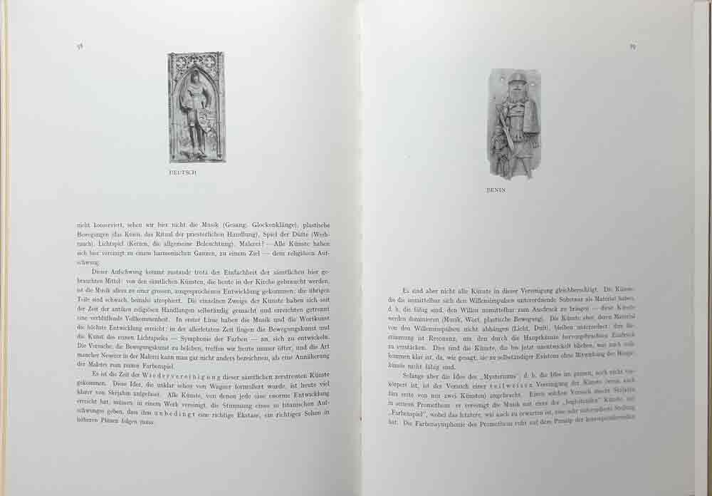
Fig 1: Almanac "Der Blauer Reiter" (page 58-59)
In his article, the artist Macke stressed that for Africans their “idols” (Idole), as he called their sculptures, were a “visible expression of an invisible idea”, “a personification of an abstract term”. He also stressed the equality of the art forms from different times and regions. For example, Macke valued bronze works from the kingdom of Benin, in what is today Nigeria, and other ethnographic works, because they are just as expressive as a grave marker in the cathedral at Frankfurt. To demonstrate this non-hierarchical attitude to art from different regions and times, Marc and Kandinsky placed two photographs side by side on a double page in the almanac – on one side the Gothic figure of a knight, and on the other a bronze plaque showing a soldier from the kingdom of Benin, which also was in the collection of the Munich ethnological museum by then (Fig 1).
The later fame of the almanac, and of its publishers Kandinsky and Marc as artists, led to the wooden sculpture being named “The Blue Rider Post” in the narrative of the museum.
It is significant for global art history dominated by the Global North that, in contrast to our broad knowledge in respect of the European admirers of this object, very little is known about its original local context in the Global South. The state of our knowledge concerning its producer(s), its patron(s), its use, its specific place of origin, the meaning of special forms, colours, figures or gestures sculptured is poor. There are two reasons for this. First, in the Global North, there has been little interest in investigating its local context. Second, it is actually very difficult to carry out such investigations in respect of such badly documented early works in ethnological museums. To unfold these difficulties: the common method used to trace the local context of poorly recorded works is to look for stylistic similarities and ethnological background information concerning comparable objects in other collections or publications. Spending long periods doing fieldwork in the place of origin is too time- and money-consuming, as there are numerous badly recorded objects, especially in the early ethnological collections. Moreover, in the Forest region of East Cameroon, the assumed place of origin, there are numerous small ethnic communities which have been inadequately studied. Thus the poor results of previous research in the Global North are the following: The sculpted post is valued as unique in ethnological and art publications. Only single figures and their gestures show similarities with a few other objects in collections of the Global North. The current suggested origin of this carved work in view of these stylistic similarities is among the Lundu or Mbo people in the Forest region in East Cameroon. There it was probably used in a cult.
A new approach has been made possible by a provenance research project of the Museum Fünf Kontinente, funded by the German Lost Art Foundation and the Bavarian State Ministry for Science and Art. In collaboration with scholars from Cameroun and the presumed source communities, members of the project are exploring the provenance and the local context of this special Cameroonian wooden block, as well as the whole collection from the German colony of Cameroon donated by Max von Stetten to the museum between 1893 and 1896. Hopefully the blank sheet regarding the original context of this wooden block will be filled.
For comparison, also read Patrique deGraft-Yankson's analysis of this object here.
The post in the context of the the repatriation discourse: Link
References
- Eisenhofer, Stefan (2009): Kulthauspfosten (?). In: Bujok, Elke (ed.): Der Blaue Reiter und das Münchner Völkerkundemuseums. Staatliches Museum für Völkerkunde München, Hirmer, München. S. 16-18
- Erling, Katharina (2000): Der Almanach Der Blaue Reiter. In: Hopfengart, Christine (ed.): Der Blaue Reiter. Bremen, Köln. S. 188-240.
- Kecskési, Maria (1999): Skulptierter Holzblock. In: Kecskési, Maria (Hg.): Kunst aus Afrika. Museum für Völkerkunde München. Prestel, Munich, London, New York. S. 116.
- Kecskési, Maria (1982): Zwei beschnitzte Holzblöcke. In: Kecskési, Maria (ed.): Kunst aus dem Alten Afrika. Pinguin, Innsbruck. S. 238-239, 72.
- Macke, August (1912): Die Masken. In: Kandinsky, Wassily/ Marc, Franz: Der Blaue Reiter. Piper, Munich. S. S. 53-59.
- Marc, Franz and Kandinsky, Wassily (eds) (1912): Der Blaue Reiter. Piper. Munich.
published March 2020
-
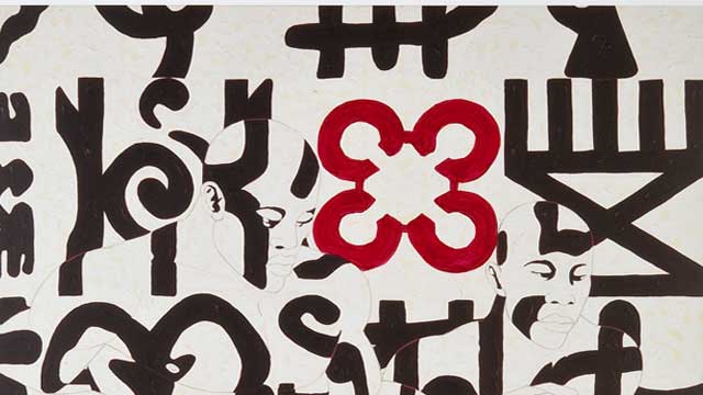
Owusu-Ankomah received his basic training at Ghanatta College of Art in Accra. He was thirty years old when he moved to Bremen in Germany, where he still lives and works today. Characteristic of Owusu-Ankomah is his devotion to painting. For him the act of painting is a kind of highly concentrated ritual in which the medial properties of his body are used as memory store and energy-field generator, rather in the manner of an action artist.
In the course of his life, Owusu-Ankomah's artistic work has passed through several distinct phases. From an iconographic point of view, his early work is strongly influenced by mask and rock painting traditions from all over the African continent. But it was not long before human bodies, especially his own, became the dominant subject of his work. Naked bodies in his paintings, represented in idealized and naturalistic perfection, demonstrate a shameless and very close physicalness and often seem to radiate superhuman energy. Owusu-Ankomah plays here with the beauty of the human male body and with the harmony of flowing, clear lines. These works also evoke a range of ideas inspired by the human body – the body as instrument of the soul and instrument of communication, as a universal symbol and point of intersection between the physical and the metaphysical, and as a means by which the individual constructs himself, presents himself to others, and negotiates the conditions of his belonging to the world.
In his recent works up to 2008, the figures are covered with markings and signs. They originate from a variety of sources: the artist has combined traditional West African symbols, such as adinkra cloth signs, with symbols from China, America and Oceania, well-known popular logos, and symbols of his own invention. The figures melt into the backgound which consists of the same symbols, and thus become almost invisible.
With these symbols and human figures that compete for space on the canvas and for the attention of the viewer, Owusu-Ankomah has created some highly dynamic and truly pulsating compositions. The works also raise questions concerning self-determination and heteronomy, the tension between the wisdom of collective worldviews and individual creativity, and the personal potential of the individual. This is particularly striking in works showing the Sankofa bird. This mythical bird is well known in large parts of West Africa and embodies the concept of "flying forward while looking back". It symbolizes the idea that one should remember the past in order to shape one's life positively in the present and the future. With its name meaning "go back and pick", the bird also stands for one of Owusu-Ankomah's guiding principles: to look for useful traditions in all parts of the world. Accordingly, Owusu-Ankomah borrows a great variety of elements from very different cultures and periods in his works. He is influenced by adinkra symbols, together with their worldviews and philosophies, but also by Michelangelo, video games and designs by popular contemporary graphic artists. In his ambition to unite elements from very different regions in one great human universal, his works become something that overcomes the borders separating individual cultures. In his search for an existential utopia, he creates a symbiosis out of these heterogeneous elements in fantastic and futuristic spaces. Thus he aims at a common "world consciousness" and global visions of the establishment of universally longed-for values, such as harmony, solidarity and non-violence.
An interpretation of an early work by the artist from 1975, "Deer Hunt", can be found under the following link.
-
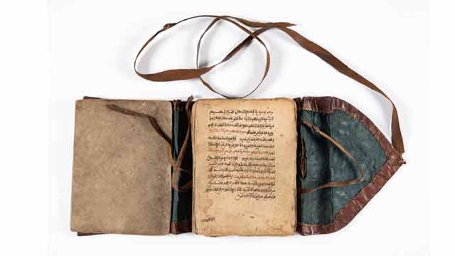
The Qur'an is typical for the time and the West African region in general. The idea originated in North Africa such as Morocco and Algeria. But the writing was later, influenced by the Hausa and Mande scholars in West Africa. The texts in this Qur'an are the same as the original from Arabia. But there are differences in the kind of calligraphy found in these Qur'ans and those found in Arabia. One important aspect of these Qur'ans is the calligraphy that comes after the beginning of a new chapter or Surah. Again, the use of red, gold and black colour in writing the Qur'an makes them unique.
Artistic features of the Qur'an
- The leather cover used to protect the Qur'an was designed with some relief using black ink. It shows that leather workers were very important in society. Similar covers are made but in a form of a bag for the Qur'an while others are wooden covers with a leather thong used to hold the wooden covers together with the Quran.
- The Holy Qur’an has Ayahs (words or verses) and Surahs (chapters). There is Bismillah before each Surah. The Qur'an has 114 Surahs or chapters.
- Calligraphy works in some portions of the Qur'an. Calligraphy as the art of beautiful, decorative writing has existed in Islam since the word of God, the Qur'an, began to be written. In West Africa which was known to the Muslim world as Bilad-al-Sudan (land of the blacks), Islamic calligraphy naturally came with Islam. They are just symbolic to honour the holy text.
- The use of three colours in writing such as gold, red and black: This shows how versatile the person was in giving an artistic impression of the Qur'an based on the Kanemi
- A large decorated sign known as shurafah (ennoblement) is written at the end of every fifteen hizb (that is the division of the Qur’an into parts and portions). This is done as a means of honouring the holy text. (See images below.)
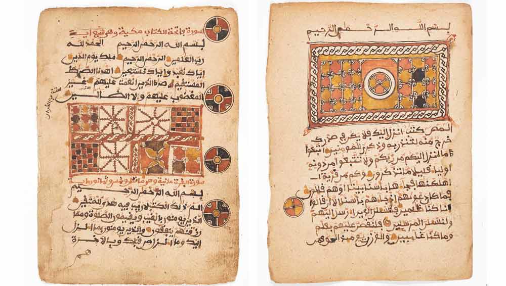
The shurafah or ennoblement at the beginning or end of a chapter (surah) is indicated in the two images. The gold, red and black colours are used to give it a splendid look. (Qur’an. 16th-17th century. Mossi in Togo. Museum Fünf Kontinente Munich. Courtesy Museum Fünf Kontinente. Nr. 20-3-1. https://onlinedatenbank-museum-fuenf-kontinente.de/detail/collection/b77d064f-c603-493c-af03-fc167f739586. [Stand: 08.08.24]. Photo: Nicolai Kaestner)
Material used for the Qur'an
The paper used is brown and a bit hard as compared to today’s paper used for printing. The ink is mixed in a variety of colours. There is jet-black ink that shines. Then there is a colour of black mixed with red and another colour which is neither black nor red. The ink is obtained through the following method. The roots of the desert date tree are collected and burnt into charcoal. This charcoal is then scraped into fine powder. The powder is filtered through a light piece of cloth. Water and gum Arabic are then added and the whole mixture is left to warm up in the sun. The mixture once prepared in this way gives out a very nice smell and its taste is very sweet.
Another method employed to produce the calligrapher's ink is to obtain the chaff of bulrush-millet (Pennisetum Spicotum), chips of the gum-yielding acacia (sieberiono), pods of the plant Egyptian mimosa (Acacia Arobico), slag from smithy and some bits of iron. All these items are then mixed with water. The mixture is filtered and boiled and once it is cooled it becomes ink. If the calligrapher wants a reddish colour or magenta colour imported dye of green or magenta colour is added. This type of ink is meant for the writing of the alphabet only and is always done in pure black. The ink is usually stored in small clay ink pots or small round gourds. The recent time, the ink is kept in small bottles.
What are the general specifics of these early Qur’ans?
The Qur'an is the holy text of the Islamic religion. In Islam, the Qur'an is believed to be the book of God’s words. The holy text remains sacred and unchanged since the beginning of time. The Qur'an is known as the most powerful text in Islam. Islam is a monotheistic faith and people of the religion take great pride in believing in pure monotheism. As followers of the Qur'an, Muslims must believe there is no one else besides Allah because Allah is the only one we worship sincerely, thus he is seen as the most powerful figure in the religion of Islam.
The Arabic text of the holy Qur'an in a book is known as the mus-haf (literally "the pages"). There are special rules that Muslims follow when handling, touching, or reading from the mus-haf. The Quran itself states that only those who are clean and pure should touch the sacred text. It is indeed a Holy Quran, a book well-guarded, which none shall touch but those who are clean... (56:77-79). The Arabic word translated here as "clean" is mutahiroon, a word that is also sometimes translated as "purified."
It was only Muslim believers who are physically cleaned through formal ablutions should touch or handle the pages of the Quran. Again, the Qur'an should be closed and stored in a clean or respectable place. Nothing should be placed on top of it, nor should it ever be placed on the floor or in a bathroom. Furthermore, when copying the Qur'an by hand, it should be legible with good handwriting. If you are reciting it you need to use a clear and beautiful voice. A worn-out copy of the Quran, with broken binding or missing pages, should not be disposed of as ordinary household trash.
Acceptable ways of disposing of a damaged copy of the Quran include wrapping it in cloth and burying it in a deep hole, placing it in flowing water so the ink dissolves, or, as a last resort, burning it so that it is completely consumed. But the translated Qur'an according to some scholars can be handled either by Muslims or non-Muslims.
Uses of the Qur'an
The Qur'an is meant for reading or recitation known in Arabic as taliwa. The recitation of the Qur'an is a highly honoured performance in Islam in which Allah blesses both the reciter and the listener. A person who memorizes the whole Qur'an is given the honorary title of a Hafiz (memorizer of the Qur'an). Again, the reproduction of the written Qur'an is as important as oral recitation. Two early calligraphic styles evolved in the writing of the Qur'an, Kufic (the more boxy, angular, heavy, and formal script) and Naskhi (the more elongated, rounded, cursive script).
The words in the Qur'an are regarded as the words of Allah and, therefore, handled with respect. Muslims also hold the view that some of the words contain mystical properties and as a result, Muslim religious scholars are sometimes consulted by people who have spiritual or psychological problems. They write verses from the Qur'an to ward off such evil spirits or for protection. The Qur'anic verses are often accompanied by diagrams drawn on a board and then washed off and given to the client to drink. As a result, these boards have high values based on the extent they have been used. It is believed that the older the board the more efficient it would be and vice versa.
At the Museum, there is one of the Qur'anic writing wooden boards that have verses from the Quaran on one side and diagrams on the other side. This board is brown and round at the base with a handle in a form of an animal beak. The surface is smooth while some old writing has remained and can be seen (see image below).
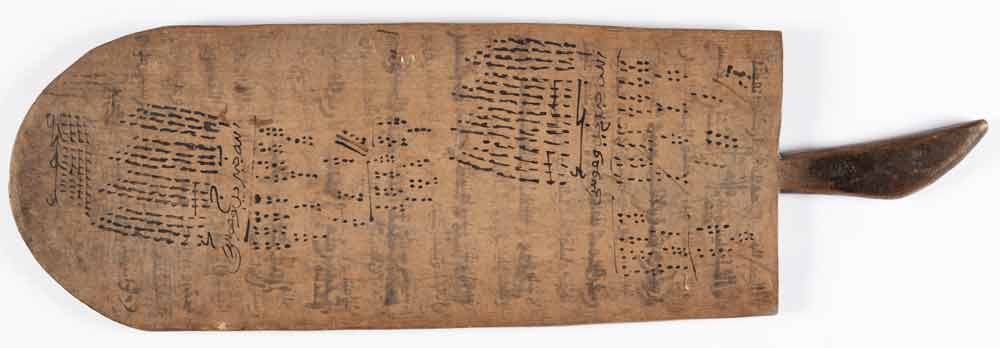
Board (Courtesy Museum Fünf Kontinente. Nr. 9-48. Photo: Nicolai Kaestner)
Where is the Qur’an kept?
Old Qur'ans were usually placed in two wooden covers before the use of leather cases or bags. It was easy to carry it once it was placed either in the wooden covers or in the leather bag. This is very important not to mess up the loose papers of the Qur'an. The two wooden covers after the Qur'an is placed and bound with a thong. There are two holes in the middle edge of the covers where the thong is passed through to bind the two wooden covers with the Qur'an. This method of bounding the Qur'an with wooden covers was practised during the early Abbasid period. Many of the early Abbasid manuscripts were copied into several volumes based on the Kufic script which was fairly heavy and not very dense. The Qur'ans of this early period were bound in wooden covers, structured like a box enclosed on all sides with a movable upper cover that was fastened to the rest of the structure with thongs. In this period, the Quran was arranged into 20 Juz or parts instead of the original 30 Juz during the Umayyad period. These wooden covers can be found at the Museum Fünf Kontinente (Inventar Nr 15-17-148).
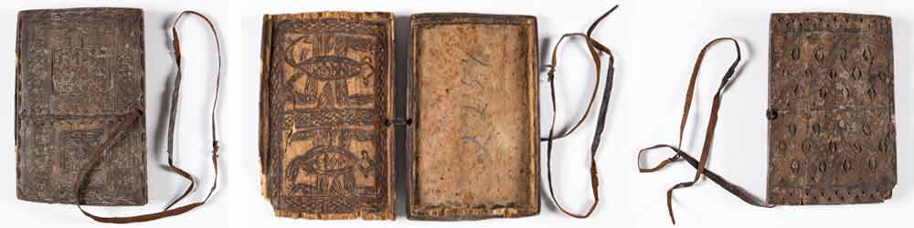
Wooden cover of a Qur'an. Museum Fünf Kontinente. (Courtesy Museum Fünf Kontinente. Nr. 15-17-148. Photo: Nicolai Kaestner)
Appendix
When is it read and how?
It is read during the five daily worship by Muslims, at leisure times, during periods of hardship, during important occasions etc. However, in West Africa, it is read even at funeral celebrations. In many instances, the whole Qur'an is shared among those who can read, or the 30 Juz are shared among 30 people who recite or read it.
Islam in West Africa
Islam as a religion was revealed to the Prophet Mohammed in the 6th century in the Arabian Peninsula. Africa was the first continent into which Islam spread, from the Arabian Peninsula in the early 7th century. By the 10th century, the Berbers of West Africa were converted to Islam by their North African counterparts. It was the Berber Muslims who began to spread Islam into Western Sudan by the end of the 10th century through their trading activities. The Berbers of West Africa also converted some of the Manding-speaking traders to Islam, and they also began spreading it alongside their commercial activities. It was the Mande traders who began to spread Islam into many parts of West Africa through trading activities. The nature of Islam made it easy for the indigenous people to accept it as adherents were able to tolerate, to some extent, some of the local beliefs.
Later, the Hausa from northern Nigeria were also involved in the Kola-nut trade in the mid-15th century. The rulers of many of the Western Sudanese States encouraged the trans-Saharan trade and extended hospitality to both traders and visiting Muslim clerics. The most crucial factor in the diffusion of Islam into many parts of West Africa was the conversion of some of the rulers to Islam. Between the 14th and 16th centuries, many rulers of the Mali and Songhai empires were Muslims and performed the annual Islamic pilgrimages to Mecca to establish trade relationships with the Muslim world. It was during the era of European colonization of West Africa that led to the spread of Christianity among the locals.

-
The photo at hand was shot in Paris in the 1920s. We are looking at a beautiful young woman with very fair skin who seems to have sunken her head on a table as if for a rest, while her left hand is carefully exposing a polished mask made from dark wood. The woman is Kiki de Montparnasse alias Alice Prin (1901 – 1953), Man Ray’s lover, a model for many painters and herself a successful artist. Supposedly, Kiki was central for the myth of the Montparnasse as an artistic enclave in Paris.3 The mask is simply “African” in the eyes of my pupils at first. I want them to learn that we are looking at a portrait mask4 of the Baule people in Ivory Coast. Pupils should also understand that such carved portraits served to honor an important member of a Baule society, a woman in this case. A dancer wearing a similar mask would incorporate the portrayed notable at the occasion of ritual dances, thus celebrating her achievements.5 This specific mask’s features are balanced and dignified, harmonious but not realistic, a point to which I will come back later.
Meanwhile I shall argue that Man Ray’s picture thrives on carefully staged contrasts. The title that has come to stick with this photograph hints not only at black-and-white photography itself, but also at the most obvious contrast, at the White and Black6 skin or surface of the picture’s protagonists. Yet there are further opposites linking the lady and the mask in the picture, namely the opposites of young, ultra-modern and lively versus ageless, “primitive” and inanimate, matt versus shiny, skin versus wood, a seemingly passive woman versus the upright face of the mask, holding versus being kept. The photo historian Wendy Grossman has described how these opposites relate: “Almost as if it were a direct cast, the vertical mask, with its shiny black patina, is a negative mirror image of the reclining model’s ovoid face, echoing her pursed lips, closed eyes, and tautly styled coiffure. Parallel symmetrical shadows extend beneath the two perpendicular forms, coupling face and mask in a shallow and austere space.”7
Clearly, Man Ray has smartly staged the Black and the White. By the time he shot this picture, Man Ray was making a living of object photography in Paris, then the world capital of fashion. It might therefore come as no surprise that this picture made its first appearance in an early print medium dedicated to beauty and fashion, the Vogue magazine. When the issue came out in 1926, everything “exotic” was fashionable in Paris, especially arts from (indirect) African origin, such as Jazz, Josephine Baker or, well, the mask in Man Ray’s photograph.8
Beyond its uncontested fashionable appeal “Noire et Blanche” unveils some deeper, more unsettling meanings, some of which I intend to unfold here. A simple reading is ready at hand if one places this artwork in the historical context of the colonial era. In 1926, the mask’s country of origin belonged to Afrique Occidentale Française. On this backdrop, the dreamy woman holding the mask in Man Ray’s picture appears to be a Freudian slip in the form of a photograph, an unconscious idealization of colonial domination. Are we looking at a personification of the imperial power of France carefully embracing its colony Ivory Coast?9
Next, we could follow a feminist lead towards interpretation. This photograph stages two females, whilst an important third actor of this mise-en-scène is invisible, the male photographer. Through his camera, the male artist is looking at the passive naked woman und at the artefact of a culture that is foreign to him. Obviously, the mask has become passive, too, once removed from its original context. In this reading, Man Ray’s photograph appears as a staging of the desire for submission – the submission of the idealized female and that of the cultural “other”. As viewers, we are lured into this voyeuristic pleasure, unless we take some critical distance.
Following a suggestion of some South African colleagues, we shall now look at this photograph through the lens of the Martinican author Franz Fanon. In his famous psychoanalytical text “Peau noire, masques blancs”, Fanon is pointing at the phenomenon of the essentializing construction of a Black soul (“l’âme noir”).10 Following Fanon, Man Ray’s photograph can be considered one of those efforts by European (and certain African) artists of the classic Modern era to catch hold of an imagined essence of Black culture. This effort needed to objectify Blackness in order to make this construct palpable and acceptable. Arguably, in “Noire et Blanche” the ’black soul’ lies in the hand of a white person and is reduced to an object, the sculpted mask. Furthermore, it could be argued with Fanon that Man Ray used the Blackness of the wooden object, the “noir” that is readily associated with the ‘continent of darkness’ in the collective imagination of Westerners,11 in order to highlight his girl-friend’s Whiteness. We know that contrasts help at intensifying and it is no secret that White is a color (of skin) that Europeans tend to associate with innocence and purity.12 Arguably, this racialized contrast of the “Noire” and the “Blanche” served to celebrate qualities that Man Ray projected onto Kiki de Montparnasse, his partner.
So far, I have tried to make clear that the artwork “Noire et Blanche” is not only a showcase of female attractivity, but that this photo also has a violent dimension to it because it relies on certain colonial mechanisms of distinction. As an art teacher, it is my ambition to make this picture’s ambivalence understandable for my pupils. I know that pupils are more likely to learn if they are allowed to make their own discoveries,13 for instance by exploring ‘real’ scientific data through the Internet. From our classroom, we can access the Metropolitan Museum’s online collections, which include a comparable portrait mask.
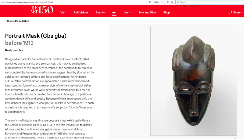
Website of the Metropolitan Museum, New York
Other than the black-and-white photograph by Man Ray, the museum’s more recent color picture unveils the fine shades of brown and red tones that are characteristic of the tropical wood used for Baule masks. Obviously, such masks are not Black in reality. Furthermore, pupils can learn from the provenance info that the Baule mask in the Met’s collection was famous amongst art lovers and artists in Paris and Berlin already before WW1.14 This insight helps to understand why Man Ray might have chosen a similar object for his photograph: artists tend to learn from each other.
As a continuation, I like to encourage my pupils to sum up the museum’s text about the characteristics of portrait masks by the Baule by means of notes in German language. In doing so, the learners realize that these masks are carved according to a complex canon of beauty, that the forehead is high for a reason, namely in order to represent intelligence, that the polished surface signifies good health and that a representation of a person can convey dignity even if the proportions of its face have been exacerbated. This is new to many youngsters, whose frustration with their own efforts at realistic drawing has shaped their preference for artists’ realistic skills. Pupils also learn from the online information that this mask can only be brought to live as part of a performance, thus discovering a problematic aspect of its preservation in a museum.
Coming back to “Noire et Blanche” with this new knowledge, my pupils realize that Man Ray’s photograph is concealing much of the knowledge that is available today. They understand that it is worthwhile to research background information for non-European art, even if this requires leaving their textbooks behind and going an extra mile with their foreign language skills. In the course of the classroom discussion that follows we are wondering why a Baule community would have let go of their precious mask, a question leading to recent restitution debates.15 Furthermore, the teenagers understand that the coquettish presentation of the mask in the hands of a naked European woman might be read as a sign of lacking respect by members of its culture of origin. At this point of the discussion some pupils have experienced a change of perspectives. This experience of assuming a position previously perceived as ‘other’ in the course of a lesson is the very purpose of our engagement with this artwork at school, arguably it is also the purpose of looking at art altogether.
Let me summarize this approach. Comparing Man Ray’s photograph “Noire et Blanche” with the mask from the Metropolitan museum’s collection is a way to scrutinize a canonical picture from a critical perspective without denying the aesthetic appeal of the historic photograph. By way of this lesson I hope to enable changes of perspective and to build sensibility for post-colonial readings of pictures amongst pupils. Taking a bold stance, I shall claim that such lessons are conducive to a more general type of visual competence because I like to think that my pupils’ experience with the implications of this attractive historic picture might encourage them to also critically scrutinize any other picture in the future.
References
[1] For a thorough photo-historical analysis read Wendy A. Grossmans insightful article “Unmasking Man Ray’s Noire et blanche”, American Art, Vol. 20, No. 2 (Summer 2006), pp. 134-47.
[2] For instance, Man Ray is mentioned in the widely used text-book Epochen der Kunst. Von der Moderne zu aktuellen Tendenzen (Hsg: Robert Hahne, Oldenburg Schulbuchverlag GmbH, 2013, S. 150/51). In this book, information about him and the photo “L’Enigne d’Isidore Ducasse” (1920) are featured under the header of „Fotografie und Film im Surrealismus“. It can be argued that „Noir et Blanche“ is surrealistic as well, since it seems to be illustrating Lautréamonts famous phrase “beautiful as the chance meeting on a dissecting table of a sewing machine and an umbrella” (Lautréamont alias Isidore Lucien Ducasse, „Die Gesänge des Maldoror“, 1874.), with Man Ray’s “chance meeting” bringing together a white woman and a wooden mask.
[3] en.wikipedia.org/wiki/Alice_Prin (last accessed on August 26, 2019).
[4] Wendy A. Grossman’s article “Unmasking Man Ray’s Noire et blanche leaves no doubt that the mask in the picture is actually an airport art version of a Baulé mask, by the way (p. 136).
[5] Collection Records of the Metropolitan Museums (Baulé Masken), www.metmuseum.org/art/collection/search/317834 ((last accessed on May 3rd, 2017), also https://www.metmuseum.org/art/collection/search/319512 (last accessed on August 26, 2019)
[6] In this text, I will spell Black and White with capitals in order to highlight the cultural construct of Race.
[7] For the complex history of the title see Wendy A. Grossman, “Unmasking Man Ray’s Noire et blanche”, pp.140.
[8] More about this fashion in en.wikipedia.org/wiki/Josephine_Baker (last accessed on August 26, 2019).
[9] Research on Man Ray does not support this easy hypothesis however. In Wendy A. Grossman’s article from 2006, the origin of the photograph is described as an open-ended artistic process partly sparked by commercial interest, partly by a collaborator, but not by political intention. However, I would like to argue that art works tend to transmit more or less unconscious convictions of their authors and their peers, which makes of artworks valuable witnesses of their times.
[10] Frantz Fanon, “Schwarze Haut, weiße Masken”, translated by Eva Moldenhauer, Wien: Turia + Kant, 2013, p. 14, 147.
[11] Fanon makes this point in “Schwarze Haut, weiße Masken” (2013), p. 158.
[12] “Symbolik der Farben, Formen, Zahlen” in Lexikon der Kunst, Bd. VII. S. 153-154, E.A. Szeemann Verlag, Leipzig 1994.
[13] I am here referring to pupils from eleventh grade of the Bavarian Gymnasium, whom the syllabus obliges to explore aspects of the body in art during half a year.
[14] Collection Records of the Metropolitan Museums (Baule masks), www.metmuseum.org/art/collection/search/317834 ((last accessed on May 3rd, 2017), also https://www.metmuseum.org/art/collection/search/319512 (last accessed on August 26, 2019)
[15] For a thorough introduction to this question read Felwine Sarr’s and Bénédicte Savoy’s “restitution report” commissioned by the French state. http://restitutionreport2018.com/ (last accessed on April 1, 2020).
published April 2020
Sound track / Hörimpuls Man Rays Noire et Blanche, 2018 (Schemmel): Link
-

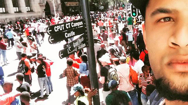
The first selfie selected is taken by a reporter Yuzrig Meyer who reported for the Bushradio blog and is taken in Cape Town with students congregating in the background. The second selected image is taken by Michelle Gumede for the student paper Wits Vuvuzela of a student of the University of Witwatersrand (Johannesburg) enrolling in January 2016, while the university campus is locked down by security guards and police officers after bloody clashes between students and police.
The two selfies should be differentiated as the first image is an actual selfie (image maker and taker are the same person) while the second is an image of a selfie-taker (Image maker differs from image taker). In the first image the direction boards towards CPUT CT (Cape Town University of Technology) campus, and the Damelin building (Private Tertiary Training Institution) in the background are clear indicators of its location. The selfie-taker is visible in the righthand side of the image forming a montage by merging his own image with that of the protestors in the background. The second selfie-taker is wearing a T-Shirt with the slogan #FeesMustFall while making a typical selfie ‘duckface’ with the security guards looking on in the background. She is provoking the security guards by asserting her presence as a protestor in their midst.The two images are selected to engage with the growing selfie scholarship also in the field of image studies. The selfie has predecessors in the rich tradition of artists painting portraits and self-portraits, and then democratized further with the invention of photography as a means of self-expression to include a broader audience and artistry. Until finally in the contemporary moment anyone with a smartphone can create a self-portrait or rather, take a selfie. The two images sampled here showcase the expressive and participatory possibilities of selfies as voicing dissent against the powers that be on the one hand, and on the other hand, showing solidarity with those uprising. As such they form part of a new visual activism that is created via online participation and images.
Interpretation(s):
The selfie is notorious for its insertion of the human subject into the digital sphere that appear ubiquitously on social media platforms. More than any other mediating technology the front-facing smartphone has enabled the human subject to create and capture images of the self as never before. The immediacy and the circulation of selfies are extraordinary.
Depictions of the self is however not a new venture within the history of images, in fact, any reflective surface has sufficed as a tool for creating self-images in the past. Most notably the mirror which shares an intimate relationship and history with self-portraiture and self-representation. The progenitor of the selfie can probably be found in Andy Warhol’s self-portraits taken in photo booths (circa 1964-1965). The selfie that became a substantial category on its own since 2012 and 2013 has elevated self-expression to a new level. The two selfies collected here fall within the insertion of agency within the image, as both photographers insert themselves and their subjects within political events. In the first selfie, the creator can only be seen in the bottom half of the image so that the world behind him becomes visible. In the second selfie, the photographer also puts the selfie-taker on display surrounded by an environment of contestation. The images state: look at me but even more importantly, look over my shoulder at the world behind me. I am a witness to these events, and by sharing this image with you, you are also now becoming complicit and a witness to the event. It is a calling forth of a visible agency.
The attempt of the artists to show his or her witnessing of an event – being there – is also not a new endeavour in the history of images. We are reminded of Jan van Eyck’s (1390-1441) signature and presence left in the small mirror in The Arnolfini Portrait (1434), and later Diego Velázquez’s (1599-1660) mocking presence in the company of royalty in Las Meninas (1656). In all these instances, the artists insert or interject themselves into the picture plane. In the case of Ernst Ludwig Kirchner’s (1880–1938) Self-Portrait as Soldier (1915) we see the artist inserting himself into the horrors of war, with an arm lost (although only imaginary), trying to work through the aftermaths of terror. Granted it is not the same interjection we see as in the case of the selfies but one may argue that something of that tradition of witnessing, making present, announcing an event is already born in these earlier examples from Western art history.
The selfies selected here as part of the #FeesMustFall events testify to being present to a historical event and also to being interpellated into the activities. Interpellation as used by the French Marxist philosopher, Louis Althusser shows the status of the individual as always already being a subject subjugated in terms of power and ideology. The selfie makes that power hegemony visible as the subject negotiates his or her status apropos the powerful and ideological hegemony. There is an awareness in the #FeesMustFall selfie that not only bears witness to the riotous event but also positions the self in a particular participatory and supportive position towards what is happening. As Yuzrig Meyer euphorically states about his participatory #FeesMustFall selfie: “I may not have been around in the apartheid era in freedom struggle as an active participator, but from my experience of today I (sic) may have a better understanding to what it was like to be in the atmosphere of passionate comrades and the feeling of camaraderie in the air.” It is both an act of uncovering how power works, by making power visible, especially in the second selfie, and showing solidarity with the riots by inserting the face of selfie-taker as a montage onto the events in the background, as in the case of the first selfie.
These two selfies could also be interpreted as decolonising images as they disrupt what can be considered to be colonizing powers and assert themselves as agents of what Nicholas Mirzoeff (2011) terms “the right to look” and moreover, asserting “the right to be seen”. These two images refuse to look the other way by pretending nothing is happening. Instead, they inject themselves into the event and confront us as viewers with their message.
Discussion of the interpretations:
If we accept the interpretation that these two selected examples of selfies create a new decolonized agency by inserting themselves as both witness and participant of the #FeesMustFall events, it can be suggested that selfies allow for an expansion to the gamut of the traditional self-portrait. The contribution or democratic expansion of the selfie to the history of self-portraiture can be identified in at least the following three categories, namely skills required, immediacy, and generating a broader reach expanding the self-portrait genre. These three categories are not exhaustive but add to the meanings attributed to the two #FeesMustFall selfies.
In the case of skills, one does not require much talent or particular artistic skill to take a selfie. Where the self-portrait traditionally required set skills in the medium utilized for creating the self-portrait, whether painting, sculpture, etching or photography, the artists had to master basic techniques. This is not the case for producing a selfie. One merely requires a front-facing smartphone and the willingness to share in order to create a selfie. In this respect the selfie can be interpreted as a democratizing tool.
Similarly, whereas the creation of a traditional self-portrait mostly implied time (duration) and space for the artwork to be executed and to be exhibited, the selfie can be immediately uploaded online and shared. The selfie also potentially has a far broader reach than the traditional self-portrait as it can be viewed by hundreds (conservatively estimated) of viewers immediately after being shared. The selfie thus further democratizes the self-portrait by being available instantly and anywhere. The selfie is not bounded by time or place and space, as is the traditional self-portrait – it crafts a tele-presence.
Although, like all images the selfie is a complex and multi-layered occurrence and therefore not all selfies produced can be considered as democratizing and destabilizing agents. What is however accurate for most selfies is that they expand the genre of self-portraiture in significant ways.
published November 2019
-
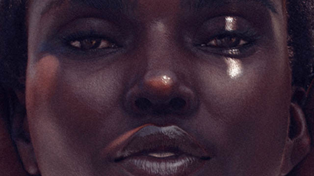
Shudu (2020), a dark-skinned mannequin based on Instagram and other social networks, is a CGI – a 3D computer graphic that, according to its creator Cameron-James Wilson (founder and CEO of the digital modelling agency THE DIIGITALS, https://www.thediigitals.com/), is considered the world's first digital supermodel. With currently more than 218,000 followers (@shudu.gram), she is one of the most booked models and has collaborations with major fashion companies such as Oscar de la Renta or the superstars Tyra Banks and Rihanna (Square, 2018). Yet the genesis of the mannequin and virtual influencer is anything but glamorous: after years as a photographer in the London fashion industry, Wilson retreats to his mother's garden shed in Weymouth, Dorset, and experiments with various design programs on a very cheap gaming computer (Jackson, 2018). In designing Shudu, he was primarily driven by a desire to work freely and “[…] focus on the art rather than the money” (Jackson, 2018). Shudu was intended to be a product of pure creativity, regardless of her later successful integration into the fashion industry (Jackson, 2018).
It takes a closer look to detect the artificiality from the model. Thanks to various digital image editing programs such as Marvelous Designer, CLO and Daz 3D, Wilson deliberately adds small flawed constructions to his very naturalistic-looking mannequin (Jackson, 2018; Square, 2018): scars, hairs, wrinkles and pores provide more liveliness, and thus also more “truthfulness”, if one were to argue in the Benjaminian sense with the aura of the unique or authentic. Basically, this is a completely contrary approach to high-end fashion photography, which classically aims to remove any physical imperfections from the human models until they mutate into doll-like, enraptured beings. This already shows through the external observation of the virtual model that „authenticity“ in the context of digital media and the outdated understanding of reality as distinct from virtuality must be rethought and oppositions in the technical, but also especially in the philosophical-social sense must be questioned.
In order to get closer to this „reality“ or the societal significance of the digital model, it is imperative to look at the controversial debates surrounding the black mannequin. As a white man, Wilson has more often had to face accusations of commercializing black culture, which is legal but equally questionable (Square, 2018). Under the rubric of “cultural appropriation”, “racial expropriation”, “racial capitalism” (Cedric J. Robinson) or “racist plagiarism” (Minh Ha T. Pham), the economic and social exploitation of inferior, marginalized cultures by the dominant white culture is understood as a neo-colonial approach, especially in the broad sector of industry. In this process, social as well as economic value is drawn from an ethnic identity, even generating a “commodity” from it, without thinking about the painful or unpleasant part or even giving minorities a share of the profits. Wilson's implementation of diversity and responsibility in the design process could, according to critics, be read as a clever marketing strategy – after all, “exoticized” phenotypes with very dark skin, high cheekbones and slender, tall stature are currently in vogue (Square, 2018). Particularly problematic in Shudu's design process appears Wilson's inspiration in the “Princess of South Africa Barbie doll”, a special edition Barbie launched in 2002 as one of the “Dolls of the World” collection (Khoabane, 2018). The digital avatar is said to have a similar origin and motivation: born out of the imagination of white companies and creatives to generate commercial success without knowing, considering or including the reality of people of color in the creation and sales process (Square, 2018).
For a holistic understanding of the figure, however, it is also important to analyze it beyond stereotypical argumentation and against the backdrop of its time, its creators and its consumers. As Generation Z and digital natives, the creators and users of virtual influencers are inevitably shaped by the technological changes of everyday life. Their thoughts and actions are primarily derived from the fascination with digital design, which increasingly merges the real and the virtual and makes physically, socially and culturally significant differentiations recede into the background. Wilson seems to use the technical qualities of the digital image, such as its mutability and ubiquity, to draw a picture of a decidedly plural, heterogeneous society in a sustainable way that is independent of time and place. Unlike the dys- and utopian visions of the future of human beings in classical fashion photography or in numerous digital drafts of human beings in art, the figure that exists only virtually seems to be the digital embodiment of a thoroughly real and, above all, present world of life characterized by diversity. With her obvious distancing from the white, male and Western-dominated political and economic mainstream, Shudu offers a template for breaking with the universalism of imperially knitted modernism via strategies of so-called inclusive marketing, which consciously considers diversity in the design process1.
The fact that the digital visualization of a virtual body that stands for diversity, such as Shudu’s, is particularly suitable for creating meanings around the human body, goes back to the postmodern discourse on the epistemology of the body and the knowledge attached to it. As Jay David Bolter recognized in the early 1990s, we as human beings know something by virtue of our bodily and social situations and not through a process of abstract and disinterested thought (Bolter, 1996, 85). Time, place and context thus determine the so-called specific “situated knowledge”, which can never be universal (Haraway, 1988). While in the 1990s transhumanist, biotechnological processes such as genetic engineering and cloning changed the body, in the (post-)digital age a new attention to the physical is evident, which is shifted to the realm of digital image production (Kröner, 2019, 72–73). What becomes evident is that despite the temporary disappearance of the human body through its dissolution into data and bits, it returns on screen in an altered and far more flexible form than the carnal. Posthumanism, following on from the tendencies of postmodernism, then makes use of digital image genesis and manipulation to base the epistemology of the body and its situatedness on the complete rejection of humanism as a Western-determined anthropocentric unity and superiority. These aspects could be relevant precisely to the reading of Shudu. The hierarchical scaling of people according to gender, ethnicity, class, sexual orientation, ability or age, which is characteristic of humanism, is to be fundamentally abandoned with the rejection of the onto-epistemological superiority of the human species (Ferrando, 2008, 438–439). Human interconnection, the symbiotic relationship with the non-human (Haraway, 2008; Wolfe, 2010) and the recognition of so-called “more-than-human geographies”2 are at the forefront of these conceptions of the body (Ferrando, 2008, 438–439). Beyond bias, dualisms and hierarchies, a (re)figuration of the human beyond the human that recognizes nature as well as technology in unity with the human (Haraway, 1985/2016) manifests itself in Shudu as a visual representation of Donna Haraway's cyborg figure. Thus, it seems that it is precisely thanks to the digital-technological “liquidity“ of bodies, techniques and media that Haraway's vision has been fulfilled: with the help of their transnational, hybrid nature, (digital) cyborgs develop subversive strategies of “writing” as a powerful form of political struggle against oppression (Haraway, 1988; Schmitz, 2016). Such “writing” (and thus also speaking) negates the dream of a common language and seemingly homogeneous identity (Haraway, 1988; Schmitz, 2016). In this respect, Shudu, as just such a (digital) cyborg, offers the template for multiple localization –against organic holism, unambiguous classification, and antagonistic dualisms (Schmitz, 2016).3
This then also includes the fact that virtual figures such as Shudu can be designed, consumed, exploited, criticized and thus also shaped on a global level in a socially, gender and culturally largely independent way4 – unlike the real, expensive Barbie dolls. With more images of underrepresented people in global circulation, habitual ways of seeing and thinking can be permanently changed, which could open up opportunities for marginalized groups, also from an economic perspective (Slay, 2018). With his collaborations with numerous representatives of the Black community as well as the Black staff team of hair stylists, make-up artists as well as also real Black models he stages for certain brands alongside Shudu (Square, 2018; Wilson 2021), Wilson intervenes in the working world and the economics of fashion. By consciously involving people of color in the design, styling, marketing, sales and profits of his company, his digital embodiments of elastic otherness impact the direction of a society that seeks to transcend Western-determined barriers – from a variety of perspectives and fields of action.
In this way, the initially small companies that originated in a decidedly plural society seem to be using both simple and advanced digital technologies to draw artificial images of a reality that has always been characterized by diversity and particularisms. The fact that the artificial figure (certainly also for marketing reasons and due to the entertainment industry) enters into a targeted interweaving with the analogue world through the staging with real people in real settings, increases its credibility and thus the social, economic and political influence of digital (human) images. Thus, these creators, who have long since outgrown their infancy and cooperate with big brands, seem to initiate a new “decentralization” of society as well as of the internet because of their politically underpinned messages about inclusion, heterogeneity and equal opportunities – and regardless of their possibly commercially colored motivation. If the dissolution of boundaries between the real and the virtual, nature and the artificial, the human and the non-human (Barron, 2003), and consequently also between art and commerce, responsibility and economy, truth and lies, majority and minority, genres, techniques and media no longer seem socially or scientifically relevant, the question of categorizing people according to skin color or ethnicity will no longer have to arise.
At this point, however, AI should also be taken into account as another possibility of digital “humanization”, which, in contrast to the purely external formation already described, concerns an “inner”, algorithmically controlled shaping of the “human-machine”. The juxtaposition of both types of artificial human creation becomes relevant in the question of the generation of “truth”, which algorithmically controlled AI – unlike the digital images and animations of social diversity mentioned above – in no way answers with the claim to represent the social cross-section. As a neural network, AI processes data such as words and images statically, it calculates the probabilities and says what the majority says and thinks (Simanowski, 2021). However, if the production of AI-generated “human images” is mainly based on large, Western-managed companies and the knowledge infiltrated into the machine is fed from data sets of a white, male majority belonging to the global North – without being externally curated or supervised – every minority and individuality is silenced (Simanowski, 2021): data inclusion on the one hand thus means the exclusion of diverse social structures on the other. This would, as it were, preprogram the return of the “gatekeepers” whose disempowerment through the internet was previously welcomed so enthusiastically (Simanowski, 2021). In this case, it becomes clear that technological progress does not necessarily go hand in hand with social progress (Simanowski, 2021).
Finally, it should be noted that the technologically induced change in the production and perception of the digital (human) image challenges us to critically rethink traditional systems of order. The interweaving with digital technologies seems to make the physical body and its interior comprehensible as an open system intertwined with its environment, whereby entrenched biases and dualisms could be invalidated and a multi-perspective view of society, politics and the economy could unfold. Whether this change in perspective can lead to a more open, even tolerant society in the long term will become clear in connection with further steps in the development and the future horizon of impact of the digital image in art, society, politics and science.
Footnotes
1) Inclusive marketing aims to create a sense of community through “authentic” cultural values inherent in the customer base. In doing so, the personal perspective of the designers, including their prejudices, should be excluded and a design for the whole of society that is as broadly conceived as possible should be created (Saputo, 2019; Maier 2021).
2) The term goes back to the findings of new cultural geography, which is based on theories of human geography. The aim of its research is to question the contemporary relationship of people to the living beings and things in their environment. Among other things, this involves the correlation between the human and the non-human, nature and culture, people and technologies. See most recently the events at the University of Bern on “More-than-human geographies”: https://www.geography.unibe.ch/forschung/sozial__und_kulturgeographie/lehre/seminar_mehr_als_menschliche_geographien/index_ger.html.
3) Against the backdrop of Haraway's theories, this multiplicity of localizations could then be conceived with the complete abandonment of the concept of identity, if relations were created based on choice in conscious coalitions and political kinship via so-called “affinities”. See Haraway 1988; Schmitz, 2016.
4) It is important to remember that although digital images circulate worldwide, they are not equally accessible to everyone in the context of divergent cultures, political, religious and sexual restrictions. Participation in a digital “global culture” is therefore always accompanied by exclusions, interruptions and detours.
References
- Barron, Collin (2003). A strong distinction between humans and non-humans is no longer required for research purposes: A debate between Bruno Latour and Steve Fuller. History of the Human Sciences, 16(2), 77–99.
- Bolter, Jay David (1996). Virtuelle Realität und die Epistemologie des Körpers. Kunstforum International. Die Zukunft des Körpers I, 132(November–January), 85–89.
- Ferrando, Francesca (2018). Transhumanism/Posthumanism. Posthuman Glossary, edited by Rosi Braidotti & Maria Hlavajova, Bloomsbury Academic, 438–439.
- Haraway, Donna J. & Wolfe, Cary (2016). A Cyborg Manifesto. Science, Technology, and Socialist-Feminism in The Late Twentieth Century (1985). Manifestly Haraway (3–90). University of Minnesota Press, http://www.jstor.org/stable/10.5749/j.ctt1b7x5f6.
- Haraway, Donna J. (1988). Situated Knowledges: The Science Question in Feminism and the Privilege of Partial Perspective. Feminist Studies, 14(3), 575–599.
- Harraway, Donna J. (2008). When Species Meet. Posthumanities, Volume 3, edited by Cary Wolfe, University of Minnesota Press.
- Jackson, Lauren Michelle (2018, May 4). Shudu Gram Is a White Man’s Digital Projection of Real-Life Black Womanhood. The New Yorker. https://www.newyorker.com/culture/culture-desk/shudu-gram-is-a-white-mans-digital-projection-of-real-life-black-womanhood.
- Khoabane, Rea (2018, May 20). Meet Shudu: the world’s first digital black supermodel. Sunday Times. https://www.timeslive.co.za/sunday-times/lifestyle/2018-05-19-mock-princess-meet-shudu-the-digital-supermodel-turning-heads/.
- Kröner, Magdalena (2019). Liquid Bodies. Ein subjektiver Überblick. Kunstforum International. Digital. Virtuell. Posthuman? Neue Körper in der Kunst 265(January–February), 72–115.
- Maier, Birgit (2021, February 5). Du bist nicht alle – warum inklusives Design uns all angeht und wie es gelingen kann. OnlineMarketing.de. https://onlinemarketing.de/marketing-tools/inklusives-design-geht-alle-an-wie-es-gelingt.
- Saputo, Sandy (2019, June). How Rihanna’s Fenty Beauty delivered „Beauty for All” – and a wake-up call to the industry. Think with Google. https://www.thinkwithgoogle.com/future-of-marketing/management-and-culture/diversity-and-inclusion/-fenty-beauty-inclusive-advertising/.
- Schmitz, Sigrid (2016, July 12). Cyborgs, situiertes Wissen und das Chthulucene. Donna Haraway und dreißig Jahre politischer (Natur-)wissenschaft. Soziopolis. https://www.soziopolis.de/cyborgs-situiertes-wissen-und-das-chthulucene.html.
- Simanowski, Roberto (2021, April 28). Identitätspolitik und künstliche Intelligenz. Es droht eine Tyrannei der Mehrheit (audio article). Deutschlandfunk Kultur. Politisches Feuilleton, ARD-Audiothek. https://podcast-mp3.dradio.de/podcast/2021/04/28/kuenstliche_intelligenz_identitaetspolitik_und_die_drk_20210428_0720_58851d76.mp3.
- Slay, Nick (2018, April 9). Twitter Reacts to Virtual Influencers: Is Shudu Art or Appropriation? The Source. https://thesource.com/2018/04/09/twitter-reacts-to-virtual-influencers-is-shudu-art-or-appropriation/.
- Square, Jonathan (2018, March 27). Is Instagram’s Newest Sensation Just Another Example of Cultural Appropriation? Fashionista. https://fashionista.com/2018/03/computer-generated-models-cultural-appropriation.
- THE DIIGITALS. Shudu.Gram. Instagram. https://www.instagram.com/shudu.gram/?hl=de.
- Wilson, Cameron-James (2021, April 30). How Digital Models are Changing the Face of Fashion. Lecture at the Online Conference „The Digital Image – Social Dimensions, Political Perspectives and Economic Constraints“, Ludwig Maximilian University of Munich, April 28–30, 2021.
- Wolfe, Carry (2010). What Is Posthumanism? University of Minnesota Press.
-
The "reunification" is the result of a synergy of different societies willing to modify their way of life and the principles of their socio-cultural organization in order to cope with the vicissitudes of the colonial yoke. These societies are based in the Great West, the Coastline, the Southern Forest, the East and Lake Tchad, the regions that mark Cameroon’s geography. Each of these regions is home to a large number of ethnic groups such as the Bamileké, the Bamun, the Akunakuna, the Babungu, the Duala,the Beti, the Fang, the Peul, the Kirdi, the Fula, the Dourou, the Fali, etc. The date of May 20th, 1972 marks Cameroon’s passage from Federal Republic to United Republic by referendum. This date can be said to be the culmination of the political commitment initiated on the 1st of October 1961 with the reunification. Based on this commitment of 1961, Cameroon continued the construction of a unitary state and the consolidation of national unity encompassing the country's entire population. It can be argued that this unitary state was the only way to protect Cameroon’s sovereignty after Independence and to implement projects of prosperity. In President Ahidjo’s words of 1961: "It is together that we will make our Cameroon finally returned to the borders of our ancestors1, a modern country where it will be good to live in a climate of freedom, fraternity and prosperity." (Mveng 1985, 262).
The Reunification Monument is situated on "Plateau Atemengue", Yaoundé’s political and administrative centre. In this area, the colonial administration had placed institutions for education and administration that were crucial constituents of the new country: the National Assembly, the school of administration and the judiciary, the military headquarters, the Leclerc High School and the University of Yaoundé, to only name a few examples. The large boulevard initially used for the parades commemorating the celebration of the feast of national unity is located on this plateau as well. Placed on top of the city, amongst the republic’s essential institutions the Reunification Monument was obviously meant to become a reminder of the sense of unity amongst the initiatives engaging the Cameroonian republic.
The ensemble of the Reunification Monument consists of an architectural structure and a sculpture. According to Noé Tonye2, its shape emerged from sketches selected by the public authorities following a national and international competition on the theme of reunification launched by the Cameroonian Head of State. However, the identity of the authors of this monument suggests that they might also have been directly commissioned because they appeared qualified for the job due to their previous projects. These artists are Gédéon Mpando and Engelbert Mveng with his “Art Nègre Workshop”, who both used to receive public commissioned in Yaoundé at that time. Annette Schemmel (2015, 66) points out with regard to Engelbert Mveng: “As the author of Cameroon’s first national history, a contributor to ABBIA {Revue}, and a politician in Ahidjo’s service, Mveng enjoyed an excellent reputation among Cameroon’s élites. His social standing also led to secular commissions ». A third partner was the French architect Armand Salomon. His involvement in the realisation of this monument is due to his proximity to the French government, who probably recommended him to the Cameroonian government, according to Noé Tonye.
Although the conditions of the commission are somewhat obscure, Engelbert Mveng is known to be the designer of the spiral tower as well as of the representation of the cultural areas of the new state, while Gédéon Mpando created the monumental statue and Armand Salomon was in charge of the realization of the spiral-shaped building. Arguably, the teaming up of three professionals had a symbolic dimension because building a "merged" nation called for the commitment of society as a whole. Such a vast project required an explosion of research and creative initiatives towards a culture of common values driven by teaching and education. The involvement of several Cameroonian artists and a French architect in the design and the construction of this monument reflects the political will to involve different parts of society and to create mechanisms that are operational and serving the interests of national unity.
The architectural component of the monument to the reunification of Yaoundé has the appearance of a giant cone built of concrete. This cone consists of two spirals which describe a sinusoidal movement, and which unite on the top. The basis of this architecture is a circular structure and each spiral is a form of concrete slide made up of stairs to the top. A high column in the centre and four parallel pillars support the structure as a whole. For these four main pillars, the Art Nègre Workshop has designed reliefs showcasing characteristics of lifestyles, landscapes, cultural and artistic elements from the North, South, East and West of Cameroon. In a similar style, the team has pictured school scenes, construction scenes of modern architecture, scenes of farming, etc. for the decoration of the underground part of the building, thus celebrating the process of transformation and development of both society and land.
Images: ASSAKO ASSAKO Paul-Henri. 2014. L’art au Cameroun du XXe au début du XXIe siècle : étude des expressions sculpturales en milieu urbain, thèse présentée et soutenue en vue de l’obtention d’un doctorat/Ph.D en Histoire de l’Art, UY1-Cameroun, p. 571.
Details of a pillar cladding representing the diversity in the Cameroonian regions: the cone-shaped architecture and an initiation mask of the Kounga from Cameroon’s West; the abbia motifs and the hunting scene characteristic of the forests on the South Cameroonian plateau and finally the fishing scene which recall the Littoral region.3
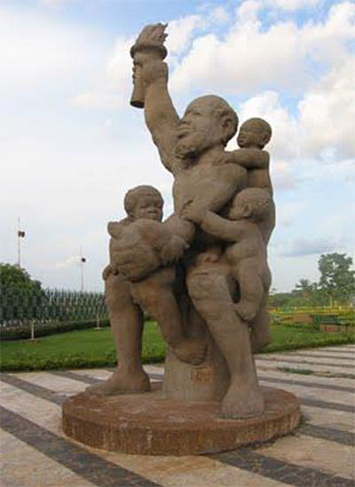
Engelbert Mveng and Atelier Arts Nègre (design, decoration in relief on the architectural structure), Armand Salomon (architecture), Mpando Gédéon (sculpture), 1973 -1976, concrete, H: 7m, Atemengue Plateau Yaoundé, Cameroon. Photo: Paul-Henri Souvenir ASSAKO ASSAKO
The sculpture by Gédéon Mpando that is situated in front of the spiral architecture reinforces the idea of a united nation as a foundation for development, fulfilment and prosperity in its own way. The artist has personified the nation in a figurative sculpture. The composition represents a stocky colossus (53 tons, height of 7m) in a seated posture of great stability. He holds a torch in his right arm while his left hand serves to support the four children who are clutched to him. The children’s visible efforts to climb up the colossus make for a strong vertical tension, echoing the cone-shaped architecture in the background. Mpando’s sculpture reveals a kind of serenity. Its strong expressiveness is due to a harmonious play of masses and volumes in the treatment of forms. Both artists’ contributions translate a vision of the nation that is both poetic and critical and as such essential to the development of a national society. Both components of the monument incorporate the idea of belonging to a nation that is united and hence display the most universal property that an image can acquire in such a context: its true ontological significance (H. Belting, 2004).
Let us come back to the relevance of this monument’s imagery. The inhabitants of the territory of Cameroon have inherited a common history of colonization. This history has forged socio-cultural, symbolic, emotional and political ties between ethnic groups. E. Renam speaks of these ties as the “fusion of populations” (1882). These links constitute the raw material of the national collective memory. It can be argued that it is worthwhile to overcome the obstacles to the consolidation of this nation due to the socio-cultural sedimentation of these ties. Disappointment with the promises of prosperity have resulted in calls to return to regional autonomy, be it in the form of a federal state or in the form of secession. Precaution needs to be preserved, however, because deconstructing the Cameroonian Republic constituted in the 1960s and 70s would imply calling into question the historical heritage, that Cameroon was born from the colonial system developed at the African conference in Berlin in 1884. The consequence would be the restoration of a precolonial environment. Instead, it seems more productive to critically analyse the historical stakes in favour of the development of today’s society.
Overview report on the current political situation in Cameroon (April 2021) - in German: Link https://www.bpb.de/internationales/weltweit/innerstaatliche-konflikte/327306/kamerun?pk_campaign=nl2021-04-07&pk_kwd=327306
References
- RENAN Ernest. “Qu’est-ce qu’une nation?” Bulletin de l’Association Scientifique de France. 26 March 1882.
- BELTING Hans. 2004. Pour une anthropologie des images, Ed. Gallimard
- BAHOKEN J.C. et ATANGANA Engelbert. 1975. La politique culturelle en République unie du Cameroun. Éditions Les Presses de l’Unesco.
- MVENG Engelbert. 1985., Histoire du Cameroun. tom 2. Yaoundé. Ed. CEPER.
- CHEICKH ANTA DIOP. 1079. nations nègres et culture, Ed. Présence Africaine
- SCHEMMEL ANNETTE. 2015. Visual arts in Cameroon - A Genealogy of Non-formal Training 1976-2014, Langaa Research & Publishing CIG, Mankon.
- ASSAKO ASSAKO Paul-Henri.2014. L’art au Cameroun du XXe au début du XXIe siècle: étude des expressions sculpturales en milieu urbain, thèse présentée et soutenue en vue de l’obtention d’un doctorat/Ph.D en Histoire de l’Art. UY1-Cameroun. p. 571.
- https://www.osidimbea.cm/collectivites/centre/monument-reunification/
- www.mbogliaa.com
Footnotes
1) The expression ‘boundaries of ancestors’ refers primarily to the idea of traditional cultural heritage and its appropriation for planning the prosperity of the nation.
2) https://www.osidimbea.cm/collectivites/centre/monument-reunification/
3) Source of images: ASSAKO ASSAKO Paul-Henri. 2014. L’art au Cameroun du XXe au début du XXIe siècle : étude des expressions sculpturales en milieu urbain, thèse présentée et soutenue en vue de l’obtention d’un doctorat/Ph.D en Histoire de l’Art, UY1-Cameroun, p. 571
published February 2021
-
Photography as a technique and medium is questioning terminologies of truth and representation as part of the respective and genuinely inscribed authorship of technically enhanced images since the emergence of early photographic works. Through rapid and widespread distribution in print media, photographic images soon became part of the formulation and documentation of shared visual memory in the Global North.
Walker Evans, the father of documentary as one web article states1, heavily influenced the style of modern (not meaning contemporary) photography. His importance as a photographer is essentially based on the photographs he took during the Great Depression in the mid-1930s. The photographic portraits of the three US-american tenant families Fields, Borroughs and Tingle became icons of photographic history and formed the general visual representation of this era by telling a story (in the sense of a historical narrative) at the same time. They, thinking like Evans here, document the person(a), meaning identity or essence, of white, hardworking americans, who, even if they struggle, keep up their integrity. They represent a socio-cultural construct in insisting on their ability of showing, ordering and defining the truth. As Evans' images focus on an American underclass of the time, they show the author of those pictures as part of their own reality.
How does the search for some kind of visual truth in modern photographic images take place when they seem to not look for their own but for the other, which is imagined to be foreign to them and mostly without history? What kind of approach to questions about history and its narratives are they able to re-present as a consequence?
Concepts of history are always entities that reveal just as much about their architects as they do about the evidence integrated into them, which represents constructors and construct at the same time. History rarely appears in a singular form, is never neutral and always normative. It is part of its own discourses, demands order as well as testimony. In documentary terms, the latter (the testimony) should legitimize science and itself. Ordering structures and strategies, on the other hand, require places and institutions where they can appear. Gazes at the end of which historical narratives should stand are seldom equal. Often they are one-sided observations, classifying and hegemonic, alienated observations through mimetic imitation or intended othering. The basis of such categorical observations are specific techniques and strategies for appropriation; results are metaphors or emanations of one's own reality.
The exhibition African Negro Art, which was on view at the Museum of Modern Art New York in 1935, marks the beginning of the institutionalized exhibiting of so-called (or labeled) African Art at major western art museums. Finally coining a terminology often still used today, 603 African objects were exhibited at the MoMA from March 18 to May 19 1935. Walker Evans was commissioned to (literally) photographically document the objects on display.
The resulting images are characterized by long exposure times, which made it possible to guide a light source around the respective object while the cameras aperture was open. The illumination is therefore mostly impressively uniform and soft, strong shadows and the constitution of space are avoided. The images have a hyperfractual clarity.2 The surface of a Bamende facemask for example is uniformly illuminated, the exposure emphasizes the contrasting structures and lines, the formal essence, if one would say so. The actual plasticity of multidimensional objects becomes obvious in a second shot. The face of the same mask appears to be pointedly drawn forward, the slight inclination of a wide comb only becomes apparent here. It almost does not seem to be the same object, so much does the first shot focus on the ornamental surface. Evans used an 8 x 10 medium format camera, the resolution of the images is correspondingly high. The partly dramatic concentration on the object causes a visual monumentalization of things, image sections are often claustrophobic narrow - the objects are not relationally representative, but are re-presented according to their formal characteristics, analyzed by the photographer. This leads to major shifts in reception. One of Evan's most effective images is the photograph of a Pende pendant made of ivory. As if from nowhere, from a timeless, deep black and imponderable background, the masks face emerges from the pictorial ground. The focus lies on the middle plane of its face, which is photographed using a large aperture. Therefore initial blurring starts as early as behind the eyes of the carved face. It is shot from above, not from the front. Viewers are urged to imagine the figure's body (which is neither present nor laid out in the object). Deep shadows let the face appear threatening and alien, framed by sharp contrasts; it becomes clear that the intention of the mask cannot be a good one. Evans gives the alien object an equally alien character, an emotion. The mask stands pars per toto for the ‘other’, the uncanny.
Evans photographs were published quite widely. Starting with the exhibitions catalogue they were used in several publications by the exhibitions curator James Johnson Sweeney focusing on the ‘Art’ of Africa in a broader even more general and art historical perspective: the generalizing and educative intention of pictures and text is already foreshadowed in the somewhat holistic titles of such publications - African Folktales and Sculpture (1952) and African Sculpture (1964) for example . Entering the realm of the photobook as a medium Evans photographic images become part of semi-theatrical stagings, some kind of educational character is inscribed into them, especially looking at the close interlacing of text and pictorial object. Ultimately, the message and content of the images are only self-referential. Evans photographs where often published together with the ones of Elitot Elisofon, who amongst other jobs worked as a photojournalist for the LIFE magazine. In The Sculpture of Africa (1958) Elisofon makes use of the photobook as a medium very consciously. For example he uses different photographic views on the same sculptural object to kind of animate it in a cinematic way, using the photobook as an idea to look at three-dimensional properties of things in a two-dimensional way, making the accessible by flipping through the book. Both photographers work is often labeled as having a documentary style, both seem to have a special interest in photographically analyzing pictorial qualities of the surface and materiality of the things they look at. Exposure and contrasts (re)produce haptic qualities and material properties of the things being looked at through the camera quasi argumentatively, based only in the photographic objects themselves.
Methodically, Walker Evans' documentarism is ergo characterized by the omission of object-immanent information and the simultaneous genesis of image-immanent content. His pictures do not allow conclusions to be drawn about the size, material and context of the representations; a mostly unspecific monochrome background detaches the objects from the contexts inscribed into them. The photographer repeats aspects of the aesthetically and content-wise neutral display of a modern art exhibition and demands that the images focus on purely formal aspects. The representations do not permit any connection between the signifiers in terms of content. In narrow sections, each object is presented in a very specific view - the photographic images ergo become significant only in a Western canonical art context, shifted to its terminology and histories.
Stylistically, Evans' photographs can be described as clean and cerebral.3 The images of African objects are clean (and timeless) in the sense that they are cleansed of any context; they are cerebral in the sense that they are open to new inscriptions and attributions. The highly specific aesthetics of the images serve to conceal and reveal equally specific information at the same time, they are markers of tailored representations4 which are more the presentation of Evans as the author of those images and his techniques to strip pictorial objects from their original terminology and historical narratives, than the representation in the sense of a documentation of the object shown.
1) https://www.theguardian.com/artanddesign/gallery/2015/dec/03/walker-evans-documentary-photography-great-depression-gallery; 15. Juli 2020.
2) Cf. Campany, David: Walker Evans. The magazine work, Göttingen 2014, S. 52.
3) Cf. Strother, Z.S.: Looking for Africa in Carl Einstein’s Negerplastik, in: african arts Winter 2013 VOL. 46, No. 4, S. 8 – 21, S. 8.
4) Cf. Webb, Virginia-Lee: Perfect Documents. Walker Evans and African Art 1935, New York 2000, S. 15.
References
- Eliot Elisofon: The Sculpture of Africa (text: Ralph Linton, William B. Fagg), New York 1978
- James Johnson Sweeney, Paul Radin (eds.): African Folktales and Sculpture, New York 1964
- Kerstin Pinther, Niklas Wolf (eds.): Photobook Africa. Tracing Stories and Imagery, München 2020
-
Based on the Ghanaian interpretation, it quickly became clear that certain ideological or political positions are immediately connotated with the respective image selection. These in turn are linked to historical and social experiences, which Winkler (2021) recently elaborated on the basis of the history of Germany. In our case, the West German, left-liberal intellectual milieu is of particular interest, since all the German project partners involved in the discussion can probably be assigned to such a milieu. "In the 1970s, the view prevailed among liberal and left-wing intellectuals in former West German, which objectively was not a nation state, did well to see itself as a >post-national democracy<. In the 1980s, this led to the conviction among many that the time of the nation state had passed and that Europe only had a future as a post-national union. [...] The self-destruction of one's own nation-state [in Nazi Germany - author's note] led to the conclusion that the nation-state as such had outlived its usefulness, and the term ‘national’ was equated with nationalist. [...] In Germany the idea that the nations had to merge into a European republic found a broader public echo." (Winkler 2020 p.186)
For art educators, the majority of whom probably feel committed to this idea of Germany as a post-national democracy, the question of a current symbolisation of national unity[1] is therefore obsolete. It cannot therefore be relevant to art education. A consensus in the German team on how at least the general topic could be addressed could be reached by the proposal to deal with the topic on another level, and to use Hans Haacke's installation "Der Bevölkerung" (2000, courtyard of the German parliament in Berlin) to deal with the topic of "national unity" in a contemporary art lesson.
Hans Haacke (*1936) is a German-American artist who has lived and worked in New York since 1965 and whose conceptually influenced works primarily address art-political processes.
Figure 2: View into the courtyard of the Reichstag building. © Hans Haacke / VG Bild-Kunst.Haacke's installation "Der Bevölkerung" is located in a courtyard of the Reichstag building. This architectural context is part of the work. The building was constructed at the end of the 19th century, during the Second German Empire (1871-1918). In neo-baroque style, it paid homage to the national pomp under emperor Wilhelm II. Damaged by fire in 1933, it was further damaged during the Second World War. Located directly on the Wall to East Berlin, the dome was finally blown up in 1954. In reunified Germany, however, a new function was found for the building. Rebuilt according to plans by Norman Foster in the 1990s, it now serves the German parliament, the Bundestag.
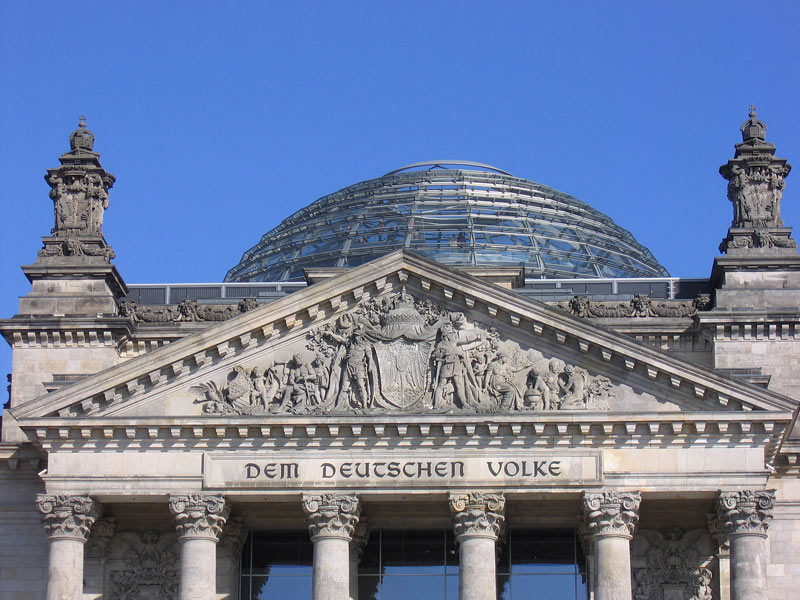
Figure 3: View of the façade of the Reichstag building with the inscription "Dem Deutschen Volke" © Hans Haacke / VG Bild-Kunst.
Hans Haacke built a 21 x 7 metre rectangular, flat wooden enclosure in this building. He then asked the MPs to gradually fill it with soil from their respective home regions. In the middle of the box, the inscription "Der Bevölkerung" (To the People / Population) can be read, in white letters illuminated from the inside. The typeface corresponds to the inscription "Dem Deutschen Volke" (To the German People / Nation), which has been on the outside of the building's west portal since 1916.[2] According to the initiator, the invitation to bring soil from the constituencies is valid as long as members are democratically elected to the German parliament. A webcam, belonging to the installation (www.bundestag.de), takes a picture every day at 2 p.m. and 8 p.m. and thus allows a take a look at the development of the project since 2000 and at the current situation.
Figure 4: An MP distributes the home soil from his constituency in Haacke's installation. © Hans Haacke / VG Bild-Kunst
When Haacke proposed to install this large-scale installation in the new parliament in 1999, ten years after German reunification, it triggered a heated public discussion. Many MPs found the words "Der Bevölkerung" (To the People / Population), which appeared to be a dedication, inappropriate and provocative. Haacke was deliberately alluding to the older inscription "Dem deutschen Volke" (To the German People / Nation) on the outer façade. In contrast to this, he used the term " Bevölkerung - population" to refer to all the inhabitants of Germany, including people who do not have German citizenship and live here. According to his own statement, Haacke was inspired by Bertolt Brecht when deciding on the lettering. Brecht had written in 1935 in exile that whoever said population instead of people would avoid many lies (Brecht 1935). Haacke is obviously also concerned with the question of how words can and should be used in the context of a national parliament to designate the basis of this democratically elected representation of the people/population. Does the term "Volk" fit, a traditional, conventional but loaded and perhaps not at all accurate term? Or would be the term "population" better, a word that sounds unfamiliar and strange at first, but perhaps makes more sense. The discussion intended on such questions is part of Haacke's work.
Similar discussions were triggered by the idea of having MPs bring home soil. For many, this was reminiscent of the National Socialist blood-and-soil ideology. Or they criticised it as "kitsch" because of the well-intentioned but overused symbolism. Obviously, the work here plays with this iconographic tradition (“Heimaterde”), but reinterprets it just as it reinterprets the lettering. At the same time, the installation is constantly changing as a result - both through the ever-changing soil and through the growth of the plants over the course of the year.
Figure 5: Screenshot of the project's website https://derbevoelkerung.de
© Hans Haacke / VG Bild-Kunst.
The installation is thus in constant dialogue with the population designated in the inscription, tries to involve the MPs and responds as a living piece of nature to the stone surroundings of the parliament building. The work of art is thus never fully completed. Haacke's art project was particularly controversial in parliament; only by a narrow majority did the MPs finally vote in favour of the realisation of the artwork in 2000 after a specially scheduled debate in the Bundestag. The entire debate is documented on the project's website - as another part of the work (Bundestagsdeabtte 2021).
[1] I.e. a "small German" solution after 1990 and with shifted borders after 1945.
[2] It was designed by the Art Nouveau artist Peter Behrens.
References
- Brecht 1935: Bertolt Brecht. Five Difficulties in Writing the Truth. www.literaturwelt.com/werke/brecht/wahrheit.html (13.10.2021)
- Bundestagsdeabtte 2021: https://derbevoelkerung.de/bundestagsdebatte/
- Kaernbach 2011: Andreas Kaernbach. Projekt „DER BEVÖLKERUNG“ im Reichstagsgebäude. https://www.bundestag.de/besuche/kunst/kuenstler/haacke/haacke-198996 (13.10.2021)
- Winkler 2020: Heinrich August Winkler. Wie wir werden, was wir sind - Eine kurze Geschichte der Deutschen. Munich (Beck)
- Winkler 2021: Heinrich August Winkler. Das widerspruchsvolle Erbe des Otto von Bismarck. In: FAZ of 18.1.2021, p.6
-
Akan definition of Colour
The Akan people have no precise terminologies that assign a ‘name’ which interprets into the meaning of colour the way it is understood in English and other languages. In other words, most of the answers to the question ‘what is colour’ makes very little meaning to a pure Akan speaker whose understanding of colour transcends a scientific definition. In spite of several efforts by contemporary linguists to subject the Akan concept of colour to nomenclatural consideration, the traditional Akan people continue to describe hues by their relationship with similar colours in nature.
Consequently, terminologies in Akan, which are associated with the word colour, are likely to describe what a hue looks like in association with the natural (or in few occasions, manmade environment) or how a hue makes one feel, think or behave. Among numerous attempts at coming up with an Akan word for ‘colour’, the ones many respondents settled on were yɛbea, subea, su, husuo, ahusuo and bↄbea. These words, which mean almost the same in Akan, literally describe the nature, quality or, probably more precisely, the physical look/appearance of something. By implication therefore, the terminologies deduced are more general and their usage go beyond the description of just the colour of an object or a situation under discussion.
Colour names
Colour names among the Akan people, are often given directly after identifiable objects within the known environment. Therefore, names given to colour in Akan have the tendency of affecting the perception, understanding and accurate adaptation of colour among the Akan people. Name, like colour itself, has strong cultural significance. Therefore, names that are understood in one’s language are likely to have better cultural associations and connections with their people than those that sound foreign.
In this regard, many Akan people are of the opinion that all efforts at identifying names for colours should continue with the culture of associating colours with the local names of known objects among the Akan people. For instance, if there are names such as ahabanmon (fresh leaves) for green and akokↄ serade/akokↄ aŋoa (chicken fat) for yellow, there could also be names like ahabanfunu/ahatawfun (dead leaves) for brown, gyafrane/gyanframa (fire flames) for orange, gon/dwene (gray hair) for gray, etc.
Number of colours
The number of colours recognizable by a traditional Akan are as many as those identifiable and describable in nature. As already indicated however, recognized Akan colour names and their identification are mostly in relation to those discernible in nature, for which reason their descriptions are broadly categorized. The following are colours available in the traditional Akan language.
- Kↄkↄↄ (Red)
To a very large extent, kↄkↄↄ, the sound of the name of the colour identified as red among the Akan people is more onomatopoeic than semantical in interpretation. Kↄↄ, the root word, visualizes the sensation of the word glow. Therefore, kↄkↄↄ actually connotes more to complexion with a strong bright colour. It commands an ambience of hot brightness, usually with scorching visual sensation, rather than a simple colour name. For this reason, kↄkↄↄ is attributable to all objects that emit some warmth in their visual ascriptions. Therefore, whilst a ripe pepper is described as kↄkↄↄ, ripe mangos, ripe oranges, glittering gold, burning coal, sunny skies, flames, the skin of a ‘white man’, etc. are all kↄkↄↄ as well. In the Akan colour scheme therefore, colours that could be placed analogous to kↄkↄↄ include red, orange, pink, wine and the like.
- Fitaa/Fufuw (White)
Fitaa/fufuw is white, light, plain, spotless, clean, neat, pure, holy, untainted and incorrupt. Moreover, fitaa/fufuw is always associated with cleanliness, purity, victory and spirituality. It denotates white coruscating brightness, visual spotlessness and stainlessness. No matter where it is spotted, the associated psychological and spiritual experience comes naturally, and this is inert in almost every Akan.
Another dimension of fitaa/fufuw is its direct association with light especially when it reflects bright objects to shine. When something shines or sparkles, or hyerɛn as it would be said in Akan, it is associated with brightness and for that matter, white. In this regard, a spark that would be lighted by any colour to give the feeling of brightness will be described as fitaa. The reason is that the psychological feeling of brightness invoked by the sensation is more important than its sensation on the eye.
- Tuntum
One does not need to understand the word tuntum to be able to link its semantic association with weight and heaviness. Tuntum connotes darkness and visual weight, and technically expressed, all the cool colours on the colour wheel fall within the brackets of colours in this category. Tuntum connotes darkness, gloom and heaviness. To the Akan, tuntum does not only stand for black, but absence of lightness, brightness, shine, glow, gaiety, happiness and sparkle. This is not to say that tuntum in Akan spells doom. Just as with all the other colours, the reason behind its application is what matters most to the Akan. For instance, the weight and compactness of tuntum also represents unmatched strength and solidity. Hence, expressions such as black power, black beauty, black star and black magic connote the highest levels or degrees attainable in the referent condition. So, whereas tuntum or dark colours are used in the expression of gloomy and moody conditions or situations, they are also considered for situations that require seriousness, formality, deep concentration, calmness, maturity, strength and energy. Again, in its association with darkness and stillness of dark night, tuntum also connotes calmness, coolness, rest, quietness and serenity.
The Akan Colour Chart: Minimal Dimensions of the Akan Colour Scheme
The following charts present attempts at putting into perspective the minimal dimensions of the Akan colour scheme. As mentioned earlier, everything that qualifies to be described as colour from the Akan point of view can be located within three broad colour spectra—tuntum (dark), fitaa (white) and kↄkↄↄ/memen (glow, spark, shine), and they physically manifest in the shades and tints of black, white and red. Right from this point, it is clear that colour among the Akan is perceived more with feelings than just the light sensation it emits. Therefore, the colours that fall under these themes are believed to share more physiological, psychological and spiritual feelings than aesthetical feelings (even though that is an integral part). In the examples of natural colours associated with colour names in the tables below therefore, the ripeness of pepper, mango, orange and tomatoes are all described as kↄↄ, establishing the overall feeling they evoke. The greenness of a virgin forest, the darkness of rain clouds, the depth of the deep blue seas and the blackness of charcoal are all tumm or tuntum (dark) because of their command of psychological heaviness. The bright skies, the white flower, cotton and the grey hair are all fitaa because they share similar ambience and invoke the same feeling of brightness. It should also be noted that apart from tuntum (black, dark), fufuw/fitaa (white, bright) and kↄkↄↄ/memen (red, glow, spark, shine), none of the associated colours has a name in Akan. What they have, at best, could be discussed as descriptions. In other words, colours of objects are rather described than named.
The following charts illustrate colour from the perspective of the participants in this study, as illustrated by the author:
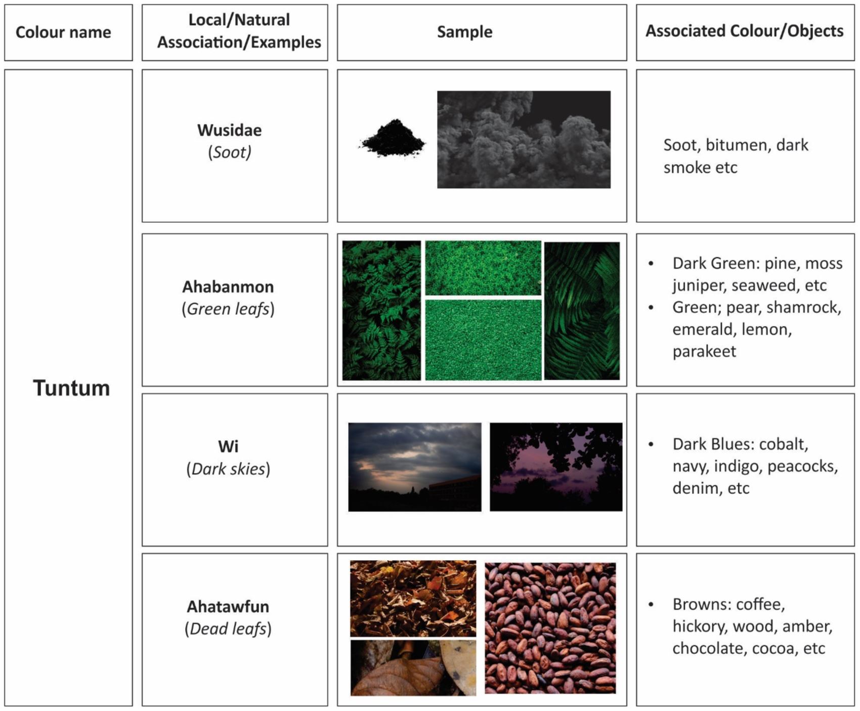
Figure 1: Akan colour category Tuntum and its natural colour associations. (Photo: the author)
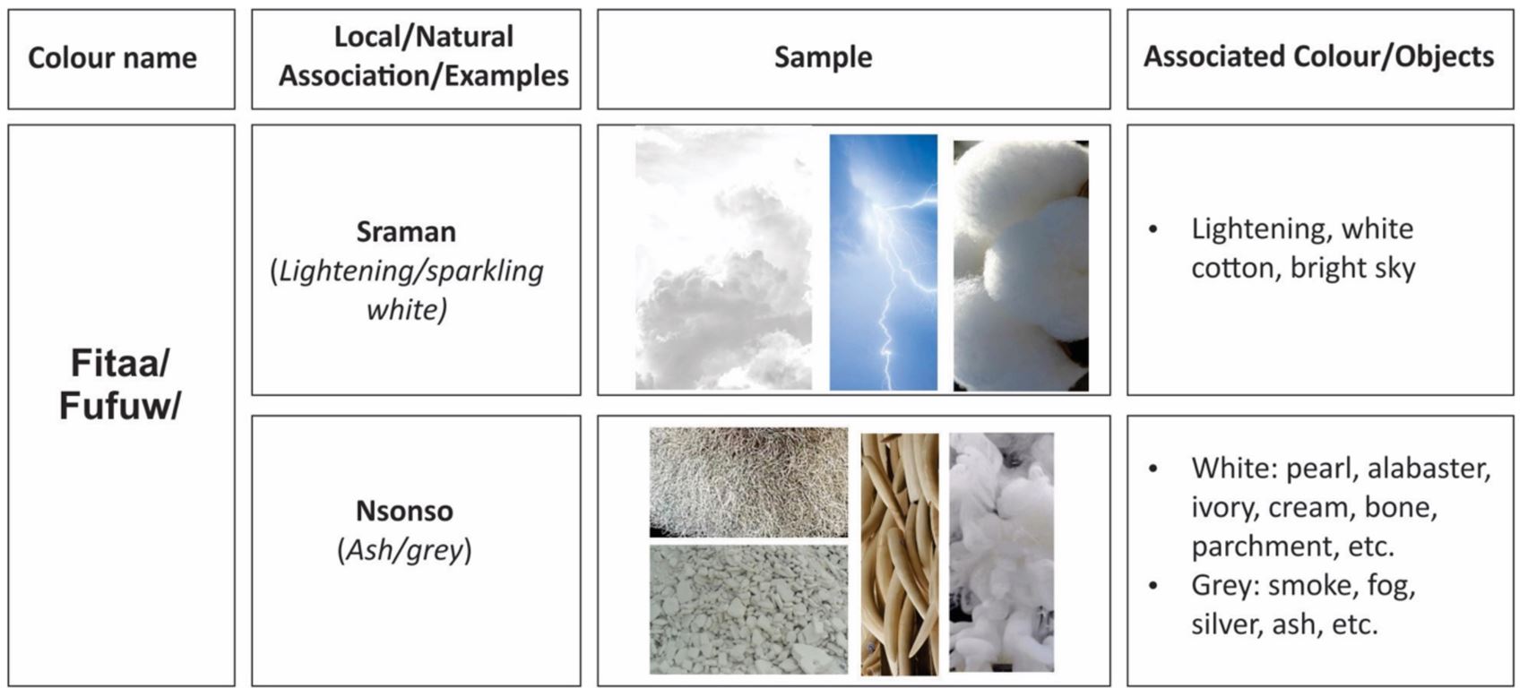
Figure 2: Akan colour category Fitaa/Fufuw and its natural colour associations. (Photo: the author)
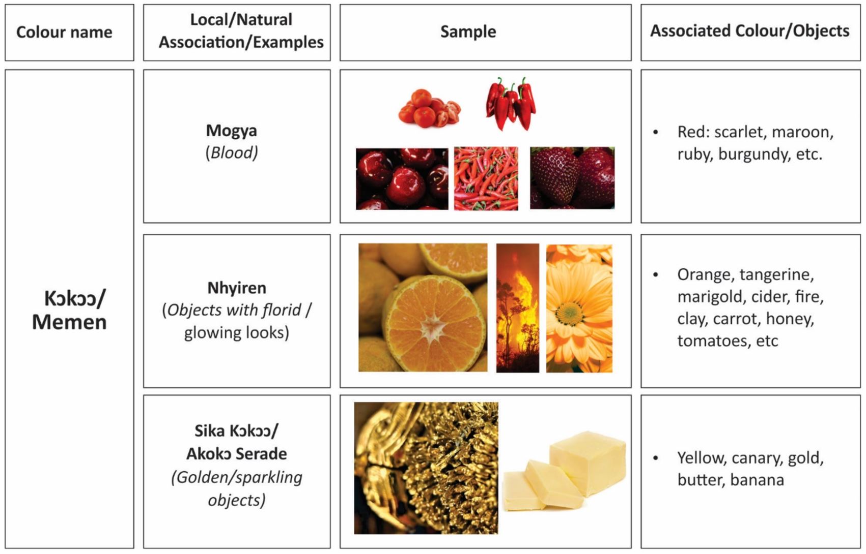
Figure 3: Akan colour category Kↄkↄↄ/Memen and its natural colour associations. (Photo: the author)
From the above charts, the Akan colour reference scheme above was derived.
Implications for design and design education
Cultural understanding of colour from Akan perspectives will direct how colours could be appropriately grouped under the appropriate themes to enhance effective appreciation of design as well as effective communication. It would also ensure that the role of language and cultural interpretation of colour is given due recognition in the design education process.
Reference
- deGraft-Yankson, Patrique (2020), ‘Of the Akan people: Colour and design education in Ghana’, International Journal of Education Through Art, 16:3, pp. 399–416, doi: https://doi.org/10.1386/eta_00041_1
published November 2020
-
Rainbow Nation
The rainbow in the Bible given in Genesis 9:16 is a reminder that we have a covenant with God not to destroy the earth again by floods. “I set My rainbow in the cloud, and it shall be for the sign of the Covenant between Me and the earth,” says the Lord. God had made a covenant with Noah and his seed for generations. Genesis 9:9. And I, “behold, I establish my covenant with you, and with your seed after you”. Since we are all Abraham’s seed, we are covered in this covenant, although Jesus makes a better covenant in the New Testament. Returning to the rainbow nation, this covenant is saying “ no more destructions”. It is as if God is saying we should no longer fight each other but live together in peace. He made us all people with different colours (rainbow).
The metaphor describes a people with multi-cultures living together. The image of the flag is a symbol of togetherness or unity. The different colours. Adopted in 1994, the red, white and blue were adopted form the colours of the Boer Republic while the yellow, black and green were taken from the ANC (African National Congress) flag. The black colour is a symbol of the people; the green represents fertility of the land while the gold represents the wealth from minerals beneath the soil. The ANC adopted these colours way back in 1925.Associated with the flag is the national anthem. This is unique in that it has many languages:
- Nkosi sikelel’ Afrika
- Maluphakanyisw’ uphondo lwayo,
- Yizwa imithandazo,
- yethu,
- Nkosi sikelela,
- thina,
- lusapho lwayo.
- Morena boloka setjhaba sa heso,
- O fedise dintwa la matshwenyeh
- O se boloke (Ntate)
- O se boloke
- setjhaba sa
- heso,
- Setjhaba sa
- South Afrika
- – South Afrika.
- Uit die blou van onse hemel,
- Uit die diepte van ons see,
- Oor ons ewige gebergtes,
- Waar die kranse antwoord gee,
- Sounds to call to come together,
- And united we shall stand,
- Let us live and strive for freedom,
- In South Africa our land…
Songwriter: Cornelius Jacob Langenhoven
Summary
The Rainbow metaphor is characteristic of a nation that aspires for peaceful living; building a peaceful nation. The symbol taken from the Bible donating the Noahic covenant reminds us that God will no longer send the floods to destroy us.
The flag is a symbol of unity between the Boers and the African National Congress colours, which represents the whole of South Africa. It is a sign of hope and nation building.
Associated with the Flag and the Rainbow nation is the National anthem. It is written in many languages signifying the rainbow nation of multi-cultures.
References
- https://en.wikipedia.org/wiki/Rainbow_nation
- https://www.worldatlas.com/webimage/flags/countrys/africa/soafrica.htm
published January 2020
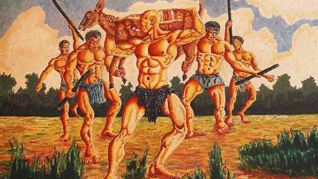
-
Owusu-Ankomah’s painting at first glance reveals a foreshortening company of energetic warriors, muscular framed with broad shoulders, muscled chest, and a narrow waist in a chiselled physique. The hunters were portrayed with huge hands, clenched fist, knuckles, strong legs visibly revealing biceps brachiis and dabs of varicose veins on the arms, thighs and legs evident of powerful and efficacious men. Before modern society, the average male spent most of their time hunting, protecting, and engaging in physical activities that increased their muscle mass and maximize their muscular proportions. Owusu-Ankomah’s production exhibits masculine competitiveness and a sense of adventure – the brave team were a-fire with passion, armed with sticks in a leopard-like graceful movement as the captain leads carrying a captured antelope shoulder high.
The warriors are noticeably naked with only a string of grass costume wrapped around the private parts which is the formal and ceremonial attire for the ancient culture. Owusu-Ankomah’s choice of colour in rendering the human figures lends credence to the fact that colours have a strong position in identifying humans while hunting. Wearing hunter orange is the best way to ensure other hunters see you and don’t accidentally mistake you for game in complex backgrounds that are often green or brown. The artwork reveals harmonizing brown colours which tend to create a central focal point in the entire picture frame to evoke earthiness, emotions, security and safety related to the natural world. The tints and shades of hues enhanced the main features in the painting to vividly communicate the intended message as well as create an illusion of depth.
A thick flora forms the background of the painting evident that the hunting expedition was carried out in a thick forest. As the fearless, able-bodied men advance through shrubs in high spirit of mission accomplished, an earthly scent swirled around them coupled with a sense of eagerness to meet a welcoming, expectant and jubilant community. Hunting is an extremely important mode of human-nature interaction closely linked to culture patterns and value systems. This engagement with wild animals is thought of as part of a deeper unity with nature, which means being part of nature in physical sense (Lowassa et al., 2012). Sustainable hunting prescribes taking as much as needed and as much as the habitat and the population can regenerate. Suffice to say, when hunting for a game form the basis of a year-long survival of a people, it calls for a deeper reflection. Owusu-Ankomah’s painting comes on the back of an ancient heritage of a distinct tribe in Sub-Saharan Africa.
‘Aboakyir’ translated ‘deer hunt’ is a festival uniquely celebrated by the Effutu (Simpa) people of Winneba in the Central Region, southern coast of Ghana, West Africa. The festival which is celebrated annually on the first Saturday in May has the historical antecedent of the replacement of a human sacrifice to a tribal god with a leopard – an alternative which resulted in the loss of many more lives than the sacrifice of a single slave. Consultations with the deity for a more humane alternative resulted in the “Wansan” (the deer) as a practicable and most acceptable substitute. The capture of a live deer, like the leopard, required many more hands than the members of the royal family could find. The additional hands required were solicited from the local militia as a service to ‘the stool – a symbol of chieftaincy, royalty, custom and tradition’. It was this change in form; that is, the involvement of the local militia, that the annual consecration and appeasement of the deity became a public, state-wide affair. This marked the birth and hence the origin of the “Aboakyer” festival.
The design of the Effutu State emblem tells this story; the ‘stool’ on which the King is installed sits on the “Wansan” (the deer).

Emblem of the Effutu state (Source: Palace of Oma Odefe)
The festival is therefore important for the ‘stool’, its occupant and the entire royal stool family. It is a religious duty and an obligation for the general citizenry to ensure its celebration annually is sustained to honour the ancestors and protect their historic culture for posterity on the back of removing evil and predicting a good harvest for a prosperous life in the coming year. The week-long activity begins with two traditional warrior groups known as the ‘Asafo’ companies consult their shrines for clearance, protection and early catch. The warrior groups clad in distinct costumes with distinct musical instruments — the ‘Tuafo' and ‘Dentsefo’, move to their respective hunting grounds at dawn on Saturday, wielding sticks and clubs amid chanting of war songs. No weapons, other than clubs and sticks are used to catch the deer, as it must be brought back alive.
By far, the relevance of Owusu-Ankomah’s painting is not in doubt as it fosters a deeper understanding of the historical and societal roles of hunting within Ghanaian communities. The painting holds both cultural and educational significance which sparks discussions on conservation, sustainable practices, and the preservation of cultural heritage. Consequently, bridging the gap between present generations and the rich tapestry of cultural and environmental history. The sight of the painting in Ghana’s National Museum serves as a poignant reflection of the nation’s cultural heritage and connection to nature. In this visual narrative, the core of historical period of a distinct society is unearthed.
References
- Lowassa, A., Tadie, D. & Fischer, A. (2012). On the role of women in bushmeat hunting – Insights from Tanzania and Ethiopia. Journal of Rural Studies 28(4):622–630.
Further Reading
- Anane-Frimpong, D. (2022). Aboakyir: Deer hunt festival. Link Retrieved on April 10, 2023
- Rubiano, W. (2017). Planting trees for the aboakyer festival 2017. Link
Published March 2024
An energetic scene. Five men in a flat landscape approach the viewer. Their bodies are naked - except for their loincloths - their faces grim. Muscles in the bright light stand out under the skin, their chests bulge voluminously - they are timeless heroes. The men do not look at the viewer of the picture. With their long, dark sticks firmly in their strong hands, they gather symmetrically around the bald man in the foreground. He presents himself with an antelope in his raised arms. His bald skull points to the left, as does the antelope's head.
On closer inspection, some things are irritating. Are the men dancing or walking? Where is the animal spatially located? Somehow it is on the shoulder of the man, but the legs are captured by the men behind, who would be much too far away for that. Is an event, an episode (as in a photograph) depicted? Or does the symmetry of the composition speak more of a constructed symbol, a sign, as in an emblem? The latter would support the strict division into horizontal planes: with the islands of grass in the foreground, the flat, ochre-coloured plane in the middle ground and the forest with sky in the background. But then again many design principles undermine this order: the tense, energetic movements of the figures, the strong brushstrokes, the irregular shapes of the white clouds and the tufts of grass, the dynamic accents of the sticks.
We know from our Ghanaian colleagues that what is depicted here, the catching of the animal, is part of a ritual celebration and a festival (the Aboakyer Festival). Here the moment is shown when the men have stepped out of the dark, hermetically sealed forest in the background with their prey and now present themselves in the bright light with their success. A comparison with the results of an image search on the internet for “Aboakyer festival” (Fig. 2) shows that this is the iconic moment. Here the idea of the festival seems to be condensed. And this also explains the emphasis on muscles: the hunters must be well trained to match the animal's speed and strength.
Fig. 2 (Google search for "Aboakyer Festival" on 9.9.2023 - the first page of results) Screenshot: Ernst Wagner
Owuso-Ankomah's painting focuses on the men with the animal. At first glance, the painting shows above all the strength of the men. The space thus becomes the backdrop for their performance. Their bodies are not only idealised but theatrically exaggerated, their muscles as if illuminated by a spotlight. The geometric centre of the picture, through which the horizon also passes, brings the loincloth of the leader into focus (see fig. 3) - perhaps an allusion to male potency?
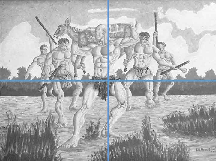
Fig. 3: Composition sketch (horizon and geometric centre) Photo: Ernst Wagner
A comparison with photos on the same theme from the Heritage Centre in Winneba (see Fig. 4-6) shows clear differences to the depiction in Owusu-Ankomah's painting. In the artwork, both animal and hunter have their mouths open, exhaustion is evident in both. In this way, too, man, animal and landscape are connected - despite hunting and death. The artist uses the warm ochre tones in such a way that the earth, the human body and the animal hardly differ in colour. Since the animal is still alive, its head does not have to be held. Thus, visually, it seems to elude a depiction of "being trapped", also due to the ambiguous spatiality described above. It could almost just as easily be understood as a triumphant appearance of the animal, to which the men are subordinate as bearers and assistant figures - comparable, for example, to Jan van Eyck's depiction of the lamb (see fig. 7), which also marks a mediating position between victim and victor, between human beings and God.
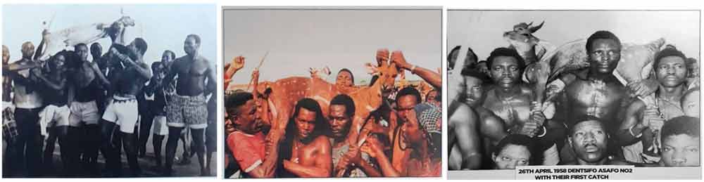
Fig. 4-6: Photos from the Heritage Centre Winneba Photos: Ernst Wagner
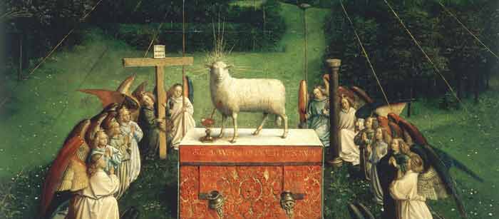
Fig. 7: Van Eyck, Lamb of God, Image Detail: Ghent Altar. Oil on wood, 350 x 461 cm
Cathedral of St Bavo, Ghenthttps://commons.wikimedia.org/w/index.php?curid=109213 [28.10.2024]
This image sets against each other contradictory concepts: static-symmetrical-ordered vs. dynamic; accidental situation vs. deliberate staging; documentation vs. sign; hyperrealism in body and space vs. symbolic charge. It sets these contradictions against each other in the unity of the painting.
Reference
Published March 2024
-
Lawrence Lemaoana’s work, entitled SILENCE … FALLS (2017) consists of Kanga fabric with cotton embroidery, measuring 155 x 115 cm. Lemaoana is a South African black male, born in Johannesburg in 1982, who lives and works in Johannesburg. The work serves as an example of the ways in which young black artists in South Africa aim to express a specific South African identity which appeals to the global art world.
The use of Kanga fabric as medium is in itself very significant. Lemaoana states that: "Kanga fabrics [...] are used extensively in my work. Manufactured in the East, and brought to South Africa to be sold in markets and bazaars, the journey of the fabrics speaks of the idiosyncrasies and trade imbalances of globalisation. The textiles themselves though have a wholly different life in South Africa – they are regarded as significant markers of spiritual healing, imbued with great religious and spiritual power, used by diviners and fortune-tellers." (Afronova)
The Kanga cloth is “used specifically in Emandzawe rituals, both as clothing for the sangoma [diviner] performing the ritual and as cloth on the shrine inside the shrine room in which the ritual takes place” (von Veh, 2017, pp. 13-14). The use of this fabric thus establishes Lemaoana’s identification with both global culture and black African culture which does not belong to a mythical past but is still very much alive today. His own familiarity with the sangoma becomes clear when he maintains that the ambiguity of the traditional healer’s utterings parallels that of headlines in the news media. He also exploits the deeper meaning embedded in the three colours white, red and black to heighten the impact of his highly topical messages.
Lemaoana’s work is inspired by current socio-political events and the way in which they are reported in the local media. The composition Silence Falls evokes the #RhodesMustFall movement which began in 2015. This demonstrates the artist’s concern with the plight of the South African youth and his identity as an artist born in the 1980s – the so-called ‘born-frees’ who did not actually experience the ‘struggle’. The works of this generation of artists are described as “symptomatic of the new identity issues of the post-apartheid era. This young generation is appropriating a history that it believes has been confiscated and twisted in order to develop an alternative that takes into account its own subjective experience. Conscious of their responsibilities, these artists are helping to formulate and affirm a specific South African identity” (Pagé and Scherf, 2017, p. 8).
Lemaoana expresses his concern with socio-political issues through a critical engagement with mass media in South Africa. He is particularly concerned by the ability of the local media to shape social consciousness. By isolating news headlines and appropriating political slogans in his very own cynical way he “turns didactic and propagandistic tools on their head” (Afronova). As Lepage (2017, p. 117) states, Lemaoana uses the power of “words as favoured instruments in the political struggle”.
The importance of Lemaoana’s work is vested in his participation in the Fondation Louis Vuitton exhibition in Paris in 2017. The exhibition was divided in three parts; the first one was entitled Being there: South Africa, a contemporary scene and aimed to show South African vitality through the works of 16 artists. In the accompanying catalogue the curators Suzanne Pagé and Angeline Scherf (2017, p. 8) explained that their choice of artists was “based primarily on the action of the artists themselves, on their engagement with the current economic and social institutions, their awareness and conviction that they can act and play a role: BEING THERE”.
Interestingly the curators also comment on the fact that this younger generation of artists, in the context of ongoing economic and social divisions more than two decades after the end of Apartheid, sees it as its mission to transform “disenchantment into the energy for renewal” (Pagé and Scherf, 2017, p. 8). Achille Mbembe (2017, p. 16) elaborates on the current tensions in South African politics and culture which have led to a stalemate. In a society where consumption has become the quintessential state of being, the visual arts are in crisis, characterised by radical fragmentation and dispersion of reality (Mbembe 2017, pp. 23-24). “What is needed in contemporary South African arts”, writes Mbembe (2017, p. 24), “are concepts with which to seek out the real … . This will not happen without a new collective imagination that will help to facilitate the passage from the past and present to the future”.
This is what Lemaoana has achieved in his art. His participation in the show confirms his status as a contemporary South African artist who has managed to decolonise his art by “seeking out the real” and grounding it in a local or national context. Furthermore, in Lemaoana’s works there is no room for, what Mbembe (2017, p. 25) calls, “tropes of pain and suffering” or the injuries inflicted “by the forces of racism and patriarchy” – tropes that are the characteristic traps of postcolonial discourse. His art is decolonised in the sense that all the resources of cultural and artistic modernity – both in terms of medium and narrative – have been mobilised in order to render itself more relevant to a modern Africa and a global humanity (Ekpo, 2017, p. 20).
References
- Afronova. http://www.afronova.com/artists/lawrence-lemaoana-2/ (accessed on September 19, 2017).
- Ekpo, D. (2017). Manifesto for a Post-African art. Unpublished keynote address presented at the SAVAH Conference, Tshwane University of Technology, South Africa, September 21 – 23, 2017.
- Lepage, A. (2017). Lawrence Lemaoana. In S. Pagé & A. Scherf (Eds.), Being there: South Africa, a contemporary scene (pp. 116-21). Paris: Fondation Louis Vuitton and Editions Dilecta.
- Mbembe, A. (2017). Difference and repetition. Reflections on South Africa today. In S. Pagé & A. Scherf (Eds.), Being there: South Africa, a contemporary scene (pp. 15-25). Paris: Fondation Louis Vuitton and Editions Dilecta.
- Pagé, S. & Scherf, A. (Eds.). (2017). Being there: South Africa, a contemporary scene. Exhibition catalogue. Paris: Fondation Louis Vuitton and Editions Dilecta.
- von Veh, K. (2017). Textual Textiles: Gender and Political Parodies in the Work of Lawrence Lemaoana, TEXTILE,1-19. doi: 10.1080/14759756.2017.1337381 (Accessed September 5, 2017).
published March 2020
-
When I first entered Anna’s house1, I was surprised to hear that it was a temple of the Afro-Cuban Santería religion, a place determined by the presence of the orichas – the sacred beings of Santería. The objects of the interior did not reveal but seemed to hide their sacred meaning for the uninitiated viewer.
On our way through the house, Anna introduced me to a doll dressed up in white: Obatalá, the paternal oricha of wisdom and justice, with a cream cake on his right and a wide-eyed Bambi on his left. On the sideboard in the corner we greeted Yemayá, the maternal oricha of the sea, represented by a plastic bowl filled with water in which various floating animals swung and a Barbie, whose light blue lace dress complemented the turquoise colored water of the bowl. Finally, in a small wardrobe, the soup tureen of the goddess Ochún was decorated with two elegant Barbies in golden outfits, staring out of the darkness with their always flawless smiles. Two foreigners, charged with western ideals of beauty, who, in this context, had been commissioned with representing Ochún, the oricha of femininity, love and freshwater.
The representation or illustration of sacred powers through everyday objects, such as toys, dolls and knickknacks, have held a strong fascination for me since I literally stumbled upon them in Santero households, and, thus, the question of how this transference of powers and meanings to ultimately mundane objects could occur has long accompanied me on my fieldwork.
How can we interpret the fact that Ochún, the Afro-Cuban goddess of love and freshwater is visualized by a glittering Barbie doll sent to Cuba by Cuban family members living in the USA.
We should take a look back to the beginnings of the history of this religion for a better understanding of these dolls on the altars of Afro-Cuban Santería. Between the 16th and the 19th century, people were moved from one world to another on the sea routes of the transatlantic slave trade, which connected West Africa with the Caribbean (and this, in turn, with Europe), where they would henceforth work as slaves on the plantations of white landowners.
We should consider that people from Nigeria, Togo and Benin who had been deported to Cuba arrived in the New World without any luggage. The carved wooden sculptures of their gods, power objects, masks or costumes were left behind together with the African coastline. The transfer of religious concepts from Africa to Cuba, the Caribbean or Brazil, therefore, took place primarily in the minds of these people and remained dependent on this imaginative reservoir for long periods of time.
Despite the fact that the Cuban social anthropologist Don Fernando Ortiz2 still managed to collect some old carved wood oricha representations which had been produced during the colonial period in the 1930s to 1950s, the tradition of carving sculptures had not been resumed in the new situation in Cuba. The wooden oricha representations of Nigeria and Benin were replaced by smooth porcelain Madonna statues and the serious looking saints of Spanish folk Catholicism. Slaves from West Africa who were forced to worship the statue of Santa Barbara reacted with a phenomenon known as the syncretism of the Caribbean: statues of the Madonna and saints were interpreted as “reservoirs” of African deities and treated as such.
In the course of these syntheses, Santa Barbara is venerated as a representation of the virile oricha Changó, ruler of fire, thunderstorms and lightning. The Virgin of Regla, with her blue and white Madonna robe, is associated with Yemayá, the maternal oricha of the sea, and the Virgen de la Caridad del Cobre, in her church near Santiago de Cuba, is worshipped as Ochún, the oricha of love, creativity and sexuality. This possibility of reinterpretation, of “declaring something to be something else,” is tantamount to breaking the link between form and content and is the precondition for the unusual appearance of Barbies on the Santería altars.
As the colonial supplies in holy figurines diminished, colorful multiples of saints from Cuban mass production are found nowadays instead of the statues. Together with plastic dolls, Barbies or everyday objects, these new assemblages bear witness to the change of time and values, of new desires and new myths that move the people of Cuba today and are visualized on the altars.
Despite the fact that the connection of object and meaning has been blown up in modern Santería arrangements, it remains unclear to what extent new narratives are woven into the conception of the orichas when they are represented by new material objects: how much Madonna can one find in Yemayá, the oricha of the sea, and what is the relationship between a Barbie and an oricha? Referring to Marshall McLuhan’s3 famous statement that the medium is a significant part of the message, we can try a more specific interpretation of Barbies on Santería altars.
Original Barbie dolls are commodities acquired in stores in the USA and sent as gifts by relatives. As commodities and gifts, they mirror family ties that have continued over decades connecting Cuba and the USA, countries that have been politically separated since the Cuban revolution in 1959. In addition, Barbie dolls are not only saturated with the sacred aura of the orichas, they are also simultaneously encrusted with a fine texture of Cuban dreams of consumption and the feverish delirium of departure. Like Catholic saints, Barbies are figurines which are highly charged with their own narrative: the story of Ken and Barbie in the US American glamour world is a story of success, power and consumption. In this sense, Barbies on Afro-Cuban altars represent the fusion of idealized body and lifestyle imaginaries with sacred Afro-Cuban entities and deified ancestors. And, in the end, the forces of the orichas are conjured for reaching exactly these reasons: to provide their adepts with power that enables them to achieve their goals and realize their dreams – be they capitalistic or of another sort.
The reclassification of the Barbie doll from toy to altar object does not happen suddenly. The dolls have to undergo a transition process to become part of an altar installation. The dolls that appear on altars have been subjected to a ritual cleansing ceremony using decoctions of herbs associated with a particular oricha, which allows them to bear the vital power “Aché” of the sacred being. A bundle of herbs and other substances have been placed inside their bodies. Throughout these preparations, nothing has changed the appearance of the doll, which preserves its fashionable style and smile. What has changed is the idea about the object and hence its place – the Barbie is now part of a sacred altar installation.
Barbie dolls watch the strollers from the illuminated doorways that line the dark streets of Havana. Powerful representations of forces, imaginations, places and practices, connecting Africa and Cuba as well as Cuba and the USA, blending boundaries between dolls and gods, toys and power objects, commodities and sacred beings. They connect long-separated families and fragmented religious concepts. They guard the entrances of homes and watch over the desires of their inhabitants, who rely on the power of their Barbie goddesses.
Footnotes
1) Natalie Göltenboth. “Yemayá und der Spielzeugdampfer – Zur Sakralität der Ready-mades auf afrokubanischen Altären.” In Ideen über Afroamerikaner – Afroamerikaner und ihre Ideen. Beiträge der Regionalgruppe Afroamerika auf der Tagung der Deutschen Gesellschaft für Völkerkunde in Göttingen 2001, edited by Lioba Rossbach de Olmos & Bettina Schmidt. Marburg: Curupira, 2003, pp. 107-127.
2) Fernando Ortiz. Hampa Afrocubana: Los Negros Brujos. Miami. Universal, 1973.
3) Marshall McLuhan. Understanding Media: The Extensions of Men. 1st Ed. New York: Mc Graw Hill, 1964
References
- Brown, David H. “Thrones of the Orichas. Afro-Cuban Altars in New Jersey, New York and Havana”, African Arts, Oct. (1993) 44-87.
- Danto, Arthur C. Transfiguration of the Commonplace. A Philosophy of Art. Cambridge, Massachusetts: Harvard University Press, 1981.
- Göltenboth, Natalie.2020. „Invoking the gods – or the apotheosis oft he Barbie doll“ IN: Philipp Schorch, Martin Saxer et al. Exploring Materiality and Connectivity in Anthropology and Beyond. London: UCL
- Göltenboth, Natalie. “Yemayá und der Spielzeugdampfer – Zur Sakralität der Ready-mades auf afrokubanischen Altären.” IN: Ideen über Afroamerikaner – Afroamerikaner und ihre Ideen. Beiträge der Regionalgruppe Afroamerika auf der Tagung der Deutschen Gesellschaft für Völkerkunde in Göttingen 2001, edited by Lioba Rossbach de Olmos and Bettina Schmidt. Marburg: Curupira, 2003, pp. 107-127.
- Holbraad, Martin, and Morten Axel Pedersen. “Things as Concepts.” In The Ontological Turn. An Anthropological Exposition. Cambridge: Cambridge Univ. Press, 2017, pp. 199-238.
- Willie Ramos, Miguel. “Afro-Cuban Orisha Worship.” In Santería Aesthetics in Contemporary Latin Art, edited by Arthuro Lindsay. Washington: Smithsonian Press, 1996, pp. 51-76.
-
Mrs Pinckney and the Emancipated Birds of South Carolina (2017) is a sculpture in the round composed of a headless, female, ‘white’ mannequin swathed in historical dress and balancing on a globe. In place of her head is an empty birdcage from which three birds have escaped. The work was created by the internationally renowned artist Yinka Shonibare (born 1962) who is a black man of Nigerian descent living in the United Kingdom. He can thus be identified as a member of the African diaspora. In his artworks he usually engages with concepts that are related to the politics of colonialism and the slave trade and explores cultural identity in the context of globalisation. [1] While his creations are deeply critical of western imperialism, he always makes sure to render them visually alluring and engaging to elicit a visceral response. [2]
This particular artwork was co-commissioned by the Yale Center for British Art and Historic Royal Palaces, Kensington Palace, and created especially for the exhibition "Enlightened Princesses: Caroline, Augusta, Charlotte, and the Shaping of the Modern World".[3] This adds an aura of seriousness of intellectual and aesthetic intent to the sculpture. In the title of the work, the artist has identified the woman as Mrs Pinckney, or Elizabeth (Eliza) Lucas Pinckney, who at the age of 16 was put in charge of her father’s plantations in South Carolina. [4] She had a major influence on the colonial economy by developing indigo as an important cash crop to be processed as dye. [5] The sculpture is said to be the artist’s response to Eliza’s encounter with the German Princess Augusta in 1753 which further identifies her as a member of the social elite. [6] All of the above components help to retrieve the identity of the subject, the ideology being addressed as well as the message in the image.
The artist has encoded his artwork with visual tropes that clarify and enforce his message. While the style of Eliza’s dress is based on 18th-century fashion, the fabric used is Dutch wax cloth which Amah Edo describes as a “marker of Africanness”. [7] Manufactured in Europe but using the Javanese batik printing technique, the cloth “came to be produced specifically for West African markets in the 1890s … [and] its aesthetic was adapted by manufacturers to suit these new consumers’ tastes”. [8] Now widely perceived as symbolic of tradition, the Dutch wax cloth is regarded “as a high-end commodity desirable to elite customers”.[9] The material of the woman’s dress thus not only identifies her as a member of the elite but also refers to Africa as the source of her wealth: it is through the labour of the African slaves that Eliza was able to run her family’s plantations in America. Likewise, the blue of the material – and the bird on her finger – is a direct reference to her successful cultivation and processing of indigo. It can thus be seen that the artist explores concepts of race and class through a careful choice of materials and colours in his imagery. By dressing the white woman in African cloth, he complicates history and racial identity in an effort to startle the viewer’s conscience.
As the plantation’s manager, Eliza occupied a position of power which is visually manifested by her being placed literally on top of the world. The latter is represented by an eighteenth-century globe that shows the colonial territories of the British empire. [10] Eliza is thus turned into a symbol of white superiority and privilege granted by the politics of imperialism. Her balancing act, however, proves to be precarious and elicits tension as the ball can roll at any moment and topple her from her position of power. It is also interesting to note that the globe is an attribute of Fortune, the fickle goddess of antiquity. Fortune is blind and even eyeless, and the globe “on which she stands or sits, originally indicated instability, but to the Renaissance it was rather the world over which her sway extended”. [11] The headless Mrs Pinckney thus shows a cunning resemblance with the antique goddess Fortune “who bestows her favours at random”. [12]
The favours bestowed by Eliza relate to her release of the birds from the birdcage. However, instead of flying away to freedom, they come back to her. She playfully lifts her left arm for an indigo-blue bird to perch on her little finger, while another bright-coloured bird sits on her left shoulder and a third one on top of the cage. According to Shonibare, the birds are a metaphor for slaves and her gesture of setting them free symbolises her wish to emancipate the slaves – hence the title Mrs Pinckney and the Emancipated Birds of South Carolina. [13] The narrative thus presents a paradox between the white woman’s privileged yet unstable position as powerful, wealthy mistress and her fickle wish to liberate the black slaves whose destiny is entirely in her hands.
In this work, Shonibare has given his own interpretation of the story of Mrs Pinckney, choosing to focus on the effects of the slave trade and colonisation in the eighteenth century in the United States, then still British territory. While the playfulness of his rendition and its aesthetic appeal conceal the harsh realities of enslavement, the dehumanisation of black people as a result of colonial politics still filters through in the form of brightly coloured birds which, although set free, are so tamed – read oppressed and subjugated - that they are not able to fly.
[1] https://en.wikipedia.org/wiki/Yinka_Shonibare (26 July 2021).
[2] Yale News, 2017. Yinka Shonibare MBE (RA): ‘Mrs. Pinckney and the Emancipated Birds of South Carolina’. Video. Yale News, Yale British Art, 25 July 2017. https://news.yale.edu/videos/yinka-shonibare-mbe-ra-mrs-pinckney-and-emancipated-birds-south-carolina (26 July 2021)
[3] Yale News 2017.
[4] Yale News 2017.
[5] https://en.wikipedia.org/wiki/Eliza_Lucas (26 July 2021).
[6] Yale News 2017.
[7] Edo, Amah M. (2019). From African print to global luxury: Dutch wax cloth rebranding and the politics of high-value. In Mehita Iqani and Simidele Dosekun (Hrsg.). African luxury: Aesthetics and politics (pp. 77-92). Bristol, UK / Chicago, USA: Intellect, p. 82.
[8] Edo 2019, p. 80.
[9] Edo 2019, p. 85.
[10] Yale News 2017.
[11] Hall, James. 1974. Dictionary of subjects and symbols in art. London: John Murray, p. 127.
[12] Hall, James. 1974. Dictionary of subjects and symbols in art. London: John Murray, p. 127.
[13] Yale News 2017.

The oeuvre of Yinka Shonibare CBE is often characterised by a colourful and at the same time amusing appearance. This facilitates the viewer's immediate access. This is also the case with his 2017 work Mrs Pinckney and the Emancipated Birds of South Carolina. What one perceives here at first glance is the figure of a lady wearing historical European clothing, a "Robe à la Française" from the 18th century. However, the clothing is unusually colourful. Moreover, the woman is standing on a sphere, albeit shakily and leaning forward somewhat. This image quickly connects with the traditional European iconography of "Fortuna", i.e. the admonishing, allegorical symbol of "fate". It turns out that the sphere is the globe.
The graceful lady also has a strange head in the form of a birdcage. But its door is open and the three birds have long since escaped. This could be an allusion to Maurice Maeterlinck's The Blue Bird, the central message of which is the obvious true happiness. In any case, the caged head shows us that it is actually our thoughts that tie us down and hinder our actions, as is often the case. Seen in this light, at least this lady has succeeded in unmasking the internalised gender ideology and liberating herself mentally. But is it really a lasting liberation?
Who actually is this lady, this "Mrs Pinckney"? What fate is at stake? She is not known here in Japan, for example. A look at Wikipedia, for example, will help: she is considered one of the first emancipated women in the USA, who achieved prosperity with her pioneering attempt to grow indigo on slave plantations in South Carolina. This dye was in particular demand for military uniforms in Great Britain at the time.[1] That is why the lady is wearing this indigo dress. But where does the artist's reference to Mrs. Pinckney come from? A direct connection is hard to find at first. However, knowing that Shonibare describes himself as a "post-colonial hybrid"[2] - he was born in London as the child of Nigerian parents, grew up in Nigeria and studied in London - and that he very often uses "African wax prints" for his works,[3] one gains more clues about the work.
At present, those wax prints seem to represent "authentic" African life, but they have an Indonesian origin and were made by Europeans, especially Dutch, and sold and distributed in West Africa.[4] In this sense, they are in fact a transcultural product. Through their use, the artist points to the "cultural imagination as a power structure and means of domination"[5] in the spirit of the critique of representation. In this specific work, too, the wax prints, which have something in common with the fate of indigo, find their use in clothing.
Thus, it turns out that the lady functions as the encouraging and, at the same time, admonishing symbol of the emancipation of women, which never proceeds in a linear fashion and is still threatened and endangered everywhere today. Moreover, this emancipation movement must always be seen in an even more complex context, which was and still is connected with the fate of countless people - in Mrs. Pinckney's case, for example, that of the slaves, according to the message of the work.
[1] https://de.wikipedia.org/wiki/Eliza_Lucas_Pinckney (27 July 2021)
[2] Shoji, Sachiko. 2019. “History is Happening Now: What Connects Us All to the Art of Yinka Shonibare CBE.” In Exhibition catalogue Yinka Shonibare CBE: Flower Power. Fukuoka: Fukuoka Art Museum, p. 105. Incidentally, this is the artist's first solo exhibition in Japan.
[3] Shonibare CBE, Yinka. 2019. “Artist Statement. Woman Shooting Cherry Blossoms.” In Exhibition catalogue Yinka Shonibare CBE: Flower Power, Fukuoka: Fukuoka Art Museum, p. 13.
[4] Ibid. According to Shoji, Japan also became involved in the production of those wax prints and their export to Africa from the late 1920s to the mid-1990s. See Shoji 2019, 106-107.
[5] Shonibare 2019.
A life-size, headless, female mannequin balances on a globe showing the African continent from the front. Her Biedermeier-style clothing in bright colours shows a deep décolleté. The fabric pattern is Dutch Wax, which can be inferred from the given information on the work. In combination with the birdcage and the three colourful birds outside the cage, the sculpture is reminiscent of surrealist montages like in René Magritte's artworks.
 René Magritte, Le Thérapeute (1976), Tehran (Copyright: WikiCommons)
The title refers to a concrete iconography that makes research necessary which - as a reward - helps to decipher the birds and the blue dress: Mrs Pinckney refers to a prominent historical woman (Eliza Pinckney, 1722 - 93) whose biography - as one can read on Wikipedia - was deeply entangled with English colonialism and the American War of Independence. Shuttling between North America and England, she was remarkably innovative and entrepreneurial. The birds in the sculpture allude to a specific anecdote when Eliza Pinckney gave such birds as a gift to the mother of the British King George III. The blue of the dress can be seen as an allusion to Pinckney's production of indigo in South Carolina.
The globe and the pattern of the dress - like the title - also allude to the theme of colonialism. Even the material specification of "Dutch Wax" tells a tangled story in colonialism. But the female role model embodied by Eliza Pinckney in her time, obviously denies the usual connotations associated with colonialism, slavery and looting. The birds outside the cage perhaps also make references to the immanent contradiction between freedom and captivity.
Alluding seems to be the most adequate term to grasp the specificity of the visual language of this work. Nothing is clearly asserted, no thesis is put fprward. Rather, a dazzling, assembled, ambiguous figurine stands in the context of 18th-century colonialism, hinting at many themes that are significant also today: women's roles, capitalism, domination and exploitation of nature, colonialism, freedom and oppression. This fits in well with the immediate perception of the object. Looking at the artwork, one gets the impression of a strange balance of lability and stability, of theatricality and ridiculousness, of immediate sensuality and learned knowledge.
Now, the question remains as to how this work is located in the transcultural contact zones. Today, it is exhibited in a US collection of British art, the "Yale Center for British Art". The artist himself is called a British-Nigerian artist. He himself uses his English title of nobility CBE (Commander of the British Empire) in his name. Since documenta 13, he is well known in the context of Global Art. In terms of iconography, the work is also located at these interfaces. Through montage, it merges different associations into an inherently contradictory complexity that cannot be resolved. This creates a fundamental openness that is reflectes when we ask about its meaning: can we read the work as ironic alienation? Or as a commentary on history? Or as homage or, on the contrary, as criticism of the historical Mrs Pinckney? As a reflection of current and very serious issues or as a harmlessly playful object?
A video produced by the museum where the work is now located shows an analogous reception history (Link 1 / Link 2). How does the work constitute the “ideal” viewer? He or she is a decoding, deciphering viewer who allows the iconographic fixation to fail with relish because of the sensuality of the playful object, just as the narrative of Mrs Pinckney fails because of the mannequin's instability. The ideal, contemporary viewer simultaneously enjoys the openness and yet sees him-/herself confirmed in his/her anti-colonial habitus.

Discussion
EW: When I compared all three contributions, I was initially surprised by the large number of common intersections. This certainly points to the global power of interpretation of media representations in English (website of the collection at Yale, Wikipedia), which we could not escape either. We all researched Mrs. Pinckney on Wikipedia, we all trusted the video on the website as a source. But what is interesting now is how differently we deal with it and what different conclusions we come to. I have the impression that in your approach, Bernadette, the story of Mrs. Pinckney plays the biggest role, while in my text this story is rather only a possible reference point. I don't know if you can agree with me.
NK: Yes, I also see these differences. With Ernst, I see more of a fundamental, principled attitude in the analysis of the work. In Bernadette's interpretation, I found the interpretation of the birds as "slaves" interesting. I myself saw in it the - temporarily - liberated soul of an emancipated woman. Moreover, in this context, I also find your reference to the paradox of the actually already liberated "slaves" particularly illuminating, as it seems to have been derived from your discussion of colonial history in Africa.
BVH: When comparing our contributions, I was also reminded of the fact that art is always about other art, hence we looked for precedents that may have inspired the artist. But what I find most exciting about our interpretations are the differences in emphasis on the various meanings that are embedded in the work. For Ernst, the transcultural nature of the work stands out, as well as its openness in meaning. For Nobu, it is the reference to gender ideology and women’s emancipation that forms the core of the work, especially in light of ongoing gender discrimination. For me, it is the historical narrative that led me to interrogate the issue of racial discrimination which also continues today in movements such as #BlackLivesMatter.
EW: I share this, and I would like to follow up with a question. Is it possible that our respective contexts in which we work have influenced this? Not in terms of content – we agree on that – but in terms of patterns of argumentation. If you, Bernadette, place so much emphasis on the story of Mrs. Pinckney, does this perhaps reflect the great oral, meaningful storytelling traditions in Africa? And when you, Nobumasa, on the other hand, elaborate Mrs. Pinckney as an encouraging and at the same time cautionary symbol, does this perhaps reflect the great ethical traditions in Asia? My refusal of direct meaning-making and ethical service, on the other hand, would then be a European-style reflexive evasive manoeuvre to a (preferably unassailable) meta-level?
BVH: Good question indeed. In my opinion, this exercise shows how we are all conditioned by the sociocultural environment in which we live and work. Hence my response, from a South African point of view, focused on the story/history in order to highlight the importance of the work in decolonising the subject. While playfully complicating racial issues in a historical context, the artist mainly celebrates Africanness by means of materials, patterns and colours. This allowed me to infuse my interpretation with African epistemologies. Your response, Ernst, could be regarded as a refusal, perhaps, to acknowledge and engage with the deeper implications of the work and indeed rather shift the focus onto more theoretical concerns as inspired by German art historians? I am keen to hear Nobumasa’s view on this matter.
NK: Ernst's question about whether a Japanese ethical tradition might secretly be reflected in my interpretation is very difficult for me to answer. But as Bernadette has just pointed out, the social context in which we work definitely plays a certain role. While globalisation has erased spatial distances, perhaps not necessarily mental ones. For Japanese today, Africa is still very distant, in the double sense mentioned above. Although Africa is the second largest continent with 55 countries and countless information is available, detailed and nuanced ideas about it are often missing from our consciousness. My leap into the general, or ethical, implication of the work could possibly be explained in this way. Seen in this way, I have probably unconsciously "traced" my own situation. But this also underlines the fact that the critique of representation – in the sense of a critical questioning of pictorial representations – is still as relevant today as it ever was.
EW: I was very grateful to you, Nobumasa, for the emphasis on the ethical, because we always have to include the ethical dimension in the context of education. My argument from a German point of view would be that the interpretation of a work like Mrs. Pinckney must not be arbitrary. That would be the ethical responsibility of the interpreters. We will have to come back to this in a moment when we discuss conclusions for a toolbox for decoding images.
But first I would like to learn more about the differences between our approaches – even though there is a large area of consensus. In the theoretical discussions we had some time ago, we clearly distinguished the Japanese concept of 'kansho kyoiku', the South African concept of 'art criticism' and the European concept of 'work immanence'. Could you elaborate on the question of how these positions are reflected in your texts?
NK: The introduction of dialogue-based art viewing from the USA in the late 1990s revived the field of art education in schools or museums in Japan. Since then, this didactic method, which seems to seek to maximise the viewer's part in interpretation through its strict rejection of knowledge transfer and ultimately prioritises the discussion of interpretation, is still in vogue today. But a crucial question still arises as to how the meaning of interpretation, or meaningful interpretation, is secured without degenerating into mere arbitrariness. In this respect, too, our experiment seems to be very inspiring.
BVH: At the University of South Africa we believe that the basic skills required to interpret objects of visual culture are best taught by beginning to practise art criticism. The proper domain of a critic is the description, interpretation and evaluation of concrete works of art. As a first step in this process, students must learn how to describe and interpret artworks. Essentially art criticism is a practice embedded in western epistemology that has been appropriated to study the art of contemporary Africa in a global context. When investigating the historical arts of Africa, the method remains the same although the local context of traditional culture and customs must be taken in consideration. My interpretation of Shonibare’s work was guided by these very same principles.
EW: Finally, I would like to ask you something with regard to the 'methodological kit' proposed by the editors of this volume: Which methodological approaches for the interpretation of images do you consider absolutely necessary – independent of our respective Japanese, South African or European context? And I'll add a second question in a moment: Does that leave one area that plays a role exclusively in your respective local context?
BVH: From an art historical point of view, the methods best suited for the interpretation of political images stem from a contextual approach which demands critical consideration of the cultural context of the work, its artist and of the social practices and power relations in which it is embedded. As the interpreter, you can apply the iconological method: first describe what you see – formal elements and details – and then identify the iconography, the specific subject and symbolism of the work. Do some research on facts and historical context, as well as the reasons why the work was made or commissioned. Then you can explain how all this information was put together to express the meaning or content of the work and decide what message or ideas the artist was trying to communicate. Because every interpreter comes to the artwork with his/her own worldview, the interpretation will differ depending on that worldview and not on the local context. For example, because I attach more importance to the idea of decolonisation, my contextual approach is combined with and influenced by decolonial theory.
NK: Basically, Bernadette, I gladly agree with you, especially with regard to your gradual approach. I also think it is reasonable and sensible from a pedagogical point of view. But this raises the question of what actually constitutes a "political image" or "when" an image becomes political. Of course, there are pictures or works of art that are obviously and unmistakably recognisable as such, but there are also those that are much more subtle, that are not so noticeable to foreign eyes, or that were not originally created with political intentions, but that in retrospect seem to be quite political. What one considers to be political depends, after all, very much on the view of the observer, possibly even completely apart from the original intention of the creator. In this respect, it seems to me that a fundamental attitude is indispensable for the viewer to be able to keep a mental distance from a picture and its context as well as from himself and his own horizon in order to perceive a picture (also) politically.
EW: Thank you both, because from my point of view I cannot and do not need to add anything more. I completely agree that an iconological basis, as Bernadette has formulated it, is needed. And I am deeply convinced that the reception-historical and reception-theoretical extension that Nobumasa has added is absolutely necessary, indeed indispensable, for the toolbox. I can add nothing to this bundle of methods.
What perhaps came up short in our conversation were the different cultural conditions and the resulting consequences for interpretation. But we'll make up for that on another occasion.
NK: Finally, let me add something to my previous statement. For responsible interpretation, we need above all a willingness to engage in dialogue. I experienced this again in our conversation and our experiment also shows this in an exemplary way.