Dear user,
This section of our website forms the heart of the EVC project. Here you find a collection of images of objects from different ‘visual cultures’. Our contributors selected and interpreted them in their respective contexts believing that these objects are particularly important for intercultural understanding across boundaries. Each time a user opens this page, the order in which the objects appear changes. In this way we hope to avoid a hierarchical understanding of the collected objects as their entries continue to be accessed in the long run. The constant changing face of the page also reflects the continuous expansion of the collection. As there are already over more than a hundred entries, users may want to form an overview, or to navigate through the growing collection according to their interests. For this purpose, we offer the following search options:

Filter: This enables you to search for objects according to time, place, keywords, etc. / Free title search: If you know the title of an object, you can find it in the free search field. / Lab: In the lab section, objects from the database are grouped under overarching themes. This is an ongoing project and about to be expanded extensively.
Enjoy exploring our database!
-
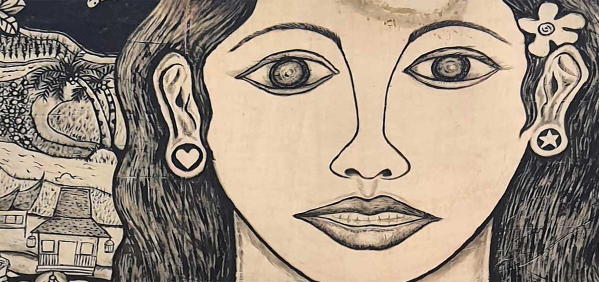
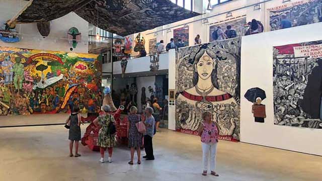
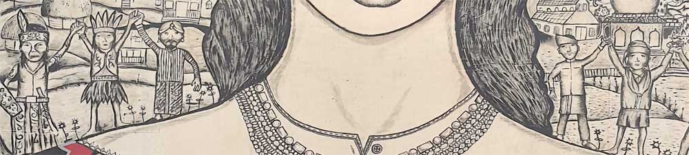
Detail (Photo: Avi Sooful)
The woman who seems to be in a reflective mood, shows a reserved demeanor and sadness. The face is not shaded, maybe to allow the viewer to project themselves more into the work and to give a clearer interpretation of the mood. The work done in ink probably with a filt-tip or a ball pen by use of line technique is effectively rendered in flowing, horizontal, curved and vertical manner to project her character and what she stands for.The good grasp of the leading lines sets the work in time and emotion. It creates a feeling of harmony between the individual and her surroundings and successfully portrays an element of resiliency in the midst of uncertainties. The subject’s predominance intimates to the viewer her feeling of absolute command of her surroundings with her well-coordinated and symmetrically placed figure. The woman communicates beyond the physical likeness and tells the viewer something about her character. There is no reason not to believe that she is protective of her space, bears compassion, at the same time, not afraid to share her feelings, pain, emotions and empathy that connects with others in openness.
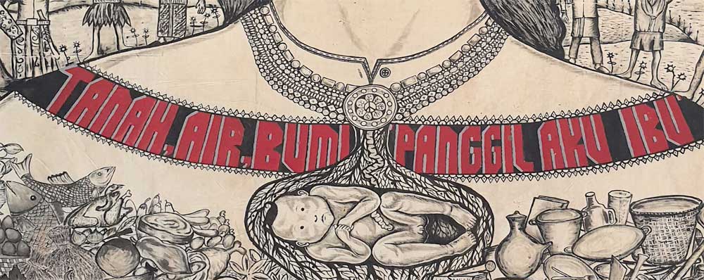
Detail (Photo: Avi Sooful)
The writings written in red color, that reads ”Tanah, air, bumi, panggil, aku ibu” (Indonesian, to be translated as ”land, water, earth, call me mother”) around the neck is glaring and tends to hold the entire work in place. It is a strong message intended to communicate to the viewer on environmental awareness and conservation of natural resources. Perhaps a deliberate attempt by the artists to draw attention to the area, helping to convey thematic ideas that distinguish the woman from the rest of the picture. The necklace has a pendant with a distinct shape of a baby, probably in the womb, is a symbolic reflection of continuity and a cry for protection for all, including the unborn. They too matter! The fine textured background has other people, holding hands in solidarity, a sign of peaceful co-existence and social commentary on issues faced.
Detail (Photo: Avi Sooful)
The woman is against the destruction of what she holds dearly, and can foresee everyday activities such as fishing destroyed. The trees create balance in the work, while Rhythm and movement run across the canvas with reflection of real life situations, with a natural background that enhances the theme. The work’s portrayal of versatility and fluidity cannot be ignored. The relationships and interactions between the activities in the background and the main figure creates a complex meaning on nature’s importance for the human survival. The creatively rendered items held on both hands form part of the attire, thus creating a visual interest that has symbolic value. The firm, full, protective hands, held close to her heart, are symbolic of the strength of a woman, giving an impression of a mother, caregiver and a nurturer. The woman, in her use of direct gaze says “This is who I am” with her direct expression. She attempts to explain herself, to unravel her character, to invite the viewer to her space even if only for a moment.
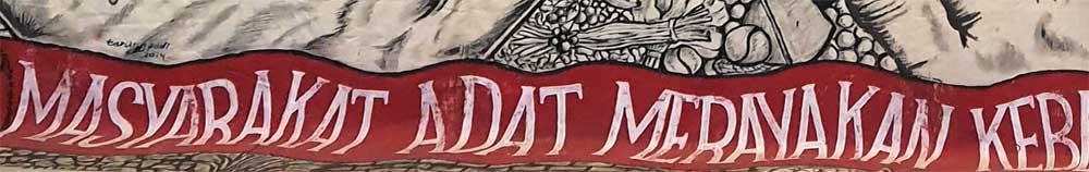
The drawing which is both engaging and intriguing, depicts the experience of understanding the environment and its connection to everyday life, “the goodness of mother earth”. It shows unity of purpose whereby different cultures from different continents come together in solidarity to support a common cause as the bottom inscription says: “Masyarakat adat merayakan keberagaman” translated “Indigenous people celebrate diversity”. The work substantially cultivates through an emotional approach the development of a connection of various cultures with nature for a common good. It underscores the importance of art as best suited to examine human existence, and that of earthly surrounding that reflects in everyday experiences and confronts the terror of the universe.
Detail (Photo: Avi Sooful)
Portrayal of how women play important roles in the construction of social and cultural meaning of different societies is evident. The realization of the goodness of Mother Earth is also shown to be a collective responsibility of all. The subject, executed from frontal view, is a woman in deep thought and a suggestion of underlying hidden pain and struggle for social justice that is explicit in various cultures. Her pain in addressing the social evils is captured more in her facial expression. Art as an expression of what it means to be human, is seen in the work that has religious expression, cultural undertones and creative energy. The artwork depicts a mysticism that is fabricated and intertwined in the socio-cultural realm, religious beliefs within different cultures. A view shared by Kumail (2017) who notes that art is a product of society’s members and so also reflects the culture and traditions of that society. Community members help to shape and evolve their culture through their efforts in the production of art. At the point when a society establishes its own particular character, the next generation is born, absorbs this identity, helps to spread it, and educates the world about it.
The black and white drawing portrays collective and creative abilities among different artists, with a show of a sense of togetherness that gives an idea of communal activity. The huge drawing distinctively points to the art of collaboration and understanding between different artists coming together for a common goal, which in turn, bonds them towards a shared future. The artists show their understanding of not only an aesthetic sensibility, but also an astute understanding of the local context, relationships and a co-creation process that engenders collective participation and ownership. The group work is a clear indication that artists do not function in isolation, and can use the visual language to transform a society. The work gives an impression of artists having good time as they work on one project thus creating a unique value of an artistic approach to community life and development. Lee, Lim, Liang, Zainuddin and Alhadad (2020) concur by stating that social issues are often unpacked when artworks are presented for sharing, eliciting further response, offering new opportunities for clarification, and imagination. The process thereby facilitates co-creation and joint decision-making because the finished product is not actually ‘finished’ as it continues to elicit reflection and dialogue. The arts are able to engage community in imaginative ways, creating a space for dialogue on community issues faced and also expanding the horizons of possible solutions.
CONCLUSION
Art is depicted in this work as a means of dealing with uncertainties and envisage of better future. The work expresses emotions that are not necessarily spoken but are powerfully rendered. The subject, overwhelmingly is suggestive of what the innate emotion is. The work brings in the significance of women’s voices and contributions as very critical in advancement of our societies. The artwork shows the diversity of artistic expression and how artists collectively use the visual language to transform a society. Different artists working together in one canvas, bring in different perspectives to properly convey the woman’s story that cuts across different cultures. The collaboration among the artists is a sure way of harnessing strengths and sharing resources through processes that foster mutual respect, shared decision-making and open communication. The artists show their understanding of not only an aesthetic sensibility, but also an astute understanding of the local context and a co-creation process, that gives rise to collective participation and ownership in development of society. Can interdisciplinary approaches to art appreciation widen perspectives of and sensibility to the meaning of art? Can collaborative creation of artworks across many media offer many avenues of self-expression and, is it an effective way in the teaching and learning of art in our institutions? How can art educators work collaboratively and explore the use of multicultural and cross-disciplinary teaching strategies in art education?
REFERENCES
- Kumail M. Almusaly (2017). Painting our conflicts: A thematic analysis study on the role of artists in peacemaking and conflict resolution. Nova Southeastern University. Department of Conflict Resolution Studies. College of Arts, Humanities and Social Sciences.
- Lee, Lim, Liang, Zainuddin and Alhadad (2020). The unique value of the arts in community development: A case study of ArtsWork Collaborative. Institute of Policy Studies, Lee Kuan. Yew School of Public Policy, National University of Singapore & Singapore University of Social Science.
Photo credits
Belinga, R.C. Institute of Fine Art Foumban, University of Dischang, Cameroon & Sooful, A., University of Pretoria, South Africa.
-
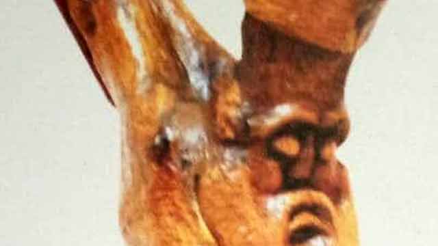
Fortunately, contemporary Ghanaian artists like Vincent Akwete Kofi and Kofi Antobam, who by their training, developed both the skills and the mindset to create and fully appreciate African arts have played major interventional roles. They, through rigorous production of masterpieces over the years, led the move to redirect the wavelength of Ghanaian artistic expressiveness along the paths of decolonization. A typical example of these arts is the Crucifix, the selected object for this discussion.
The Artist – Vincent Akwete Kofi
The Crucifix is a sculpture in the round, measuring 45x10x19 inches, and was created by Vincent Akwete Kofi, a Ghanaian artist who lived between 1923 and 1974. Characteristically, Vincent creates outstanding sculptures in humanistic forms. His sculptures speak to traditional African philosophies, ideals and beliefs (Grobel, 1970), and he through his works, seeks to reinforce the beauty, dynamism and complexities of African art. Indeed, Vincent’s artistic posture was largely informed by his training in the then Achimota College in the Gold Coast (now Ghana), an educational institution which sought to bridge the gap between European and African forms of knowledge (Woets, 2014).
Description and interpretation
The Crucifix was carved in tropical hard wood, one of Vincent Kofi’s preferred media, with the style and subject matter reminiscing his belief in the creative and objective fusion of lessons from the history of modernism in the arts by an immersion in his Ghanaian heritage. Like his earlier sculptures therefore, the choice of this Euro-Christian theme throws lights on his Pan-Africanism and decolonization intents.
The sculpture is a depiction of a free-standing human figure with features that conform with his earlier wood carvings, such as depiction of enlarged head and heavy feet which are more representational than naturalistic. Again, the entire form is seen as being directed by the limitations of the tree trunk deliberately chosen for the work. This, of course is one of Kofi’s traditional wood carving styling.
The Crucifix is postured in a clasped forward-bent lower limb. Like the lower limbs, the upper limbs of the figure which are raised over the head and stretched backwards, are also clasped together, depicting the entire image in a rather discomforting posture. Further strengthening the feeling of distress and discomfort in the image is the dropped and lifeless face and facial features of the image. The long thick beard of the image with the tightly fitting cylindrical hat on the head, carved after one of those won by royals among some sections of Ghanaians, give the figure an elderly look.
Other significant features of the image are the exaggerated clasped, forward-bent and wobbly elephantine feet, dropped face with shuttered eyes, flaccid body/skin/muscles (which is visible even in wood), and the heavy beard.
In trying to understand the presentation of the Crucifix, it is important to note that Ghanaians have stories about characters who lived and suffered similar fates as that of the Christ. The Fante people (a section of the Akan ethnic group), for example have records on a man called Ahor, who offered himself as a sacrifice to the gods, when the life of a human being was demanded as an antidote to a calamity which befell the people. Up to today, Ahor is celebrated in a festival called Ahorbaa to commemorate his brave and sacrificial feat. Other ethnic groups in Ghana have similar stories which render the Passion of the Christ not just a familiar phenomenon, but a lived experience recorded in the history of the people.
Also worthy of notice is the familiarity of the various themes which characterize the story of the Christ, such as his kingship, miraculous personality, sacrificial journey and his eventual torture and death. The Crucifix therefore, was Vincent Kofi attempt at depicting the passion of the Christ in a way that would make it familiar and relevant to the people.
The image in Kofi’s Crucifix was therefore needed to be presented as a man with royal personality, as depicted in the cylindrically shaped cap, which is symbolic of some of the Ghanaian royal millinery that depict kingship and authority. This is reinforced by a heavy beard to portray wisdom. Wisdom which is reserved for kings and aged people.
Analysing from the experiences of a people whose history was not devoid of unpleasant experiences, such as enslavement, brutal torture and execution, the image presented in the Euro-Christian Crucifix could not have been a complete representation of the Man of Sorrow described in the Christian holy book (Isaiah 53:3). Kofi therefore saw the need to present a figure which paints a real picture of a man who had gone through an extreme physical pain. Those strong and heavy, yet wobbly feet were a symbol of a man overburdened with sorrows and sins of the world.
Indeed, the man on the Crucifix was dead, with no chance of maintaining a smooth and shiny skin as seen in the Euro-Christian crucifix. In Vincent Kofi’s Crucifix, therefore, he, even in wood, managed to present a flaccid body/skin and muscles which, with the closed eyelids, dropped and lifeless face gave an impression of an extremely tired dead body. Probably an artistic rendition that comes close is Mel Gibson’s crucified Christ in his movie, the Passion of the Christ.
Conclusion
Early missionaries introduced the Christian religion with its attendant icons, images, stories and language in 1400s. Semblance in religious icons, images, stories and their associated functions made the acceptance of Christianity easier among indigenous Africans/Ghanaians. Vincent Kofi’s Crucifix could therefore be considered as a great effort towards connecting foreign Christian belief systems to known religious experiences, thereby making Christianity much more relevant to the African than it has been.
References
- African Artists in America (1978). African Affairs, 11 (3), 84-85.
- Frank, B. (1999). The Visual Arts of Africa: Gender, Power, and Life Cycle Rituals by Judith Perani and Fred T. Smith (A review). African Affairs, 11 (3), 14-16.
- Kwami, A. (2016). Kofi, Vincent Akwete (1923–1974). In the Routledge Encyclopedia of Modernism.: Taylor and Francis. Retrieved 31 Dec. 2021, from https://www.rem.routledge.com/articles/kofi-vincent-akwete-1923-1974. doi:10.4324/9781135000356-REM845-1
- Moore, G. (1967). The Arts in the New Africa African Affairs, 66 (263), 140-148.
-

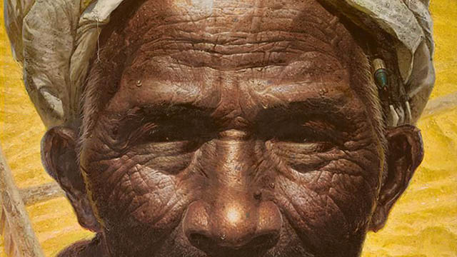
"Father” is a huge portrait created by Luo Zhongli (born 1948) in 1980. The picture shows an elderly man with dark skin and fine wrinkles on his face wearing a white headscarf. He is holding an old bowl containing tea in both hands. The old man’s fingers are rough, there is still dirt embedded in his nails and there is dirty gauze wrapped round his fingers. He has only one tooth left in his mouth. In the wrinkles on his forehead, on his brows and on the end of his nose there are glittering beads of sweat. This is the typical image of industrious peasants in China.
The importance of farmers was of great significance in China in the 20th century. Mao Zedong's assessment of issues concerning Chinese farmers commenced with the establishment of the People's Republic of China in 1949. Before the founding of the People's Republic of China, the peasants were liberated through a political revolution centered on the Agrarian Revolution; after the founding of the People's Republic, the common prosperity of farmers was achieved through the modernization of rural socialism. The role of the farmer changed from a participant in the revolution to a builder of modernization. Farmers were an important political foundation in the Mao Zedong era. Even today, there are still about 600 million farmers in China.
As a result, most of the works depicting farmers were created after 1949. Regarding the painting “Father”, the portrayal basically conforms to the definition of ordinary farmers. With the change of context during history, the visual interpretation of identity is very much influenced by the opinions of the post-modern.
Farmers are considered to be the people society relies on for a living – that is the reason why the artist named his work "Father". The model for this work was a farmer in the Daba Mountains in Sichuan province of China. The Cultural Revolution began in 1966. Mao Zedong advocated that young people from the cities should go to the countryside to receive re-education through hard labor. In 1968, Luo Zhongli, who was studying at the High School attached to the Sichuan Academy of Fine Arts, went to the Daba Mountains and stayed there for nearly 10 years. One Chinese New Year's Eve he saw an old man squatting outside a public toilet, guarding a pile of faeces as if he were guarding something of great value.[1] This image of a peasant bearing the burden of humiliation made a deep impression on the artist's mind. In 1980, when the artist was a student[2] at the Sichuan Academy of Fine Arts, he created his work “Father” by combining the image of Deng Kaixuan[3], an old man who was the artist’s landlord in the Daba Mountains , with the memory of the old man who had been guarding the pile of faeces. In 1981, Luo Zhongli was awarded the gold medal in the Second Chinese Youth Art Exhibition held in Beijing.
Controversy caused by "Father"
Today, the people viewing this large-size portrait may not be able to imagine what the people felt 40 years before when they stood in front of the large-size portrait “Father” for the first time. Those people experienced a visual shock and an impact to their values when they first saw this over 2-meter high portrait of a farmer. At that time, people were used to seeing the huge portraits of Mao Zedong or Marx only, and the monotonous idealized paintings of workers, farmers and soldiers.
During the Cultural Revolution, works of art were of the "revolutionary romanticism" style that is red, light, bright, tall, large, and full. A picture was required to contain brightness and sunshine as well as strong colors, especially red, and even shadows were not allowed to be painted in cool colors. The characteristics of such a picture is vividness and fine detail, and there are almost no traces of the brush. The themes of the works are mainly revolutionary idols and the history of the revolution. In this artistic style the happiness and prosperity of the country and the people are praised. This form of painting depicts a paradise full of sunshine and no pain, a utopian world of social optimism and revolutionary idealism. The depiction of Mao Zedong was always as an extremely tall well-built man in the center of the picture, in fact completely the image of a supernatural god. Mao Zedong was worshipped as an idol.
As an intellectual, Luo Zhongli had his own interpretation of this. "True and benevolent farmers and the like make me feel that there are people whose nature is unpolluted. The people are simple, honest, rustic. ‘Men of the earth’ with soil permanently under their fingernails. This kind of simple, down-to-earth nature often makes me feel ashamed".[4] The artist makes use of a huge portrait, a method traditionally used in nation leaders' portraits to express their sympathy, empathy and respect for ordinary farmers. At the same time, the artist tried to use painting to explain two kind of "truths", the moral truth and the artistic truth. This method is to use the truth of art to criticize the hypocrisy of morality. At the time this was however dangerous and controversial.
In fact, even for a long time after the smashing of the “Gang of Four” in October 1976, the “Mind Emancipation" had not really begun. At the Third Plenary Session of the Eleventh Central Committee of the Communist Party of China held in December 1978, the Communist Party of China clearly showed that the core of their work would be shifted from class struggle to the economic construction of modern socialism. However, at this time people's minds had still not been completely liberated from the shackles of the Cultural Revolution. Regarding the standard of artistic "authenticity", artistic creation at this time was still following the logic of the Cultural Revolution.
Shao Yangde (Chinese art theorist at this time) wrote an article in 1981 titled "Creation. Appreciate, comment, read "Father" and discuss with relevant reviewers"[5]. The article triggered a wide-ranging, long-lasting and intense academic debate on the field of Chinese art theory. Shao Yangde believed that "Father" showed the image of a farmer of the old society: numb, passive, sluggish. Therefore the painting gave the impression that farmers were submissive and pessimistic. He accused the artist of not injecting "noble revolutionary ideals" into "Father". "The image vilifies the peasant”. In fact, the living standards of Chinese farmers had nearly reached rock bottom during the Cultural Revolution while the political theorists were trying to convince the farmers that they were the masters of society and lived in paradise. This view also proved that between 1976 and 1980, many people in China were still living in utopian dreams and were unwilling to recognize reality. Luo Zhongli's "Father" shows a strong critical realism opposite to the rigid thinking at that time.
A dramatic irony is that before the work was sent to Beijing to join the Section 2 National Youth Art Exhibition, at the insistence of Li Shaoyanchairman of the Artists Association of Sichuan Province, Luo Zhongli replaced the cigarette that was originally behind the left ear of the farmer with a ballpoint pen (image below). In this way he showed that the man was an educated farmer with noble ideas in the new era. The artist's compromise was in the hope that his work would pass the intensive political investigation before a work of art was accepted, and thus been sent to Beijing. However, this modification shows the great irony of utopian fantasy.
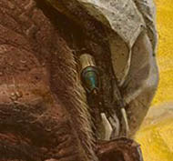
Luo Zhongli, 1980, detail © Luo Zhongli
When the works were successfully exhibited in the National Art Museum of China in Beijing in 1981, “Father”, the image of a farmer who endures the suffering and never complains, deeply moved hundreds of millions of people. The huge size and the hyperrealism of the picture were extremely fresh but tacit to those Chinese people who saw the work at the museum. Li Xianting, the editor of the official media "Fine Arts" magazine at that time, was also moved by the human compassion shown in the work. For this reason, in 1981 he used "Father" as the cover of the magazine. Only through the undisguised expression of reality can art find the truth it has lost.
Changes in social thinking after "Father"
In terms of artistic language itself, China originally had its own context of development and its own system of language. However, Chinese art since 1949 has been mainly influenced by the realistic art of the former Soviet Union, coupled with the Cultural Revolution’s censoring of the traditional Chinese context and the ban on Western contemporary art. Under the influence of this aesthetic inertia, representational realism has become the most acceptable visual narrative method for the public.
Luo Zhongli was inevitably influenced by the American photorealist Chuck Close at that time. However, instead of deliberately hiding traces of personality, emotion, and attitude to create a flat and indifferent picture as Chuck Close did, Zhongli added these feelings to his picture. "I feel that this form is most conducive to powerfully conveying all my feelings and thoughts. The arts of the East and the West have always absorbed and been influenced by each other. Forms, techniques, etc. are just the language that conveys my emotions and thoughts. If this particular language can say what I want to say, then I will learn from it.”[6] The artist seems to have used a more calm and objective approach, but made the most subjective elucidate of a farmer in the work "Father".
To the general public at that time in China, Chuck Close and modern art in Europe and America were unfamiliar and so far away. Even at the Sichuan Academy of Fine Arts, the school had bought a Japanese-published "Complete Works of the World" but it was locked in a cabinet. The students had to press their faces against the window, brush the condensation from their breath off the glass, and view the book as they would a cultural relic in a museum. Such a book would take 1-2 months to read and absorb –but only under such conditions it was possible to read about Western modern art.
For a period of time after this work, a group of artists who were contemporaries of Luo Zhongli returned to their innermost selves in pursuit of their own spirits and emotions. They became more willing to pay attention to people's daily life, and wanted to explore and express the beauty of human nature in ordinary life. The spiritual essence of their paintings was the continuation of the humanitarian sentiment.
It is precisely because of the success of “Father” that the artist was sent by the government to study at the Royal Academy of Fine Arts in Antwerp, Belgium at the end of 1983. He developed a comprehensive and deep understanding of European art and phenomena. Later, he held a personal exhibition at Harvard University in the United States, and thus gained a wide international reputation. Since then, his use of different techniques to express the language of painting has become more pioneering and expressive.
In addition to reflecting on and breaking through the constraints of the political dogma on art, Chinese artists are eager for artistic change. Art theorists have begun to introduce and translate a large number of works on the history of Western modern art, for example Herbert Read‘s: A Concise History of Modern Painting (1979), H. H. Arnason’s History of Western Modern Art (1986) and many more. In the 1980’s, influential art newspapers such as "Art" (reissued in 1976), "Art Translation Collection" (founded in1980), and "World Art" (founded in 1979) began to publish articles on a large number of Western modern art genres and artists. Faced with the influence of foreign culture as well as domestic social pressure to achieve modernization, the ruling party has adopted a more accepting attitude.
Precisely at that time, Western modern art and post-modern ideas came together and quickly merged in China. There is 1985 Art Trend[7] movement, the 89 Art Exhibition[8] etc. So far, Chinese modern art has entered the experimental stage on a large scale and has been continuously reconstructed.
However, what is significant is that the village in the Daba Mountains where the artist once lived has now lost its former prosperity. As villagers have started to go to work in cities across the country, the village has become very glum and mediocre, in sharp contrast to the prosperity of the cities. And those farmers who have moved to the city are also working hard to transform themselves into a part of the city. Farmers, who once held an important position in China's social structure, are now gradually being urbanized under the drive of the market economy, and are being marginalized in the city.
References
- Michael Sullivan, Art and artists of Twentieth-Century China, Shanghai, 2012
- Gao Minglu, Chinese Avant-Garde Art, Jiangsu Fine Arts Press, 1997
- LvPeng YiDan, The Art History of China Since 1979, Beijing, 2011
- WangYong, A History of Art Exchange between China and Abroad, Beijing, 2013
Footnotes
[1] During the Cultural Revolution, China's economy was extremely weak and faeces was the most important source of fertilizer in rural areas at that time.
[2] During the 1966-1976 Cultural Revolution, universities stopped accepting students, and the college entrance examination did not begin again until 1977. Luo Zhongli was admitted to the Sichuan Academy of Fine Arts in 1977.
[3] Deng Kaixuan was a farmer in the Daba Mountains. Luo Zhongli lived in the farmer’s home when he was in the Daba Mountains. Deng Kaixuan was also the model for the painting "Father". He has passed away now.
[4] Gao Minglu, Chinese Avant-Garde Art , ( Jiangsu Fine Arts Press,1997)P70
[5] “Fine Arts" Magazine, (Beijing,1981)Issue 9, P57
[6] "Fine Arts" Magazine, (Beijing,1981)Issue 2, Page 4
[7] The 85 Art Trend refers to an art movement towards modernism that emerged in mainland China in the mid-1980ies. The young artists at that time were dissatisfied with the line of leaning to the left of the art world at the time, and with the Soviet socialist realism art stereotypes as well as some values in traditional culture. They tried to find new blood from Western modern art, which triggered a nationwide art trend.
[8] 89 Art Exhibition, "Chinese Modern Art Exhibition" held at the National Art Museum of China in Beijing in February 1989. This is the first exhibition of concentrated Chinese avant-garde art including performance art and installation art. The artist Xiao Lu shot her installation "Dialogue" and the exhibition was forced to terminate. The shooting incident of "Dialogue" has therefore become a symbol of the 89 Art Exhibition and has an important position in the history of modern Chinese art.
published September 2020
-
In the 13th century, when traffic and information were sparse, Marco Polo, a Venetian, came to China by land and served the Chinese Yuan imperial court from 1275 to 1295. The white Chinese porcelain vases, which he took back to his motherland and which are archived at San Marco Museum in Venice today, are reputed as a symbol of the Chinese vogue that went viral in Europe 300 years later. The Travels of Marco Polo has stirred European’s imagination of China[1] , and also promoted Europe's maritime exploration.
However, before the opening of the new sea route between China and Europe in the 15th century, Chinese porcelains were rarely exported to the European market as a commodity. The trade of Chinese porcelains to Europe was monopolized by Arab merchants, while European merchants could only obtain fewer Chinese porcelains from West Asia and Egypt in the form of intermediary trade. Unlike silk and spices, which were easy to carry and transport, Chinese porcelains were mostly sold locally by means of land transportation because of their fragility and weight. They were closely connected with local culture, after which they were imprinted with local aesthetic characteristics and shipped to Europe. However, Chinese porcelains were not what they had always been. Forerunner of great geographical discoveries as he was, Zheng made seven large-scale ocean voyages during Ming Dynasty from 1405 to 1433, but did not establish direct contact with Europe.
Comparatively, European humanism and capitalism were at an embryo stage. From the 15th century to the 17th century, European fleets represented by Portugal, Spain and the Netherlands carried out sailing explorations in order to seek new trade routes and trading partners as well as develop the capitalism in Europe.
First, Chinese porcelains were shipped to Europe as ballast. However, the European upper class favoured them by virtue of their smooth texture, delicate and hard casing and exquisite emblazonment. European royal nobles and bishops all were keen on owning Chinese porcelains to show off their wealth and status. European royal families’ love to Chinese porcelains did not ease in spite of the fact that they had little understanding of the materials and techniques and far away China. Philip II of Spain (1527-1598) had a collection of 3,000 pieces. Although Europe started importing Chinese porcelains on a big scale, a mysterious atmosphere always clung to these exquisite utensils. At that time, some people in Europe even thought that Chinese porcelains could play an anti-virus effect.
The French doctor Loys Guyon (1527-1617) and Sir Thomas Browne (1605-1682) of England studied Chinese porcelains. Père Francois Xavier d'Entrecolles (1664-1741), a French missionary, was in Jingdezhen, China, for 7 years during the 17th century. In 1712 and 1722, he wrote reports on the details of Chinese porcelains making which he observed and inquired into and mailed them back to the Jesuits in Europe, making it possible for French to imitate porcelains locally.
Already in 1575, Italian Medici Grand Duke Francesco's factory made an attempt to produce porcelains, which was the first imitation recorded in Europe. Such a kind of Medici pottery bottle with blue and white patterns is collected in the Louvre. Both the white glazed blue painted pottery in Delft, the Netherlands, and the Nevers kiln in France have imitated the decorative style of Chinese porcelains. However, in terms of materials, they came in pottery or soft porcelain. The alchemist Bottger did not calcinate the earliest European porcelain at Meissen, Germany until 1709. In this process, the aesthetic taste in Europe had gradually changed. The fashion of loving oriental artifacts had gradually spread from nobles to rich bourgeoisie. As the demand for relatively cheap goods had also become more and more vigorous, porcelains had gradually turned a part of the daily life of the common. The nature of Chinese porcelain had gradually changed from collectibles to daily commodities.
In order to meet the needs of European society, East India Companies in European countries imported a large number of porcelains from China in the 17th and 18th centuries. In China, this kind of porcelain for export was called export-purpose Chinese porcelain.[2] From the change of shape and pattern the export-purpose Chinese porcelains can be roughly classified into traditional styles, hybrid styles and foreign styles.
1. Traditional styles (The shape and decoration of porcelain have not been influenced by foreign styles, and are no different from products on the Chinese market.)
From the opening of the new sea route in the 16th century to the lift of the ban on maritime trade in 1684, it was illegal for Chinese to export porcelains. As per the ban on maritime trade in the Ming Dynasty, non-governmental maritime trade was strictly prohibited, while official tribute trade was allowed with strict restrictions. Foreign countries could only conduct limited official trade with the Ming authorities. Since then, the Qing authorities have repeated the ban on maritime trade. The production and shipment then were at great risks.
Merchants usually purchased Chinese porcelains in Guangzhou and then shipped them abroad from Macao, making the export-purpose Chinese porcelains dominated by traditional Chinese style at this stage. It influenced the early stage of the Chinese style in Europe as well as the reproduction and imitation of Chinese porcelain with soft pottery in Europe. Chinese porcelains were mainly used as daily necessities, such as dishes, bowls, bottles and pots. But there were few ornamental porcelains as well. The decorative patterns mostly came in cloud-dragons, deer, horses, cranes, monkeys, flying butterflies, birds and insects, folding branches and flowers, fairy ladies with babies, city walls with mountains and waters, auspicious characters, etc.
Unknown, Blue and white porcelain vase, 1700-1710, Victoria and Albert Museum London.
The style of blue-and-white porcelains represented the life of the easterners to Europeans. A great number of Chinese porcelains of this kind are recorded in the archives of Dutch East India Company.
On the one hand, few Chinese porcelains were exported to Europe with a higher price; on the other hand, the pure oriental shape made Chinese porcelains deviate from the daily needs of Europeans. For example, easterners’ habit of eating rice and using chopsticks makes bowls the most common utensils in the East, while westerners’ custom of eating bread and using knives and forks has not made bowls, with a deep-walled shape, the mainstream of European tableware by far. Because the typical Chinese tableware consists of fewer parts compared to Western dining habits, Chinese porcelain dishes could only be used for holding cakes and pastries in Europe. For example, porcelain pen containers were used as wine cooler, and porcelain fish tanks were used as flowerpots... Chinese porcelains were constrained in terms of use, and often modified or displayed as ornaments. Therefore, a new style came out in the course of development.
2. Hybrid styles. (Chinese traditional style couples with foreign ornaments and vise versa, or Eastern themes couple with Western ones for hybrid ornaments.)
It is the stage of free transformation of Chinese style porcelains. Among this type, porcelain with traditional Chinese themes, or a mixture of different themes from China and Europe, combined with European shapes is the most representative. Part of the changes in the shape of European porcelain came from metalware, and part from the changes in lifestyle brought about by trade. For example, since the 17th century, Europeans have been importing black tea and coffee from the East and chocolate from Mexico. These hot drinks come brown in color after brewing, and white Chinese porcelains serve as the most suitable drinking utensils. The emergence of new eating habits has promoted the transformation of Chinese porcelain utensils. The Dutch enlarged the size of traditional Chinese small teacups and designed a lug.[3] Kraak porcelain[4] and Mandarin style were the most representative.
Unknown, Dish, ca. 1635-1655, Kraak Porcelain, Diameter: 47,5 cm, Bibliographic Reference: Clunas, Craig (ed.). Chinese Export Art and Design. London: Victoria and Albert Museum, 1987, p. 38, fig. 16.
Kraak porcelain is a form of blue and white porcelain exported from Wanli Period of Ming Dynasty (1573-1620) to early Qing Dynasty. It was mainly shaped in dishes, bottles and bowls, and represented by trimmed patterns. These patterns came round, diamond-shaped and lotus petal-shaped, with designs of flowers, birds, fish and insects, landscapes, figures and auspicious mascots commonly seen in Chinese porcelains. Later, exotic religious myths and social life themes appeared in trimmed patterns. In terms of techniques, the traditional way of drawing the outline of the pattern on the surface of the porcelain body with a writing brush and then filling it in with color was adopted. Kraak porcelain is a kind of export-purpose porcelain with the largest quantity and the longest influence period of more than 100 years. After that, blue and white porcelain in Kangxi Period (1662-1722) of Qing Dynasty came in western rendering techniques in drawing, showing a maximum of eight or nine color gradations on the porcelain body. And it drew much popularity among westerners.
The word “Mandarin” was a name for Chinese officials when Portuguese traded with Chinese merchants in the 17th century. In the 17th and 18th centuries, many missionaries and painters came to China and recorded their experiences there, including their life and work with Chinese officials in addition to preaching.
Most of the decorative patterns depicted the life of officials and wealthy merchants in Qing Dynasty, who enjoyed a rich and leisurely family life. These descriptions and landscape paintings further aroused European‘s curiosity about live in China. Aiming at this market opportunity, Guangzhou Porcelain Workshop launched Mandarin style products for European and American markets. Some patterns use the perspective technology of European oil paintings, and the expressions of the characters are vivid, which conforms to the aesthetic orientation of Europeans. These patterns presented a desirable pastoral oriental atmosphere for westerners. Playing in picturesque courtyard gardens, hunting in enchanting springtime, harmonious coexistence between human beings and nature, and vivid home life scenes embodied elegant Chinese costumes, fascinating home decoration, exquisite garden scenes, and charming family happiness. These themes greatly satisfied Europeans’ curiosity and yearning for the East.
Unknown, Three Vases, 1700-1720, Procelain, Jingdezhen, Staatliche Kunstsammlungen Dresden.
3. Foreign styles. (Chinese porcelains satisfying the requirements of European merchants in terms of shapes and patterns, calcined elaborately to serve European consumers’ needs. Most of the patterns were drawn in strict accordance with the prints and patterns as required by customers, so they were usually called custom-made porcelains.)
One type was produced in the 17th century. Since Europe had not yet mastered the technology of porcelain-making, Chinese porcelain workers imitated the pottery of European style according to the requirements of European merchants. Chinese Porcelain competed with European pottery in this way and earned a lot of silver used as currency.
Unknown, Vase with Angel, 1700, Porcelain, H: 36cm, Victoria and Albert Museum London. Bibliographic Reference: Clunas, Craig (ed.). Chinese Export Art and Design. London: Victoria and Albert Museum, 1987, p. 60, fig. 40.
Another type emerged when the Chinese style in the West reached its peak in the 18th century and Chinese characters and landscapes imagined by Westerners appeared in the patterns. The pictures are humorous and interesting, while the number is quite limited. In addition, there were porcelain carvings, figures and animals.
The pattern was typically formed by heraldry (the special signs of European and American aristocratic guilds, groups, etc. In the 18th century, China sold up to 600,000 kinds of heraldry porcelain to Europe). In addition, characters (out of Greek or Roman fairy tales, the Bible, European customs-based sketches), ships, landscapes, flowers, etc. used to be popular themes among Europeans. Besides, European living habits were taken into consideration in terms of modeling.
Unknown, Souceboat, ca. 1740, Porcelain, L: 18,4cm, Victoria and Albert Museum London. Bibliographic Reference: Howard, David Santuary. Chinese Armorial Porcelain. London: Faber and Faber Limited, 1974, p. 295.
Apart from blue and white, multicolored and famille rose ones were among this kind of style. Because of the higher cost, longer period of capital occupation, more complicated procedures and greater commercial risks, this variety did not turn a mainstream among export-purpose Chinese porcelains in spite of their distinctive features. Especially in 1769, the first production line of British Wedgwood Porcelain Plant rolled off, when European porcelain production began to leap from the handicraft era to the industrial era. Since then, importing Chinese porcelains has grown unprofitable, and the porcelains in Chinese style turned gradually out of date.
In the course of trade development for nearly 300 years from the 16th century to 19th century, from “Made in China” to “Making Chinese Porcelains”, the Chinese vogue going viral in Europe represented a process of Europeanization of Chinese cultural practices. In this process, lacquerware, woven carpets, clothing, furniture, wallpaper and garden architecture were as well used for reference, quotation and modification in Europe, and finally integrated into the social context of Europe, influencing and even changing the artistic outlook of Europe. Nowadays, the shortened distance and accessible information across the world enable us to see the diversity of cultures more quickly and accurately. More possibilities for cultural exchanges will definitely be springing up in the future.
FOOTNOTES
[1] China in the 13th-19th centuries was only a Far East country geographically along with India, Southeast Asia, South Korea and Japan
[2] Due to the limited space, the export-purpose Chinese porcelain in this paper refers specifically to the exported ones to Europe.
[3] Lin Lin's, Research on Porcelain Trade of Dutch East India Company in the 17th-18th Centuries, pp 31-34.
[4] Its name probably originated from Portugal Caraack, meaning “giant merchant ship”.
REFERENCES
- WangYong, A History of Art Exchange between China and Abroad, Beijing, 2013
- Shanggang, A new compilation of the history of Chinese arts and crafts, Higher Education Press , 2007
- Etiemble, L’Europe Chinoise. The Commercial Press, Beijing, 2013
- Liwei, Through the silk Road, Beijing, 2018
- Hugh Honour,Chinoiserie: The vision of Cathay, Peking University Press, 2017
-
Based on the Ghanaian interpretation, it quickly became clear that certain ideological or political positions are immediately connotated with the respective image selection. These in turn are linked to historical and social experiences, which Winkler (2021) recently elaborated on the basis of the history of Germany. In our case, the West German, left-liberal intellectual milieu is of particular interest, since all the German project partners involved in the discussion can probably be assigned to such a milieu. "In the 1970s, the view prevailed among liberal and left-wing intellectuals in former West German, which objectively was not a nation state, did well to see itself as a >post-national democracy<. In the 1980s, this led to the conviction among many that the time of the nation state had passed and that Europe only had a future as a post-national union. [...] The self-destruction of one's own nation-state [in Nazi Germany - author's note] led to the conclusion that the nation-state as such had outlived its usefulness, and the term ‘national’ was equated with nationalist. [...] In Germany the idea that the nations had to merge into a European republic found a broader public echo." (Winkler 2020 p.186)
For art educators, the majority of whom probably feel committed to this idea of Germany as a post-national democracy, the question of a current symbolisation of national unity[1] is therefore obsolete. It cannot therefore be relevant to art education. A consensus in the German team on how at least the general topic could be addressed could be reached by the proposal to deal with the topic on another level, and to use Hans Haacke's installation "Der Bevölkerung" (2000, courtyard of the German parliament in Berlin) to deal with the topic of "national unity" in a contemporary art lesson.
Hans Haacke (*1936) is a German-American artist who has lived and worked in New York since 1965 and whose conceptually influenced works primarily address art-political processes.
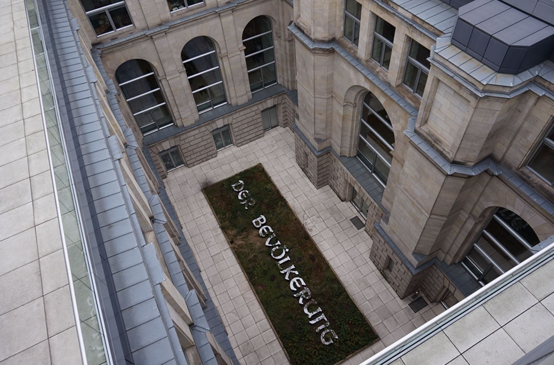
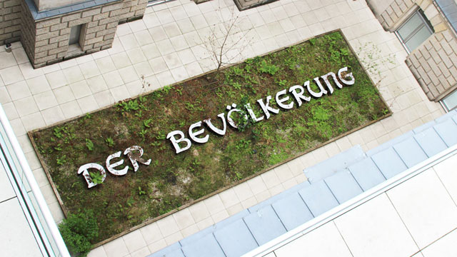
Figure 2: View into the courtyard of the Reichstag building. © Hans Haacke / VG Bild-Kunst.
Haacke's installation "Der Bevölkerung" is located in a courtyard of the Reichstag building. This architectural context is part of the work. The building was constructed at the end of the 19th century, during the Second German Empire (1871-1918). In neo-baroque style, it paid homage to the national pomp under emperor Wilhelm II. Damaged by fire in 1933, it was further damaged during the Second World War. Located directly on the Wall to East Berlin, the dome was finally blown up in 1954. In reunified Germany, however, a new function was found for the building. Rebuilt according to plans by Norman Foster in the 1990s, it now serves the German parliament, the Bundestag.
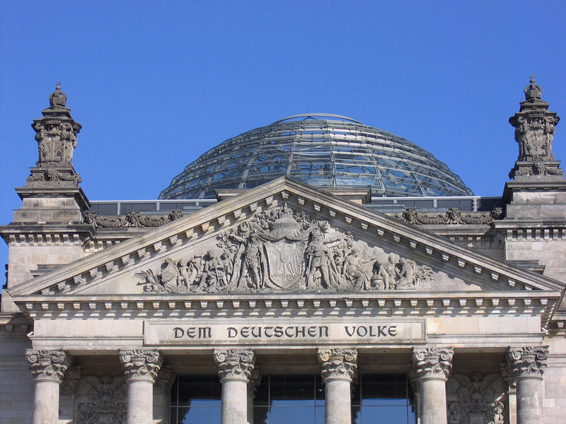
Figure 3: View of the façade of the Reichstag building with the inscription "Dem Deutschen Volke" © Hans Haacke / VG Bild-Kunst.
Hans Haacke built a 21 x 7 metre rectangular, flat wooden enclosure in this building. He then asked the MPs to gradually fill it with soil from their respective home regions. In the middle of the box, the inscription "Der Bevölkerung" (To the People / Population) can be read, in white letters illuminated from the inside. The typeface corresponds to the inscription "Dem Deutschen Volke" (To the German People / Nation), which has been on the outside of the building's west portal since 1916.[2] According to the initiator, the invitation to bring soil from the constituencies is valid as long as members are democratically elected to the German parliament. A webcam, belonging to the installation (www.bundestag.de), takes a picture every day at 2 p.m. and 8 p.m. and thus allows a take a look at the development of the project since 2000 and at the current situation.
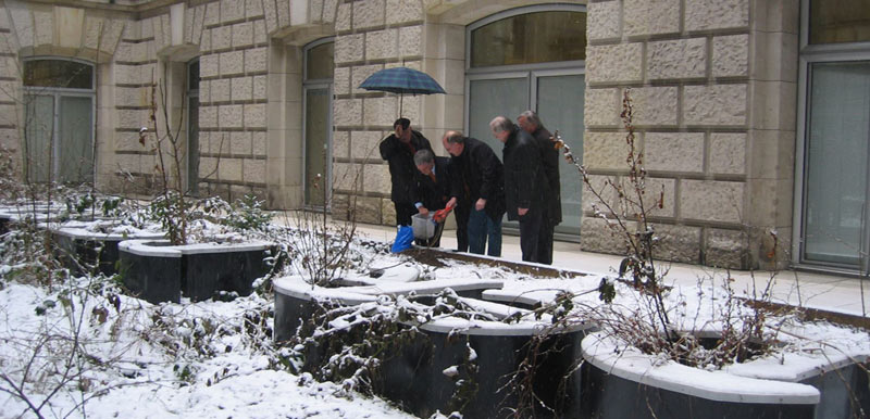
Figure 4: An MP distributes the home soil from his constituency in Haacke's installation. © Hans Haacke / VG Bild-Kunst.
When Haacke proposed to install this large-scale installation in the new parliament in 1999, ten years after German reunification, it triggered a heated public discussion. Many MPs found the words "Der Bevölkerung" (To the People / Population), which appeared to be a dedication, inappropriate and provocative. Haacke was deliberately alluding to the older inscription "Dem deutschen Volke" (To the German People / Nation) on the outer façade. In contrast to this, he used the term " Bevölkerung - population" to refer to all the inhabitants of Germany, including people who do not have German citizenship and live here. According to his own statement, Haacke was inspired by Bertolt Brecht when deciding on the lettering. Brecht had written in 1935 in exile that whoever said population instead of people would avoid many lies (Brecht 1935). Haacke is obviously also concerned with the question of how words can and should be used in the context of a national parliament to designate the basis of this democratically elected representation of the people/population. Does the term "Volk" fit, a traditional, conventional but loaded and perhaps not at all accurate term? Or would be the term "population" better, a word that sounds unfamiliar and strange at first, but perhaps makes more sense. The discussion intended on such questions is part of Haacke's work.
Similar discussions were triggered by the idea of having MPs bring home soil. For many, this was reminiscent of the National Socialist blood-and-soil ideology. Or they criticised it as "kitsch" because of the well-intentioned but overused symbolism. Obviously, the work here plays with this iconographic tradition (“Heimaterde”), but reinterprets it just as it reinterprets the lettering. At the same time, the installation is constantly changing as a result - both through the ever-changing soil and through the growth of the plants over the course of the year.
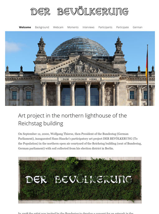
Figure 5: Screenshot of the project's website https://derbevoelkerung.de
© Hans Haacke / VG Bild-Kunst.
The installation is thus in constant dialogue with the population designated in the inscription, tries to involve the MPs and responds as a living piece of nature to the stone surroundings of the parliament building. The work of art is thus never fully completed.
Haacke's art project was particularly controversial in parliament; only by a narrow majority did the MPs finally vote in favour of the realisation of the artwork in 2000 after a specially scheduled debate in the Bundestag. The entire debate is documented on the project's website - as another part of the work (Bundestagsdeabtte 2021).
[1] I.e. a "small German" solution after 1990 and with shifted borders after 1945.
[2] It was designed by the Art Nouveau artist Peter Behrens.
References
- Brecht 1935: Bertolt Brecht. Five Difficulties in Writing the Truth. www.literaturwelt.com/werke/brecht/wahrheit.html (13.10.2021)
- Bundestagsdeabtte 2021: https://derbevoelkerung.de/bundestagsdebatte/
- Kaernbach 2011: Andreas Kaernbach. Projekt „DER BEVÖLKERUNG“ im Reichstagsgebäude. https://www.bundestag.de/besuche/kunst/kuenstler/haacke/haacke-198996 (13.10.2021)
- Winkler 2020: Heinrich August Winkler. Wie wir werden, was wir sind - Eine kurze Geschichte der Deutschen. Munich (Beck)
- Winkler 2021: Heinrich August Winkler. Das widerspruchsvolle Erbe des Otto von Bismarck. In: FAZ of 18.1.2021, p.6
-
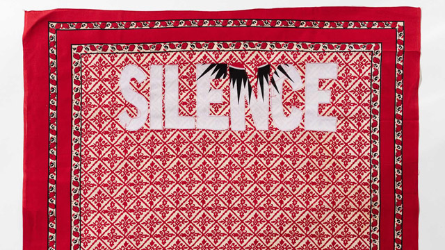
Lawrence Lemaoana’s work, entitled SILENCE … FALLS (2017) consists of Kanga fabric with cotton embroidery, measuring 155 x 115 cm. Lemaoana is a South African black male, born in Johannesburg in 1982, who lives and works in Johannesburg. The work serves as an example of the ways in which young black artists in South Africa aim to express a specific South African identity which appeals to the global art world.
The use of Kanga fabric as medium is in itself very significant. Lemaoana states that: "Kanga fabrics [...] are used extensively in my work. Manufactured in the East, and brought to South Africa to be sold in markets and bazaars, the journey of the fabrics speaks of the idiosyncrasies and trade imbalances of globalisation. The textiles themselves though have a wholly different life in South Africa – they are regarded as significant markers of spiritual healing, imbued with great religious and spiritual power, used by diviners and fortune-tellers." (Afronova)
The Kanga cloth is “used specifically in Emandzawe rituals, both as clothing for the sangoma [diviner] performing the ritual and as cloth on the shrine inside the shrine room in which the ritual takes place” (von Veh, 2017, pp. 13-14). The use of this fabric thus establishes Lemaoana’s identification with both global culture and black African culture which does not belong to a mythical past but is still very much alive today. His own familiarity with the sangoma becomes clear when he maintains that the ambiguity of the traditional healer’s utterings parallels that of headlines in the news media. He also exploits the deeper meaning embedded in the three colours white, red and black to heighten the impact of his highly topical messages.
Lemaoana’s work is inspired by current socio-political events and the way in which they are reported in the local media. The composition Silence Falls evokes the #RhodesMustFall movement which began in 2015. This demonstrates the artist’s concern with the plight of the South African youth and his identity as an artist born in the 1980s – the so-called ‘born-frees’ who did not actually experience the ‘struggle’. The works of this generation of artists are described as “symptomatic of the new identity issues of the post-apartheid era. This young generation is appropriating a history that it believes has been confiscated and twisted in order to develop an alternative that takes into account its own subjective experience. Conscious of their responsibilities, these artists are helping to formulate and affirm a specific South African identity” (Pagé and Scherf, 2017, p. 8).
Lemaoana expresses his concern with socio-political issues through a critical engagement with mass media in South Africa. He is particularly concerned by the ability of the local media to shape social consciousness. By isolating news headlines and appropriating political slogans in his very own cynical way he “turns didactic and propagandistic tools on their head” (Afronova). As Lepage (2017, p. 117) states, Lemaoana uses the power of “words as favoured instruments in the political struggle”.
The importance of Lemaoana’s work is vested in his participation in the Fondation Louis Vuitton exhibition in Paris in 2017. The exhibition was divided in three parts; the first one was entitled Being there: South Africa, a contemporary scene and aimed to show South African vitality through the works of 16 artists. In the accompanying catalogue the curators Suzanne Pagé and Angeline Scherf (2017, p. 8) explained that their choice of artists was “based primarily on the action of the artists themselves, on their engagement with the current economic and social institutions, their awareness and conviction that they can act and play a role: BEING THERE”.
Interestingly the curators also comment on the fact that this younger generation of artists, in the context of ongoing economic and social divisions more than two decades after the end of Apartheid, sees it as its mission to transform “disenchantment into the energy for renewal” (Pagé and Scherf, 2017, p. 8). Achille Mbembe (2017, p. 16) elaborates on the current tensions in South African politics and culture which have led to a stalemate. In a society where consumption has become the quintessential state of being, the visual arts are in crisis, characterised by radical fragmentation and dispersion of reality (Mbembe 2017, pp. 23-24). “What is needed in contemporary South African arts”, writes Mbembe (2017, p. 24), “are concepts with which to seek out the real … . This will not happen without a new collective imagination that will help to facilitate the passage from the past and present to the future”.
This is what Lemaoana has achieved in his art. His participation in the show confirms his status as a contemporary South African artist who has managed to decolonise his art by “seeking out the real” and grounding it in a local or national context. Furthermore, in Lemaoana’s works there is no room for, what Mbembe (2017, p. 25) calls, “tropes of pain and suffering” or the injuries inflicted “by the forces of racism and patriarchy” – tropes that are the characteristic traps of postcolonial discourse. His art is decolonised in the sense that all the resources of cultural and artistic modernity – both in terms of medium and narrative – have been mobilised in order to render itself more relevant to a modern Africa and a global humanity (Ekpo, 2017, p. 20).
References
- Afronova. http://www.afronova.com/artists/lawrence-lemaoana-2/ (accessed on September 19, 2017).
- Ekpo, D. (2017). Manifesto for a Post-African art. Unpublished keynote address presented at the SAVAH Conference, Tshwane University of Technology, South Africa, September 21 – 23, 2017.
- Lepage, A. (2017). Lawrence Lemaoana. In S. Pagé & A. Scherf (Eds.), Being there: South Africa, a contemporary scene (pp. 116-21). Paris: Fondation Louis Vuitton and Editions Dilecta.
- Mbembe, A. (2017). Difference and repetition. Reflections on South Africa today. In S. Pagé & A. Scherf (Eds.), Being there: South Africa, a contemporary scene (pp. 15-25). Paris: Fondation Louis Vuitton and Editions Dilecta.
- Pagé, S. & Scherf, A. (Eds.). (2017). Being there: South Africa, a contemporary scene. Exhibition catalogue. Paris: Fondation Louis Vuitton and Editions Dilecta.
- von Veh, K. (2017). Textual Textiles: Gender and Political Parodies in the Work of Lawrence Lemaoana, TEXTILE,1-19. doi: 10.1080/14759756.2017.1337381 (Accessed September 5, 2017).
published March 2020